The “Policy Makers” Are Fighting For Their Lives


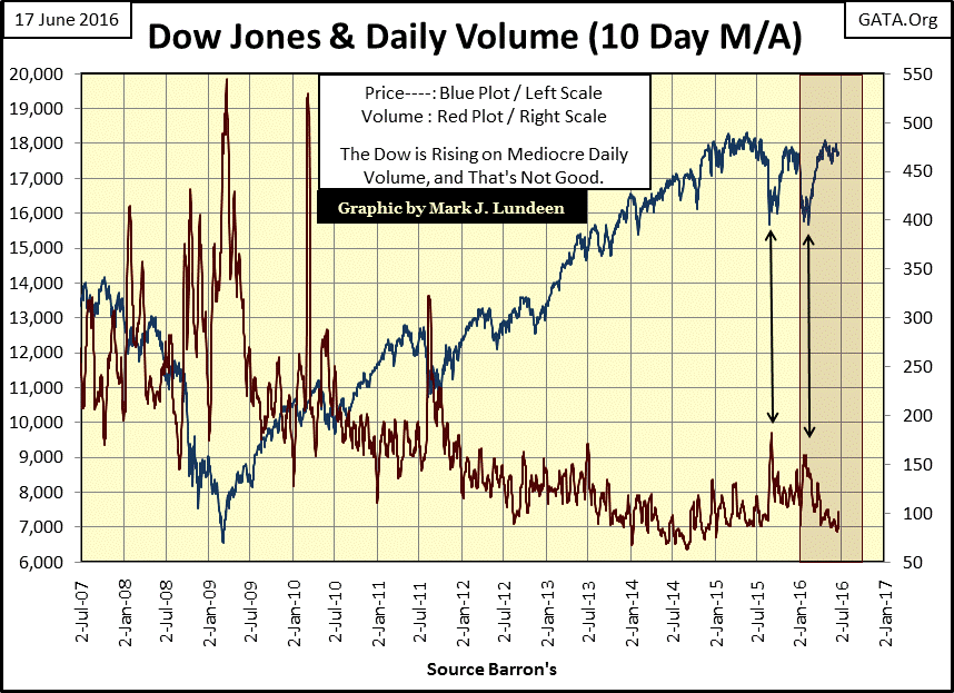
Something interesting happened on Friday; trading volume exploded on a decline in the Dow Jones. In the BEV chart below I inserted the daily trading volume (mils) for the Dow Jones instead of the usual BEV values to highlight what happened. It wasn’t just the trading volume for the Dow Jones either; trading volume was up everywhere. What does this mean? I think it indicates a lot of people wanted out of the market – now. Friday was the type of day where the PPT had to support the market or we would have seen a larger decline than we see below.

But seeing trading volume explode during a single day’s trading isn’t much of an indication of what we can expect in the coming weeks. If this week we continue seeing trading volume increasing, it will be a sure sign of bad things coming at the stock market, and the “policy makers”’ increasing efforts required to support current market valuations.
The chart below is proof positive that the “policy makers” have manipulated market valuations in the stock market for years. Trading volume is best understood as demand for stocks trading in the stock market. From January 1900 to January 2000 (100 years), rising trading volume (rising demand for stocks) occurred in bull markets. Declining trading volume (declining demand for stocks) occurred in bear markets.
But all that changed when the high-tech bubble of the 1990s began deflating in January 2000. Since then, trading volume (Red Plot below) has declined during market advances, and increased during market declines. For the past sixteen years, trading volume has had little to do with actual demand for stocks trading at the NYSE or NASDAQ. Today trading volume is best understood as the measurement of the effort applied by the “policy makers” to prevent the bubble they’ve inflated in the stock market from deflating.
In March 2009, the Dow Jones (Blue Plot below) bottomed at its second deepest percentage decline since 1885: on record high trading volume. It’s not shown below, but the same thing happened at the bottom of the high-tech bear market in 2002. Doctor Bernanke wasn’t shy about taking credit for turning the market around by supporting its artificial valuations with “policy.”
“Policies have contributed to a stronger stock market just as they did in March 2009, when we did the last iteration of this. The S&P 500 is up 20% plus and the Russell 2000, which is about small cap stocks, is up 30% plus.”
- Doctor Benjamin Bernanke, CNBC Interview with Steve Liesman 13 Jan 2011 (1:40 PM).
Below we see the entire 2009-2015 market advance occurring on collapsing trading volume, and in the past year both 10% market corrections for the Dow Jones saw a spike in trading volume. True to form, the market’s advance since last February, once again occurred on declining trading volume.
The “policy makers” have managed market valuations for the past sixteen years; why can’t they do so for the next sixteen? Because, their support for market valuations was accomplished by expanding credit, which also increased the debt load that now weighs heavily on economy. I don’t expect much to change until the bond market begins to see bond yields rising, due to market fears of defaults. The Fed may be able to manage the stock market, but will prove to be woefully inadequate in supporting both the stock and bond markets simultaneously in a time of crisis.
And if Barron’s Confidence Index (CI) below is to be believed, that’s exactly what is going to happen. This week the CI broke below 65 for only the third time since World War 2. The other two occasions were at the bottoms of the tech-wreck and mortgage debacle bear markets. The CI is just the spread between two investment quality bond yields; best and intermediate grade bonds, and since 1938 it has provided a technical indication of the bond market’s opinion of the ability of lesser quality bonds to service their debts to term. Seeing the CI break below 65 (64.3) this week is not a propitious omen for the market! This is something we need to keep an eye on.

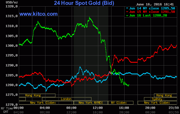
Gold got something more than a capping on Thursday this week. Dropping $35 in just a matter of hours, it was actually bushwhacked.
And, as to be expected, once again the big banks are flooding the paper COMEX gold market with promises to deliver gold they don’t have and could never deliver. Geeze Louise; since its lows of June 3rd open interest (OI) at the COMEX gold market has expanded by 93,637 contracts. At 100 ounces of gold per contract, that’s a lot of gold that doesn’t exist coming into the gold market. Still, looking at the price of gold in the chart below (Red Plot), Thursday’s bushwhacking did little to moderate its advance from the lows of a few weeks ago.
Expect OI to continue increasing until the advance in the price of gold begins to stall. At that point, once again we’ll see the big banks begin selling their long positions at market, while offering low ball bids for them, attempting to create a selling panic in the gold market. But as noted before, this scheme didn’t work in March or May of this year; will it work in July or August? Maybe, but with Barron’s CI breaking below 65 this week, manipulating the markets is becoming increasingly complicated for the “policy makers” as we move on towards the November elections.
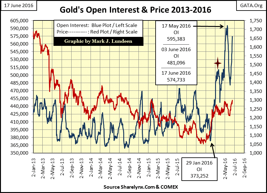
Gold and its step sum are doing great. Had it not been for the bushwhacking gold took on Thursday, we may have seen it close the week at over $1,325. In every bull market there are down days, as in every bear market there are advancing days. So even if we see a few big down days in the coming weeks, I still expect gold (Blue Plot below) will continue to advancing until the big banks engineer their next collapse in COMEX’s gold open interest, whenever that is.
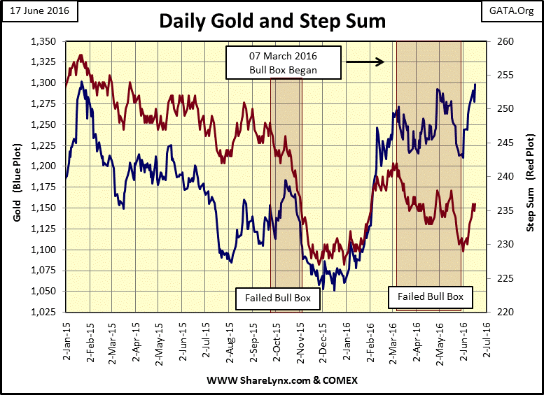
Gold and silver’s step sums and 15 counts continue to be positive. Gold’s 15 count ended the week at +5, finally rising above silver’s. The next week or two should be good for the metals and their miners. But I expect the $1,300 level for gold will be a battle, as will $18 for silver.

It’s unfair how Hollywood’s horror genre has maligned medical doctors and scientists. In the real world it’s the doctors of economics and sociology who have created the monsters that have destroyed cities and the lives of billions with their quack theories. Yes, I’m thinking of the advocates of Marxism and other proponents of big-government economics. The types of big-government where we see historical-market trends in prices and trading volume become inverted, such as we see today.
From the 1940s up to the 1960s “sociologists”; our self-proclaimed “experts” of how societies should order themselves, were advocating “social engineering” and “urban renewal” to revive America’s inner-cities and the lives of those living in them. After eight decades and more trillions of dollars in taxes disbursed than Washington’s political class would care to admit to fund these charlatans’ “social programs”, what’s there to show for it? To say nothing would be incorrect, as these wizards-of-smart have for decades devastated communities and the lives of people living in them.
The most successful “social engineer” / “community organizer” has to be Karl Marx. In his Communist Manifesto of 1848, he outlined a ten- item program, which with its implementation, would destroy the Capitalist System, from whose ashes would spring “scientific communism.” I haven’t included all ten items below. The manifesto was written in 1848 and so, a bit dated. But you can be sure that for people like Burnie Sanders, and college professors everywhere, the items below are near and dear to them.
1. Abolition of property in land and application of all rents of land to public purposes.
2. A heavy progressive or graduated income tax.
3. Abolition of all rights of inheritance.
5. Centralization of credit in the hands of the state, by means of a national bank with State capital an exclusive monopoly.
6. Centralization of the means of communication and transport in the hands of the State.
10. Free education for all children in public schools.
https://www.marxists.org/archive/marx/works/1848/communist-manifesto/ch02.htm
I’m bringing this up because the concepts of individual liberty, the right to the fruits of one’s own labor, and access to free markets have been under attack by a well organized opposition for centuries. Monetary inflation is an ideal weapon for these people.
“Lenin was certainly right. There is no subtler, no surer means of over-turning the existing basis of society than to debauch the currency. The process engages all the hidden forces of economic law on the side of destruction, and does it in a manner which not one man in a million is able to diagnose….By combining a popular hatred of the class of entrepreneurs with the blow already given to social security by the violent and arbitrary disturbance of contract….governments are fast rendering impossible a continuance of the social and economic order of the nineteenth century.”
- John Maynard Keynes, The Economic Consequences of the Peace, 1920, page 235
In 1913, the “progressives” were successful in implementing Karl Marx’s item #5 with the creation of their Federal Reserve. Two decades later, the US Treasury saw the first of two 20th century gold defaults; 1934 & 1971. Post 1971, monetary inflation in the global “reserve currency” has been scandalous. Though one could attend twenty years in America’s government subsidized schools and be totally unware of this fact.
One thing you can count on; when the current monetary bubble does finally pop, the socialists in the Democratic Party will be quick to blame it on “capitalism”, and all too many “conservatives” in the Republican Party Leadership will follow their lead calling for ever more market regulation. However, one rule that will not be considered is the one that would have the greatest impact in restoring integrity to the financial markets: to have all accounts marked to market at the end of the day. Those accounts found underwater, even J.P. Morgan’s or Goldman Sachs’, are to be liquidated, and have their operations cease immediately.
Of course as things stand now, implementing that rule today would result in a financial crisis not seen since the Great Depression. But it would also facilitate Mr Bear’s efforts to clean up the garbage piling up on Wall Street, which is exactly what has to happen before Wall Street and the financial markets can once again operate to finance business. As it is, Wall Street’s current business model is one of inflating bubbles in the stock and bond markets; exactly as Keynes told us above: “the process engages all the hidden forces of economic law on the side of destruction.”
With this as background, how is current “monetary policy” progressing? As you can see in the chart below, it’s progressing. During the Obama Administration the number of paper dollars in circulation has increased from $881 to $1,458 billion, a 65% increase in paper dollars circulating in the economy. That’s a lot!
However, such an increase is dwarfed by the increase in the Federal Reserve’s balance sheet after its three QEs. In January 2009, the Fed had monetized $497 billion in US Treasury debt. Currently it has $4,230 billion in US Treasury debt on its balance sheet; a seven year increase of 750%. This is serious “policy making!”

This increase in money and credit hasn’t been beneficial for the economy, or even for the American banking system; the primary beneficiary of trillions of dollars in bailouts, QEs and low interest rates.
Below is the banking system BEV chart going back to 1938. Market valuations have seen significant inflationary increases since 1938. The first data point in the banking index was 41.87 in April 1938. At the close of the week it was 1,413.57, a 35 fold increase in the market value of the banking index. Displaying this data in a Bear’s Eye View (BEV) format actually enhances the information that can be obtained from it; specific details that are not obvious when the raw data is plotted.
Before the dollar was officially taken off the gold standard in 1971, the banking index never saw a decline of over 40%. However, after 1971 the banking index has frequently seen market declines of over 40%, with an 86% decline seen during the mortgage crisis. In their current state, the BEV -40% line now serves as a market top for the banks rather than a bottom, which is not good.
Keep in mind the banks that are now holding down the price of gold are included in this group. They are getting weaker with the passage of time. When these banks resume their market decline that began during the mortgage crisis, there will be nothing to stop the rise in the price of gold and silver.

As the growth in CinC, and credit is no longer held in check by a functioning gold standard, but limited only by the bites of data stored on the banking system’s hard drives, the burdens of debt in our post mortgage-crisis world have become overwhelming. The fact that the Yellen Fed now finds it impossible to raise their Fed Funds rate by even a pathetic twenty-five basis points is a warning just how fragile the global economy is.
The chart below plots the Fed Funds rate with the yield for the US Treasury’s long bond from 1954 to present. I’ve identified three eras in “monetary policy” in it;
- Post WW2 to 1981: the “Policy Makers” fight inflation
- 1981 to 2007: the “Policy Makers” fight deflation
- 2007 to 2016: the “Policy Makers” fight for their lives
If you go back and review my above chart on the growth of CinC since 1925, you’ll see that monetary inflation has been a permanent fixture in the American economy since the 1920s. But economists have redefined “inflation” from one of the expansion of the money supply, to the increases in consumer prices as defined by the government’s dubious CPI data.
As post WW2 monetary inflation flowed into consumer prices, the Federal Reserve waged a war on consumer-price inflation by resorting to frequent yield inversions; where they increased their Fed Funds Rate (Blue Plot) above the yield of the US Treasury’s long bond. This forced the banking system to call in commercial loans, resulting in a contraction in the economy (a recession). What the Federal Reserve was attempting to do was to check rising consumer prices by reducing demand for goods and services from people who became unemployed during the recession.
Did it work? If it did it wasn’t for long. From 1954 to 1981, as the monetary inflation flowing from the Federal Reserve continued inflating consumer prices, we see the Federal Reserves’ reaction; progressively greater yield inversions / progressively deeper economic recessions in a failing attempt to stem rising consumer prices. Heck, all they had to do was to stop printing money, and consumer-price inflation would have ceased.
Note too how interest rates, both short and long term, responded to rising consumer prices by increasing. Bond yields increased as bond buyers began demanding an inflation premium, forcing the Federal Reserve to increase short term rates. It was during this period of rising bond yields that proved to be a great time to invest in gold, silver and the mining shares, while bond only lost money for their owners and the stock market did little to reward investors.
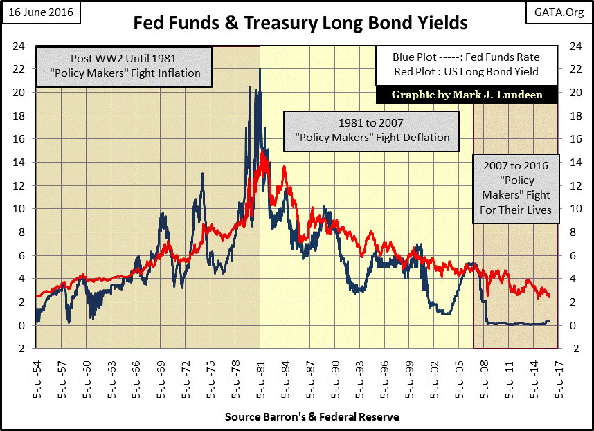
However, with the decline in interest rates after October 1981, monetary inflation stopped flowing into consumer prices, and began to flow into the financial markets. No longer were the “policy makers” attempting to contain rising consumer prices; their battles now were to prevent the bubbles they inflated in the financial markets from deflating.
If you once again go back up to my chart plotting CinC, you’ll see that monetary inflation didn’t stop in October 1981. With “inflation” re-defined as rising consumer prices, something that was no longer occurring, the inflationary growth in financial assets valuations were now re-defined as “economic growth” and who’s not for that? After all, everyone likes a good bull market, until they go pop, which is something that has happened three times since 1981 (chart below).
Next we see the spread of the Fed Funds Rate and Treasury’s long bond yield plotted above. The change in “monetary policy” after interest rates peaked in October 1981 is obvious. Before, the Federal Reserve resorted to frequent yield curve inversions that saw their Fed Funds rate many hundreds of basis points above the yield of the US Treasury’s long bond. After 1981, the most severe inversion of the yield curve was less than two hundred basis points. And look at how loose “monetary policy” became after 1981; twice the “policy makers” took the Fed Funds rate down five hundred basis points below the long bond yield. Before 1981, when their monetary inflation was flowing into consumer prices, they never had “monetary policy” so loose.
Also note how before 1981, yield inversions were greater than after. Still, even increasing the Fed Funds Rate more than 8% above long bond yields, and keeping short term money tight for years (late 1970s & early 1980s), there was never any fear of crashing the global economy. Currently, the Yellen Fed is terrorized by the thought of increasing the Fed Funds Rate even a pathetic twenty five basis points.
After 1981, each of the four periods of easy money inflated a bubble somewhere in the financial markets;
- Leverage Buyouts, Junk Bonds & Japanese Stocks and Real Estate
- High Tech Bubble
- Mortgage Bubble
- The Current Bubble in Everything
Each of the first three bubbles were deflated by “monetary policy”, with the raising the Fed Funds Rate above the long-bond yield. I placed a star over the first inversion. With the deflation of the LBO and Junk Bond bubble, the bank index (two charts up) saw a crash in their valuation of 55%. The banking stocks crashed for good reason. No doubt some familiar names seen on TV today could have gone out of business back in 1990, had not Alan Greenspan lower his Fed Funds Rate to an incredible five hundred basis points below the long bond yield. He may have saved the banks, but by this action he also ignited a bubble (#2) in the high-tech stocks. A bubble that began to deflate when Greenspan once again inverted the yield curve in the late 1990s, early 2000s.
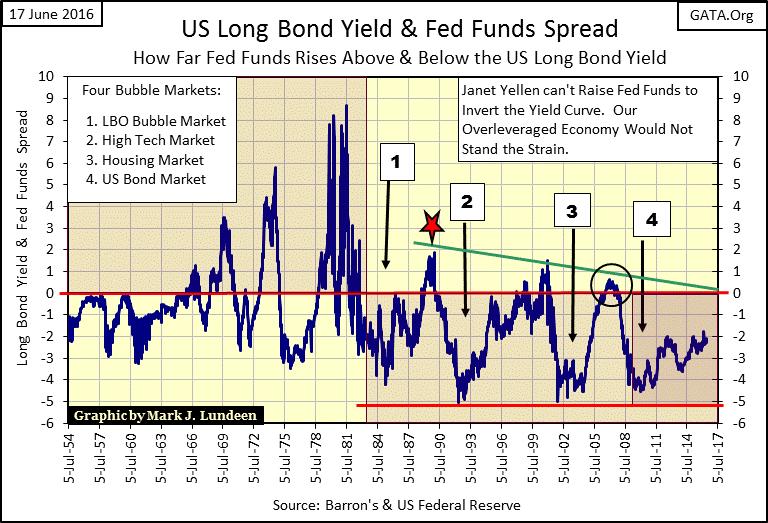
The real estate bubble followed the bust in high-tech, when once again Greenspan lowered his Fed Funds Rate five hundred basis points below the long bond yield. But look at what it took to pop the bubble in real estate; I placed a circle in the chart around it. The most insignificant yield inversion of the past sixty years resulted in total chaos in the global financial system, and today, with the current yield inversion being a loose -2%, the Yellen Fed is frozen with fear at the thought of any further tightening of their “policy.” I expect they fear triggering another Great Depression event on their watch.
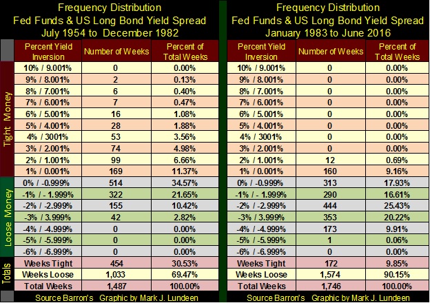
Using the data plotted in the chart above, I created two frequency distribution tables below. The first spans from July 1954 to December 1982, the other from January 1983 to this week. The “Percent Yield Inversion” column is broken into three sections;
- Tight Money: Fed Funds Rate Higher than T-Bond Yield (0.001% to 10%)
- Loose Money: Fed Funds Rate Lower than T-Bond Yield (0% to -6.99%)
- Totals
It’s worth your time studying these two freq tables, comparing one against the other. But the key to where we are now, as compared to where we were then, is found in the “Weeks Tight” column in the Totals. As bad as the consumer-price inflation was from 1954 to 1981, the Federal Reserve instituted tight monetary policy for a full 30.5% of the weeks during these three decades in their fight against consumer-price inflation. After 1982, the Federal Reserve instituted tight money for less than 10% of the weeks during these four decades, in their battle against deflation in the financial markets.
Currently the Fed is neither fighting inflation, as they did from 1954 to 1981, nor deflation as they did from 1981 to 2007; just before the mortgage crisis. Today they are fighting for their professional lives, because they know exactly what they have done, and the horrific consequences that are going to follow.
Everyone is going to suffer. But to mitigate the damage coming our way, owning gold and silver bullion, as well as some of the gold miners makes sense in today’s world.
Mark J. Lundeen


