The Banks Are The Millstone Around The Market’s Neck


Boring is how I’d describe the stock market last week. The last day of extreme market volatility (Dow Jones 2% day) occurred on March 1st and we haven’t seen a day of extreme market breadth (NYSE 70% A-D Day) since January 29th. However a pause of a few months is an insignificant gap in the growing super cluster of extreme market breadth in the chart below. This cluster of extreme market events began NINE YEARS AGO in February 2007; at the very cusp of the sub-prime mortgage crisis – yikes! Looking at this chart, I can’t help but believe there is something massive and ominous, something really, really bad lurking just below the surface. Nothing like this has been seen since the Great Depression of the 1930s; can that be good?

The Dow Jones closed the week just 798 points from a new all-time high, not far from where it ended last week. Its last 52Wk High was May 19th of last year. If the Dow doesn’t manage to exceed 18,312 sometime in the next two months we’ll see the green 52Wk High plot begin to descend to its highs of last November. What’s it waiting for?

I expect the problem the market has originates with the banking system, whose stocks are much closer to 52Wk Lows than 52Wk Highs. At the end of the week, a full seven years after their March 2009 -86% bear market lows, the banks find themselves 50.17% below their last all-time high in 2007.
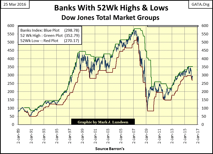
To put the banking chart in its proper place within the general market, I’m posting the DJTMG’s 52Wk High Low table below. Its sorted by how far the various indexes are from their 52Wk Lows (Blue Tab) and the banks find themselves in the #70 slot (7.26%), far from the market’s average (#22 / 21.21%).
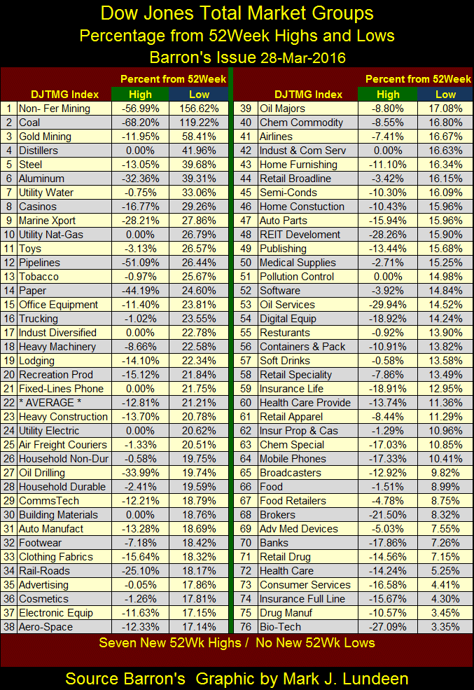
Look at the top two in the list – triple digit gains, and all the indexes from #1 to #25 are over 20%. Most of these gains are from their 52Wk Lows of just ten weeks ago, a week when the DJTMG saw forty-five new 52Wk Lows (table below). Coal Mining and Non-Ferris Mining went from the bottom two, to the top two positions in the past ten weeks. Gold Mining at #3 above and #70 below has also outperformed the market by a wide margin since January.

But what have the banks done for us in the past ten weeks? They moved from #39 in January down to #70 at the end of this week. Except for J.P. Morgan’s Jamie Dimon, it seems that everyone else is avoiding the banking stocks.
I. M. Vronsky; founder and proprietor of Gold-Eagle.com has written a comprehensive yet concise article on exactly this subject, which I urge all my viewers to read:
“Bankrupt Banks Brutally Bleeding…Worldwide”
https://www.gold-eagle.com/article/bankrupt-banks-brutally-bleeding%E2%80%A6worldwide
It’s an excellent article, but I would disagree with Dr. Vronsky on one point:
“Indubitably, there can be NO distortion implied nor built into the stock price, which is determined rationally by many thousands of individual investors and Institutional Investors over a protracted period.”
I’m not so sure the word “rational” can be used when describing banking stocks these past few years. Central banks, like the Federal Reserve have targeted these banks with trillions of dollars in direct and indirect aid for the past nine years. One could look back to February 2007, when the super cluster of NYSE 70% A-D Days began for a clue when the banks actually began having problems. A significant percentage of these banks’ stocks are now held on the balance sheets of these same central banks, thus greatly limiting the supply of bank shares actually trading in the market. Considering all the financial aid Washington provided to banks, and assuming the number of shares trading in the market has been reduced by central bank hoarding, banking shares should have performed far better than what we see in the chart above. I guess what I’m saying is that when Mr. Vronsky states:
“This analysis will reveal the international banking system as a House of Cards (at best) and a rickety, fragile, unstable, weak and unsound Garage for Storing Cash (at worst).”
Mr Bear will soon prove this outlook on the banks and their stocks to be incurably optimistic.
Be that as it may, the Dow Jones below is still near its BEV -2.5% line, but I note it took a small turn down towards its -5% line this week. The next few weeks will tell the tale. But I still have to wonder if the “smart money” is already selling into market strength (even though market levels are below those of last November). Seeing the Dow Jones break below its BEV -5% line without first crossing above its -2.5% line would be very bearish. If the Dow approaches its BEV -7.5% line expect a return of extreme market events – Dow Jones 2% Days and NYSE 70% A-D Days.
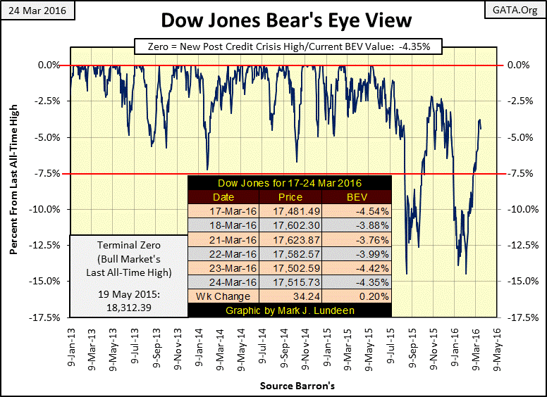
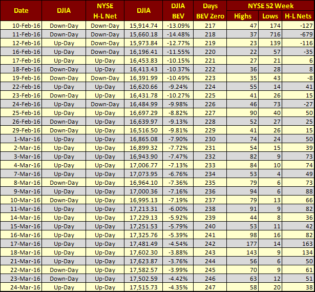
As seen in the table below, since February 25th new 52Wk Highs have dominated daily trading at the NYSE (NYSE H-L Net Column), but for the most part the daily H-L Nets have only been double digits. I take this to mean that the market is waiting for something to happen, which during bear markets means waiting for the next decline. But the bulls don’t see it that way. It’s now been 247 trading days since the last Dow Jones’ all-time high (Days BEV Zero column). The bulls may have to wait a while longer before the next.
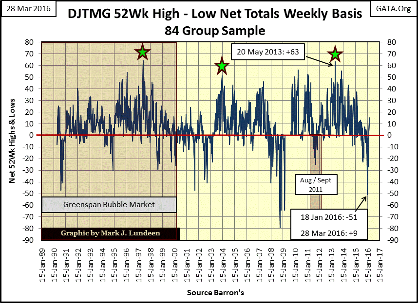
Here’s is the Dow Jones Total Market Group (DJTMG)’s Net 52Wk High – Low Plot. It’s recovered nicely from its January low, ending the week at +9. But will it rise up into the 30s and 40s as it did weekly for years at a time during the high-tech, mortgage and post credit crisis bull markets? I think that’s asking too much with the global economy now struggling with the massive levels of unserviceable debt the global central banking system has burdened the world with.
Something strange has been happening in the credit markets; mortgage rates (Red Plot below) have fallen below the yield for Moody’s Aaa corporate bonds (Green Plot) since October 2008. And that’s not all, since 2008 mortgage rates have occasionally been the same, or lower than the 30 year Treasury bond yield (Blue Plot). I realize that people don’t generally see the Freddie Mac mortgage rate as published in Barron’s; it’s the average rate for all types of residential mortgage loans closed from coast to coast over the past month. But seeing mortgages (that will ultimately be serviced by wage earners) at rates lower than Aaa rated bond yields or Treasury’s long bond yields is an indication of how in today’s world something other than market risk is being used to set the price for debt.

The mortgage market has always been a government market. Banks have always preferred lending short-term to businesses, leaving most mortgage lending to savings and loans. It wasn’t until the creation of interest-rate derivatives in the 1990s that the mortgage market began to interest the banks. They may have originating new mortgages during the sub-prime mortgage bubble, but only because Fannie Mae and Freddie Mac would immediately purchase these mortgages to bundle together with credit default swaps. The resulting Mortgage Backed Securities (MBS) would be immediately unloaded to mutual funds, insurance companies, and other suckers but never kept on the bank’s balance sheet with the intention of holding them as long term reserves. In collusion with the banks, many prime and subprime mortgages received an “A” rating from the ratings agencies which allowed quick and easy sale of these soon to be worthless securities. This returned the money invested in mortgages to the banks and allowed the cycle to repeat.
The major reason the global banking system froze up in 2007-08 was because banks didn’t trust the collateral offered by their fellow bankers in the money market. Everyone in the industry knew their competitors, like themselves, were flooding the money market with toxic waste, hoping to exchange worthless mortgages for cash. In an environment such as this, it wasn’t surprising the Dow Jones suffered its second deepest bear market since 1885.
Here’s the spread between mortgages and the Treasury’s long bond yield going back to 1964. During the Greenspan Fed from 1992-93 the spread approached the red 0% line, the point where the mortgage rate and the Treasury long bond yield are equal. However it wasn’t until after 2008 that the spread began to drop into negative territory; the mortgage rate actually fell below the yield on the long bond.
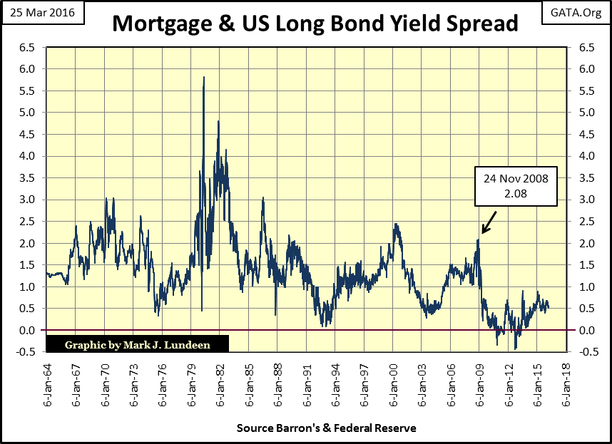
I get my data from Barron’s; a reliable source. But it’s hard to comprehend why there were weeks when Freddie Mac was offering money at lower rates than the US Treasury. Who in their right mind would choose mortgages offering lower yields than US Treasury Bonds? Well no one would – but that is when “policy” kicks in and the gears turning out debt that can never be paid back, even at “attractive-low rates” just goes on and on.
Ignore it if you want, but the credit crisis is still ongoing. Like Zero Interest Rate Policy (ZIRP), since November 2008 the spread between mortgage rates and yields for the Treasury long bond yields have remained at historic lows.
The “policy makers” absolutely refuse to allow real estate prices to deflate, bond market yields to rise, or stock prices to be set by the free market – far lower than we see them today. So nowadays millennials graduate from college, financed with freshly printed money courtesy of Sallie Mae, and find themselves living in their parents’ basement unable to afford the inflated cost of housing thanks to the Fed depressing mortgage rates.
Moving on to corporate bonds, the following chart plots the yields for Moody’s Aaa & Baa rated bonds. When looking at these plots keep in mind that from 1962 to 1982, bond yields were rising due to inflation from the Federal Reserve flowing into consumer goods and cost of living items. The rising yields were due to the bond market demanding an inflation premium on fixed income investments, making the bond market a losing venture during these two decades. It was during this era of collapsing bond prices (and rising bond yields) that gold, silver and gold mining shares enjoyed a prosperous bull market.
With the decline in bond yields in the early 1980s, we can see the point in time when inflation began flowing into financial assets, and the bull market in financial assets began. However, in 2012 bond yields bottomed near the lows of the early 1960s, which would lead us to believe that the thirty year bull market for bonds (and stocks) is over.
Considering the bond market’s current low yields, concluding that the decades long bull market in stocks, bonds and real estate has seen its best days is now reasonable. At some point in the not too distant future I expect that just as during the early 1960s through 1980, we’ll once again see bond yields begin to trend upwards, ultimately to double digits whether the “policy makers” like it or not. At first interest rates will increase because of defaults in and capital flight from the bond market, then later from Federal Reserve money printing targeted at stocks and bonds, but instead flowing into CPI inflation. This is a perfect economic environment for a massive bull market in gold, silver and precious metals mining shares.
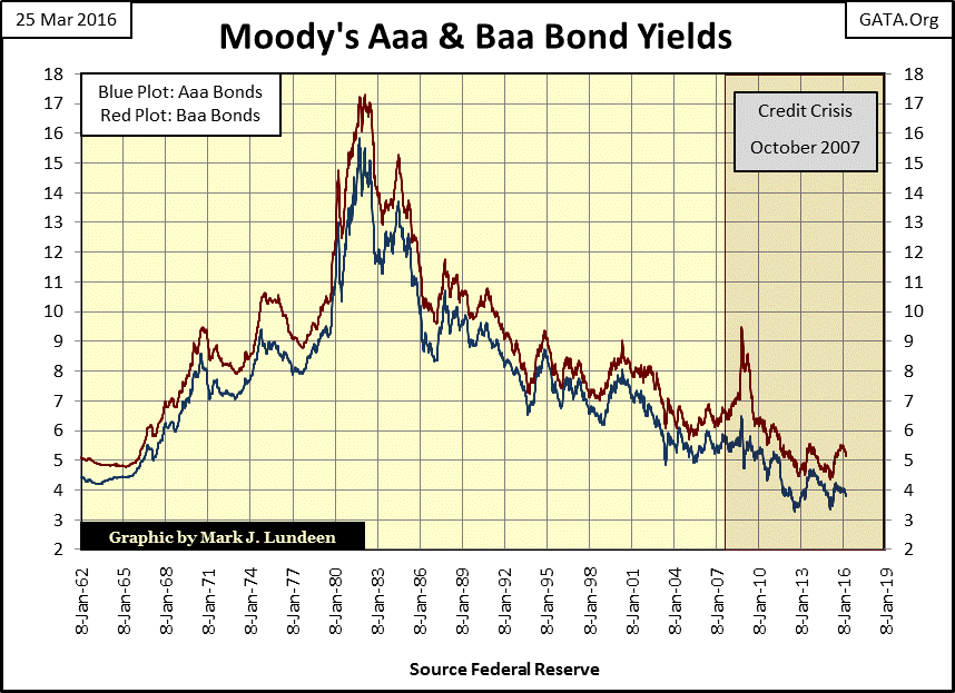
Below is the credit spread between Moody’s Aaa and Baa bond yields seen above. Aaa bonds are issued by companies with solid balance sheets (low debt to assets ratio) and Baa bonds issued by companies burdened with higher levels of debt. During good times the yield spread between these bonds shrinks as bond buyers abandon their fear of default. But when the economy, or financial system is stressed the spread widens as bond buyers demand higher yields to compensate for credit risks associated with lower quality bonds.
From the mid 1960s through 1982 this spread widened as bond buyers demanded a premium (lower price / higher yield) for Baa bonds. After the 1982 top the spread between Aaa and Baa bond narrowed for the next sixteen years as both stocks and bonds enjoyed a historic bull market, while precious metals and their miners languished. After the January 1998 top the bond market generally became more discriminating and once again began demanding a premium on Baa bonds, especially during the Tech Wreck and Mortgage debacles.
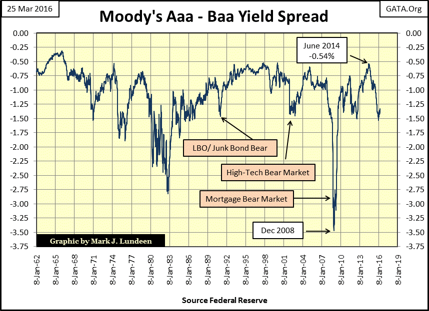
The thing that catches my attention in the above spread is how the bond market’s attitude toward risk changed noticeably after 1998; it’s now quick to respond to bad news and sell off lesser quality bonds. Currently the spread has bounced off the -1.50 line for the second time since 2012. I’m not a date setter, but I expect we’ll soon see the spread break below the -1.50 line, and then attempt to break below the December 2008 lows in the months to come when Mr Bear returns to Wall Street.
I’m not charging the Federal Reserve with any criminal activity. Congress has ensured that any morally-abhorrent practice the Fed now routinely uses to “save the banking system” is perfectly legal. But for the past eight years their Zero Interest Rate Policy, has been driving savers’ money away from the banking system into lower quality bonds in search of yields that were once safely attainable in a savings account. In so doing the FOMC has pushed retirees and pension funds into the cage with Mr Bear. It seems to me that the smart thing to do now is to reduce one’s exposure to the stock and bond markets, and take a position in the precious metals and their miners.