Focus On Gold, Silver And Precious Metals Mining


The graphic card in my computer committed suicide Monday evening this past week, and I didn’t get it back until Thursday evening. So this article may be a bit short of text and graphic than are my usual outputs. I think I’ll use this as an excuse to focus on gold and silver this week.
Here’s gold’s step sum chart going back to November 2010. For almost a year (November 2010 to August 2011) gold’s step sum saw an amazing ascent; rising from 220 to 275 (55 net advancing days) in a ten month period. That’s a lot, but then that’s what a buying panic looks like in a step sum plot. Then came 22 August 2011, with gold closing at $1,888.70, and that was it for the advance.
The way to understand a step sum chart is realize the price plot (Blue Plot) is market reality, the simple fact of whether the market is trending up or down. The step sum plot (Red Plot) is a market sentiment indicator of the most important people in any market, those who are actually buying and selling day in and day out.
Usually, market reality and sentiment are in agreement with each other. But this isn’t always so. When these plots conflict with each other a step-sum box forms, such as the big bear box seen below from October 2012 to March 2014.
Sometimes it’s difficult seeing a box form and develop in real time, other times it’s not. And there are no hard rules to follow when a box begins or ends. Basically, the only rules I follow are if I see the two plots diverge for over eight weeks, a box is forming. When the two trends undeniably synchronize once again with each other, the box is closed, and I can always change my mind should the situation require it, as sometimes it does.
Whether a box is a bull or bear is determined by the trend of the price plot. Seeing the price plot advance as its step sum trends sideways or actually declines is a bull box. Having the price trend down as the step sum plot trends sideways or actually advances is a bear box. When a box has been identified, trust the price plot (market reality), not the step sum (market sentiment), as the best predictor of the future price trend, though that isn’t always true but usually it is.
If the price plot is so important, why even bother with the step sum plot? To answer that question, let’s study gold’s bear box below. The bear box began in October 2012, a year into a vicious four-year decline. The step sum plot also began declining at this time, but nothing like the decline in the price of gold because the bulls refused to capitulate. After a down day, the bulls all too frequently only want to buy more cheap gold the following day, preventing the collapse in the step sum plot.
I placed a black rectangle around the false breakout in the bear box, from December 2013 to April 2014 when gold saw a good advance off an apparent bottom. Note the step sum plot followed the price plot up as the bulls piled into the market. At the time it would have been reasonable to have closed the box, as it appeared a bottom was made in December. However, up to this point it was a problem not seeing market sentiment (the step sum plot) collapse along with the price of gold. For a multi-year bear box this was unusual, though not unheard of.
Beginning in late April 2014 gold’s price plot once again turned down, but nothing like the decline of 2012-13. However, this decline broke the back of bullish market sentiment, resulting in an 18 month long collapse in the step sum plot (collapse in bullish market sentiment). Where before the bulls were ready to enter the market after a decline to purchase more “cheap gold”, now a decline in the price of gold only made the bulls want to join in the selling to exit their positions.
Note my second black rectangle, pointing where gold’s step sum plot dropped like a rock – illustrating total capitulation by the bulls in the gold market; total exhaustion by the market’s bulls at the December 2015 bottom. That’s what a hard bottom looks like in a step sum chart.
Looking at the chart below, I don’t believe gold will ever again trade below $1,100. If I didn’t look at gold’s step sum plot along with its price plot below, I wouldn’t feel comfortable saying that. Take another look at the chart and consider the chart action between the price and step sum plots. Waiting for the capitulation of bullish market sentiment in a prolonged market decline is why following a market’s step sum plot is so useful.

Here’s the step sum chart for the Dow Jones during its 1929-32 crash. Though not exactly the same as gold’s from 2011 to 2015, the similarities of the Great Depression’s hard bottom below and gold’s above are apparent. In the early 1930s the step sum tells us the bulls remained firmly bullish in the face of a massive price decline. The collapsing step sum below identifies when bullish-market sentiment finally gave way to market reality during the Great Depression crash; exactly as happened above. After the step sum bottomed in July 1932 below, selling pressure had exhausted itself, exactly as happened above.
These big bear boxes aren’t everyday occurrences, but when they develop, it’s worth making the effort to follow their progress.

Next is silver’s step sum chart. I look at silver’s step sum, but I don’t do much with it as it’s a weird market. Silver does form step sum boxes, but since 1969 its step sum plot has never properly collapsed – its bulls never capitulate as we see gold and the Dow Jones bulls doing above. The most likely answer to that is that silver’s bulls are for the most part industrial users who are going to buy silver by the ton regardless of what price silver is selling at, as they have to.

This is actually a bullish factor in for the silver bulls in the years to come, as auto, cell phone, digital equipment and many other manufactures require silver in minute amounts in their product and aren’t going to be put off by paying $500 an ounce for their silver. Practically speaking, when the cost per unit of silver for their products rises from pennies to a few dollars for something the public pays thousands of dollars for, even $1,000 silver won’t result in a buyers strike from these industrialists in the silver market. But that doesn’t mean they won’t go to Congress and whine about the high price of silver.
Returning to gold’s step sum chart above, since the December 2015 bottom gold’s price and step sum plots have been in synch with each other for most of the past two years, and both trends are advancing. They may not be advancing as you or I would have them, but after the hard bottom of December 2015, that’s to be expected. Never fear, ahead of us will come a time where gold and silver will do all that we would want them to do.
I haven’t published the Silver to Gold Ratio (SRG) chart for a while, so here it is. What’s the story we should take from this chart? With today’s ratio of 75 ounces of silver for one ounce of gold, silver is damn cheap, and so a better investment than is gold.
Gold is a more concentrated form of wealth than is silver. So for anyone who is intending to purchase a few million dollars of the old monetary metals, they are going to buy gold, as silver by weight, at today’s ratio will require 75 times more storage area to keep. But for anyone who is purchasing less than $100,000 in metal, storage shouldn’t be a problem. So for retail investors, silver at today’s price is the superior investment.
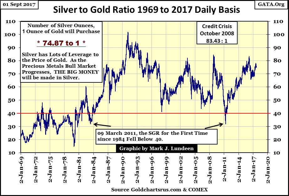
In the coming advance in precious metals, when the SGR once again descends into the 30s, the gains seen by silver will be twice that seen by gold. Should the SGR return where it was in January 1980, and it very well could, the gains seen in silver will be by a factor of 4 better than gold’s. Should the ratio descend to 1:1 in the chart above, the price of silver and gold would be identical, making todays purchase of silver 75 times more profitable than gold.
Is that going to happen? I can’t say that it will, but I won’t say it can’t. Above ground availability for gold bullion is much larger than for silver bullion because the silver used in manufacturing is almost never recycled. There are thousands of years of silver production (hundreds of billions of ounces) resting in garbage dumps and lands fills because people buy something containing silver, only to then throw it away without a thought.
Historically, gold was more expensive than silver as it was rarer than silver, but today that is no longer true. And today we have industrial demand for silver, something that didn’t exist during the Roman, or even during the British Empires.
There are going to be some real surprises coming to the markets in the years ahead of us. One of them may be what the actual free-market price of silver is, because right now no one really knows.
Here’s the step sum chart for the Dow Jones. Looking at the Dow’s step sum (Red Plot), since its latest bull box closed in late July, the Dow Jones has seen many more daily advances than declines. However all these advances have had little effect on the Dow Jones itself. So at the end of the week I have to ask myself – what are the stock market bulls so bullish about?
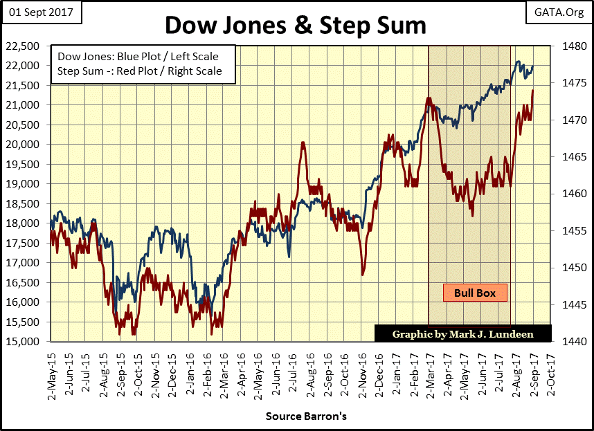
The Dow Jones began this market advance in March 2009. Expecting the stock market to continue advancing in the months and years to come may just be a bad habit the bulls picked up over the past eight years. So, on the first day of September 2017, am I calling a top in the stock market?
Nope. I still expect the path of least resistance for the Dow Jones continues to be up. And I won’t change that opinion without some good reason, say like some extreme days of market volatility and market breadth. But just how much longer this market can continue advancing without seeing a double-digit correction is the question.
Dow Jones at 23,000? I don’t see it. And should the “policy makers” allow the Dow Jones a proper bull-market correction of say 10%, can they once again get this aging, and very tired bull charging up the hill one more time?
Should the coming bear market be as ugly as I expect it to be, this is the set up for another classical bear box formation that the Dow Jones and gold saw in the two charts above, where the bulls remain stubbornly bullish inspite of a huge market decline, only to capitulate at the closing of a prolonged bear box. Review gold’s and the Dow Jones bear boxes in the chart above to see what I’m thinking. Will this happen? Like me you’ll have to wait to see, but this is one of those things that make following a market interesting.
Personally, other than for entertainment purposes, I don’t care. Investments in the stock market currently offer huge risks and little potential rewards for investors. Gold, silver and the precious metal miners seem the logical place to be at this time.
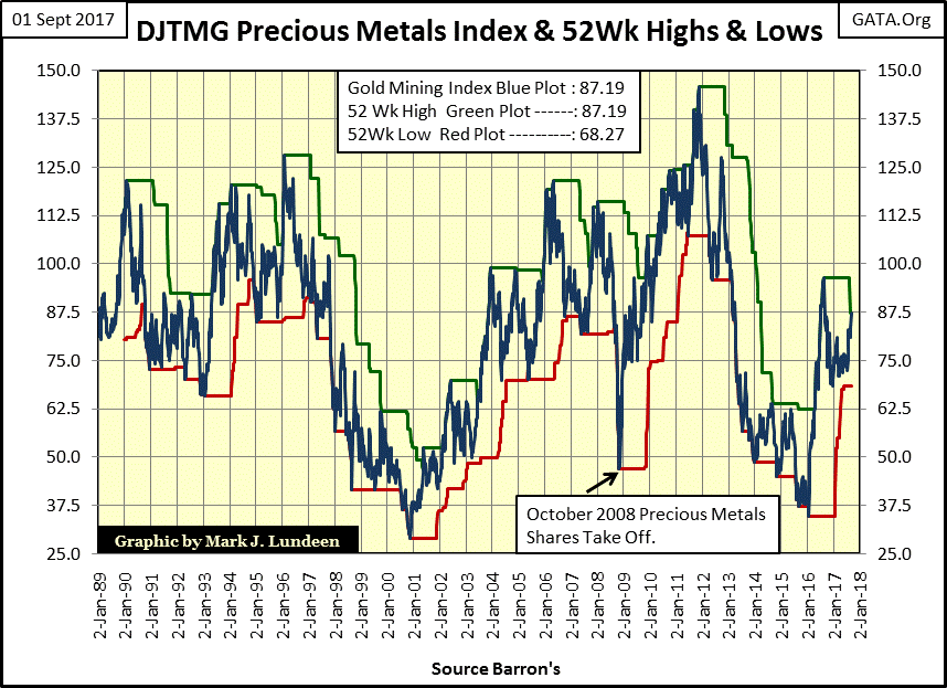
Speaking of gold mining shares, they (along with fourteen other groups) hit a new 52Wk high this week, making #9 in the DJTMG’s 52Wk High and Lows performance table below.
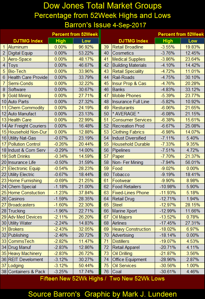
That sounds good, but in reality it’s not all that good as there are two ways for an index to reach a new 52Wk high, or low. One is to advance in to new 52Wk high. The other is to wait 53 weeks and have the indexes’ stale 52Wk high collapse on the indexes’ current price, as we see happen in the DJTMG Gold Mining index below.
What a lousy investment category gold and silver mining has been for decades; after almost thirty years they haven’t broken above 150 in the chart below. Now in 2017, DJTMG Gold Mining Index finds itself exactly where it was in 1989. And this week it’s hit a new 52Wk High, as seen below – what a hoot!
Why is anyone recommending this junk? Well, this is what happens in a “regulated” market place, a market where the prices of everything are only allowed to range within the parameters set by “policy.”
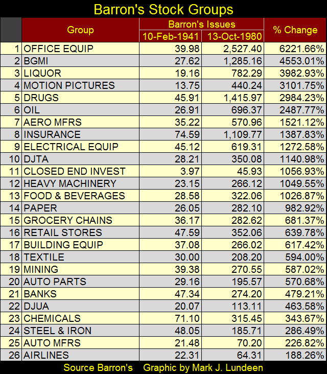
There was a time when the market itself set prices. From 1938 to 1988, Barron’s published their now discontinued Barron’s Stock Groups (BSG). This is the antique data series that Barron’s Gold Mining Index (BGMI) was originally from. From 1941 to 1980, the US Government inflated the supply of dollars (CinC) from $8.63 billion to $129.99 bil, an increase of 1400%. As you see in the table below, only the top seven groups in the BSG beat the rate of inflation during these forty years, with the BGMI (gold mining) taking the #2 spot. Office Equipment manufacturers took the #1 spot, as this group included computer companies like IBM.
Here’s the chart for the BGMI going back to 1938. Considering that CinC is currently at $1.56 TRILLION DOLLARS, and seeing how little this horrific inflation has effected the price of gold, silver and the BGMI seen below, I expect these precious metals investment, being held back for decades by the market’s “regulators”, have much to make up for in the near future.

The point is that gold mining as an investment wasn’t always such a poor choice for investors to make, as they’ve become since Alan Greenspan became chairman at the Federal Reserve.
It’s as I’ve said before: the old monetary metals and their miners don’t benefit from monetary inflation. Stocks, bonds and real estate do. If that wasn’t the case, Wall Street would have no interest in inflating the money supply. What drives the old monetary metals and their miners upwards is DEFLATION in the previously inflated stocks, bonds and real estate, as FLIGHT CAPITAL is the rocket fuel for precious metal investments. If the DJTMG’s Gold Mining Index and the BGMI above appears rotten, it’s because Washington and Wall Street have had great success in inflating financial assets since 1989.
But there is a glimmer of optimism to be seen in the gold mining charts above, two of them actually. Twice since 1989 the gold miners have been a top performing group, and the start of these bull market began in 2000 and 2008, exactly when the general stock market began big bear markets. So, in times of deflation in the general stock market, gold and silver mining is still seen as a safe harbor for flight capital.
That’s good to know, because in the next bear market there is going to be a lot of capital fleeing for its life, and finding safety in the gold and silver miners. And for all the inflated market values in the financial markets since 1989, there will be plenty of rocket fuel to drive the gold and silver miners into history.
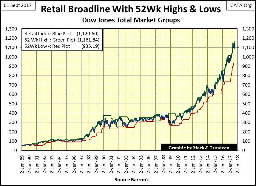
For example, take the DJTMG’s Broadline Retailers in the chart below (#39 in table above). Since 1989 they’ve increased by over a factor of twenty. But the capital gains of the past three decades seen below are vulnerable. Business is lousy in retail; even Walmart is closing stores. Their customer base is heavily indebted to their credit-card companies and to the banks that hold their mortgages, or they’re actually broke. Everyone knows the problem,
http://www.zerohedge.com/news/2017-08-31/working-class-cant-afford-american-dream
yet like a bad habit, the bulls (stupid cows they are), continue paying top dollar for these shares, but that’s not going to last.
When these shares, and most others groups in the DJTMG begin deflating in the coming bear market, where can refugee dollars fleeing DEFLATION in the stock and bond markets find safety? The history displayed in the DJTMG Gold Mining Index above suggests the gold mining shares. I also expect that in the coming bull market in gold and silver mining, the “policy makers” will ultimately find it impossible to stop the deflation in the general stock market, and the advance in precious metals assets.
Mark J. Lundeen


