Foreign Holdings Of Treasury Debt


The market this week was a bit on the boring side, but that is how things on Wall Street usually go. Following the market is much like following a daily soap opera on television. Not every episode is exciting, but you have to see most episodes to follow the story line of who is doing what to who at General Hospital.
And this week on Wall Street, the bulls and the bears may have been sharpening their long knives, but you wouldn’t have known that by watching this week’s market action.
So, what was happening this week? The bulls and bears were making nice with everyone else. But that is just for show, like seeing the major market indexes closed slightly above, or below where they closed a week ago. But regular watchers of the soap opera on Wall Street noticed the idiot savants at the FOMC increased their Fed Funds Rate to 2.33% (Red Plot) from 1.58% (Blue Plot) two weeks ago (chart below), increasing the inversion in the yield curve as they did.
It’s never good seeing longer dated debt yielding less than the 1Yr T-bill. Yah sure, this week at General Hospital, Nurse Trunnion and Doctor Anthracite were making googly eyes at each other. But should this inversion in the yield curve continue increasing as the FOMC pushes their Fed Funds Rate to even higher levels, by Christmas someone is going to get hit where it hurts the most.
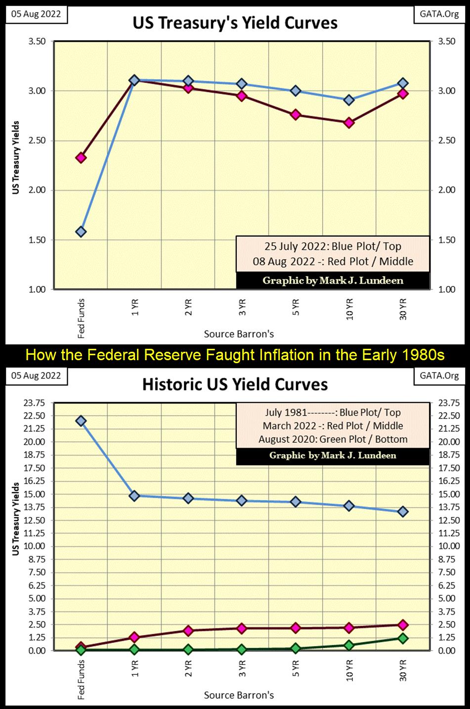
If the idiots are really serious about “fighting inflation”, which so far they haven’t been, they’ll have to inflict much pain by raising their Fed Funds Rate to something above the real rate of CPI inflation. Someday, they will have to invert the yield curve until every nurse and doctor at General Hospital comes down with a cardiac arrest, as happened in 1981 (Blue Plot) in the chart above.
In the late 1970s and early 1980s, double-digit CPI inflation drove T-bond yields into double-digits. That’s how things go in fixed income when inflation becomes out-of-control; bond holders get hit right where it hurts the most – in the wallet! To regain control of “monetary policy”, then Fed Chairman Paul Volcker increased his Fed Funds Rate to 22%. Why 22%? Because it was several hundred basis-points above the then rate of CPI inflation.
Can we be far from that day? Heck, CPI inflation is already in double-digits (+10%) if one believes in their rising household expenses, rather than the gobbledygook “CPI data” published by the US Government’s Bureau of Labor Statistics. So why in August 2022 are bond yields so low? Doctor Anthracite knows why, but he’ll never admit the FOMC continues “stabilizing” the bond market. A “monetary action” which by itself is inflationary, as the Fed continues “monetizing” debt to keep demand for bonds unnaturally high, to keep bond yields unnaturally low.
So, the yield curve is now inverting. That’s not good. But as we see in the Dow Jones BEV chart below, it wasn’t bad this week.
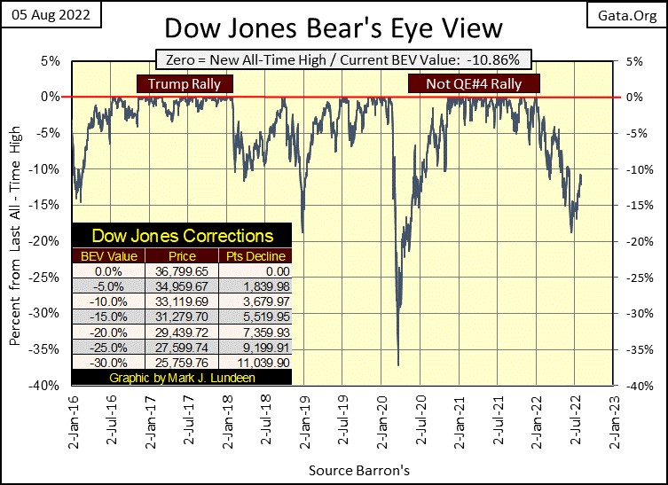
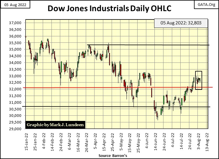
In the Dow Jones daily bar chart below, this week was a real snooze-event on Wall Street, as the bulls and bears were thinking over what to do next. For the bulls, the 33,000 level seems to be the level to pay attention to. Should the Dow Jones break above that level with conviction, we may see the venerable Dow Jones once again making a serious attempt at making a new all-time high in the months to come.
On the downside in the chart below, should the Dow Jones break below its 29,500 line, that would not be good.
So, what do I think will happen next; Dow Jones above 33,000 or below 29,500? For the Dow Jones, 33,000 is so close to this week’s close of 32,803. As a betting man, I’d wager a buck, but not two we’ll soon see the Dow Jones close above 33,000. And if the idiots really want to make it happen, seeing the Dow Jones close at another all-time high, above 36,799 is a sure thing.
Keep in mind, all it takes for the valuation of anything to go up is more buying than selling. And all that takes is more money coming into a market. If there is one thing the FOMC will never be short of; it’s more money.
But I’m still sitting in the market’s cheap seats, eating hotdogs and drinking beer. As the players below slug it out, I have no market exposure to the broad stock market, and won’t until the Dow Jones’ dividend is yielding something over 6%, which might actually prove to be something over 10%.
It’s hard saying now exactly what I’m going to do sometime in our very uncertain future. But I’m waiting for a time when market valuations are compelling. Which means the bulls of today, who now are willing to pay top dollar for historically overvalued financial assets, will then think buying today’s glamor issues at 80% or 90% discounts foolish. At such a market bottom, the prospects of immediate profits via capital gains are minimal. But the dividend payout and yields will ensure that buying at such an extreme bottom will make the wait worthwhile.
In other words; until the Dow Jones’ dividend is yielding something over 6%, I’m out of the broad stock market, and staying in precious metal assets.
At the Dow Jones current dividend payout of $701.99, a 6% yield would deflate the Dow Jones’ valuation to 11,700. That would be a 68% decline from the Dow Jones last all-time high of 36,799, seen on January 4th of this year.
But should the economy enter a recession, or worse, the Dow Jones will not be able to maintain that $701.99 payout, which will only make the coming market decline worse, much worse.
And however long it takes the Dow Jones to see a 6%, or greater yield, I’m pigheaded enough to wait for that to happen, even if the Dow Jones should somehow make a few new all-time highs first.
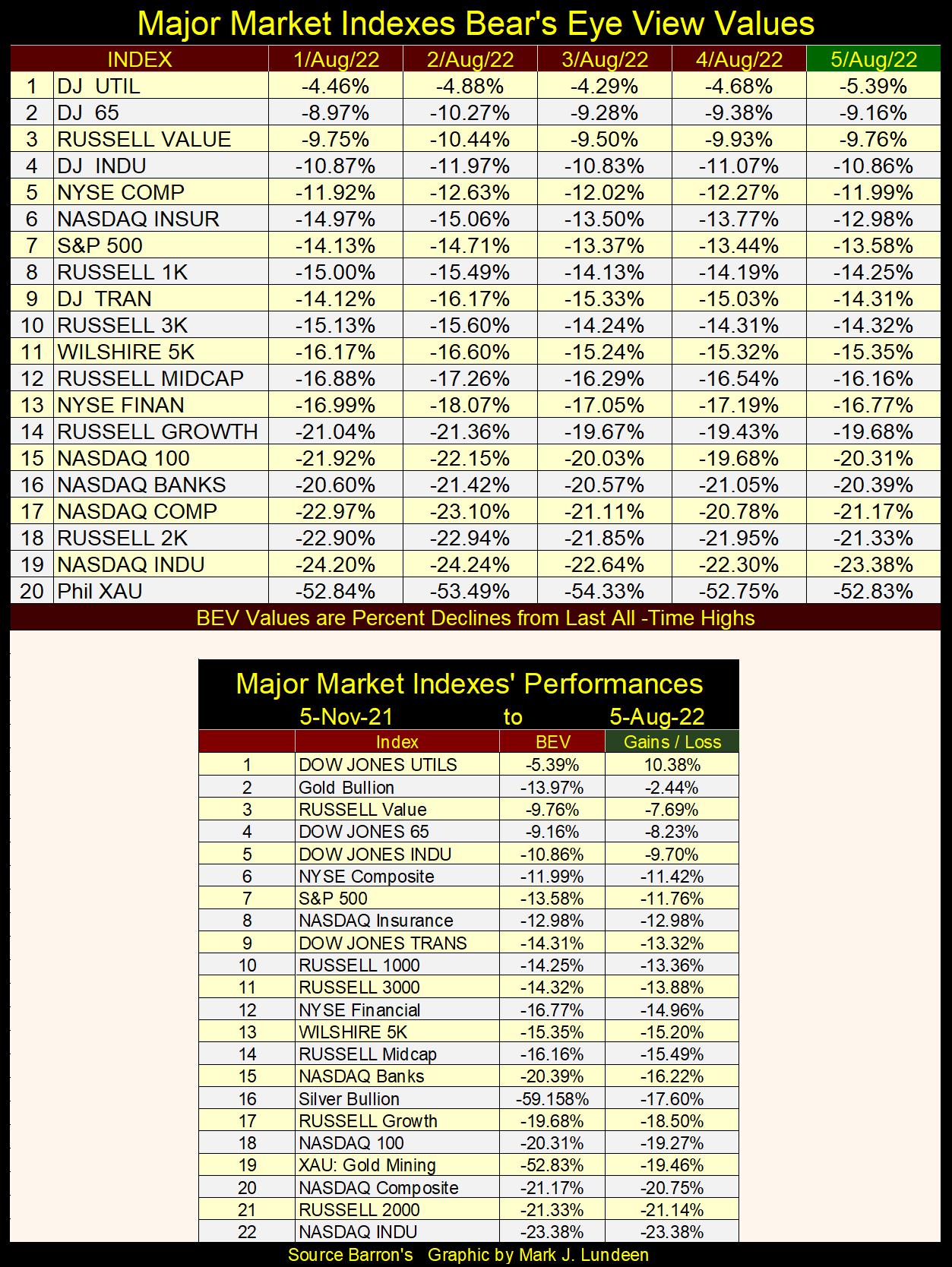
The major market indexes BEV values below validate my point; that nothing much happened in the stock market this week. I note that the Dow Jones Utilities Average closed the week outside of scoring position, with its BEV of -5.39%.
I haven’t written about foreign ownership of US Treasury debt for over a year. Looking at who owns Uncle Sam’s I-Owe-Us (Treasury bonds) below, we see the holdings of Japan and China from 2008 to May 2022. In March 2008, both Japan and China owned more T-debt than did the Federal Reserve, but that is no longer true.
Beginning in 2008, Japan and China’s holding of T-debt began to soar. This was exactly the time when the real-estate bubble began to deflate, a financial bubble that was global. Like the Federal Reserve (FOMC), central banks everywhere were “injecting liquidity” into their financial systems to “stabilize market valuations.”
Like the FOMC, Japan and China may have had their QE-1. But for reasons best known to them, they stopped their massive purchases of T-bonds when the FOMC began their QE 2-3, and their massive Not QE#4.
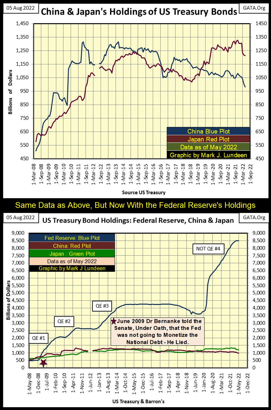
The bottom chart is the same as the top, except I included the holdings of T-debt by the Federal Reserve. What is there to say about this, other than to admit the idiot savants dictating “monetary policy” at the FOMC have made a mess out of the US dollar.
If you’re still wondering who is responsible for our current problem of rising consumer prices, the chart above should set you clear as to who is responsible; the Federal Reserve System and our elected officials who for decades have refused to reign in the out-of-control Federal Reserve System they created in 1913.
The most disturbing item seen above is the June 2009 quote by Dr. Bernanke (Red Star); that the Federal Reserve wasn’t going to “monetize” the national debt. This chart makes it obvious when he was Fed Chairman, Bernanke committed perjury in front of the Senate. This chart also makes it clear that the Senate will never charge Dr. Bernanke, or any other official from the FOMC with perjury.
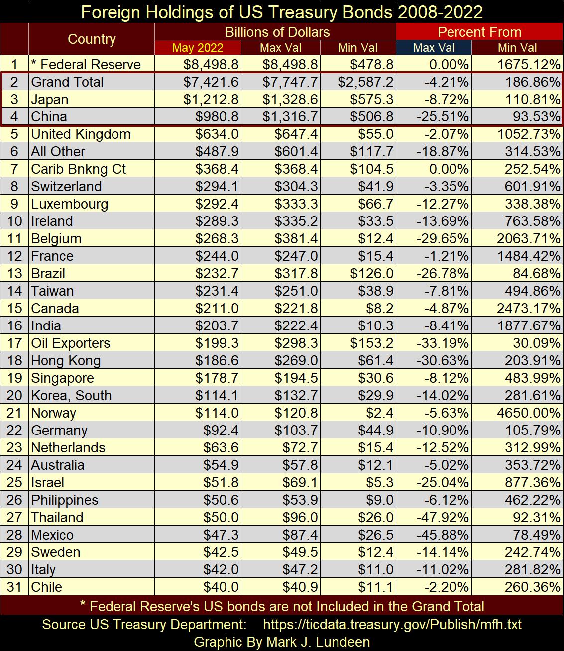
In the table below, I’ve listed the foreign holdings of T-bond reported by the US Treasury. This is the same data set I used to construct the charts above. The list is not complete, as I’ve listed only those countries whose holdings have been reported continuously by the Treasury Department since 2008. Some countries come and go in the Treasury’s monthly reports, and those countries are not included.
The column (May 2022) contains the latest data, and is sorted by largest to smallest holder. The next two columns list, in billions-of-dollars the largest and smallest monthly holdings of T-debt since 2008.
The last two columns compare the May 2022 data with the Max Val & Min Val columns, in percentage terms. For example; China (#4). It has reduced its holdings of T-Debt by 25.51% from its maximum holdings, but now hold 93.53% more T-debt from its minimum holdings of T-debt.
For the month of May 2022, only two line items increased their holdings of T-debt to a new all-time high (0.00%);
- Federal Reserve (#1),
- Caribbean Banking Center (#7 Cayman Island & Bahama Banking Systems).
I hear talk about China selling their T-debt. They are selling, but that 25% reduction took place during the past decade. China isn’t trying to start a selling panic. But this data is before Nancy Pelosi visited Taiwan last week. So, maybe next week China will change its mind and begin dumping an ever-growing volume of their T-bond holdings to show Nancy Pelosi just how unhappy they are with her.
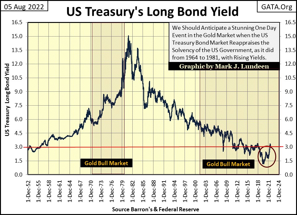
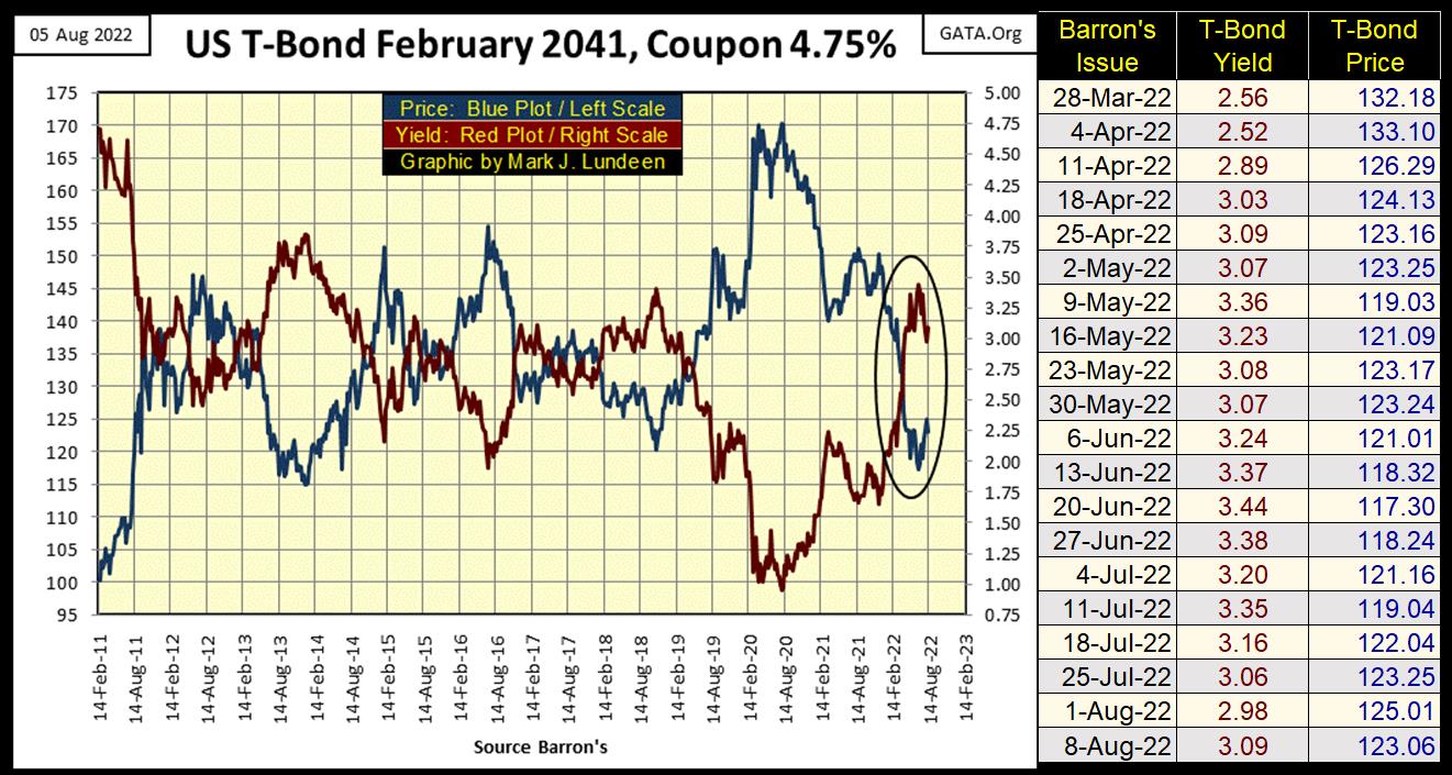
One thing is certain, lots of nations have significant holdings of US Treasury Bonds. I doubt the dollar values above are market values, which in the past two years would have decreased significantly as T-bond yields have increased since August 2020. See chart below.
Something to keep in mind; from October 1981 when T-bond yields peaked, until they bottomed in August 2020, owning T-bond proved to be very profitable. But that wasn’t always so, as from 1955 to 1981 in the chart below, where rising CPI inflation resulted in tremendous losses to owners of not just T-bonds, but all fixed-income investments. Don’t think it can’t happen again.
Below is a 30Yr T-bond issued in February 2011. Yields peaked in Barron’s 20 June 2022 issue, and have since been declining.
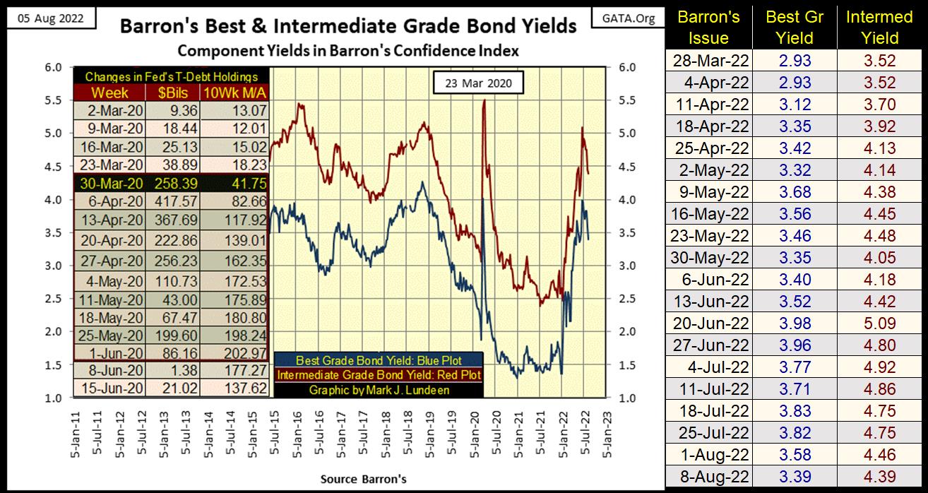
Yields peaked in Barron’s 20 June 2022 issue for their Best and Intermediate Grade Corporate bonds too, coming down some since then.
Bond yields have been falling (bond prices rising) since late June, and so have the 19 commodity prices I follow weekly (chart below).
I believe in the months and years to come; the commodity market will become a more important market to keep track of. So, to have a data series I can easily plot in a chart, I indexed each of the commodities I follow to 23 August 1993 as 1.00, which I then take an average of these 19 indexed values. The result of that is seen in the chart below.
These commodity prices have come off their highs of last February. But remain far above their lows of March 2020 when Chairman Powell began “injecting liquidity” by trillions into the financial system.
Like the stock market, I don’t have a stake in the commodity market, except for gold and silver, two markets that frequently frustrate me. In future articles of mine, I expect the bull market in commodities will once again resume, and that goes for gold and silver too.
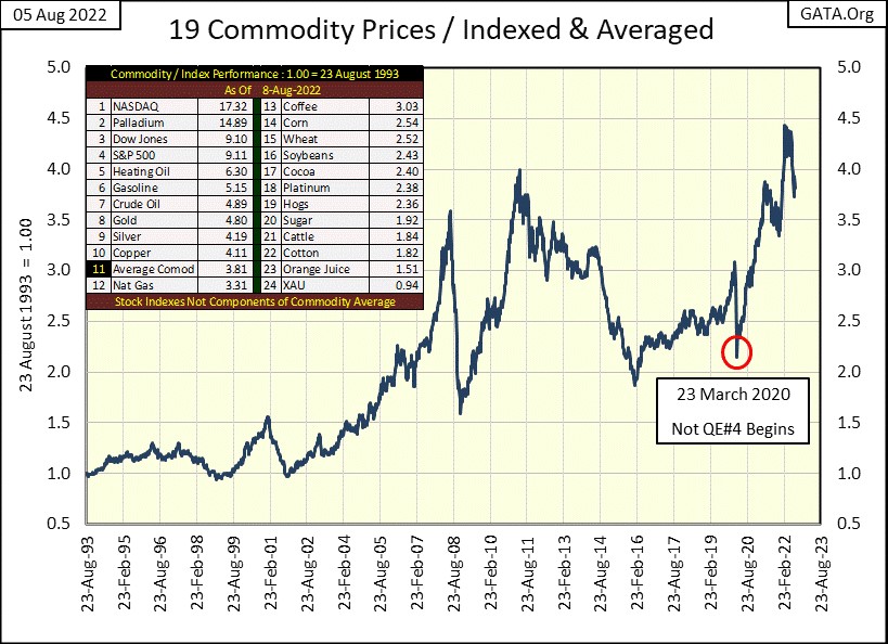
In the table included on the chart above, I’ve fixed each commodity’s factor increase since 23 August 1993, along with their average (#11). Many commodities have so far failed to keep up with their average, by a good amount. But that is unavoidable considering what a mathematical average is. I also included four major market indexes into the mix to provide a comparison between these two markets.
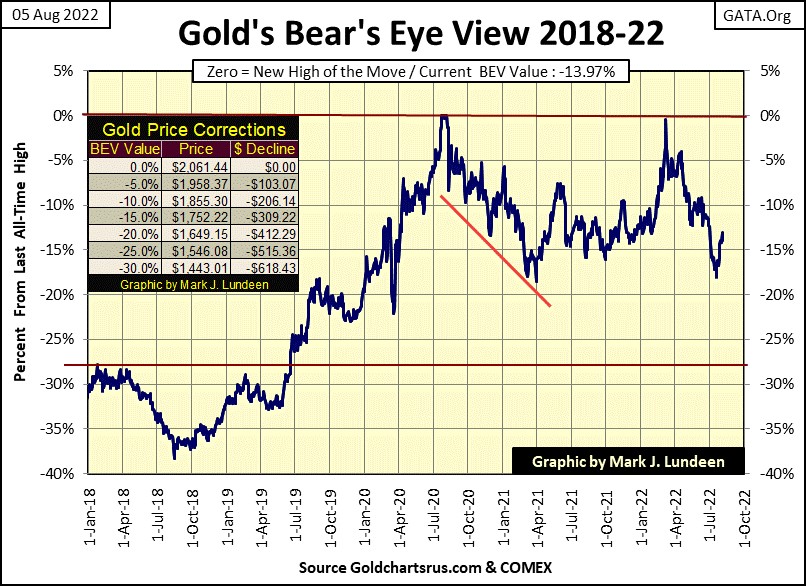
Gold’s BEV chart below remains positive to the bulls. I wish it would trend towards its BEV -10% line with a little more urgency. But considering how this market is manipulated by the goons at the COMEX, I’m happy as long as gold isn’t breaking below its BEV -20% line.
What is it going to take for gold and silver to break free of their tormentors in the paper futures markets? I hope it won’t be more chaos in the global financial markets, but then one never really knows. Until then, we must grin and bear it.
Below, market sentiment for gold (the rising Red Step Sum Plot) has remained stubbornly bullish since last January, no matter the trials and tribulations the price of gold itself has seen in the past seven months (Market Reality; Blue Plot). In the past, a bear box such as this is a prologue for a big fall in the price, as seen in the 2011 to 2014 bear box to the left. But not always.
In our current world ever growing difficulties, I believe the smart thing to do is to buy more gold and silver on any decline. Which in the step sum chart below, the bulls currently don’t believe is going to happen anytime soon. Time will tell who is right.
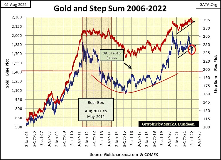
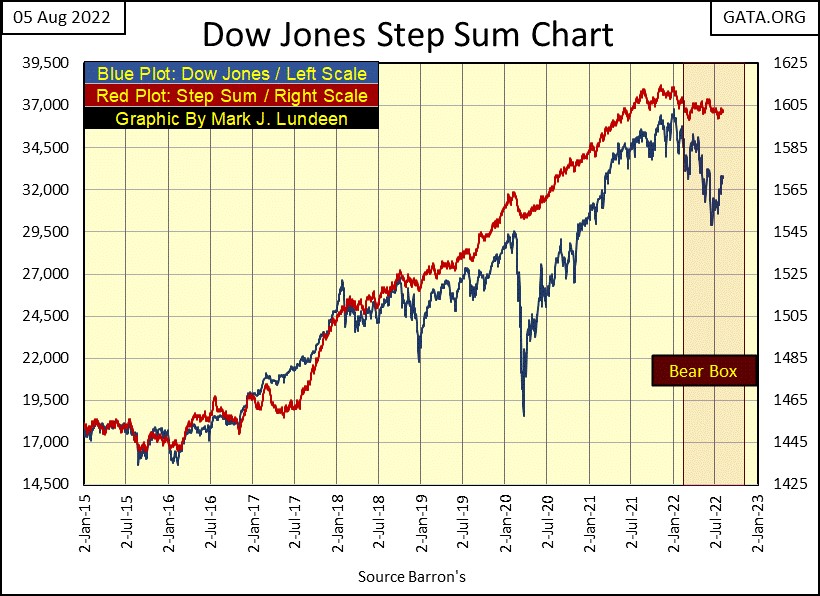
Since last January, the Dow Jones is also in a bear box, with market sentiment (Red Step Sum Plot) refusing to follow the declining price of the Dow Jones. As I said earlier; a bear box is a chart formation that usually resolves to the favor of the bears, where in the fullness of time, the bulls ultimately recognize the errors of their ways when the step sum plot finally breaks down, and recouples with the declining price plot.
My expectations at the close of this week are; that the gold bulls above will be proven correct to ignore the poor price action, while in the stock market, the bulls below will regret any buying they do at current prices.
But my opinion on such matters don’t really matter. What matters is; what are the idiots at the FOMC going to do in the coming months? If you can tell me that, I can then tell you what will happen in the coming months.
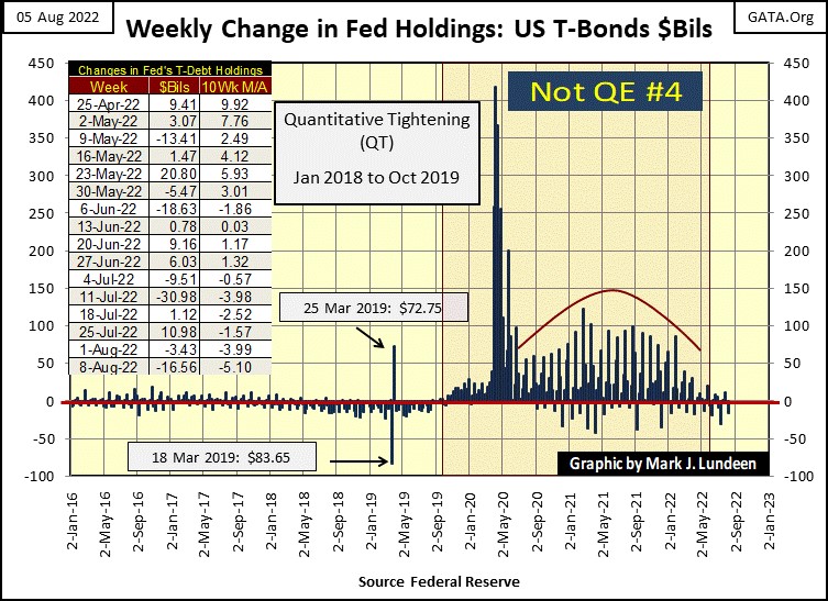
So, what was the FOMC going to do this summer? Last winter they promised to reduce their balance sheet by $40 billion a month, month after month beginning in April. But so far, since the end of March they’ve reduced their balance sheet by only $51 billion dollars over the past four months, far from the promised $160 billion.
But the $51 billion is still a reduction in their balance sheet. So how can the FOMC be “injecting liquidity” into the financial markets to “stabilize market valuations” when they are selling more bonds than buying?
That is a good question, one that assumes we are dealing with honest people. And that is a BIG assumption when dealing with those who operate at the highest levels of finance. As to how they might go about it, we possibly saw a how too example during the Enron crisis of the early 2000s, where Enron’s accounting was using “special purpose vehicles” (SPV) to dump their financial-toxic waste from their balance sheets.
As someone who has no actual knowledge of what is actually going on, I have no problem believing the FOMC has created SPVs, such as Enron’s Chewco and Raptor SPVs, to be used for the same reason that Enron used them for; to maintain a second set of books to keep questionable activities far from public knowledge.
Seeing bond yields decline (bond prices increase) since June, as valuations in the stock market have rebounded off their summer’s lows, as the US Government’s Bureau of Labor Statistics reported the second consecutive quarter of negative GDP growth, a declaration the US economy has entered into a recession, seems a bit odd to a market enthusiast such as myself.
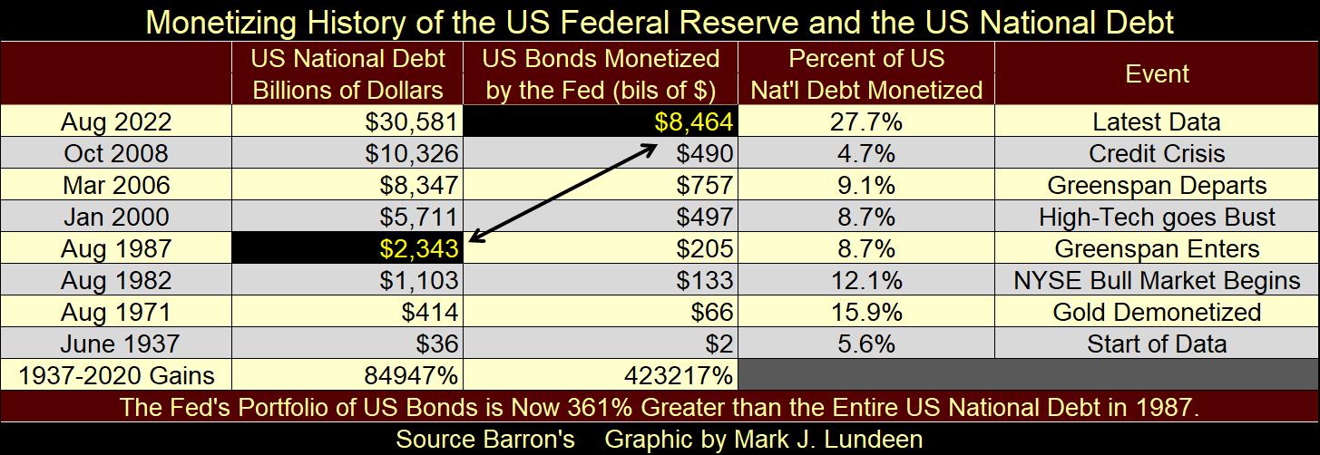
Automatically assigning any apparent market irregularity to the FOMC’s market machinations isn’t the stuff of conspiracy theories. Not when this week’s holdings of T-bond by the FOMC is now 361% greater than the entire US National debt when Alan Greenspan became the Chairman of the Federal Reserve in August 1987. I’m assuming all of this debt “monetized” by the FOMC was “injected” into the financial system to inflate market valuations.
We’ve all had a grand time since Alan Greenspan began “providing ample liquidity” into the market in October 1987. But this too shall pass, and the downside to a historic inflationary bubble won’t be any fun. Yep, I believe precious metal assets (bullion & mining shares) are the place to be in August 2022.
Looking down at gold’s step sum table below, I notice the selloff that bottomed on July 20th has led to a nice rebound in the price of gold, with more advancing than declining days. This could turn around at any time, but I choose to be optimistic, and hope to see a nice advance from here.
Gold’s 15-count has increased to a +5. That’s fine, but we don’t need the gold market to see an overbought +7, or more in its 15-count. Seeing two daily advances, next to one daily decline from here on is good market action.
One nice thing happening in the gold market, is its daily volatility’s 200D M/A is beginning to creep up, on the verge of breaking into the 70% range. Big upside surges in the gold market are volatile markets. We’ll know when gold bulls are serious about taking gold up to a new all-time high, when this metric increases to something over 1.00%.
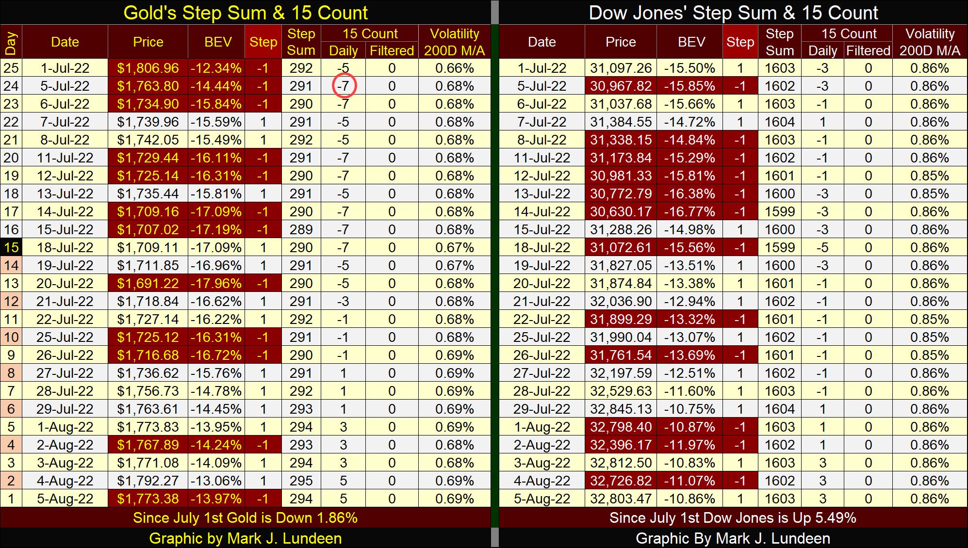
Not much new on the Dow Jones side of its step sum table, other than noting its daily volatility’s 200D M/A has flatten out at 0.86%. Rising daily volatility is always bad for the stock market. Should this metric decline back to the 70% range, its most likely because the Dow Jones is once again advancing.
As I noted above, the FOMC will never run out of money. But the problem is; what the FOMC’s “monetary policy” does to other entities in the financial market, like pension funds and insurance companies. The following link is to King World News, concerning as you may have already guessed; problems with people’s pension funds.
https://kingworldnews.com/pension-fund-crisis-pension-funds-now-gambling-on-riskier-assets/
One day all this is going to come to a head, and stocks and bonds will then become just two more four-letter words.
Mark J. Lundeen
*********


