Gold Market Update


After gold’s losses of the past couple of weeks there is increasing talk about its bullmarket being finally over. In this update we will use long-term charts to determine whether these claims have any substance.
On its 12-year chart, which goes back to the start of the bullmarket, we can see that the top boundary of the uptrend from 2006 is defined by the line drawn across 3 important peaks, and it is from this line that the parallel supporting trendline beneath is derived. While there is no law stating that the lower trendline has to be parallel, it is nevertheless likely, and it is regarded as no coincidence that the strong support at recent lows, which needs to hold, and this lower trendline are more or less coincident at this time – if the current reaction continues this is where it should stop and reverse, although as we will see later on the 6-month chart it may not drop back any further than where it is now.

Having gotten a perspective on the entire bullmarket, we will now look at the action from the 2006 peak in more detail on a 7-year chart. On this chart we can see more clearly where gold will arrive at a “buy spot” if the current reaction continues, in the green oval. Since the August 2011 peak, gold has mostly been trading in a horizontal box or rectangular trading range bounded by the clear lines of support and resistance shown. On a further dip into this support, which will bring it close to the major supporting trendline, gold will be a buy, and as this important support above $1500 is so clearly defined, the point to set stops will be a little below $1500. This mechanical approach affords a highly favorable risk/reward ratio, as positions would be closed out for a minor loss if the support fails, while upside potential from this entry point is obviously very considerable.

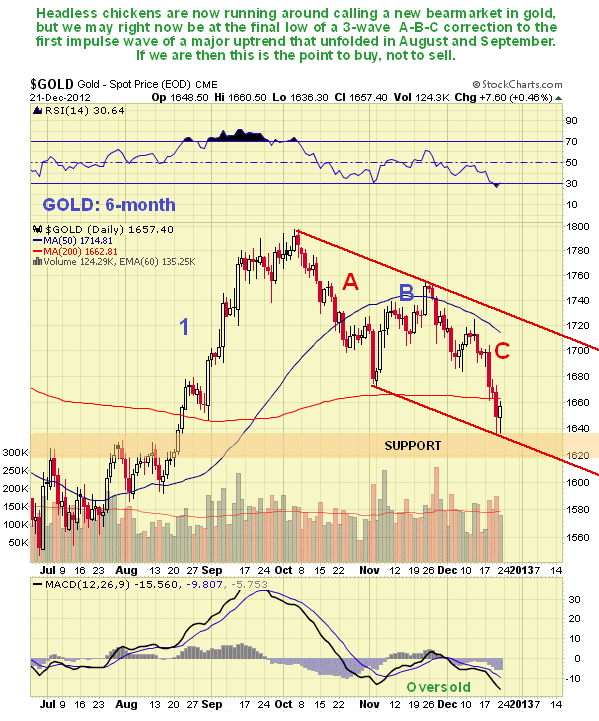
A lot of traders were upset last week when gold dropped below its early November lows, in the process dropping below its 200-day moving average, and grumbling about the dastardly cartel and their “dirty tricks department” bubbled up again. On the 6-month chart we can see recent action in detail, and it might not be anywhere near as bad as it looks at first sight. On the contrary we could be at a buy spot right now - for what we might just have seen is the completing C-wave of a 3-wave A-B-C correction to the strong upleg in August and September, which still looks like an impulse wave (advance in the direction of the primary trend). The price has now arrived at the bottom of the parallel channel shown and at a zone of significant support in an oversold condition. Also, last week’s selling looks rather panicky and capitulative, the sort of thing you associate with weak hands.
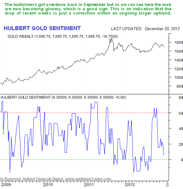
The latest Hulbert Gold Sentiment, courtesy of www.sentimentrader.com shows that the sentiment pendulum has swung from being very bullish a few months ago, and thus a sign of a top, to getting bearish again, which increases the chances of a reversal to the upside soon.
Gold’s COT charts did call the retreat of recent weeks, with high Commercial short and Large Spec long positions having built up ahead of it, as the latest COT chart below shows. The chart is now less useful, as readings have moderated into middle ground, and thus don’t give much of an indication one way or the other.
What about the dollar? – a dollar plunge would be “just what the doctor ordered” for gold’s convalescence and swift return to ruddy cheeked health would it not?
The dollar index chart looks dire. On its 18-month chart we can see that a large Head-and-Shoulders top appears to be completing. While these patterns can sometimes abort, it indicates a high probability that the dollar will break lower soon, and if it does it can be expected to drop quite rapidly to the next important support level in the 73.50 - 74 area. Clearly such a drop is likely to drive a substantial rally in gold and silver. The fact that gold and the dollar dropped together over the past week or so is regarded as a temporary anomaly.

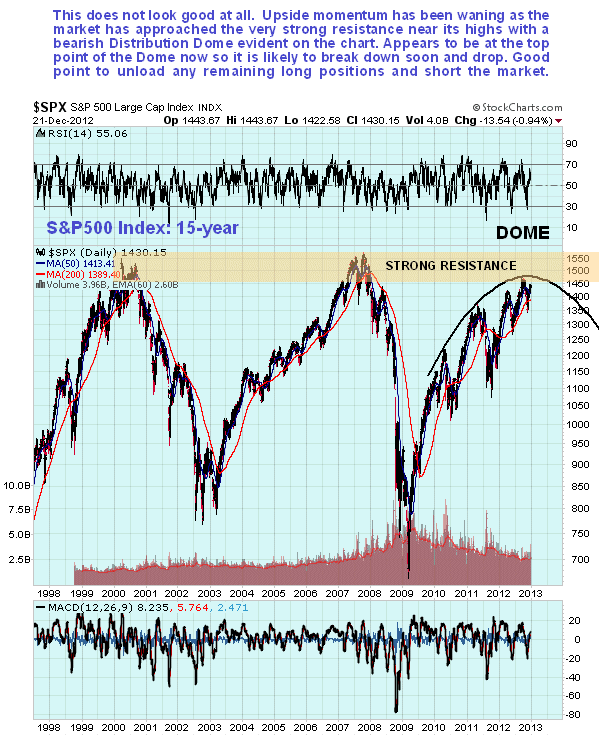
At the same time, the broad stockmarket look like it about to roll over and head south. On the 15-year chart for the S&P500 index we can see how its big bearmarket rally has been steadily decelerating as it has approached the massive resistance at its 2000 and 2007 highs, with the uptrend approximating to a bearish Rising Wedge, but more accurately defined by the large bearish “Distribution Dome” shown on the chart. While the pattern could abort, with a breakout to new highs – possible if the dollar craters – by itself this chart points to a potentially severe decline. One horrifying possibility is that the dollar and US stockmarket drop in tandem as the US economy, finally overcome by its massive debt burden with the eventual threat of runaway interest rate hikes, plunges into the abyss.
If the Head-and-Shoulders top in the US dollar were to abort, and it rallies as a result of a “dash to cash” as in 2008, then it is easy to see how the US stockmarkets could then plunge, which they look set up to do. In this situation what would happen to Precious Metals stocks, which have recently looked really lame?
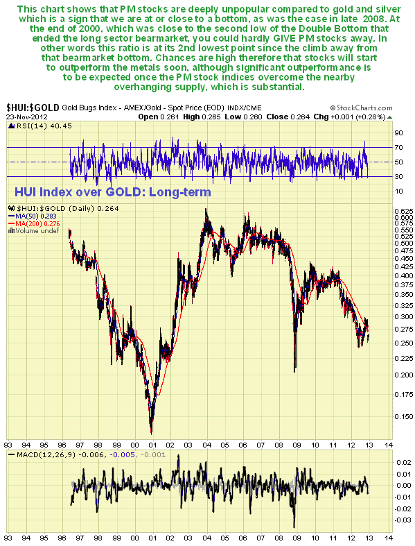
Our 5-year chart for the HUI index shows that the sector looks vulnerable to a brutal decline if the broad stockmarket plunges, as a large potential Head-and-Shoulders top is completing in this index. In this situation quality junior mining stocks which have typically lost 80 – 90% of their value over the past couple of years, might only lose another 50 – 75% of their current value, so that a stock which has dropped from say C$2.00 to C$0.20 over the past 2 years, might only drop to say C$0.07, where needless to say, it will probably be a great bargain.

In conclusion it is a complex and messy picture, but at least we have the clear parameters that are set out in this update. Gold could reverse and take off higher from here, and is viewed as a buy on any further retreat back into the support above $1500. Failure of the key $1500 level would be a bearish development that would call for the closing out of positions or at least protecting with hedges. The dollar looks set to break down, but so does the stockmarket, which is an extraordinary situation as normally when the dollar drops, stocks rally to compensate.
To finish on a supremely positive note, at least we survived the Mayan prophecy for the world to end on 21st December. After that 2013 should be a cakewalk!...

Silver Market Update
Clive Maund
Many silver longs were upset by the rather sharp drop over the past week or so, but as we will now see, this drop looks like a “storm in a teacup” on longer-term charts.
On its 12-year chart, which goes back to the start of the bullmarket, we can see that the top boundary of the uptrend from 2004 is defined by the line drawn across 4 important peaks, and it is from this line that the parallel supporting trendline beneath is derived. While there is no law stating that the lower trendline has to be parallel, it is nevertheless likely, and it is regarded as no coincidence that the strong support at recent lows, which needs to hold, and this lower trendline are close together at this time – if the current reaction continues this is the area where it should stop and reverse, although as we will see later on the 6-month chart it may not drop back any further than where it is now.

Having gotten a perspective on the entire bullmarket, we will now look at the action from the 2006 peak in more detail on a 7-year chart. On this chart we can see more clearly where silver will arrive at a “buy spot” if the current reaction continues, in the green oval. Since the August 2011 peak silver has been trading in a bearish Descending Triangle, with a very clearly defined line of support at its lower boundary, which it broke out from to the upside in August, a bullish development. Even after last week’s decline the recent reaction back looks like a correction to the 1st impulse wave out of the Triangle, which has brought the price back towards support at the top boundary of the Triangle. For the bullish case to remain intact the price should go no lower than the green oval shown, where silver will be a buy, with stops below the support or the lower trendline. Here we should note that the setting of stops with silver is not as “cut and dried” as it is with gold, as by the time you are stopped out of it, if your stop is below the trendline, it will be at about $24, and the next serious support starts to come into play not so far beneath in the $20 area.

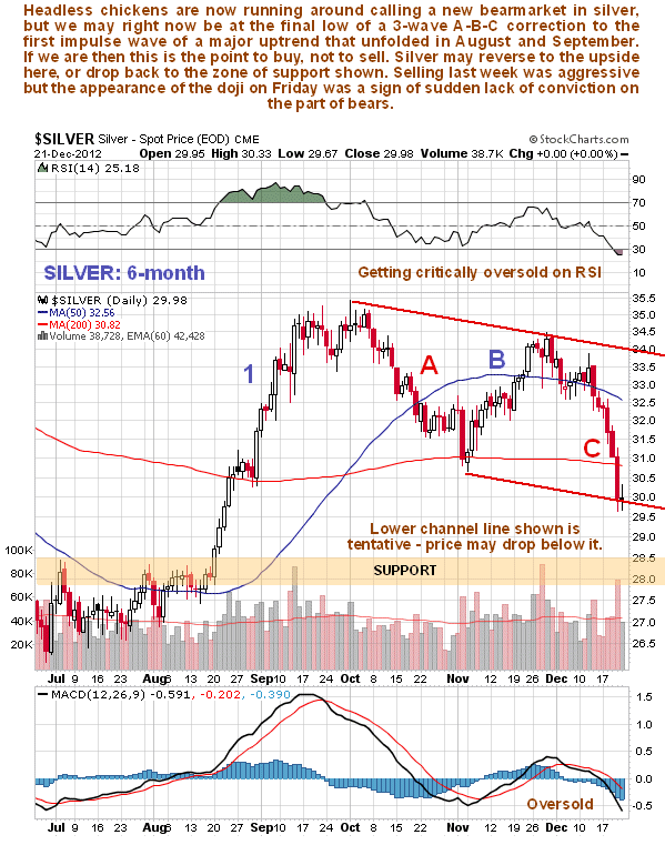
Although the 6-month chart for silver looks pretty grim at first sight, with it falling relentlessly for 7 trading days in a row and breaking below its early November lows, on closer inspection we can see that it has arrived at the bottom of a tentative channel and is now quite deeply oversold. So it could be right at the bottom of a 3-wave A-B-C zigzag that has served to correct the first impulse wave out of the Descending Triangle that occurred during August and September, which is labeled on the chart. It’s too early to say regarding this and it could continue lower to the support shown, although the appearance of the doji on Friday, indicating a state of indecision, could mark the low point.
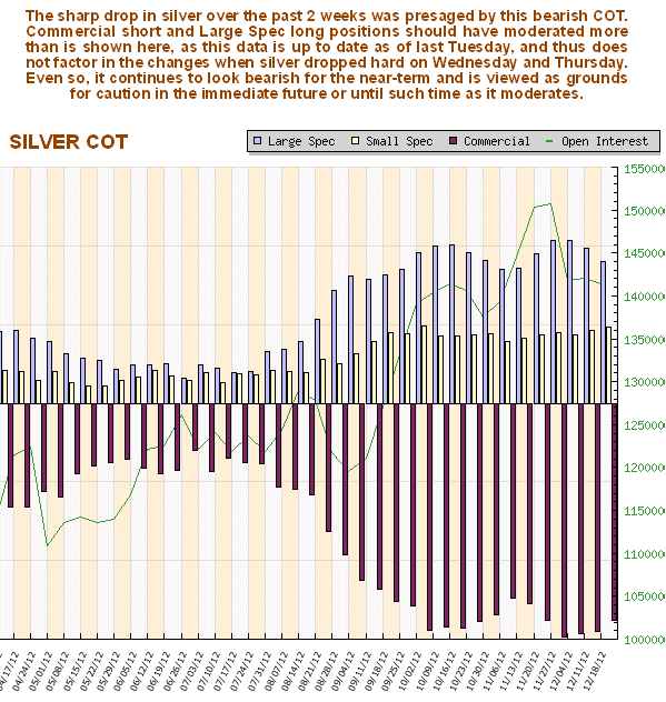
Silver’s retreat of the past several weeks was presaged by a strongly bearish COT structure, and while the readings on the chart shown below, which is only up to date as of last Tuesday night’s close, can be expected to have moderated further as the week went on, in response to the lower silver prices that ensued, Commercial short and Large Spec long positions can be reasonably presumed to be still at high levels which urge a measure of caution short-term.
Clive Maund, Diploma Technical Analysis
Copiapo, Chile, 23 December 2012

Clive P. Maund’s interest in markets started when, as an aimless youth searching for direction in his mid-20’s, he inherited some money. Unfortunately it was not enough to live a utopian lifestyle as a playboy or retire very young. Therefore on the advice of his brother, he bought a load of British Petroleum stock, which promptly went up 20% in the space of a few weeks. Clive sold them at the top…which really fired his imagination. The prospect of being able to buy securities and sell them later at a higher price, and make money for doing little or no work was most attractive – and so the quest began, especially as he had been further stoked up by watching from the sidelines with a mixture of fascination and envy as fortunes were made in the roaring gold and silver bull market of the late 70’s.
Clive furthered his education in Technical Analysis or charting by ordering various good books from the US and by applying what he learned at work on an everyday basis. He also obtained the UK Society of Technical Analysts’ Diploma.
The years following 2005 saw the boom phase of the Gold and Silver bull market, until they peaked in late 2011. While there is ongoing debate about whether that was the final high, it is not believed to be because of the continuing global debasement of fiat currency. The bear market since 2011 is viewed as being very similar to the 2-year reaction in the mid-70’s, which was preceded by a powerful advance and was followed by a gigantic parabolic price ramp. Moreover, Precious Metals should come back into their own when the various asset bubbles elsewhere burst, which looks set to happen anytime soon.
Visit Clive at his website: CliveMaund.com
More from Gold-Eagle


