Gold Price Update
 share
share
 share
share
 share
share
 share
share
 share
share
Gold cracked support and plunged to new lows since the last update, which came as no surprise to us. So what now? We are seeing signs that a recovery rally is about to begin, but it probably won’t get all that far before a new down-leg gets underway that sees gold make new lows again.
It’s not just gold prices that are suffering – the entire commodity complex is in ragged retreat, with steep falls also in copper and oil. Why is this? The reason is that the gathering forces of deflation are starting to wreak havoc, and they are not going to be stopped by more QE – even if they print another $10 trillion to throw at the problem. The reason is that the debt mountain dwarfs whatever QE can be generated, and the deflation will continue until this debt is purged. Governments are like greedy short-sighted children – they are not interested in doing what is right and behaving with restraint and propriety, if they were they would have taken control of the debt crisis long ago. They are only interested in short-term expediency, which is why we have had all this extend and pretend of recent years, involving QE and suppressing interest rates. Since they refuse to do their job properly, the markets are going to take over and do it for them, and the results are going to be very ugly indeed. Soon the rot will extend from commodities to stock markets.
It was certainly an interesting two weeks in the gold and silver space since the last update. The plunge in the PM sector didn’t surprise us, on the contrary we welcomed it because we were short the sector. Our DUST ETF doubled. Now though, we are seeing signs of an imminent bounce.
On gold’s 6-month chart we can see the nasty plunge that followed failure of support at the March lows, but after one big down day there was little follow through, and on Friday, after making new lows intraday, gold closed back up again leaving behind a bull hammer on its chart, with the heavy volume confirming that this was very probably at least a short-term reversal.

The 1-year chart for gold is also very interesting and useful as it makes plain the importance of the support failure, which dates back not just to the March low, but also to the November low. The failure of this support was a terrible shock for remaining gold longs, many of whom were running around like headless chickens, and dumping gold and silver stocks willy-nilly for whatever they could get for them. We’ll come to this later when we take a brief look at the chart for GDX.
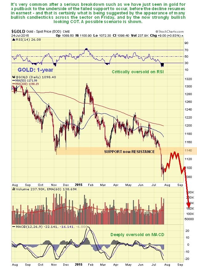
Gold’s long-term 8-year chart puts things into more perspective. On this chart we can see that, although gold appears to be starting to break down into the C-leg of the bear market that is expected to take it below $1000, it is hanging on by the tips of its fingernails to the bottom boundary of the recent 2-year long down-sloping consolidation, at which point the short-term bullish action on Friday across the sector developed. This, coupled with the latest COTs which are positive, is what makes us think that a rally is now imminent, but it will likely get no further than the upper boundary of the channel shown on this chart, meaning not higher than about $1170 maximum. A possible scenario is shown.

The latest COT chart shown below is the most positive I can recall seeing, which is a big reason to take profits in short positions, and is what we are doing. Commercial short positions have all but vanished – and you can bet these guys have booked huge profits – while the hapless large Specs have “thrown in the towel” and all but quit gold. Of course there is nothing to say that gold won’t eventually continue lower and the Commercials go long, while the Large Specs go short, which has never happened in recent years.

The longer-term Hedgers chart shows readings at one of their most positive levels ever – you certainly wouldn’t want to overstay your welcome on the short side with readings at these levels – better to wait for them to calm down some before considering shorting the sector again.

Chart courtesy of www.sentimentrader.com
The Gold Optix continues to look quite strongly bullish and suggests that, while gold’s bear market is believed to have some way to run, we should be on the lookout for a final low before too much longer.

Chart courtesy of www.sentimentrader.com
Both these sentimentrader charts go back to early 2011, in order to show the entire period from the bull market high of April – May 2011.
What about the all-important dollar? A scenario that dovetails with our outlook for gold (and silver), which is for a significant bounce to be followed by renewed decline, is shown on the dollar’s 14-month chart below. On this chart for the dollar index we can see that although it broke upside out of its recent Triangle, which is believed to be a consolidation pattern, it has lacked follow through so far and looks rather frail. What we therefore suspect may happen here is that the dollar pulls back to test support near to the apex of the Triangle, before a more determined advance into the next major upleg gets going, as shown on the chart.

Another factor suggesting that a rally of sorts is about to start across the PM sector is the all-out pandemonium that broke out amongst surviving gold stock aficionados when gold broke lower, which is shown clearly by the huge volume on the GDX at the time. This smacks of capitulation – they simply couldn’t take any more. The declines in stocks like Barrick and some others were amazing.

Finally, it is worth digressing a little to point out a couple of developments that appear to have gone largely unheeded by investors in the broad US stock markets. The first is that commodity markets started to cave in in July of 2008, several months before US stock markets tanked in the Fall of that year. The second is the recent collapse in the Chinese stock market. To most investors in the US market, the stock markets of mainland China might as well be on Mars, or that newly discovered Earthlike planet, yet, it’s worth recalling that the Chinese stock market crashed in 2008, just ahead of the US stock market crash. Below are presented two charts for a 27-month month timeframe for the S&P500 index, one that embraces the 2008 market crash, and the other leading up to now, with the Chinese stock market and the Commodity index overlaid at the top and bottom of the chart. This ought to get you thinking about what may be coming down the pipe for the US stock marekt (and other stock markets).

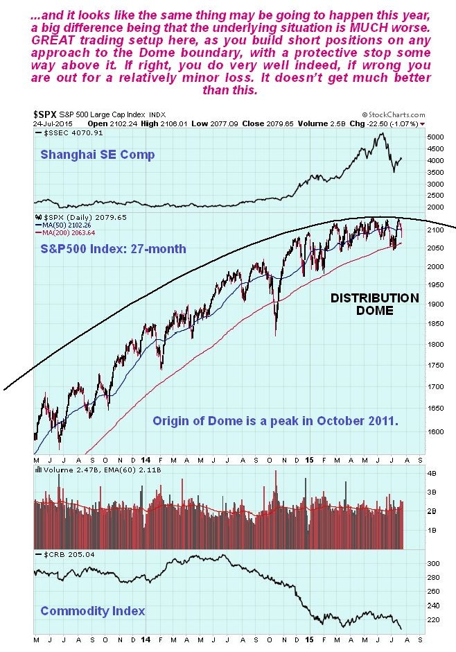
There is an argument that the US stock markets will be the beneficiary of “funk money” fleeing the growing chaos in Europe and elsewhere, and so hold up or even rally, and while this could happen it may be wishful thinking, as when big global markets cave in, they like company, and in the writer’s experience they are like a flock of sheep and they all go together when they go. Observe how the S&P500 index is rounding over gradually beneath a giant menacing Distribution Dome (the point of origin of this Dome is a peak in October 2011, off the chart) – once this thing goes, no-one can ever say that it didn’t give plenty of warning first. It’s a dream setup for traders as you establish short positions when the index is close to the Dome boundary, and have a general stop above the Dome boundary. If you are right you are rolling in loot when it finally breaks down and caves in. If you are wrong and it goes on to break out upside, you are out for a minor loss – as a trading setup what more could you want??
share
share
share
share
share

Clive P. Maund’s interest in markets started when, as an aimless youth searching for direction in his mid-20’s, he inherited some money. Unfortunately it was not enough to live a utopian lifestyle as a playboy or retire very young. Therefore on the advice of his brother, he bought a load of British Petroleum stock, which promptly went up 20% in the space of a few weeks. Clive sold them at the top…which really fired his imagination. The prospect of being able to buy securities and sell them later at a higher price, and make money for doing little or no work was most attractive – and so the quest began, especially as he had been further stoked up by watching from the sidelines with a mixture of fascination and envy as fortunes were made in the roaring gold and silver bull market of the late 70’s.
Clive furthered his education in Technical Analysis or charting by ordering various good books from the US and by applying what he learned at work on an everyday basis. He also obtained the UK Society of Technical Analysts’ Diploma.
The years following 2005 saw the boom phase of the Gold and Silver bull market, until they peaked in late 2011. While there is ongoing debate about whether that was the final high, it is not believed to be because of the continuing global debasement of fiat currency. The bear market since 2011 is viewed as being very similar to the 2-year reaction in the mid-70’s, which was preceded by a powerful advance and was followed by a gigantic parabolic price ramp. Moreover, Precious Metals should come back into their own when the various asset bubbles elsewhere burst, which looks set to happen anytime soon.
Visit Clive at his website: CliveMaund.com