The Great Train Wreck Of 2016


 Today we are going to review irrefutable evidence that a slow motion train wreck is already well underway across global markets that will end with the last wagons on the train, the S&P500 index and the Dow Jones Industrials, disappearing into the abyss right after their immediate predecessors.
There are still a remarkable number of investors out there, and an even more remarkable percentage of mainstream financial journalists, who seem to think that everything is alright just because the flagship indices like the Dow Jones Industrials and the S&P500 haven’t caved in yet, but as we will now see they are probably just about to.
We start with the 6-month chart for the S&P500 index, where we see that it has just broken down from a topping Triangle that formed after the big October recovery. This breakdown was predicted on the site last week. From this position it is vulnerable to a precipitous decline, which could happen next week ahead of the Fed meeting, or after it – or both.

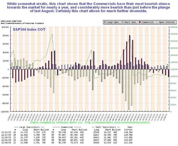
Latest COTs for the S&P500 index are bearish, with the Commercials holding their largest short positions for nearly a year – more bearish than before the August plunge when they were modestly long. This chart certainly allows for a lot more downside.
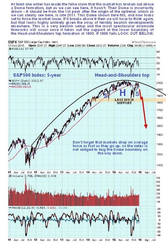
On the 5-year chart for the S&P500 index we can see exactly why it stalled out where it did, and has now reversed. It had arrived at the boundary of a giant Distribution Dome that started to form way back late in 2011. Some bullish writers have claimed that the market has broken out upside from a smaller Dome of shorter duration, but their Dome is overridden and nullified by our bigger stronger one. As we can see, our Dome has capped the advance and is bearing down on the index, forcing it lower, and it now clear that the recent advance served to complete the Right Shoulder high of a large Head-and-Shoulders top. Last ditch support is above and at 1800 - once this fails, the market should plummet.
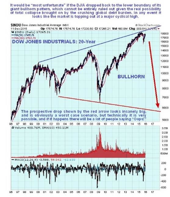
How low could the market drop? – before reading on you might want to make sure you are sat down, and perhaps with a stiff drink. We’ll see just how far it could fall on the long-term 20-year chart for the Dow Jones Industrials shown below. On this chart we see that after a long bull market phase from the 2009 low, the market has risen to the top of a gigantic bullhorn pattern. If it turns lower here, which it certainly appears to be doing, it could conceivably drop all the way across the bullhorn, back to the lower boundary in the 6000 area. I know – it doesn’t seem possible, just too far-fetched, right? – WRONG!! – with a brutal depression almost upon us caused by the rapidly accelerating implosion of the bankrupt fiat money system after over 40 years of excess after the abolition of the gold standard by Richard Nixon, culminating in the vertical blowoff move of recent years, as the entrenched beneficiaries of this system played the last cards in their hand, these hyper-leveraged markets could now collapse in one of biggest self-feeding liquidations in history. Whether it will drop back as far as 6000 I don’t know, but it is certainly within the realms of possibility – and it will seem a lot more possible to you as you read on and witness the carnage that is already underway elsewhere.
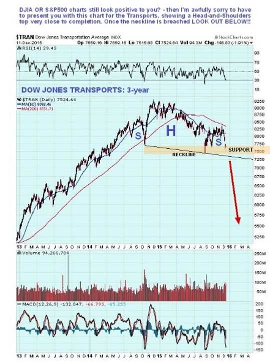
The Dow Jones Transports have been much weaker than the Dow Jones Industrials and the S&P500 index in the recent past, as we can see on its 3-year chart shown below, on which we can see that a large, down sloping, and thus very bearish, Head-and-Shoulders top is rapidly approaching completion. Once the neckline is breached, this index could plummet. The Transports are providing a classic Dow Theory non-confirmation of the action in the Dow and the S&P500 index, and it means trouble.
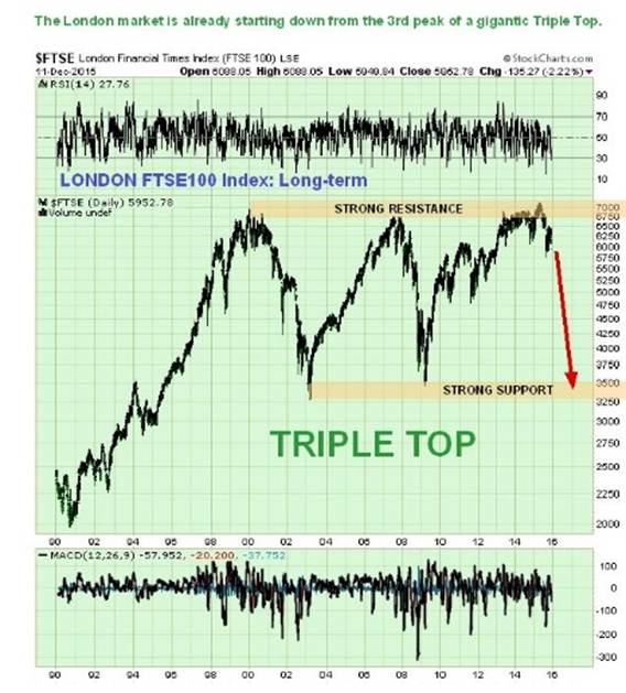
There are other markets pointing to Big Trouble dead ahead, like the London FTSE100 index, on whose long-term 20-year we can see that a gigantic Triple Top is completing, with the market now starting to descend from the 3rd protracted peak…
Other European market indices look similar, like the French CAC, the German DAX and the pan European STOXX600, as we would expect.
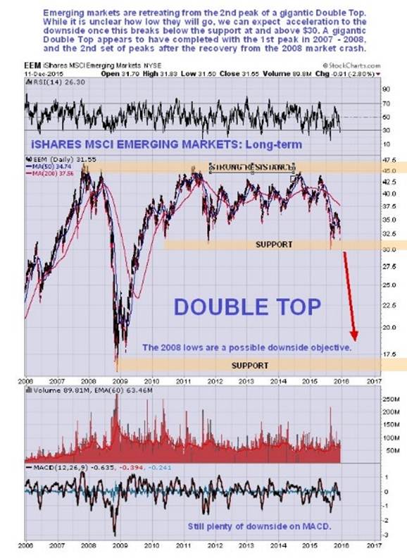
Emerging Markets are in ragged retreat again, and descending from the 2nd protracted peak of a gigantic Double Top. The Emerging Markets indices made a good recovery from their 2008 crash lows, with investors thinking it was back to business as usual but they were unable to make new highs and have limped along sideways for years marking out a very elongated 2nd peak of what is viewed as a giant Double Top. Now they are clearly on the defensive again and if the $30 level on the EEM chart gives way, it could plummet quickly all the way back to its 2008 lows – or lower still. Again, this clearly means Big Trouble, not just for Emerging Markets themselves, but all markets.
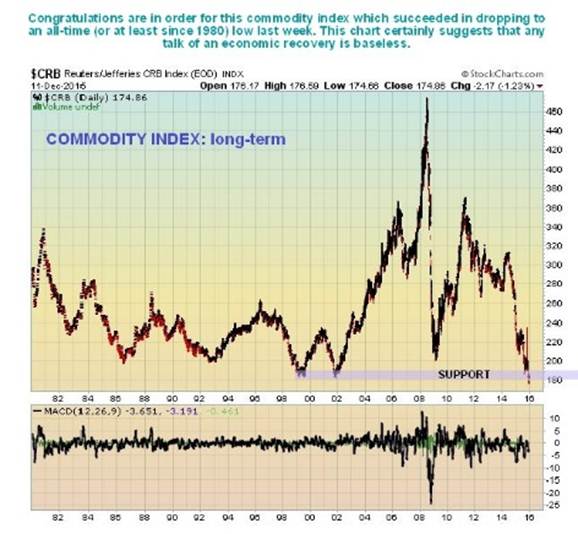
Commodities markets are in a parlous state, as is made plain by the long-term CRB index chart, which is at multi-decade lows. If you ever needed proof of the gathering forces of depression, this is it…
The slump in the oil price is a symptom of the deepening global malaise, and makes nonsense of the claims of an economic recovery…
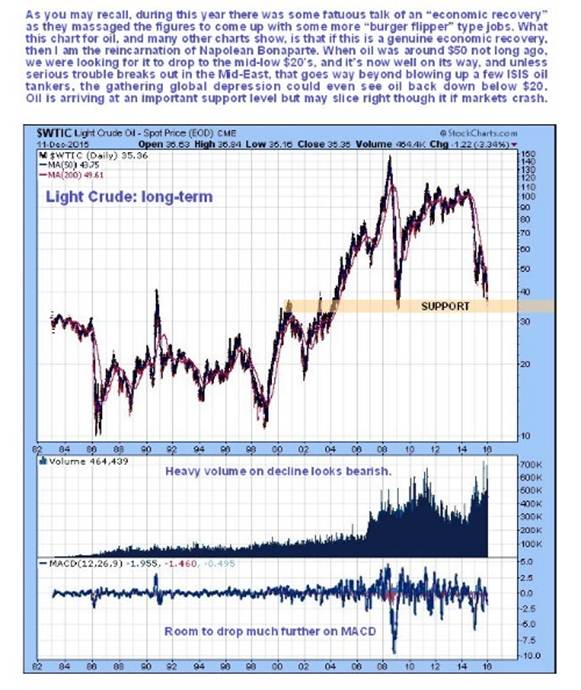
Our downside target for oil has for some months been the mid-low $20’s. As we can see on the Light Crude chart above, it is now arriving at a support level, which ordinarily might be expected to generate a bounce, or at least a temporary price stabilization, but if markets generally drop heavily or crash then it is likely to continue lower with little or no pause, probably into our target zone.
The slump in world trade has contributed to a decline in shipping rates to very low levels – they are now close to hitting record lows, another sign of depression…

Both the Baltic Dry shipping index and the Commodities markets have been warning of depression for a long time, but stock markets have happily ignored them up to now, pumped up as they have been by massive Central Bank slush funds financed by QE, so that ordinary citizens can finance speculators (by later losing their purchasing power via inflation of the price of basic goods), but it’s going to be a lot harder for markets to ignore the breakdown and collapse of the Junk Bond market, which really started to get underway just last week.

The message of this chart is that interest rates are going up, whether the Fed wants to join in raising them or not. When rates rise significantly markets will crash, because of the impossibly huge debt overhang.
Turning to sectors within the US stock markets that look set to implode, we have Biotech, which signaled that it is entering a bear market back in September, when it plunged on huge record volume as it broke down from its parabolic slingshot uptrend.

As we can see, Biotech’s bear market has only just begun, and it still has an awful long way to fall. On the site we have looked at leveraged inverse ETFs and options to take advantage of the expected drop.
Meanwhile the Tech heavy NASDAQ index still looks relatively strong, but has just double-topped with its highs of last Summer, and is moving in conformity with the broad stockmarket S&P500 index, and so should drop with it. Interestingly the NASDAQ appears to be topping out just a shade above its 2000 bubble highs, and even though the current bubble does not look so serious this time round because it has not risen so steeply as in 2000, the red-hot Bay Area (San Francisco) property market certainly has the attributes of a bubble about to burst.

While the products of Tech companies are certainly alluring, and much additional demand is generated by consumers upgrading their equipment every 6 months or less in order to keep up with their peers and abreast of the latest developments, they will find it a lot harder to do so when they are flat broke, out of a job and maxed out on credit. In this situation demand for even the most attractive products can falter. So the stocks of Tech companies can drop like anything else.
Speaking of the property markets, they are still riding high, but don’t expect that to last much longer. The REIT chart below shows that it is still at a high level within an uptrend, but don’t expect that to last as rates rise and stock markets crash. If you own speculative property you should offload it to the bag holders as soon as possible.

We will end with an interesting Treasury proxy chart which shows that Treasuries broke out upside from a rather large Triangle on Friday. What this suggests is that, despite the huge careening deficits and the likelihood of a dollar crisis later on, investors are still going to run for safety to Treasuries during a 2008 style meltdown. Why? - because they reason that the US will be the last domino to topple, certainly well after Europe and debt-wracked Japan have gone down the drain.

I could shovel still more of this stuff onto you, but if you haven’t got the picture by now you never will.
********
Courtesy of Courtesy of http://www.clivemaund.com

Clive P. Maund’s interest in markets started when, as an aimless youth searching for direction in his mid-20’s, he inherited some money. Unfortunately it was not enough to live a utopian lifestyle as a playboy or retire very young. Therefore on the advice of his brother, he bought a load of British Petroleum stock, which promptly went up 20% in the space of a few weeks. Clive sold them at the top…which really fired his imagination. The prospect of being able to buy securities and sell them later at a higher price, and make money for doing little or no work was most attractive – and so the quest began, especially as he had been further stoked up by watching from the sidelines with a mixture of fascination and envy as fortunes were made in the roaring gold and silver bull market of the late 70’s.
Clive furthered his education in Technical Analysis or charting by ordering various good books from the US and by applying what he learned at work on an everyday basis. He also obtained the UK Society of Technical Analysts’ Diploma.
The years following 2005 saw the boom phase of the Gold and Silver bull market, until they peaked in late 2011. While there is ongoing debate about whether that was the final high, it is not believed to be because of the continuing global debasement of fiat currency. The bear market since 2011 is viewed as being very similar to the 2-year reaction in the mid-70’s, which was preceded by a powerful advance and was followed by a gigantic parabolic price ramp. Moreover, Precious Metals should come back into their own when the various asset bubbles elsewhere burst, which looks set to happen anytime soon.
Visit Clive at his website: CliveMaund.com


