HUI And Gold…Who’s Leading Whom?


 The Key Principle of this market analysing discipline we call Chartology : What makes the markets go up and down and sideways is investor’s and trader’s emotions.
From the little guy trading on his laptop to some big hedge fund manager that has an office full of people telling him what to do. The sum total of everyone’s psychology and conviction is what creates the many different chart patterns we are constantly searching for. Take for example the principle of Reverse Symmetry , how a stock goes up is often how it comes back down. Something one needs to look for when you’re analyzing a chart for the purpose of discerning the next probable move. It doesn’t make any difference what time frame you’re looking at either. This is the reason, when you have a parabolic rise in a stock, you’ll see a very similar decline which many times is faster than when it went up. The reason for this is because the stock spent very little time consolidating the impulse move , only taking the time to form very small consolidation patterns which don’t have the staying power of a big consolidation pattern. There is nothing to offer support once the reversal takes place. The conviction (psychology again) of the market players is not there.
The weekly chart below shows you some nice reverse symmetry on the combo chart that has the HUI on top and Gold on the bottom. Don’t pay any attention to the top chart, CDNX:Gold ratio chart. The two lower charts for the HUI and Gold are what I want to focus in on.
What do I really mean by Reverse Symmetry? First let’s look at the HUI’s massive H&S top and the price action above big neckline #2. Think of the massive H&S top on a piece of paper on your desk. Then think of the bull market highs for both the HUI and Gold as the center of your piece of paper, black dashed vertical line. Next grab the right hand side of your piece of paper and fold it to the left side of the chart using the bull market highs, black dashed vertical line, as the center of your piece of paper. You can see how the right shoulder lays right on top of the left shoulder. There is your reverse symmetry.
Another good example of some reverse symmetry is on the lower half of the weekly gold chart starting at reversal point #6 on the bullish rising wedge on the left hand side of the chart and the #1 reversal point on the bearish falling wedge on the right side of the chart. Note the left side of the chart has a bullish rising wedge and the right side of the chart shows a bearish falling wedge, reverse symmetry.
This combo chart also has some very telling price action on it. Note where the HUI’s current price action is relative to its 2008 crash low. The HUI is trading well below that very important low. Now look at where Gold’s current price action is trading relative to its 2008 crash low. It’s trading way above its 2008 crash low which tells us the HUI is much, much weaker than Gold. The only relative strength I see for the HUI is that it’s trading just above its bottom trendline while gold is trading right on its bottom trendline. Don’t make the mistake of thinking that if gold breaks down from here the HUI is not going to suffer. Gold is actually leading the HUI now by a small margin so if it breaks down the HUI won’t be far behind.
If one is bullish on the HUI the first thing you will need to watch for is for the price action to break back above the blue falling dashed trendline that is showing the tops for reversal points 4, 6 and 8. If the HUI can do that, then the 2008 crash low comes into play as the next area of overhead resistance around 150 or so. Gold is ever so close to breaking below the 2 1/2 year bottom rail of its bearish falling wedge. I don’t think anyone is looking at these very large consolidation patterns on the HUI and Gold, and what the consequences are if they break below their respective 2 1/2 year bottom trendlines. It has been a relentless bear market making lower highs and lower lows especially during the 2 1/2 year blue consolidation patterns. The only thing that is missing is the capitulation phase which finally takes out those that have been hoping every low was the start of the next bull market. One can only imagine the pain and fragility that must be felt by those still holding losing positions for over four years now. The last 2 1/2 years has lulled many into thinking things have to get better in this beaten down sector. Everyone who has bought an ounce of gold since the bull market high in September of 2011 and still holding has a losing position as of the close today. As a matter of fact everyone who has bought an ounce of gold at any time in the last 6 years has a losing position. Maybe this is the bear market bottom which will prove them right but I will have to see more evidence before this bear market is over for me.
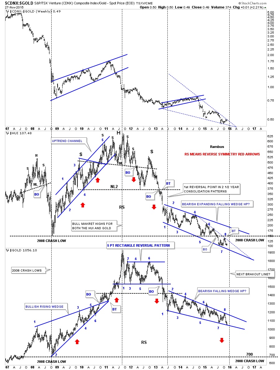
This next chart will give us the next important clue that the impulse move that began at the fourth reversal point in gold’s blue bear flag, about six weeks or so ago, has finished up with its first small red consolidation pattern and is beginning the next leg down for Gold and up for the US dollar. I know it’s hard to believe but this impulse move down for gold is already six weeks in the making. One never knows how a move will ultimately play out but I have shown you a countless number of chart which shows these very small red consolidation patterns that slope in the same direction of the prevailing trend, usually show up in fast moving markets. We are as close as we can get to starting next important move for these two stocks.

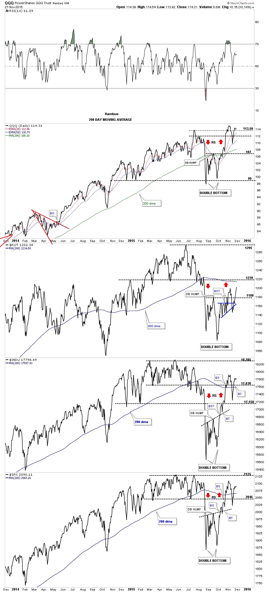
Below is the long-term daily combo chart we’ve been following on the stock markets in which I was showing you reverse symmetry taking place after the double bottoms were formed, red arrows. As you can see it’s not a perfect science, but more of an art thing. It’s just another tool we can put into our Chartology toolbox.
********
 Meet Rambus, a seasoned trader and technical analyst renowned for his unbiased and insightful chart work. Through his website, Rambus Chartology, and Substack newsletter, Rambus shares his expertise with a global community of subscribers, providing daily updates, commentaries, and hands-on training in the art and science of chartology. With his calm, humble, and down-to-earth approach, Rambus demystifies complex market trends, helping his followers navigate the challenges of today's volatile markets. Join the Rambus Chartology community today and discover a unique blend of technical analysis, trading expertise, and time-tested protocols. Subscribe now at www.rambus1.com or https://rambuschartology.substack.com/