Imminent Bear Market In US Stocks Signaled By DOW Theory


 Don't be fooled by the new highs in the flagship US stock indices that are being trumpeted on Wall Street as a sign of strength. The internals of the market are terrible and getting worse…and one big sign of impending trouble is the Dow Theory non-confirmation of these new highs by other key indices.
First we will see how the S&P500 looks on its charts before moving on to consideration of other key indices. On the 1-year chart for the S&P500 index we can readily see that the breakout to new highs was marginal, on weak volume, and that the index has made very little progress since late last year – it appears to be rounding over and weakening within an uptrend that is converging, which has bearish implications. The fact that it has made new highs has theoretically opened up the possibility of a run to the upper boundary of the uptrend, which is quite some way above. However, other factors we will come to shortly suggest it will fall way short of that. Moreover, they further suggest that this breakout could be false -- and be followed by a reversal to the downside anytime now.

We can get a clearer idea of the big picture on the 4-year chart for the S&P500 index. At first glance the market appears to be in the middle of a parallel channel in force from early 2012 with scope for significant further gains towards the upper boundary of the channel, but in recent months’ action has been increasingly choppy -- and it appears to be flagging and rounding over. It is thus very interesting to find that if we draw a parabolic Dome from the start of the uptrend, the index is at the apex of this Dome right now. And if it doesn’t negate it soon by breaking clear above it, it will be forced lower by the Dome into a downtrend. That is what Dow Theory and various other indicators suggest is going to happen. Furthermore, once it breaks down below the lower boundary of the uptrend shown, a severe decline could be in prospect.

It should thus come as no surprise that all indicators are bearish now…

Table courtesy of www.sentimentrader.com
Now, what about the other major indices that are weak and not confirming the Dow and S&P500 breakout, and thus, according to Dow Theory, calling for an imminent end to this bull market?
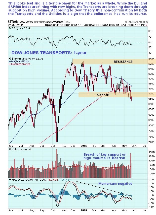
We will start with the Dow Transports, which looks threatening. After going into a trading range from late November, it broke down from this range just last week on the highest volume this year, which was a bearish development that calls for it to drop further, and thus for the other flagship indices to follow suit. Momentum for the Transports is weak and swinging negative, as shown by the MACD indicator at the bottom of the chart. Moreover, we are about to see a bearish moving average cross (where the 50 dma crosses down below the 200 dma), the somewhat luridly named “Death Cross” -- this is hardly the stuff of roaring bull markets. The Transports are now in position to plunge…and take the entire stock market down with it.
The Dow Jones Utility average is also giving a clear non-confirmation of the new highs in the Dow Jones Industrials and the S&P500 index. It dropped back hard from late February to early March and has not recovered. It found support in the recent past in the vicinity of its highs in the middle of last year, which has allowed its oversold condition to unwind. However, this support looks likely to fail going forward…leading to another steep drop.

If you ever wanted proof that investors don’t learn from history, take a look at the following (NYSE Available Cash chart), which presents the starkest warning possible that we getting very close to something very nasty happening to this market Don’t waste your time telling people who are heavily committed to the market and strongly bullish about this! They don’t want to know and will simply ignore you, or attempt to counter with some vacuous “this time it’s different” tale. Look after Number One and let those fools learn the hard way.
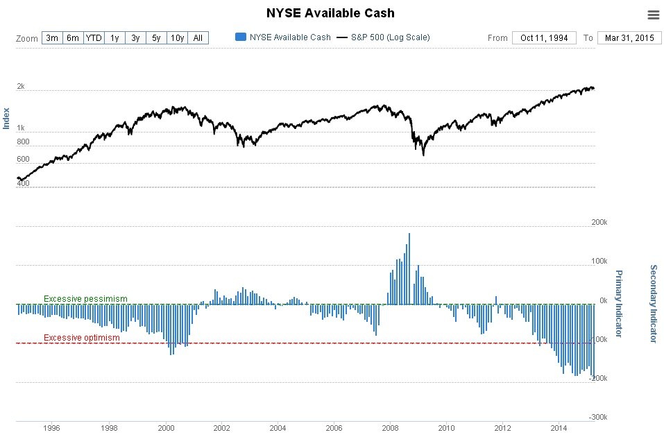
There are several points to note regarding the NYSE Available Cash chart. The data are reported late…and therefore are a little out of date. Consequently, the dire situation could be even worse now. Extreme readings tend to precede major reversal by a few months. Prudent investors must take note the situation is far more extreme than it was before the 2008 crash.
Chart courtesy of www.sentimentrader.com
Conclusion
According to Dow Theory the bull market in US stocks has run its course…and therefore it won’t be long before it breaks down into a bear market that is likely to be severe. A catalyst for this could be a collapse in the bond markets. There is no logical reason for investors to hold bonds. They yield next to nothing. Furthermore , bonds carry an increasing risk of severe capital depreciation, because most governments are either insolvent or fast heading in that direction. This means they cannot and will not honor their debts. If we see a collective realization of this reality by bond holders worldwide, which could happen at any time, we could quickly witness an ugly stampede for the exits leading to a dramatic spike in interest rates…and pave the way for a global market crash. We have already seen a convulsion in the bond markets in recent weeks, which is viewed as “a shot across the bow” – ergo a warning of much worse to come.
********
Courtesy of http://www.clivemaund.com/

Clive P. Maund’s interest in markets started when, as an aimless youth searching for direction in his mid-20’s, he inherited some money. Unfortunately it was not enough to live a utopian lifestyle as a playboy or retire very young. Therefore on the advice of his brother, he bought a load of British Petroleum stock, which promptly went up 20% in the space of a few weeks. Clive sold them at the top…which really fired his imagination. The prospect of being able to buy securities and sell them later at a higher price, and make money for doing little or no work was most attractive – and so the quest began, especially as he had been further stoked up by watching from the sidelines with a mixture of fascination and envy as fortunes were made in the roaring gold and silver bull market of the late 70’s.
Clive furthered his education in Technical Analysis or charting by ordering various good books from the US and by applying what he learned at work on an everyday basis. He also obtained the UK Society of Technical Analysts’ Diploma.
The years following 2005 saw the boom phase of the Gold and Silver bull market, until they peaked in late 2011. While there is ongoing debate about whether that was the final high, it is not believed to be because of the continuing global debasement of fiat currency. The bear market since 2011 is viewed as being very similar to the 2-year reaction in the mid-70’s, which was preceded by a powerful advance and was followed by a gigantic parabolic price ramp. Moreover, Precious Metals should come back into their own when the various asset bubbles elsewhere burst, which looks set to happen anytime soon.
Visit Clive at his website: CliveMaund.com
More from Gold-Eagle


