Keep Your Eye On The Precious Metals Bear


We’re going to look at the precious metals complex and get focused again as this is the area we need to concentrate our efforts right now…IMHO. All the volatility in the stock markets has many taking their eyes off the ball of what may turn out to be the trade of a lifetime for some of you. I’m just as guilty as the next person trying to play the stock markets looking for that big trade that is so elusive right now. The stock markets are like a veg-o-matic chopping up both the bulls and the bears alike.
I have made a couple of small trades trying to catch one of the swings…but the volatility is very hard to deal with. Back in 2000 after the markets topped, I began to play the short side as bear markets can be very profitable if you can catch them just right. What I learned back then was you had to be dead on the money with your entry points, because the volatility would knock you out before the move you were looking for actually took place. It looks easy in hindsight when you view the long term charts of bear markets…but trading them in real-time is a whole different ballgame.
I see the same thing happening right now. The volatility is eating investors alive. Just when you think you’re on the right side of the trade we get 500 to a 1000 point reversal. Believe me it doesn’t take to many whipsaws before you become totally confused on what to do. We made some good profits on the initial thrust down which is why I sold out on Monday to lock in our gains. As I stated earlier I’ve made a couple of trades but nothing big because I know what is likely to happen. The markets have a way of taking back all your profits and then some before you finally throw in the towel. And the thing is you’ll be proven right over time but for most investor they’ll keep trying until they go broke. It’s a game of psychological warfare.
Until this latest stock market move we’ve been really focused on the PM complex and that is where I’m going to concentrate my efforts for the most part over the next week or two. Yes, there will be some big money to be made in the stock markets, but there will also be some big money to be made in the precious metals complex which is giving us a better read on the charts than the stock markets right now. As I have shown you this week the PM complex is beginning to finally break down out of some of those huge 2 1/2 year consolidation patterns unlike the stock markets where the trading action is in the middle of no man’s land right now as the big breakout has already occurred.
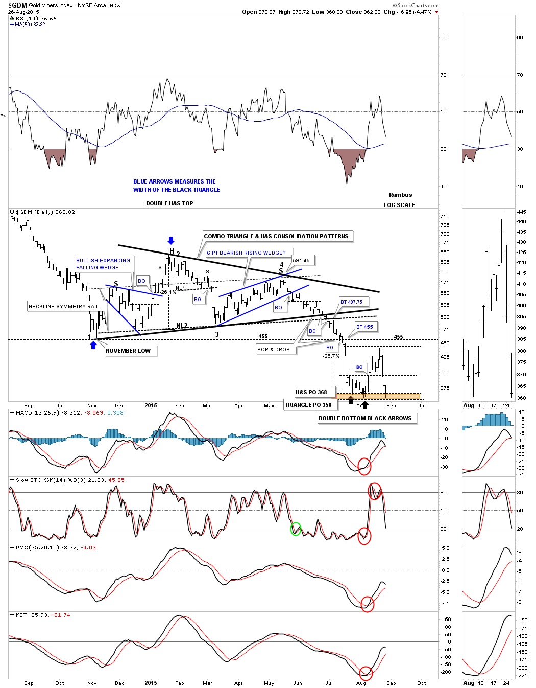
Before we look at the daily chart for gold I would like to show you the daily chart for GDM which has the last pattern which was a combo triangle / H&S consolidation pattern that began to form at the November low from last year. The reason I’m showing you this chart first is so you can see the price objectives of these two patterns was met and then the relief rally started with a small double bottom. As you can see the relief rally went almost back up to the 455 area which was the November low from last year and was a place to look for some resistance to show up. The price action came close but fell just shy before heading back down to the bottom where GDM closed today.
This is a critically important low right here. Either the GDM will break down right here and now or we could see another reversal back up which would then give us a consolidation pattern. If this new trading area is going to be a bigger consolidation pattern then we have completed two reversal points so far with the third one beginning at our current low. In other words we need one more counter trend rally to complete a consolidation pattern. Keep the combo triangle / H&S consolidation patterns in your mind when we look at the daily chart for gold.
Now let’s look at a daily chart for gold which shows the same two formation the triangle and H&S consolidation patterns which began to form at the November low last year. Unlike the GDM which reached its price objectives gold didn’t even come close to reaching its. As you can see gold had the breakout move and the counter trend rally but the counter trend rally was much stronger than GDM’s. The red circle shows where I was looking for the counter trend rally to end which has two necklines and the bottom rail of the black triangle. As you can see gold went slightly higher finally finding resistance at the top rail of the black triangle where it has finally started to roll over. On the GDM chart above the price action is trading right at the very bottom of its last low but gold is still trading well above its previous low which is showing the miners are much weaker than gold which is what we want to see right now. This combo chart pattern for gold has two price objectives down toward the 1000 area. Where will the PM stock indexes be if gold reaches the 1000 area?

This next chart for gold is a daily line chart which shows the massive 2 1/2 year bearish falling wedge with the blue triangle / H&S consolidation pattern that formed out toward the apex. This daily line chart shows the counter trend rally stopped dead in its tracks at the neckline and the apex of the blue triangle. At this point I’m calling this counter trend rally just a strong backtest to the bottom rail of the 2 1/2 consolidation pattern until something says differently.

Now let’s take a look at a daily line chart for silver as I believe it’s showing us the way lower for the precious metals complex. After breaking out of its blue triangle consolidation pattern about a year ago silver has been chopping out a pretty large H&S consolidation pattern. Today marked a brand new low for its bear market that began in April of 2011. It’ hard to imagine anyone holding on for the better part of four years and then seeing silver hitting a new low today. It has to be very frustrating psychologically and financially.

The weekly candlestick chart for silver shows how its bear market has unfolded since it put in an unbalanced double top to end its bull market. Note the string of black candlesticks, on the right side bar, that tells us the last move down was an impulse move. If the month of August ends up with a black candle then this will be the first one in silvers brand new impulse move down in which we should see a sting of black candlestick into the low.

This next weekly chart shows how silver is reversing symmetry back down from its big rally off of the 2008 crash low. Strictly from a Chartology perspective it’s hard to find anything bullish on this chart.
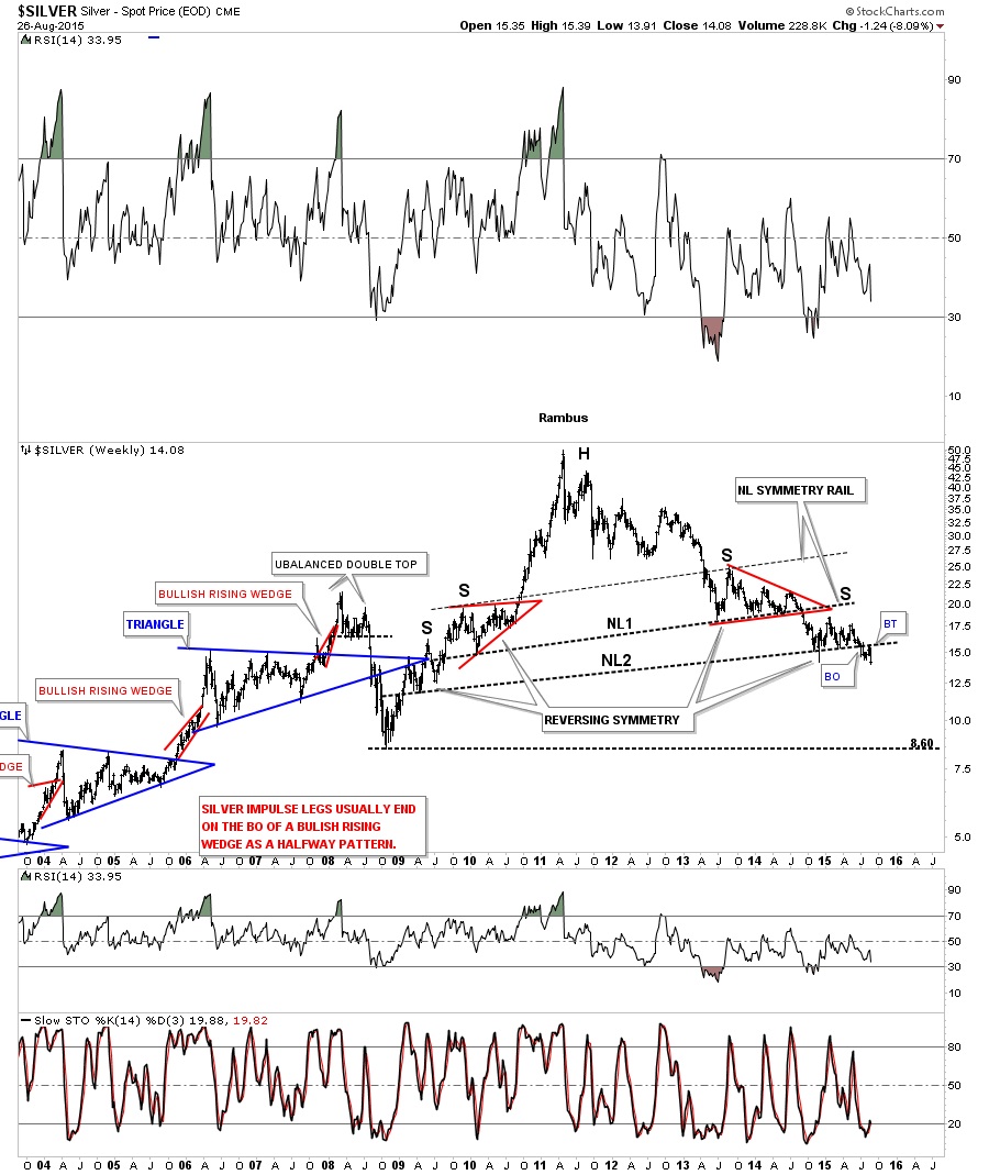
The very long term monthly chart for silver shows its double H&S top and the recent breakdown this week of neckline #2. There really isn’t much in the way of support until neckline #1 is reached. I know it’s hard to believe but that’s what the chart is telling us.

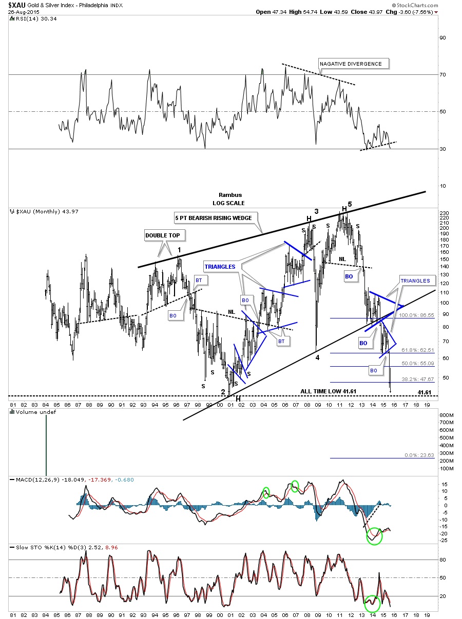
Next I would like to show you a couple of long-term charts for the $XAU that shows where we may look for a price objective for this next impulse move lower. This first chart shows you the entire history of the XAU which is showing us a massive bearish rising wedge formation. I would like to focus your attention to the bottom rail of the massive rising wedge which shows us one blue triangle consolidation pattern above the bottom rail and one below. I have talked about and shown you many cases of setups like this. You’ve heard me say if you see a consolidation pattern above an important trendline, or below and important trendline, or one right on an important trendline or one above and one below and important trendline that is usually a very good setup. Here we see one above and one below that very important 15 year bottom trendline. The XAU is now just several points away from making brand new all-time lows. Pretty amazing when you think about it. Also note the big reversal patterns that have played such a key role during the formation of this nearly 35 year monthly chart. Big reversal patterns big moves. I got a price objective by measuring the width of the huge bearish rising wedge which shows a price down to the 23.63 area.
Next I’m going to show you the price objective for the GDX based on the big bearish falling wedge. On the weekly chart below there are two different price objectives based on the impulse and breakout to breakout methods. Using these to techniques we get a price objective between 7.40 and 7.90. I will use these price objective for our DUST trade.

Next we’ll look at a weekly chart for the GDXJ which shows its entire history complete with its massive H&S top and a slightly different bearish falling wedge. The GDXJ’s bearish falling wedge is made up of six reversal points and has a price objective down to the 6.50 to the 7.50 area.
Keep in mind these price objectives will get us into the ballpark and give us a place to look for an important low. Nothing is 100% guaranteed in the markets, but I like this setup we’ve been following for well over a year and probably longer. This could very well be the capitulation phase that drives the last of the diehard gold bugs nuts. This is why I said in my opening comments that I feel much more comfortable playing this potentially last impulse move down in the PM complex vs trying to catch a move in the stock markets right now.
 Meet Rambus, a seasoned trader and technical analyst renowned for his unbiased and insightful chart work. Through his website, Rambus Chartology, and Substack newsletter, Rambus shares his expertise with a global community of subscribers, providing daily updates, commentaries, and hands-on training in the art and science of chartology. With his calm, humble, and down-to-earth approach, Rambus demystifies complex market trends, helping his followers navigate the challenges of today's volatile markets. Join the Rambus Chartology community today and discover a unique blend of technical analysis, trading expertise, and time-tested protocols. Subscribe now at www.rambus1.com or https://rambuschartology.substack.com/


