Looking At Economic Growth Via The Kilowatt


I first learned the significance of electrical power demand (EP) just after the Berlin Wall came down in 1989. With the collapse of the Soviet Union, the western intelligentsia was thrown into disarray with the discovery that intellectuals managing an economy could fail. Twenty-five years ago the elite of the Ivy-League couldn’t understand how socialism in the USSR could have self-destructed; they mourned its passage to the dustbin of history. Before 1989, Paul Samuelson’s text book on economics used in most college level economics 101 classes for decades taught communism as a viable economic system; but he was wrong. Academia’s mistaken optimism about the Soviet-economic system proved to have been due to their blind trust in the data published by the Soviet Union, which in retrospect was wildly optimistic. This included the academics employed by the CIA who were as far off target as everyone else. The only people that accurately predicted the economic collapse of the Soviet Union was a small underfunded group at the CIA which was studying Soviet kilowatt demand: EP.
At the time I was an instructor at the US Navy’s Electrical School in Chicago. One morning before I left for class I watched a morning news program interviewing the CIA officer who directed the Soviet EP program. He was obviously doing a victory lap on national TV and visibly enjoyed rubbing the nose of his academic colleagues in their error of trusting statistics generated by a socialist-economic bureaucracy rather than the real world data on EP. Electricity was my life in the navy, so I knew exactly what he was talking about.
In my career I saw service on six ships, including an aircraft carrier (photo below left) a fleet oiler (mid-ship) and a battleship (right), as in the photo below. The reason I’m including this photo is to provide an example of EP demand. The oiler has four big steam driven turbine generators (TG) in it. When underway in normal steaming it has two TGs “on-line”, and they aren’t working very hard. But when refueling two large capital ships, (as shown below), the oiler has all four TGs on line because it takes a lot of kilowatts to pump a few million gallons of fuel oil in three or four hours. After the refueling detail is secured, the engineering department will stand down two of the TGs, because unless the ship is pumping fuel oil, the demand for EP just isn’t there.
This is how the CIA’s researchers of Soviet EP correctly understood its steadily declining demand for EP: economically speaking the Soviet Union was shutting down no matter how much “economic growth” the commie statisticians would have the world believe there was.

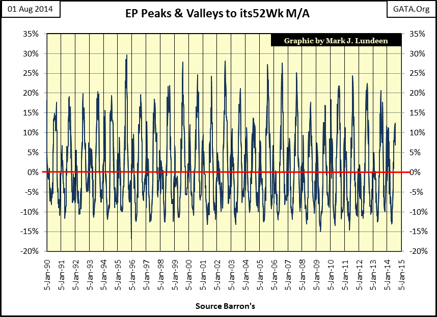
After I retired from the Navy, I spent a few years compiling statistics from the old issues of Barron’s. When I saw that Barron’s published EP in their “Pulse of the Economy” I made sure to include that in my research, and was pleasantly surprised to see the data went all the way back to August 1929. Below are the 4,435 weekly values of US electrical power consumption published by Barron’s, along with a 52Wk M/A to smooth out the seasonal variations. Air-conditioning, however, didn’t become a significant factor in EP until the 1960s. EP has two seasonal peaks and two seasonal valleys per year, as shown on the chart.

There’s a lot of information in the chart above. Looking at EP’s 52Wk M/A (Red Plot), post WW2 EP demand was doubling every ten years up until 1975; impressive! After 1975, EP didn’t double again until 2008, a full thirty three years later, but the seasonal peaks in EP became very pronounced. EP also provides us with a proxy for national air-conditioning demand. The hotter the summer, the larger the peak; and the truth is that ever since the summer of 1995 (when EP’s summer demand peaked at 30% above its 52Wk M/A), peak-electrical demand for EP has been declining, even as academics seeking additional Federal research funding continue to warn us of “global warming.”
Below we see EP demand peaks for summer and winter. The vertical grid lines fall on the first week of January; winter EP demand peaks are found on them. Summer EP demand peaks are located between the grid lines. Assuming that North American electrical power demand for air-conditioning is a good proxy for any particular summer’s extremes in temperature (a safe assumption), then a case for global warming cannot be made with the data below. Currently, summer 2014 EP has yet to rise 15% above its current 52Wk MA (0%-Red Line). Global warming has until early September to get EP demand up above the 15% line or this will be North America’s lowest demand for air conditioning since 2004, and maybe since 1990.
Next is a Bear’s Eye View (BEV) chart for EP’s 52Wk M/A (seen as the red plot two charts above). What’s a BEV chart? It’s a chart that compresses data between 0.00% for each new all-time high in a series and -100% for a total wipeout. A BEV plot is an excellent way to highlight historical-market declines, or in this case, declines in EP since the Great Depression. Two charts up there is no indication that demand for EP declined by 17.32% in the early 1930s. But with a BEV chart we can’t miss the fact that during the Great Depression (1929-39) the American economy suffered two major declines in EP demand (specifics listed on below chart’s table), and both declines mirrored large increases in unemployment. The declines in EP came about as factories and assembly lines were shut down from 1930-32 and again from 1937-38; increasing unemployment was an unavoidable consequence of these shutdowns (as indicated by declining demand in EP).

The second largest historic decline in EP occurred in 1946. The EP decline of 1946 wasn’t from a recession, but rather from retooling the American economy from wartime to peacetime production. Post WW2 industry demanded a lot of man hours, if not kilowatts, to reconfigure America’s assembly lines. So there were jobs waiting for returning veterans even as demand for EP declined a huge 8%. The 1946 decline is unique as every other decline seen above was the result of economic contraction.
Our current decline is also unique. The 1930-35 -17.32% decline in EP occurred during a 277 week gap from EP’s all time high in August 1930 which was finally exceeded in November 1935. Currently we haven’t seen a new all-time high in EP demand since August 2008, 312 weeks ago, and there are no indications that demand for EP will see another new all-time high anytime soon. Historically speaking; that’s a long time and suggests that there are structural problems in the economy that have yet to be addressed. There’s no great difficulty in identifying the problem; the Federal Reserve and its banking system has been creating trillions of dollars in unrepayable debt that they refuse to write off.
Anyone currently living in a $250,000 home purchased with a $500,000 mortgage during the housing bubble knows exactly what the problem is; debt service is consuming a preponderance of income, and will continue to do so for decades to come. And the problem is not just seen on the balance sheets of homeowners. Debt taken on for reasons of consumption has become a chronic problem for state and local governments as well as glamorous companies like Apple Computer. Currently this ill-conceived debt is still being serviced, but should the economy (and EP) begin to decline as it did in 2008, there will be trillions of dollars in defaults, sending shockwaves through the credit markets.
Another unique feature of our current decline is that unlike all other EP declines since 1929, where EP experienced a sharp decline followed by a steep recovery (a downward spike in the BEV plot), the current decline more closely resembles a bearish pattern for a stock chart. The most likely reason for the languishing decline in EP is Doctor Bernanke’s quantitative easing program. The Doctor’s massive “injections of liquidity” have managed to keep his patient’s chart pattern hovering above the lows of November 2009, but have failed to restore the economy’s demand for EP to a new all-time high. Basing my prognostication on the strange nature of EP’s current decline, I believe that the worst of what’s to come has yet to arrive.
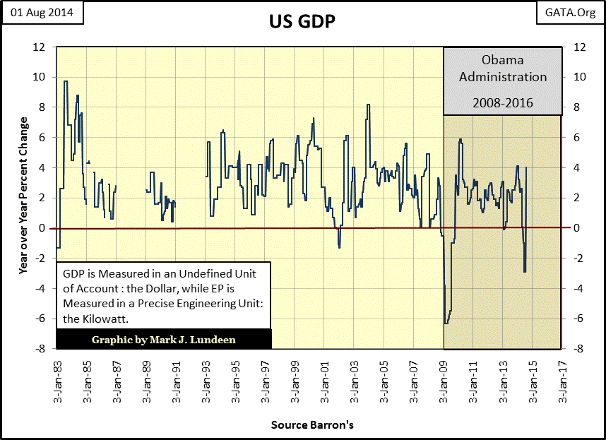
However, I admit that by using GDP statistics published by the Federal Government in the chart below, a rosier scenario of the future is possible. Just this week the Federal Government reported that their management of the economy has produced growth in GDP of 4%. And unlike the EP data above, where EP hasn’t seen a new all-time high since before President Obama was sworn into office, the GDP data below shows economic growth of around 2%, or better for most of Obama’s time in office.

But the key to understanding current “growth” in GDP is in knowing it’s measured in US dollars – not in units of production or sales; and ever since August of 1971, the dollar has become an undefined unit of account. So, measuring economic growth with GPD can have problems. For instance, should total national widget production be cut by 50%, as hyperinflation increased the price of widgets up by 104% over the past year, the government would claim an annual economic growth of 4%; which would be total nonsense. This is not so when measuring the economy by its demand for kilowatts. The kilowatt today is the same unit of measurement as it was in 1930. And for that reason I believe that measuring economic health in terms of demand for kilowatts (EP) is a superior method to measure economic growth than with a dollar defined “market value” of goods and services (unadjusted for monetary inflation) as is the case for GDP.
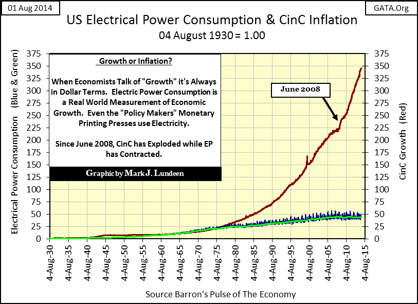
In my next chart I’ve indexed US Currency in Circulation (CinC / Red Plot) and EP (Blue and Green Plots) with 1.00 = August 1930. From 1930 up until the mid-1970s increases in CinC and EP were approximately the same, however since 1975 CinC has increased by a factor of 14 while EP has only doubled.
So what’s a dollar defined measurement of the economy such as GDP really telling us? One would hope something more in tune with reality than what Soviet statistical measurements were telling Western academics in the 1980s, but I fear it’s not.


