Market Crash


The last few years we have witnessed what may be described as a “zombie” bull market in US stocks. What do we mean by that? We have all seen those old zombie movies where deathly figures come lurching forward out of the darkness, determined to make the remaining living like them – they are dead, but still moving, thus the term was coined “the undead”. The recovery in the US economy has not been commensurate with the rise in the markets – to look at the charts for the S&P500 index you would think that the mood across the country would be like the ROARING TWENTIES or the boom of the 60’s, but nothing could be further from the truth. In practical terms there has been no real recovery at all – incomes are not keeping pace with inflation and unemployment, or underemployment, remains stubbornly high. So why have the markets been rising and rising? – the reason for this is simple: With interest rates clamped at zero, investors have had no choice but to wade into the stock market in an effort to get some yield. With the passage of time it has become a virtuous circle, with rising stock prices meaning that investing in the stock market provides a double benefit, not just dividends, but capital gains too. This is the reason that as it has progressed, more and more money has been attracted into the market, and it has risen higher and higher, with the bull market amplified further by a flourishing carry trade promoted by ZIRP (Zero Interest Rate Policy).
There are two big problems that threaten to derail this bull market, and soon. One is that investors have now leveraged themselves to extreme levels to maximize their take from the markets, and the other is the inconvenient truth that the economy is not growing at all – it is in recession. Revised 1st quarter GDP figures came in at a shocking -3%. While the bad weather last Winter was used to explain this away, they’ll have a hard job using this excuse if the 2nd quarter figures, due to be announced within the next few weeks, come in bad. After such a prolonged and increasingly correction-free advance, the danger is that if things turn seriously sour there will be an almighty rush for the exits leading to a precipitous decline.
While this fundamental rationalizing leads us to conclude that big trouble is not far over the horizon, can we see signs of it on the charts? – We most certainly can!
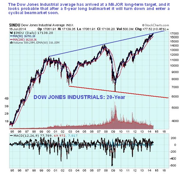
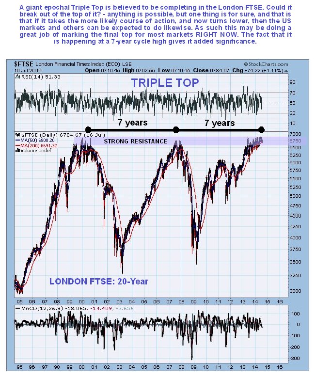
To start with, two major market indices, the US Dow Jones Industrials Index, and the UK FTSE Index, have arrived at major long-term targets. We can see that on their 20-year charts shown below. The Dow Jones Industrials have arrived at the upper boundary of a giant bullhorn pattern, while the UK FTSE is completing the third peak of a gigantic Triple Top.
Looking at the US bull market on an 8-year chart for the S&P500 index, we can see that it has taken the form of a large bearish Rising Wedge, which is displaying a number of important negative characteristics. One is that volume has dropped back steadily as the rally has continued. Another is that volatility has dropped back to an extremely low level, as shown at the top of the chart, with corrections become smaller and smaller, which is a sign of extreme complacency. With the index now contacting the top boundary of the Wedge, it’s a good time to dump any mainstream stocks you may have, and to consider bear ETFs etc. We could see the index meander about until the Fall, as it will have to traverse back across the narrowing Wedge before it can break down from it – it’s when it breaks down beneath the lower boundary of this Wedge that the real downside fireworks will start.

Finally, the ratio of stocks over bonds has risen to the same peak levels it attained at the major market tops of 2000 and 2007, so it’s definitely a good time for the stock market to check out.

The following charts provide additional evidence regarding the overextended extremes of the markets and largely speak for themselves.
The NYSE available cash situation is far more extreme than that prevailing before the 2008 market crash…

Chart courtesy of www.sentimentrader.com
The retail money market ratio looks absolutely frightful – it shows that investors are as fully committed to the markets as they possibly can be – they couldn’t go more out on a limb on borrowed money even if they wanted to…

Chart courtesy of www.sentimentrader.com
The Rydex Money Market % shows that Rydex traders are about as fully committed to the market as they can be, with their money market funds down to the sort of levels last seen in 2007 !!!

Chart courtesy of www.sentimentrader.com
The Rydex Ratio, which measures the assets in the bullish funds in relation to total assets in the bullish and bearish funds, is at an extreme reading well beyond what we saw in 2007 ahead of the market crash, which is yet another warning !!!

Chart courtesy of www.sentimentrader.com
********
Courtesy of http://www.clivemaund.com

Clive P. Maund’s interest in markets started when, as an aimless youth searching for direction in his mid-20’s, he inherited some money. Unfortunately it was not enough to live a utopian lifestyle as a playboy or retire very young. Therefore on the advice of his brother, he bought a load of British Petroleum stock, which promptly went up 20% in the space of a few weeks. Clive sold them at the top…which really fired his imagination. The prospect of being able to buy securities and sell them later at a higher price, and make money for doing little or no work was most attractive – and so the quest began, especially as he had been further stoked up by watching from the sidelines with a mixture of fascination and envy as fortunes were made in the roaring gold and silver bull market of the late 70’s.
Clive furthered his education in Technical Analysis or charting by ordering various good books from the US and by applying what he learned at work on an everyday basis. He also obtained the UK Society of Technical Analysts’ Diploma.
The years following 2005 saw the boom phase of the Gold and Silver bull market, until they peaked in late 2011. While there is ongoing debate about whether that was the final high, it is not believed to be because of the continuing global debasement of fiat currency. The bear market since 2011 is viewed as being very similar to the 2-year reaction in the mid-70’s, which was preceded by a powerful advance and was followed by a gigantic parabolic price ramp. Moreover, Precious Metals should come back into their own when the various asset bubbles elsewhere burst, which looks set to happen anytime soon.
Visit Clive at his website: CliveMaund.com


