Market Turning Points


Current Position of the Market
SPX: Long-term trend - Bull Market
Intermediate trend - Is the 7-yr cycle sketching an intermediate top?
Analysis of the short-term trend is done on a daily basis with the help of hourly charts. They are important adjuncts to the analysis of daily and weekly charts which ultimately indicate the course of longer market trends.
WEAKENING TREND
Market Overview
Last week, the market appeared to lose a little more of its upside momentum. After making an all-time high, SPX gave back a little over six points, which is not very much, but it is a departure from the previous four weeks during which it recorded an advance of nearly 120 points. This could be the beginning of a pause before resuming its uptrend. A retracement of 40 to 60 points from the high would be a normal correction of the move from 1980. More would suggest the possibility that an intermediate decline is taking hold.
Indicators survey
The weekly trend is up, but the momentum oscillators continue to make lower lows as the market makes higher highs. This has the effect of increasing the negative divergence in these indicators. As for the daily ones, they appear to be on the verge of giving a sell signal.
Last week, I pointed out that breadth was beginning to show some weakness. This can be seen in the performance of the McClellan Oscillator which has barely stayed positive for the past 10 weeks and turned down last week. A similar period of weak readings last year was followed by a strong correction. Is something similar in the offing?

Some short-term distribution appears to be taking place in the 1X Point & Figure chart. The longer-term 3X chart may be engaged in making a large rounding top formation. Perhaps this is due to the topping of the 7-year cycle which has not quite started its declining phase, yet.
Chart Analysis
We start with the weekly SPX (chart courtesy of QCharts.com, including others below) with the McClellan Summation Index (courtesy of StockCharts.com) posted underneath it.
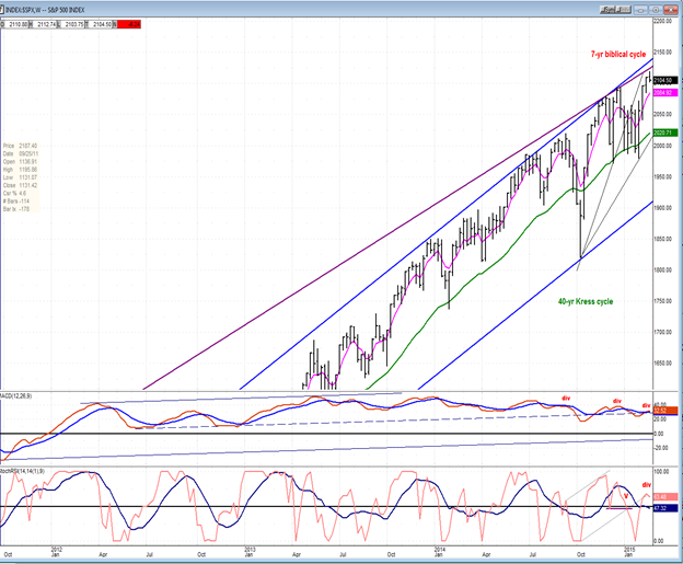

Soon, I may be able to stop repeating that deceleration in the weekly MACD -- which has been going on for over a year – will eventually lead to deceleration in price. If we should get a correction from here, it will be the first time that weekly prices have failed to make it all the way to the top channel line of the (blue) intermediate channel. Of course, it will take a few more weeks to establish this as a fact. But if it is, it will support the view that a slowly developing rounding- top pattern is forming, a possibility which is a little more obvious in the P&F chart. Even if this were so, it would not prevent the index from making other higher highs, but each clearly showing a loss of momentum in the overall trend from 2009.
The oscillators look as if they are getting ready to roll over. The McClellan Summation index did surpass its former high, but this has generated some negative divergence in its MACD histogram. Also, its RSI (not shown here) has generated a strongly overbought pattern which is ripe for a return to the lower part of its range.
The daily chart shows that the SPX tried on multiple occasions to get above the lower channel line of the previous trend but without succeeding. It looks as if it has finally given up and opted for a correction instead. It has already pierced through the pink MA, but must go through the green one to confirm that it has started to correct. (I mentioned above what kind of a decline could be expected if this were the case.)
The oscillators are all rolling over, suggesting that a decline is beginning to take hold. Only if the pull-back were to extend to the recent low of 1980 would there be a risk that an intermediate trend has started.

The hourly chart, shows that with the middle oscillator at its low and divergence in the A/Ds (bottom) there is a good chance that Friday found a near-term low, especially since we’ve reached a support level which has been tested a couple of times before, as well as the bottom of two channels (red and yellow).
A short bounce followed by a break below all that support would pretty much cinch that a correction has started. The first target would be the horizontal red line below; and the next, if it is broken, the former tops a little lower.

Sentiment Indicator
The pull-back of a few days has already caused the sentiment index to readjust to ‘greed’ instead of ‘exterme greed’. But I suspect that a rebound in the market would drive it to extremes again. On the other hand, if a decline should start, we would probably have to get it back into the red before a low is reached.

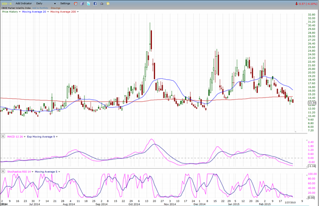
VIX (NYSE Volatility Index) - Leads and confirms market reversals.
VIX has gone sideways for three days and is holding at its recent low. It does not offer any prognosticating value at this time.
XLF (Financial Sector SPDR) - Historically a market leader.
XLF has also done little during the past week, except to hold on to its relative weakness to the SPX.

UUP (dollar ETF)
UUP is trying to overcome its resistance at the top of its long-term consolidation channel. It’s not yet enough penetration to forecast that it is ready to move higher. Give it more time!

GLD (Gold trust)
GLD has found support where it should. More time will be needed to evaluate whether or not it is ready to challenge its downtrend line once more.

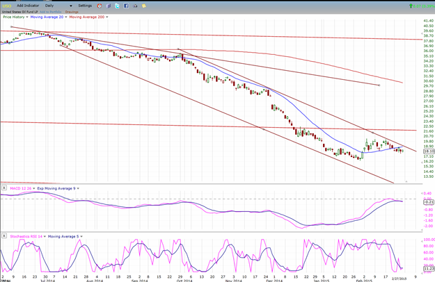
USO (US Oil Fund)
All indices showed little activity last week and USO was no exception. It is not clear if it is ready to challenge its downtrend line or re-test its recent low. We should know by next week.
Summary
The past week showed low volatility. SPX has been decelerating over the past two weeks and looks ready to start a minor correction. We should know this coming week if that is its intention.
********
FREE TRIAL SUBSCRIPTON
Market Turning Points is an uncommonly dependable, reasonably priced service providing intra-day market updates, a daily Market Summary, and detailed weekend reports. It is ideally suited to traders, but it can also be valuable to investors since highly accurate longer-term price projections are provided using Point & Figure analysis and Fibonacci projections. Best-time reversal estimates are obtained from cycle analysis.
For a FREE 4-week trial, send an email to: [email protected]
For further subscription options, payment plans, weekly newsletters, and for general information, I encourage you to visit my website at www.marketurningpoints.com . By clicking on "Free Newsletter" you can get a preview of the latest newsletter which is normally posted on Sunday afternoon (unless it happens to be a 3-day weekend in which case it could be posted on Monday).
The above comments and those made in the daily updates and the Market Summary about the financial markets are based purely on what I consider to be sound technical analysis principles. They represent my own opinion and are not meant to be construed as trading or investment advice, but are offered as an analytical point of view which might be of interest to those who follow stock market cycles and technical analysis.

When Andre Gratian was a stock broker years ago, a friend introduced him to technical analysis of the market. Consequently, it is not an exaggeration to say that Andre fell in love with this approach! Ever since then, it has become an increasingly important part of his professional life. Gratian has studied the works of Wyckoff, Edwards & Magee, Edward J. Dewey (cycles) and many others. However, one of my most profitable undertaking has probably been to study Point & Figure charting, which he finds invaluable in analyzing stocks and indices. If he were restricted to one methodology, this is the one that he would choose. This well-rounded background has given him what he feels to be a special insight into the stock market, facilitating the recognition of meaningful patterns and the ‘turning points’ in all trends, whether they be short or long term. Andre feels very comfortable discussing the stock market and passing on meaningful information to others. His subscribers include individuals and money managers throughout the world. Moreover, his Newsletters are currently published on several financial sites, here and abroad.