Market Turning Points


Current position of the market
SPX: Very Long-term trend – The very-long-term cycles are in their down phases, and if they make their lows when expected, there will be another steep decline into late 2014. However, the Fed policy of keeping interest rates low has severely curtailed the full downward pressure potential of the 40-yr and 120-yr cycles.
Intermediate trend – The DOW may be tracing out an ending diagonal pattern.
Analysis of the short-term trend is done on a daily basis with the help of hourly charts. It is an important adjunct to the analysis of daily and weekly charts which discusses the course of longer market trends.
ANOTHER MINOR TOP
Market Overview
A better than expected June employment report was the catalyst needed for the SPX to complete the phase which started at 1862, although it is possible that the move could reach 1987 and perhaps even 1989 if the rally extends into Monday morning.
This should be followed by a correction starting on Monday/Tuesday which should be deeper than the previous one from 1968 since it will be correcting a longer advance. But it will not be a major correction. This may be reserved for the one that takes place after the next rally, in a couple of weeks. An analysis which uses various methodologies show that are negative signals converging on mid-July for a potential reversal that could bring about a long overdue correction.
In the meantime, last week new all-time highs were registered by the various indices, including those which were thought of have topped a few weeks ago. Even the DOW -- which I discussed last week for making a pattern which looks very much like a long-term topping formation – was widely cheered for a first-time closing above 17000, but that has not altered its negative setup in the least! The other bearish index which was featured -- the XBD (Amex Securities Broker/Dealer) -- did participate in the rally but remains several points below its March high. It is worth noticing that, in spite of rising prices, IWM failed to make a new high for the second consecutive day, which adds to the perception that we are ready for another pull-back
Chart Analysis
In spite of the obvious strength evident in the SPX daily chart below (courtesy of QCharts.com), there are some aspects which point to the proximity of a correction. The first is that the price has reached the purple parallel (discussed earlier) which has served as resistance over the past four weeks. At the same time, there are indications that this move is completing the rally which started at the 1862 level. If this is the case, it would mean that the green trend line is about to be broken, with the correction most likely taking prices down to the vicinity of the blue MA, perhaps to find support on the grey trend line which connects 1814 to 1862.
Although I have not labeled it, the structure calls for completion of the phase starting at 1862. As was mentioned earlier, a slightly higher level could still be reached before the start of a decline with evidence for this being found in the oscillators at the bottom of the chart.
To begin with, the MACD has been in a flat to down trend for the past month. This has caused double divergence to develop in that indicator. Considering other negative factors, it is highly dubious that this index will be able to re-establish its uptrend and nullify this divergence. The fact that the middle indicator, (SRSI) has reached the top of its range is another indication that we have arrived at a top – although that, in itself, is not a convincing argument. What is more compelling is the condition of the lower indicator (A/D oscillator). It has been showing less and less support for the price trend since mid-April, at least! And on Friday, its reaction to the ten-point rally resulting from the jobs report was one big yawn! It refused to lift off the zero line.

Even with this accumulation of warning signals, there is no guarantee that a correction is imminent; but if you ignore them, you might as well throw technical analysis out of the window! Time and again, these conditions have correctly called for a CIT (change in trend).
Let’s pay a visit to the hourly chart (also courtesy of QCharts.com) to see if it tells us the same story as the daily chart.
It does! On Friday, SPX rose to its projection target, essentially filling it, although another two or three points higher are still possible. This chart also shows that SPX is up against the resistance (provided by a purple parallel to the channel top) which has stopped former short-term advances.
The oscillators are in nearly identical positions as those of the daily chart, with divergence in the MACD, an overbought SRSI, and strong negative divergence in the A/Ds. Because that last oscillator is still oversold, it is possible that we will not reverse immediately but perhaps undergo a short period of distribution around the current price before a CIT occurs.
It is easier to see on the hourly chart that the index has completed the phase which starts at 1862, and that the green trend line drawn from that level should now be challenged. Breaking below the small horizontal red trend line at the 1972 level should be sufficient to confirm that the decline has started, with the break of the green trend line as the final proof that we are in a corrective mode.
A pull-back down to the longer red trend line at 1945 would be ideal.

Cycles
Short-term cycles keep pulsing regularly causing short-term moves in the market – some better- defined than others. The week before last, the 4-wk, 6-w, and 12-wk cycles created a minor decline as they made their lows, and triggering the rally which is now ending. This week, the 10-wk and 22-wk cycles will be bottoming, which is a good reason to expect another pull-back.
Breadth
The McClellan Oscillator and the Summation Index appear below (courtesy of StockCharts.com).

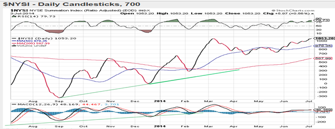
 The McClellan oscillator is stuck at neutral or just above while the market is making new highs. It is enough to keep the NYSI in a lethargic uptrend which has resulted in an overbought RSI. But this shows that the advance does not have wide breadth support and that sooner or later, it will need to correct.
Sentiment Indicators
By remaining at 70 for 5 consecutive weeks, the SentimenTrader (courtesy of same) long term indicator is getting long in the tooth! The easiest (and perhaps only) way that this reading can be lowered to a less bearish level is by a good correction in the stock market.
VIX (CBOE volatility Index)
VIX continues to make a pattern which is the reverse of the DOW’s -- even making a fractional new low last week as the DOW made a new high. However long they take to reverse, trends eventually do and every day brings the VIX closer to a reversal. The next two weeks could be key!

XLF (Financial ETF)
XLF also made a marginal new high last week while keeping its relative weakness to the SPX. Except for this minimal difference in performance, the index is making a pattern almost identical to that of the SPX. But that small difference is not enough, by itself, to draw valid conclusions about the state of the market.

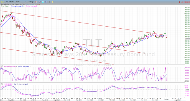
TLT (20+yr Treasury Bond Fund)
TLT attempted a second break out of its channel but this one failed also. If the market corrects, as expected, it will most likely try again. According to its P&F base, it has the capability of moving to 117 -120 on a break out.
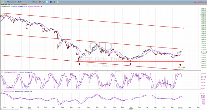
GLD (ETF for gold)
GLD has broken out of its short-term downtrend with a gap, but it has stalled slightly above the 200-DMA (not shown on this chart). If it extends its move a little higher, it will have to overcome the resistance of its mid-channel line. It has made a good base pattern and is still early in the up-phase of its cycle. The odds of breaking out above both are good, even if it takes the time to consolidate first.
UUP (dollar ETF)
UUP has started a small downtrend which stopped short of challenging its former low. Its pattern is similar to that of GLD, but with an inverse relationship. Both have stalled in their trends and we need to wait and see if they are capable of resuming them.

USO (US Oil Fund)
USO has also stalled in its uptrend after finding resistance at the mid-channel line of its up-channel. It should find support at intersecting trend lines just a little lower. It must stay above its lower (green) channel line if it is to maintain its uptrend.

Summary
Another minor top appears to be forming, preceding a correction which should exceed the former one in depth; but limited and very short-term (not lasting more than a few days).
After this correction is over, another attempt at making a new high should occur.
********
FREE TRIAL SUBSCRIPTON
Market Turning Points is an uncommonly dependable, reasonably priced service providing intra-day market updates, a daily Market Summary, and detailed weekend reports. It is ideally suited to traders, but it can also be valuable to investors since highly accurate longer-term price projections are provided using Point & Figure analysis. Best-time reversal estimates are obtained from cycle analysis.
For a FREE 4-week trial, send an email to: [email protected]
For further subscription options, payment plans, weekly newsletters, and for general information, I encourage you to visit my website at www.marketurningpoints.com. By clicking on “Free Newsletter” you can get a preview of the latest newsletter which is normally posted on Sunday afternoon (unless it happens to be a 3-day weekend in which case it could be posted on Monday).
The above comments and those made in the daily updates and the Market Summary about the financial markets are based purely on what I consider to be sound technical analysis principles. They represent my own opinion and are not meant to be construed as trading or investment advice, but are offered as an analytical point of view which might be of interest to those who follow stock market cycles and technical analysis.

When Andre Gratian was a stock broker years ago, a friend introduced him to technical analysis of the market. Consequently, it is not an exaggeration to say that Andre fell in love with this approach! Ever since then, it has become an increasingly important part of his professional life. Gratian has studied the works of Wyckoff, Edwards & Magee, Edward J. Dewey (cycles) and many others. However, one of my most profitable undertaking has probably been to study Point & Figure charting, which he finds invaluable in analyzing stocks and indices. If he were restricted to one methodology, this is the one that he would choose. This well-rounded background has given him what he feels to be a special insight into the stock market, facilitating the recognition of meaningful patterns and the ‘turning points’ in all trends, whether they be short or long term. Andre feels very comfortable discussing the stock market and passing on meaningful information to others. His subscribers include individuals and money managers throughout the world. Moreover, his Newsletters are currently published on several financial sites, here and abroad.


