Oddities In The Stock Market


This week the Dow Jones closed at new all-time highs every day except for Tuesday; the 96th to 99th since the November 2016 presidential election. Of January’s eighteen NYSE trading sessions, eleven of them closed with the Dow Jones at a new all-time high.
The drama of this advance can’t properly be displayed on a BEV chart; not with every new all-time high being equal to Zero. However, looking at the table listing Dow Jones Corrections, the Dow Jones would have to decline by just under 4,000 points to see a 15% correction, and the Dow Jones would still be over 22,500. Not that the bulls care, and why should they when they’re making money?

But I care. Look at the Dow Jones with its 52Wk High and Low plots below. Since February 2016 the Dow Jones has done nothing but advance. And since November 2016, distinguishing the Dow Jones plot (Blue) from its green 52Wk High plot has become impossible.

Look at the Dow Jones Total Market Group’s (DJTMG) 52Wk Highs and Lows in the table below. The week closed with 44 of the 76 groups at new 52Wk Highs, and we have to go down to #71 to see a double-digit percentage decline from a 52Wk High. And how in the hell does Retail Broadline become the #1 in the list? From what I read in the media, even Walmart is hurting from Amazon’s aggressive expansion into retail.
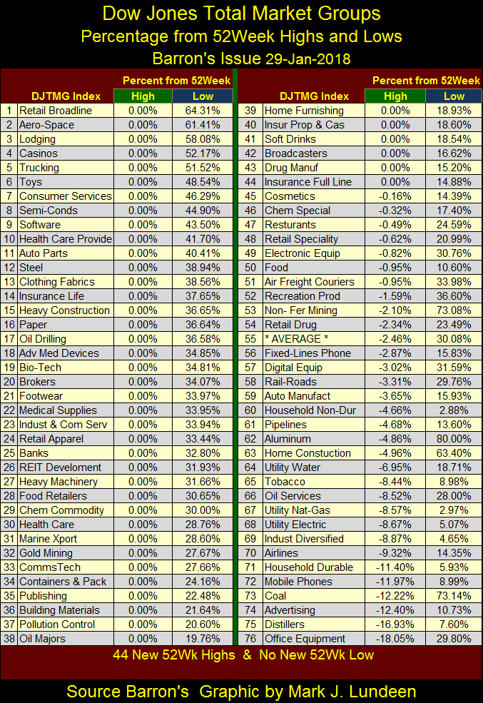
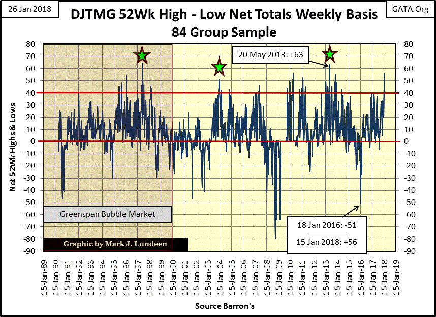
Here’s the DJTMG’s 52Wk High – Low nets. Two weeks ago it registered a big +56. The problem I have with that is with a geriatric market advance, such as ours, it shouldn’t have the energy to make a serious attempt to take out a high from five years ago; the +63 seen in May 2013.
What’s missing is seen in the Dow’s BEV chart above, a post March 2009 major market decline of say -25% or even more. This advance’s largest decline for the Dow Jones has seen was way back in September 2011, of only 16%, not that the bulls care.
Still, for all the strange things happening in the stock market, we’re looking at history being made. Like oddities in trading volume whose explanations aren’t ever going to come into the light of day unless we get the FOMC to testify under oath. And even then their interlocutors may have to water board a few of the “policy makers” to stop them from lying. Anyway, let’s look at trading volume in the stock market.
What makes anything, including NYSE share prices go up? Rising demand (rising trading volume), just as falling demand (falling trading volume) results in declining valuations. This is simple to understand; how in the chart below NYSE trading volume’s 100 day M/A peaked in December 1929 near the top of the Dow Jones itself (September 1929), and crashed down with the Dow Jones as investors walked away, taking their losses with them during the depressing 1930s.
Like the Dow Jones itself, NYSE trading volume saw three bear market bottoms from 1932 to 1942, with the blue plot being a BEV plot, and the red plot displaying the millions of shares traded daily in the 100 day moving average.
Note: After the December 1929’s last all-time high in the selected data, the red millions of shares plot overlays the blue BEV plot. So after December 1929, the red plot can be used for both BEV values (Left Scale) and millions of shares (Right Scale).
FYI: On 29 October 1929, after a two day 25% decline in the Dow Jones, the NYSE saw panic selling resulting in 16.41 million shares traded. They called it “Black Tuesday.” NYSE trading volume would not exceed Black Tuesday’s until 01 April 1968 (17.73 million shares). I make note of this as the 100 day M/A used in the chart below smooths over this historical fact.
The point to take away from this chart is that bear-market bottoms are painfully illiquid; lots of desperate sellers and only a few disinterested buyers.

But this relationship between supply and demand (Dow Jones’ valuation and Trading Volume) hasn’t been the case at all since January 2000, the top of Greenspan’s NASDAQ bubble market until after the November 2016 election. Rather, the bear-market bottoms for the NASDAQ & Sub-Prime Mortgage (Credit Crisis) market declines occurred with historic “liquidity” flooding into the stock market.
The data below is indexed to January 1980 =1.00, and in the next twenty years as the bull market on Wall Street gathered momentum, as expected trading volume for the NYSE (Red Plot) and volume for the Dow Jones itself (Blue Plot) increased by double digit factors by January 2000. But what is entirely unexpected is how trading volume for both NYSE, and most especially for the Dow Jones, peaked at record highs at the bottom of the High-Tech and Sub-Prime bear markets. I have NYSE trading volume going back to January 1900, and in the past 118 years, there has been nothing like what we see below at the Red and Green Stars.
Oh, it gets worse. The Dow Jones began its March 2009 advance, our current advance as trading volume collapsed – crashing demand (Blue Plot). And so it went until after Trump’s November 2016 election victory, when for the first time in seventeen years the Dow Jones advanced on rising volume, as NYSE trading volume contracted slightly. But the post November 2016 advancing trading volume for the Dow Jones still looks oddly out of place. Its 40Wk M/A looks as if someone used a straight edge to draw it on the chart.

What’s going on here: “market regulation”? Exactly what I can’t say, but in the fullness of time we’ll discover just how deep the “policy makers” have set their meat-hooks into the financial markets. Also, considering the trading volume in the stock market as it’s been for years now, why have many local branch offices for discount brokers closed in recent years?
Post 2000 trading volume has remained higher than it was in the 1980s and 1990s when these discount brokers were a then growing business. Just looking at trading volume, one would think the discount brokers serving the public would have seen sufficient business to keep their employees gainfully occupied and these branch offices open.
But that hasn’t been the case, which leads inquiring minds to conclude that most of the current trading volume seen since 2000 isn’t from the public, or even financial fiduciaries but from high-frequency trading programs used by large Wall Street establishments which work hand-in-hand with the FOMC in manipulating valuations in the financial markets. In other words, since January 2000 trends in trading volume seen above have been more a measurement of the force applied by the “policy makers” to “stabilize market valuations” than natural demand for what Wall Street is selling: stocks.
Another oddity in the market which developed after the top of the NASDAQ High Tech bubble is seen in the NYSE Advance – Decline Ratio. This data goes back to 1926 and really displays the strangeness in our current stock market. From the bottom of the NASDAQ High-Tech bear market (October 2002), the ratio has advanced in a most peculiar manner; a whopping 150 points in only sixteen years. The Sub-Prime Bear Market, the second greatest percentage decline in the Dow Jones since 1885, proved to be only a little speed bump in its advance.

Later in this article, I cover Barron’s Confidence Index. Like trading volume and NYSE Advances and Declines seen above, with the NASDAQ bubble deflating in 2000, fundamental things also began changing in the bond market, but now on to gold.
At the end of the week, gold in the BEV chart below closed at -28.52%, back above where gold closed in October 2008 – hurray! After the torment investors in gold and silver have suffered since 2011, I pass up no opportunity to find some joy in the precious metals markets.

And things are beginning to look up for gold and silver. Should gold break above its -27.5% line in the chart above, it should be able to do some open field running towards, and then over its -22.5% line. Is that what’s going to happen in the weeks to come? Like me, you’re just going to have to wait to see what actually does happen. But the Good Lord willing, that’s what I’m thinking.
Gold and its step sum chart below supports the possibility of this happening. Look at that multi-year bear box. The bulls remained bullish as the price of gold crashed over 30% from its August 2011 highs, then came the bear market reality with the collapse of the red step-sum plot in July 2014. When gold and its step sum bottomed in December 2015, people were fed up with gold and silver, as is always the case with a hard bottom in any market.
Since December 2015, slowly but surely, gold has once again established an uptrend that I expect will ultimately take it back to, and then above its old highs of August 2011. I say that with the understanding that nothing exciting is going to happen in precious metals assets until the financial markets once again become distressed.
But then market bottoms have always been boring, while tops are exciting. It’s been that way since before Holland had its tulip mania in the 17th century. So now is the time to be buying boring gold, silver and their miners and placing some distance from yourself and the current excitement in the stock market.

As a speculation, I’m still recommending Eskay Mining. Last year’s drilling program conducted by Silver Standard was very satisfactory, and so they’re going to do it again in 2018. Here’s Eskay’s latest press release discussing their pending projects.
http://eskaymining.com/index.php/2018/01/19/eskay-mining-corp-announces-2018-plans/
* No guarantees of outcome can be made with an exploration play. *
But Eskay is located in a prolific area known for large mineral deposits, some within sight of its property lines. IF they find paydirt, pennies * could * become dollars even at today’s low prices for gold and silver.
Here’s gold’s and the Dow Jones’ step sum tables. Both have seen their step sums advance by a net of 8 advancing days, and their 15 counts have remained above zero for the past twenty-five trading days. Apparently, both want to advance to higher levels. Since December 20th gold has advanced 6.39% at Friday’s close while the Dow Jones has advanced by 10.76%.
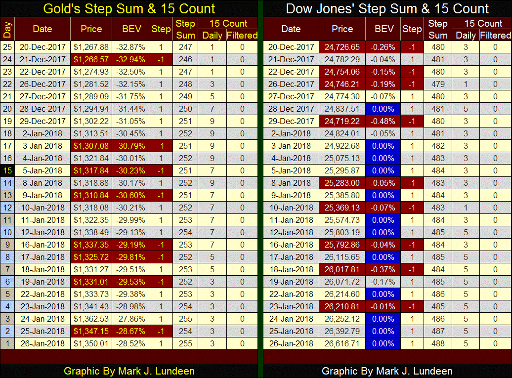
But today the whole world is focused on the Dow Jones. All those beautiful blue BEV Zeros (new all-time highs) are bound to attract a lot of attention, generating lots of greed and inflows of new money. While gold remains unloved and unwanted by the general investing public globally.
Considering everything, in my opinion seeing gold up 6.39% in the past twenty-five trading days is more impressive than the Dow Jones’ 10.76%. As I see it, gold is climbing the Wall of Worry, while the Dow Jones is floating ever higher on dumb money flooding the market. Not that the bulls care. Don’t be surprised if the current advance in the Dow Jones doesn’t terminate until it rises over 30,000; not that it has to.
Dow Jones Inc. from its earliest days made the effort to publish valuable market data, which for the price of an issue of Barron’s or the Wall Street Journal was available to all. Of course, it wasn’t until the introduction of the personal computer that this body of market data could truly be useful to the public. For instance, the following chart on Barron’s Best (Blue Plot) and Intermediate Grade (Red Plot) Corporate Bond Yields. FYI: periods of rising bond yields are bear markets, periods of declining yields are bull markets in bonds.
Both Barron’s Best and Intermediate bonds are considered investment grade bonds, but not all investment grade bonds are alike. During times of economic prosperity, reaching for yield, going for the lower grade intermediate bonds for the increased income they offer can be costly to their owners. But then buying them during times of economic distress, when intermediate grade bond yields are far above those of best grade bonds has proven to be a very profitable strategy.
In the 1930s, during the Great Depression’s second crash in the market (1938-42) we see intermediate grade bond yields soar to 7.5% as best grade bond yields continued declining. This jump in intermediate bond yields represents a huge loss of principle for their owners during 1938. However, for those who purchased these bonds now yielding 7.5%, they received not only income far above what best grade bonds could offer, but the opportunity to receive $1.00 for what they paid only $0.55 for when these bonds matured.
Like I said, not all investment grade bonds are alike. That was certainly true during the 2007-09 credit crisis, when current yields for the intermediate grade bond spiked to over 15%! This was when bond buyers ignored the “investment grade” ratings by Moody’s and Standard & Poors and quickly downgraded these bonds to low-grade junk bonds without first asking anyone’s permission. Don’t believe it can’t happen again!

From 1947 to 1981, all bond yields and interest rates increased from low single to double digits in reaction to America’s inflationary monetary policy. The bond market recognized a dollar locked up in a fixed-income investment (bonds) would purchase less when a bond was redeemed than it could when the bond was first issued. Bond buyers began demanding an inflation premium to protect their principal. So, from 1947 to 1981 bond prices were discounted down, to increase the current yield buyers were demanding, ultimately to double-digit yields.
But when denominated in a unit-of-account under the assault of its central bank, such as the Federal Reserve and its dollar, fixed income (bonds) became the ultimate mug’s game. The following table makes my point. Using the now discontinued Dow Jones 10 Utility Bond Average, let’s compare how a million dollars invested in top grade utility bonds and the Dow Jones Industrials performed as the Federal Reserve inflated CinC (paper money in circulation) from 6.57 billion to 642.5 billion from January 1938 to April 2002 when Dow Jones discontinued this bond series.
The table’s top listing the as published data tells the story. During these sixty-four years the Dow Jones increased from 120 to 10,271 while the Dow Jones 10 Utility Bond Average declined from 103 down to 101. Neither blue-chip stocks, represented by the Dow Jones, or high grade bonds kept up with the expansion in CinC. But which class of financial assets best preserved the wealth of its owners during these decades?

The middle of the table tells us that. Investing a million dollars in January 1938 with the blue-chip stocks comprising in the Dow Jones inflated to $84.994 million dollars, while the Utility bonds failed to preserve the $1 million invested. The third part of the table gives the returns in constant 1938 dollars. Deflating the April 2002 values by CinC shows that in 1938 terms, even the Dow Jones lost money, but look at the Utility Bonds. Small wonder years ago people called bonds “certificates of confiscation.”
If you’re wondering what is going on here, here’s Alan Greenspan explanation of why the “policy makers” hate gold, and love inflation so much.
“--- In the absence of the gold standard, there is no way to protect savings from confiscation through inflation. There is no safe store of value. If there were, the government would have to make its holding illegal, as was done in the case of gold.
“--- This is the shabby secret of the welfare statists' tirades against gold. Deficit spending is simply a scheme for the confiscation of wealth. Gold stands in the way of this insidious process. It stands as a protector of property rights. If one grasps this, one has no difficulty in understanding the statists' antagonism toward the gold standard.”
- Alan Greenspan: [written in 1966] This article originally appeared in a newsletter called The Objectivist published in 1966 and was reprinted in Ayn Rand's Capitalism: The Unknown Ideal
So which asset class should be considered by investors today? I don’t like either as each are at the top of a multi-decade bull market, and no one makes the big money buying at the top of long-term advance. But if I had to choose, it would be blue-chip stocks over bonds.
Bonds are debt contracts, and in the case of US corporate, muni-bonds and Treasury Debt, they are all contracted to be payable in US dollars. My expectation is the US dollars these contracts are payable in will one day fail, and all US bonds will become worthless in terms of the post US dollar currency. Here’s another shabby secret of the welfare statists; inflationary-monetary regimes sheds their unserviceable debt by rendering its underlying unit-of-account worthless as it institutes its new currency.
This is not so for the corporations that issued these bonds, as was the case for Mercedes Benz after WW1 & WW2.
https://www.daimler.com/company/tradition/company-history/1920-1933.html
Richard Russell’s once commented how in the early 1920s, one could have purchased the entire Mercedes Benz Company (stocks) for the price of a handful of its cars. Yet Mercedes’ shares survived two devastating currency wipeouts Germany suffered at the end of World Wars One and Two and prospers to this day, something none of its pre-war bonds did.
The two bond yield series plotted above are also the base data for something Barron’s calls the Confidence Index (CI). The CI is derived by dividing its Best Grade by its Intermediate Grade yield. This data has been continuously published by Barron’s since December 1938, but using bond yields published in Barron’s, I pushed the series back to January 1934, which I labeled in the following chart as “My CI.”
Barron’s states a rising CI is a precursor to an improving economy, a falling CI a precursor to a declining economy, which I won’t argue with. However I see something else in this data. I see the CI as the bond market’s best guess of the ability of the issuers of lesser-grade bonds to service their debts to maturity.
One thing is certain; the CI is a horrible market timing tool for bond bull and bear markets. It would have gotten bond buyers into the 1946 to 1981 bear market, and kept them there, as well as having bond holders to sell their bonds in 2002 and kept them out to today, missing a good portion of the 1981-2018 bond bull market.
I’m including CI this week to point out something has changed in the debt markets since the 2000 top in the high-tech bull market. We all know of the trauma the depressing 1930s were to the financial markets, a decade of counter-party failure has a way of making the debt market skittish. But after 1962, in the main the CI remained above 90 for the next three decades, and from March 1995 to July 1998 the CI never dropped below 95. The bond market is suffering from cockeyed optimism when yields for best and intermediate grade bonds are almost identical for over three years.
With the bursting of Greenspan’s NASDAQ bubble in 2000, the bond market apparently began reassessing the prospects of lesser grade bonds, and the companies issuing them as seen in the collapse in CI.

During the NASDAQ bear market the CI declined to 65, and down to 45 during the credit-crisis bear market, a low not seen since the Great Depression. Since then the “policy makers” have “stabilized” the bond market and the CI has been oscillated between 65 and 80.
I follow the CI weekly because as seen during the deflation of the NASDAQ and sub-prime mortgage bubbles, a collapsing CI (the bond market downgrading intermediate, investment grade rated bonds down to junk status) proved an excellent leading indicator of pending problems in the stock market that eventually manifested in 2002 & 2008.
And exactly what were those big problems? Actually there were lots of them, but in a nutshell I’d say that since January 2000, what the CI has been reacting to was the bond markets’ fear of a coming uncertain future and the increasing risks of counter-party failure that uncertain future represented.
Every night I pray to God to protect President Trump, and the United States of America. Canada, Mexico and the world as whole could use a little divine assistance too.
Mark J. Lundeen
More from Gold-Eagle


