SPX/Gold, 30-Year Yields And Yield Curve - Amigos 1, 2 And 3 Updated


We began the Amigos theme last year in order to be guided by the goofy riders during the ending stages of a cyclical, risk-on phase that was not going to end until the proper macro signals come about, no matter how many times the bears declared victory along the way. The fact that grown adults see conspiracies around every corner (okay, I see them around every third corner myself, but work with me here) makes such macro signaling very necessary in order to keep bias at bay.

To review…
- Amigo #1 is the SPX/Gold Ratio (more generally, stocks vs. gold) and a counter cyclical and risk ‘off’ environment simply will not engage until stocks top out vs. gold, if even for a cyclical down phase within the up phase.
- Amigo #2 is the 30yr Treasury Yield and it’s 100 month EMA ‘limiter’, which has supported the funding mechanism (unrestrained credit creation) for the leveraged economy for decades. If the limiter holds yet again, while there could be some deflationary problems the system will persist. If it breaks for the first time in decades well, we are not in Kansas anymore and the door would open up to an inflationary Crack Up Boom (von Mises style).
- Amigo #3 is the Yield Curve, which is in the late stages of flattening. When it turns up it will either be under pains of deflationary or inflationary pressure. Note the word “pains” because there would be pain, either way; but in different financial and economic areas.
The picture above shows Amigo #1 closing his eyes and bracing for impact, just as Amigo #2 did many months ago. Amigo #3 is the dim one (I mean, Martin Short with Steve Martin and Chevy Chase? Come on) happily riding along, his star shining less brightly than the other two. He is still a macro holdout.
Let’s get to our review.
Amigo #1
SPX/Gold Ratio (daily chart) took a hard hit and has bounced a bit. If this were a stock chart we’d call it a bear flag. As it is we call it a hard lurch toward a risk ‘off’ situation that does not look complete.
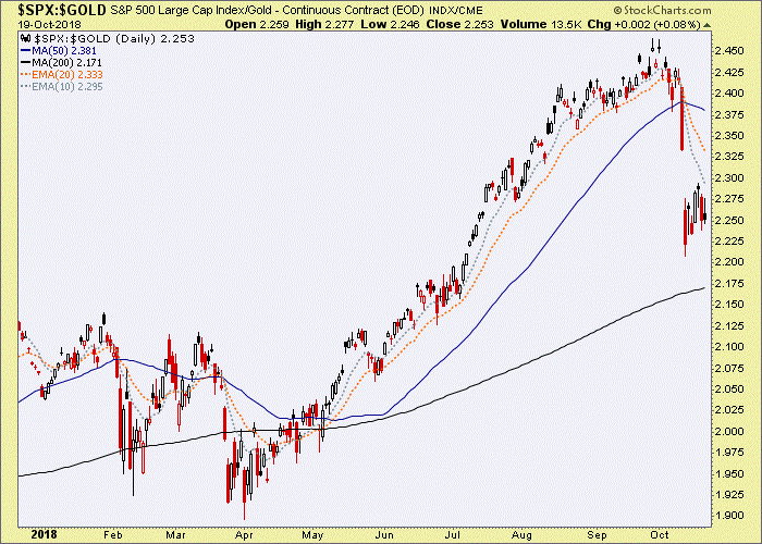
The big picture monthly chart shows the ratio smashing into and dropping from a resistance zone we laid out years ago and advises that even a normal drop to the 1.9 area could bring major pain in US stocks if they were to drop to the equivalent support level. So, why were Amigo #1’s eyes closed? That smash into resistance. We do hold open a final burst of greed and mania either before a big pullback or quite possibly, after one.
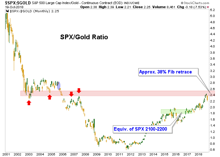
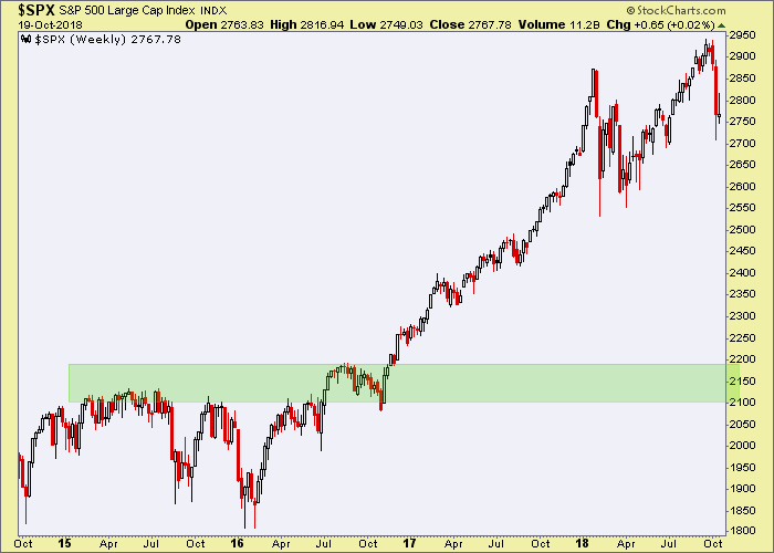
This weekly chart of SPX shows the equivalent zone. There is other daily and weekly chart TA involved when managing the nominal chart, but this one is stripped down simply to show the support correlation. A normal pullback by the ratio above = what many would find an abnormally harsh correction for the S&P 500. But really, it would just be the market taking back the Trump rally.
Amigo #2
The 30 year Treasury Bond yield has been very strong and targets about 3.5% by this daily chart’s pattern. It’s on its way.
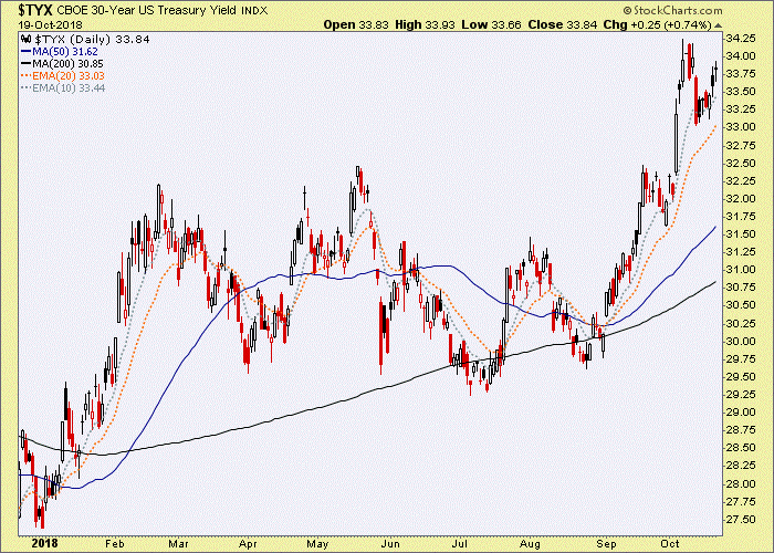
Okay, so interest rates are up. What’s so bad about that? Well, if you listen to conventional market analysis and/or one-way bulls who want you to be a one-way bull too, nothing. It is a sign of a strong economy. But this Continuum ™ of long-term yields declining from very high to very low has supported everything we think we know about the economy for decades. The red dashed ‘limiter’ is a backbone, if you will.
If we close October above the line a historic event will have taken place. To be safe from whipsawed analysis, let’s give it to the end of Q4. If we close 2018 in this condition something will have changed and for a credit-dependent economy and fiscal policy summoning ever more debt, that would not be good.

But if it were to fail it could be a hard down into another disinflationary or deflationary issue. Look what has followed each of the red arrow failures on the chart above. Either way, the US economy is screwed. So says me? No, so says the very extended and extreme flattening Yield Curve.
Amigo #3
The Yield Curve has pulled back a bit this week but retains the potential to resume steepening by the daily chart. The spike in February attended a market mini crash and the curve then resumed flattening as the expected (by NFTRH, anyway) market relief took hold all summer as the S&P 500 was due for a top test.
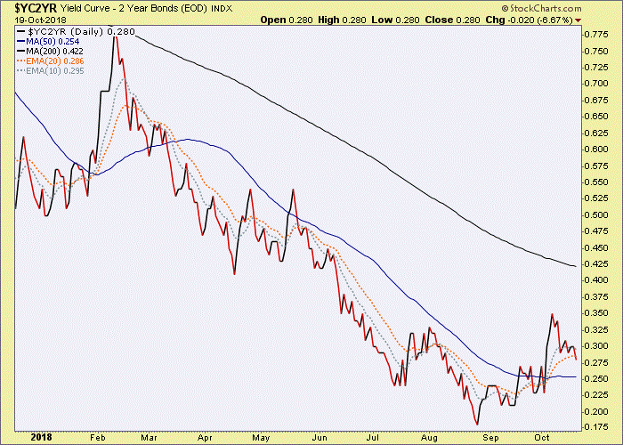
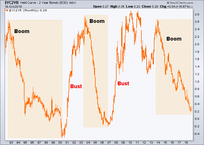
And so below we have the monthly chart showing the little bounce above as barely a blip in the ongoing economic and market boom. But changes will always start somewhere and that somewhere is on shorter-term charts.
The next steepening is going to bring pain, and long-term yields (Amigo #2) will inform about the nature of that pain. But this is obviously a mature situation right here and now. Don’t listen to the stuff about an inverted curve being a warning. Inversion means next to nothing. It is the direction of the curve that will matter and it can begin to steepen at any time with no need to invert.
Bottom Line
We have gotten a hard crack in the S&P 500 vs. Gold. It could be a routine pullback and buying opportunity as the risk ‘on’ party resumes. But we targeted this area years ago for a reason, and that reason was to identify high risk vs. potential reward. The cyclical, risk ‘on’ trade is at high risk.
That’s not even counting the implosion of our original positive cyclical indicator from early 2013, the Semi Equipment sector. This cycle early bird has been making a negative signal since just after we began noting its vulnerability nearly a year ago, per…
Semi Equipment Spending Record, 2018 Growth, But…

Long-term Treasury yields have broken the limiter of our 30yr bond yield Continuum ™ and need a monthly and/or yearly close in this state to break a decades old macro market condition. Success or failure of the yield to hold above the limiter will determine whether the coming macro stress will be inflationary or deflationary.
The Yield Curve, still comfortably flattening, will be the decider of when the stress – inflationary or deflationary – will be brought to the surface for the mainstream to see, feel and react to.
Meanwhile, it is our job as macro geeks to simply respect the progress of the Amigos (and other indicators that are in play) and the currently unpleasant risk vs. reward situation. Join NFTRH if you would like to successfully navigate this admittedly confusing, but ultimately rewarding* macro situation.
* I do not promise the rewards casino patrons promise. I promise the rewards of dedicated and right minded analysis that will always seek to be on the right side of the markets, with no bias involved.
NFTRH.com and Biiwii.com
********


