The Sun Rises On The Precious Metals Sector


We “went walkabout” over the past several years, largely deserting the Precious Metals sector for other greener pastures, because it has been performing so poorly, apart from a dramatic flurry during the 1st half of last year. However, the latest charts suggest that a major bull market is incubating in the sector and that it won’t be much longer before it starts. This being so it is time for us to return to take positions ahead of its commencement.
We will now proceed to look at the latest long-term charts for gold, silver, Precious Metals stocks and also the dollar to identify the signs of the impending major bullmarket in gold and silver.
On the 8-year chart for gold it is now becoming apparent that a large Head-and-Shoulders bottom is completing, that started to form way back in 2013, so this is a big base pattern that should lead to a major bull market, and given what is set to go down in the debt and derivatives markets it should easily exceed earlier highs. With the benefit of this long-term chart we can also put the sizeable run-up during the 1st half of last year into context – it was the advance to complete the “Head” of the Head-and-Shoulders bottom. This being so we can also readily understand why it then gave back about half of these gains – it dropped back to mark out the Right Shoulder of the pattern, and the good news is that with this late stage of the pattern now approaching completion, we can look forward to more serious gains soon. The new bull market will be inaugurated by the price rising above the 1st zone of resistance shown, although it will then have to contend with another major zone of resistance in the $1550 area. However, if the credit markets are coming apart at this time, this shouldn’t prove to be much of an obstacle.

The 8-year chart for silver is quite similar to that for gold, as one would expect, except that it is skewed downwards because silver tends to underperform gold during the late stages of sector bear markets and the early stages of bull markets, but it certainly looks like a good entry point for silver and silver related investments here, with it still only $4 off its lows.

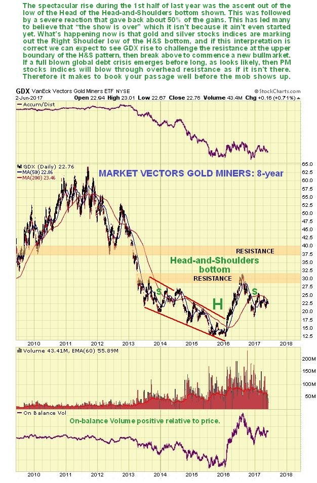
The 8-year chart for the PM stocks index proxy, GDX, also looks very similar to that for gold, except that it is somewhat upwardly skewed, which reflects the wild excitement of speculators in this sector once they sense a turn. There was a really big percentage gain during the 1st half of last year as it came off a really low level, but as with gold what was happening was that GDX was rising up to complete the Head of the Head-and-Shoulders bottom pattern. Once it had done so a reaction set in which saw stocks lose about 50% of their gains before stabilizing, with this reaction serving to mark out the Right Shoulder of the pattern. Now it looks ready to advance up to the neckline of the pattern to complete it and set the stage for the nascent bull market to come, and just this part of the advance will result in big gains in many trampled down stocks, some of which we will be looking at in a separate article.
Despite the down sloping moving averages, there is evidence of coiling on the 6-month GDX chart, and this combined with the suspected bull Flag of the past couple of weeks could lead to a surprise strong rally soon…
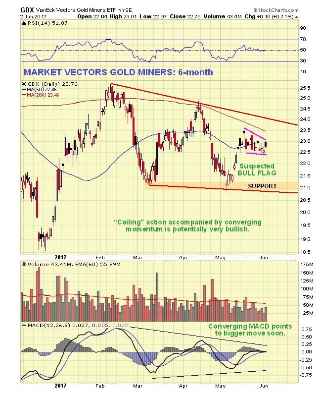
Many are expecting the sector to weaken again, citing the falling 200-day moving average on the indices, poor seasonals until the end of June, and an expectation that the dollar will rally from oversold. With respect to these factors it is worth pointing out firstly as regards the falling 200-day moving average, that the high values at the peak around last August will soon drop out, causing it to flatten, especially if we see a rally. Secondly, the poor seasonals are a background influence, and didn’t stop the sector from advancing during June of last year. Thirdly, as we will now see, the dollar looks like it is tipping into a severe decline, oversold or not.
On the 8-year chart for the dollar, we can see how the it broke out above resistance to new highs on euphoria over Donald Trump’s election victory, but it was subsequently unable to hold on to these gains, and has slumped back into the large trading range, a bearish development, particularly as the entire pattern from early 2015 now looks like a giant bearish Broadening Top. Having broken down back into the pattern and below its 200-day moving average, which is rolling over, it now looks like it will continue lower to the key support level at the bottom of the pattern, as a 1st stop, despite its already being significantly oversold. If it breaches this support there is some support lower down at the red trendline, which marks the lower boundary of the Broadening Top, but if it breaks below that things could quickly get a lot more serious.

On the 8-month chart for the dollar index we can see recent action in much more detail. This is an interesting chart for it shows that the dollar has been weakening beneath a parabolic trendline that is forcing it lower at an accelerating pace. There has been some talk about it forming a minor base here over the past week or two, and rallying from oversold, but it doesn’t look like that is going to happen. Instead the small tight pattern of the past week to 10 days looks like a bear Flag that will lead to another steep drop, and it started to fall quite hard again on Friday. Such a move can of course be expected to lead to gains in the Precious Metals sector.

Should we see the usual seasonal dip in the Precious Metals sector during this month and possibly into July, it won’t alter the Big Picture set out here and it should be seized upon as a buying opportunity, although what we are seeing in the dollar now suggests that the seasonal dip may not happen this year.
********

Clive P. Maund’s interest in markets started when, as an aimless youth searching for direction in his mid-20’s, he inherited some money. Unfortunately it was not enough to live a utopian lifestyle as a playboy or retire very young. Therefore on the advice of his brother, he bought a load of British Petroleum stock, which promptly went up 20% in the space of a few weeks. Clive sold them at the top…which really fired his imagination. The prospect of being able to buy securities and sell them later at a higher price, and make money for doing little or no work was most attractive – and so the quest began, especially as he had been further stoked up by watching from the sidelines with a mixture of fascination and envy as fortunes were made in the roaring gold and silver bull market of the late 70’s.
Clive furthered his education in Technical Analysis or charting by ordering various good books from the US and by applying what he learned at work on an everyday basis. He also obtained the UK Society of Technical Analysts’ Diploma.
The years following 2005 saw the boom phase of the Gold and Silver bull market, until they peaked in late 2011. While there is ongoing debate about whether that was the final high, it is not believed to be because of the continuing global debasement of fiat currency. The bear market since 2011 is viewed as being very similar to the 2-year reaction in the mid-70’s, which was preceded by a powerful advance and was followed by a gigantic parabolic price ramp. Moreover, Precious Metals should come back into their own when the various asset bubbles elsewhere burst, which looks set to happen anytime soon.
Visit Clive at his website: CliveMaund.com


