Trump Makes The US Stock Market Great Again
 share
share
 share
share
 share
share
 share
share
 share
share
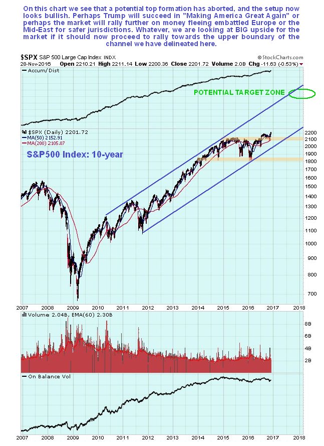
The broad US stock market actually looks better overall than it has done for several years, which may come as a surprise considering it has been in a bull market since as far back as early 2009. On the 10-year chart for the S&P500 index we can see that a potential top area developed from early 2015 through the middle of this year, which has now been aborted by recent gains that have seen it break clear above resistance at earlier highs. This index remains within the big parallel channel that started to form back in 2010 – 2011 and appears to have its sights set on a run to the upper boundary of the channel again, which will result in BIG gains from the current level. Whilst we can speculate about the fundamental reason or reasons for such a move – a Trump spending spree, hot money flowing out of embattled Europe and possibly the Mid-East and Japan into the US, and helicopter money, such pondering is largely a waste of time – the chart says the market is set to advance and quite a lot, and that’s what matters. This is a big change from several months back or even several weeks back, when it looked toppy and vulnerable.
The 4-year chart enables us to see how the market gradually rounded over beneath a giant Dome pattern, but then broke clear above it in the Spring of this year. Observe how, after this happened, and it advanced away from the Dome, it then dropped right back to test support at the Dome boundary before advancing again. This was a very deceptive move, given that it looked like it had topped out at the resistance at the highs, and thus was a buying opportunity that many missed out on. Like Russian dolls, a Dome pattern of lesser magnitude then formed during this year, which involved the market breaking out to new highs in the Summer before this Dome boundary forced it back down again, but Trump’s unexpected victory caused this Dome to abort too, and after its recent sharp advance the market is now “in the clear”, having risen well above the considerable zone of congestion approaching the 2015 highs.

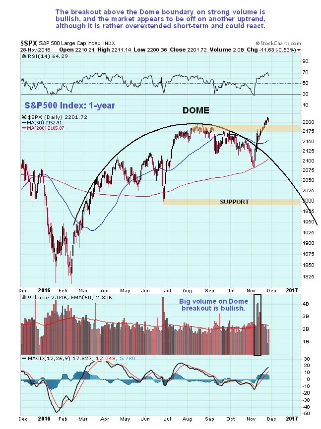
On the 1-year chart we can see how the market was being forced lower by the Dome pattern that developed this year, but suddenly broke out of it on the Trump victory on strong volume, which was a bullish development, and following the breakout it has continued to push higher, breaking its Summer highs at the top of the Dome as moving averages swing into bullish alignment.
Courtesy of Courtesy of http://www.clivemaund.com
On the 3-month chart we can see recent action in detail and how jitters ahead of the election caused the market to drop sharply, until a bullish “inverted hammer” right at the 200-day moving average heralded a reversal, which occurred on the Trump victory when a gap up into a giant white candle signaled the birth of a new uptrend. After rising almost vertically for a few days, a move which punctured the Dome boundary, the market settled into a more orderly, if still steep uptrend. Now it is getting overbought on various oscillators so it would not be surprising to see it break down from this uptrend to enter a period of consolidation or reaction, although any reaction is likely to be minor before the larger uptrend resumes.

Conclusion
The market appears to be starting out on another major upleg within the giant parallel uptrend channel shown on the 10-year chart above, on which you will also find a prospective target for this uptrend that is a long way above current levels. If this interpretation is correct, any short-term reaction will present a buying opportunity.
share
share
share
share
share

Clive P. Maund’s interest in markets started when, as an aimless youth searching for direction in his mid-20’s, he inherited some money. Unfortunately it was not enough to live a utopian lifestyle as a playboy or retire very young. Therefore on the advice of his brother, he bought a load of British Petroleum stock, which promptly went up 20% in the space of a few weeks. Clive sold them at the top…which really fired his imagination. The prospect of being able to buy securities and sell them later at a higher price, and make money for doing little or no work was most attractive – and so the quest began, especially as he had been further stoked up by watching from the sidelines with a mixture of fascination and envy as fortunes were made in the roaring gold and silver bull market of the late 70’s.
Clive furthered his education in Technical Analysis or charting by ordering various good books from the US and by applying what he learned at work on an everyday basis. He also obtained the UK Society of Technical Analysts’ Diploma.
The years following 2005 saw the boom phase of the Gold and Silver bull market, until they peaked in late 2011. While there is ongoing debate about whether that was the final high, it is not believed to be because of the continuing global debasement of fiat currency. The bear market since 2011 is viewed as being very similar to the 2-year reaction in the mid-70’s, which was preceded by a powerful advance and was followed by a gigantic parabolic price ramp. Moreover, Precious Metals should come back into their own when the various asset bubbles elsewhere burst, which looks set to happen anytime soon.
Visit Clive at his website: CliveMaund.com