Voodoo Gold Stocks Analysis – FNV, CG, NCM, SBM


FRANCO-NEVADA CORP (FNV)
Franco-Nevada Corporation (FNV) is the Big Daddy of the Canadian gold market. It is listed on the Toronto Stock Exchange (TSX) with a market capitalisation of around CAD$7.8b. Its main interests are its North American gold assets but it is a truly global company with investments in several other countries including Mexico and Australia. Price last traded at $60.25. To learn more about the company, please visit its website at www.franco-nevada.com
Let’s take a top down approach to the technicals beginning with the yearly chart.
FNV YEARLY CHART
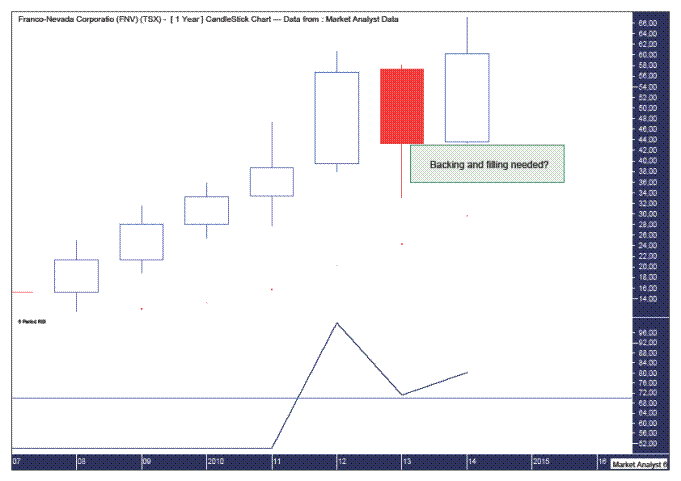
Despite the tough times gold has experienced in recent years, FNV has performed superbly. While a pullback was seen last year there was no real damage done to the uptrend.
The Parabolic Stop and Reverse (PSAR) indicator, which pertains to the dots, shows a nice bullish bias with the dots well below price. The dots currently stand at $29.70 and next year should be around $35.
The Relative Strength Indicator (RSI) demonstrates the nice bull trend in play. The correction last year saw this indicator still show a solid positive reading. Price is indeed in a strong yearly position.
However, to my eye, the chart looks in need of some backing and filling under this year’s low of $43.38. Just as the 2013 low did the job of backing and filling, I suspect 2015 will also see some backing and filling. But how low could price be expected to go next year? Let’s move on to the monthly chart to answer that question.
FNV MONTHLY CHART
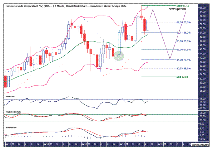
The 2012 high is showing a bearish divergence with this year’s high on the RSI, Stochastic and Moving Average Convergence Divergence (MACD) indicators. The RSI is also showing a little bearish divergence from the February and August highs this year. The Stochastic indicator shows a recent bearish crossover while the MACD indicator looks to be threatening one. So these lower indicators suggest some downside pressure on price is set to occur shortly.
The PSAR indicator now has a bearish bias after the dots to the downside were busted this month. As often happens, price then goes back up to test the resistance. The dots are currently at $66.75 so from the current price of $60.25 there is room for price to go up over the next couple of months before succumbing to the bearish pressures.
And where is price likely to come back down to?
I have added Fibonacci retracement levels of the move up from the 2013 low to recent high. I favour a deep retracement back to around the 76.4% level which stands at $41.09. Breaking below there would bring the rarely used 88.6% level at $36.93 in to play but I doubt price will go that low.
I have also added Bollinger Bands and perhaps we could expect price to head back to the lower band which looks to be headed to right around that 76.4% Fibonacci level.
Also, the green highlighted circle shows the area where price exploded higher. When correcting, price often pulls all the way back to these levels. Interestingly, this level is also right around the 76.4% Fibonacci level. Hmmm.
Once the coming pullback is over, as long as price doesn’t trade below the 2013 low, we could expect a continuation of the uptrend.
Let’s move on to the weekly chart.
FNV WEEKLY CHART

Price looks to be in the midst of a move up. The Bollinger Bands show price moving from the lower band to the middle band seemingly on its way to the upper band. Perhaps price can consolidate a little first around the middle band. Let’s see.
Price recently busted the PSAR dots to the upside so there is now a bullish bias there.
The RSI and Stochastic indicator are both looking bullish so the weeks ahead look positive for price.
To try and nail down how high price will rise in the short term, let’s take a look at the daily chart.
FNV DAILY CHART
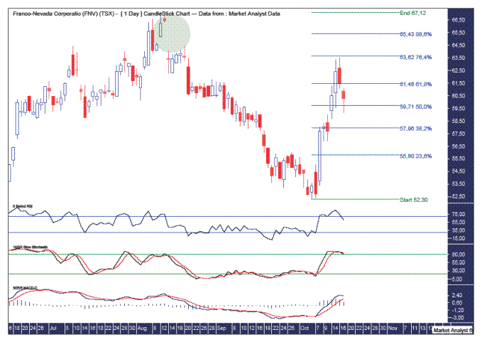
The RSI and Stochastic show a turn back down but I suspect this is just the start of some developing bearish divergences that will see price make new highs while these indicators make lower highs.
The MACD indicator also shows the averages diverging quite a lot and perhaps we will see a bearish crossover here in the not too distant future.
I have added Fibonacci retracement levels of the move down from high to recent low. Price has already found resistance at the 76.4% level. That could be it but I favour a touch higher. The 88.6% level is one candidate at $65.43.
The green highlighted circle shows a gap with the high side at $66.32. This gap should get filled but I suspect it won’t be on this move up. Perhaps that will happen when the next big uptrend gets underway.
Summing up, price looks positive in the short term while a big pullback is expected over the medium term before the big picture uptrend kicks back in.
Disclosure – I have no financial interest in FNV.
CENTERRA GOLD INC (CG)
Centerra Gold Inc. (CG) is listed on the Toronto Stock Exchange (TSX) with a market capitalisation of around CAD$1.1b. It is the largest Western-based gold producer in Central Asia with major investments in Turkey and Mongolia. Price last traded at $5.45. To learn more about the company, please visit its website at www.centerragold.com
Let’s begin our investigation of the technicals with the big picture yearly chart.
CG YEARLY CHART
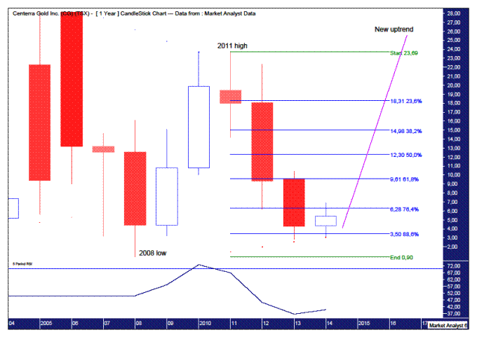
The chart shows price has been struggling however there are interesting signs that have captured my attention. Let’s run through them.
I have added the Parabolic Stop and Reverse (PSAR) indicator which shows the dots to the upside being busted back in 2011. As often happens, price has come back down to test the support from the dots to the downside. So far this support has held. The dots this year stand at $3.09 while the yearly low was $3.16. So this PSAR support has held the the low for the last couple of years. Nice.
I have added Fibonacci retracement levels of the move up from 2008 low to 2011 high. We can see the 76.4% level held the 2012 low but the downtrend was not done and price then moved even lower and looks to have found support around the 88.6% level.
Price looks set to show a bullish yearly candle and if recent support levels can hold then perhaps price can embark on a new uptrend in the years ahead. Let’s see.
The Relative Strength Indicator (RSI) looks to be turning the corner and new yearly highs next year will confirm this.
CG MONTHLY CHART
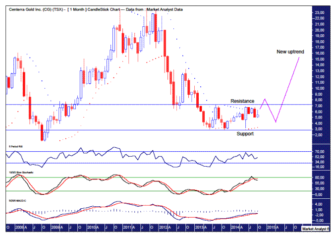
Price is showing some clearly defined support and resistance levels. From the yearly analysis, we know the support is critical so breaking the resistance level is the next course of action needed for the bulls.
The PSAR indicator still has a bullish bias after price busted the dots to the upside back in June this year. Price looks to have been consolidating that bullish June candle but some upside follow through looks to be in order shortly that should bust out above the resistance level. This resistance stems from the August 2013 high at $7.20.
The RSI, Stochastic and Moving Average Convergence Divergence (MACD) indicators are appear to be generally trending up although they appear to be near the end of their moves. The RSI may jump up into overbought territory before turning back down. The Stochastic is already showing a bearish crossover while the MACD looks to be threatening one.
I favour price cracking resistance before turning back down and these lower indicators seem to support this view.
Let’s move on to the weekly chart to try and nail down further some likely high and low points.
CG WEEKLY CHART

I have drawn a black down-trending line across the August 2013 and April 2014 tops. We can see price broke above this line and then when correcting seems to have found support at this line. This can be seen in the green highlighted circle. Perhaps this will be the springboard to a higher high.
I have also added a Fibonacci Fan and the recent low shown in the green highlighted circle was also around support given from the 61.8% fan angle.
The Stochastic indicator shows a recent bullish crossover while the MACD indicator looks to be threatening one but retains a bearish bias. So perhaps we could expect a move higher shortly.
As for where a higher high may form, the Fibonacci Fan may be helpful there. The high may find resistance at either the 23.6% or 38.2% fan angles. Time will tell.
I have drawn a black up-trending line along the November 2013 and June 2014 lows. This should act as support for any move back down in future.
One possible scenario is price eventually pulls back all the way to where the uptrending and down-trending lines meet. This is shown in the yellow highlighted circle. This is around the $3.85 level in May 2015. Keep in mind the month of May has often been a low level for gold in the past so this is certainly a scenario to watch for.
Once a higher low is in place we could expect price to surge higher in a new uptrend.
Let’s wrap it up by taking a quick look at the daily chart.
CG DAILY CHART
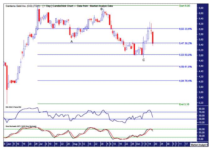
The recent move up from low looks impulsive compared to the move down since the high which looks more corrective in nature. That leads me to believe there is higher to go.
The move down looks like a simple ABC Elliott Wave correction.
This move down also found support at the 50% Fibonacci retracement level.
The C point low was also accompanied by bullish divergences on the RSI and Stochastic indicator.
Summing up, short term looks positive for price while a more substantial pullback should occur over the medium term. As long as that pullback does no major damage to the big picture then it should be up, up and away after that.
Disclosure – I have no financial interest in CG.
NEWCREST MINING LTD (NCM)
Newcrest Mining Ltd (NCM) is one of the head honchos of the Aussie gold sector and is listed on the Australian Stock Exchange (ASX) with a market capitalisation of around AUD$6.7b. The company generally focuses on low cost, long life mines in Australia, Asia and the Pacific region. Price last traded at $10. To learn more about the company, please visit its website at www.newcrest.com.au
Let’s investigate the technicals beginning with the yearly chart.
NCM YEARLY CHART
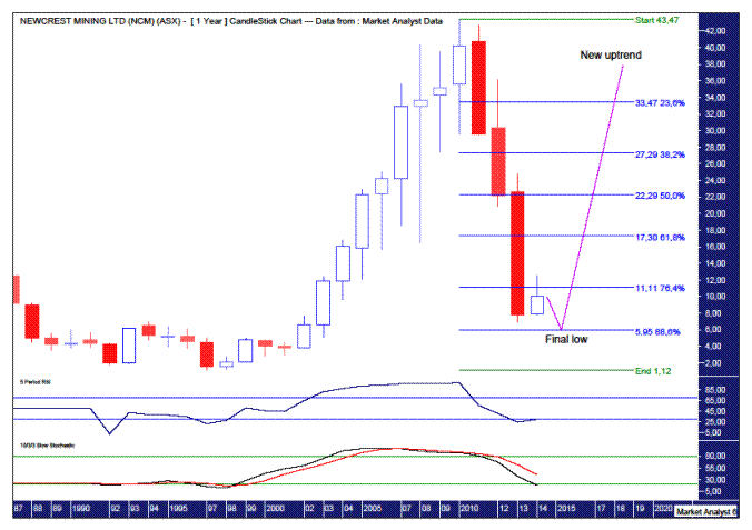
Price has fallen off a cliff since it’s high in 2010. Price came all the way back to $9.96 which was just above its 1994 high level of $6.88. Old highs often act as support in the future and that certainly appears to be the case here.
In fact, price often pushes a bit under these support levels giving them a real test. That has happened here yet but I suspect it will shortly.
I have added Fibonacci retracement levels of the whole leg up. Price has brushed aside all levels it has encountered. The last level to potentially provide support is the 88.6% level which stands at $5.95. That is where I’m targeting the final low to occur.
The Relative Strength Indicator (RSI) shows a slight turn back up which may well be just the beginning. Personally, I favour price making new lows in 2015 before reversing back higher and closing out the year in the black. That would see the RSI continue this trend up.
The Stochastic indicator looks to have diverged to its extremes so a turn would not look out of place here either.
NCM MONTHLY CHART
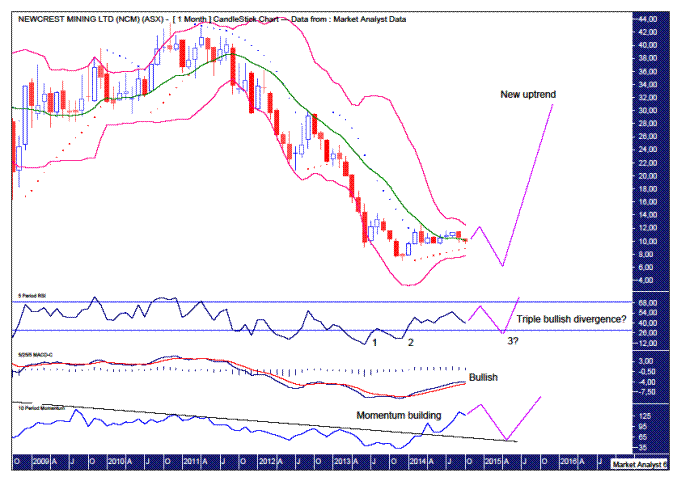
The Bollinger Bands show price moving away from the lower band and milling around the middle band. This middle band looks to be providing support and I favour price making the leap to the upper band before trading back down.
The Parabolic Stop and Reverse (PSAR) indicator shows the dots to the upside being busted back near the start of the year. Despite this bullish bias, price just hasn’t gone on with the job. I doubt it now has the ticker to break to new rally highs above the March 2014 high of $12.50. I suspect it can get up close and personal but eventually be rejected.
The RSI shows a bullish divergence on the last low. However, I suspect after a rally now, price trades back down to make a new low which would be accompanied by yet another higher low in the RSI – a triple bullish divergence. Let’s see.
Also, a common bottoming pattern is three consecutive marginally lower lows. I call this a “three strikes and you’re out” low as the third low is generally the last. There are currently two lows in place so all that is required now is the third marginally lower low.
The Moving Average Convergence Divergence (MACD) indicator is currently bullish suggesting further upside is in store.
An interesting development has occurred in the Momentum indicator. The downtrend in momentum was finally busted by the move up from the most recent low. I have drawn a downtrend line which demonstrates this. Momentum is now building and I suspect one final low in price will see momentum trade back to this downtrend line and find support there.
Once the next low is in place I expect a big move higher as part of the next big uptrend.
NCM WEEKLY CHART
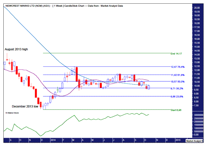
I have added Fibonacci retracement levels of the move down from the August 2013 high to December 2013 low. Price turned back down right at the 76.4% level at $12.47. The actual price high was $12.50 and I suspect that is it. I favour price now going up to challenge this level but failing in its attempt to bust higher.
I have added moving averages with periods of 14 (purple) and 50 (blue). This shows the averages finally meeting and crossing over. There is some toing and froing going on and I expect this to last for quite a while as price consolidates before any uptrend can commence. The 100 period moving average is yet to catch up and that will also be needed before any serious uptrend can occur. So there is still quite a while to go here. This might get a tad frustrating for the bulls.
Something of interest that I noted was the On Balance Volume (OBV) indicator. While price has consolidated and even gone down slightly since the March 2014 high, the uptrend in the OBV has remained largely intact. This is bullish.
Let’s finish off the analysis by zooming in for a close up with the daily chart.
NCM DAILY CHART
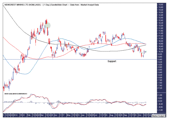
I have added the moving averages with periods of 50 (blue), 100 (red) and 200 (black). They are now criss-crossing each other which is consistent with periods of consolidation.
The MACD indicator shows a bullish bias with the blue line above the red line so we should expect higher prices over the short term.
I have drawn a horizontal line which denotes support from the March 2014 low of $9.40. Short term upside can be expected as long as this support is not clearly broken.
How high can price be expected to rally in the short term?
I have drawn a green highlighted circle which shows the existence of a gap. The upside of this gap is around $12.14 and I think price can give it a good shake at closing it out.
Summing up, price looks bullish over the short term while a pullback to new lows can be expected over the medium term before the next leg higher in the big structural bull market commences.
Disclosure – I have no financial interest in NCM.
ST BARBARA LTD (SBM)
St Barbara Ltd (SBM) is a gold producer listed on the Australian Stock Exchange (ASX) with a market capitalisation of just over AUD$60m. Its main focus is its Leonora operations in Western Australia consisting of two underground mines while it also has a major investment in Papua New Guinea. Interestingly, a director recently purchased around $150,000 worth of shares on market. Price last traded at 14.5c. To learn more about the company, please visit its website at www.stbarbara.com.au
Let’s begin by looking at the big picture – the yearly chart.
SBM YEARLY CHART
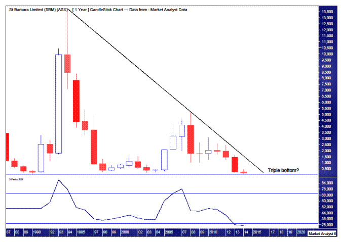
We can see price is now back down to long term support with the potential to make a triple bottom. If support does indeed hold then we could expect a big move up that breaks the downtrend line I have drawn across the major tops.
When I do this long term analysis on stocks, the company may have changed completely the type of business it is in. That is of no concern to me as I am more interested in the major support and resistance levels. The question is will whatever the new company is doing being enough to bust any long term support or resistance levels.
The Relative Strength Indicator (RSI) is at oversold levels but that’s not to say it couldn’t become more oversold. It looks like it is do or die time for the company.
The yearly candle shows price opened the year at 26.5c and I’d like to see price close out the year above that level even if only marginally. That would set up a positive doji candle, a common bottom formation, and provide the springboard for higher prices in the following years.
SBM MONTHLY CHART
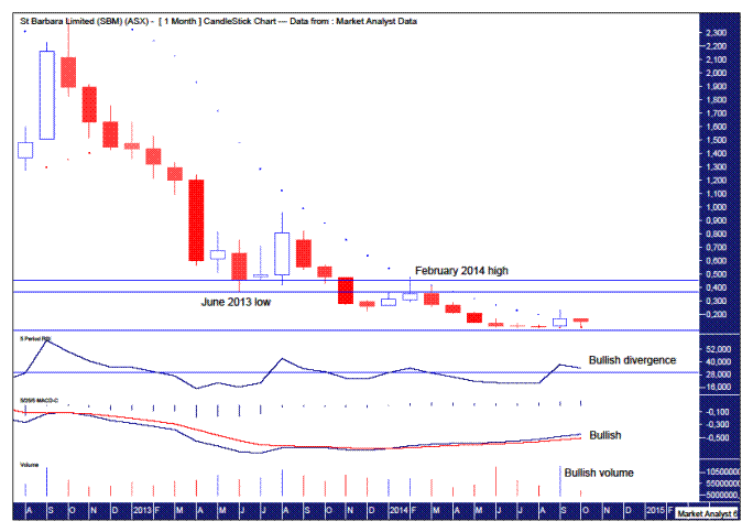
The Parabolic Stop and Reverse (PSAR) indicator shows price busting the dots to the upside a couple of months ago so this indicator now has a bullish bias. The dots now stand just below 11c so that should be solid support.
Price looks to have been basing for a few months and this move higher came on big volume. Nice.
Both the RSI and Moving Average Convergence Divergence (MACD) indicator show bullish divergences while the latter also looks bullish with the blue line above the red line.
Some major resistance levels come from the June 2013 low at 36.5c and February 2014 high at 45.5c. Taking out these levels would be very bullish. While I think those level will eventually be taken out, I suspect some more basing is in order under these levels over the next 3-6 months. Let’s see.
SBM WEEKLY CHART
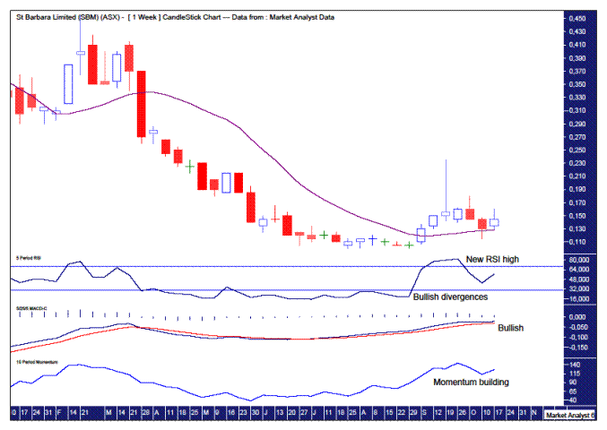
The RSI shows the basing low of 10c to be accompanied by bullish divergences in this indicator. It subsequently ran up into overbought territory creating a new RSI high. Perhaps price can now make a new high above the recent 23.5c high and be accompanied by a lower high in the RSI – a little bearish divergence. That could then be expected to lead to a move back down in price in line with the basing pattern.
I have added a 14 period moving average denoted by the purple line. It has only recently caught up with price and turned up and now looks to be acting as a type of support for price.
SBM DAILY CHART

We can see the recent move higher busted the previous swing high level which augurs well for the future.
This move higher also created a new high reading in the RSI and perhaps new price highs will be accompanied by lower highs in the RSI. Time will tell.
The Bollinger Bands show price trading back to the lower band after this spike high. A bullish sign is price bounced off the lower band pretty quickly. It is now around the middle band with the upper band seemingly in is sights again.
The move down from the spike high was a near perfect hit on the 88.6% Fibonacci retracement level. I wouldn’t like to see price trade lower than there now.
The MACD indicator is back to a bullish bias with the blue line above the red line so things are looking pretty good here.
Summing up, price looks to have made the initial steps to break its downtrend. Some more upside in the short term looks likely as part of the medium term basing pattern. Then, as long as no major support is broken, price can make a concerted effort at surging to much higher prices over the longer term.
********
Disclosure – I have no financial interest in SBM.
© 2014 Copyright The Voodoo Analyst - All Rights Reserved
The Voodoo Analyst is published by Galtrade Publishing Pty Ltd
Disclaimer: The above is a matter of opinion provided for general information purposes only and is not intended as investment advice. Information and analysis above are derived from sources and utilising methods believed to be reliable, but we cannot accept responsibility for any losses you may incur as a result of this analysis. Individuals should consult with their personal financial advisors. Put simply, it is JUST MY OPINION.