Waiting For The Next Big Thing


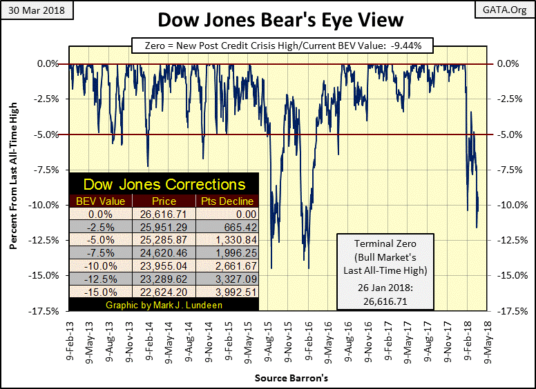
The Dow Jones Index was up for the week with its BEV plot below closing above its -10% line. Nothing wrong with that as it enters its third month correcting from its last all-time high of 26,616 of January 26th. As double digit corrections go, this one has been a fairly wimpy one – so far. The Dow Jones’ last correction occurred from May 2015 to July 2016 (fourteen months); twice the Dow Jones dipped below its -12.5% line in the BEV chart below, or 16,000 points on a point chart in August 2015 and again in February 2016. Since then the Dow Jones has put two years and 10,000 points behind it.
Assuming last Friday’s BEV value of only -11.58% will be the ultimate low of this correction seems a bit unreasonable. Considering the gains the Dow Jones has made since February 2016, expecting a correction lasting only a few months may be optimistic. So, if this were a normal bull market, I’d still expect deeper declines in the Dow Jones in the months to come before it once again resumes making new all-time highs.
But this isn’t a normal bull market, and hasn’t been since Alan Greenspan became Chairman of the Federal Reserve in August 1987. Below is a chart plotting the Fed Funds Rate and the US T- Long Bond Yield from 1954. There’s a lot of history in this chart, but I’ve broken it into three eras:
-
“Policy Makers” Fight Inflation (1954-1982). Monetary inflation flowing into consumer prices.
-
“Policy Makers” Fight Deflation (1983-2007). Monetary inflation flowing into financial asset valuations.
-
“Policy Makers” Fight for Their Lives (2008-2018). Risks of a catastrophic deflationary depression dominates “monetary policy.”
During the fighting inflation phase below, long bond yields (Red Plot), and Fed Funds Rate (Blue Plot) increased from low single digits to well over 10%. In July 1981, Fed Funds peaked at 22%!
Bond yields were rising in response to “monetary policy” inflating consumer prices. The Fed Funds Rate was rising because the FOMC routinely increased its Fed Funds Rate above bond yields, hoping to check rising consumer prices by inducing the economy into a recession. And the higher bond yields rose, the higher the FOMC had to raise its Fed Funds Rate to invert the yield curve.
It wasn’t working. Consumer prices continued absorbing excess dollar production from the Federal Reserve like a sponge. By the late 1970s CPI inflation had increased to double digit percentages as gold and silver became the investment of choice by many people.
Here’s a small sample of articles published by Barron’s during this period. These articles covered topics the financial media hadn’t written about for decades, but frequently did when bond yields increased from 1950 to 1981.

Summarizing 1954 to 1982, the Federal Reserve’s inflationary monetary policy pushed the bond market into a twenty-eight year bear market. From 1966 to 1982 the stock market also underperformed increases in consumer prices.
The Fed’s reaction to rising consumer prices (rising bond yields) was to invert the yield curve; increase their Fed Funds Rate above the yield for US long term T-bond, inducing the economy into a recession. The thing that stands out in the chart below is how frequently the Fed inverted the yield curve, and how far above bond yields they were willing to push their Fed Funds Rate to check consumer price inflation.
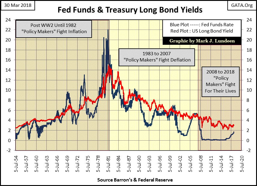
But inverting the yield curve didn’t have the desired effect of containing rising consumer prices. Consumer prices were rising because the Federal Reserve was issuing paper dollars into circulation in excess of what the Bretton Woods $35 gold peg allowed. However from January 1979 to October 1982, then Fed Chairman Paul Volcker increased his Fed Funds rate far above long bond yields, and held them there for over three years. Inflationary dollar flows streaming from the Federal Reserve stopped flowing into consumer prices, and began flowing into financial asset valuations.
The net effect of this shift in monetary inflation’s destination from consumer prices to financial assets was that consumer price inflation ceased being a concern to the public. After 1982 the public became enamored with investing in “bull markets” on Wall Street.
Which brings us to the second phase of the chart above; where the “policy makers” focus became one of fighting deflation in financial asset valuations. What changed? Before 1983 inverting the yield curve (increasing Fed Funds above bond yields) checked inflationary increases in consumer prices, or so the “policy makers” hoped. But this was something the Federal Reserve wanted to do. So previous to 1981, they weren’t afraid to increase their Fed Funds Rate far above bond yields.
However, after 1982 when monetary inflation began flowing into financial asset valuations, inverting the yield curve resulted in bear markets on Wall Street. So, fighting price inflation in financial assets resulted in making voters poor. This was something the “policy makers” were loathed to do, as demonstrated by the tiny increases of the Fed Funds Rate above bond yields since 1982.
The first post 1983 yield curve inversion (chart above) deflated the bubble in the leverage-buyout scam and in the junk bond market (late 1980s to early 1990s). The second yield curve inversion (chart below) deflated the high-tech stock bubble of the 1990s, and the third deflated the sub-prime mortgage bubble. Look at the 2005-09 period below. This tiny inversion in the yield curve resulted in the second deepest Dow Jones bear market since 1885.

Now we come to our present era, where the “policy makers” are fighting for their lives. Let’s call it what it is, an act of desperation to reflate the economy and financial markets after the sub-prime mortgage bubble began deflating, while not destroying the global financial system.
The “policy makes” lowered their Fed Funds Rate to an effective Zero % from November 2008 to December 2015 (7 years). But that wasn’t enough, as in January 2011 they also implemented what was then called “Operation Twist”, where the FOMC began using their inflationary dollars buying long term bonds for the purpose of lowering long term bond yields to “stimulate growth” in the economy.
In the chart above, it’s obvious how for the third time in the 21st century the FOMC is now increasing its Fed Funds Rate toward the long T-bond yield. When the “policy makers” once again invert the yield curve, the results won’t be any different from when this happened in 2000 and again in 2007; a big bear market in whatever financial assets whose valuations they have inflated. Today it’s just about everything except for gold, silver and the precious metals miners.
It may be years before this happens. But as the current inflationary bubble in the financial markets is historic, there is no reason Mr Bear wouldn’t begin deflating the financial markets on his schedule, not the FOMC’s. So, this is why I’m reluctant being strongly bullish or bearish for the stock market at the present time as Mr Bear doesn’t have to wait for an inversion in the yield curve before he begins his work on Wall Street. However, for gold, silver and the companies who mine them, I’m really bullish for them long term for the same reasons I’m bearish on everything else.
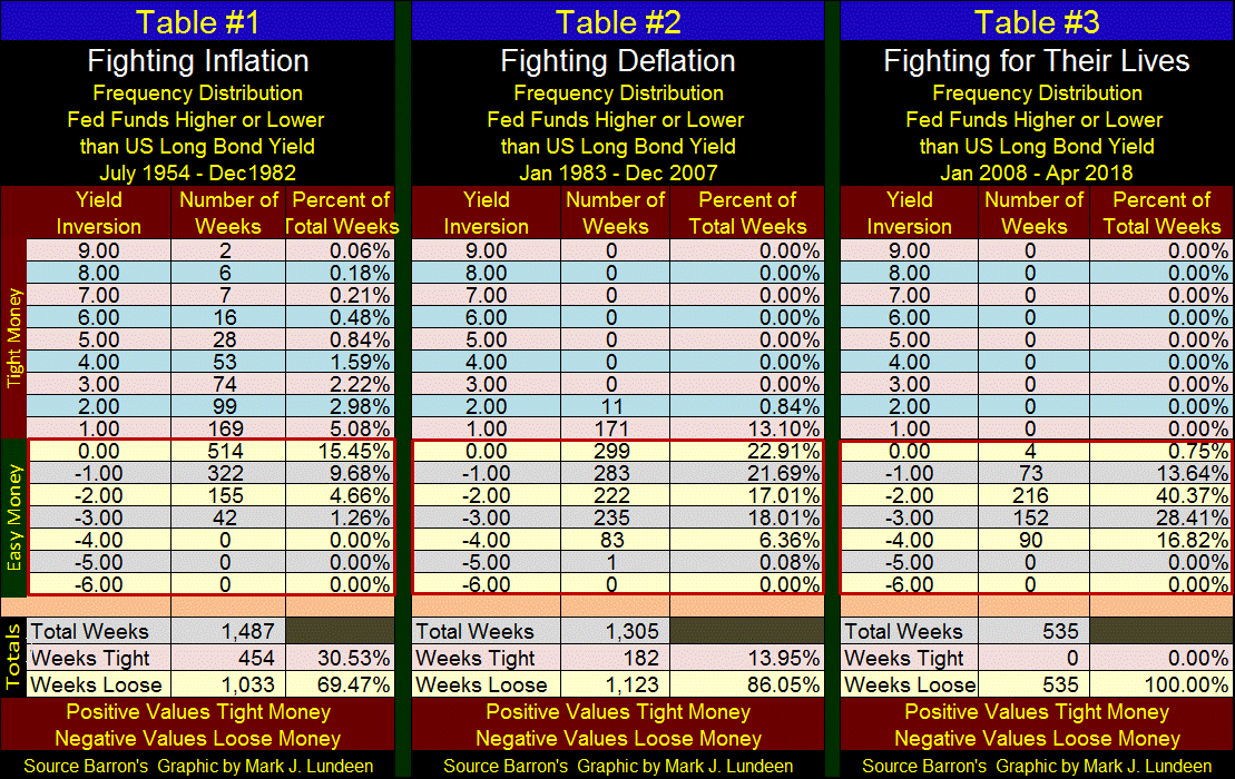
The frequency tables below are for the three eras shown in the charts above. They record how many percentage points the Fed Funds Rate was above, or below the long T-bond yield in terms of weeks. When the Federal Reserve makes “money tight”, the Fed Funds Rate is higher than bond yields, resulting in deflation in valuations somewhere in the economy, and the higher the value, the tighter money has become. When money is “loose”, the Fed Fund Rate is below bond yields, recorded by negative values in the tables below, and the lower Fed Funds is below bond yields, the looser monetary policy is.
The most informative section of these tables is seen in the total section listing the percentages of weeks tight and loose. From 1954 to 1982, the FOMC had the yield curve inverted for 30% of the weeks. From 1983 to 2007 the yield curve was inverted for only 14% of the weeks. And this point misses the degree to which monetary policy had tighten or loosen money, easily seen in a quick study of the yield inversions of the three tables.
But from January 2008 to this day, the FOMC hasn’t inverted the yield curve for even a single week for fear of the deflationary consequences for stocks and bonds should they do so. As I see it, the financial markets today are sitting on a powder keg that could blow up at any time. But with the Dow Jones within 10% of its last all-time high, it could still go on to new all-time highs in the weeks and months to come.
Let’s move on to the Dow Jones (Blue Plot) and its 200 count (Red Plot) below. As expected, the Dow Jones began having problems when it began producing daily moves in excess of 2% from their previous day’s closing prices.

The history of this data series proves there’s more money to be lost than made with exposure to the stock market when the above red 200 count plot is rising. Currently the count is only a five, but the correction is only two months old.
There’s nothing wrong exiting the stock market and taking all of your money with you; and this seems like one of those times. Should these trends continue, a day is coming when the Dow Jones will see a bottom far from where it is today, as its 200 count rises up towards and possibly exceeding its highs of 2009. This is when these data series will develop an excellent buy signal, when the Dow Jones’ 200 count begins declining from its bear market high.
Look at this chart, and how using it provided almost perfectly timed, and profitable entry and exit points for the past three decades. The same was true for the Roaring 1920s and depressing 1930s! With a superb track record that goes back long before any of us were even a twinkle in our mothers eyes, seeing the Dow Jones 200 count in early April 2018 rise up from zero to a five in the past two months motivates me to get out, and stay out of stocks and bonds.
This will be my position until the 200 count begins declining as it did in 2003 and again in 2009. Note: should the Dow Jones rise up and once again make several new all-time highs, this would not negate the sell signal. But then seeing this sell signal doesn’t tell us how long we’ll have to wait until Mr Bear begins feeding on inflated market valuations either. Remember, 2018 is another election year in the United States, and the powers that be don’t like rocking the boat in election years.
Here’s the Dow Jones Total Market Group’s (DJTMG) top 20. It closed the week at 50 of 74 groups within 20% of their last all-time high. I think we are still in the early phases of a massive bear market, a time when investors and “market experts” still expect more from a dying or dead bull market.
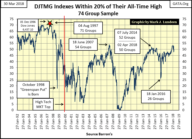
Is there anything that could change my mind on that? There sure is; the bulls in the FOMC could decide to “inject” some “liquidity” into the financial system and get the groups seen below moving back towards the left, where they were in January. But after nine weeks of lower valuations in the DJTMG, they haven’t done that yet.

Bond yields (Red Plot below) are going down, but long-term factors will continue driving them higher in the months and years to come. The bond market has been in a bull market since October 1981 when the US Treasury actually sold a long bond with a 15% coupon. In August 2016 yields bottomed (bond bull market ended) with a 30 year T-bond issued with a 2.25% coupon. As seen below, yields have been rising, and prices falling ever since.
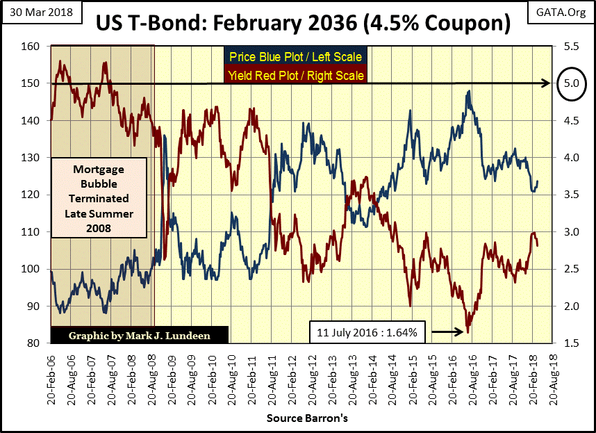
The thing to keep in mind with these bond yields is that Wall Street had bundled a few hundred trillion dollars of interest-rate derivatives in the debt market. With yields and rates at their current levels these derivatives are worthless, and so not a problem. I don’t know where the trip wire is in the bond market, but I expect that somewhere between 3% and 5% in this bond, Wall Street may wake up to the fact that its big banks are bankrupted by hundreds of trillions in counterparty obligations they can’t honor.
That’s exactly what happened during the 2007-09 credit crisis. The US Government and Federal Reserve bailed out the big banks then, but could they do it again? I think not.
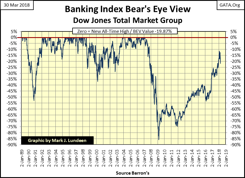
That also seems to be the opinion of the market. Looking at the DJTMG’s Banking Index’s BEV chart below, the banks are one of the few indexes in the DJTMG that in April 2018 have failed to return, and then exceed its pre-credit crisis valuations. These banks were ground zero during the sub-prime mortgage crisis, declining over 85% from their 2007 highs. During the credit crisis the US government and Federal Reserve sent trillions of dollars in bailouts their way, and yet after nine years they’ve yet to break above their highs of 2007? That can’t be good.
What would their losses have been if they weren’t bailed out? I suspect we’d have seen this BEV plot hit the dreaded -100% line – the total wipeout line.
Gold’s step sum chart below looks good.
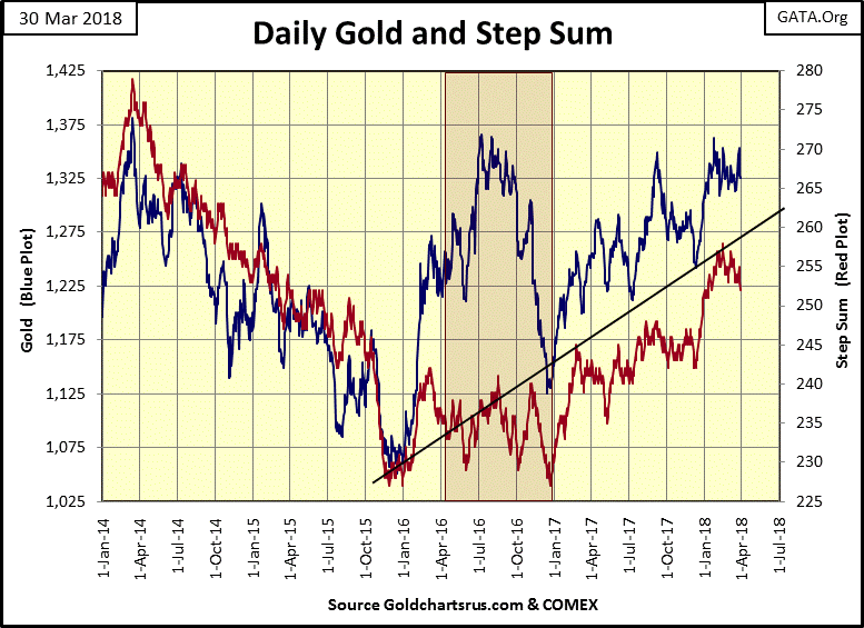
A lot better than the step sum chart for the Dow Jones below. I don’t know what the future holds, but looking at this chart it seems the Dow Jones is more likely to break below 23,000 than break above 25,000. And as goes the Dow Jones, so goes the broad stock market. But like me, my readers will just have to wait to see what the markets have to offer us in the weeks to come.

In gold and the Dow Jones’ step sum tables below, they have both seen more declining than advancing days since February 23rd. But gold has weathered the storm better than the Dow Jones. In the past twenty-five trading days gold is down by only 0.25%, while the Dow Jones has declined by 4.77%.
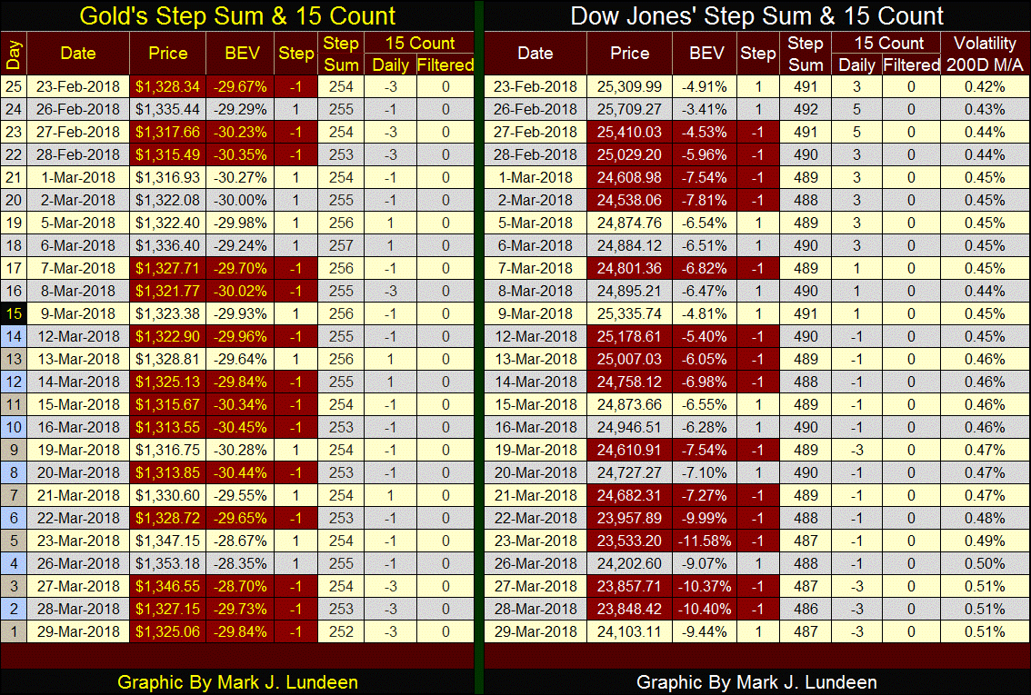
I’m expecting this strength, gold’s refusal to decline in valuation in a market dominated by declining days to continue. Sometime in the future we’ll see gold’s 15 count become positive, indicating the gold market is seeing more advancing than declining days. It will be interesting seeing how the price of gold responds to a 15 count of say +4, where it has seen only four declining days during the counts’ 15 days.
The Dow Jones’ bull market is an aging bull. If the bulls (the FOMC and Wall Street) can’t get its 15 count back into the positive soon, we’ll see deeper declines in the stock market.
This is Easter weekend, a time for celebrating the resurrection of Jesus from the grave.
I used to be a skeptic, but I’m not anymore. My conversion is a bit different from most people who don’t believe Christian dogma. And dogma isn’t a bad word; it just means necessary beliefs one has to accept. If one is a Christian, one has to believe in Christ’s resurrection. If one wants to be a believer in science and evolution, one has to believe that all we see about us is a manifestation of the actions of cosmic chaos on the elements listed in the periodic table. In either case, we’ve decided to believe in something that can’t be proven using the scientific method.
Once I believed in “science”, as it seemed that scientists were seekers of truth. But with age comes wisdom, at least for me it did when it became apparent that the only truth science sought today came in recognition of its absolute dependency on government funding.
Should the truth discovered in government-funded research question the dominant-secular dogma of academia, the gatekeepers guarding the funds from government will shut that science down. Global Warning research is a perfect example of what I’m talking about; researchers who can’t find “global warming” won’t find any government money in their bank accounts either. This is a scientific truth of the 21st century, and there are many other examples of this too.
And there is so much basic research in astrophysics, quantum mechanics and yes even in paleontology that while not proving the existence of the God of Abraham, Isaac and Joseph, lends credence to the possibility that all we see around us may best be explained by accepting an all loving Creator in action. Intelligence design as it is called.
So why should that lead me to becoming a Christian? Why not a Buddhist or Hindu? Well, my roots are from Western Christian civilization, so the truth is I’ve studied the Bible much more than say the Koran, and the Bible is really an odd book that I find fascinating.
Who in antiquity funded the authorship of historical chronicles? The nobility and priesthoods did. And for the money they spend to have their deeds recorded for prosperity, the chroniclers had better make them look good. But the Bible isn’t like that, its 1,500 years of the nobility and priesthood behaving badly, earning them God’s condemnation.
Another aspect about the Bible is its claim that it can be proven true by prophecy, that God know the ends of all things from their beginnings. In Psalm 22, written by King David around 1000 BC, who is that man and what are they doing to him? During this Easter season, Isaiah chapters 50 & 53 are also interesting reading.
All this is ancient history; but the Bible speaks much about our time too. Revelation 9:6 has a very interesting comment on something that could not have been considered possible until our current time: “During those days people will seek death but will not find it; they will long to die but death will elude them.”
How is this possible? Look at the following half hour video to see how.
https://www.youtube.com/watch?v=5fIhxPobaJ8
I’m not going to write a book on this, as I understand people read me to follow my comments on the markets. But I am a Christian, and I would like to spread the good news about Jesus. So I’m going to link to Chuck Missler YouTube video on the Bible. Mr. Missler is a very interesting person. He holds a master’s degree in electrical engineering and information science. He was also the CEO of the company that won the contract for designing the aviation package for the B-2 stealth bomber. Chuck is a lot smarter than I am, and if I sparked an interest in you to learn more about the God of Abraham, Isaac and Jacob, go to the link below. It’s good, you’ll like it.
Mark J. Lundeen


