Bond, Stock & Gold Market Update


Sorry for not writing for most of the month of April, but I've been under the weather for the past few weeks. Now that I'm feeling better I should be back writing weekly articles.
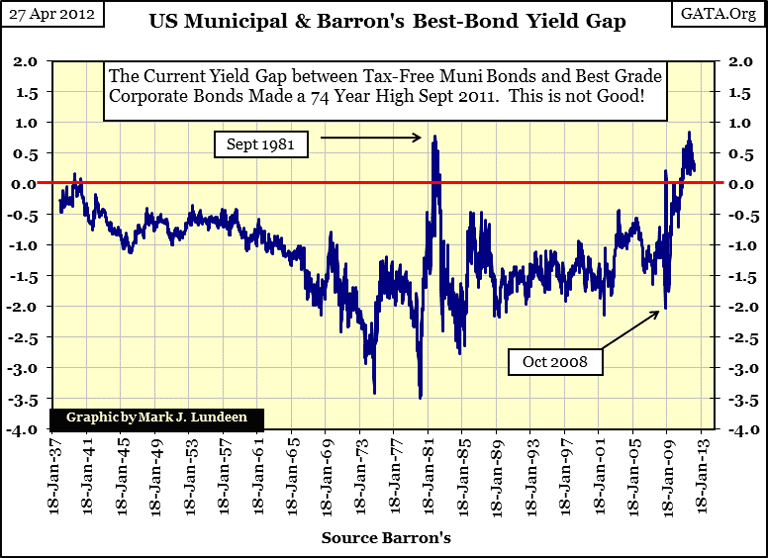
Since I've neglected the debt market for many months, this is as good a time as any to take a historical look at the bond market. Below is the credit spread between the Bond Buyer Municipal Bond Index (40 bond index) and Barron's Best Grade Bonds yields. Both series record bond yields since 1938, but not all bond yields are equal. Barron's Best Grade Bonds are US corporate bonds, and so pay taxable income (state and federal) to US citizens, while income from Municipal bonds is free from US Federal taxes. They are also free from state income tax if the bond buyer is a resident of the state issuing the muni-bond. This is why the mutual funds provide state-specific muni-bond funds, so people from Illinois can avoid paying state income taxes on income received from California tax-free muni bonds.
Why does the Federal government allow this HUGE-TAX LOOPHOLE for local and state governments? Simply because the only way federal legislators can get reelected is with the cooperation from local-party officials, the samepeople who typically run local government in the US. No tax-free loophole for local government bonds, no "get-out-the-vote" support for Federal elected office holders during election years! Democratic Party officials may support terminating tax loopholes they themselves once placed in the tax code a few years back, because raising the income tax on income from taxable corporate bonds, provides a powerful incentive for "greedy" millionaires to sell their taxable corporate bonds, and buy tax-free muni-bonds. This is a HUGE-TAX LOOPHOLE that no newspaper, elected party official, or billionaire-camp followers, like Warren Buffet and Bill Gates will ever demand to be closed. But itshould be closed, as subsidized interest rates are an invitation for local government officials, like home buyers during the mortgage bubble, to do something stupid with the funds received. That, plus the federal government would receive negative feedback from local government officials should income taxes on muni-bonds income becomes excessive.
The bond market factors the tax-free income status from muni-bonds into their prices and yields, as well as the taxable income from corporate bond income into their prices and yields. The net effect is that corporations must pay a higher rate of interest in the bond market to compensate their bonds for income taxes, and that is exactly what is plotted in the yield spread chart above. Since 1938, the data shows muni-bond yields consistently * below * taxable corporate bonds with very few exceptions.
But as we see above, on rare occasions the plot rises above its Zero line, indicating that muni-bonds actually pay more income than taxable corporate bonds. Why would this be? Because there are times when political considerations cause elected officials to destroy the credit standings of the political institutions they oversee. The 1999-07 mortgage bubble is a prime example of the danger of subsidized financing money for political purposes.
For the better part of a decade (1999-2007), local governments were flush with cash as the mortgage bubble inflated their property tax base; and taxpayers were using their inflating home valuations as a cash machine by obtaining second mortgages on their homes. But the good times ended five years ago. Today in 2012, deflating home prices and mortgage defaults are putting severe pressure on the finances of local government. Now tax-free bonds for financially overstretched state and local governments are being punished with higher interest rates in the bond market, as defaults are becoming a serious concern. At such times, wealth seeking income sees the wisdom of forgoing tax-free income, for the safety of their principal in high grade taxable corporate bonds. Historically, there is nothing new going on in the muni-bond market.
During the great depression, nearly all of Florida's muni bonds defaulted. Significantly, just a few years earlier, Florida's real estate had seen an enormous boom-and-bust cycle (1925-26), that devastated its local tax base evenbefore the depression. In a late 1920's editorial, Clarence Barron (the founder of Barron's) placed full responsibility for this real-estate debacle on the Federal Reserve, blaming its easy money policy for destroying the lives of many. And he was exactly right in doing so.
It wasn't just Florida's local government having problems with servicing their debts eighty years ago. After the Roaring 20s, credit concerns for Chicago and Cook County became so alarming, that Silas H. Strawn, "prominent head" of the First National Bank of Chicago, publicly declared that "Chicago and Cook County are broke." (source: Wigmore's, The Crash and its Aftermath; page 206-7).
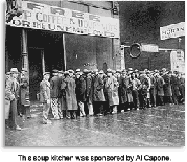 Things in Chicago were so grim; Al Capone volunteered to donate some of his bootlegging profits to open soup-lines to feed Chicago's dispossessed. Sources always credit Capone's motivations as cynical, and they may have been. However in our world, it's not only ruthless criminals who are cynical. My point is that many decades ago, during the boom-times of the 1920s, Chicago's Democratic machine had managed the city's affairs so poorly, that when the bad times came, they were helpless to come to the assistance of Chicago's unemployed.
Today, there is good reason to once again anticipate another crisis in the muni bond market. Here is an excellent video (6 minutes long) from CNBC's Kudlow Report on the hazards of tax-free income aired in late 2010. Two years later, nothing has changed.
Today, eight decades after the Great Depression, and for the same reasons, local and state governments find themselves in an almost identical situation. The muni-bond market is only waiting for our financial bubble to deflate to differentiate which bond issue survives, and which defaults.
As Barron's didn't publish muni-bond yields until 1938, we can't examine this data during the great depression. But in the chart above, we see the three times when default concerns inverted muni-bond yields above Barron's Best Grade corporate bond yield:
- During the 1937-41 bear market, where fear of a return of the early 1930s was on everyone's mind.
- As interest rates peaked in 1981
- Since early November 2010, just a few weeks before CNBC's Kudlow Report aired the Video above
The first of these three occurrences is ancient history, but the last two muni-bond yield inversions are still in the living memory of many people today. Let's dig a little deeper into this data, and examine the durations and yield inversions and for muni and Barron's Best corporate bond yields.
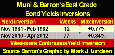
- The 1981-82 inversion first occurred in Barron's 24 August 1981, and the last in its 28 June 1982 issues, but weekly inversion events during this ten month period were intermixed with weeks of muni-bond yields declining below Barron's Bests yields. But as noted in the table above, from November 1981 to February 1982, there was a period of 12 weeks of continuous yield inversion.
- In our current inversion, the first occurred in Barron's 23 August 2010 issue, but since Barron's 01 November 2010 issue, yields for muni-bonds have refused to decline below Barron's Best Grade Bonds - for seventy-seven continuous weeks!
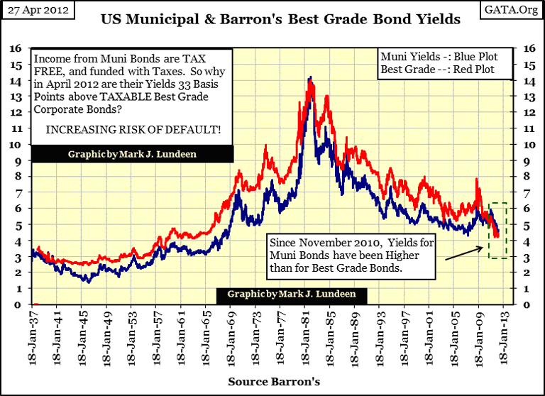
Just how bad local government finances currently are is evident in the chart below. Here are the two bond-yield series used in the construction of the yield-gap chart above. Typically (97% of the 3,877 issues of Barron's since January 1938), the Best Grade Corporate yield (Red Plot) is higher than the tax-free muni-bond yield. Historically, when we see the blue plot rise above the red, local and state government financial affairs are in difficulty, and the mostprotracted period of inverted yields in modern history began in November 2010 (dashed green box in chart). This is clear evidence that concerned muni-bond buyers increasingly fear that bond defaults by local and state governments are imminent.
Admittedly, increasing concern over muni-bond default does not necessarily equate to actual defaults, but look at the differences between the bond yield inversions of the early 1980s, and today. During the early 1980s, historic high interest rates put a squeeze on everyone's finances. Had Paul Volcker * not * increased interest rates in the late 70s and early 80s to double digits, would this yield inversion had occurred? Most likely not. But our current, and continuous seventy-seven week yield inversion, is not only the most persistent since 1938, it's occurring during a year and a half period of declining current yields for bonds. To my thinking, this is quite a notorious accomplishment in the muni-bond market.
We should also note that the US muni-bond market was a major "consumer" of Wall Street's credit-default swaps derivatives (CDS), the same financial "product" that was, and still is at ground zero for the Greek, and other European sovereign debt debacles. Our current-yield inversion is telling us much more than just the state-of-solvency for American local government. People of substantial wealth are not only avoiding tax-free income, but seventeen months before last month's Greek-bond CDS fiasco, where sovereign debt was "guaranteed" against default risk by Wall Street proved fictitious, wealthy investors were already forgoing the blessings of Wall Street's "structured finance" in the US muni-bond market. Are we looking at the early stages of yet another major derivatives debacle? I suspect that's exactly what this chart above is telling us.
If the muni-bond market caught a head cold in 1981, thirty years later the muni-bond market seems to have contracted walking-pneumonia, hustling for a few extra basis points on dirty street corners somewhere in lower Manhattan. And Doctor Bernanke has nothing to cure what ails the muni bond and CDS markets. This is not going to end well.
Speaking of future hard times in the bond market, let's look at Barron's Best-Grade Bond and Barron's Intermediate-Bond Yields. Note: Barron's began publishing these series in January 1938, but I back engineered the data from 1934-38 using data from Barron's bond tables.
Look at bond yields at their top in 1981-2. I don't care what Standard & Poors or Moody's says about credit quality, any bond yielding double-digits, for whatever reason, is a junk bond. It's interesting to note that Barron's Best Grade's yield peaked at 14.03% in Barron's 18 January 1982 issue. However, at the top, one US Treasury 20 year bond had a coupon of 15.75%. For twenty years, this bond's current yield was published each week in Barron's Treasury bond table. Below is a table listing weekly closing peak bond yields, with their Barron's issue's publication.
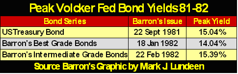
Note that the bond market gave corporate America (Barron's Best Grade Bonds) lower financing costs than it gave the US Treasury * AND * peak yield for Barron's intermediate bonds (A to BBB Rated bonds) were almost identicalto the US Treasury's. Remember this fact later on in the article!
What drove bond yields up to double digits in the early 1980? Well everyone knows it was Paul Volcker, but what is never mentioned is that Paul Volcker was forced to do so, as the US Dollar was being abandoned by international commerce. Just eight years after the US Treasury closed its gold window, terminating the Bretton Woods $35 gold peg, America's trading partners were rejecting Washington's inflationary dollar.
When the US Treasury long bond yield reached 9.20% in October 1979, (a yield unthinkable just eight years earlier in August 1971 when the US Treasury long bond was yielding 5.90%), Barron's ran an article on the problems American's were having trying to spend dollars in Europe. Hotels and restaurants were refusing American dollars for payment. That all changed when Volcker forced US Treasury yields above 14%.
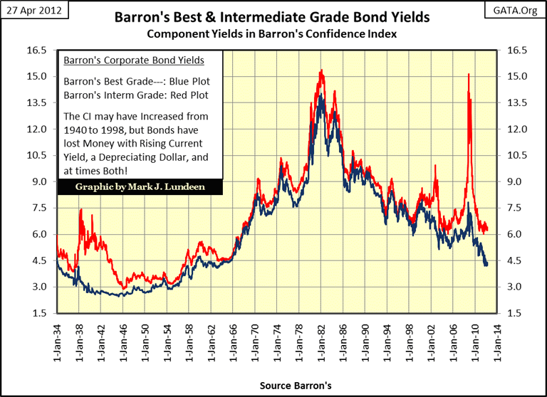
What I find interesting about this chart above is how quickly Barron's Intermediate-Bond yields have decoupled from Barron's Best Bonds since Alan Greenspan's high-tech bubble popped in 2000. As noted above, the yield performance for these intermediate bonds was very similar to the US Treasury's only thirty years ago. These are * NOT * junk bonds! But during the stock market's tech-wreck (2000-02) & credit-crisis bear markets, less than best grade corporate bond yields took off to the stratosphere at the first sign of trouble in the financial markets. How should we interpret this data? I think Barron's Intermediate Grade Bonds are showing us the future for the bond market, that in the credit crisis's next phase, it won't just be intermediate grade bond yields spiking upwards. God help anyone who is buying actual junk grade bonds for income today.
As these two bond yields are used in constructing Barron's Confidence Index (CI), let's look at the chart for the CI. Now the CI hast to be the worst indicator of future bond prices in the world, as is easily proved by comparing the bond yields used in its construction (chart above) and the CI itself. From 1942 to 1966, the CI increased from 42 to 99, as bond prices, and the dollars of income from bond investments saw huge inflationary losses. Still, as bond yields peaked in 1981-2, the CI showed no sign of distress.
But the CI doesn't care if bond buyers make money. What the CI measures is the bond markets' best-guess of the prospects of less than best grade bond issuers' ability to make principle and interest payments to term - and that is all the CI cares about.
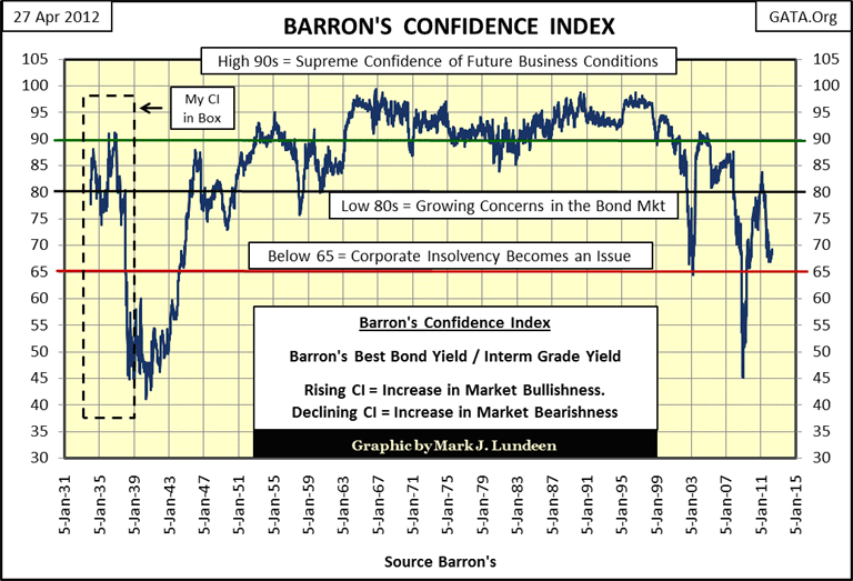
Understanding this, we see the logic of a high CI during the early 1980s. Intermediate grade corporate credits borrowed bucks with some bang in them from bond buyers in early 1970s. Then after almost a decade of double digit CPI inflation, a decade where business was good, if not great, A-BBB rated corporate credits paid their creditors back with dollars, very much the worse for wear. So, the CI is not a bond market indicator, but economic indicator, providing us with the bond market's - Best Guess - of future economic conditions that bond market intermediate grade corporate credits must deal with to pay off their debts to bond holders. Currently; the CI is telling us that it expects future economic conditions are going to be difficult for A-BBB rated company bonds to service their debts to term. But keep in mind that Doctor Bernanke, and his "liquidity injections" can cause short-term predictions to run contrary to market reality - for a while.
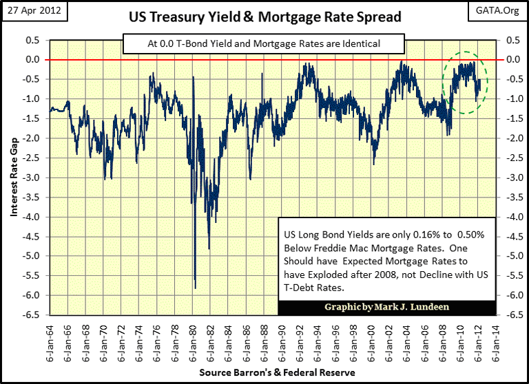
Let's examine the US Treasury Bonds and Mortgage markets, ground zero for the largest bubble in the history of finance. This is an incredible chart, post January 2008 as default risks increased in the mortgage markets, mortgage rates collapsed. How does this happen? Mortgages haven't traded in a free open market since 2007, and I read where the Fed is purchasing over 40% of the new bonds issued by the US Treasury. So mortgages and Treasury debt prices and yields are what the Fed says they are; this is "policy making" at its finest!
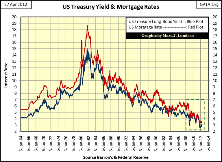
The yield spread (next chart) between these two debt vehicles is down-right depressing. From 2010-11, the spread between US Treasury Long Bonds and mortgages was measured in single-digit basis points. One could argue that this indicates that the US Treasury's credit worthiness is * No * greater than financially stretched home buyers, because this is the awful truth. But it is also true that like US T-debt, the Fed is mindlessly purchasing garbage from the banking system at prices grotesquely above fair market values, so the Fed's banking system can apply fantasy valuations on the mortgages still on their balance sheets.
- This is going to end in tears -
Let's move on to the stock market, and look at the NYSE's 52Wk H-L Ratio. Let me tell you a little secret: from a 52Wk H-L basis, bull markets play out in waves, as is nicely displayed below. Since three months after the terrible lows of March 2009, the NYSE 52Wk H-L ratio grew in strength up until April 2010. The May-July 2010 correction was completely natural for a bull market.
Now look at the second bullish wave in the chart (July 2010-11); its peak was lower than the first wave, and reversed to the downside every time the ratio saw double-digits. Not only that; but the correction that followed was REAL BEAR MARKET STUFF.
The third bullish wave, beginning last October (if you want to call it that), has yet to see a single day where the NYSE 52Wk H-L ratio broke above 10%, and since early March, the ratio has retreated below the 0% line twice, indicating the market saw more 52Wk Lows than 52Wk Highs. That by itself is nothing to panic about, but if you take a quick look at the chart below, it's easy to conclude that the stock market's current advance lacks bullish conviction.
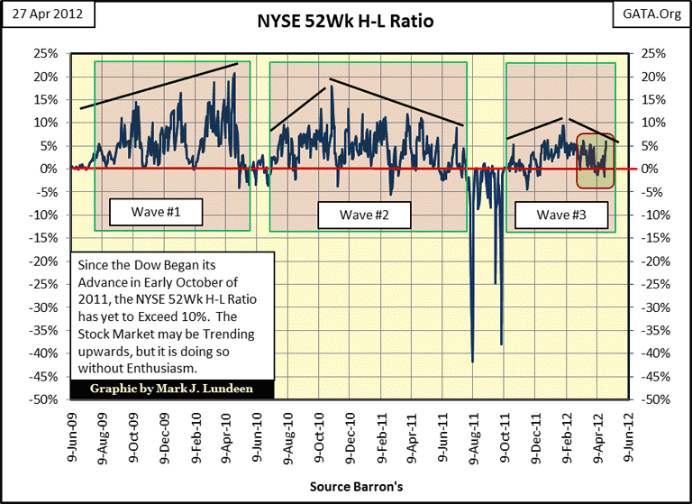
There are real problems in the stock market's fundamental valuation, because market manipulation by the Federal Government, via the PPT, makes a mockery of the legitimate market function of price discovery. Someday, when economic reality finally forces the Fed to stop supporting financial asset valuations, I suspect we will see a historic market low in stocks and bonds. Currently, everyone knows market prices seen on CNBC are backstopped by the Federal Reserve, and for the most part, everyone is complacent and comfortable with our current situation. But the day is coming when financial assets will have to stand on their own strengths and weaknesses and this will be a real problem as no one really has a clue what the real free-market valuations for financial assets are, or even what the US dollar itself is worth.
That is what makes tracking the NYSE 52Wk H-L Ratio so valuable, and right now it's telling us that the bulk of the NYSE's 3134 listed companies can't claw their way up to where Apple Computer now roams: to new daily 52Wk Highs. Well you know what I think; depending on how you measure it, we've been in a massive bear market that began in early 2000 or in October 2007. But any way you look at it, since 2000, the general stock market has been a horrible investment while gold and silver have outperformed the stock market no matter what they tell you on TV.
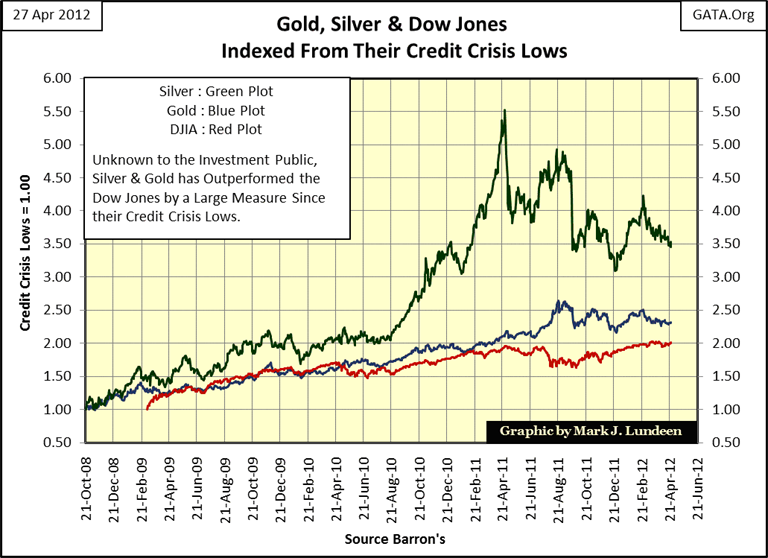
Since the end of August of last year (2011), the Dow Jones (Red Plot) has been on an uptrend, as gold (Blue Plot) has been under pressure. Still, from their lows of the credit crisis, the Dow has yet to exceed the gains for gold, while silver has outperformed both by a large measure, even after a massive 45% correction.
Long term, these trends will continue. But I have my suspicions that the "policy makers" will soon attempt another 2008 hit job on gold and silver. After four decades of central banks inflating valuations in financial assets, the gold and silver markets have become tiny in comparison to the inflated global financial assets. Remember, gold and silver * DO NOT * benefit directly from central bank inflation, but from the deflationary aftermath of monetary inflation; when the real economy can no longer service the massive amounts of debt created during the inflationary boom times. As the economy and financial markets enters their deflationary cycle, with or without the permission of Doctor Bernanke, gold and silver will come into their own as wealth flees deflating financial assets and seeks safety in gold and silver.
Europe is an inflationary mess; Europe's financial reserves will inevitably deflate and there's nothing the EU officials can do about it but stall for time. There is great fear that this deflation will result in huge capital flows into the tiny gold and silver markets, resulting in price increases that will make gains in Apple Computer look insignificant. But my work with gold and its step sum suggests that before the tsunami of "liquidity" strikes gold and silver, we may see better (lower) prices in the next few months.
In the chart below, for the past two months the price of gold (Blue Plot) has been trending down, as market sentiment as measured by my step sum (Red Plot) has been trending slightly upwards. This has resulted in the second Bear Box for gold in the past year. Now the step sum is a sentiment indicator, and within the bear box we see that the sentiment in the gold market has decoupled from the price action. This means that the gold bulls are ignoring their losses, hoping that the price trend will reverse and make good their losses. Well this might happen, but the longer this bear box continues, the less likely the prospects for a bullish resolution for the bear box becomes.
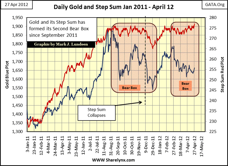
Look at the first bear box. When its step sum collapsed in early December 2011, it marked the start of a selling panic in the gold market as market sentiment quickly reversed to the downside. I suspect we will soon (by next August, or sooner) be seeing a manufactured collapse in gold's step sum that will coincide with a financial crisis somewhere in Europe.
The "policy makers" can't afford having gold and silver make a major move upwards as their precious banks and bond markets are under duress, so I'm expecting them to use the paper markets in New York and London to manipulate gold and silver prices lower using a crisis for cover. How far gold and silver prices will decline with the step sum's collapse isn't something I can predict, maybe much less than I think. Today, unlike in 2008, central banks are now huge buyers of physical gold, and that has to make a difference. Now, no technical formation is accurate 100% of the time, but after these boxes have become established for a few months, they have a good history of predicting lower prices to come.
In any case, gold and silver are very attractive even at today's prices. If you want to purchase some metal now, go ahead as I'm sure in two years you will be glad you did. Just don't panic out of your position if we should see gold and silver going down with Europe's banks sometime in the next year. At some point, market forces will overwhelm the market manipulators, and you'll be glad you have some metal.
Mark J. Lundeen
[email protected]
[email protected]


