Big Picture…Big Moves Brewing
 share
share
 share
share
 share
share
 share
share
 share
share

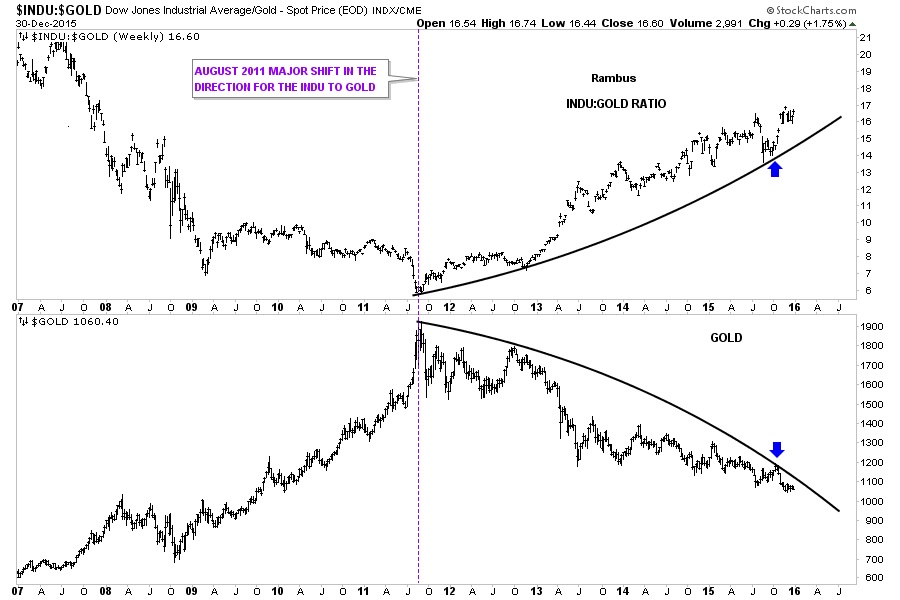
Since gold topped out in 2011, it has been in a confirmed and unrelenting bear market. Since that bull market high in gold, the INDU has been outperforming gold in a big way. The first chart I would like to show you is a combo chart, which has the INDU:GOLD ratio chart on top and GOLD on the bottom. As you can see both the INDU:GOLD ratio chart on top and GOLD on the bottom reversed direction in 2011 with the ratio chart on top showing the INDU moving in a near parabolic move against gold. Gold on the bottom chart is showing a near parabolic move lower since its 2011 bull market peak. Since October of this year both have hit their respective parabolic trendlines as shown by the blue arrows. If this combo chart continues to play out then we should see the INDU keep outperforming gold going forward. The ratio chart on top shows the price action getting very close to breaking out into new highs and gold is very close to breaking down to new lows since the big reversal took place in 2011. All this chart means is that the INDU should keep outperforming gold until something changes this fact.
The bottom line for PMs is they are in a bear market and as such cannot be traded from a buy and hold perspective .
However, believe it or not there are other markets that are in confirmed bull phase , where investors / traders have been and will be making a lot of money buying and holding .
Enter Chartology .
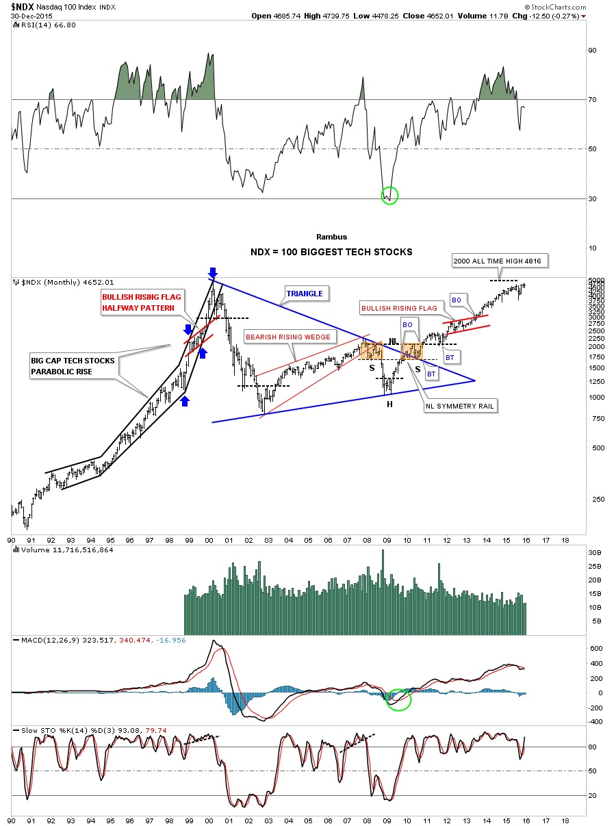
This next chart is a 25 year look at the $NDX 100 which shows its bull market rally back in the 1990’s to its current high which is just shy of its all-time high at 4816. I’ve shown you this chart several times through the years as the Chartology is very nice. First note the parabolic rise in the 1990’s to its bull market peak in 2000 with the red bullish rising flag as a halfway pattern as shown by the blue arrows. Many parabolic moves end with some type of balanced or unbalanced double top or H&S top.
Next you can see the beautiful symmetrical H&S bottom that formed out toward the apex of the 10 year triangle consolidation pattern. The right shoulder formed on the backtest to the top rail of the 10 year triangle consolidation pattern while the left shoulder and head formed inside the blue triangle. The brown shaded areas shows how symmetrical the left and right shoulders were which launched the new bull market that began at the 2009 crash low.
What I find interesting is that with all the bear market calls taking place right now in the stock markets, when I look at this chart, I see a stock that is very close to breaking out to new all-time highs which is a bull market. Granted there are some areas that have most likely seen their bull market highs but there are other areas that haven’t and these areas are where we’ll see the big moves take place going forward, think rotation. What generally happens during a bull market is that the initial strongest sectors will top out first and just trade sideways while the other weaker sectors take their turn at making their bull market runs. This is one reason why the topping process can take so long sometimes.
Tonight I would like to show you a few stocks that have yet to have their bull market moves but are setting up for that possibility. As I’ve shown you in the past one area that I think will do good going forward are the semiconductors. The long term monthly chart for the $SOX shows it broke out of its massive 10 year bullish falling wedge in 2010 which had a small red bull flag form just below the top rail and the blue triangle that formed as the backtest. Note the big support and resistance line that comes in at the 545 area which has been backtested twice. We know that S&R line is very hot so above it is positive and below is bearish. At this point the $SOX would have to double to reach its bull market peak made back in 2000 which tells us this sector is undervalued on a relative basis.

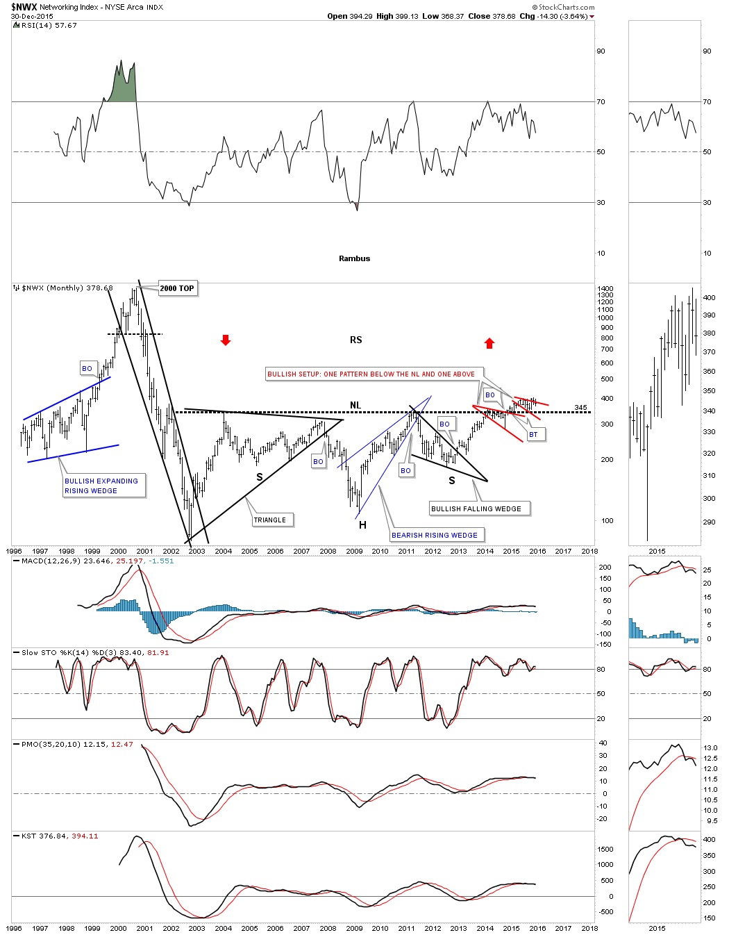
Another area I’ve been showing you that is still undervalued and unloved is the $NWX which has a bullish setup taking place with one consolidation pattern that has formed below the massive 12 year neckline and one that is trying to form above the neckline. Here we have a very clean line is the sand with the 12 year neckline showing us where support is located. Positive above and bearish below.
Another area I’ve been watching which had big moves in the 1990’s were the online brokers. SCHW was one of the first to kick off the bull market in this sector. After building out a blue 5 point triangle reversal pattern as its bull market top SCHW declined into its bear market low in 2003 or so. It took a massive 13 year triangle to consolidate that huge bull market in the 1990’s. It finally broke out in 2013 and has been in consolidation mode for the last two years above the top rail.

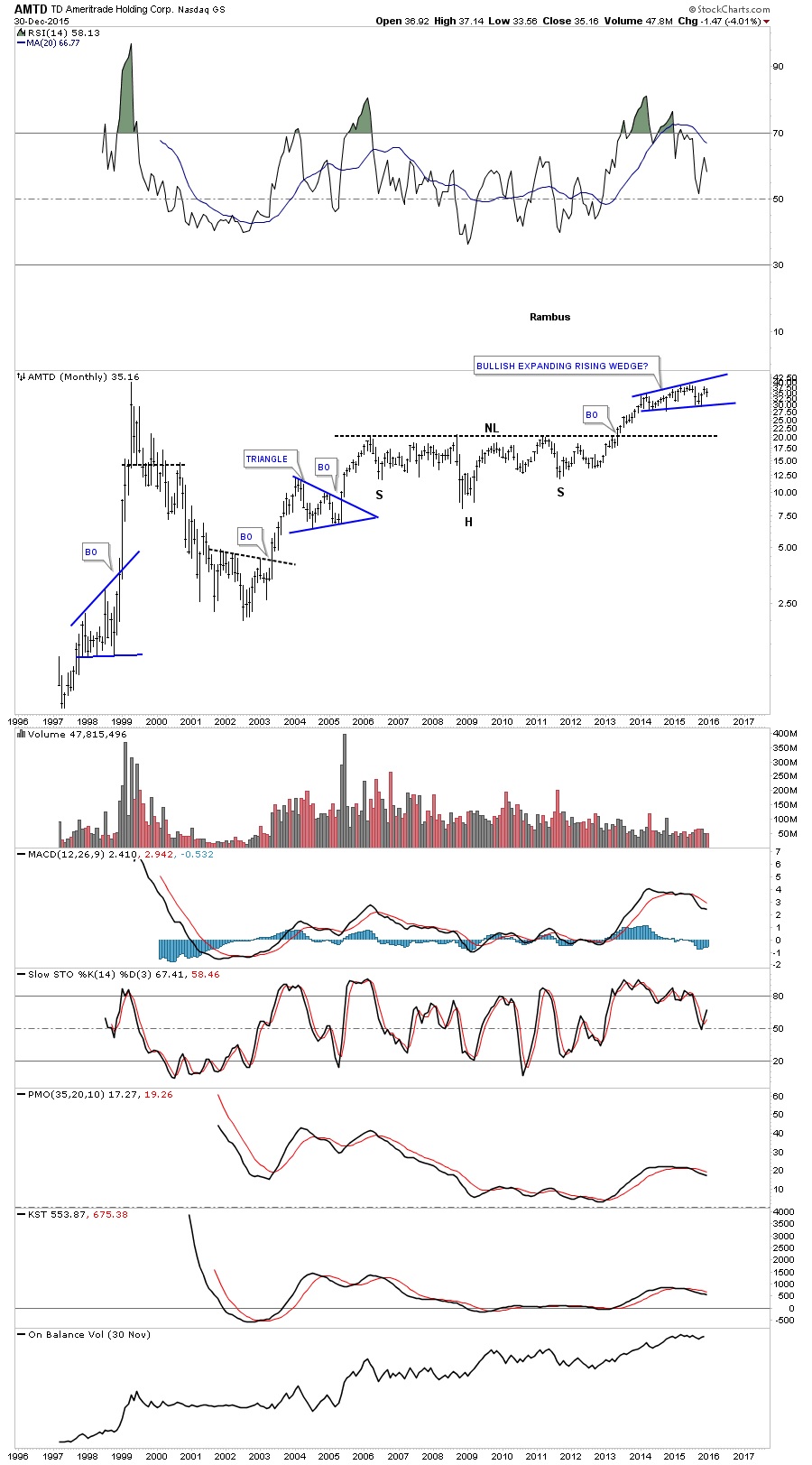
AMTD is another online broker that built out a beautiful eight year H&S consolidation pattern and is also forming a bullish expanding rising wedge just below its all-time highs, which actually took place in 1999. I can still remember the excitement when the online brokers were born. It was a game changer for the little guy. NO more huge commission fees each time you made a trade.
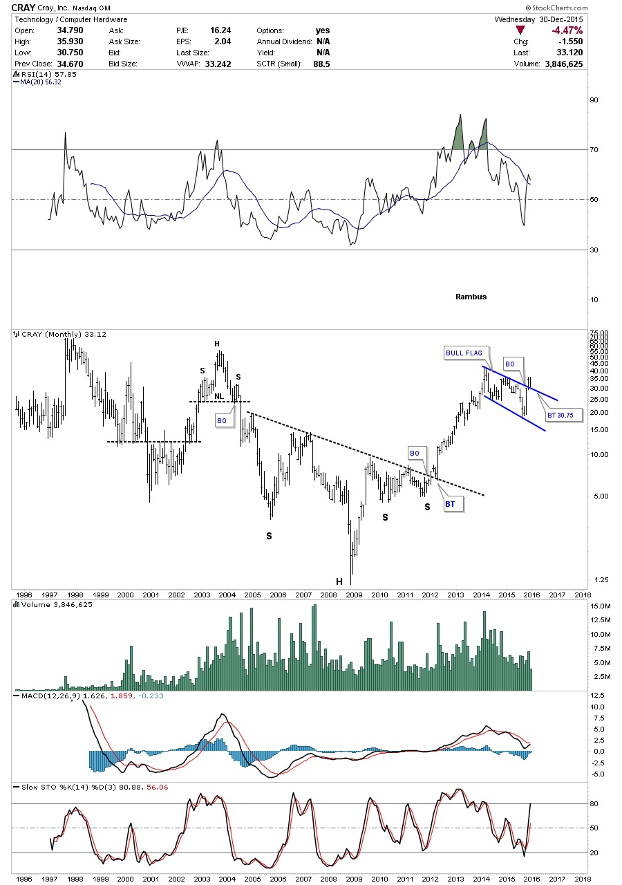
Below are a few good looking charts that have been behaving pretty well and are still positive. CRAY built out an eight year unbalanced H&S bottom and had a really nice impulse move up. It consolidated for about a year and has broken out above the top rail of a possible blue bull flag and has had a backtest.
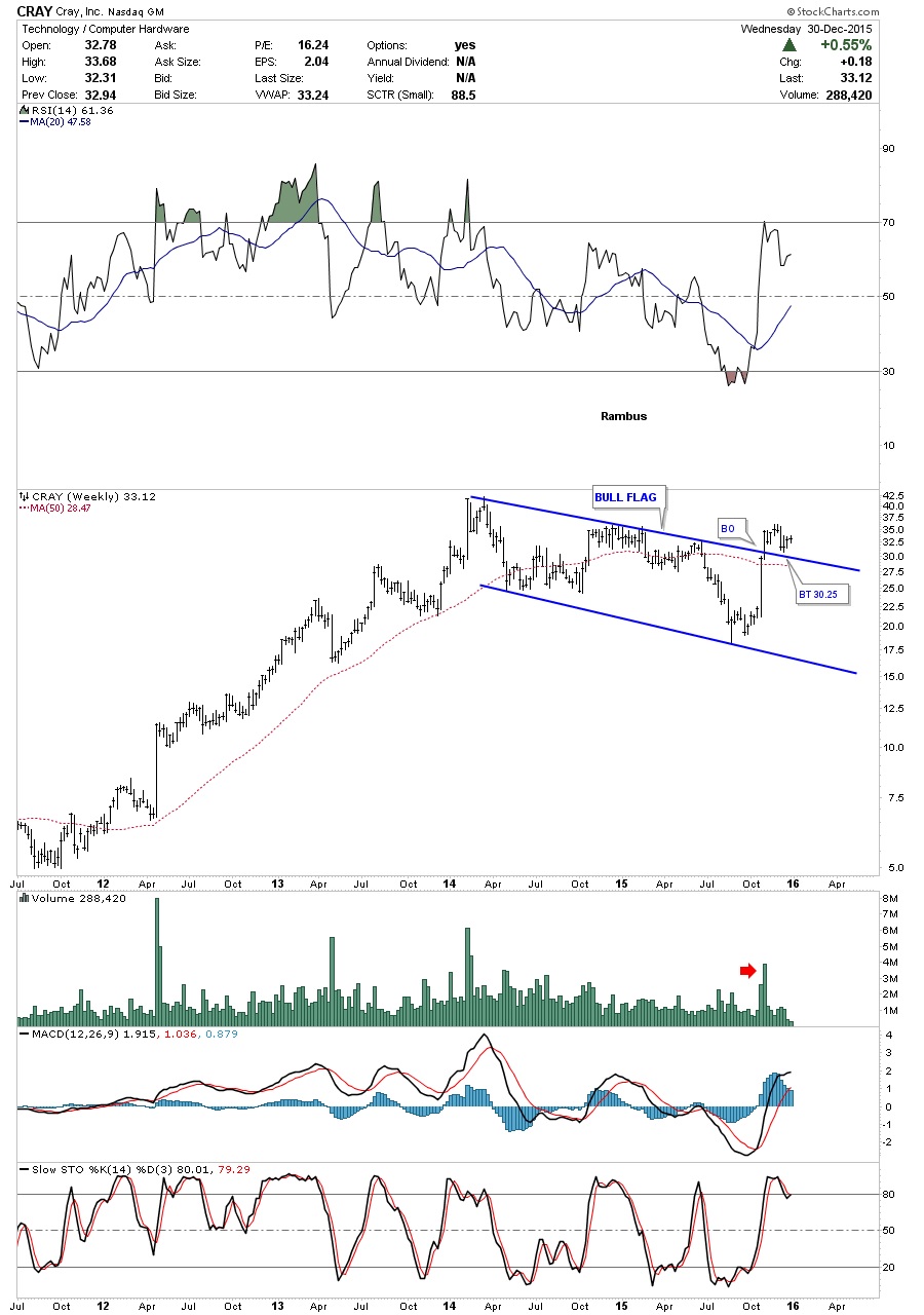
The weekly chart for CRAY shows its bull flag up close and personal.
CUB has been building out a five year six point rectangle consolidation pattern. In big consolidation patterns like this you can see how each reversal point has some type of reversal pattern. Note our most recent touch of the bottom rail has a H&S bottom in place and has broke above the neckline. The red circles shows you what I call a false symmetry breakout. What this means is that the distance of the false breakout below the bottom rail, red circle added to the next high that fails to reach the top rail, are about equal. If you add the red circle to the failure point of the price action to reach the top rail it would be a complete and equal reversal which will be the same as the other reversals.

The daily chart for CUB shows the head as a blue 5 point rectangle reversal pattern with the first H&S bottom complete and the second one is under construction.

BRCM has a beautiful looking long term chart and is making new multi-year highs. It broke out of an eleven year black triangle consolidation pattern that had to have five reversal points because it formed below the 2000 top.

I’m going to stop right here for tonight. I just want you to be aware that there are some really big consolidation patterns that have formed since the tech bubble came to an end in 2000. It has taken many years for some of these stock to consolidate those massive gains made back then. I will be posting many more of these types of stocks as I think there is alot of potential in many of them to have really big moves as some are doing right now.
********
Courtesy of http://rambus1.com/
share
share
share
share
share
 Meet Rambus, a seasoned trader and technical analyst renowned for his unbiased and insightful chart work. Through his website, Rambus Chartology, and Substack newsletter, Rambus shares his expertise with a global community of subscribers, providing daily updates, commentaries, and hands-on training in the art and science of chartology. With his calm, humble, and down-to-earth approach, Rambus demystifies complex market trends, helping his followers navigate the challenges of today's volatile markets. Join the Rambus Chartology community today and discover a unique blend of technical analysis, trading expertise, and time-tested protocols. Subscribe now at www.rambus1.com or https://rambuschartology.substack.com/