Mr. Bear Looks at the Dow Jones & Barron’s Gold Mining Index


The Dow Jones continues making new all-time highs / BEV Zeros; four more this week. I’m not going to argue with success, the stock market is going up, or at least the Dow Jones is, as well as some of the other major-market indexes.
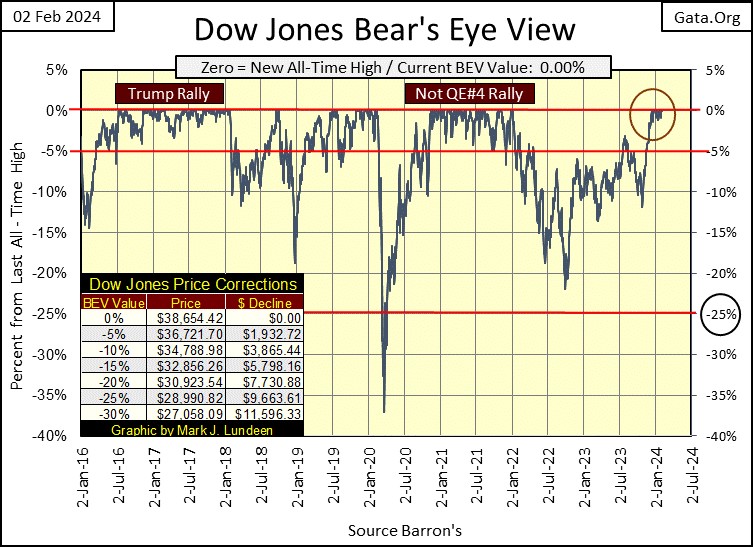
Looking at the Dow Jones’ BEV plot below, our current advance (Red Circle) is remaining very close to the 0% BEV Line, a couple of months now.
I wonder how long before it breaks down towards its -5% BEV Line. It won’t mean the end of the advance, but the bulls could use a rest. Look at the other two advances noted in this chart to see what I’m talking about.
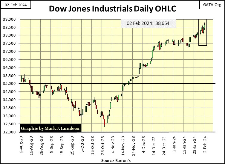
For a better view of the advance of the Dow Jones, here it is plotted in dollars in a daily bar chart. Finally, the venerable Dow Jones is trending up again, with 39,000 in its sights.
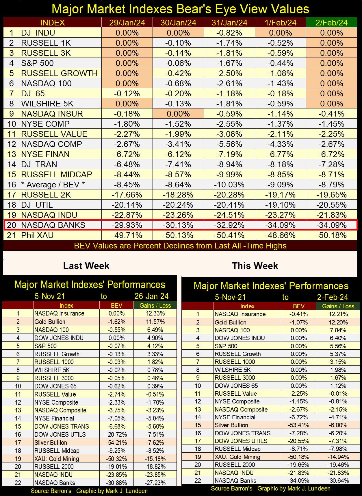
It’s not just the Dow Jones making market history. Looking at my table for the major-market indexes I follow below, this week there were many new all-time highs (0.00% = BEV Zeros) to be seen. Friday closed with eight of these twenty indexes with BEV Zeros, and the next four in the list closing in scoring position, or with BEV values between -0.01% to -4.99%. All and all, the market is looking very positive for the bulls.
But, and it’s a BIG BUT, the NASDAQ Bank Index (#20) doesn’t want to join the party on Wall Street. Remember the 2007-09 Sub-Prime Mortgage Debacle? Up to October 2007, the market was looking very good, but the banks soon after began closing their operations, due to their reserves being mostly illiquid mortgage assets. October 2007 was a top, and not long after the Dow Jones entered the second deepest bear market decline in its history. A percentage decline exceeded only by the Great Depression Crash.
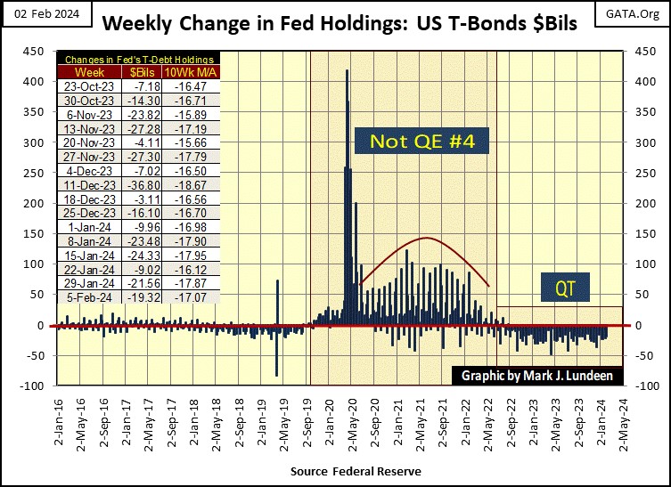
So, an illiquid banking system in 2008 caused all that market mischief, and motivated Dr Bernanke to begin his first of three QEs. The FOMC’s current primate idiot; Jerome Powell, began his Not QE#4 in October 2019 when the overnight repo market became illiquid. Five months later we saw the March 2020 Flash Crash on Wall Street.
During this flash crash, the Dow Jones lost 38% of its valuation in only twenty-three NYSE trading sessions. That had never happened before. The Dow Jones, and the rest of the stock market would have continued collapsing, had four years ago, Powell not “injected” a few trillion dollars of “liquidity” into the market in a matter of weeks to “stabilize market valuations.”
What could be the problem today? Possibly commercial real estate in the post covid-epidemic economy? I see a lot of strip malls with empty shops in them. There are also strip malls totally vacant.
I suspect a significant percentage of commercial real estate is no longer servicing its debts to the banking system, as these businesses are out of business. In the coming year or two, we’ll discover who is holding on to these abandoned mortgages, and loans. Maybe the regional banks listed in the NASDAQ Banking Index?
I’m going to skip commentating on the performance tables above, and move on to my table on the NYSE 52Wk High – Low Nets. Look at all those Dow Jones’ BEV Zeros in the table below.
Above, we see some of the major market indexes advance nicely. But below, looking at the broad market trading daily at the NYSE, new 52Wk Highs aren’t as common as I would like to see them in a market advance. A few NYSE 52Wk H-L Nets of +400 would be nice to see. Instead, we’ve not seen a H-L Net of over +200 since the end of December. This indicates most issues trading at the NYSE are lagging the indexes seen above.
This should change if the Dow Jones, and the other major market indexes continue advancing. If it doesn’t, this lack of 52Wk Highs at the NYSE is a concern of mine.
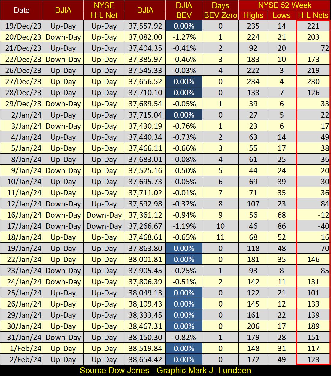
Oh, FYI there were 2914 issues trading at the NYSE on Friday. So, if 172 of them closed at a 52Wk High, I’m thinking 2742 of them didn’t.
In a strong market advance, there will always be stocks trading at the NYSE making new 52Wk Lows, or doing little to nothing to make money for their owners. In the market, that is just how things go. But if this is a real market advance, we should see some NYSE 52Wk H-L Nets at or above +400. If not, I have to ask why not? Maybe because we are at a market top?
In any case, why is this market going up? It shouldn’t be, as the QT the idiots began in May 2022 continues unabated, as seen in the chart below. Since May 2022, the FOMC has withdrawn $1.37 trillion dollars from the financial system, and two years later Wall Street is in a bull market? Exactly how does that work?
2024 is an election year. The primary function of the market in an election year is to keep incumbent office holders in Washington, in office. I can be as bearish as I want, and for good reason. But Joe Biden wants to win a second term as president, and that may be the only thing that matters in the market for 2024.
A couple of times a year, I like to go into detail about the Bear’s Eye View (BEV) charting technique. What is the Bear’s Eye View? It’s looking at the market as Mr Bear does;
- each new all-time high = 0.0%, and never more,
- all other closings not a new all-time high, register as negative percentage claw-backs from their last all-time high.
In effect, a BEV plot compresses price data into a range of only 100 possible percentage points;
- 0.0% = new all-time high / BEV Zero,
- -100% = total wipe out in valuation.
What makes this the “Bear’s Eye View,” is Mr Bear, hates BEV Zeros. He’s only interested in how many percentage points he can claw-back from each new all-time high. So, to understand a BEV plot, one has to understand it consists of a range of only 100 possible percentage points; spanning from 0.00% down to -100%, or new all-time highs and percentage claw-backs from them.
I begin each week’s article with a BEV chart for the Dow Jones, but I could use a dollar-based chart of the Dow Jones as well. I choose the Dow Jones’ BEV chart because, well it’s what I do that is different from other market commentators. The way I see it; if I can’t add something new and unique to the discussion of the market, I’m just taking credit for the work of others.
Okay, so how is using the Bear’s Eye View adding something new to the discussion of the market? Let’s begin with a daily chart, in dollars, for the Dow Jones going back to 02 January 1900; 124 years of plotting the Dow Jones in the dollars its publisher, Dow Jones Inc. published it in. The first daily closing in the plot below was 68.13, the last on 01 February 2024 was 38,519. That’s a big move up.
But the dollars seen in the Dow Jones below are not all equal. In January 1900, a dollar was legally defined in terms of gold, and an ounce of gold over a century ago was equal to $20.67 dollars. Since August 1971, the dollar no longer has a legal definition. It’s worth whatever the market gives credit to for its issuer’s (the US Government) “full faith and credit,” which in 2024 is worth less and less every day.
This degradation of the dollar, from a gold standard to one based upon the perceived competency of Washington’s elected and bureaucratic officials, has had enormous inflationary consequences, as is painfully seen below.
The Red Star marks August 1982, the beginning of our current, forty-two-year market advance, an advance that took the Dow Jones from 776.92 on 12
August 1982, to over 38,500 this week. In the chart below, this forty-two year advance is its outstanding feature.
But look at what’s missing; the biggest market decline in the history of the Dow Jones happened during the Great Depression, an 89% bear-market decline. In the chart below, where is it?
The second deepest bear-market bottom occurred during the 2007-2009 sub-prime mortgage debacle. Within the Red Oval below, is the second deepest bear market in Dow Jones history. Yet, when plotting the Dow Jones in the dollars Barron’s or the Wall Street Journal publishes it in, this massive bear market appears to be just a correction within the 1982 to 2024 market advance.
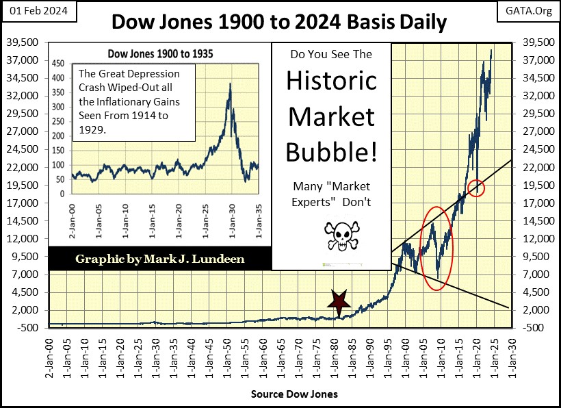
Is this why the main-stream financial media never publishes long-term charts, as seen above, as it’s embarrassing? When was the last time you saw a chart of the Dow Jones, or any major market index going back to the 2007-2009 bear market, published by the main-stream financial media? A long time ago.
The Bear’s Eye View plot corrects these inflationary distortions seen when plotting the Dow Jones in dollars, as a BEV plot ignores dollars. Rather, a BEV plot only displays new all-time highs (BEV Zeros = 0.00%), and the percentage claw-backs from those new all-time highs, as seen in the BEV plot of the Dow Jones going back to 1885 below.
People being people; don’t like the Bear’s Eye View when they first look at one, as it’s something new and strange. But this is a very logical way of looking at the Dow Jones’ 139 years of history. For example, the famous bear-market of 1906-07, the bear market that convinced Wall Street they needed the Federal Reserve System.
Like all bear markets, the 1906-07 bear market came following a bull market advance. This bull market’s last BEV Zero, its Terminal Zero (TZ = bull market’s last all-time high) peaked at 103.00, on 19 January 1906. It was all downhill from there, until the bear-market bottomed at 53.00, seen on 15 November 1907. For the Dow Jones, this was a dollar decline of $50; a punishing 48.54% bear-market decline.
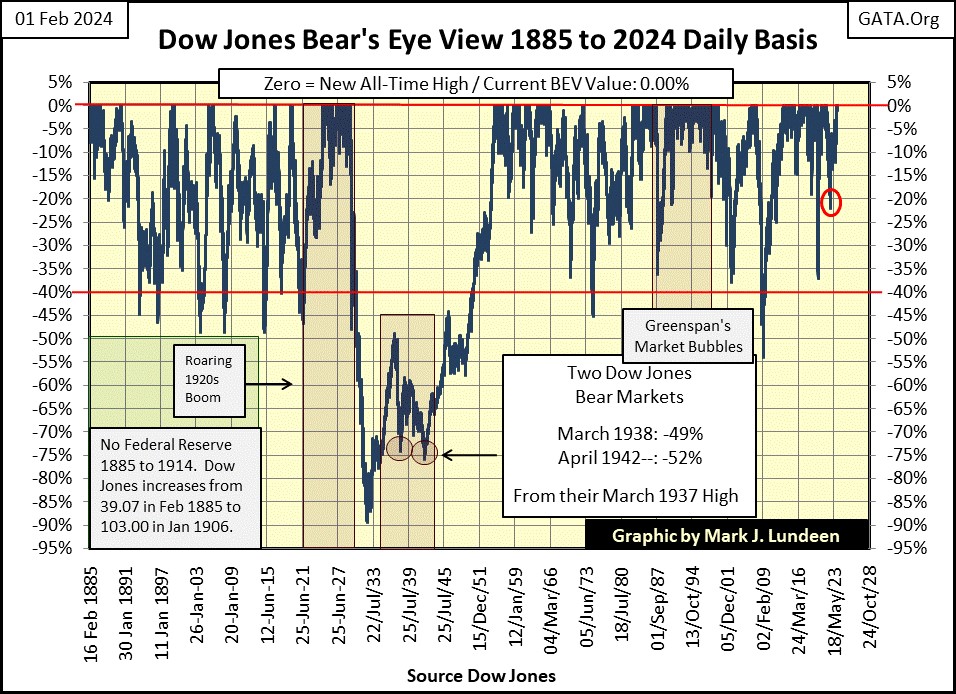
Now compare the 1906-07 bear market, with the bear market of 1973-74 in the BEV chart above. For the market advance preceding this bear market, its Terminal Zero (last all-time high) was 1,051.70, seen on 11 January 1973. From this TZ, it was all downhill until the bear-market bottom of 577.60, seen on 06 December 1974.
This Dow Jones bear market lost $474.1, about ten times the dollar loss from the 1906-07 bear market. So, was the bear market of 1973-74 ten times worse than the 1906-07 Dow Jones bear market? Actually – no. The 1906-07 bear market, from its Terminal Zero, to its ultimate bottom saw a 48.54% market decline. The 1973-74 bear market saw a 45.08% market decline. So, the impact on investors’ account balances for these two Dow Jones bear markets were about the same; little more than a 45% loss.
This is the important point to keep in mind; how large a percentage the Dow Jones lost to Mr Bear, when he begins clawing back from a bull market’s last all-time high, is exactly what is displayed in a BEV chart.
Bull markets in a BEV chart are easy to identify too, as when market advances begin to pile up BEV Zeros on the Red 0.00% line. How high a market rises is something Mr Bear doesn’t really care about, so each new all-time high in a market advance is only worth a 0.00%, and never more on a BEV plot.
Using the data seen above, since 1885 for the Dow Jones, a 40% bear-market decline has for the most part satisfied Mr Bear’s blood lust for the bull’s previous capital gains. This makes a 40% market decline in the Dow Jones a historic safe, reentry point for investors. Knowing this fact makes maintaining a BEV chart on the Dow Jones a wise thing for any investor to do.
The exception to the 40% bear-market bottom rule was of course the Great Depression’s Bear Market, a massive 89% market decline, the crater seen in the BEV chart above.
Books on market history, and the history of the Federal Reserve itself, have all pointed out the credit excesses of the Roaring 1920s, made possible by the then new Federal Reserve System, made the Depressing 1930s, and the catastrophic deflationary bear market seen above inevitable.
Why would that be? Because a market can’t have massive deflation, like the Great Depression’s 89% market crash, without it first having its market valuation being inflated far above where natural market forces would allow. Something the Federal Reserve excels in; blowing bubbles into market valuations with their “injections of liquidity.”
Which most market historians note the Federal Reserve did with its credit expansions during the 1920s for;
- Consumer debt,
- Real Estate Valuations,
- And the stock market.
In other words, the Federal Reserve during the 1920s, weakened balance sheets for individuals, and corporations with its expansions of credit, and attractive low interest rates. When the bust came in the early 1930s, these weakened balance sheets were forced to liquidate, adding selling pressure to the decline as the 1929-1932, 89% bear market progressed.
As the setup in the credit markets today is not only similar to the 1920s, but even more egregious, I’m expecting another catastrophic, deflationary market event is pending once again. Or in BEV terms, the idiots at the FOMC for a second time, are going to produce another crater, another catastrophic bear-market bottom in the BEV chart above.
So, I wouldn’t be in a big hurry to become bullish should the Dow Jones once again see a 40% market decline. When the BIG ONE finally comes, I wouldn’t be interested in the stock market until the Dow Jones has fallen below its BEV -70% line in the BEV chart above, and possibly not until it has fallen below its BEV -80% line.
Now let’s next look at Barron’s Gold Mining Index (BGMI), in dollars and in BEV terms. If you take the time to compare these two indexes, the Dow Jones and the BGMI in dollar terms, it’s obvious these are two different markets. Today, the Dow Jones is far above where it was in 1980. While for the past forty-four years, the BGMI may get above its highs of 1980, but can’t stay there for long.
Obviously, the massive flows of inflation from the FOMC have greatly inflated stock-market valuations. But since 1980, the BGMI has been an inflation-free zone, making gold mining an unloved, and an under-owned sector of the stock market.
To some people, people like me, this has been very annoying! But stepping back a moment, and looking at the Dow Jones plotted in dollars above, and the BGMI plotted in dollars below, it’s the Dow Jones above that is at risk of a massive deflationary collapse in the coming bear market, * NOT * the BGMI below.
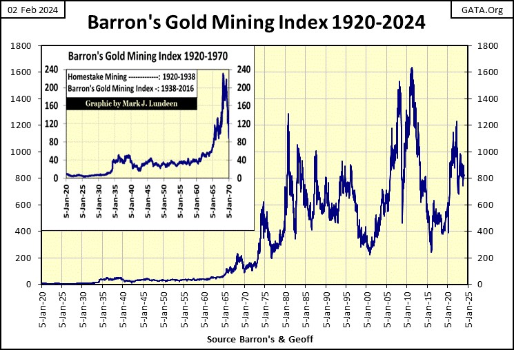
Comparing the BEV charts for the Dow Jones above, and BGMI below, the differences between these two markets become apparent. The Dow Jones above has many more BEV Zeros, and sees its bear markets terminate following a 40% market decline.
It’s hard describing the BGMI’s BEV chart below, as it changes over time. Before August 1971, bear market declines of over 50% were seen, but there were two strong market advances too, many BEV Zeros on the 0.00% line during the depressing 1930s, and again in the 1960s when there was a run on the US gold reserves.
So, before 1971, gold mining did well for its investors during the deflation of the 1930s, and the inflation of the 1960s. That is interesting.
Following 1971, something changed with the BGMI. Before it, most weekly closes were above the BEV -40% line; after it, most were below this critical level.
Also, attempts for the BGMI to rise into market history, by generating new BEV Zeros, became brief episodes in the market, as seen in the four post 1971 market advances, short episodes of BEV Zeros generation below.
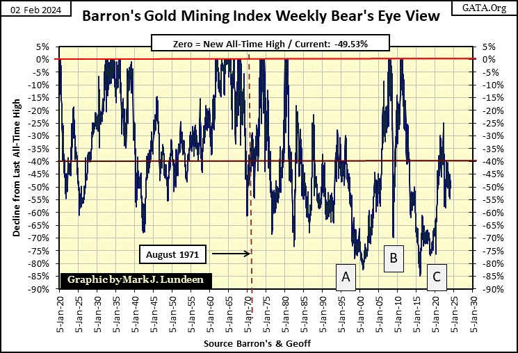
Bear market bottoms after 1971 became deeper, and more frequent. I noted three of these bottoms (A-C);
- A = bottom of 1980 to 2000 bear market in gold and silver,
- B = sub-prime mortgage bear market bottom,
- C = January 2016 bottom – biggest percentage decline in BGMI history.
The C-bear market bottom seen above happened eight years ago. Since that extreme-market bottom, the BGMI managed to advance only to its BEV -25% line, before it was manhandled back below its BEV -55% line shortly thereafter. Since then, the BGMI has only oscillated around its BEV -50% line.
After the fifty years of this financial abuse, we can be sure professional money managers have little, to no exposure to gold and silver mining, which is what a historic market bottom looks like. I don’t know when the gold mining sector will once again take off, as it did twice before 1971. But when it does, it won’t take much money flowing into this sector to make it soar.
One more item to cover for the Bear’s Eye View, looking at this data in a Frequency Distribution Table, which I’ve included for both the BGMI and Dow Jones below.
I’ve enclosed the 0% (BEV Zeros) & -0.01% (Scoring Position) rows in a Red Box, as they are key in understanding how well an index has performed over time. Add the percentages of these two rows together to gain a unique insight to their market performance. The larger percentage, the better that market index has performed over time.
Each table below covers the 5431 weekly closes since January 1920, and the BGMI has only 8.08% of its 5431 weekly closings in these two important rows. Considering the massive inflation the American money supply has seen since 1920, this is ridiculous; seeing the BGMI advancing in a bull market for only 8.08% of the past 5431 weekly closings.
For the Dow Jones, it has seen 37.79% of its 5431 weekly closing since January 1920, in these two important rows. Or, in other words, since January 1920, the Dow Jones was advancing in a bull market for 37.79% of the past 5431 weekly closings.
Quite a difference in performance between these two indexes. Then the Dow Jones has friends in high places, while the BGMI is like a baby seal, who gets clubbed anytime it sticks its head out of the ice. But this too shall change – but when? Hopefully, sometime soon.
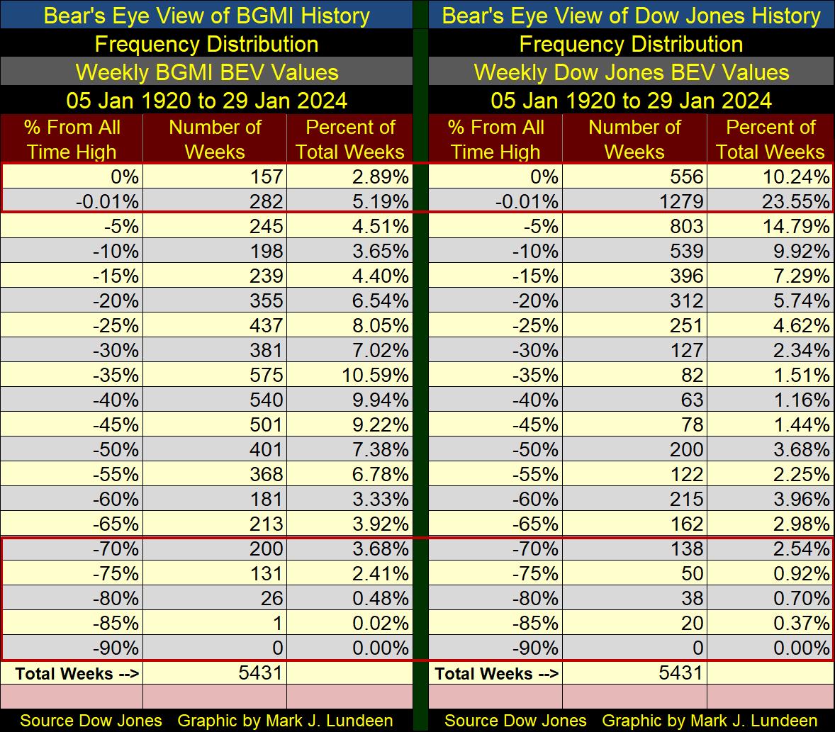
I also have a box around the BEV -70% to -90% rows above. For the BGMI, all these extreme lows happen after August 1971. For the Dow Jones, these are the market lows for the Great Depression market crash.
What’s going on with the price of gold? Let’s look at its BEV chart to see the details. Since November, gold has closed in scoring position, daily closes above its BEV -5% line (Red Circle). But for all that, it has managed to make only two BEV Zeros in the past three months.
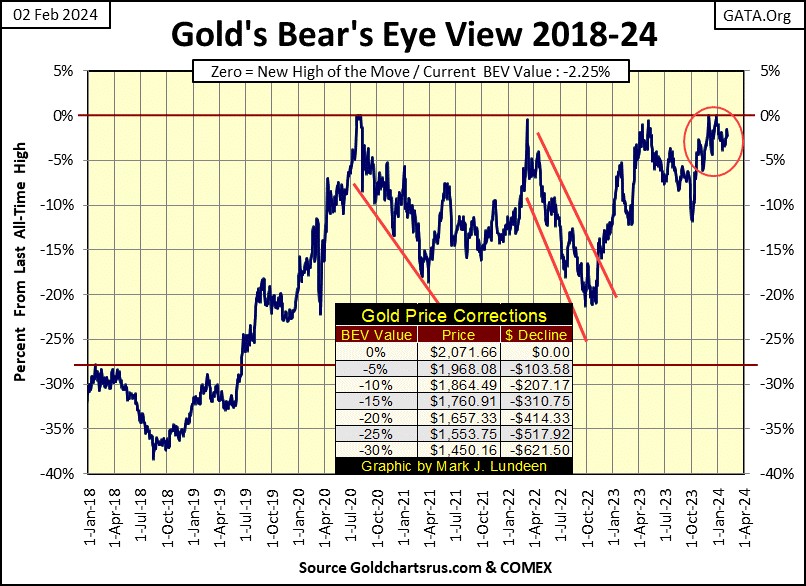
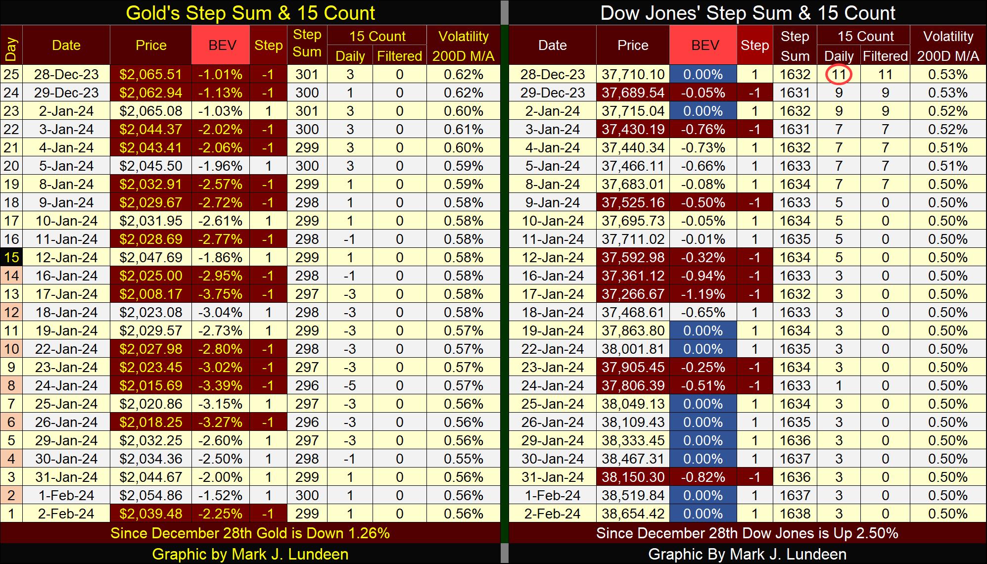
This is really weird. For a superior insight of what is happening in the gold market, let’s compare gold with the Dow Jones in their step sum tables below. Keep in mind that both gold, and the Dow Jones have closed daily in scoring position since before Thanks giving (last November – three months now). But the Dow Jones has seen SIXTEEN new BEV Zeros during these three months, while the gold has seen only two.
Everything associated with gold, the bullion or its miners has for many years behaved in a most bizarre fashion. It’s no mystery why that would be; the “policy makers” see the old monetary metals as competitors to their dollar, and have for decades suppressed the price of gold in the markets, as seen in this quote from Barron’s from 1951.
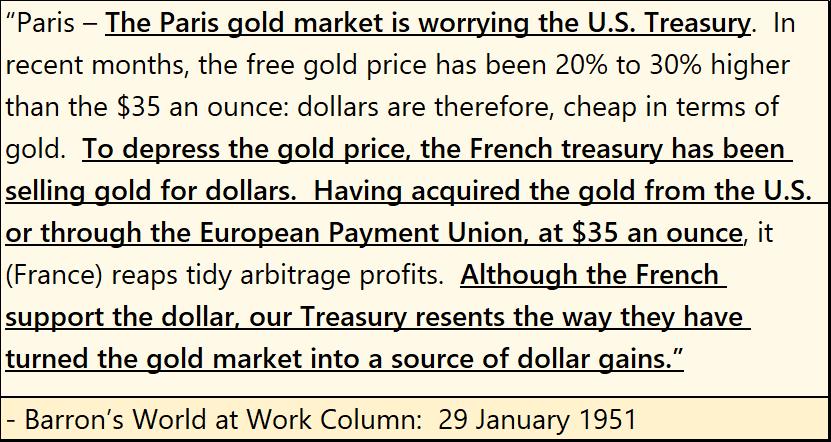
Why was it necessary for anyone to support the dollar, when the dollar was on the Bretton Wood’s $35 gold peg? Because the US Government continued issuing more than 35 paper dollars for each ounce of gold held by the US Treasury. Dishonesty at the highest levels of government and finance is why the dollar is no longer on the gold standard, and why investors today should have a position in gold and silver and their miners.
Mark J. Lundeen
********


