Precious Metals Remain the Place to be in 2026


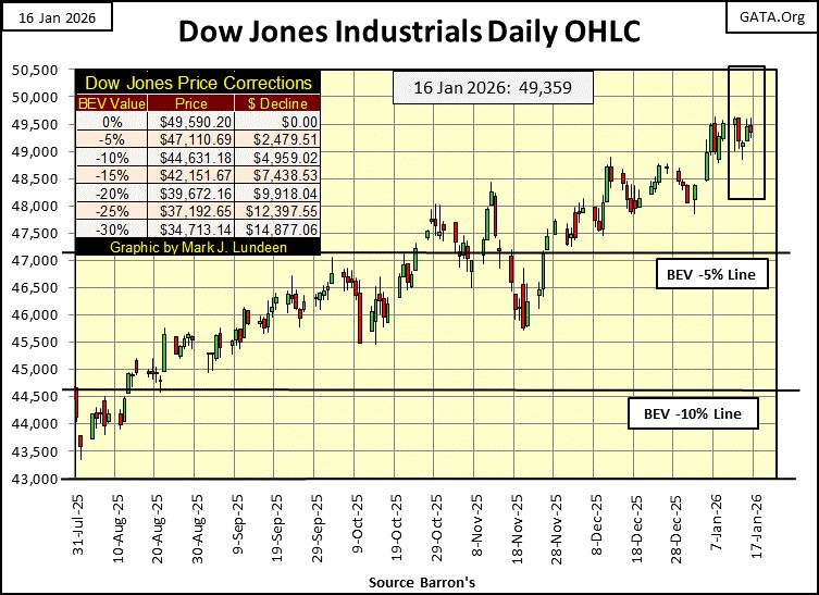
I’ve been gone for the past month. Let’s take a look at what has changed these past four weeks. Looking at the Dow Jones’ Bear’s Eye View chart below, not much has. Though since Christmas Eve, the Dow Jones has made five new all-time highs, or BEV Zeros (0.00%) in its BEV chart. On the days it wasn’t making a new all-time high, the Dow Jones remained within 1% of its last all-time high. So, since December 19th, the Dow Jones has advanced by 2.54%. A very satisfactory performance for the dividend yielding, mature blue-chip stocks that make up the Dow Jones.

A better view of the past month for the Dow Jones is seen below, with the Dow Jones plotted in daily bars, looking at the market action from the December 18th vertical grid line, to this week close.
In early January, the Dow Jones advanced a thousand points, from 48,500 to 49,500. But for the past two weeks, it has stalled at the 49,500 level. Is the Dow Jones still thinking of closing at, or above 50K? Oh, I believe we’ll see the Dow Jones at, and then above 50K, if for no other reason than for as long as the Dow Jones remains in scoring position in its BEV chart above (within 5% of its last all time high), we should assume new all-time highs are pending.
On that day, when the Dow Jones closes above 50,000, I’ll most likely go in to a dark room with a generous glass of bourbon, and try to think about something else.
So, the Dow Jones at, or above 50K still sounds so wrong to me. Then I am someone who once followed the Dow Jones when it routinely closed well below 1,000, as things were before August 1982.
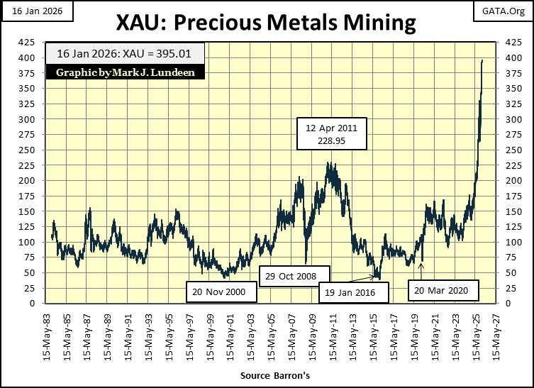
In my table below listing BEV values for the major market indexes I follow, the gold miners in the XAU (#1) closed at a new all-time high every day this week. Many other indexes also saw new all-time highs this week, but the XAU was the only index I follow that closed every day this week, at a new all-time high.
If you’re wondering what is with that, the chart below plotting the daily values for the XAU since it first began trading in 1983, illustrates something has changed since last May, when the XAU blasted off for the moon. Just eyeballing this chart, in the past eight months, the XAU has soared from 175, to close this week at 395. That is an eight-month gain of 125%!
This is a remarkable chart. For five decades, the XAU was rangebound between 50 and 225. Then beginning just last May, something changed in the market that made the XAU do what we see below. And like gold and silver bullion, the XAU so far has shown no interest to correct the amazing gains seen below. The day is coming when the XAU, as well as gold and silver bullion will see a pullback of 20% to 30%, maybe more, before continuing in their bull market advances.
But not yet. And we may see considerable advances in precious metals assets before they finally do correct, maybe months from now. Enjoy this while it lasts. We are watching market history in the making. Market history that most investors are totally unaware of, and “market experts” who choose to keep it that way.
To see how everything else I track has done since May 15th, I constructed the table below. The XAU has outperformed everything else, except for the price of silver, which was up 176% since last May. Gold came in at #3 in this table, but advancing only 42% since last May, which was still much better than anything else I follow.
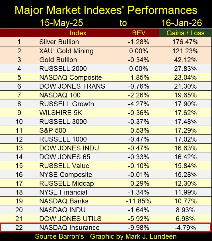
Seeing the precious metals, and their miners outperform the other indexes seen above, for the past eight months, one would think the public would begin paying attention to them. Maybe some are. And then maybe most aren’t. When I look at the main-stream financial media covering the financial markets, something I don’t do very often, I don’t see much coverage for advances seen above for gold and silver, or their miners, except for the paid ads selling gold and silver to the public.
So, what does that tell us about this bull market in gold and silver? That we are still very early in this bull market for gold and silver.
As promised above, below is this week’s table listing the BEV values for the major market indexes I follow. For the stock market bulls, the bull market continues, and most likely will continue for longer than I can guess. But one of these days, we’ll see these indexes’ BEV values slip far below -10%. If a bull decides to ride out the decline, I believe that will be an expensive mistake.
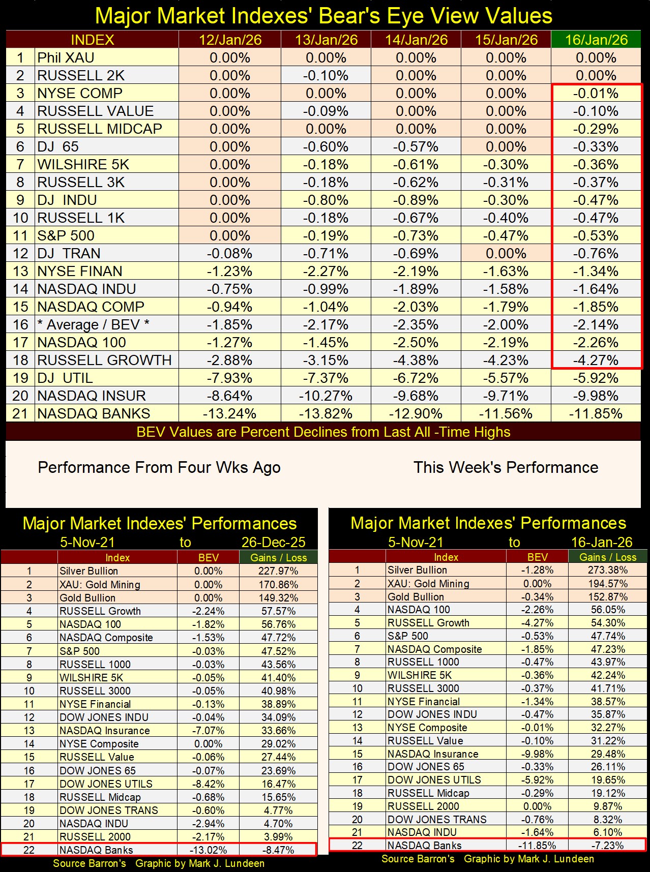
In the performance tables above, since 26 December 2025 most of the indexes have advanced, but not by much. This was not so for gold, silver and their miners, in the top three slots in these tables. Gold didn’t do much, but silver and the XAU did.
Just out of curiosity, I copied the BEV table for my market indexes from May last year. The XAU was #21, at the bottom of the table. Things change over time.
The old monetary metals are currently hot markets, and most likely will continue advancing aggressively in the months to come. Just keep in mind; one of these days, they are going to see a 20% to 30% correction, but when?
In 2026, silver has become a volatile market, which for silver means it is seeing extreme daily volatility; multiple moves of +/- 5%, or more, from a previous day’s closing price. The chart below (two charts below) plots silver’s days of extreme volatility, all 342 of them since 1969.
Rising volatility for the old monetary metals; gold and silver, works differently than it does for the Dow Jones. For the Dow Jones, rising daily volatility is a harbinger of deflation, an indicator that Mr Bear is beginning to think about the stock market, more than the bulls would like him too. However, for the old monetary metals, days of extreme volatility (3% Days for Gold, 5% Days for Silver), indicates an increase in the flow of funds, into, or out of the market.
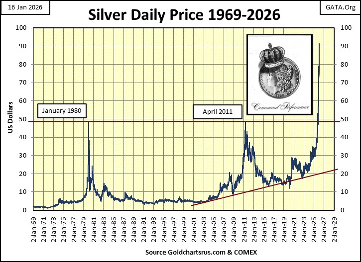
So, seeing an increase in silver’s 5% days below, doesn’t tell us whether silver is in a bull, or bear market, just that something significant is happening with the price of silver in the market. Something significant, such as the dollar price of silver seen below, where since last May, silver began a moon-shot from around $33, to over $90 just this week. It’s safe believing silver’s current extreme volatility, is bullish; that the flow of funds is now flowing into the silver market.
Note for the chart below, plotting silver’s days of extreme volatility since 1969, silver has seen about as many negative, as positive 5% days. That is important to keep in mind, as during bear markets, silver has seen many large daily advances, gains of 5%, and more from one day to the next. Also, during bull markets, silver has seen many large daily declines. So, don’t get discouraged should silver, or gold sees a huge daily decline, possibly a couple of them in the months ahead of us. That is just how things go in the precious-metals markets during their bull markets.
So, is silver’s day of extreme volatility seen on 27 March 1980, a 31.65% decline from one day to the next in the price of silver, a bullish market event? No, it marks a shameful day for America’s “Free Markets.” A day when the bulls in the silver market discovered the Federal Government’s “Regulators” had it out for them.
In January 1980, as silver threatened to close above $50 an ounce, with the big banks coughing-up-blood because they were on the wrong side of the silver market; the CFTC issued a new order for the silver market. Speculators in the silver market would only be allowed to sell silver contracts, no more buying silver contracts at the COMEX, unless someone was a big bank.
The banks weren’t bullish on silver in January 1980, they only wanted to buy silver contracts at the COMEX, at much reduced prices, so they could close out their losing short positions. If that meant the silver longs took massive losses to save the banks, the silver market’s “regulators” were more than willing to do just that.
That order triggered several huge drops, daily declines in the price of silver of over 10% in the price of silver in early 1980, as seen in silver’s price chart above.
This is an important historical note to keep in mind now in 2026, as the price of silver approaches $100 an ounce.
I’m just a market enthusiast, someone who follows the financial markets much like many people follow sports. I have no insider information, but somethings never change. Such as the big banks begin to cough-up-blood whenever the price of silver begins taking off, as it did in from 1979 to 1980, and now again in 2026. When silver breaks above $100 an ounce, expect some shenanigans from the silver market’s “regulators,” to aid Wall Street in exiting their losing short positions in silver.
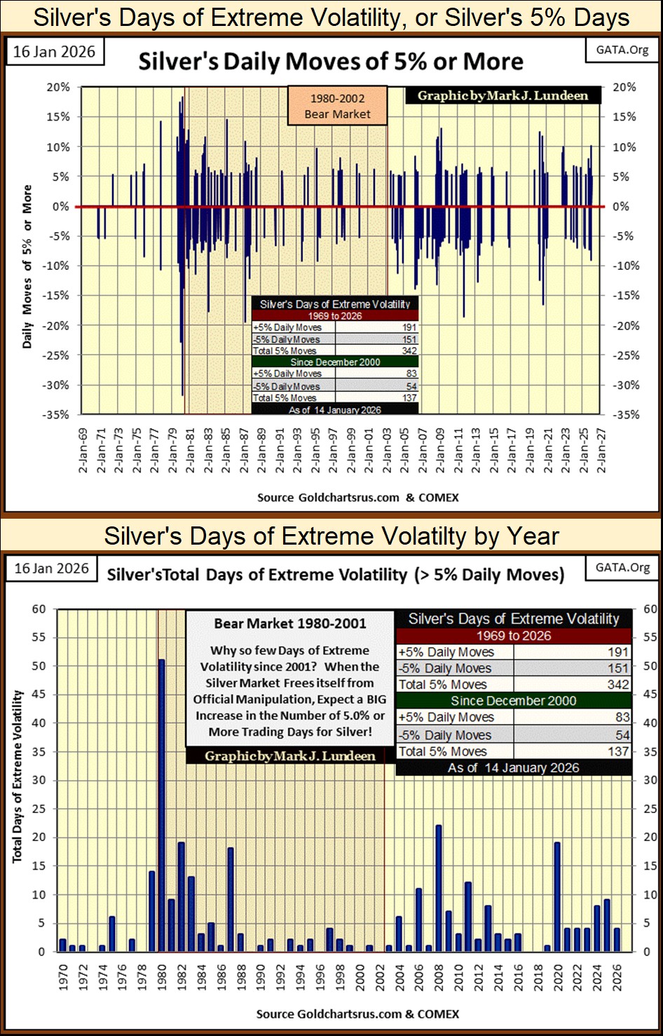
Here is something to note in the chart above; for the years of 2021-23, each saw only four days of extreme volatility. So far, silver has seen that many 5% days in just the first half of January 2026! Exactly what does that tell us? That something has changed in the silver market. What that means for the price of silver for the rest of 2026, is something we’ll all see in the year to come.
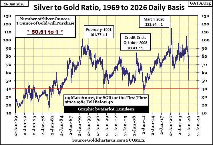
Wow, the silver to gold ratio (SGR / chart below) is dropping like a rock. It was over 105 ounces of silver for one ounce of gold last April, but this week closed just above 50 ounces of silver, for one ounce of gold. A good rule-of-thumb to apply to this chart is; a rising SGR, is associated with bear markets for gold and silver, while a declining SGR, is associated with market advances for gold and silver.
Seeing the SGR drop by over fifty ounces of silver, for one ounce of gold in less than a year, as seen below, is a strong confirmation the old monetary metals have entered into a bull market. So, what is next? Hopefully an SGR of something below 40. What that will mean for the price of gold and silver, is something we’ll just have to wait for to see.
It’s accurate saying the days of buying silver on the cheap stopped shortly after last May 9th, when the SGR broke below 100 ounces of silver for one ounce of gold. On that day, gold closed at $3328.74, and silver at $32.77. With the old monetary metals closing this week at $4596.38 & $90.13, gold has advanced by 38%, and silver by 175%, as the SGR declined these last eight months.
Below is a very interesting chart, the price of gold and silver indexed to 02 January 1969 = 1.00. Why index these price series? Indexing the price of gold and silver allows us to look at them as if they are in a horse race, and since January 1980, silver has been the losing horse in this race between gold and silver. But in the past year, all that has changed, as silver began roaring upward like a rocket.
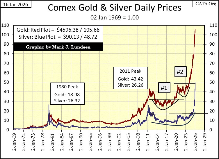
How much would silver have to rise up to, too finally catch up with gold in the chart above? Well, on 02 January 1969, the price of silver closed at $1.85 an ounce. Multiply that by today’s gold’s indexed value of 105.66, and we get silver at $195.74 an ounce.
That isn’t a targeted top price in silver for this bull market. No, no, no! Silver at $195.74 only adjusts the price of silver, to the gains seen by gold since 1969. Don’t be surprised should silver outperform gold in this bull market, as it did in January 1980, in the chart above.
That was fun, so what happens when we index the price of gold, and the Dow Jones, to 05 January 1970 = 1.00. First thing, why 1970, and not 1969 as I did above? I don’t know. I made these charts many years ago, and I haven’t made the effort to make that correction. Why would I, as this is the first time I’ve ever used these two charts together in an article.
Anyway, since gold began its current bull market in 2001, it has outperformed the Dow Jones by large measure, almost by 100%. Not that retail investors would learn that by following the main-stream financial media, who are still promoting high-tech stocks trading at the NASDAQ.
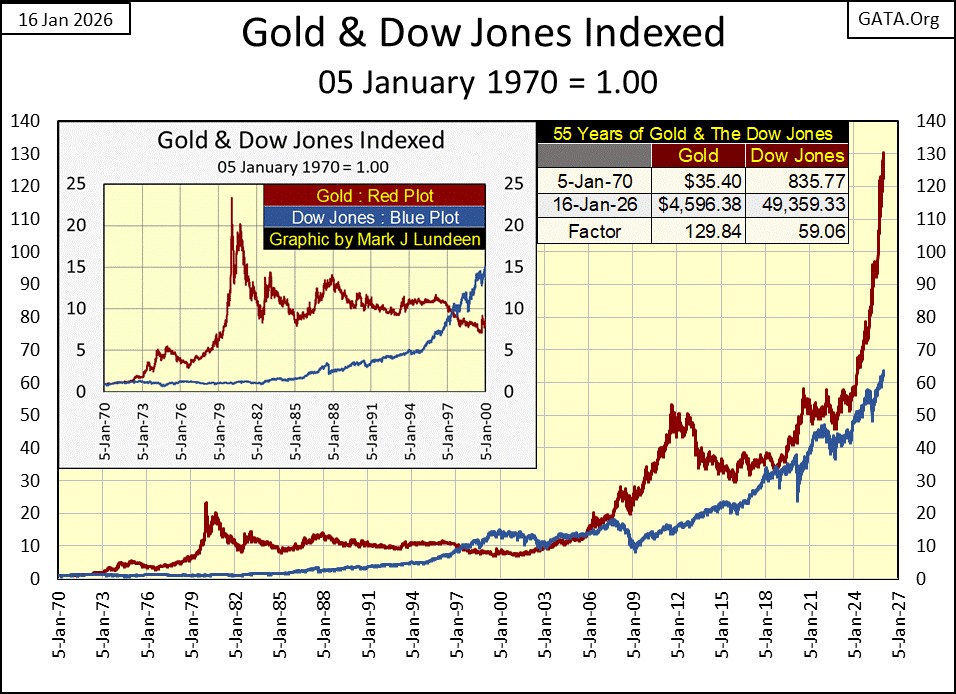
Though the Dow Jones has underperformed gold in the chart above, in 2026 the stock market is still overvalued, as measured by its dividend yields and P/E Ratios. The Dow Jones closed the week yielding only 1.69%, the S&P 500 yielded even less, 1.13%. As per Barron’s, the P/E Ratio for the Dow Jones closed this week at 25.52, meaning people were buying $1.00 of Dow Jones earnings, with each $25.52 of Dow Jones’ valuation. The S&P 500’s P/E is at 25.75, and the NASDAQ 100’s P/E closed the week at 32.65, while it was yielding an incredibly low 0.65%.
People aren’t buying, and holding shares now trading in the stock market because they offer good values, say like offering a dividend yield higher than what a bank will pay in a savings account. People are buying, and holding shares now trading in the stock market, because inflation is flowing into them, inflating their valuations in a huge bubble of overvaluation. One of these days, this bubble is going to go bust, you’ll not want any part of that!
But when is that going to happen? I haven’t a clue. Maybe next week, next month, or next year. The stock market is a political animal these days. A big bear market in stocks will anger a lot of voters, and Washington knows that.
Here is gold’s BEV chart. Gold saw a day of extreme volatility, or a 3% day for gold on December 29th. This 3% day, actually a decline in the price of gold from a previous day’s close of 4.41%, is seen in the BEV plot below. But gold didn’t say down for long, and has since made three new BEV Zeros (new all-time highs) so far in January.
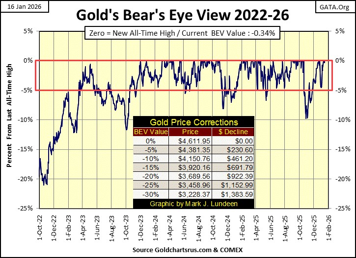
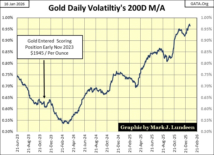
Gold in its step sum table below is looking good. Since December 11th, it has seen six new BEV Zeros. Looking at gold’s 15-count, its been positive for over a month, which means gold is seeing more daily advances than daily declines. And the price of gold has benefitted from all of those net daily advances, which is usually the case, but sometimes isn’t. Daily volatility for gold continues to rise, which is something I like.
Here is a chart for gold’s daily volatility’s 200D M/A. Since gold entered into scoring position in its BEV chart above in November 2023, its valuation has more than doubled, as daily volatility’s 200D M/A has advanced nicely for the past two years.
It doesn’t have to be that way, as rising daily volatility can also be associated with bear markets in gold, but this time it isn’t. So, if gold begins to see a pick up of days of extreme volatility / 3% days, I’m all for it.
Since December 11th, gold became overbought three times, as seen in gold’s 15-count, with the red-circled +7s. Markets don’t like being overbought, so they tend to generate more daily declines whenever their 15-counts increase to a +7, or above. Which is exactly what gold has done in the past month. But note that in spite of becoming overbought, gold managed to make six new all-time highs in its step sum table below.
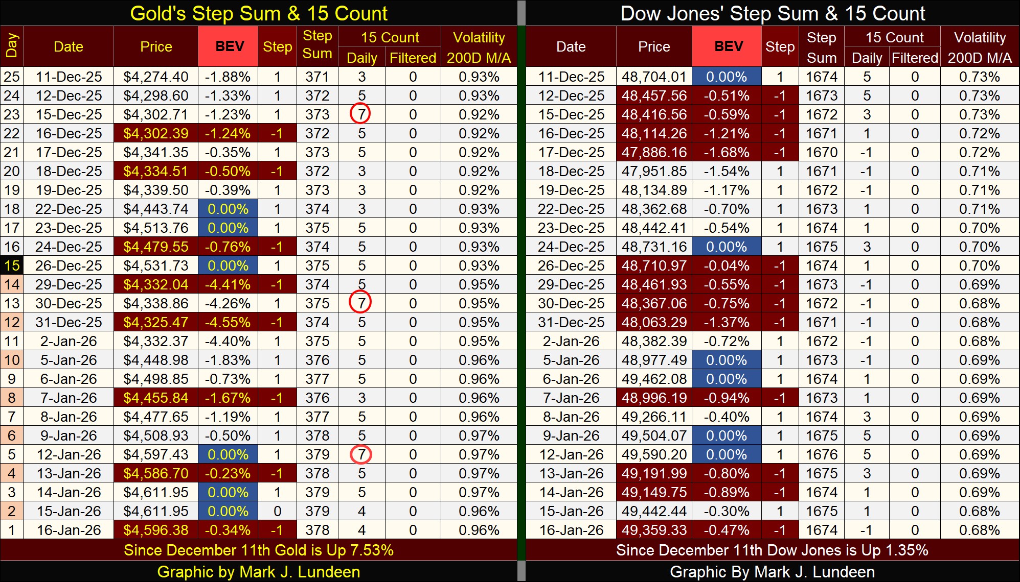
Looking at the Dow Jones side of the step sum table above, we see how differently the Dow Jones (my proxy for the general stock market) is trading compared to gold. Gold sees a down day, to be followed by an advancing day, or maybe several advancing days. The Dow Jones is seeing declining, and advancing days come in blocks, very much different from what we see gold doing.
One thing both gold and the Dow Jones has done since December 11th, is each has seen six new all-time highs (0.00% = BEV Zero). When you think about that, maybe that is the most important thing these markets can do for their investors – keep making new all-time highs.
True, but when we see that since December 11th, gold is up by 7.53%, while the Dow Jones is up only by 1.35% in the past twenty-five trading days, it becomes obvious that gold continues being a superior generator of capital gains, than the stock market.
I guess that does it for this week. I’ll be back with more next week.
Mark J. Lundeen
********


