The Dow Jones Index Is Going To New All-Time Highs – BUT…


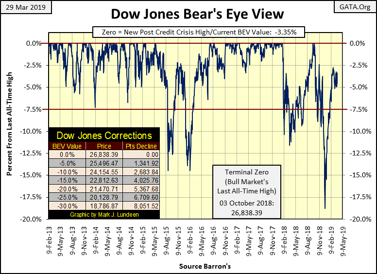
The Dow Jones closed higher this week, with a BEV Value of -3.35% from its last all-time high of last October. Last week it closed with a BEV value of -4.94%. That’s progress as I understand it, though we see nothing exciting happening in the Dow’s BEV chart below. But that will change when (if?) the Dow Jones breaks above its -2.5% BEV line below, or above its 26,000 level in a point chart.
All and all, I remain confident the Dow Jones will see more new all-time highs in the months to come.
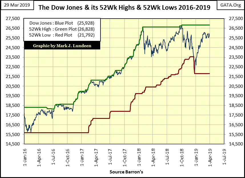
The chart below plots the Dow Jones in dollars along with its 52Wk High and Low lines. After October 3rd’s last all-time high, as the Dow Jones declined 18% in late December, I wasn’t predicting a recovery towards new all-time highs. With the Dow Jones seeing sixteen days of extreme volatility from October to early January, there was no reason to.
But since January 4th, daily volatility has calmed down as the Dow Jones snapped back towards its highs of early October. What the Dow Jones did below was to push down its 52Wk Low Line by 1708 points, that’s a very nice and healthy correction in the stock market.
As long-term readers know, I don’t believe there’s much of a future for the bulls in the stock market, but that’s my long-term view of the Dow Jones. However, just looking at these charts of the Dow Jones as March 2019 comes to a close, I understand the appeal of buying what the NYSE and NASDAQ are selling. My only concern is should the Dow once again enter a phase of breaking to new all-time highs, how much higher can it go? Another 11,328 point advance seen from January 2016 to October 2018?
Anything is possible, but most things aren’t probable.
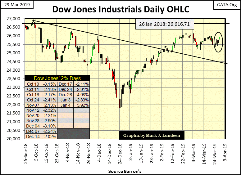
Here’s the Dow Jones in daily bars. After the month long correction seen below, there’s a good chance it will take out its 26,000 level next week or the week after. From there I expect the Dow Jones will once again find itself making history as it advances toward 27,000, but what then?
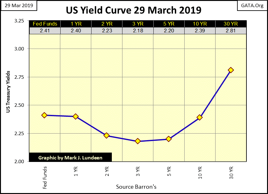
One BIG problem the bulls have to ignore, is the yield curve is currently inverted. T-bond yields going out to 10 years are below the Fed Funds Rate, and that has NEVER been a positive factor for the stock market.
Looking at today’s yield curve below, if I were a bull in the stock market sitting on some nice capital gains, the first time the Dow Jones saw a day of extreme volatility I’d get the “Hell Out of Dodge City” by selling it all and not look back. It’s just a fact THE big problem retail investors have is they never have an exit plan, as they sadly believe the good times will never end; but they always do.
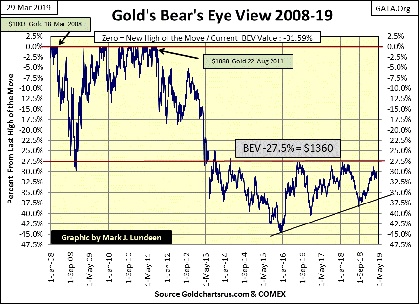
So how did gold do this week? It closed down $21 from last Friday’s close, a decline of -1.59%. I’d had rather seen it advance by $21, but the decline is hardly noticeable in gold’s BEV chart below. As it is, at the end of the week gold’s BEV chart below is still very attractive.
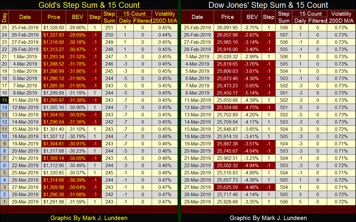
Skipping down to gold’s step sum table below, the gold market has seen a lot of selling pressure all month long. Looking at gold’s 15 count in my Excel file, gold has actually been under pressure since the end of January. Yet for all their effort the bears haven’t accomplished much.
So when will gold and silver once again advance towards new all-time highs? Well, if you look at their charts, they’ve been advancing towards new all-time highs since December 2015. They just aren’t moving up as fast as we’d like them to. So, maybe the question should be; when will gold and silver advance fast enough to make people like you and me happy?
I can’t give you a date. But looking at the yield curve above, it’s reasonable assuming within the next six months the stock and bond markets will have their day with Mr Bear. And deflating financial assets are usually a positive for precious metal assets.
Another thing I’m looking forward to is a period of time when the Dow Jones and gold and silver are all seeing multiple days of extreme volatility. What’s bad for the stock market can be very positive for the old monetary metals; big daily (+/- %) moves.
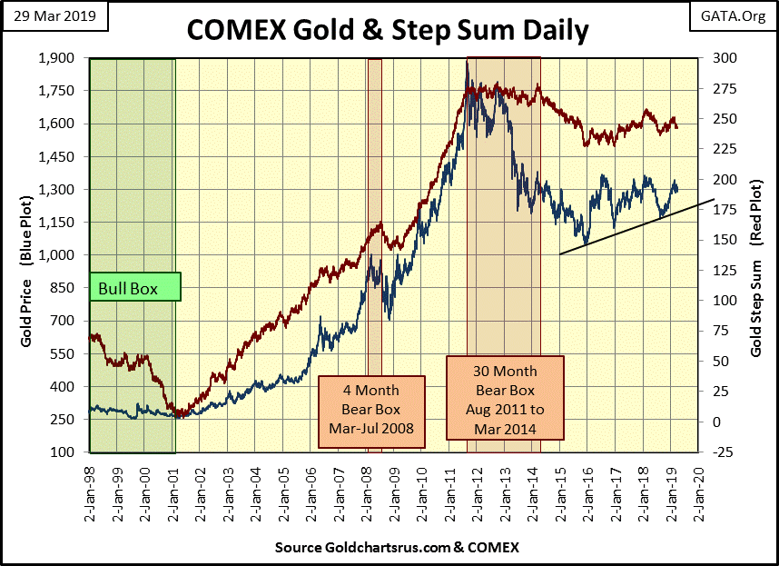
Next is gold’s step sum chart, and as is evident in it, gold (Blue Plot) has been advancing towards new all-time highs since December 2015. Current market action for gold is typical of the early stages of a major market advance: uncertainty whether the asset in question is actually in a self-sustaining advance.
Today everyone knows the place to be is in the stock market, as the stock market always goes up. But at some point, what everyone knows about a market proves to be worthless. Except for central banks, who are buying gold as fast as they can, currently gold has few supporters. What are these central bankers looking at that is missed by most investors?
It’s not hard understanding why gold and silver are shunned assets by most investors. After the August 2011 to December 2015 45% market decline, a traumatic market event, those investors who would like to invest in gold still suffer from batter-bull syndrome. In other words, gold bulls today continue looking down at the low of December 2015 rather than focusing on gold’s last all-time high of August 2011.
But this too shall pass as gold takes out its $1360 line of resistance, a line of resistance that has stood for the past six years that now is only sixty-eight dollars from today’s closing price. This sounds very optimistic. Well I am. But I know being a gold bull is also an exercise in frustration as gold bulls are going against the interests of an entrenched establishment who hate it, as gold and silver are objective measurements of value.
Ask yourself what makes a policy maker a “policy maker?” They operate outside the realm of law, and do what they damn well please with no fear of consequences from the legal system that controls everyone else. But this too shall pass, and when it does you’ll be happy to own gold and silver.
The Dow Jones’ step sum chart below is looking good, with both the blue price plot (Market Reality) and red step sum plot (Market Expectation) aligned and trending upwards. Twenty-six thousand is the key level. Should the Dow Jones cross over that, I expect it will be making history shortly thereafter.

In gold’s step sum table below, the selling pressure gold has endured is very evident. Gold hasn’t seen a positive 15 count since the end of February. Yet for all that selling by the big banks, with their tons of paper metal flooding the futures markets, insincere promises to deliver gold they don’t have and couldn’t get if their lives depended on it, they haven’t yet driven gold down below $1290.
If the “policy makers” can’t do that, gold just might be at a turning point where it next takes out $1360 in the weeks to come.
The Dow Jones is entering a period where advancing days outnumber the decliners, and its valuation is benefitting from it. With its BEV value only 3.35% from the Dow Jones’ last-all time high of last October 3rd, it’s easy being a bull in the stock market.
My favorite measurement of monetary inflation is Currency in Circulation (CinC). Unlike the Consumer Price and Producer Price indices, which are measurements of changes in prices, viewing CinC is actually looking at the growth in the supply of dollars in circulation, aka – monetary inflation.
Below we see CinC (Green Plot), the Dow Jones (Red Plot) and the BGMI (Blue Plot) indexed to 1.00 = January 1920. In the past ninety-nine years the Federal Reserve System has inflated the supply of dollars in circulation (CinC Green Plot) by a factor of 384. Any “economist” or “market expert” claiming the United States has a low “inflation environment” is deceiving the public.
Also note the only Dow Jones’ bull market that actually outperformed CinC inflation was the Roaring 1920s bull market. The Dow Jones came close to CinC inflation in the late 1990s, but has since lagged far behind. So, if investing in the stock market returns to investors more dollars than they put in, does the increase in dollars keep up with rising consumer prices? From one year to the next, it can. But from one decade to another I doubt it.
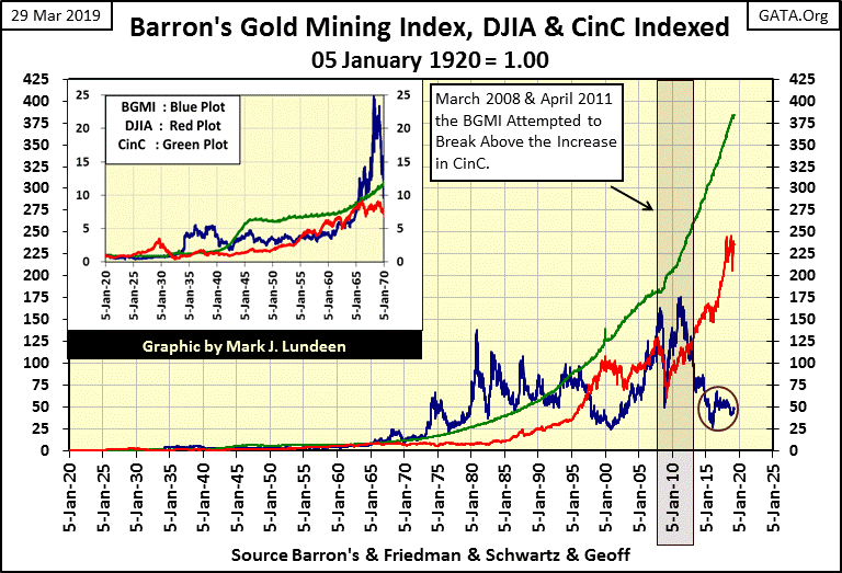
Amazingly, gold mining stocks as measured by Barron’s Gold Mining Index actually exceeded, or traded darn close to the rate of CinC inflation from 1965 to 1996: thirty-one years. That plus the BGMI in 2008 and again in 2011 attempted, but failed to break above the rate of CinC inflation. That it failed to do so was most likely a “policy decision” made by the “policy makers” in Washington and on Wall Street.
As of right now the BGMI is trading where it was twenty years ago. I’ve read the comments of many famous investors, and most of them have stated the most important thing in making a killing in the market is to first buy cheap, and right now the gold and silver miners are DAMN CHEAP.
A quick inspection of the three plots above illustrates the BGMI and the Dow Jones are typically counter-cyclical to each other, though not always. Meaning, the ever rising CinC plot (liquidity flowing from the Federal Reserve) either flows into financial assets (the Dow Jones) or consumer prices (the BGMI). This observable fact plotted in the chart above makes one wonder what the future holds for the BGMI when the Dow Jones once again begins to deflate.
Will the BGMI once again increase far above the CinC plot? I’m thinking it! Here are the numbers; for the indexed value of the BGMI to match that of CinC (384 as of this week) the BGMI would have to appreciate from 447.6 at week’s close to 3,585, a gain of 701%. For the Dow Jones to match CinC at the end of the week it would have to increase from this week’s close of 25,928 up to 41,500, a gain of 60%.
Of the two possibilities, I doubt the Dow Jones has the wherewithal to inflate its valuation to 41,500. That plus the last time the Dow Jones found itself above the green CinC plot in the chart above was during the 1920s.
However, recognizing the fact that during the 20th century, the blue BGMI plot spent about half of its time above the green CinC plot, there would be nothing unusual seeing the gold mining stocks rising above the rate of CinC inflation again, and staying there for years.
Other measurements of monetary inflation are the Federal Reserve’s Ms: M1 & M2. Back in the late 1970s and early 80s, when CPI inflation was rising by double digits, even Networks’ nightly news broadcast by CBS or NBC frequently included a report on the change of M1. Back then the media and the public made the connection between the growth in the money supply and the rising cost-of-living. Today with monetary inflation flowing into financial asset valuations, sadly that is no longer so.
What’s M1? From Investopedia:
“M1 is the money supply that includes physical currency and coin, demand deposits, travelers checks, other checkable deposits and negotiable order of withdrawal (NOW) accounts. The most liquid portions of the money supply are measured by M1 because it contains currency and assets that can be quickly converted to cash. "Near money" and "near, near money," which fall under M2 and M3, cannot be converted to currency as quickly.”
Investopedia above noted M3, but the Federal Reserve discontinued M3 in March 2006, or so they said. Most likely the Fed has continued calculating M3 for their internal use, but discontinued publishing it in the public domain. The link below goes to the Federal Reserve’s h6 report, which publishes M1 & M2.
https://www.federalreserve.gov/releases/h6/current/default.htm
So why was following M1 so widely followed forty years ago? In the second half of the 1970s CPI inflation was rising by double digits. At that time, unlike today, there were still many people alive who personally remembered the gold standard; people who unlike today’s college graduates with degrees in economics knew the government was over issuing US dollars into circulation.
As you can see in my table of past Barron’s articles, the problems the US dollar had in the late 1970s and early 80s was a long time coming.
In fact, Barron’s reported in October 1979 how the dollar was being refused for payment in hotels and restaurants in Europe. Something had to be done, and that something was Paul Volcker becoming the chairman of the Federal Reserve in August 1979.
For decades M1 (and CinC) had been rising, funneling monetary inflation into consumer prices. Something drastic had to be done, and what Volcker did was to invert the yield curve as no one had before, or will ever again (Blue Plot below). In July 1981 Fed Funds was at 22%, as the rest of the curve saw double digit yields. But it wasn’t just in July 1981 when the yield curve was inverted to extremes; Volcker inverted the yield curve from December 1979 to October 1982, almost for three years.
The remarkable thing to note about the yield curves below is how resilient the US economy and financial system was during Paul Volcker’s tenure as Fed Chairman (August 1979 – August 1987). The Fed Funds Rate first increased above 10% in Barron’s 01 January 1979 issue, with Barron’s 29 October 1984 issue the last to publish a Fed Funds Rate in double-digits; that’s over five years of abnormally high and painful interest rates.
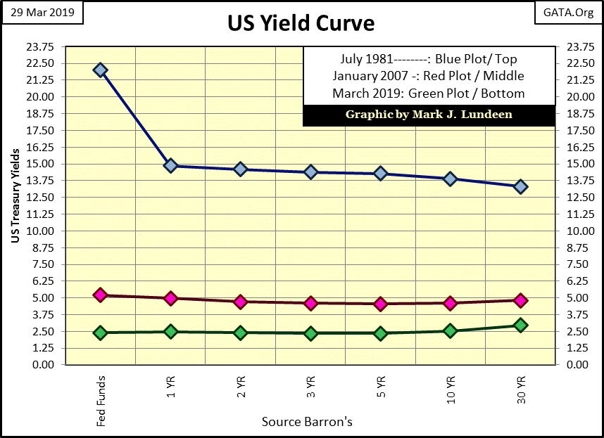
Yet during the Volcker years, the banking system continued operating as it had before, and savers were getting well over 10% on bank deposits. Hard to believe it, but in October 1981 one could purchase a US Treasury 20 year bond with a coupon of over 15%, though few people dared to. Unemployment was high, but business in general continued on from one day to the next all during this time. Then something remarkable happened; the early 1980s saw a drastic reduction in Consumer Price Inflation as the stock and bond markets began a bull market that continues to this day.
Today, after decades of machinations by the idiot savants who’ve sat at the Federal Reserve’s Open Market Committee (FOMC) dictating “monetary policy,” our economy and financial system cannot survive the yield curve as seen in January 2007 (Red Plot above). That’s pathetic, seeing the economic establishment actually fearing interest rates and Treasury Bond yields at or slightly above 6%. What in the heck did they do?
The big difference between then and now is before Alan Greenspan, individual Americans were savers and businesses saw the virtue of maintaining a strong balance sheet. So, corporations liked lots of cash in the bank and kept debt to a minimum. This created a situation where the public and businesses benefitted from high rates and yields, as on the whole they were creditors receiving interest payments, not debtors servicing debt.
But fifty years later all this has changed. Financial Advisor reports that half of Americans over 55 don’t have retirement savings.
https://www.fa-mag.com/news/half-of-americans-55-and-older-don-t-have-retirement-savings-44040.html
Well, people of my generation listened to what the “market experts” and “economists” had to say, and doing all they were told to do, they are now they screwed!
Here is a quote by Robert McTeer of the Dallas Fed commenting on the popping of the 1990s NASDAQ High Tech Bubble. His solution? Everyone should take out a $30,000 loan for a new SUV.
“My term for what happened to the economy as we were gliding in for the proverbial soft landing is that we hit an air pocket. Fortunately, we were flying high enough so that the sudden decline in growth didn't cause us to crash-land. If we all join hands and go buy a new SUV, everything will be all right. Preferably a Navigator.”
- Robert McTeer, President Dallas Federal Reserve Bank: Remarks before the Richardson, Texas, Chamber of Commerce, 02 Feb 2001
I can tell you what Americans do have after decades of college professors of economics professing the virtues of debt to millions of their students; Americans have more debt than they will ever be able to pay off. Like many Silicone Valley tech companies, local governments, and yes Washington DC, increasing interest rates and bond yields to 6% would be catastrophic.
However, the biggest problem for increasing rates and yields are the OTC interest rate derivatives. In my Barron’s article table above, in the banking section we see an old article on Interest Rate Swaps: the $150 Billion Dollar Baby. That was in 1985. Today the Bank of International Settlements reports that interest rate swaps in the first half of 2018 (latest data) has increased by three orders of magnitude and a double to $349.76 TRILLION dollars in notional value.
Notional value? What’s that?
A look at a CBOT corn contract for 5000 bushels will answer that. At Row #1, we see a long and a short entered into a contract with corn selling for $3.75. With corn at $3.75, notional value of this 5000 bushel contract is at $18,750. But to the long and short side of this contract, the impact of this notional value of $18,750 on their capital accounts is $0, as it takes a change in the price of corn to create a flow of funds from one party of the contract to the other.
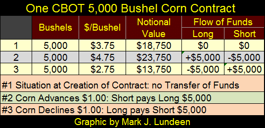
Looking at rows #2&3 in the above table we see the impact on the parties to this corn contract as the price of corn changes.
So, realizing that all OTC derivatives are essentially futures contracts, or options on futures contracts, the table explains why with $349.76 TRILLION dollars in notional value in interest rate swaps, the global-financial system hasn’t yet collapsed; because rates and yields have yet to increase above a certain, yet currently unknown threshold. I expect that threshold is well below those yields (less than 6%) seen in the yield curve for January 2007 shown in the yield curve chart above.
In the late 1990s the financial media was always yapping about the virtues of derivatives. How they would transfer “market risks” to those best able to bear them. During the sub-prime mortgage market meltdown, which was essentially a derivatives debacle, we all discovered who was best able to bear trillions of dollars of market risks created by Wall Street: the US Treasury.
With OTC interest rate swaps now with a notional value of $349.76 trillion dollars, we don’t see the MSM yapping about derivatives on CNBC anymore, as derivatives have become exactly what Warren Buffet predicted in 2002, before the Sage of Omaha joined the dark side of the force:
“The derivatives genie is now well out of the bottle, and these instruments will almost certainly multiply in variety and number until some event makes their toxicity clear....[They] are financial weapons of mass destruction, carrying dangers that, while now latent, are potentially lethal.”
-Warren Buffett, 2002 letter to shareholders
Okay, so the Dow Jones is once again advancing towards new all-time highs. However there are problems the financial media is fully aware of, but have chosen not to cover, massive problems most people are totally unaware of.
But the day is coming when events will force them to discuss derivatives once again, for the simple reason that Mr Bear isn’t going anywhere until he personally stress tests every single balance sheet on Planet Earth. At that time expect counter-party failure of some astronomical number, which is why I like gold and silver so much, as precious metals have zero counter-party risks.
Mark J. Lundeen


