Reasons to Believe, The Stock Market is at a Top


As the United States is having its 4th of July national holiday next week, I’m going to take next week off. The Good Lord willing, I’ll be back two weeks from now.
A lot can change in a week. In these last few weeks, the Dow Jones appeared to have topped out, just below scoring position in its BEV chart below, as if its BEV -5% was a very hard ceiling. Now this week it closed with a BEV of -2.65%, halfway to making a new BEV Zero (0.00% = new all-time high). In dollar terms, what would a new BEV Zero be? Looking at the table in the chart below, any Dow Jones close above its current 0.00%, at 45,014.04.
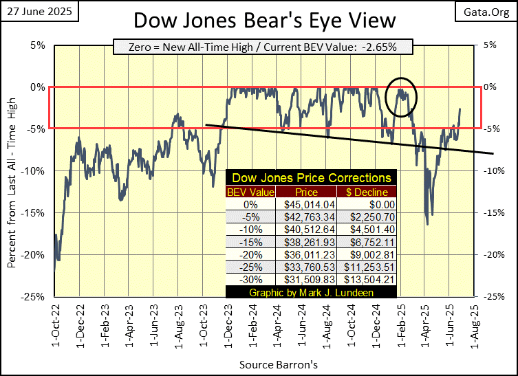
Will the Dow Jones make a new BEV Zero in its BEV chart above? In the next few weeks, I suspect it will. Up here in the market’s peanut gallery, I have a few beers on it, that it will. It had better, and not repeat what it did last February (Black Circle), where the Dow Jones made multiple daily closes within a BEV of -0.90%, to then fall out of scoring position, followed by a decline to its BEV -15% line by early April.
So, what if the Dow Jones does make a new BEV Zero in its BEV chart above? That is the question; what then? Does it resume the advance seen above from November 2023, to December 2024, a year where the Dow Jones generated fifty-five new all-time highs? A year where the Dow Jones advanced from its first BEV
Zero, to its fifty-fifth BEV Zero, some 7,924 points, a one-year advance of 21.3%? Or does it do something else?
The paragraph above has a lot of question marks in it. For a market advance that began in August 1982, with the Dow Jones closing below 800, to December 2024, with it closing above 45,000, maybe seeing so many question marks isn’t such a good thing. The Dow Jones (my proxy for the general stock market) is in a massive bubble, and has been for decades. That isn’t my opinion, that is a fact as documented by the Dow Jones Dividend Yield plotted below.
Before Alan Greenspan became FOMC Idiot Primate in August 1987, investors could time very profitable entry and exit points using the Dow Jones dividend yield;
3% yield = sell
6% yield = buy
Using this little rule-of-thumb a century ago, would have gotten people out of the market, near the Dow Jones’ September 1929 top, and back in the market, if not at the July 1932 bottom, then close enough to make following the Dow Jones’ dividend yield during the Great Depression’s bear market, very worthwhile.
That has been true for all of the major bull and bear markets between 1925, to August 1987, when something very odd happened. The Dow Jones’ dividend yield declined to a historic low; 2.54% in August 1987. It was time for a major market decline, time for the Dow Jones dividend yield to once again rise up to something over 6%. But as seen in the chart below, that didn’t happen.
Following the flash crash of October 1987 (two months into Greenspan’s Idiot Primateship), he began “providing ample liquidity” to the market, until thirteen years later, the Dow Jones was yielding an incredible 1.30% in January 2000. Look at the chart; Wow!
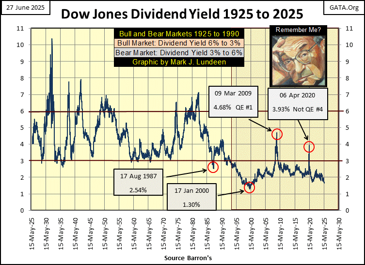
Since August 1987, when the FOMC’s idiotic “monetary policy” shitcanned the old sell on the 3%, then buyback on a 6% yield, an effective rule that lasted for over six decades, the stock market has been in a gigantic valuation bubble.
And every time the Dow Jones’ dividend yield attempts to return to historical norms, such as yielding something over 6% at a bear-market bottom, all hell breaks loose. As seen above in March 2009 and again at the March 2020 market bottoms, in a panic the idiots at the FOMC implemented their QEs by flooding the financial markets, with trillions-of-dollars of monetary inflation, to “stabilize market valuations.” Or in other words; to get the Dow Jones’ dividend yield back below 3%.
Thinking about the Dow Jones with its dividend, is exactly like thinking about it as if it were a bond. Unlike a bond’s fixed coupon (fixed income), the dividend payout for the Dow Jones can, and does change. If a bond has an annual payout of $10, the yield of that $10 payout depends on how much the owner paid for the bond. If they paid $100 for the bond, that bond is yielding an annual 10%. If they paid $200 for the bond, that bond is yielding an annual 5%.
So, for the Dow Jones with it current payout of $727.40, how much is it now yielding? At this week’s Dow Jones close of 43,819, the Dow Jones is yielding 1.66%. To force the Dow Jones to yield 6%, the old bear market buy signal, the valuation for the Dow Jones would have to deflate to 12,123, a market decline of 72.33% to yield a 6% dividend, with a dividend payout of $727.40.
As bad as that is, it could get worse should the Dow Jones’ dividend payout decline, which is very likely during a massive, 72.33% bear market valuation collapse. If the payout for the Dow Jones is reduced to $500.00, to make that payout yield 6%, the Dow Jones’ valuation would have to deflate to 8,333, a valuation collapse of 80.9% from this week’s close of 43,819. That is a Great Depression market event.
Like I said; the Dow Jones has been in a massive bubble for decades. Long enough for concerns about its too small dividend yields, to become invalid in the minds of most investors and “market experts,” and that is a mistake. A long enduring, and on-going mistake to be sure, but a mistake nonetheless.
So, you now know why this market enthusiast is only betting a few beers on the stock market, up here in the market’s peanut gallery. But then, who knows how long these idiots can keep the market’s valuations “stabilized” near their current valuations? Could be years. Then again, maybe only a few more months.
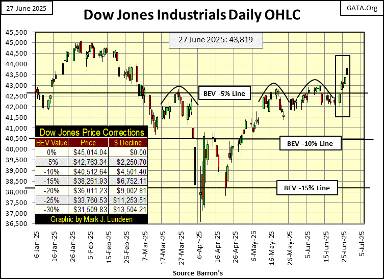
Here is the Dow Jones in its daily bars below. What can I say? It looks good! Maybe on Monday, I’ll bet a few hotdogs the Dow Jones will be at new all-time highs next week, before the 4th of July. That seems like a safe bet.
This week, the NASDAQ Composite (BEV chart below) closed at a new all-time high. If the Dow Jones is currently in a massive bubble, the NASDAQ Composite’s valuation is even more inflated. But the NASDAQ bulls don’t care, so why should I?
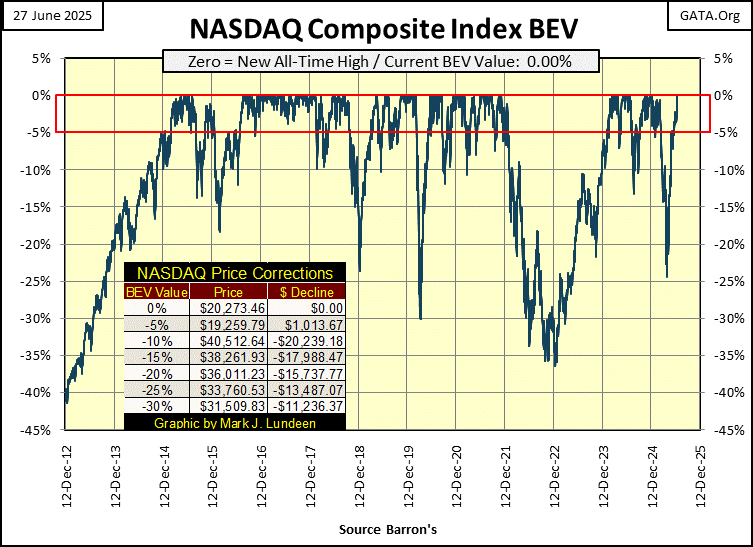
In the past few weeks, I’ve been asking; where are all the BEV Zeros for the major market indexes I follow below. For weeks, we’ve seen plenty of these indexes closing in scoring position (BEVs of -0.01% to -4.99%), but no BEV Zeros (0.00%). Then, on this last Friday of June 2025, this week closed with eight of these indexes closing at a BEV Zero, with the next seven closing the week in scoring position. Not a bad week for the bulls.
Look at the NASDAQ 100 (#3); it closed at a new all-time high for four of this week’s five trading days.
One oddity seen below, is how the NASDAQ Banking Index is tail-end Charlie in the table below, closing the week with a BEV of -19.98%, or 19.98% below its last all-time high of November 2021. While this week, the NYSE Financial Index saw three BEV Zeros. What is the difference these financial institutions?
I don’t know. But I expect the NYSE Financial Index contains all the big, “important” Wall Street banks. While the NASDAQ Banking Index, by design is composed of regional banks, that the idiots at the FOMC see more as annoying little entities, than assets with which it can execute “monetary policy” with.
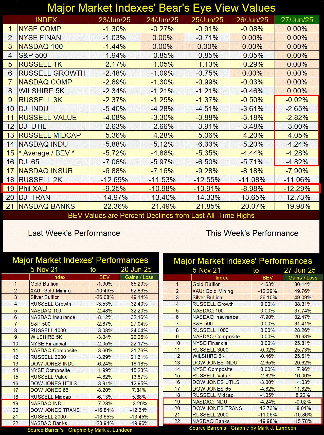
Moving on to my performance table for this week, precious metal assets remain at the top of the table. But the gap between them, and the rest of the market closed up some this week.
In the weeks to come, will the XAU and silver lose their current positions to other indexes in the table? Maybe. But over the long-term, I still like the XAU and silver more than anything else currently below them in the table above.
I haven’t looked at NYSE Margin Debt for a while, so this is a good time to do so. Leveraging one’s position in the stock market, by purchasing additional shares via a loan from one’s broker is called using margin debt. Using margin debt transforms an investor into a speculator. Nothing morally wrong with that. But speculating in the market using other people’s money, presents higher levels of risk to any investment.
How large a loan depends on how large an investment. A 50% margin is the highest level of debt brokers will allow. In other words, for every $1 an investor places in the investment, the broker is willing to lend $1. So, 50% of the position belongs to the investor, and 50% of the position belongs to the broker = 50% margin.
Of course, an investor could use lower levels of leverage too. But for this discussing we’ll assume the position is leveraged by 50%. Though if the position’s valuation increases, the percentage of the position of the brokers declines accordingly, unless the speculator purchases additional shares, on margin.
Leveraging one’s position by 50%, makes a 50% advance in the market, a 10% gain for the investment using margin debt. That sounds pretty good, and it is in an advancing market. However, a 50% decline in the market, results in a 100% loss for the position using 50% margin.
But that isn’t going to happen, as when one uses margin debt, the broker has as much say about that position as does the investor. And that is fair, as the broker also has money in the trade. Should the position begin to decline, the broker will begin to reduce his position in the losing trade, by selling your shares. Which in most cases, is doing the investor / speculator a favor.
But then, they may send the investor a “margin call,” or notification that if you pay back a certain portion of the loan they made for your position, they won’t sell any shares. But making a margin call for a losing trade is foolish. Best to keep your money, exit the trade by taking your losses, and wait for a better day to leverage a bullish bet on the market.
Nothing is certain in the market, but somethings never change. One of those things that never seems to change is; the public is always late to the any party going on at Wall Street, and then they stay on long after the festivities have ended. That can be seen when looking at the expansions and contractions in NYSE Margin Debt below.
NYSE margin debt (Red Plot below) peaked in March 2000, as the NASDAQ High-Tech bubble popped. In other words, the public’s bullishness peaked exactly when they should have become bearish. The Dow Jones declined by 38% in October 2002. But the real action for the High-Tech bubble was at the NASDAQ, and I suspect so was most of this margin debt seen below too. In October 2002, the NASDAQ Composite was down by 78%, as NYSE margin debt declined by 53% from its highs of March 2000.
One would think margin debt would have been down more than that. But there really are people who do know what they are doing in the market, people who buy stocks on margin at the bottom, not at the top of the market. I don’t know for a fact, but I suspect that is why following October 2002, NYSE margin debt once again began going up, as the stock market recovered.
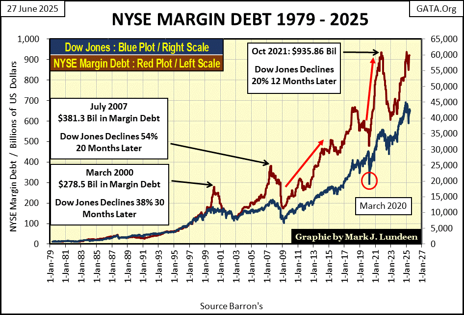
I have two other examples of when NYSE margin debt peaked in the chart above, as expected at market tops. The Sub-Prime Mortgage boom and bust, and then the market boom following FOMC Idiot Primate Powell’s multi-trillion dollar Not QE#4, that peaked in November 2021, the same market top I use in my weekly performance tables above.
The latest top in NYSE margin debt occurred in January of this year, with NYSE margin debt peaking at $937.25 billion dollars, almost a trillion dollars of margin debt, inflating market valuations in the stock market.
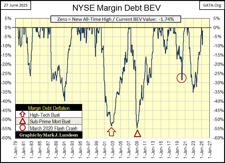
Below is a Bear’s Eye View of NYSE margin debt going back to 1979, which provides a unique view of how to make money in the stock market, from the perspective of the brokers who lend money to speculators in the stock market.
Brokers aren’t emotional about the market. As long as it is going up, they are willing to lend money to speculators to buy stocks. But when the market turns, they are ruthless about protecting their loans, and will close a speculator’s position without their permission, thus pulling money (reducing NYSE margin debt), from the stock market.
The latest data available is for May, last month, which has a BEV of -1.74%, or only 1.74% below the last all-time high for NYSE margin debt seen last January. Market history tells us the best time to buy * ISN’T * when NYSE margin debt is near an all-time high, but following a * BIG DECLINE * in NYSE margin debt, as seen at the bottom of the NASDAQ High-Tech and Sub-Prime Mortgage bear markets.
Currently, the market is advancing. But at the top of any market advance, market risks to invested funds increase to maximum, while the potential for seeing profits on invested funds decrease to minimum.
Looking at the dividend yield for the Dow Jones, and NYSE margin debt above, tells me this bull market has become a mug’s game. This isn’t the time to be buying shares in the market, or even holding on to what one has. Rather, this is a darn good time to be selling, to protect what wealth you have accumulated in the market.
So, when should one return to the market? I’m no “market expert,” just a humble market enthusiast whose personal market research, seen above, strongly suggest one should get out, and stay out until the Dow Jones once again yields something over 6%, and NYSE margin debt is reduced by something over 50% from current levels.
When will that be? I haven’t a clue. But there are times when one should play it safe in the market by getting out, and staying out, until it makes sense to once again become bullish on the market. To my understanding of where the market currently is; this is one of those times. Until then, gold, and silver bullion, and the mining companies that mine for them, seems to be the place to be. And it’s always nice to have a little cash sitting on the side.
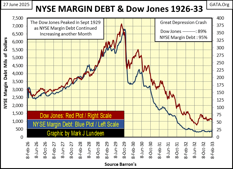
Oh, from the dusty old pages of Barron’s from a century ago, the chart below is something very interesting; NYSE margin debt, and the Dow Jones from 1926 to 1933. At the Great Depression’s July 1932 bear-market bottom;
Dow Jones down 89%,
Dow Jones Dividend Yielded over 10% (see dividend yield chart above),
NYSE Margin Debt Reduced by 95%,
And No One Wanted to Pay Ten Cents, for what was Eagerly Purchased for a Dollar Three Years Before.
Market psychology is perverse.
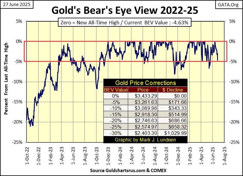
Moving on to this week’s BEV chart for gold below, the bears have almost knocked gold out of scoring position at this week’s close. Should we be concerned about that? Maybe, but I’m not.
Since 1971 when gold was “demonetized” by the US Government, as expected the growth in debt, and volume of US dollars in circulation has exploded, and this explosion in debt and dollars has yet to be fully priced into the price of gold. To my way of thinking, that makes gold an excellent long-term hold, something to be purchased, and then be forgotten about. An asset that in a few years, its owners will be happy to have purchased at today’s price, and held on to.
Looking at gold and silver below, from 1969 to today, gold’s exponential advance continues (Red Plot), an advance that has yet to see an appropriate correction. I’m not complaining. But if one comes in the near future, I’m not going to panic about that either, as that is something that all markets eventually do. As gold did some time ago, during its corrections at #1&2 below.
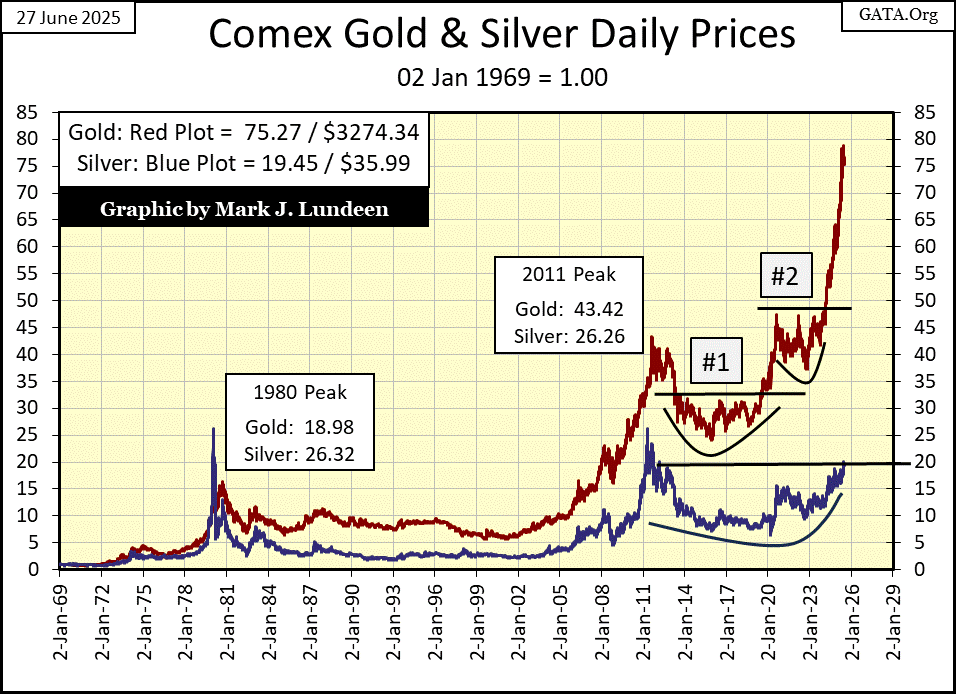
Speaking of market corrections, in the chart above, silver (Blue Plot) is still in a correction that began in April 2011, fourteen years ago. Or for old geezers like me, still in a correction that began in January 1980, forty-five years ago.
Currently, silver is being contained by its indexed 20 line; about $37 in dollar terms. The day is coming when silver will break above $37, and go on to something above $46, or its indexed 25 line. We may see some excitement in the silver market when that happens, as silver has some catching up to do with gold.
So, why is gold at risk at being knocked out of scoring position; at risk at seeing its BEV value decrease below -5.0%? Take a look at gold’s step sum table below, look at all those down days overwhelming gold’s daily advances since it last made a new all-time high on June 13th. In the past nine trading days, the price of gold had advanced in only two of them. I’m happy to see gold’s BEV values still in the single digits after all that!
But this is how markets operate; during both bull and bear markets, there are about as many daily advances as declines. So, if daily declines are currently overwhelming daily advances, there will come a time where daily advances will begin to overwhelm daily declines.
Last month, I though this transition to daily advances overwhelming daily declines would have occurred this month, June. As you can see below, that didn’t happen. What did happen in June, was that after all those down days in May / June, gold saw a new all-time high two weeks ago, and has remained in scoring position since then. A remarkable display of market strength in my opinion.
However, should these daily body blows continue, at one point gold will see a significant decline, to or even below its BEV -10% line. It may not come to that.
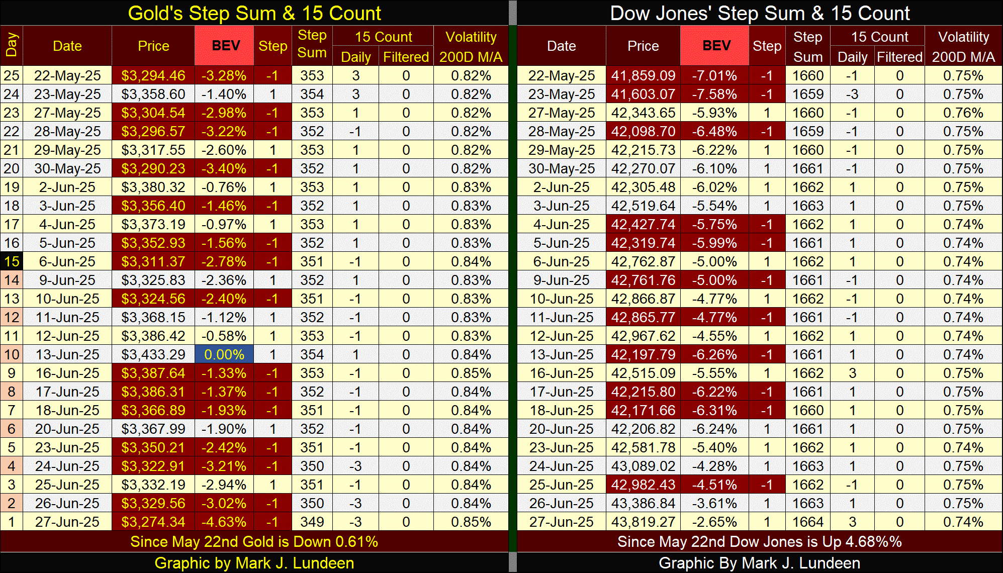
The Dow Jones is seeing a period where daily advances are overwhelming daily declines, but unlike gold, it is struggling to generate a new all-time high. That is very interesting.
That is it for this last week in June 2025. I’ll be back in early July.
Mark J. Lundeen
********


