50 Years of Bloated Market Valuations
 share
share
 share
share
 share
share
 share
share
 share
share
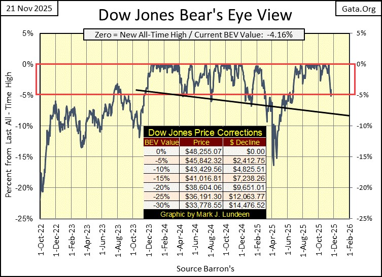
This week, on Thursday’s close, the Dow Jones slipped below scoring position, below the Red Line at its BEV -5% level (5% from its last all-time high). But just barely, with a BEV of -5.19%. It then bounced back, into scoring position on Friday’s Close, with a BEV of -4.16%.
A quick look at the Dow Jones below, shows the advancing trend which began two years ago, in November 2023, should continue into the foreseeable future. And that is how it will be for as long as the Dow Jones in its Bear’s Eye View chart below, remains inside scoring position, above its BEV -5% line.
I can’t say when the Dow Jones will see its next new all-time high, only that we should assume it will. What could alter that market perspective, would be seeing the Dow Jones begin closing below scoring position. A close below last April’s lows, below its BEV -15% would be very bad.
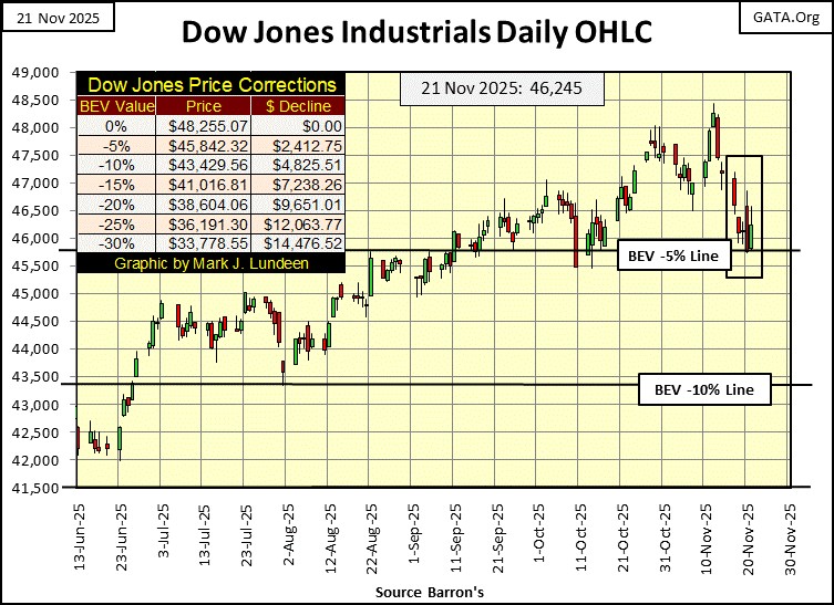
Looking at the Dow Jones’ daily bar chart below, we see a more traditional view of it. And stating the obvious, in this chart too, the Dow Jones bounced off its BEV -5% line.
Keep in mind, the current BEV -5% line (45,842), is 5% below the Dow Jones last all-time high of 48,255. Though I’ve placed the line going all the way to the left, to the scale for this chart, this BEV -5% line has absolutely nothing to do with any of the other daily closes seen below. Only the Dow Jones last all-time high, seen on November 12th. The same goes for the BEV -10% line in this chart.
What is there to learn from studying this chart? For the bulls, now running wild and free on Wall Street, this BEV -5% line is a very important technical level.
If the bulls can defend this level, and continue the bull market advance that began two years ago, 2025 may yet see additional new all-time highs for the Dow Jones.
If not that, the next thing to anticipate would be a Dow Jones decline towards its BEV -10% line, at 43,429. Which will it be?
- A hold at the BEV -5% line?
- A test of the BEV -10% line?
I’m thinking the Dow Jone will hold at, or very near its BEV -5% line, and then on to additional new all-time highs before 2025 comes to its close. As far as the Dow Jones closing below its BEV -10% line, one day it is destined to do exactly that. But I’ll believe that, when I see it.
Baring the return of the days-of-terror, days when the Dow Jones closes more than +/-2% from a previous day’s closing price, as long as the Dow Jones remains in scoring position, and daily volatility remains subdued, I’m bullish on the stock market.
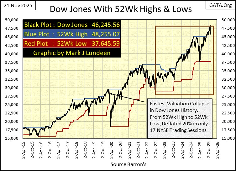
Next is my chart for the Dow Jones with its 52Wk High and Low lines. I talk a lot about the Dow Jones remaining in scoring position during market advances. But below, it is so obvious that during any prolonged advance in the Dow Jones (Black Plot), its 52Wk high line (Blue Plot) remains within 5% of the advancing Dow Jones itself, or in scoring position.
Okay, so what else should we note in the chart below? That in the past ten years, the Dow Jones didn’t only go up, there were also times when it pushed down on its 52Wk Low line, the last time last April. Though as seen below, last April’s decline wasn’t much of a push down on the 52Wk Line. The fact is, in the past ten years seen below, the Dow Jones was pushing up on its 52Wk High Line, very much more than it pushed down on its 52Wk Low Line.
Pushing my imagination out to the next ten years, what will this chart look like in 2035? In the next ten years, will the Dow Jones continue pushing up on its 52Wk High Line, as frequently as seen below? Or, will it begin pushing down on its 52Wk Low Line, with an enthusiasm that will shock economists and “market experts,” as well as retail investors?
Include me in the latter case, as I believe we are due for a huge bear market decline, sometime in the next year, or in the years to come. But until the Dow Jones below, once again begins pushing down on its 52Wk Low Line with some enthusiasm, something not seen in the past ten years below, I’m going to remain bullish on the stock market. After all, the trend is your friend, and right now the trend in the Dow Jones, as seen since 2015, is bullish.
This week in the table below, listing the BEV values for the major market indexes I follow, we see a demonstration of how “liquidity” leaks from the stock market. Not one new all-time high, or BEV Zero was seen this week.
That plus, the trend in BEV values this week was to lower levels, meaning these market indexes were declining farther from their last all-time highs. Only ten of these indexes closed the week in scoring position, within 5% of their last all-time highs. Since late June, the average BEV value (#13), has been in scoring position on a daily basis, above -5%. On Thursday, it declined to a BEV of -7.81%.
So, based on what we see below, should we press the panic button for the stock market? We should * NEVER * press the stock market’s panic button ourselves, as that is an honor reserved for Mr Bear himself, when the Dow Jones begins seeing multiple, weekly occurrences of his dreaded; Dow Jones 2% days.
You’ll know them when you see them. You will not need me to tell you when the Dow Jones saw a day of extreme market volatility. Should the Dow Jones see a one-day decline of 5% next week, you’ll feel it in your guts. Until then, think of our current market decline, as a modest correction in the stock market.
But that isn’t saying I wouldn’t approve, should anyone want to sell this market. Since the March 2009, Dow Jones’ bottom of the sub-prime mortgage bust (6,547), the Dow Jones has advanced to 48,255 just last week. A sixteen year, 637% gain. In this stock market advance, the big money has already been made.
The only thing left for today’s bulls, are the table scraps from a meal enjoyed by others, long ago.
In my opinion; if someone want to be in the stock market today, the place to be is in the gold and silver mining sector, as the precious metal miners’ bull market, is still very early into their advance. That is always the best time to buy into a bull market; as early as possible.
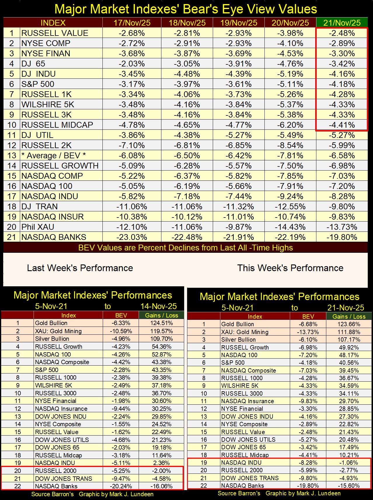
In this week’s performance table above, precious metal assets remained in the top three spots, though down slightly from last week. Well, the XAU was down almost 8% from last week, making the gold and silver miners the market’s biggest losers for the week.
Which, to my way of thinking about them, makes them an even more attractive investment, than they were at the close of last week. During a bull market in anything, one should buy on market weakness, like after this week. From personal experience, that is so much easier to say, than to do, but true nonetheless.
For the most part, the other indexes in the table above were down for the week. Let’s see if we get a Santa Claus Rally this year.
I doubt many people, including “market experts” have any idea just how bloated the stock market has become since August 1971, when the US Treasury decoupled the dollar from its $35 gold peg. Usually, I post a chart of the Dow Jones going back to January 1900 to make this point, as I did last week. But there is a better graphic to display today’s bloated market valuations; a table listing the market capitalization of the twenty largest corporations trading in the stock market, as seen below.
This table has two sides to it. On the right side, data from an old Barron’s issue; 20 October 1975, pg. 9. This article discussed the fifty top corporation held by managed money, but did not directly report the market capitalization of these companies. Rather, it gave the dollar amount held by managed money, and the percentage of the public float these managed money accounts held. With that data, I calculated the market capitalization of these companies seen for October 1975 below. The data for the left side of this table, for June 2017, is from The Online Investor, which did list the market capitalization for the twenty corporations.
The data for October 1975 (right side), is only four years after the dollar was decoupled from its $35 gold peg. The #1 company on this list from 1975, is IBM, or “Big Blue” as it was known to anyone who followed the stock market fifty years ago. And IBM was exactly that; * BIG BLUE *, a massive high-tech company, with an equally massive market capitalization of $30.96 billion dollars, in October 1975.
Following IBM, at #2 was AT&T, the company that had the American monopoly on phone service in 1975. Whether you called home, long distance a hundred miles away, or across a state line, that was only possible because “Ma Bell;” AT&T made the connections. Everything used in phone service, in every one of America’s fifty states, including every telephone people used at home or at work, belonged to AT&T. Apple I-phones, competing with AT&T’s line phones in 1975? Competing with AT&T was illegal in 1975, earning AT&T its massive market capitalization of $28.55 billion dollars.
It's amazing how the world has changed in these past fifty years. But in October 1975, the market capitalization for the twenty-four publicly traded corporations seen below, was a massive $217.20 billion dollars. Going now to the table for June 2017, the entire market cap for these twenty-four corporations from 1975, $217.20 billion dollars, would place it only at #18 for June 2017.
The list of corporations for June 2017, is almost a completely different list from October 1975, though there are some repeats in the two lists. Exxon is one of them, though in 1975, it was #3, with a market capitalization of $21.35 billion dollars. In 2017, Exxon was pushed down in the list by the high-tech giants, down to #9, with a 2017 market capitalization of $350.68 billion dollars.
Proctor & Gamble, and General Electric (GE) are on both lists, both seeing a huge increase in their market capitalization from forty-two years before.
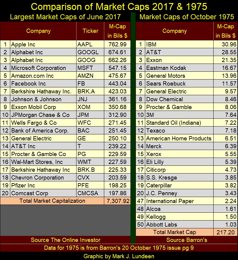
Looking at the total market capitalization in the tables above for 1975 & 2017;
- 1975: $217.20 billion dollars,
- 2017: $7,307.92 billion dollars,
market capitalization for the top twenty publicly traded companies had increased by a factor of 33.64, during these forty-two years.
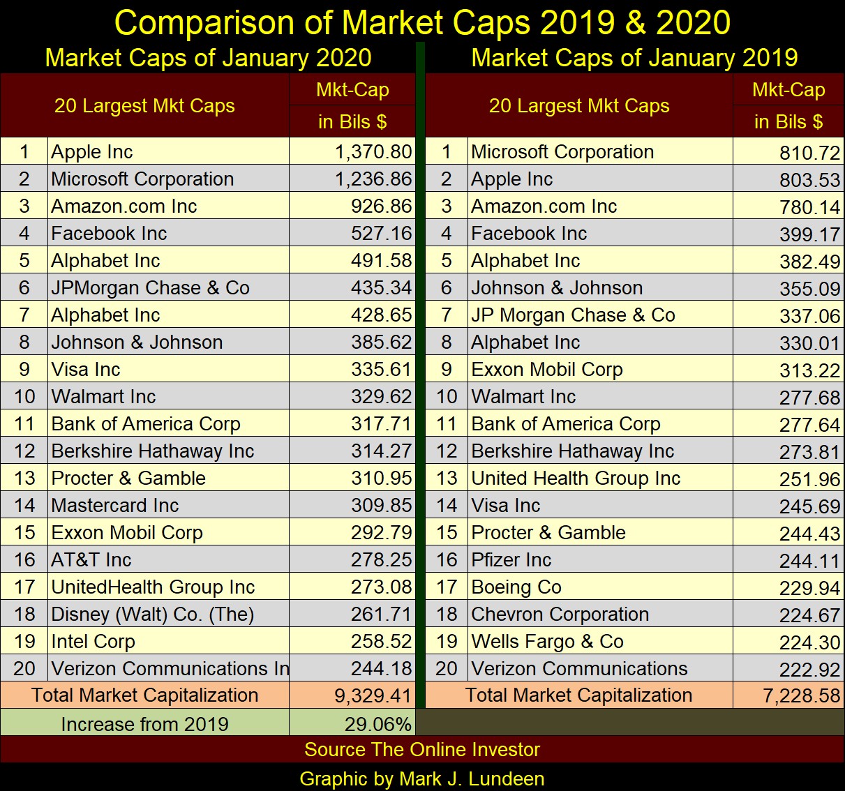
Here is the data for January 2019 and January 2020, just before the covid scamdemic, and FOMC Idiot Primate Powell’s Not QE#4. Note; in January 2020, two of the stock market’s top twenty market capitalizations had bloated to something beyond a trillion dollars; Apple and Microsoft.
In my final table for this series, below, I have data for the twenty largest corporations for November 2025, and October 1975, and what a difference the past fifty years have made! Four years following the dollar’s decoupling from its $35 gold peg, a market capitalization of only $1.03 billion dollars, something less than the current net worth of Oprah, earned Abbot Lab’s a spot at #50 for 1975.
Don’t get me wrong; if someone offered me $1.03 billion dollars today, I’d take it. But what a billion dollars in market capitalization does for a company today, barely gets it out of the NASDAQ’s Pink Sheets. Today, the top nine spots of the 2025 table, are all market caps of over a trillion dollars, with the top four corporations, multiples of a trillion dollars.
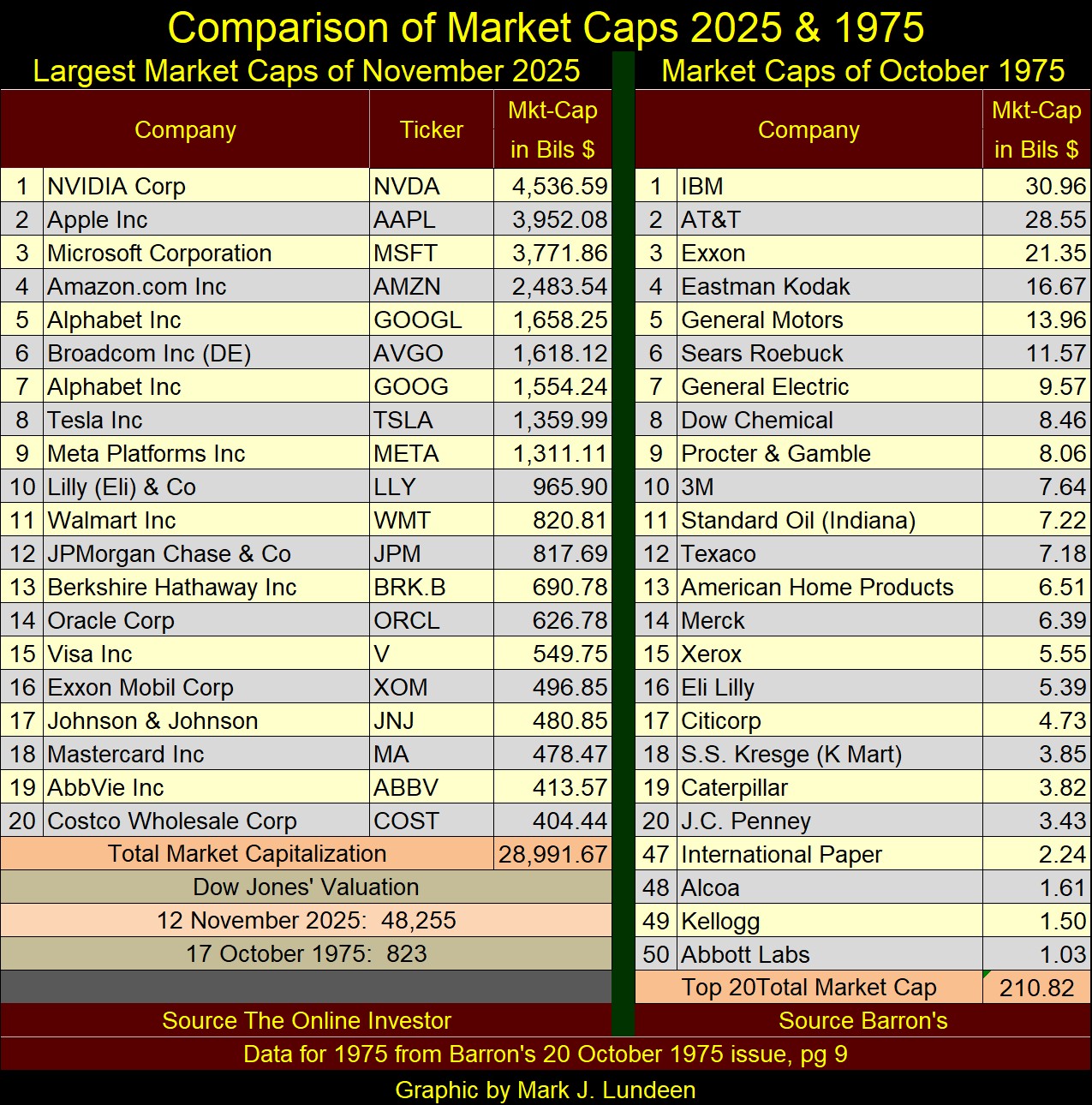
What is going on with this bloat in market capitalization for these past five decades? Economists and “market experts” will tell you; it’s “economic growth” driving these companies’ market capitalization ever higher. So, “economic growth” had driven market capitalization from $210.82 billion dollars for the top companies trading in the stock market in 1975, to $28,991.67 billion dollars in 2025? Really, an increase in market capitalization by a factor of 137.51?
I remember hearing tall tales of the sea, of the iron men who walk the steel decks of the US Navy. Early in my days at sea, I learnt the real reason why US Navy’s carriers don’t operate far inside the Arctic Ocean. Looking at a map of the world, one might believe the reason carriers don’t operate deep in the Arctic Ocean, is because of the polar icecap.
But that is not true. The real reason is, the Arctic Ocean is the abode of the Kraken, an enormous sea monster whose giant tentacles would rise up from the frigid waters of the arctic, and pull-down fighter jets, and flightdeck crew to their doom into the briny deep.
When I first heard this, my reaction to this Arctic Ocean monster, was much the same as when I first heard that “economic growth” is responsible for the grotesque bloating of market capitalization, seen in the stock market since the 1970s. Really? Someone tells me that with a straight face, expecting me to believe that? But then, this tall tale of the sea, the Kraken, was told to me by a Third-Class Boatswain’s Mate, who unlike many “market experts” and economists, was a dependable source of at sea scuttlebutt.
To see the real reason market capitalization for the stock market has increased as it has since August 1971, when the US Treasury decoupled the dollar from its $35 gold peg, look at the Federal Reserve’s balance sheet below. The inverted Red Star marks October 1975. In the fifty years that followed, enormous flows of monetary inflation have flowed from the Federal Reserve, into the financial markets, thus bloating market capitalizations in the stock market.
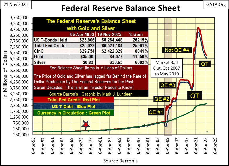
Here is something interesting to note about the chart above; note the QT from 2017 to 2019. This withdrawal in “liquidity” from the financial markets, ultimately resulted in overnight rates in the repo markets, to spike into double-digits in October 2019. This spiking in repo over-night rates, was the cause FOMC Idiot Primate Powell then gave to terminating this QT in October 2019, and instigating what he called a “Not QE,” which I call Powell’s “Not QE#4.”
Six months later, the Dow Jones saw its sharpest decline in its history; deflating its valuation 20% from an all-time high, in only seventeen NYSE trading sessions. In the history of the Dow Jones, that had never happened before. See my chart of the Dow Jones with its 52Wk High and Low lines above.
Economists and “market experts” blamed this sharp decline on the covid scamdemic, which may have been a factor. But I personally believe that such things are inevitable, when a monetary system is daily managed by a gaggle of Ph.Ds. at the FOMC.
To terminate this horrific decline in the stock market, Idiot Primate Powell began “injecting liquidity” by the trillions of dollars, into the financial system, as seen above with his Not QE#4.
What is interesting about that today is; I’m seeing articles on the internet claiming over-night repo rates are once again spiking, that plus FOMC Idiot Primate Powell, is considering terminating his current QT, seen in the chart above. How long will it be, before Powell announces his Not QE#5?
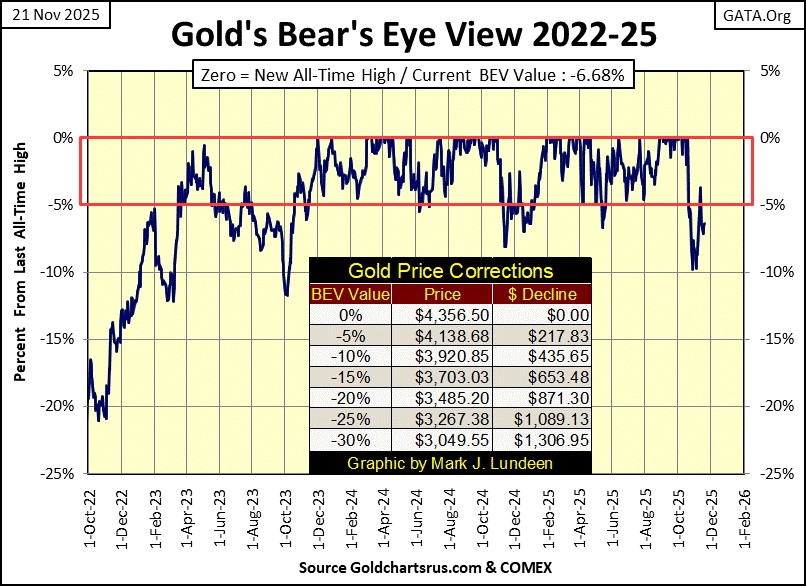
Next is my Bear’s Eye View chart for gold. Gold closed this week below scoring position, with a BEV of -6.68%. But it bounced off its BEV -10% line not too long ago, and closed inside scoring position on the bounce. I believe gold is still advancing.
Its current last all-time high (BEV Zero) was on October 20th, when it closed at $4,356 an ounce. In the months to come, gold still has plenty of room to the upside to advance.
If FOMC Idiot Primate Powell is planning for his Not QE#5, he, and his fellow idiots at the FOMC will execute it following a plan. Typically, that will mean a sharp decline in the futures prices for gold and silver on the announcement of this massive “injection” of monetary inflation into the financial system. That is just how things go, when idiots at the FOMC manage “monetary policy.” But that is no reason to believe gold, silver too aren’t going to continue advancing in the years to come.
Looking at gold’s step sum table below, gold is working off its oversold 15-count of -7 seen on November 6th. Since then, it has seen an increase in daily advances, that hasn’t resulted in a significant increase in the price of gold, not yet anyway.
Keep in mind; from August 29th, to October 20th, thirty-five trading sessions, gold closed at a new all-time high in 21, 60% of those 35 trading sessions, taking gold from $3447, to $4356.
That wasn’t a hot market; the gold market was sizzling a month ago. If the gold market has cooled down since October 20th, that isn’t necessarily a bad thing for it to do. Be patient. In the coming year, maybe before 2025 comes to its conclusion, we’ll see plenty of excitement coming from the gold market.
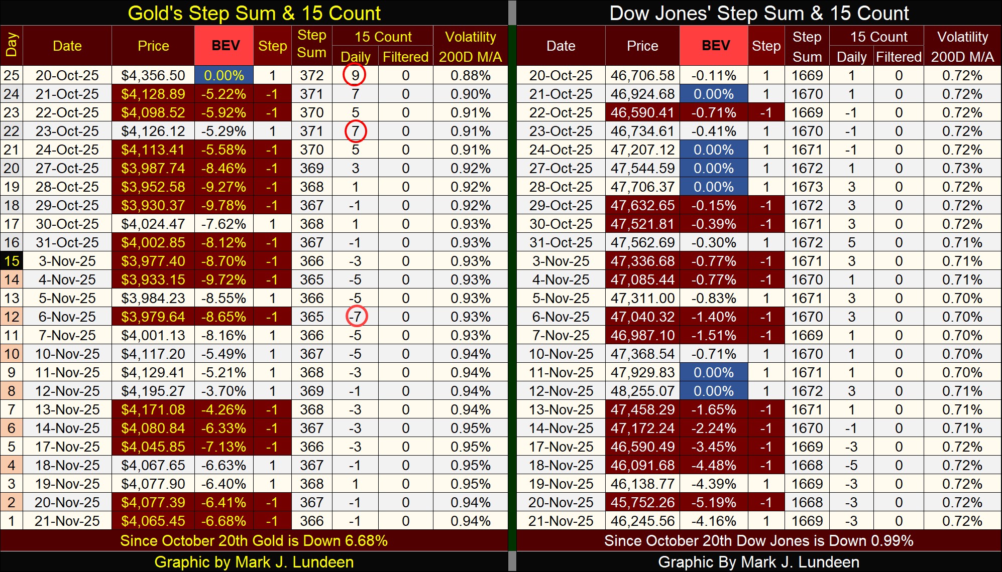
The Dow Jones in its step sum table above, continues looking very bullish. I expect that will be the case until its BEV declines below its BEV -10% line, as daily volatility once again takes its 200D M/A in the table above, to values well above 1.00%. Bear markets are always volatile markets. As we don’t see market volatility increasing above, I’m not ready to be bearish on the stock market.
As this is my last article for November, I guess that is that. I’ll have more to say about the markets come December.
Mark J. Lundeen
********
share
share
share
share
share