Around The World With Currencies (Part 1)


As there seems to be a lot of interest in some of the currencies I would like to show you some charts we’ve been following for a very long time. Most of the charts will be long-term in nature which won’t do us much good in the short-term, but they will keep us in tune to the direction these currencies are most likely to take.
Knowing what to expect in the Longer-term is important not only to currency and commodity traders but to the very Countries whose currencies are impacted and to their exporters and importers as well.
Long time members may remember some of these massive tops in 2011, which led to the sharp decline in the PM complex and commodities. I won’t spend a lot of time on these charts as they’re pretty self-explanatory.

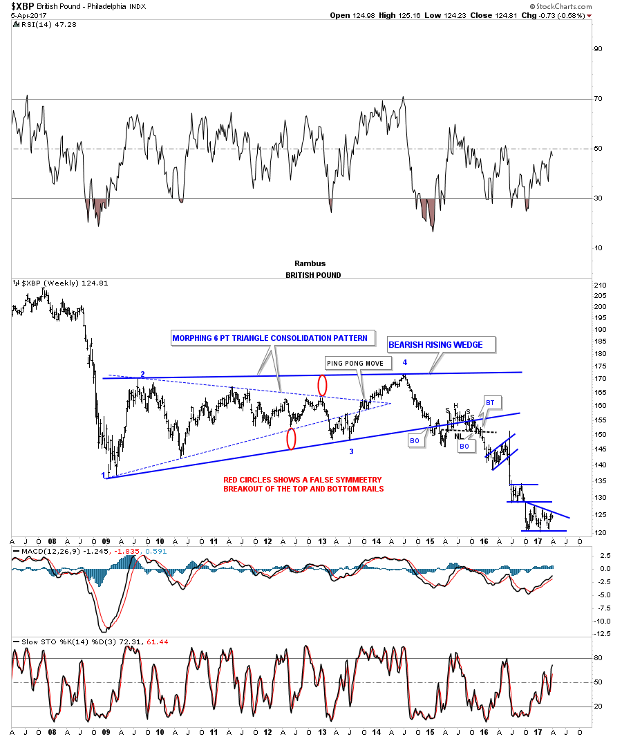
The weekly chart for the $XBP, British Pound, was one of the first times I showed how a triangle can morph into a bigger consolidation pattern, as shown by the red circles. The backtest to the bottom rail produced a H&S top which launched the multiple impulse moves down followed by a consolidation pattern.
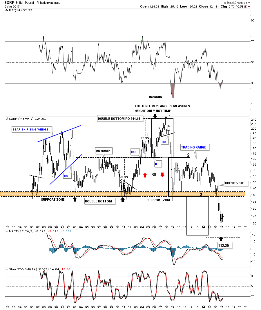
The 30 year monthly chart for the $XBP is setup a little different than some of the other major currencies. In the 1990’s the $XBP built out a double bottom which had a measured move up to the 211 area. After the small H&S top was in place the $XBP basically crashed below the double bottom hump all the way down to the previous multi year lows. After chopping sideways for almost 5 years the $XBP took out the multi-year lows on the BREXIT vote.

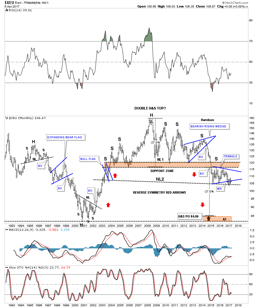
Next is a monthly chart for the $XEU, which shows its massive double H&S top and the blue triangle that is building out the possible right shoulder of the 2nd H&S top.
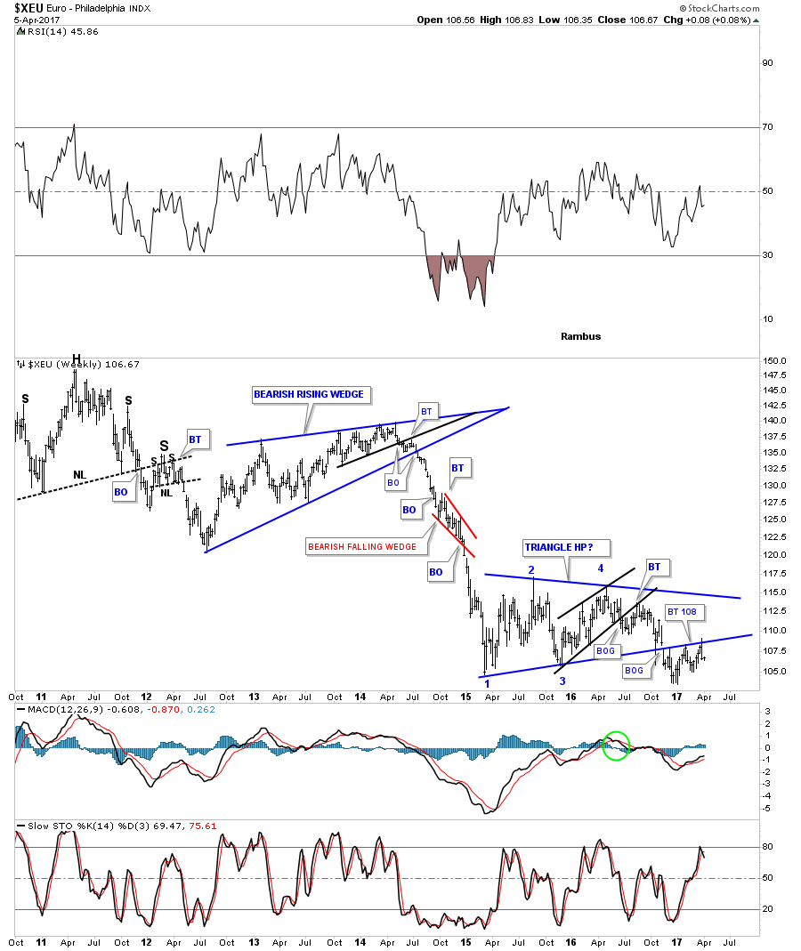
This 7 year weekly chart for the $XEU shows the one year blue triangle that has been building out with a breakout and multiple backtests to the bottom rail which would also be the right shoulder on the chart above.

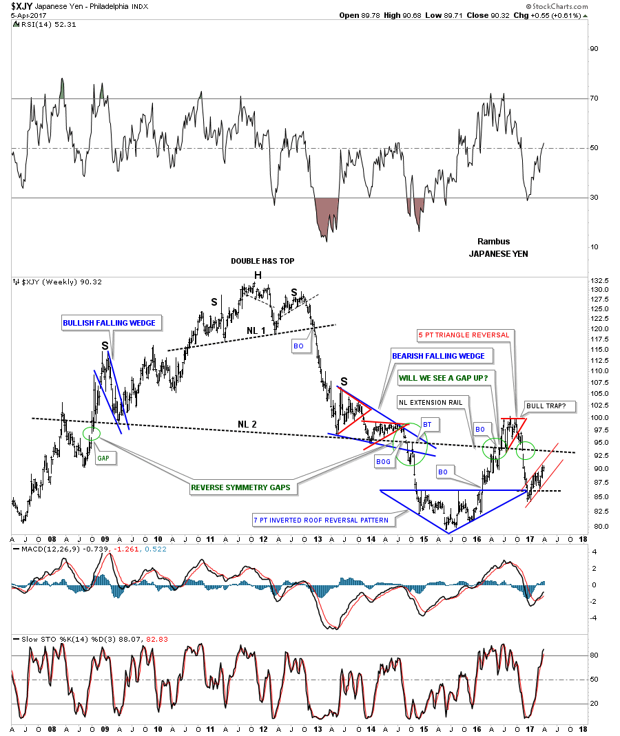
The weekly chart for the $XJY, Japanese Yen, shows its double H&S top. The green circles shows the gaps made on neckline #2 telling us the neckline is correctly placed.
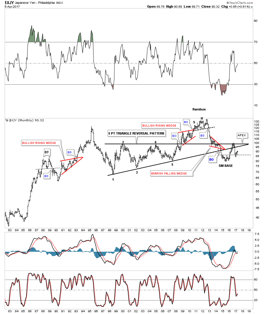
This next chart for the $XJY is a 35 year look which shows the H&S top that ended its bull market in 2011.
Whichever way this multi-point black falling wedge breaks out a big move will follow.
I’m going to focus in on the US dollar and some of the US dollar currency crosses in the Weekend Report as there are just too many charts to put into one post. You will see some charts I have not posted before, so stay tuned. All the best…Rambus
Flags produced with Permission from http://www.theodora.com/flags/
********
 Meet Rambus, a seasoned trader and technical analyst renowned for his unbiased and insightful chart work. Through his website, Rambus Chartology, and Substack newsletter, Rambus shares his expertise with a global community of subscribers, providing daily updates, commentaries, and hands-on training in the art and science of chartology. With his calm, humble, and down-to-earth approach, Rambus demystifies complex market trends, helping his followers navigate the challenges of today's volatile markets. Join the Rambus Chartology community today and discover a unique blend of technical analysis, trading expertise, and time-tested protocols. Subscribe now at www.rambus1.com or https://rambuschartology.substack.com/


