Bond Yields And Interest Rates Continue To Rise


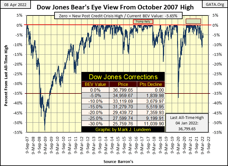
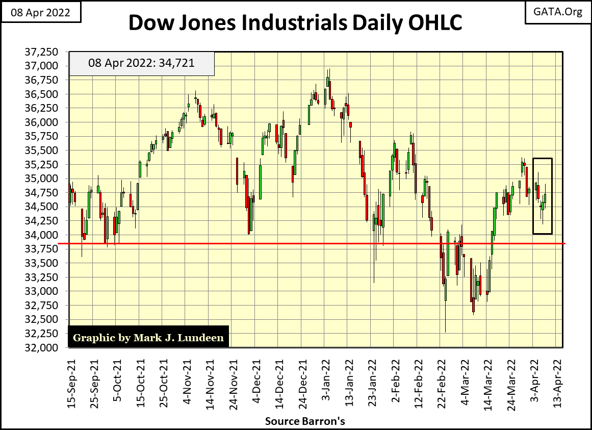
Looking at the Dow Jones’ BEV chart below, this week the Dow Jones closed in between its last all-time high of last January, and its lows of early March. Just looking at the chart, the Dow Jones could go either way; to new BEV Zeros or take a dive below its lows of March. But which is to be next?
Now that’s the question on everyone’s mind; a question I don’t have an answer to.
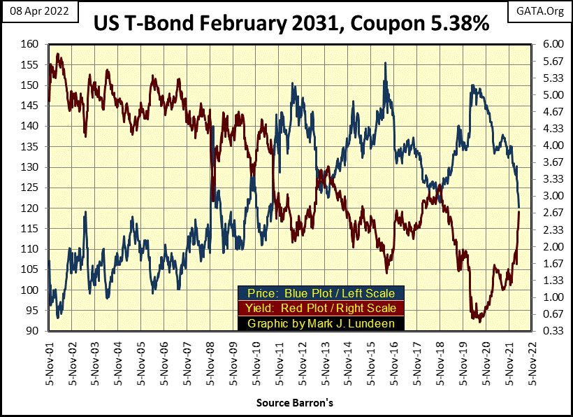
But I notice bond yields, Treasury and corporate, are going up. Since last November, this 30Yr T-bond issued in 2001, has seen its yield (Red Plot below) doubled. And since August 2020, the face-value of this bond (Blue Plot below) has deflated by 20% making this, and the entire T-bond market (the US National Debt), big-losers these last twenty-one months.
If bond yields continue to rise, it’s only going to get worse; much worse for the widows and orphans who purchased Uncle Sam’s IOUs for their alleged safety. It won’t be any different for unions’ pension funds, or your life-insurance company.
Fiduciaries of other people’s money tend to have lots of T-bonds. Having their reserves full of T-bonds keeps their Federal Regulators happy. However, should this trend in rising T-bond yields, and deflating bond valuations continue, and I believe it will, it’s only a matter of time before we see news of private pension funds’ monthly benefit reductions. An event that won’t make their beneficiaries happy.
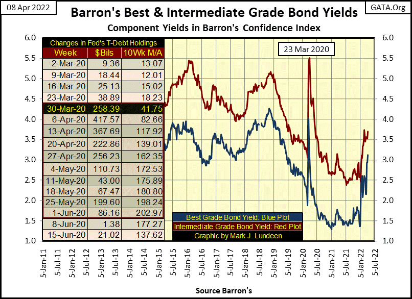
It's not just T-bonds seeing their yields rising (valuations deflating). Below, we see corporate-bond yields, as published in Barron’s since 1926.
Take a good look at this chart. It’s hard believing the corporate-bond bull market that began in October 1981 (declining yields / rising valuations) isn’t now in the market’s rearview mirror. And now, a bond BEAR MARKET (rising yields / deflating valuations) that began in January this year is now bearing down on us.
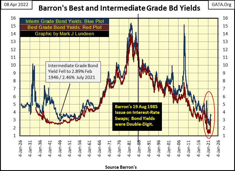
If I’m correct, this new bond-bear market will have an effect on the financial system the bond-bear market of 1956 to 1981 didn’t have.
Long ago, before 1981, corporate America still had living memories of the trauma of the depressing 1930s. Corporate management had personal recollections of the ruin an over leveraged balance sheet brought to many companies trading on the NYSE during the Great Depression.
So, they kept their balance sheets clean, squeaky clean. In fact, pre 1981 many companies trading on the NYSE enjoyed rising interest rates and bond yields. As they had more in saving at their bank that in debt, rising rates provided a source of net-income for them. Rising bond yields allowed these companies to buy back their bonds in the bond market at a discount, thus keeping their liabilities low. Before 1981; much of corporate America, benefited from double-digit interest rates and bond yields.
But today, in April 2022, corporate America shares a problem with students working on their Ph.D. in a Queer Studies Program; past debts they’ve taken on haven’t proven to be profitable. So, this debt is now what was once called a “dead horse” as this debt isn’t helping to propel the company into a profitable future. In fact, has proven to be a huge burden on the company’s finances even during the current good times.
They find it difficult servicing their “dead horses” at current low rates. When it’s time to roll over their “dead horses”, they’ll find future interest rates will be much higher, which just might result in much of Wall Street becoming bankrupted, because they can’t service their debts, or pay their bills. Such companies trading on Wall Street trade at a huge discount, and that isn’t bullish for the stock market.
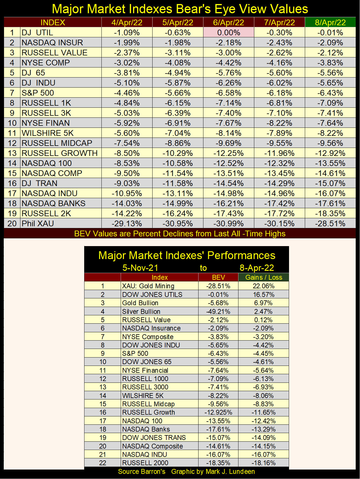
But the stock market wasn’t deep in a depressing funk at the close of this week. Looking at the bright side of the market, the Dow Jones Utilities Average saw another BEV Zero (new all-time high / BEV of 0.00%) on Wednesday. And three of the twenty major indexes seen below closed in scoring position (BEVs of -0.01% to -4.99%).
Let’s NOT look at those indexes below that began the week with single digit BEV values, but close the week sporting double digit BEVs (#13-16).
Look at the XAU (#20). It closed the week above its BEV -30% level. Let’s see if it can keep it up.
Moving on to the Dow Jones in daily bars below, it closed where it was at last week’s close. To my eyes, it looks as if Mr Bear is about to take the Dow Jones down to where the bulls fear to tread. But I’ve been wrong before.
But keep in mind the “policy makers” can always “inject liquidity” into the financial system, and reflate a deflating market trend, as long as they want to. But in April 2020, do the idiot savants at the FOMC want to keep market values in the stock and bond markets inflated?
* You do know – they don’t have to. *
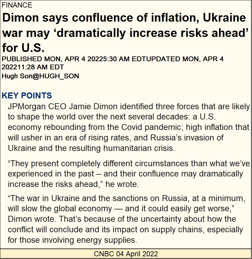
What a load of baloney; JP Morgan’s Jamie Dimon (below) is giving the public a heads up; that rising “inflation and the Ukraine war may dramatically increase risks ahead.”
Oh, you best believe risks of another significant market debacle resulting in a plunging stock market and spiking bond yields are rising. However, if the Ukraine war has anything to do with it, it would be no more than the preverbal straw that broke the American financial system’s back, and no more than that.
The reckless manner with which the “policy makers” have been managing the markets and banking system’s expansion of credit following the 2007-2009 subprime mortgage bear market, since Doctor Bernanke’s first bout of QE in 2009, has only one predictable outcome; the ruin of the United States of America and its dollar. The only doubt is when?
Do you think I’m being a bit harsh? Well, if you understand what is seen in the chart below, I’m not. The management of the global reserve currency (the US dollar) is as if by the monetary authorities of a banana republic.
These people were enabled by our Congress and political establishment, and validated by academia and the mainstream financial media, have inflated a historic bubble into everything trading in the financial markets – everything except for gold and silver.
Their bubble is going to pop, and Jamie Dimon damn well knows it. His task, as well as CNBC in the quote above, is to attempt to divert responsibility for the coming woes to areas not directly associated with the Federal Reserve System (and its banks like JP Morgan) or to the Federal Government.
Maybe they can do that. And then maybe they’ll fail to convince most of the public that “Putin’s war on the Ukraine” and the covid epidemic, were the sole causes of all of our current and coming ills.
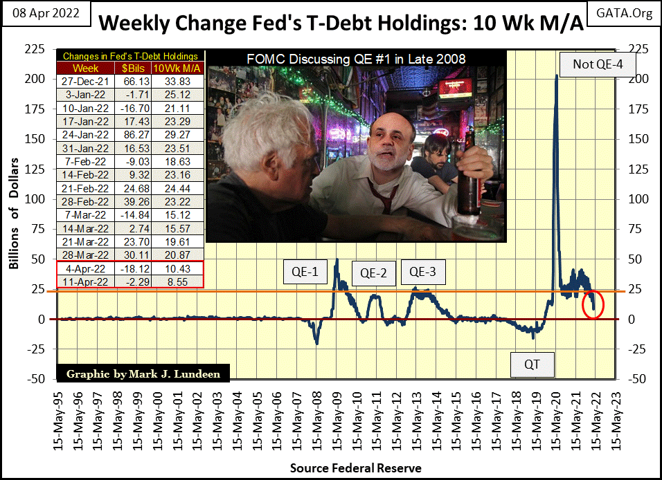
Let’s see if I can do my part to inflict a little pain and suffering on the “policy makers” by analyzing their “monetary policy” in the chart below, a chart that will never be published in the mainstream financial media. As you go through this article, I’ll refer back to this Weekly Change in the Fed’s T-Debt Holding chart as I go. To keep it simple, I’ll call it “The Chart” above.
At the beginning of Doctor Bernanke’s QE #1 (January 2009), the Federal Reserve’s balance sheet was only $505.32 billion dollars. By the conclusion of QE #3 (May 2015), the Fed’s balance sheet had expanded to $4,237.83 billion dollars. An increase of the Fed’s balance sheet by a factor of 8.39 in only six years. WOW! Now that’s what I call “policy making.”
Here's where 2021-22’s massive inflation in consumer prices came from. It began long ago, as Doctor Bernanke’s solution to the sub-prime mortgage fiasco; his quantitative easings, (QE 1-3 / chart below). This single-family mortgage fiasco saw the Dow Jones deflate to its second deepest percentage decline since 1885; a historic 54% bear market. A bear market that would have gone deeper. Based on its historical dividend yields, the Dow Jones could have deflated by 70%, or more, had it not been “stabilized” by a series of three quantitative easings from the FOMC.
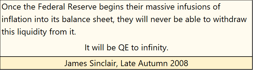
Officials from the FOMC, had always claimed their QEs (massive “injections of liquidity”) were temporary operations of their “monetary policy.” Operations they intended to reverse when the idiot savants at the FOMC had “stabilized” the markets and economy.
However, in late 2008 after Doctor Bernanke announced his intention to initiate his first bout of QE, James Sinclair made this prediction:
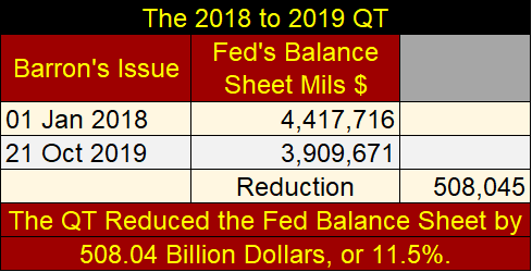
In January 2018, the FOMC began their quantitative tightening (QT) in “The Chart” above, in what became a vain attempt to drain “liquidity” from the FOMC’s balance sheet. A QT that was unceremoniously aborted in October 2019, as over-night interest rates in the repo markets spiked to double digits.
Fed Chairman Powell assured all his new QE was NOT going to be anything like QE 1-3. As seen above, his Not QE #4 wasn’t. Not when from late February to mid-March 2020, the Dow Jones’ valuation deflated by 37% from an all-time high in only twenty-seven NYSE trading sessions. This had never happened before. In the 1929 crash, it took forty-eight NYSE trading sessions before the Dow Jones deflated by 37% from its last all-time high.
Also, in March 2020 a selling panic developed in the corporate bond market that saw bond yields almost double (chart below). With Powell’s Not QE #4, the FOMC also began “monetizing” corporate bonds to “stabilize” valuations in the bond market. This too had never happened before.
Looking at current bond yields below rising (bond valuations deflating) again, since the first week of January, don’t be surprised if the FOMC is forced to “stabilize” the corporate bond market a second time.
All this market mayhem from the FOMC’s 2018-2019 QT, resulted from only an 11.5% reduction ($508 billion) in the Fed’s balance sheet (table below). Far from the $3,732 billion these three QEs “injected” into the financial system from January 2009 to May 2015.
In the chart directly above, it appears, to my eyes anyway, that since the first week of January, corporate bond yields are once again spiking upwards, as they did during the March 2020 flash crash.
Yields for Barron’s Best Grade Bonds have more than doubled in the past three months, from below 1.5% to over 3.0%. This is not a reason to be bullish on the stock market. In fact, just the opposite.
Now in April 2020, two days following Jamie Dimond’s warning above, the FOMC announced they intend to begin draining “liquidity” from their balance sheet they added with their Not QE #4.
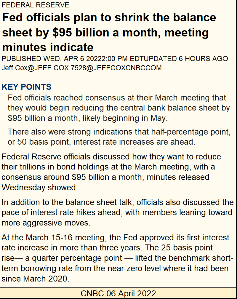
https://www.cnbc.com/2022/04/06/fed-minutes-march-2022-meetings-.html
Actually, if you look at “The Chart” above, the FOMC had begun the process of draining liquidity from their balance sheet since early March of this year (Red Circle and table). They desire to drain $95 billion a month in this upcoming QT, though in the press release above, they chose to not call it a QT.
Their first QT (January 2018 to October 2019) saw a monthly reduction of $32 billion on average. Three years after they aborted their first QT, they’ve announced a second round of QT with a monthly reduction of $95 billion.
What kind of market mayhem will this second round of QT result in? Will Chairman Powell be forced to implement a Not QE #5?
I’ll make it a habit of publishing “The Chart” above weekly. Shortly after this new QT takes its 10Wk M/A once again into negative territory, things in the stock and bond markets should begin to get interesting.
Someone else covered “monetary policy” at the Fed this week; Bob Fitzwilson, who writes market articles worth reading, sometimes writing several articles a week. Bob has been in the financial industry for decades, which is something I can’t say.
Go to the link below if you’d like to see this week’s letter for free. If you like to, pass Bobs, and my stuff, along to your friends and family. Subscribing to Bob’s site can be for free, for minimum content. Or for a small fee for additional content.
If you’re a publisher on the web looking for additional content (I have several publishing my work), ask Bob for permission to republish his stuff, and he’ll keep your site up to date with his latest. Here’s Bob’s email address:
PortolaGroup [email protected]
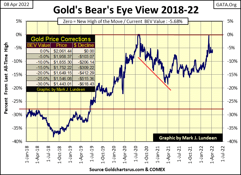
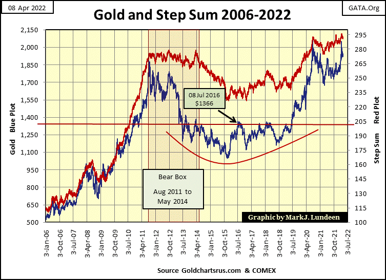
Let’s move on to gold’s BEV chart below. Gold came just a fraction of a BEV point from making a new all-time high on March 8th, but since then has remained just below its BEV -5% level. What to make of this? Considering all I’ve covered above, I remain bullish on gold and silver. Sometimes patience is a real value in the market, and I believe this is the case now.
Like gold’s BEV chart above, gold’s step sum chart below has become tedious. Yes, they look good, but they have for the past few months, changing little as time goes by.
I’ll tell you what the precious metals need now in April 2022. For the idiots at the FOMC to keep their promises to drain their balance sheet by $95 billion a month, and begin raising their Fed Funds Rate in fifty-basis point increments, four or more times this year, come hell or high water in the financial markets.
The FOMC is going to crash the financial system. We’ll watch in amazement at how the old monetary metals and their miners will benefit from it.
As with gold’s charts above, the Dow Jones step sum chart below has become tedious. Thus it will be until The Dow Jones either makes a new all-time high, or breaks below its 32,500 line.
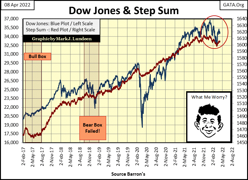
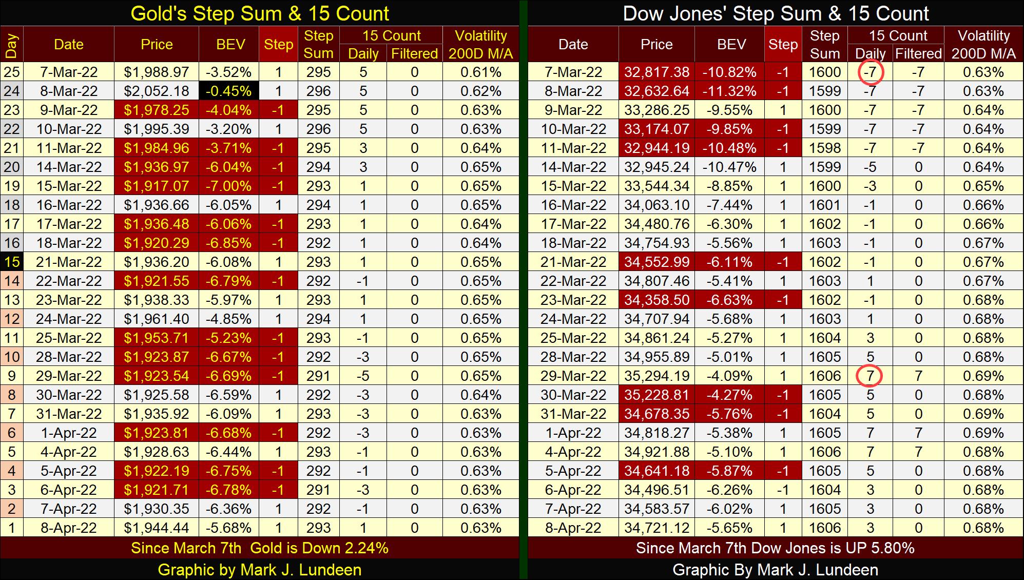
Here is something interesting; comparing gold’s and the Dow Jones’ BEV value at this week’s close. They are almost identical to each other, equally as far (or close) to making a new all-time high. Let’s see which will first print a BEV Zero (0.00%) in their tables below. One point to keep in mind. Gold has been trending down this past month, while the Dow Jones has been advancing. Could that make a difference? We’ll see.
Gold is neither overbought of oversold; having a 15-count of (+/-) 7-15. An over or under done market is a market setup for a reversal. Then it may not make a market reversal, but become even more over or under done before it does reverse.
The Dow Jones has twice in the past month become overdone. On March 7th it saw a 15-count of -7, making it oversold. The Dow Jones then reversed its trend from down to up, advancing some 2,500 points until on March 30th, when its 15-count saw a +7, making it overbought, due for another reversal in the market.
Don’t take these 15-counts’ over sold or bought signals as iron rules of the market. They can be wrong. But it’s amazing how frequently they do catch the little, and sometimes big reversals in market trends during bull and bear markets.
After saying all this, I now point out how, like gold and the Dow Jones charts above have become tedious, so too have their step sum tables below.
These markets can’t remain boring forever. One of these days, excitement will once again become a huge factor in the market. When that day comes, I believe investors with exposure to gold and silver will enjoy their excitement more than those in the financial markets.
Eskay Mining is raising funds for this summer’s drilling program. That won’t be a problem. Eskay’s share prices got down to $1.82 this week. But buying came in on Friday, taking prices up to $1.94 at this week’s close. I wouldn’t be surprised if this week’s $1.82 proves to be a bottom. But the market has a way of making such predictions wrong.
Last year’s drilling program was very successful in developing a superior geophysical model of Eskay’s huge land package in the middle of Canada’s Golden Triangle. Significant precious metals findings were seen in the majority of last year’s drill-core samples. But so far, the mother lode has not been fixed on the map just yet.
The company’s geologists have come a long way identifying exactly where they want to drill to locate a precious metals ore body similar to the old Eskay Mine. Should they be successful doing so, it would have a huge impact on the company’s share price.
I’m no geologist, just an old retired fleet sailor. But looking at the results of last year’s drilling program, this sailor’s untrained eyes can see the possibly of several potential Eskay Mines to be found. However, without additional drilling come this summer’s exploration program, and maybe the drilling program for 2023, all that is speculation.
Eskay Mining is a precious metals exploration company pregnant with possibility. But this is not going to be easy money for anyone investing in the company. Much hard work and time must come before any economic ore body of precious metals is discovered, if in fact there is one to be discovered.
Still, I believe my readers should consider taking an appropriate size position of Eskay Mining, something like 5% for their mining companies’ portfolio. But if they wanted to be adventurous, say taking a position of 15% to 20% of their total gold mining portfolio for Eskay Mining, I wouldn’t talk them out of it.
I should note I’ve been a shareholder for many years, and have a large position in this company. I have never accepted any fees or compensation from the company for recommending Eskay Mining. I just really like the company, and its management, so I’m recommending it to my readers.
Mark J. Lundeen
********


