The Dow Jones and its Step Sum


On Thursday this week, the Dow Jones closed within 1% of making a new all-time high in its BEV chart below, with a BEV of -0.81%, to then pullback from a new BEV Zero on Friday, closing the week with a BEV of -1.43%.
If this is a bull market, sometime in the next few weeks, the Dow Jones is going to make a new all-time high, or look damn silly with its second failed attempt at a new all-time high (0.00%), so far in 2025. What it will be, or not to be, I’m not smart enough to know.
What I do know is; if I have to place a second black circle in the Dow Jones BEV chart below, for its second failed attempt at a new all-time high in 2025, that would be a very bad omen for the bulls now running wild and free on Wall Street. But I won’t do that unless the Dow Jones deflates below scoring position, below its BEV -5% line.
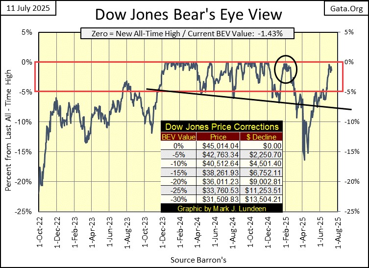
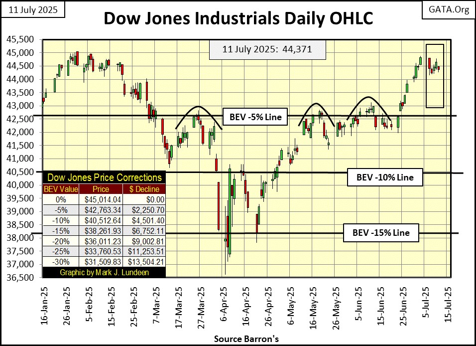
In the Dow Jones chart below, charting the Dow Jones in its daily bars, we see its first failed attempt at a new all-time high from last February, where it failed to close above December’s last all-time high of 45,014. Now in July, is it going to be a reprise of last February’s failure, with no close above 45,014 for a second time?
Let’s not get too bearish just yet, for as long as the Dow Jones remains in scoring position, above its BEV -5% line, the proper thing to assume is; the Dow Jones will be making additional new all-time highs. And until next week, we’ll leave it at that.
In my table below, listing the BEV values for the major indexes I follow, the Dow Jones sits at #9 in the table. On Thursday this week, five of these indexes saw new all-time highs, aka BEV Zeros, but the Dow Jones couldn’t do that this week.
However, as I’ve said many times before, the key to making new all-time highs is to first get into scoring position, and then staying there. So, if on Friday’s close none of these major indexes closed at a new all-time high, fifteen of them did close inside scoring position. Even the BEV average for these indexes (#15) closed the week in scoring position. So, as of Friday’s close, there are sixteen reasons in the table below, to remain bullish on this market.
Am I recommending buying this market? Heck no, for the simple reason we are very close to a market top, where the risks to invested funds approaches maximum, and the potential to provide profits from invested fund approaches minimum.
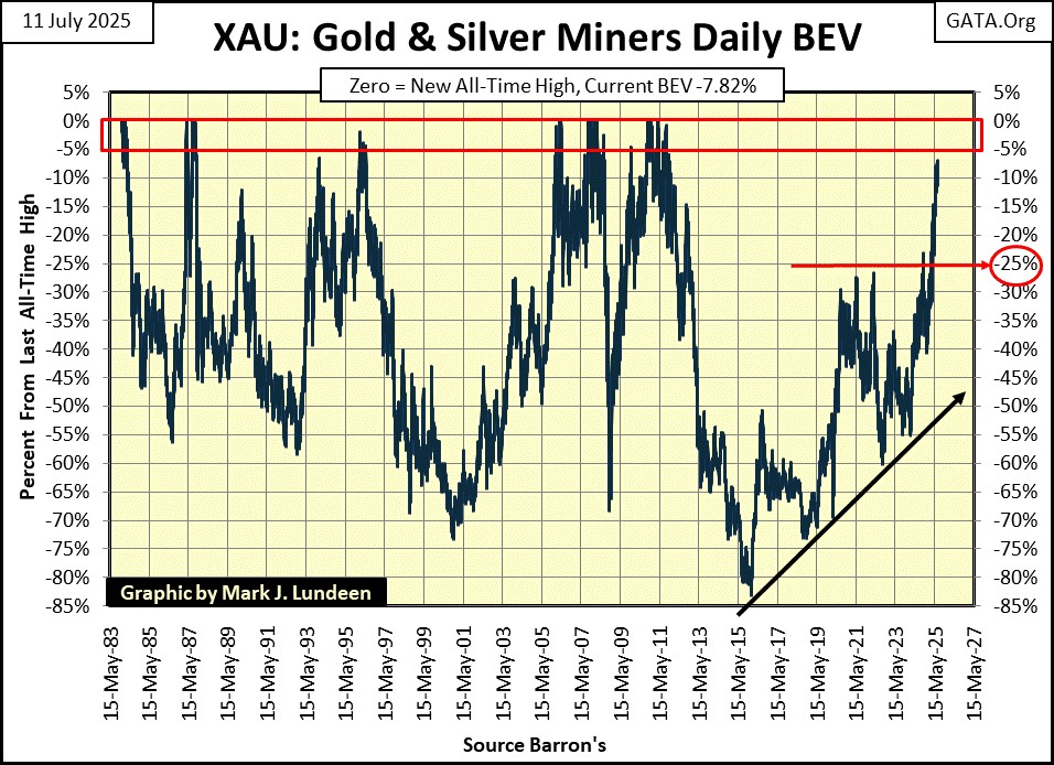
Risking money on the stock market in July 2025 is a mug’s game, that is unless I’m talking about the XAU; #17 in the table below, which closed the week with a BEV of less than 10%. That is something it hasn’t done since 2011, fourteen years ago, as seen in the XAU BEV chart below. This is a very strong chart, so buy all the gold and silver miners you care to. I won’t try talking you out of doing so.
And at this week’s close, where was the NASDAQ Banking Index? Once again these bankers were Tail-End Charlie, at #21 in the table. These bankers were also the only market index with a double-digit BEV value; -16.48%.
If someone was looking for a reason to be bearish at this week’s close, say someone like me, I’d say looking at the NASDAQ Banking Index’s BEV chart below could be that reason. Seeing these banks perform so poorly, suggests something dark is lurking, somewhere out of sight in our uncertain future.
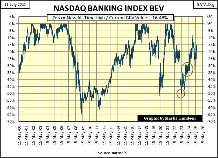
The last time the NASDAQ Banking Index closed above its BEV -10% line, was last November. Now in July, eight months later, these banks are struggling to close above their BEV -15% line. It’s not good for something, like these banks to find going down easier than going up, and that sums up how these banks have been doing since last November.
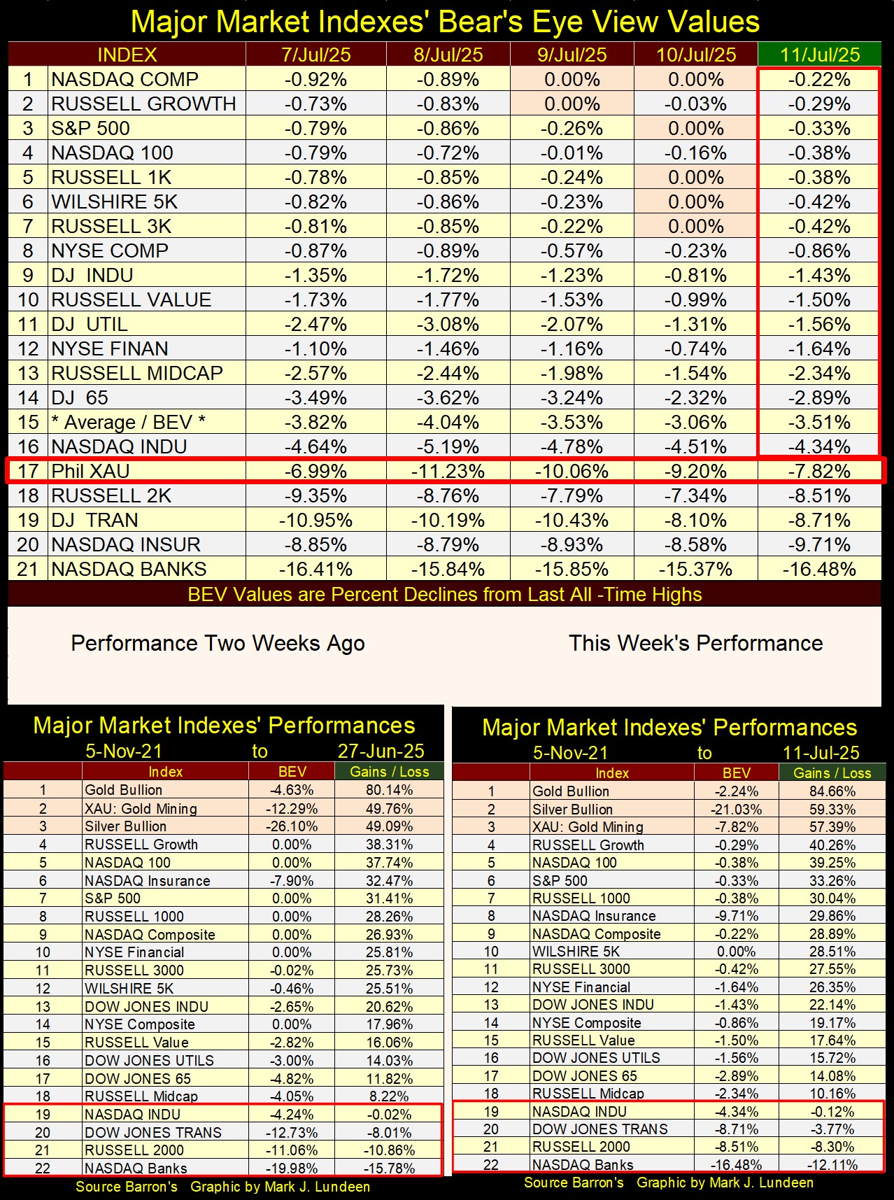
Looking at this week’s performance table above, precious metal assets remained in the top three spots, but note how this week silver replaced the XAU at the #2 spot. How did that happen? By silver advancing 5% this week! As summer flows into autumn, I’m expecting to see more of that, as silver attempts to catch up with gold in the table above, and chart below.
Silver (Blue Plot below), closed the week above its indexed 20 line, something it hasn’t done since 2011, fourteen years ago. I take that as an important market milestone in our bull market for gold and silver. The next important milestone for silver, would be seeing it close at a new all-time high, something silver hasn’t done since January 1980, forty-five years ago, to then have silver keep going up in the chart below.
What would a new all-time high for silver be in this chart? An index value above the 26.32 ($48.70) seen below, in January 1980. That is only $10.24 (27%) from this week’s close. Following that multi-decade breakout, it might be “look out above” for silver.
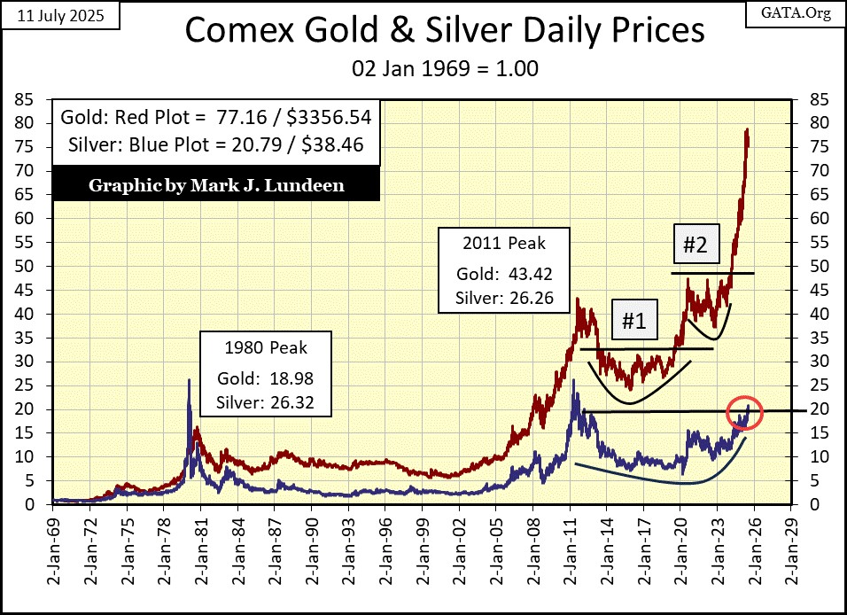
Gold in the chart above (Red Plot), still refuses to correct from its current lofty heights, as it did at #1&2 above. Oh, don’t worry about that, as someday in the future, gold will correct; see a 10% to 15% pullback in price from an all-time high. But most likely from much higher, loftier heights than we see at this week’s close. Things are becoming so interesting in the gold and silver markets.
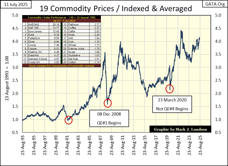
In the chart below, I’ve plotted the indexed average for the nineteen commodities I maintain a weekly data base for. This average would be #11 in the inserted table on the chart, where we are seeing the performance for these weekly data series, indexed to 1.00 = Barron’s 23-August-1993 issue.
August 1993 was at the start of the NASDAQ High-Tech bubble, and to this day, the top three spots in the table are still occupied by stock-market indexes, with the NASDAQ at #1.
The next three spots (#4 to #6) are precious metals, which in 2025, are finally catching up with the gains seen in the stock market since August 1993. Sometime in the next few years, I expect the old monetary metals (gold and silver) will take the top positions in this table.
Following silver (#6 in the table), are the energy and agriculture markets, which since August 1993, have underperformed the stock market and precious metals, by a large measure. I know CPI inflation has increased the cost of living in the past few years, but it isn’t because the farmers and energy companies have increased prices to unreasonable levels in these past thirty-two years.
Keep in mind, two big components in any price consumers bear, are taxes to governments and interest payments to banks. Price components economists conveniently ignore, when discussing “price inflation.” Why would that be? Most likely; because most economists are employed by governments and banks.
Looking at the plot of the indexed average (#11 in the table below), this indexed average is approaching a new all-time high. But, after thirty-two years of CinC inflation, where the volume of paper dollars in circulation have increased by a factor of 6.93 since August 1993, having this index average now approaching its 4.5 line, may not be good, but something to be expected.
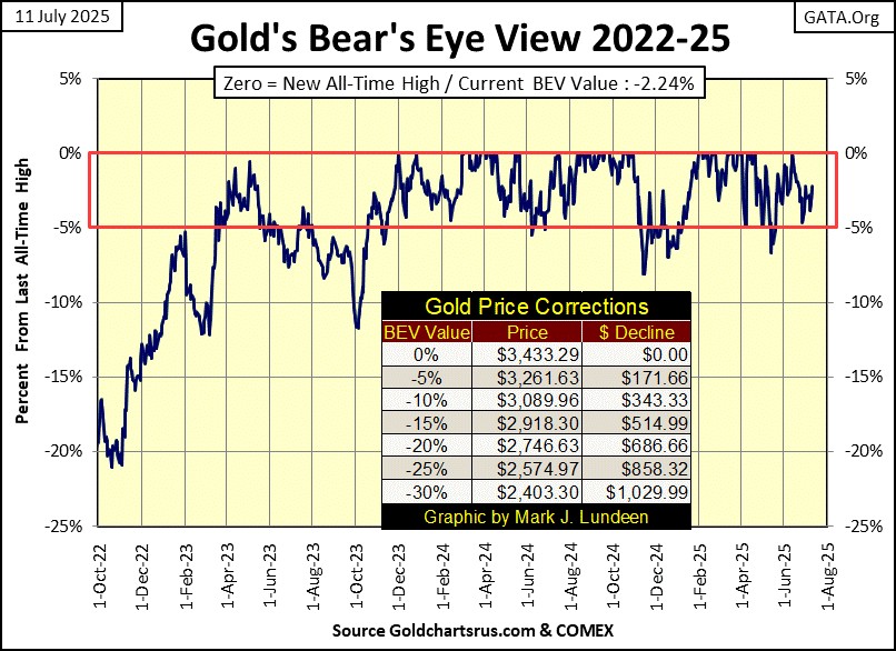
Next is gold’s BEV chart. What did I say above, about what is important in any bull market? That as long as a market remains in scoring position, one must assume new all-time highs are pending.
This condition, remaining in scoring position, has described the gold market since November 2023 in its BEV chart below. Since November 2023, since entering scoring position, gold has so far seen sixty-six new all-time highs (0% = BEV Zeros), its last on June 13th. Since November 2023, how many dollars has the price of gold advanced? By $1389, an advance of 75% from 14 November 2023, to gold’s last all-time high on its June 13th close.
That being the case, I’m going to keep it simple, and assume gold will see additional BEV Zeros in the weeks and months to come. Why make analyzing a bull market, any more complicated than it has to be?
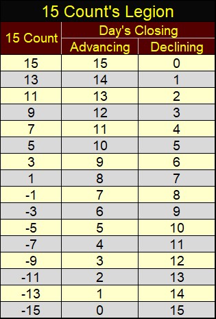
Next is gold’s step sum table. I highlighted gold’s 15-count, the running sum of the daily advances and declines in the gold market, each a sum for the past fifteen trading days. Here is the legion for a 15-count, how many daily advances and declines for any count, ranging from +15 to -15.
In the table below, most of gold’s 15-counts were negative values, indicating that most of the days in these fifteen-day samples were down days for the past month. Even so, gold has done a good job in keeping in scoring position, and even made a new all-time high (0.0% = BEV Zero) on June 13th.
Gold’s 15-count closed the week with a +3. Which indicates that gold is beginning to see more daily advances, than daily declines in these 15-day samples. Seeing gold’s 15-count shift from negative to positive, is yet another reason to be optimistic about gold in the weeks to come.
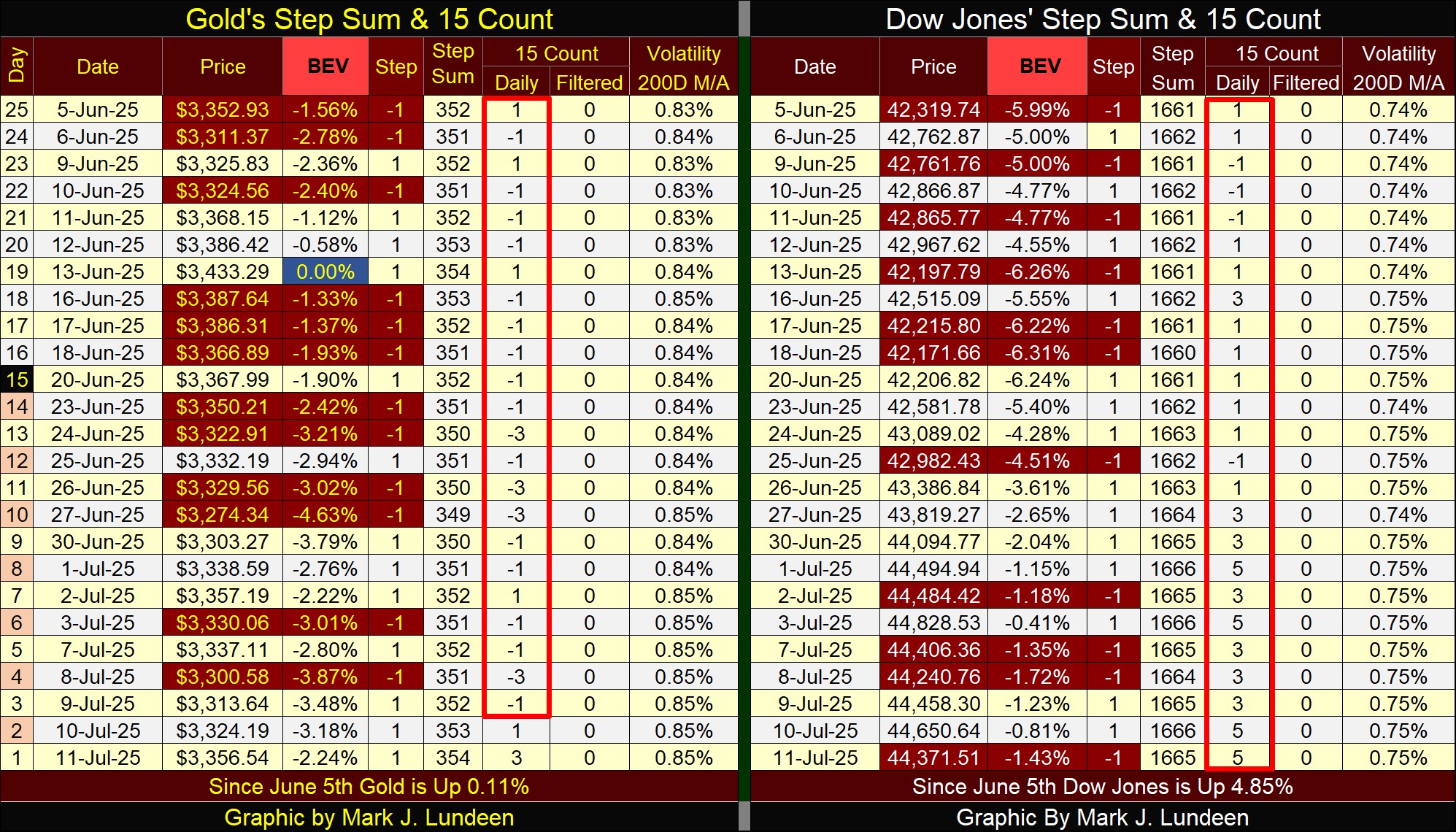
Now compare the Dow Jones’ 15-count to gold’s. Since June 5th, the Dow Jones’ 15-count has mostly been positive values, with four being +5. As seen in the 15-count legion above, a +5, 15-count results when 10 of the days in the 15-day sample are daily advances, with only 5 daily declines. Still, this week the Dow Jones couldn’t make a new all-time high after all those daily advances since June 20th? It is what it is, and what it is, is lame.
What is the Dow Jones going to do when its 15-count once again switches from being positive, to negative values? Will it be able to remain in scoring position? I don’t know, but in the weeks to come, we’ll find out.
I haven’t covered my step-sum for a few years, as in the past few years the step sum for the Dow Jones, or gold, hasn’t done anything interesting. Still, I do follow their step sums, as seen in their step sum tables above, should they do something of interest.
First, what is a step sum? It is the sum totals of daily steps, the daily advances, and declines, seen in the gold and the Dow Jones’ step sum table above;
- +1 = daily advance,
- -1 = daily decline.
The step sum itself, is the sum total of these daily steps. For gold, its step sum at this week’s close was; 354, or a net of 354 daily advances since 02 January 1969. The Dow Jones’ step sum was 1665, or a net of daily advances of 1665 since 02 January 1900, the net of daily advance for Dow Jones for the past 125 years. The net of 1665 advancing days, of the 33,848 NYSE trading sessions of the past 125 years isn’t very much. But then, during both bull and bear markets, the market sees about as many daily advances, as it sees daily declines.
Something else I should point-out before I go any further;
- during bull markets, investors accumulate the shares trading in the stock market, and market-wise investors buy additional shares during market declines (buy on market weakness),
- during bear markets, investors get rid of the shares they accumulated during the previous bull market, and smart investors sell when the market sees an up day (sell on market strength).
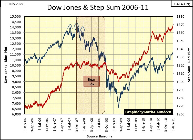
So, why I track the Dow Jones step sum, can be seen in the chart below, plotting the Dow Jones and its step sum from 1929 to 1934. Think of the trends in the valuation of the Dow Jones as “market reality,” and its step sum the market’s expectation of this market reality, a sentiment indicator of the Dow Jones.
Below, from January 1928, to April 1930, market reality (Blue Plot) for the Dow Jones’ and the market’s expectations of this reality (Red Plot) followed each other, both up and down. Then beginning in April 1930, as the Dow Jones itself began descending into the abyss of the Great Depression market crash, its step sum refused to follow it down, and wouldn’t for another ten months, until February 1931.
What happened during these ten months, was the bulls on Wall Street were in denial that the bull market of the Roaring 1920s was over, as they continued buying on market weakness, when the bear market of the depressing 1930s still had a long way to go before it bottomed.
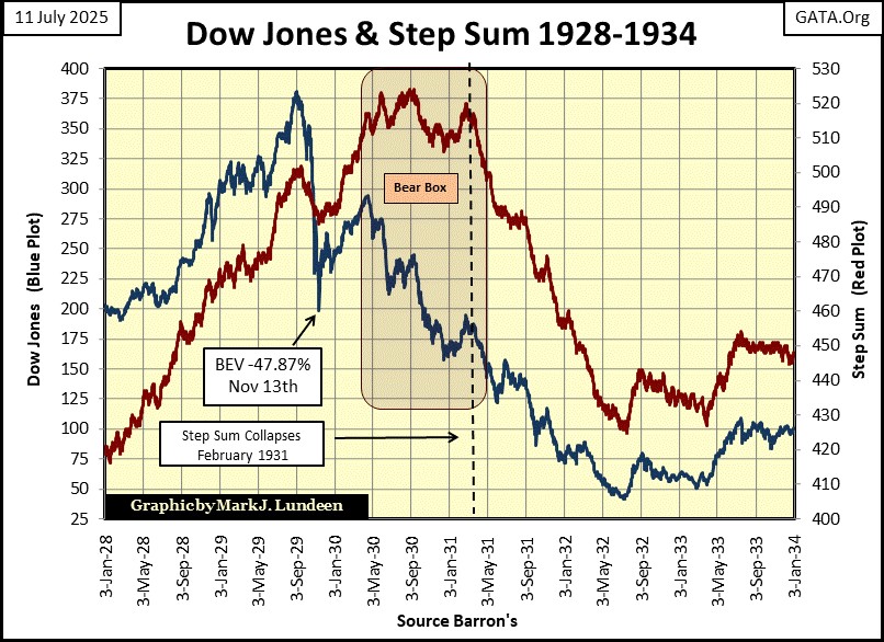
From 1928 to 1932, the Dow Jones, and its step sum plots above, provides a remarkable display of market psychology. During bull market advances, corrections in market valuations (declines in market prices) are seen by the bulls as opportunities to buy more at discounted prices, because they are. So, from January 1928, to September 1929, the Dow Jones’ valuation (Blue Plot), and its step sum (Red Plot), rose and declined with each other, as the bullish perception of the market, was in line with the market’s bullish reality.
The same is true during the initial phase of the Great Depression market collapse; from September 1929 to April 1930. The Dow Jones and its step sum follow each other down during the initial 47.87% market collapse, from its all-time highs of a few months earlier, and then again during the dead-cat bounce seen from November 1929 to April 1930.
But in April 1930, market reality (Blue Plot) and the market’s expectations of market reality (Red Plot) decoupled, forming what I call a Bear Box, where the market’s bulls refuse to accept the fact that a bear market is now the market’s primary trend. In the bear box above, the bulls continued buying on market weakness, a huge mistake during the Great Depression crash.
It wasn’t until February 1931, with the collapse in the Dow Jones’ step sum, that the bulls realized the bull market wasn’t going to resume anytime soon. So, they began selling at any price, to get out of the market, to stop the pain during the greatest market decline in history.
The bottom of the 1929-32 market collapse can be seen above, when both the Dow Jones and its step sum bounced off their July 1932 market bottoms.
Gold also saw a bear box during its 2011 to 2015, 45% bear market, as seen in the chart below. Once again, following a very nice market advance from October 2008 to August 2011, the bulls refused to believe a major market correction was the next big thing to happen in the gold market.
But it was, as the bulls continued buying on the dips in the price of gold, which there were many, until May 2014 when gold had already seen 30%, of its ultimate 45% market decline. At this point, gold’s step sum began to collapse, signaling the bulls finally recognized gold was in a bear market, and they began selling (at a loss) to exit the market.
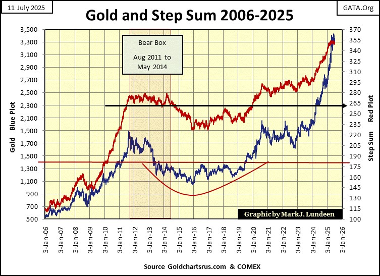
Like the Dow Jones and its step sum in July 1932, when gold and its step sum bottomed in January 2016, and once again began advancing, it signaled the selling pressure all bear markets have, had exhausted itself, providing a solid buy signal in the gold market.
Of course, for gold in January 2016, exactly as it was in July 1932 for the Dow Jones, to actually buy gold was seen by most investors as a foolish thing to do. However, as seen in the chart above, doing what everyone else refused to do – buy gold, was the thing to do in January 2016.
There can also be bull boxes, where a market advances as its step sum refused to follow it up. In fact, in the chart above there was a bull box in the gold market from January, to July 2016. Take a moment to study the chart above to see it.
The Sub-Prime Mortgage / Dow Jones bear market (chart below) also saw a bear box, from October 2007 to October 2008, after which bullish-market sentiment collapsed, with the Dow Jones’ step sum. In March 2009, when the Dow Jones and its step sum bottomed, and began turning up, signaled a strong buy for the stock market.
The problem with step sum boxes is, they don’t always form at market tops, or market bottoms. But when they do form, they provide a reliable technical indication of when to exit, and reenter a market.
Looking at our current step sum chart for the Dow Jones below, since last October the Dow Jones’ step sum (Red Plot) has for the most part just flatlined in the 1660s, as the Dow Jones saw a double top (December / February), and now looks to be making a third top. Looking at the Dow Jones’ step sum, since last October, it has made no effort to follow the Dow Jones up. Which it would, if the Dow Jones was actually advancing. Something is not right here.
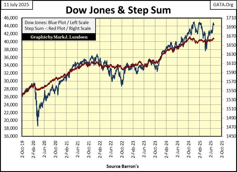
I’m going to spend more time keeping an eye on the Dow Jones step sum above, as it is obvious since last October, the Dow Jones and its step sum haven’t agreed with each other. Until the Dow Jones’ step sum breaks above the 1669 it saw last October, and keeps trending upward, it’s doubtful the Dow Jones will do much for the bulls.
I’ve been following Jeffrey Epstein for over a decade. From what I’ve read about him, he was a math teacher who overnight became a man of finance, and a billionaire. Exactly what Jeff financed to make his billions is never commented on, as I doubt anyone knew. Which makes me think his money; where it came from, and how he used it, was used for purposes that would never make his mother proud of him.
It seems he was also associated with pedophilia, and cruelty towards the kidnapped children who fell under his power. Is that really so? I, and many others in the internet-media believe it to be. This has been alleged about him for years, yet nothing much was ever done about him, until he “committed suicide” in jail, or so the story of Jeffrey Epstein goes.
His home in New York City, a ranch in New Mexico and at his private island in the American Virgin Islands, all had extensive CCTV coverage, including in the bedrooms. Which leads credence to the theory that Jeffrey Epstein was making available, sexual activities with underaged children to very powerful people. People such as Prince Andrew (King Charles’ brother), who Epstein may have filmed having sex with children for purposes of blackmail.
Is all that true? I really don’t know. But inquiring minds, such as mine, want to know if all that is true, or not.
One item Trump, and many members of his team now in the cabinet frequently discussed in the media during their 2024 campaign, was making public the files the FBI obtained in their searches in Epstein’s homes. Or so Trump and his team did before July 8th, as seen below.

If all this is true, I have no desire of seeing the brutal videos of powerful people raping helpless children in one of Jeffrey Epstein’s homes, than I do seeing the photos of how they disposed the bodies of these same children, when they were finished with them.
If all this is true, these people are not only disgusting, but remain at large, free to move about in their jet-setting, multi-million-dollar lifestyles, as pillars of society, business, and politics, in many countries around the world. This possibility is offensive to me.
Here is Michael Franzese, former captain of the Columbo mafia crime family, who sizes up the situation for Epstein’s case. Michael’s comments on Epstein committing suicide at the correctional facility is insightful, as in his former life of crime, he too had also spent time where Epstein was incarcerated, and committee suicide.
https://www.youtube.com/watch?v=mnzol4FoBYA
Here is another video interview of an Epstein Island survivor, Juliette Bryant, by INFOWARS.
For what it is worth; I demand Trump’s Department of Justice, to pursue this issue with the same vigor, as Biden’s Department of Justice used in persecuting the January 6th protestors, frequently updating the public of who they are inditing, and nothing less will do. I don’t care if doing so threatens to bring down governments, England’s Royal House of Windsor, or the CIA and FBI. “Let Justice be done, though the Heavens may Fall.”

The more things change, the more they stay the same. And so it will be, until my Lord Jesus returns to judge the world.
Mark J. Lundeen
*******


