Bond Yields Continue Rising Market Valuations Continue Deflating


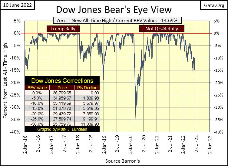
This week closed with the Dow Jones’s BEV at -14.69%. Which comes close to answering the question I posed last week; which BEV line does the Dow Jones break next; its BEV -5% or BEV -15%? Its BEV -15% line I’m expecting to come next. The Dow Jones should see a BEV of -15% next week, or the week after.
I was looking at the difference between the Trump rally (November 2016 to January 2018) with the Not QE#4 rally (March 2020 to December 2021) in the BEV chart below. During the Trump rally, the Dow Jones seldom broke below a BEV of -1.5%, pretty much thirteen months of new all-time highs.
Once the Not QE#4 rally began making new BEV Zeros, unlike the Trump rally, it would frequently correct downwards towards its BEV -5% line, until it broke below its BEV -5% line, and continued going down in our current market decline.
What is there to learn from this comparison? Probably nothing. Still, it’s interesting seeing how different two significant market advances can be.
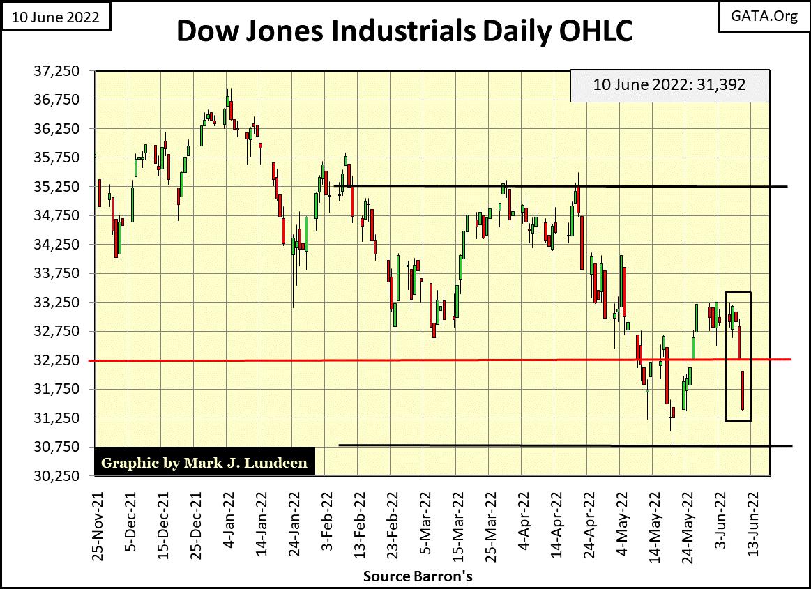
The Dow Jones hit an air-pocket late last week, as seen in its daily bar chart below. On a daily close-to-close basis, Friday was one of the dreaded Dow Jones 2% days (2.73%). Something not seen since May 18th, with a day-of-extreme market volatility of 3.57%.
This is not good for the bullishly inclined. During major market advances, the Dow Jones can go for many months, even years with no days of extreme-market volatility (Dow Jones 2% days). Since the Dow Jones last all-time high on January 4th, it has seen ten Dow Jones 2% days. Should it continue deflating, it will see more.
It's not just the Dow Jones (#6 below) upchucking dollars. All of the major market indexes are too, with last year’s hot NASDAQ indexes upchucking the most. That’s how things go in the market; the higher something flies, the farther it falls.
It’s a momentum thing. Like bitcoin, the higher something soars in price, the more money it attracted, with really dumb-money flooding in at the top. Then it stalls out and begins going down, creating a situation where bull become frightened bunnies, more than willing to Sell-At-Any-Price, which only increases selling pressure.
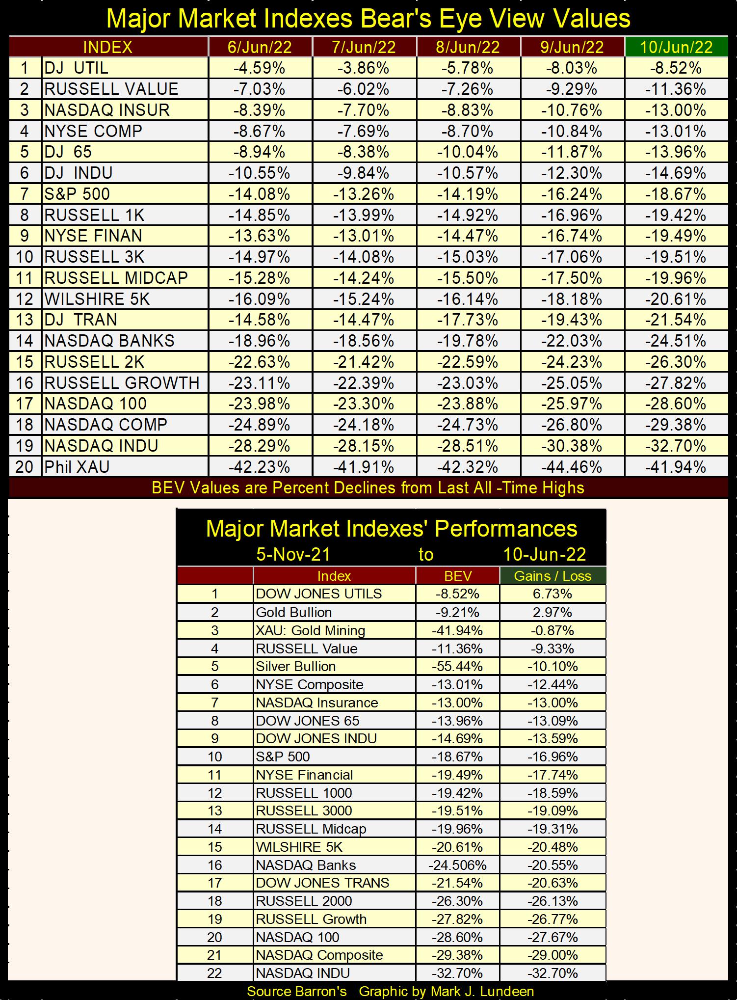
Looking at the declines of my major market indexes since the first week of November (table above), week by week their BEVs & losses drift ever deeper.
Being a mere market enthusiast, I have to be careful of what I say. I don’t like saying something I can’t support by publishing something like a chart or table. But I still have market insights, if not certainties. And I have this feeling the bulls out there remain true believers, believing our current market decline is only a correction within the context of a continuing bull market advance. In other words, the current population of frighten bunnies in the stock market remain a minority.
Look at the Dow Jones BEV chart above. Since its last all-time high of January 4th, it has seen only two daily closes with a BEV of -15%, and big bull markets frequently see 15% corrections.
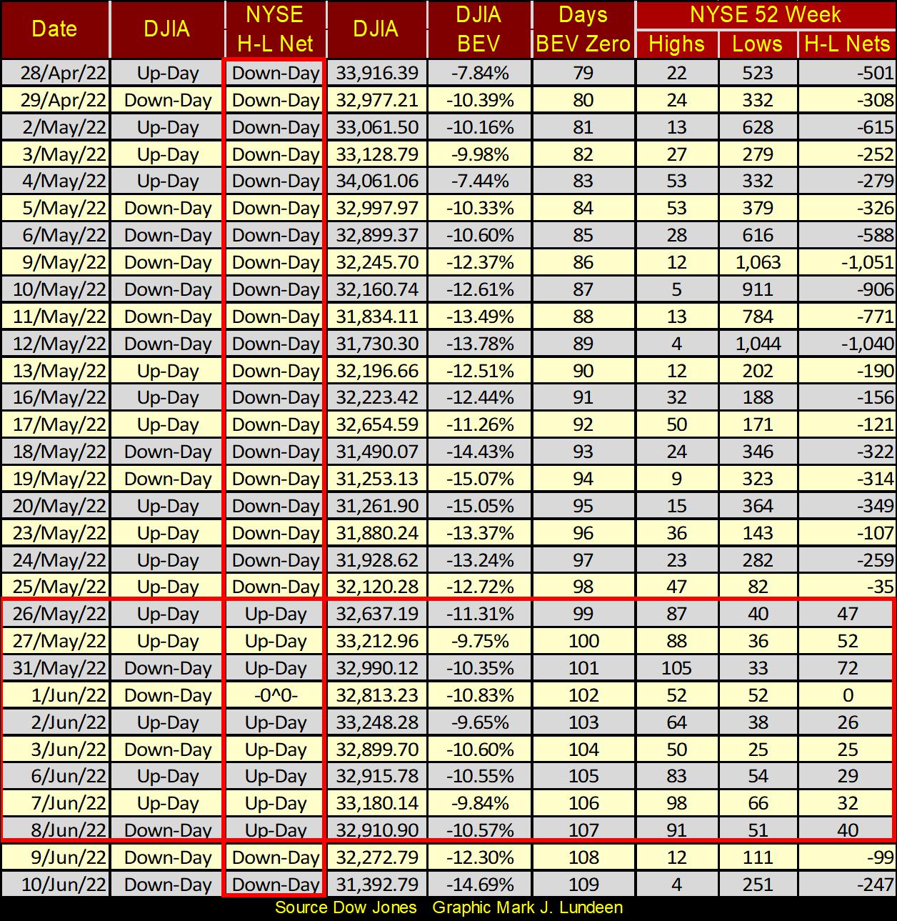
But I’ve moved on from this bullish perspective on the stock market. My market insight is now bearish; before this Dow Jones bear market sinks below its BEV -40% line, it first must break below its BEV -15% line. Looking at developments in the NYSE 52Wk High – Low nets below supports my bearishness.
Look at the vertical red box below; noting whether or not a daily 52Wk H-L Net was positive (more 52Wk highs than lows) or negative (more 52Wk lows than highs). Compare it to the column to its left, noting whether the Dow Jones itself saw an up or down day. In bull and bear markets alike, the Dow Jones sees both daily up and downs as it advances or declines. But during bull markets, the NYSE H-L Nets will be a continuous string of up-days, while during bear markets, the H-L Nets will be a continuous string of down-days.
Now look at the horizontal red box. From May 26th to June 8th, the 52Wk H-L Nets went from negative to positive, something expected at a market bottom. Then at this week’s close (Thursday and Friday), 52Wk Lows at the NYSE once again began dominating its 52Wk Highs.
Maybe this is a market anomaly. Maybe next week we’ll once again see 52Wk Highs at the NYSE dominate its 52Wk Lows. For the bulls, it better be. Because should 52Wk Lows once again dominate the NYSE, that would be very bad.
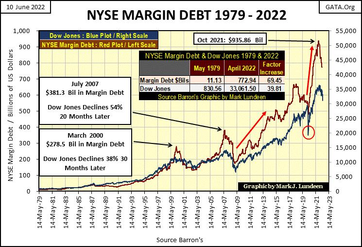
More bad news for the bulls; after peaking at $936bil last October, NYSE Margin Debt (Red Plot below) has declined to $772bil in April (latest data). That’s a six month decline of 17.5% in margin debt. We’ve yet to see what the data looks like for May, and June has a few weeks to go, so maybe this trend will reverse.
It could. But looking at the data below, since 1979, once NYSE Margin Debt peaks, for the past forty years it continued declining for at least a year following that peak, and usually for longer.
Following the March 2000 High-Tech peak in margin debt, the Dow Jones deflated by 38% during the High-Tech bust at the NASDAQ. By October 2002, the NASDAQ Composite itself collapsed by 78%, while the NASDAQ 100 deflated by 82%.
Following the July 2007 peak in margin debt, the Dow Jones deflated by 54% (its second deepest percentage decline since 1885) during the sub-prime mortgage bust.
The March 2020, 37% flash crash (Red Circle below) also followed a significant decline in NYSE Margin Debt. Now, as per the last six months of available data, once again margin debt has peaked, and is now declining. As is the Dow Jones (Blue Plot below), my proxy for the broad stock market.
We may not have yet felt Earth’s magma shifting beneath our feet. Belching clouds of volcanic ash and noxious gas high above Manhattan’s skyline haven’t yet been reported by the mainstream media. Inescapable pyroclastic flows have yet buried Wall Street’s prime real estate beneath a thousand meters blanket of lava and ash. Maybe, just maybe none of the above will happen any time before 2023.
But don’t push your luck. Because in June 2022, looking at the NYSE’s Margin Debt chart above, with its 17.5% decline of margin debt since last October, plus the FOMC’s ongoing QT strongly suggests this isn’t the time to fall in love with last year’s NASDAQ’s glamor stocks, currently trading at “bargain prices”, or little else of what is bought and sold on Wall Street.
“Market experts” offered to the public by the MSM never provide long-term charts on the market. I can’t help but believe that one of the attractions to my weekly market comments is that I frequently offer charts going back before the Great Depression.
That plus I try not to comment on something I can’t provide a chart or table for. My readers may, or may not agree with my market opinions. But I leave them with the means to form their own conclusions on the market. Such as this chart of earnings for the Dow Jones going back to 1929, which like so much concerning the market, has changed greatly since August 1971, with the decoupling of the US dollar from the Bretton Woods’ $35 gold peg. That and when Alan Greenspan became Fed Chairman in August 1987.
The first item concerning Dow Jones earnings is how volatile they’ve become since August 1971. Yes, earnings did crash, and actually went negative during the Great Depression Bear Market. But following the Dow’s earnings in the insert below, growth in earnings from 1932 to 1972 were regular, and seldom surrendered to Mr Bear.
Looking at the earnings for the Dow Jones in the chart’s main body below, since the dollar was decoupled from the gold standard in 1971, earnings became very volatile. Regularly rising to new all-time highs, then collapsing 90%, or more.
During the sub-prime mortgage bear market, for the second time in the past 100 years Dow Jones’ earnings went negative. A huge difference between 1932 and 2008, was following the 1932 collapse in earnings; it took twenty years before earnings for the Dow Jones recovered to their 1929 highs. Not so for the 2008 collapse, where it took only four years for the Dow Jones earnings to fully recover, and then on to new all-time highs.
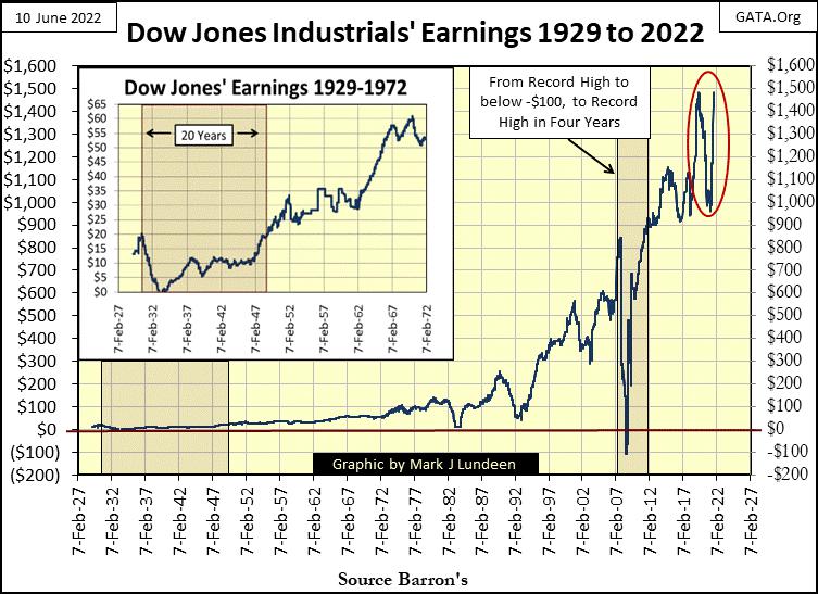
At the close of this week, earnings for the Dow Jones are once again approaching historic levels, following a 30% decline seen in late 2021 (Red Circle above). This is crazy! Are the “market regulators” at the SEC investigating this? Obviously, that is not their job.
However, this crazy action brings a question to my mind; are we next to see another collapse in earnings for the Dow Jones? If Mr Bear is ready to make his move, you can count on that, and further, much deeper deflation in market valuations.
Here’s my Commodity Bear’s Eye View Values table, which has one large difference from my BEV value table for the major stock indexes seen above; that being the data is weekly, not daily. So don’t be surprised seeing large percentage changes from one week to another, as the data has five trading days from one datapoint to another.
This week soybeans (#3) also made market history, making a new all-time high (BEV Zero). Before September comes, there will be other commodities listed below making BEV Zeros, or closing in scoring position; less than 5% from a new all-time high.
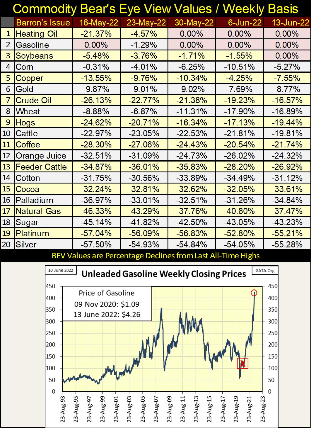
As rising gas prices are on everyone’s mind, I included a chart of gas prices in the table above. When the mainstream media, and the entrenched deep state stole the election from President Trump in early November 2020 (Red X), gas traded in the futures market at $1.09.
The usurper; bumbling Joe Biden, in a little less than a year and a half has increased the price of gas in the futures market to $4.26, and this was done with intent and purpose to promote “the progressives’” “green economy”. I’m seeing stories of independent truckers going out of business because of rising gas and diesel fuel prices. Without truckers, store shelves go unreplenished, making money worthless for the lack of anything for it to purchase.
Welcome to the New World Order, and its green-energy powered economy. A world where “we’ll own nothing, but be happy.”
Well maybe in America’s upcoming election this November we’ll vote these bums out of office, and the new office holders will clean house. All this is so depressing. Let move on to something more cheerful, like gold’s BEV chart below. But first, what is happening to bond yields?
Any “market expert” worth their generous fees from the financial mainstream media will tell anyone willing to listen to them, that rising interest rates and bond yields are negative factors for gold and silver.
But for myself, a mere market enthusiast who spent years compiling data sets from the dusty old pages of Barron’s, knows rising bond yields are actually bullish for precious metals assets. They were in the 1960s and 1970s, and will again be in the years to come, as a prolonged trend of rising bond yields indicates capital is fleeing deflation in the financial markets; money is on the move looking for a safe harbor somewhere else. In the 1960s and 1970s, somewhere else was found in the inflation happening in soaring commodity prices, and precious metals assets.
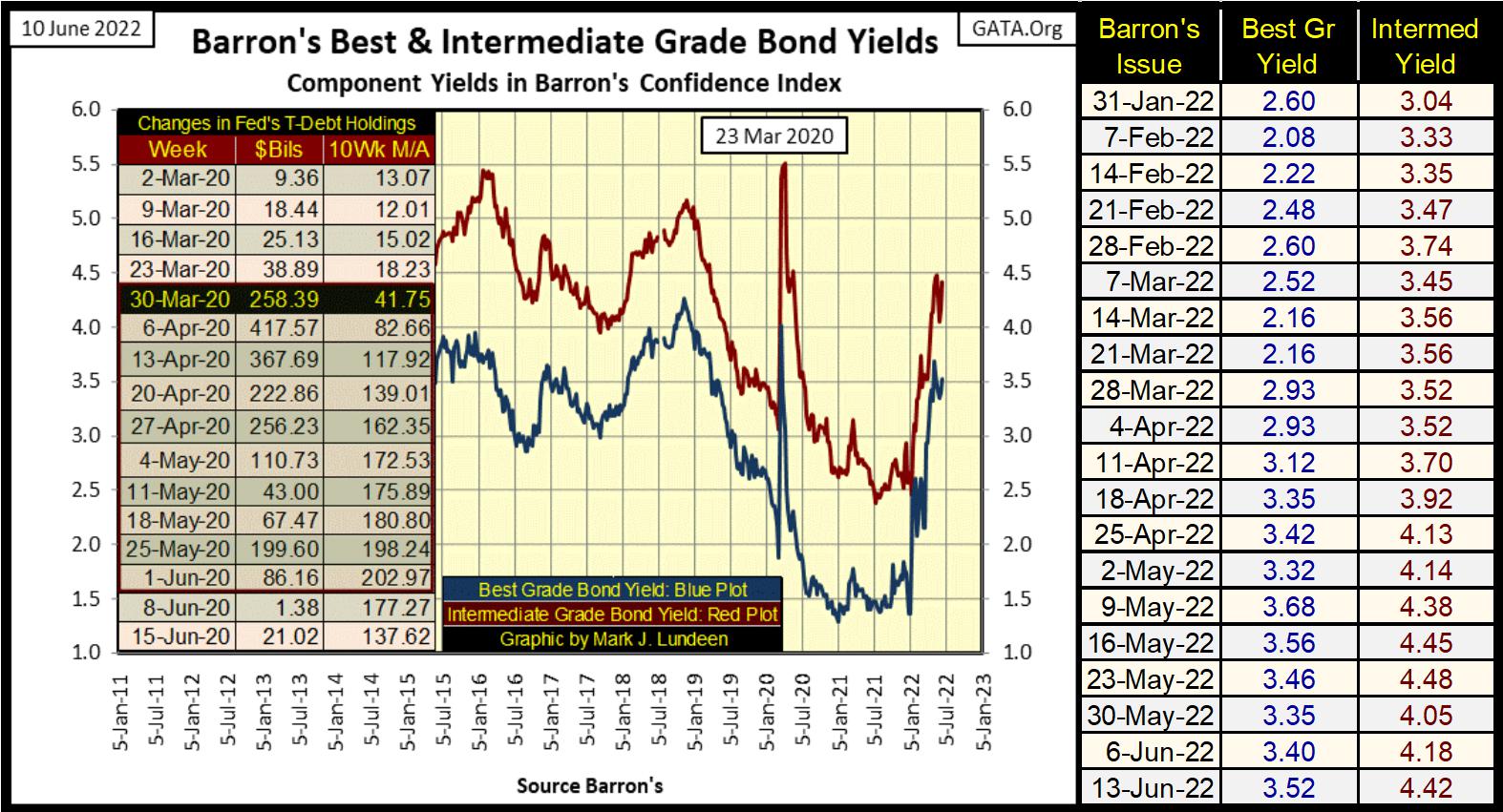
Below is a chart for Barron’s Best and Intermediate Grade Bond Yields. They peaked in May, and corrected a bit in the weeks since. But this week they both attempted making a new high for their moves. With commodity prices continuing to rise (rising CPI inflation), bond yields have nowhere else to go but up, and bond prices nowhere else to go but down in the foreseeable future.
And that’s good for gold, silver and the precious metal mining companies, as well as commodities in general.
It’s not only American bond prices deflating (bond yields rising). These deflationary trends in finance are international, as seen in the chart below.
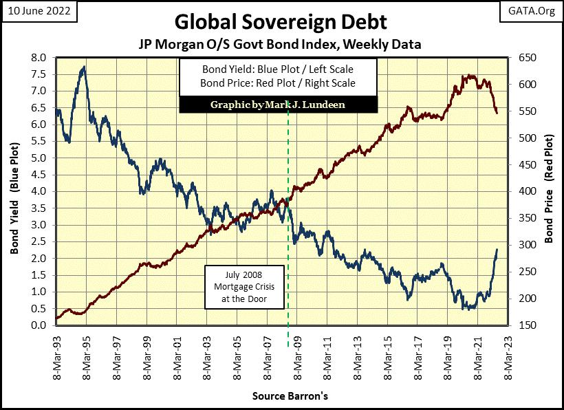
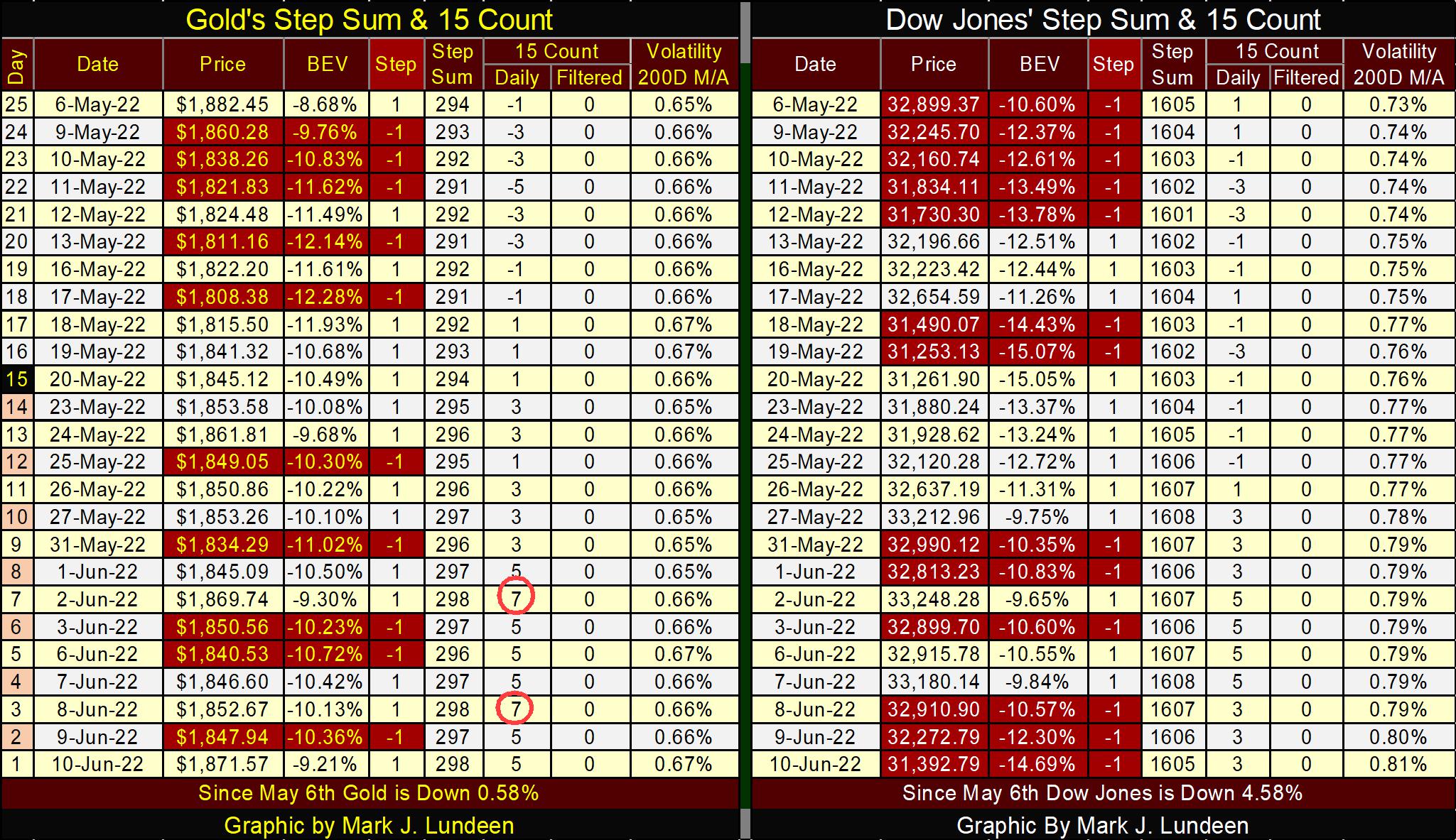
As promised, here is gold’s BEV chart. There is a war going on at its BEV -10% line. In the past month, the bears (COMEX goons) have done their best to keep gold below this -10% line. They got it down to a BEV -12.28% on May 17th, but since then the bulls have struggled mightily to drag it back up above it. This week gold closed at a BEV of -9.21%.
Should bond yields continue rising, and they should, it will become ever more difficult for the COMEX goons to keep gold, and silver from trading at historic levels.
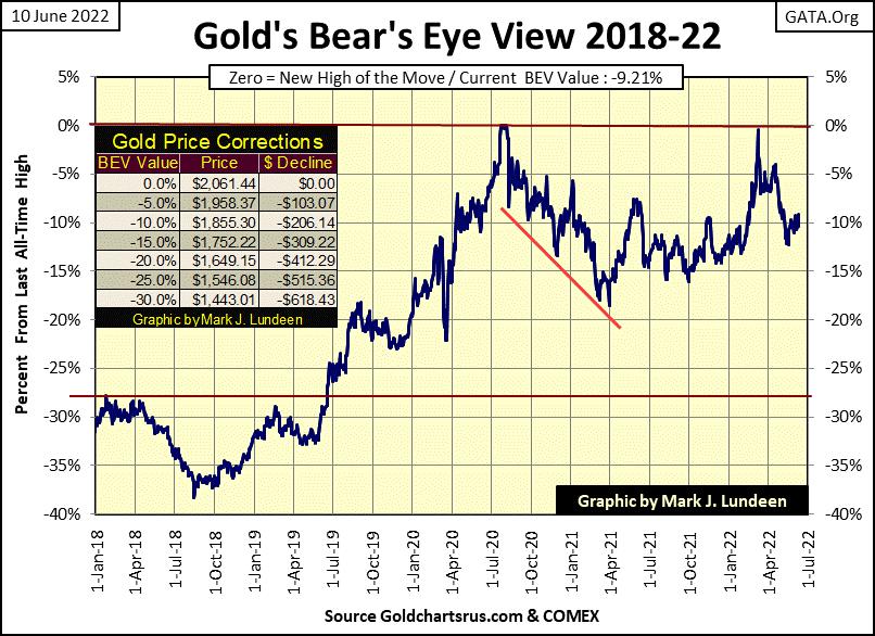
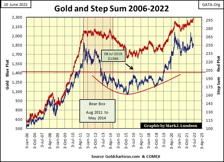
Last week I mentioned that gold, like the Dow Jones was in a bear-box, though due to the scale of this chart, going back to 2006, I didn’t include a red box for bear box. Looking at its BEV chart above, I expect this bear box to be invalidated as market reality (gold price / blue plot) rises up, and recouples to its red step sum plot.
The more bond yields rise, and the stock-market valuations deflate, the more likely this will happen. We’ll know more next week. But at the close of this week, I’m optimistic on the prospects for precious metals assets.
The bear box for the Dow Jones continues, with market sentiment (Red Step-Sum Plot) remaining stubbornly bullish, as market reality (Blue Dow Jones valuation Plot) trends downward. This could become a historic step-sum box before this bear market is over.
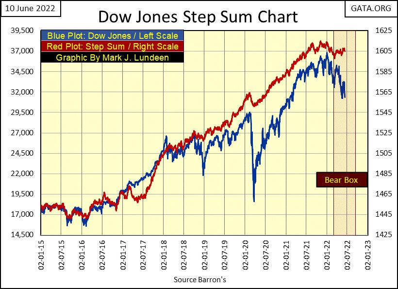
Gold and the Dow Jones bear-boxes can be seen as they develop daily in their step sum tables below. Neither is seeing their step sums breaking down towards their price plots.
Gold twice in June became overbought, with a 15-count of +7. For the bulls, that isn’t a positive, but this is no reason to panic. Let’s see what happens from here.
Daily volatility’s 200D M/A for the Dow Jones closed the week at a 0.81%. This rising trend in daily volatility is really bad for the bulls
As an example of current journalist malfeasance; here’s CNBC reporting on Senators Sanders & Warren’s proposed bill for Social Security. New legislation supposedly that will extend its funding for an additional 75 years, as well as providing an increase of $200 / month in payments. Newly arrived illegal immigrants, now flooding across the Texas / Mexico border will be glad for that. Oh, and me too.
How is this legislation to accomplish this? In the new Senate bill proposed by Berne Sanders & Liz Warren, they plan “tax the rich.” Nothing could be simpler.
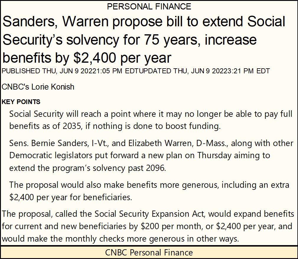
If you read the article below, clearly CNBC now functions as a propaganda organ for Washington’s politicians, with no attempt to challenge the dubious proposals of this new bill on Social Security.
The financial media used to deliver real investigative journalism, concerned with keeping their readers informed on important issues of the day, but not anymore.
Check out Barron’s first article on the then new Social Security System in September 1936 (below); “its accounting is a fraud.” With today’s legacy media, unless attacking a political opponent of our entrenched elite, they would never question the integrity of a major Washington bureaucracy, such as Social Security or the FDA. But decades ago, they used to, because that was what journalists did as a profession; dig deep and publish all the dirt that is fit to publish.
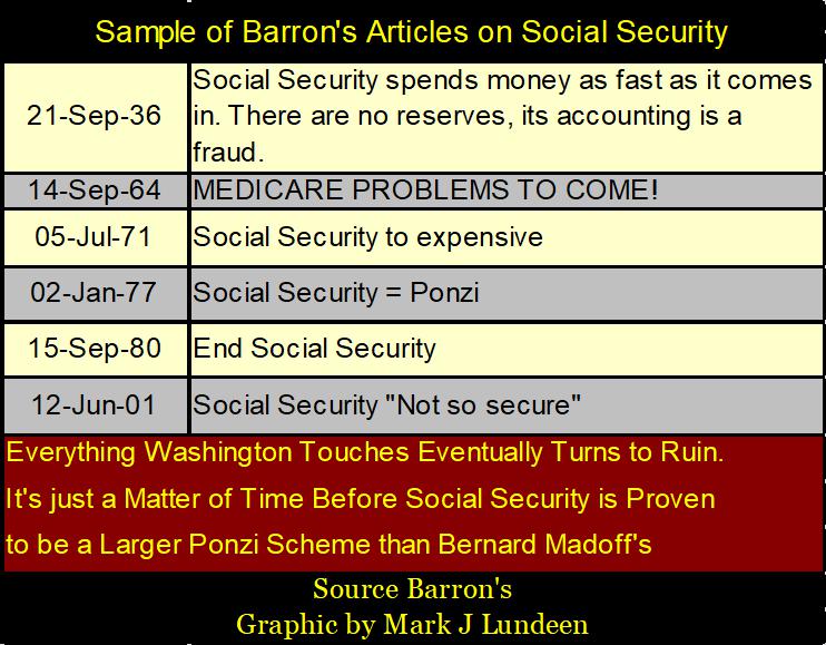
In the fullness of time, we’ll see the fraud that was true with Social Security in 1936, is also true in 2022, as no doubt it will be 75 years from now. Assuming Social Security lasts that long, which is a huge assumption.
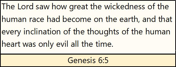
If someone knows something bad is going to happen, do they have a duty to inform others who will be impacted by an impending disaster? In the Bible’s book of Ezekiel, chapter 33, God tells Ezekiel we certainly do, and if we fail to do so, he will hold us personally accountable for not informing others of the pending calamity.
With that in mind, here is a link to Epoch Time’s Roman Balmakov’s Facts Matter. I like Roman, and the Epoch Times. They offer their followers really good stuff.
https://www.youtube.com/c/FactsMatterwithRomanBalmakov/videos
The above link leads to Roman’s daily topics, lots of information the mainstream media, and even Fox News somehow never covers. His link below covers the Great Reset, and its nine Most Dystopian Plans the World Economic Forum (WEF) is Pushing on us, to achieve the WEF’s stated goal for you and me; “that we’ll own nothing, and will be happy.”
https://www.youtube.com/watch?v=fpwy0D3ffbY
After viewing the above, we should note somethings never change, as stated in the Bible.
That wraps it up for this week. Next week could be very interesting should bond yields continue rising, and stock market valuations continue deflating.
Mark J. Lundeen
*********


