Bull Box In the Gold Market


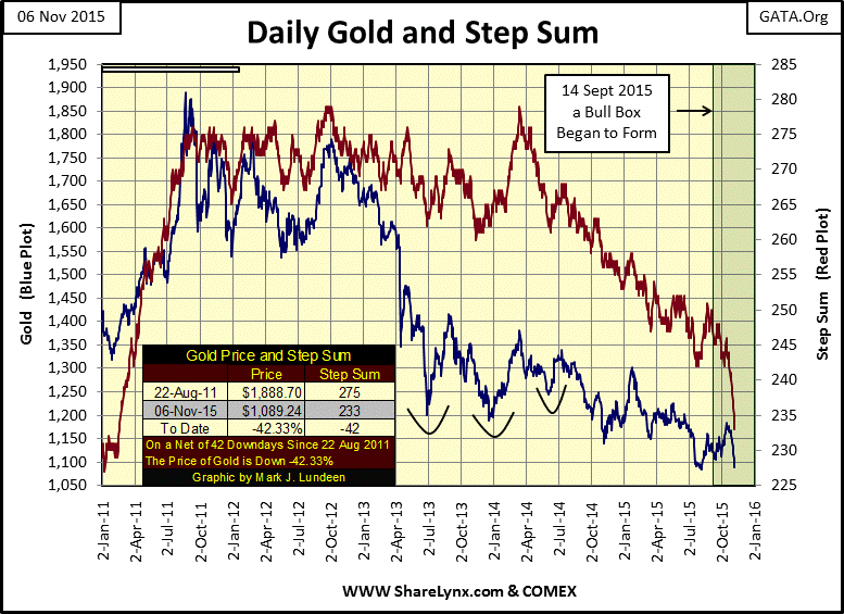
 Last week I discussed the step-sum bull box forming in the gold market in which the price of gold either goes up or trends sideways as its step sum trends bearishly downward. A bull box is a bullish development in any market as its shows the price of something holding firm or actually advancing as market sentiment collapses. Take a look at the price of gold (Blue Plot) and its step sum (Red Plot) in the bull box below. Now compare what is happening these last few weeks with what happened in April and June 2013 when the price of gold collapsed as it hit two air pockets. At no time during 2013, or any time since August 2011 did the step sum (market sentiment) collapse as we see it doing now.
We see the price of gold declining under the assault, but still it has been holding remarkably firm under this relentless attack. At week’s end gold was still above its lows of early August. Unlike the late 1990s, at the end of gold’s two decade long bear market where the bulls finally surrendered, sold their gold and moved their money to greener pastures at the NASDAQ, the current decline is very different. Today there really is no rational investment alternative for the gold bulls to transfer their money to. We live in a world weighed down with unserviceable debt and pregnant with counter party risk. Gold and silver are currently the most logical investments and the PM bulls KNOW THIS, even though most “market experts” apparently don’t.
So the present decline in the old monetary metals is not due to sales by frustrated bulls exiting the arena but by frustrated bears selling paper gold short, backed by the global central bankers. These sales are conducted in futures markets which are backed by less than 1% of the bullion necessary to deliver on these contracts. They are naked shorts; meaning the sellers don’t actually possess the metal to deliver on the contracts. Selling something which does not exist and will never be in one’s possession meets my definition of fraud. What are they afraid of? It could very well be that the “policy makers” have recently become painfully aware that the future for bears in the gold market is bleak. But it costs the Fed nothing to print up the money used to suppress the gold futures markets, and this suppression is absolutely necessary to perpetuate the illusion that the dollar actually has some value.
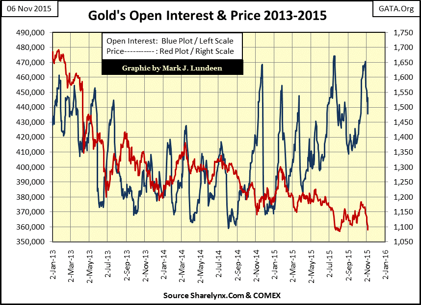
Look at the chart below plotting COMEX open interest, or the number of active contracts trading on the COMEX (Blue Plot / Left Scale). Each contract is for 100 ounces of gold to be delivered sometime in the future, gold the big banks don’t have and can’t get. The big NY banks are short the majority of these contracts, and since September of 2014 COMEX open interest, and short side liability in the gold market has exploded.
Since October 27th open interest has fallen 33,457 contracts (3,345,700 ounces of phantom gold) during the same time gold’s bull box became active. It could very well be that the recent frantic selling seen in the gold and silver markets are the bears’ best effort to extract themselves from a very bad situation. How far down does COMEX open interest have to decline before this frantic selling in the gold market ends? I don’t have a clue, but I’d expect somewhere below where it was in September 2014. Looking at the gold market from this perspective, we should expect even more frantic selling in the weeks to come as Wall Street attempts to force the COMEX longs out of these contracts.
I’m no market insider; I’m just a guy analyzing the market using publically available data. However the above theory explains much of what is now occurring in the gold market, and it’s a reasonable theory.
But whether or not my theory is correct, how far does the price of gold have to decline before this bull box must be considered as failed? If gold declines below $1,000 I’d have to say the bull box failed, and that is not necessarily bad for the gold bulls. Stepping back in time to 1998 and we see the four yearlong bear box below, seeing the price of gold fall below $1,000 as its step sum collapsed would finally close this box; a very positive and bullish development.
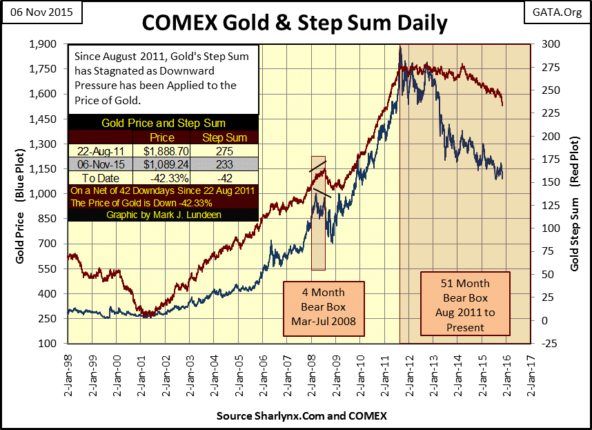
In any event seeing this bull box form (my first chart) fifty months after gold’s last all-time high, whether it closes as gold bulls would desire (step sum and price of gold surge upwards) or whether it fails to the benefit of the bears (price of gold declines below $1,000), it reveals something about the struggle currently going on in the gold market. Maintaining the price of gold, and silver within the parameters set by the “policy makers” is becoming more and more difficult with the passage of time. It might actually be that after fifty months the “policy makers” now feel their time is running out, and realize the need to extract themselves from their massive short positions in the gold futures market ASAP.
Even if they manage to keep the price of gold futures contracts suppressed and under control, eventually premiums will rise in the physical gold markets causing an ever growing divergence between the physical price and the futures price. The Shanghai gold exchange which delivers more than 50% of its contracts in bullion has now taken over as the world’s preeminent supplier of gold bullion, and the paper gold futures markets such as the COMEX and LBMA will soon cease to have any importance. These markets for “the future delivery of gold” will cease to exist once gold approaches its fair value of tens of thousands of US dollars per ounce, and that is not even including the future runaway currency creation by the US government on the order of a trillion phony paper dollars each and every year with no end in sight.
No matter how this current bull box resolves itself, this could result in a historic price explosion in the gold market. However, as I’m suffering from Battered-Bull Syndrome, I’m making no guarantees on that as the people on the other side of the trade are allowed by their government “regulators” to lie, cheat and steal. But I’m thinking it!
Let’s peer a little deeper into gold’s step sum. Since October 15th gold’s step sum has collapsed by twelve steps, as you can see in gold’s step sum charts above and in the table below. A step sum can only go up or down by a single step a day, so we are witnessing a huge collapse in market sentiment in a short period of time, as I’m sure most of my readers can attest to.
Keep in mind that there are usually just as many up days as down in bull markets and bear. Seeing just two up days in the price of gold over a 17 day trading period is a rarely seen market anomaly. But note that since October 15th the price of gold has fallen less than a $100 after all this selling.
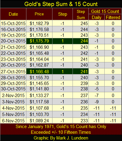
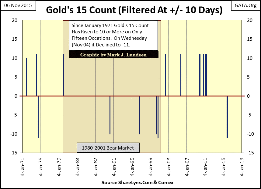
To illustrate just how abnormal it is to see the step sum drop by twelve steps (from 245 to 233) in this short a period of time, I’ve introduced another column in the table above called “the 15 count.” In the past I’ve used the Dow’s 8 and 200 counts in which I plotted just the number of days of extreme volatility (2% days) when the Dow Jones moved 2% or more from a previous day’s closing price. The 15 count for gold is different; it adds all the up and down steps in a running 15 day count, and over 44 years since January 1971, gold’s 15 count has reached a +/- 10 only fifteen times. The chart below plots 11,273 trading sessions, so we can appreciate just how rare a market event occurred this week in the gold market.
Exactly what market predictions can be made using the data above? Quite a few, but none that I care to make as since August 2011 Washington and Wall Street have clamped down on the price of gold. I’m tired of making bullish predictions that are always overwhelmed by the reckless selling of unregulated phantom gold at the COMEX, a government “regulated market.” Let’s be honest; for decades and with the full cooperation of the Federal Government, the big NY banks have cheated the longs in the gold and silver markets and investors in mining shares. This is a huge market scandal that will never be properly reported in the main-stream media.
So gold is currently in a bull box with its step sum collapsing by twelve in the past three weeks, and its 15 count saw a -11 this week. It’s not exactly clear what’s happening here, but it reeks of desperation by the bears for reasons that are not yet apparent to market watchers outside the system. However like me, my readers will just have to wait to see what comes of all this. I’m optimistic that ultimately we’ll see much higher prices in the months to come, but I’m expecting further declines in the price of gold and silver in the near term.
This link to King World News is an audio interview with former US Treasury official; Dr. Paul Craig Roberts on the subject of manipulation in the gold and silver market is most interesting.
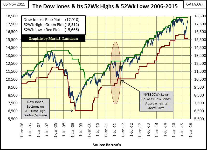
Moving on to the stock market, let’s look at the Dow Jones plotted with its 52Wk Highs and Lows. Two months ago the Dow Jones declined below a 52Wk Low on news of collapsing share prices in China and concerns that the Federal Reserve would increasing its Fed Fund Rate twenty-five basis points (from a minuscule 0.13% to a pathetic 0.38%). Making a new 52Wk Low is something the Dow Jones hadn’t done since the credit crisis. It has since seen a nice advance and currently is only 402 points (2.19%) from its all-time high of last May.
All in all this chart looks pretty darn bullish. But as beauty is only skin deep, ugly in this case goes all the way in and that pretty well sums up my feeling on the stock and bond markets. ZeroHedge this week had a good article on corporate downgrades in the bond market.
"Absent the central banks, we would be in the later stages of a credit cycle," warns Principal Global Investors's David Blake as 2015 has now seen the most corporate debt downgrades since 2009...”
It seems that corporate America’s trashing their balance sheets in the bond market to fund share buyback programs is coming home to roost. Before this is all over there will be many more stories on downgrades and defaults in the bond market.
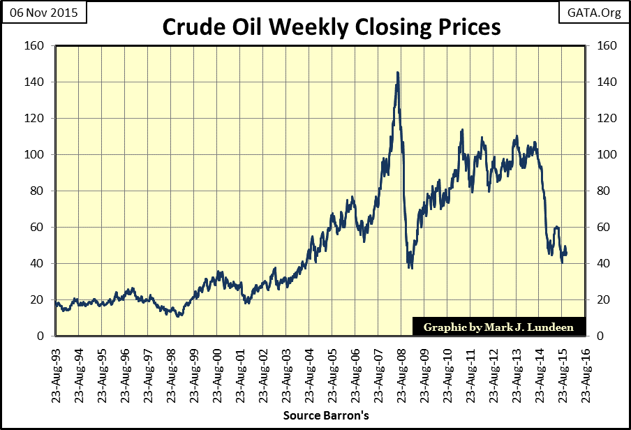
And there are big problems in the oil patch. The shale-oil industry was financed with junk bonds. Everything was fine when oil was $100 a barrel, but oil hasn’t sold above that since August 2014. Shale oil development is a capital intensive business. It wouldn’t surprise me if a trillion dollars in bonds were floated to fund these companies.
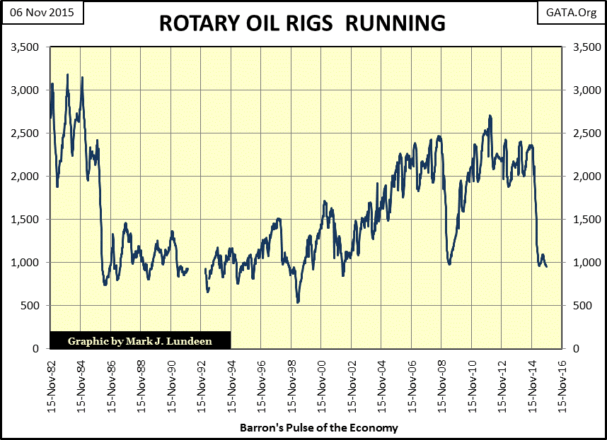
It also wouldn’t surprise me if a good portion of these shale-oil industry bonds are just a coupon payment away from defaulting if crude oil prices don’t increase soon. Look at the number of drilling rigs in the chart below that have stopped drilling for crude oil. This will continue as long as depressed oil prices make these marginal wells unprofitable. On a global basis the oil industry is in a depression, and during depressions defaults on bonds issued during the good times is par for the course.
Since every company needing capital goes to Wall Street, and Wall Street never passes up an opportunity to bundle a derivative with bonds they sell to the public to “hedge risks” like default, one has to wonder how exposed Wall Street actually is to these bonds? More than enough to crash the NYSE I would guess, even if the Fed maintains the ludicrous Fed Funds Rate at 0.13%. Free money for all! Well for the banks anyway. It may be only a daily/overnight interest rate, but when rolled over indefinitely, it becomes an annual rate as well.
But the stock market’s problems run deeper than a drill bit in North Dakota. The fact is that the current advance that began in March 2009, almost seven years ago, is getting very tired. Here’s a chart plotting the NYSE’s 52Wk H-L Ratio since 1996. The data points below are computed as follows:
NYSE 52Wk Highs – 52Wk Lows / NYSE issues traded that day
The red stars mark the Dow Jones bull-market tops for these three historic bubbles inflated in the stock market by the FOMC over the past two decades. There’s a pattern between the NYSE 52Wk H-L Ratio data and bull market tops. The NYSE 52Wk Highs peak before the Dow Jones reaches its ultimate bull market high. This means that most individual stocks top, and begin their bear market before the Dow Jones does.
During the high-tech bubble the NYSE 52Wk highs peaked two years before the Dow Jones saw its ultimate high in January 2000, but NYSE 52Wk highs peaked just one year before the mortgage bubble popped. Below we see that the Dow Jones made its last 52Wk high in October 2007 (middle star) with few companies following its lead, which is typical of a bull-market top.
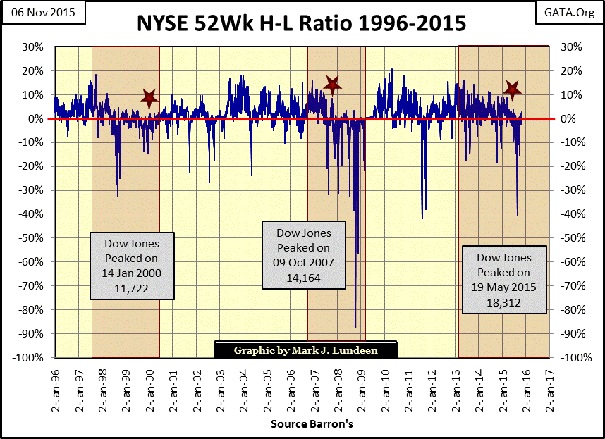
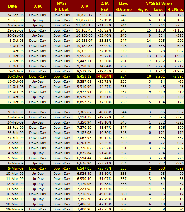
Look at the 10 October 2008, 87% collapse in the NYSE 52Wk H-L Ratio in the chart above and table below. It’s interesting to note that NYSE 52Wk Lows peaked in October 2008 on the day the Dow Jones saw its first 40% decline since September 1974 (DJIA BEV column below), not on 09 March 2009 at the bottom of the second deepest Dow Jones bear market since 1885. This shows that during the credit crisis most stocks had bottomed, and begun their bull market months before the Dow Jones did.
The “Days BEV Zero” column below is calculated using the number of trading days since the Dow Jones October 2007 market top. It’s interesting to know that 254 trading days after the Dow Jones saw its October 2007 top its valuation collapsed 40%.
Returning to the NYSE 52Wk H-L Ratio chart above, and our current “bull market” we see very few NYSE listings making new 52Wk Highs. Take a moment and study the chart. The last time the Ratio was over 10% was in the summer of 2014, and hasn’t been above 5% since April of this year. In August the Dow Jones saw its first 10% correction since 2011, and has now rebounded to only 2.19% away from making a new 52Wk High (and new all-time high). But remember NYSE 52Wk data is a leading indicator, so why aren’t more companies trading on the NYSE breaking above their old 52Wk Highs with the Dow so close to doing so? In a vibrant bull market this is what happens. It looks like the market advance that began in March 2009 has its best days behind it. There’s more future pain than gain investing in the stock market today.
Next is a chart plotting the daily NYSE Advance – Decline Ratio. Data points computed as follows:
Advancing shares – Declining shares / NYSE issues traded that day.
The plot is the running total of all the daily data points.
This data informs us when it was easy making money at the NYSE, as well as when it wasn’t. From 1926 to 1942 is pretty obvious as it covers the tail end of the Roaring 1920s bull market and the Great Depression including a huge bull market that took the Dow Jones up 371% from July 1932 to March 1937. Beginning in April 1942 the Dow Jones began another bull market that for all practical purposes ended in February 1966, but note how the A-D Ratio peaked in January 1956 with the Dow Jones at 485.78. Over the next decade the Dow Jones managed to double even though shares trading at the NYSE saw more daily declines than advances.
Next the Dow Jones entered an era when breaking above, and staying above 1,000 seemingly became impossible. We see the NYSE’s A-D Ratio collapsing as declining shares overwhelm advances. That didn’t change until the bottom of the Dow Jones 1973-74 bear market, when for the first time since April 1942 the Dow Jones declined 40% from a bull market top.
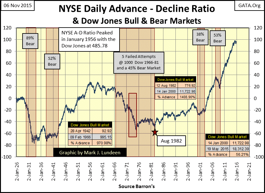
Interestingly, the NYSE A-D Ratio during the Dow Jones bull market of 1982-2000, (during which the Dow Jones advanced 1400%) was subdued compared to 1942 to 1956, when the Dow Jones only managed to advance 422%; from 92.92 to 485.78.
I’m publishing this chart to point out what the A-D Ratio has done since January 2000; it made its most aggressive advance of the past century with a disproportionately small effect on the Dow Jones. To be fair, from 1926 to 1966, the thirty companies comprising the Dow Jones Industrials were the glamour stocks of the day, which for the most part is no longer true.
Also I calculated the Dow’s current advance from its January 2000 bull market top (11,722), rather than the October 2002 high-tech bear market bottom (7,286). Still using the Dow Jones value from October 2002 would still have shown a pitiful advance of only 151% since 2002 for the Dow Jones. Not much when we consider all the net advancing shares at the NYSE since 2002.
I believe we are seeing the “policy makers” fingerprints on the stock market with the NYSE A-D Ratio. If “policy” prohibits bear markets in stocks, then someone has to buy stocks at higher prices than allowed by natural market forces, and continue to do so year after year. This is exactly what the FOMC and Wall Street have been doing beginning in 2000, fighting Mr Bear using monetary inflation to fund their purchases in the stock market.
I don’t know how much longer this can continue. But “policy” be damned; sometime in the future the NYSE A-D Ratio will start a multi-year decline. After decades of monetary inflation being “injected” into market values at the NYSE, I expect the next bear market will be particularly brutal. In November 2015, that’s how I see it, making gold and silver bullion held outside the banking system really the only place to be.
Mark J. Lundeen


