Consumer Debt And Inflation


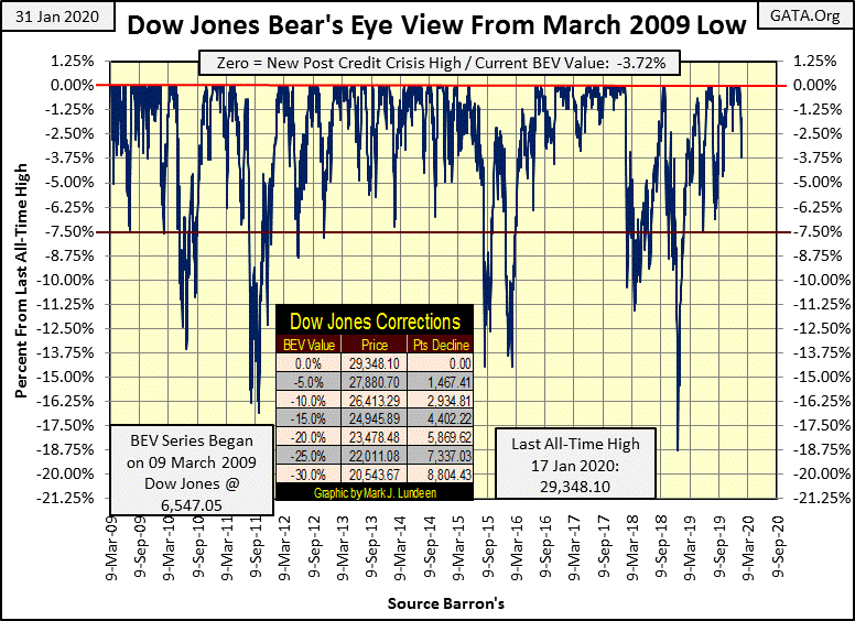
It’s been awhile, but this week we saw some excitement that took the Dow Jones down to its BEV -3.75% line at Friday’s close. And being today was also the first Dow Jones 2% day since last August, a -2.09% day, most of this week’s decline happened today.
The financial media is blaming this week’s difficulty on the coronavirus outbreak, and maybe the coronavirus had a part in this week’s decline. But with the Democrats disastrous impeachment trial, and the end-of-week market break down, it sure is convenient for the media to have a topic other than politics and markets to fill endless hours of airtime with.
As far as the stock market goes, for myself I’m looking at the 394 BEV Zeros in the Bear’s Eye View Chart below, which pushed the Dow Jones up by 22,801 points since March 2009. So, I don’t need a viral pandemic to explain a bad day in the market. After an eleven year advance, maybe gravity is finally having an effect on the stock market? Then again, an advance such as the Dow Jones has seen since March 2009 is like a speeding-freight train that isn’t going to stop on a dime either.
It seems the thing to do now is to keep an eye on the Dow Jones’ BEV chart in the coming week. Being down 3.72% means the Dow Jones remains in scoring position for more new all-time highs in the month to come. But should the Dow Jones decisively break below its BEV -7.5% line, as it has five times in the past eleven years, that wouldn’t be good.
Today the Dow Jones also saw a day of extreme volatility, a Dow Jones -2% day. One extreme day is no big deal. But should we see another next week, even a +2% day, I’d see that as Mr Bear’s paw prints on Wall Street.
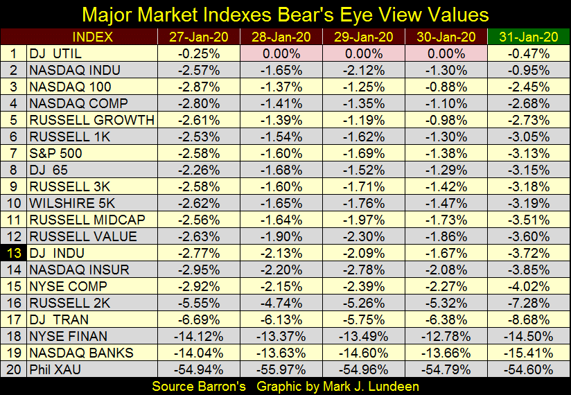
The Dow Jones Utility Average was the only major index I follow seeing new all-time highs this week. But fifteen of these indices remain in scoring positon for new all-time highs, closing the week within 5% of their last all-time high.
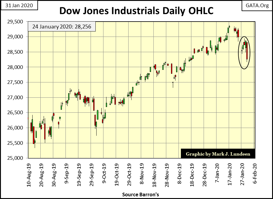
The Dow’s daily-bar chart below is an ugly one, if you’re a bull. But the bears shouldn’t expect much going their way next week, as after a big down day like Friday’s, the market should see a reflex rebound in the coming week. If we see next Friday’s close above this week’s Wednesday’s high (28,944), the market is likely to go on to new all-time highs sometime in February.
However, should next week’s anticipated advance prove to be a tepid reaction to this week’s decline, the Month of February 2020 may see further and significant declines in the stock market.
But the stock market’s real problem is that for decades, its valuations have been actively inflated by the Federal Reserve with its flows of monetary inflation. Yes – monetary inflation has had an impact on market valuations and on us, but what exactly is “inflation?” Economists today define inflation as rising consumer and producer prices, as measured by the Department of Labor’s Consumer and Producer Price Indexes.
Why consumer and producer prices would rise year after year is never explained to the public. Still, the bulk of Americans accept the inevitable, or blame it on “capitalism”; that prices in the economy naturally rise, and most know their wages and other sources of income will not keep pace with their rising costs of living.
But long ago, at a time when most people didn’t attend college, everyone knew exactly what caused inflation: governments printed more units of currency than they had gold coin (or bullion) to back this new paper money. So gold, when monetized and allowed to circulate as money, provided an incredibly effective check on excessive-credit creation and paper-money inflation, and that’s why politicians and bankers demonetized it.
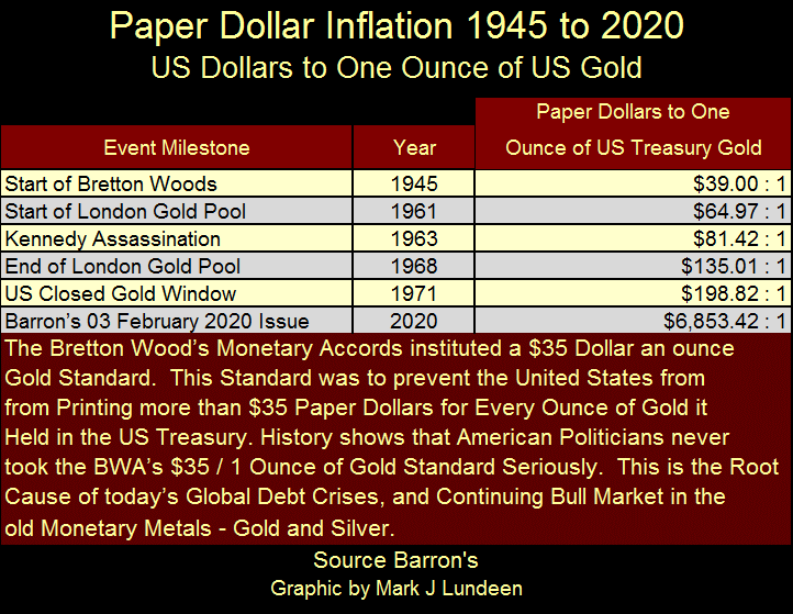
Below is a table showing the history of the Bretton Woods Era, which brought us not only a $35 gold peg for the dollar, but also the IMF and World Bank. As the “policy makers” have only terminated the dollar’s link to gold, while the IMF and World Bank remain functioning, is it really proper stating the Bretton Wood’s Monetary Accord is no more? Anyway, here’s the data.
Barron’s has published this data weekly since the early 1930s, and the data points are easy to calculate: divide the volume of paper dollars in circulation (CinC) by the number of ounces of gold held by the US Treasury. To calculate that, one takes the published value of the US Gold Reserves (always given in dollar terms), and from 1945 to 1972 divided that by $35, or how many dollars an ounce of gold was pegged to. After August 1971 the dollar was devalued to $42.22, so we use that. But this is an odd price as the US Treasury has never sold an ounce of its reserve gold at it.
The Bretton Woods’ monetary era (1945_1971) began with a $35 gold peg. But in 1945 the US Government had already issued 39 paper dollars for every ounce of monetary gold it held. As time passed, the “monetary authorities” only issued more paper dollars, all the time claiming (lying) the US Treasury was pegging its dollar at $35 for an ounce of gold. A ridiculous lie they knew they’d never be called on.
Today everyone knows “Nixon closed the gold window.” However, note in the table below how his predecessors had already abandoned the $35 peg before 1961. After all a $35 gold peg, by definition doesn’t have $64.97 paper dollars issued for each ounce of gold held by the currency’s “monetary authorities.”
So, I’m not so quick to give them a pass by dumping the abandonment of the $35 gold peg solely on President Nixon.
Look at how many paper dollars the US Government has issued for each ounce of gold it now has: 6,853. And they have the unmitigated audacity to “officially” fix their 261 million ounce gold bullion reserves (actually ours) gold at $42.22 an ounce! That gold now struggles to break above $1,600 is a fraud hosted daily at the COMEX.
Okay – so what? The sun continues rising in the east and setting in the west and as it does the stock market only goes up.
That pretty much describes early 18th century France when a Scottish Banker, Mr. John Law instituted a new banking system using paper money. It didn’t end well for Mr. Law, or for France.
“Last year I was the richest individual who ever lived, today I have nothing, not even enough to keep alive.”
- John Law (18th Century Banker of France, one year later)
Who is this John Law? The following five minute video by the Mises Academy tells his interesting story in early 18th century France: The Mississippi Scheme.
https://www.youtube.com/watch?v=08Gy4c60mEQ
The United States also had problems with its money in the early 19th century because the Second Bank of the United States (that period’s Federal Reserve) expanded paper money and credit above its ability to redeem in gold. Here’s a quote from the Senator of Massachusetts: Daniel Webster.
“We are in danger of being overwhelmed with irredeemable paper, mere paper, representing not gold nor silver; no sir, representing nothing but broken promises, bad faith, bankrupt corporations, cheated creditors and a ruined people”
- Daniel Webster, speech in the Senate, 1833
That was how Daniel put it in 1833. Sometime in the future, if the Main Stream Financial Media tells the truth, they will report the Federal Reserve expanded credit and currency far above the real economy’s ability to service its debts, resulting in massive counter-party failures rippling across the global financial system, leaving in their wake the smoking ruins of a once prosperous world.
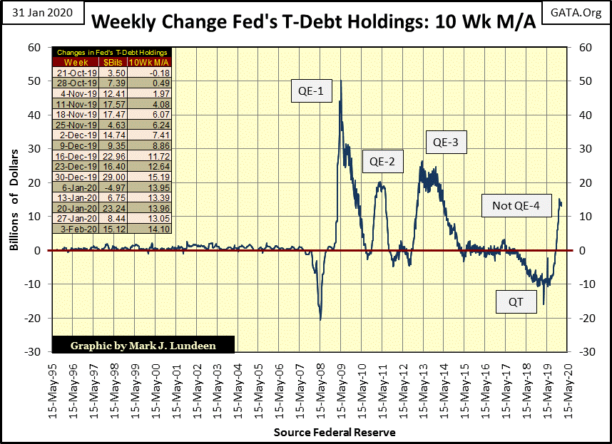
But when? I don’t exactly know. But with FOMC’s Not QE-4 now in progress (chart below), I’m hearing a disquieting TICK-TOCK somewhere in the background.
After all, two years ago the FOMC boasted they were raising interest rates and selling their reserves of US Treasury debt. In the past year they’ve once again begun cutting their Fed Funds Rate and purchasing US Treasury debt, and that is something that wouldn’t have happened if the global banking system wasn’t under distress from solvency issues typical in a late stage of a fiat-money boom.
Reread Daniel Webster’s quote above.
Without a doubt in my mind; the FOMC is once again monetizing the US national debt to keep its banking system operational, because no one else is willing to buy its banking system’s illiquid reserves of mortgages, commercial and consumer loans.
I haven’t plotted consumer debt (aka consumer credit) for a few years, so I downloaded the data this week and took another look at it. I inserted three tables on the chart to illustrate the growth of debt taken on by consumers over the past sixty-eight years;
-
1951 to 1971
-
1951 to 1993
-
1951 to 2019
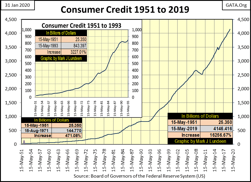
Undeniably, as the volume of paper dollars (CinC) has increased since 1945, so has consumer credit. In fact consumer credit has expanded almost as much as CinC. As seen in the table on the bottom right of the chart, consumer credit has expanded by 16,256% from 1951 to May 2019 (latest data), while CinC has expanded by 17,571%.
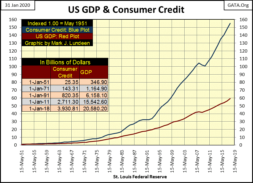
I used quarterly data in the chart above, but the chart below is based on annual data as that is what I had for GDP; so the dates below are a bit off from above. But the data is from official US Government sites.
What everyone should take away from the data below is that while consumer credit has kept pace with CinC during the post WWII era, GDP as measured by the US Government has not, advancing less than 1/3 of CinC and consumer credit.
-
CinC: 17,571%
-
Consumer Credit: 16,256%
-
GDP: 5,932.6%
This is exactly why monetary inflation results in rising prices in both consumer and producer prices, as more money (monetary inflation) chases proportionally fewer goods and services available in the economy. That consumer and producer prices have been contained as they have been is because the “policy makers” have had great success in diverting their inflationary flows away from prices, into financial market valuations.
When Mr Bear really begins squeezing inflated valuations now present in the market; precious metal assets won’t be the only commodities that will attract refugee dollars fleeing deflation in the financial markets.
Below is a table listing the prices of commodities I follow as well as various major market indexes (Black & Gold Tabs) performances since August 1993. Note: the stock indexes values are from January 17th, the date of the Dow Jones’ last all-time high.
I also included CinC, CPI and PPI (Blue & Gold Tabs). CinC (#5) is my favorite inflation index as it measures what the Federal Reserve is actually doing; increasing the supply of paper dollars circulating in the economy. CPI (#15) and PPI (#16) are official government inflation indexes, which measures consumer and producer price increases. But note how CPI and PPI lag far behind CinC in the table; something not right about that, or so it seems to me.
Oddly palladium is #1 on the list. I would have thought one of the major stock market indexes would be at #1. However coming in at #2-4 proves they have been major beneficiaries of inflation flowing from the Federal Reserve System.
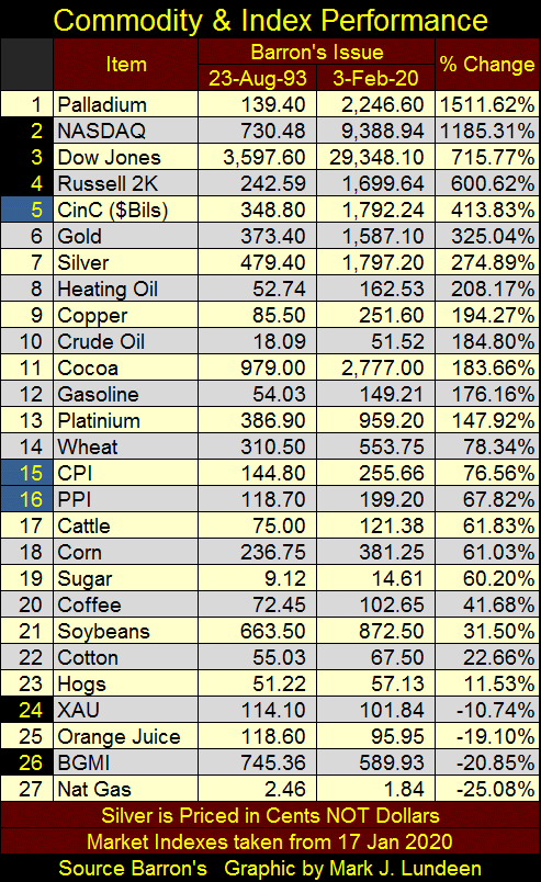
Try as they have, and they have tried to keep inflation from flowing towards precious metals assets, it’s interesting the “policy makers” failed to prevent gold and silver from rising up to #6 & 7 in the list.
The precious metal miners are a totally different story, coming in at #24 & 26 and showing actual negative returns for the past twenty-seven years.
Everyone knows how to get rich: you buy low and then sell high! But what most people never fully understand from the above is that you first have to buy low, and the only reason the price of something is low is because no one wants it.
That sums up the market’s opinion of the miners of gold and silver in February 2020. But if you believe gold and silver are in bull markets that will take them far above their current all-time highs, you have to love their miners currently trading at these depressed prices.
That sounds so – depressing. Instead let’s call these precious metal miners compelling bargains in the market, because when the old monetary metals once again resume their advance into new all-time highs, the miners should outperform most items in the above list by a wide margin.
So, when is gold and silver going to advance towards their old all-time highs? As evident in gold’s BEV chart below, they began that advance the day after their December 2015 bottom, an advance that continues to this day. With gold now only 16% from its last all-time high (BEV Zero), it could easily see new all-time highs before the end of 2020 or even by this summer.
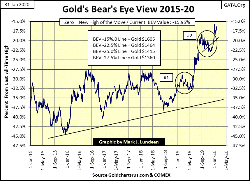
But silver, closing the week 62.93% from its last all-time high of * JANUARY 1980 * is altogether a different story.
An interesting thing about a BEV plot is that it can sit exactly on its underlying dollar plot between one BEV Zero to the next, which in silver’s case is from 17 January 1980 to a yet unknown future new all-time high in the price of silver.
As silver’s high of April 2011 fell short of being a new all-time high by only $0.116, in the chart below its BEV and dollar plots have rested exactly on each other for the last forty years of market history. Until silver exceeds its high of 1980, one can take this single plot and read its BEV value on the left scale, or its dollar value on the right scale.
That this situation has continued post April 2011 is only because the “policy makers” have prevented silver from exceeding its last all-time high of January 1980. So, since April 2011 silver began a 72% correction from its April 2011 highs, a correction that like gold’s 45% correction bottomed in December 2015.
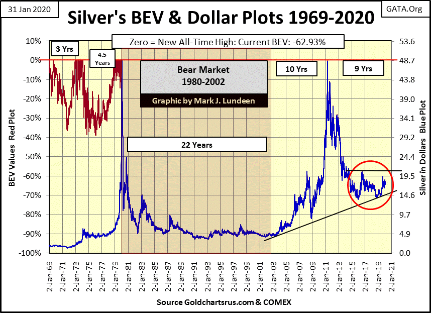
The thing to keep in mind about silver is that when it wants to move, it can move in a stunning fashion. Silver in January 1979 was a bit above $5; a year later it closed at $48.70. In August 2010 silver traded at $19.50 (BEV -60% from its January 1980 all-time high), eight months later in April 2011 it traded just pennies from making a new all-time high.
The chart above plots the dramatic fifty-one year history of silver that no one other than my readers has ever seen. If gold can make a new all-time high in 2020, this chart strongly suggests that silver too can do so if it really wants to. With the silver to gold ratio (SGR) currently at 88 ounces of silver for one ounce of gold, currently silver’s market action is uneventful, but that could change rapidly should the financial markets begin deflating.
Look at the huge collapse in COMEX open interest below, but this time the price of gold hasn’t followed. This indicates that the COMEX shorts in the gold futures markets are exiting the market at substantial losses; a refreshing change where typically it’s the longs that exit the market at great expense.
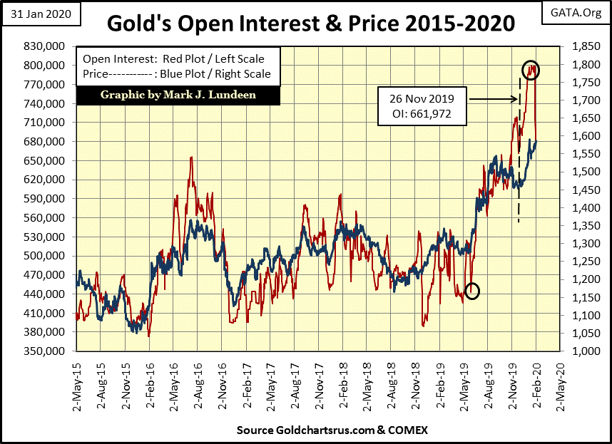
The gold bulls aren’t out of the woods just yet. The shorts are the big Wall Street banks that don’t like to lose and are very willing to cheat. They may yet have a surprise for us bulls to pull out of their bag of tricks. That said this chart looks very positive for the bulls.
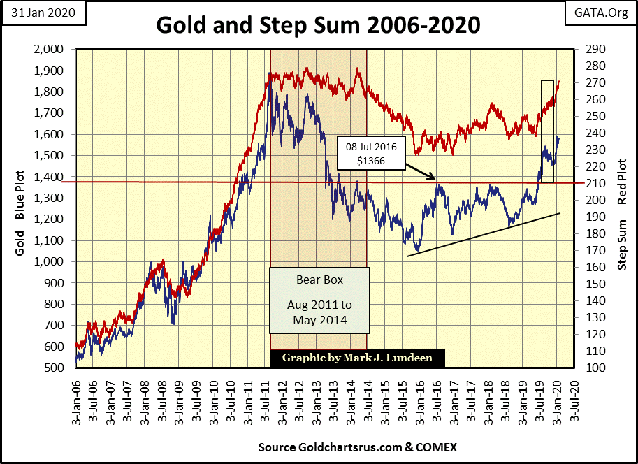
Gold’s step sum chart below also is very positive for the bulls. Last August the price of gold (Blue Plot / Market Reality) began a correction. Gold’s step sum (Red Plot / Market Expectations) for the next four months refused to follow market reality down. This decoupling of market reality from market sentiment creating a four month step sum bear box (black rectangle). Whenever that happens, bet on the price trends bearish market action.
But this bear box failed, meaning this time bullish market sentiment (Red Plot) within the bear box proved to be correct. This happens, but not often. Typically bear boxes (the decoupling of market reality, price, from market sentiment, the step sum) resolves itself as seen in gold’s 2011-2014 bear box below. A bear box that set up the December 2015 bottom in the gold market.
With last month’s failure of gold’s bear box, the gold market is now poised to see further, possibly significant advances in the months to come.
Seeing COMEX open interest in the gold market collapse without a corresponding decline in the price of gold (above), along with the failure of a bear box below, gives hope for good things to come for gold and silver in 2020.
Moving on to the step sum chart for the Dow Jones, at week’s close it remains bullish with trends for both the Dow Jones price and step sum pointing upwards. All that may change in the weeks to come, but at week’s close I see this chart as bullish.
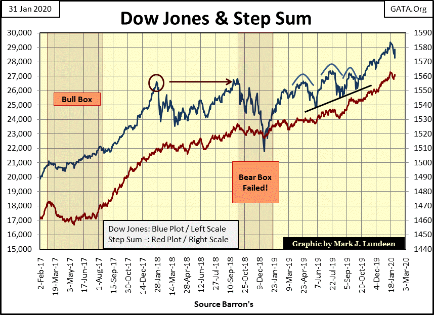
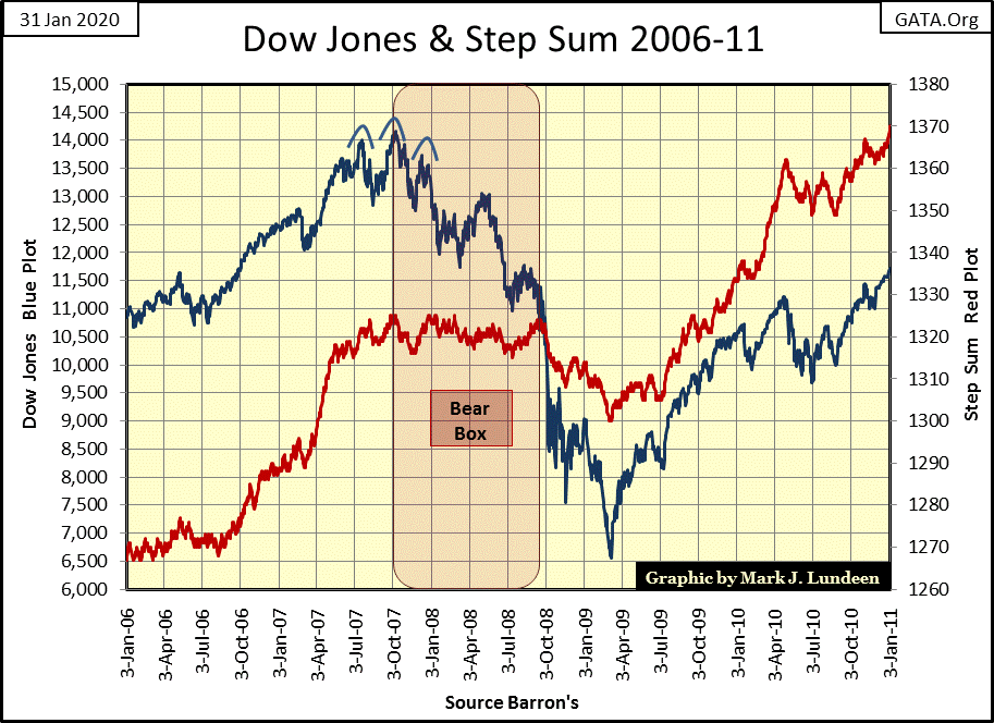
But, whenever the Dow Jones does begin deflating in earnest, I wouldn’t be surprised to see a bear box form; it did during the 2007-2009 sub-prime mortgage market crash. But as seen below it was an odd bear box.
First it began at the very top of the Dow Jones 2002-07 market advance, in October 2007. A year later in October 2008, and with the Dow Jones down by 40% for the first time since December 1974, market sentiment remained stubbornly bullish. And finally, after market sentiment did collapse as the box closed, the step sum only fell by 23 net down days by the March 2009 market bottom.
Keep in mind that what is seen below is the second deepest bear market decline for the Dow Jones since 1885. That bullish-market sentiment (as measured by the step sum) never really collapsed into stark-terror bearishness, which such a deep bear market should have inspired; and why not?
Everyone now knows what happened during the market panic of 2008-09; the
bulls in this market collapse were funded by the Federal Reserve, which funded its purchases in the market with monetary inflation. Unlike you or me, the FOMC wasn’t worried about losing a few trillion dollars; their concern laid in breaking the market collapse and then reflating market values. The Dow Jones’ step sum pathetic collapse during this market panic reflects this reality.
Next is the step sum chart for the Dow Jones during the Great Depression Crash, during which a bear box of a completely different nature developed.
First note during the initial September – November 1929 market decline, market sentiment (the step sum) fell with market reality (the Dow Jones). The bear box didn’t begin until the dead-cat bounce failed in April 1930, and continued until February 1931 with the Dow Jones down a historic 55%.
It was at this point where the bulls’ faith that the market would rebound was abandoned and the bear box closed. No hope of massive “injections of liquidity” from the Federal Reserve to refloat valuations of issues trading at the NYSE during the 1930s! The collapse in the step sum that followed is a study of the horrors of the Great Depression’s deflationary collapse.
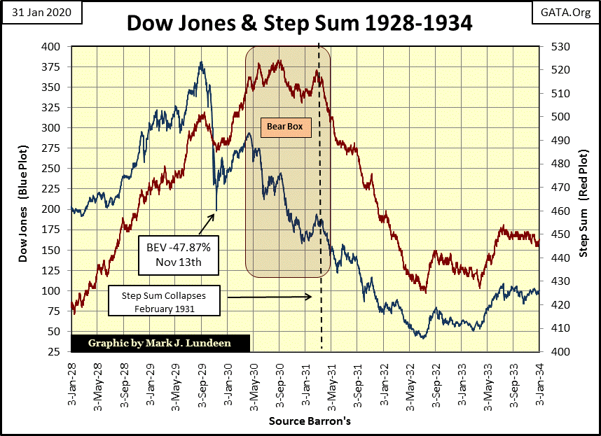
I really believe had the “policy makers” NOT intervened as they had in 2008-09, the sub-prime mortgage bear market would have been a repeat of what happened in the early 1930s. But the “policy makers” didn’t prevent a 1930s’ style deflationary collapse in the stock market and banking system, they only postponed the inevitable for now more than a decade.
Anyway this is how I see it: what should have happened in the early 2010s, will now play out in the 2020s.
It’s getting late, and I want to get this article out, so I’m going to cut short most of my usual commentary on the step sum tables below. But the most interesting item I see below is how gold from December 26th to January 15th saw more than its fair share of +9s and +7s in its 15 count.
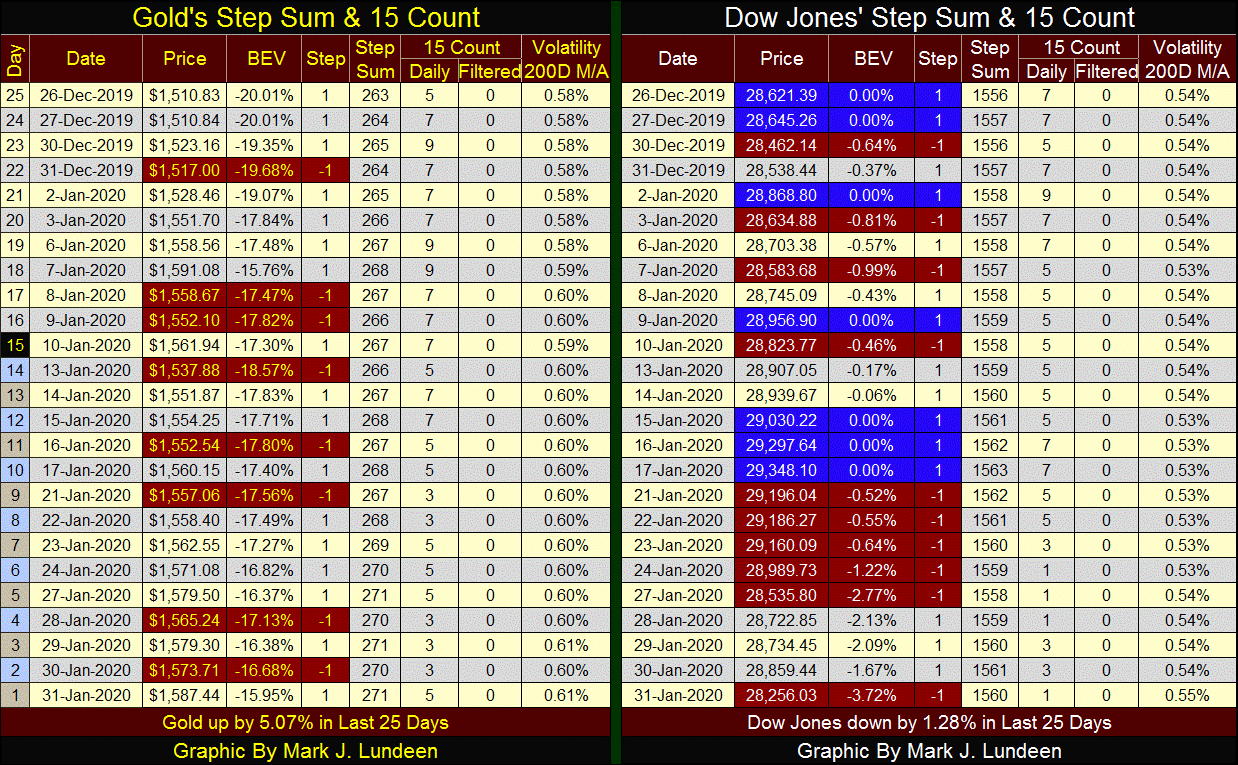
Typically such high number are not short-term bullish, rather they’re flagging a market that is overbought and at risk of a short-term price correction. But after gold’s last 15 count of 7 on January 15th (over two weeks ago) that has yet to happen.
I see a lot of resilience in the gold market; let’s hope it can keep it up!
Mark J. Lundeen
********


