The Dow Jones And Barron’s Gold Mining Index 1885 To 2013


Every now and then it’s good to take a long term look at the market, so here’s a 128 year chart of the Dow Jones Industrials going back to 1885; weekly closing price basis. The Dow Jones published price is plotted in red and uses the right scale. My Bear’s Eye View (BEV) format is in blue and read off the left scale.
Looking at the Dow Jones’ price data (Red Plot), where in the heck is the Roaring 1920s’ bull and Depressing 1930s’ bear markets? They’re there, but you have to chart the 1920s and 1930s by themselves to fully appreciate the drama of these two decades. What’s the problem? Monetary inflation. The 1929 top occurred on 03 September 1929 with the Dow Jones soaring to a then unbelievable 381! Now look at the red plot; in October 2013 with the Dow Jones’ last all-time high of 15,676, the price data before the 1980s is non-apparent in the chart. After all, the Dow Jones’ 1929 high is 381; which is only 2.43% of its latest all-time high of just a few weeks ago. In 2013, after decades of monetary inflation, the Dow Jones can move as much as its entire 1929 top in a single day.
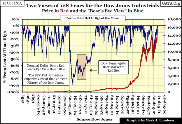
The numeric gains in the Dow Jones of the past nine decades are huge. However, to believe that this vast increase in the Dow Jones made the stock market a great investment is a mistake. In fact in the past nine decades, monetary inflation flowing from the Federal Reserve has distorted price data, and the public’s perception of market valuations. As we will see later, when taking inflation into account the Dow Jones has been a losing investment for a very long time. Interestingly, the last time investors received a rate of return from the Dow Jones (blue-chip stocks) that exceeded the rate of growth of dollars issued from the Federal Reserve was during the Roaring 1920s.
I occasionally get letters from readers who tell me that it’s not accurate looking at blue-chip stocks solely from a valuation (capital-gains) perspective as such stocks also pay a dividend. I’ve never done the math, or know where to begin, but dividend payments supposedly make up 50% of the total return of blue-chip stocks. Well that may be true, but the income tax’s treatment of dividend payments makes it very difficult to calculate dividends data into a real-world total return basis. If it were easy, Dow Jones Inc. would have begun doing so long ago! Since 1913, there were times when tax brackets for dividend income ranged from single digits to as much as 70%; that plus the income tax law changes every few years; where does one start? So to keep everything simple, I ignore dividends and chart the published valuations of the Dow Jones for my articles.
My Bear’s Eye View (BEV: Blue Plot) for the Dow Jones above provides an easy to comprehend format of the Dow Jones’ history going back to 1885. I best give a little review on BEV charts here for new readers. The first data point for every BEV series is always Zero as the formula used for the Bear’s Eye View is:
(Data Point / Last All-Time high)-1
As 62.76 is first data point published for the Dow Jones (16 February 1885), the BEV formula divides this by itself and then subtracted 1 from it making it equal to Zero. This is always the case with the first data point in a BEV plot. The next three days for the Dow Jones were all new all-time highs. But with only four days of recorded history for the Dow Jones, that doesn’t say anything except that days 2-4 in Dow Jones history were up days gaining $1.53 in total, but each day was a BEV Zero. On 20 February 1885, the Dow Jones had its first decline in history; falling $0.51, or a 0.79% decline from an all-time high. My point is here that in the blue BEV plot above, the Dow Jones’ all-time highs of 17-19 February 1885 are treated no differently than its latest all-time high of 15,676.94 seen on 18 September 2013. Their published values may be many thousands of points away from each other, but in the BEV plot, all these all-time highs, (as is each all-time high from 1885 to 2013) are only equal to Zero. Well this is how Mr Bear sees every new all-time high in the Dow Jones – a big fat Zero. He’s only interested in how large a percentage of the bulls’ capital gains he can claw back from these all-time highs, so all other data points, not a new all-time high, are displayed as a negative percentage decline from their last all-time high.
A BEV plot is simple to read as it only contains:
- All-time highs
- Percentage declines from these all-time highs
- And nothing else
The BEV plot is an excellent method of normalizing the Dow Jones’ bear markets of the past 128 years. If someone invested $100,000 at the 19 Feb 1885 top (64.29) and for example if six months later the Dow Jones declined 50% to 32.15, they would have lost $50,000 or half their money. This would be no different than if someone invested $100,000 at the 18 Sept 2013 top (15,676) and for example if six months later the Dow Jones declined 50% to 7,838, again they would have lost $50,000 or half their money.
In a BEV plot, bull markets are identified as concentrated groupings of Zero% on the Red Line, as the bulls take the Dow Jones from one new all-time high to another in a hot market. Bear markets occur during prolonged gaps between BEV Zeros, where the blue BEV plot declines far below the BEV -10% line. As is obvious in the BEV plot above, since 1885 BIG-BEAR Markets for the Dow Jones are market declines of 40% or more. I admit this value is arbitrary, but I think useful.
Such steep market declines always produce market distress and panic selling that investors remember for a long time. However, for this reason a 40% decline in the Dow Jones is an excellent indication that the worst of the bear market is over, and stock prices are actually cheap. But very few people do buy at the bottom because fear dominates market psychology; think of gold mining stocks today. We’ll cover these later in the article.
The exception to the -40% decline rule-of-thumb occurred during the Great Depression’s bear market (1929-32). You can’t miss the Great Depression bear market; it’s the crater in the BEV plot in the chart above. In 1929, using the Dow Jones 40% rule to reenter the market during the Great Depression Bear Market was a fatal mistake, but who could know?
In November 1929, with the Dow Jones declining 48% from its 1929 high of just a few months earlier, the stock market began an excellent dead-cat bounce that advanced the Dow Jones 48% (from -48% to -23% on the BEV plot below) in the following five months to April 1930. This strong advance caught any investor who returned to the market off guard, when Mr Bear returned in May to escort them to the poor house with an ultimate 89% bear market bottom two years later. The entire period from 1929 to the early part of World War Two, just months prior to the Battle of Midway, was depressing. After three major Dow Jones -40% bear markets from 1929 to 1942, an entire generation of former investors had to die off before the public returned to the stock market to any great extent in the 1980s. And for your information, the 1938 & 1942 40% bear markets are both based on the 1937 top, not the 1929 all-time high.
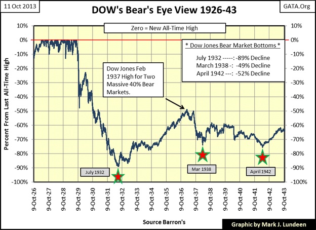
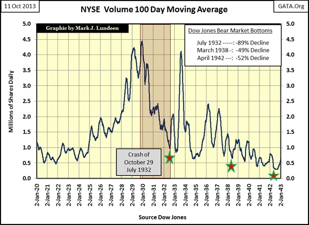
In past articles I’ve made the point that trends in stock valuation and trading volume go hand in hand in bull and bear markets, or did until 2000. So, for your information here’s a chart for the NYSE Volume’s 100 day moving average from 1920 to 1943. I placed stars in the chart below that match the dates (stars) in the chart above. As you can see BIG-BEAR Market bottoms occur on low trading volume, not on historic high volume which has been the case since 2000. Also, note the big spike in trading volume in 1933; it’s over four million shares. This tremendous increase in trading volume occurred during the best year in Dow Jones history, where from July 1932-1933, the Dow Jones saw a one year gain of 153% off its Great Depression bear market low.
Strangely, things are different today. From the Dow Jones’ March 2009 bear market bottom to its latest all-time high of just three weeks ago, the Dow Jones has gone from the bottom of its mortgage bear market to new all-time highs as trading volume has contracted by 80%. Someone’s finger prints are all over this anomaly of rising valuation on falling trading volume. I’d call Doctor Bernanke to get the inside dope on this, but he doesn’t answer my phone calls any more.
Here is a table listing the nine Dow Jones 40% bear markets since 1885.
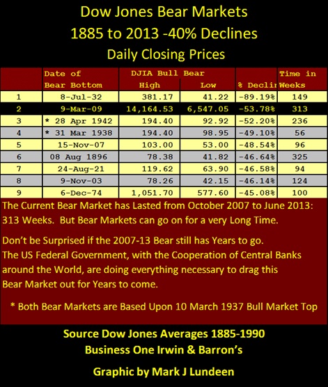
I count the beginning of our bear market from October 2007, and ignore the amazing post March 2009’s advance in the Dow Jones. You may disagree and feel that the Dow Jones has actually entered into a totally different bull market. But had the Congress not given the US Treasury (Hank Paulson / former CEO of Goldman Sacks) and the Federal Reserve (Doctor Bernanke) a license for bear hunting in October 2008, reasonable people can conclude that the 09 March 2009’s 53% bottom would not have been the Dow Jones ultimate percentage decline, and its new all-time highs of the past year not possible.
How far the Dow Jones could have dropped 4.5 years ago is anyone’s guess, but in early 2009 I was thinking a 70% decline was very possible. As current market values are totally contrived by the “policy makers” with no connection to reality, I expect the current bear market will ultimately not only become the deepest bear market in the history of the Dow Jones, exceeding the percentage declines of 1929-32, but using the Dow Jones’ October 2007 top for its starting date, this bear market will soon become the longest since 1885. But I hope I’m wrong.
I find “expert” opinion on inflation and deflation misleading, as it assumes that all prices are either inflating, or deflating concurrently in the markets. But history has lots of examples where inflation dominates one market while simultaneously another market deflates. The proper way to understand inflation and deflation is to understand that they are both monetary events stemming from the Federal Reserve’s continual increases in the money supply, as it has done since it was created in 1913. It’s what people do with the inflationary dollars once they are circulation that determines what market is inflating or deflating.
The inflationary increase in the supply of dollars can be seen in the Currency in Circulation (CinC) green plot in the chart below. Unlike the Dow Jones (Red Plot) or the Barron’s Gold Mining Index (BGMI: Blue Plot), the CinC plot has never seen a decline of any significance, nor will it ever.
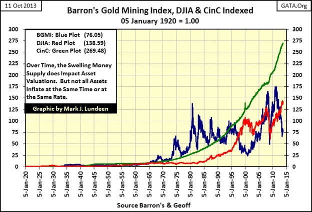
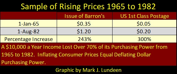
Understanding the Dow Jones as a proxy for financial assets, and the BGMI a proxy for consumer prices, it becomes apparent that from 1965-80 our ever rising money supply was flowing into consumer prices as the BGMI (Blue Plot) saw a fantastic bull market; this when the Dow Jones (Red Plot) was stuck between 700 and 1000 for well over a decade (1965-1982). You may believe that a range-bound Dow Jones isn’t deflation, but consumer prices were rising. Whatever the thousand dollars Dow Jones could purchase in 1982, it was much less than what it bought in 1965. Economists don’t like to admit it, but they know that inflating consumer prices equal deflating wages for the middle class and fixed-income dependent retired people. The table below is only for two items, but people of my age group remember how prices for everything only went up a lot during these years, especially after 1971, while wages for most people failed to keep up with price inflation.
Moving onto the blue BGMI plot in the chart above, gold mining stocks unlike blue-chip stocks were one of the primary beneficiaries of CinC inflation from 1965 to 1980. In fact the BGMI never fell below the growth in CinC from 1965 to 1990, whereas in the past five decades the Dow Jones has yet to catch up to the growth in CinC.
After the BGMI’s 1980 top, gold mining shares began deflating with each peak terminating below its previous high. Also note that as the BGMI began deflating in the early 1980s, the Dow Jones’s valuations began inflating, as did bond and real estate valuations. The late 1990s not only saw the dramatic bull market blow off top in the Dow Jones, but a bear-market catastrophic collapse in valuations in the BGMI, as “liquidity” from the Greenspan Fed rushed into the stock market, and shunned the BGMI. No mystery here as all “liquidity” flowing from the Federal Reserve first passes through Wall Street. Wall Street and many of their clients love to leverage their investments in an inflating asset class like the high-tech stocks of the 1990s with debt. I doubt many people purchased gold mining shares in the late 1990s on margin as they were cheap, and getting cheaper fast.
Things changed after 2000 as the river of “liquidity” once again changed its channel and began flowing away from the Dow Jones and into the BGMI, whose gold mining shares continued inflating until March 2008. After the Dow Jones’ 2002’s 38% bear market, it too once again went on to new highs in October 2007. But the chart above makes it obvious that from 2000 to 2007 the BGMI was the primary beneficiary of inflation flowing from the Federal Reserve. If the Federal Government and Wall Street weren’t managing market valuations to the stock bulls favor, I doubt that the Dow Jones would have been going up at all from 2000 to 2007.
The credit crisis was hard on both the Dow Jones and the BGMI. The mortgage debacle caused the Dow Jones to decline to its #2 all-time greatest bear market bottom from 2007-09. It’s a matter of public record that its subsequent advance, one that continues to this day, is due to market manipulation approved at the highest levels of government. The following quotes make my case.
"Well, what I just want to talk about for a few minutes is the various efforts that are going on in public and behind the scenes by the Fed and other government officials to guard against a free-fall in the markets...perhaps most important, there's been--the Fed in 1989 created what is called a * PLUNGE PROTECTION TEAM *, which is the Federal Reserve, big major banks, representatives of the New York Stock Exchange and the other exchanges, and there--they have been meeting informally so far, and they have kind of an informal agreement among major banks to come in and start to buy stock if there appears to be a problem. They have, in the past, acted more formally"
- George Stephanopoulos, former Clinton administration adviser
September 17, 2001 on ABC Good Morning America
“Policies have contributed to a stronger stock market just as they did in March 2009, when we did the last iteration of this. The S&P 500 is up 20% plus and the Russell 2000, which is about small cap stocks, is up 30% plus.”
- Doctor Benjamin Bernanke, CNBC Interview with Steve Liesman 13 Jan 2011 (1:40 PM).
It’s very clear that Washington and Wall Street have outlawed bears in the financial-market place, except for the gold and silver markets, a market that include the precious metal mining shares.
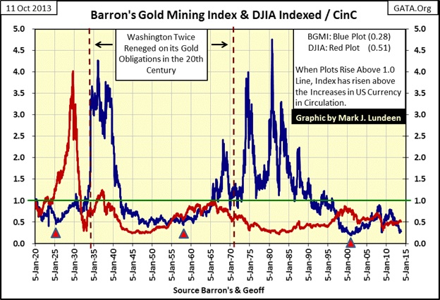
The following chart has an interesting story to tell. The plots are derived from the same data used in my indexed price chart for the Dow Jones, BGMI and CinC above. Both the red Dow Jones and blue BGMI are ratios to CinC, with CinC being the denominator in the ratio. So the plots display the relative performance of the Dow Jones and the BGMI to increases in CinC since 1920, with the Green 1.0 line marking the point where the Dow Jones or the BGMI have matched the growth in CinC over the past nine decades.
As I said earlier in this article, the Roaring 1920s was the last time the Dow Jones gave investors an investment return above the rates of inflation, but that is not true with the gold mining shares in the BGMI. Twice during the 20th Century the BGMI delivered superb bull markets to investors as the broad stock market deflated. And now in the 21st Century gold mining shares appear to trying to make the effort to do it again.
“Experts” always tell us that gold, silver and mining shares need “inflationary pressure” to go up, and as we have no inflation today, as measured by the government’s CPI index, precious metals investments are poor investment choices for people. But this is historical nonsense, because what monetary inflation actually drives up in price are financial assets like the Dow Jones.
This was exactly the case in the Roaring 1920s bull market. The red triangle at 1925 identifies the May 1925 event when the US Treasury and Federal Reserve began supporting the British Pound with massive dosages of inflation as the UK attempted to return to the pre-WW1 gold standard. We see that at first the Dow Jones was inflated. The BGMI did advance but to a much less extent. However the gold mining stocks were not part of the Roaring 1920s bull market. What drove the valuation of the BGMI to highs in the 1930s, gains that actually exceeded the 1929 peak in the Dow Jones, was flight capital from the now deflating financial markets and the fact that the US Government defaulted on its gold obligations to US citizens, and then devalued the US dollar in gold terms from $20.67 to $35 an ounce.
This happened yet again from the 1950s to 1980. In 1958, the US Treasury saw the start of a run on its monetary gold that didn’t end until 1971 when Nixon closed the Treasury’s gold window, and the US Government defaulted on its gold obligations to foreign central banks. What started this run on the Treasury’s gold was paper money inflation, as we can see in the chart below. Something most modern investors don’t understand about the gold standard is that it’s a commitment by a government and its banking system not to circulate more paper currency than their gold reserves allow. This limit on paper money creation, and ultimately on the ability of banks to expand credit, is the key to the economic stability a gold standard provides.
But politicians, bankers and academics hate gold as money as the gold standard limits them too. Commerce during the Bretton Woods gold standard era didn’t demand an end to it. What happened was that the “policy makers” in control of the Federal government continued to increase the number of paper dollars in circulation until the gold standard was dead. Academics and bankers then blamed all the inflationary problems they caused in the markets on the gold backed dollar, which by the 1960s existed only as legal fiction.
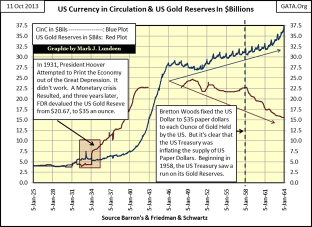
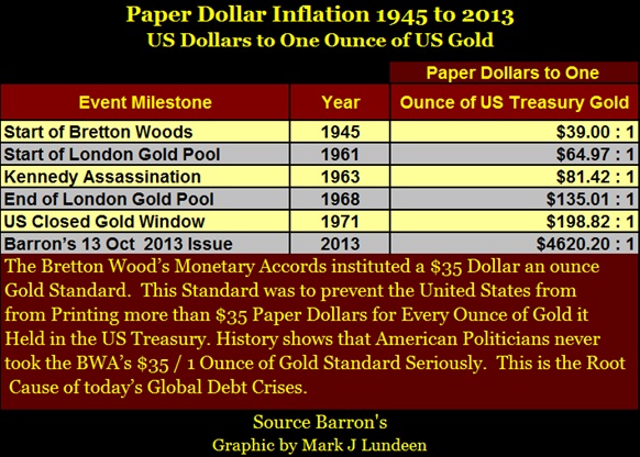
Here’s a table giving how many paper dollars were in circulation for each ounce of gold held by the US Treasury in its reserves from 1945 to today. It’s easy to understand why foreign central banks after 1958 were cashing in their paper dollars for US gold; it only took $35 paper dollars to receive an ounce of gold from the US Treasury, while actually there were many more paper dollars per ounce of gold. “Monetary policy” became a game of musical chairs. When the music stopped on August 1971, anyone (foreign central banks included) who didn’t exchange their paper dollars for gold was stuck with a deflating asset (paper dollars) instead of an inflating asset – gold.
Returning to the chart with the CinC ratio plots for the Dow Jones and BGMI; it was the Dow Jones in the early 1950s that first benefitted from this monetary inflation, not the BGMI. The BGMI really didn’t begin to inflate until the 1958 run on the US Treasury’s gold began, and then its gains were similar to the Dow Jones. Not until the Dow Jones began to deflate in February 1966, when for the last time the Dow Jones touched the Green CinC line in the chart and began to turn down, that the BGMI really began to benefit from what could be called second-hand inflation flowing from deflating financial assets like stocks and bonds. Go back and look at the chart. The BGMI’s valuation almost gained 5 times the increases in CinC during its 1958 to 1980 bull market. The best the Dow Jones did during this period was to see it’s gains match the increase in CinC for two weeks in February 1966.
Then in November 2000, for the third time since 1920, the BGMI once again began to inflate as the Dow Jones deflated. After January 2000 as the stock market began to deflate, the “policy makers” focus was to restore order in the stock market (get the damned share prices going up again!) and to inflate a bubble in the American real estate market. The flood of monetary inflation into the economy via the mortgage market with freshly created dollars was to ward off the hobgoblins of “deflation.” And after the policy makers wrestled with their hobgoblins for the first eleven months of 2000, for the third time since 1920 (see red triangle on chart); the BGMI once again began inflating as reaction to the deflating Dow Jones and the ever inflating US money supply. Well it did, and I believe this is historically significant.
Here’s another fact that I believe is historically significant. Go back and look at the first chart in this article which plots the Dow Jones from 1885 to 2013. In its blue BEV plot there is the -89% crater created by the Great Depression bear market. From the July 1932 bottom of the -89% crater, the Dow Jones took twenty two years, (November 1954) to once again exceed its highs of September 1929. Now look at Barron’s Gold Mining Index BEV chart below. Compare how the BGMI responded to its -83% bottom of November 2000 to that of the Dow Jones’ July 1932 -89% bottom. The gold stocks rebounded to a new all-time high in less than seven years after this horrific 83% decline (November 2000 to September 2007). This was a powerful move in a market that has received absolutely no positive comments from the financial media, a market sector avoided by most financial advisors and their clients since the 1980s.
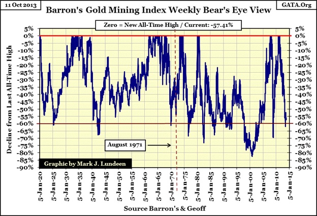
Since September 2007, the BGMI has struggled. We see in the BEV chart above how the mining shares endured a 70% bear market during the 2008-09 credit crisis. Historically this makes no sense, as it is precisely this sort of deflationary situation in financial assets where gold mining stocks have really outperformed other investments. But from their November 2008 -70% bottom, the mining shares once again saw a new all-time high in November 2010 – just two years later: wow! What other investment class has recovered from such a devastating decline so quickly? The Dow Jones in comparison only declined 53% during the credit crisis. In response to this crash in the Dow Jones, George Stephanopoulos’ “Plunge Protection Team” has “injected” unknown trillions of dollars of stimulus into the stock market to get those damn share prices back up. Yet the Dow Jones didn’t see a new all-time high until March of this year (2013), four years after its credit crisis bottom.
Currently, the BGMI is down 57% from its last all-time high of April 2011 as the Dow Jones is now very close to making a new all-time high. Well good for the Dow Jones, if not the mining shares. But since the BGMI’s 1980-2000 83% bear market bottom, each subsequent percentage decline has been less than the one before. This is an indication of technical strength in the gold mining shares, not that the wounded investors in gold mining shares today have noticed this fact.
These are strange times in the investment world. Since the 2000 top in the High Tech stock bubble, there are many violations of historical norms where what should be going down is now going up, and what should be go up is now going down. The failure of the BGMI to once again enter into a bull market that would have its valuations far above the rate of CinC inflation for the third time in the last one hundred years is certainly one of them.
Exactly why this is happening I cannot say, but I note that deflation in the stock and bond markets are a constant fear of the minds of the “policy makers”. They express this fear in every public speech they make. These are people who can, and have created trillions of dollars in seconds with a few key strokes on their computers. It’s a matter of public record that the Federal Reserve during the credit crisis extended sixteen trillion dollars in credit to foreign banks to prevent a derivative disaster in the American banking system. Who knows what extremes in “monetary policy” they are doing now? Seeing so much rocket fuel staged below gold, silver and their miners, with so little effect on their valuation is strange indeed. I suspect the heavy hand of “policy” has so far prevented them from doing what one day they must do, soar to astounding record highs as financial assets deflate.
I am not a financial advisor, so exactly what mining shares one should purchase is something I don’t like to do. But after studying past gold and silver bull markets, I expect that even the little puppies in the mining sector will bark like big dogs when bond yields in the US Treasury market and the dividend yield for the Dow Jones begin to rise in earnest. And one day they will, with or without the permission of the “policy makers.” But before anyone invests in mining shares, they should first use a good portion of their investment funds to purchase actual gold and silver bullion, and I think today’s metals prices are attractive.