Dow Jones Industrials – Initial Bear Market Target: 16,100
 share
share
 share
share
 share
share
 share
share
 share
share
If it looks like a duck, and it walks like a duck and quacks like a duck – then its probably a duck
The five charts below show clearly that:
-
The Dow Jones Industrial Average has topped – having broken up in a “last gasp lunge” above a multi decadal upper channel line following the completion of a Bearish “Megaphone” formation.
-
It is currently in the closing stages of completing a Bearish “Diamond” formation.
-
That the Diamond Formation is indeed bearish is confirmed by the contra directional movement of price and volume in recent weeks – Volume has been falling even as price has been rising. i.e. Rising prices have not been driven by buying pressure.
-
A break below 22,300 will constitute a significant Bear Market sell signal because it will evidence a greater than 50% retracement of the previous bull run that commenced in early 2016 at around 16,100
-
The volume patterns since 2009 have been manifesting a “saucer” formation with volume having been artificially high since the closing weeks of 2016. The most reasonable explanation of this volume pattern is the emergence of algorithm trading which has driven Price/Earnings Ratios of the S&P 500 to overbought levels
-
If the 22,300 level is penetrated, the entire rise of the previous bull run. i.e. The index will fall by around 38%
-
This will bring Price/Earnings ratios of the S&P 500 back to around 15:1 – ASSUMING THAT UNDERLYING CORPORATE EARNINGS DO NOT FALL
-
Timing is impossible to call. However, the apex of the Diamond formation will be reached within 7 trading days of today – i.e. by March 23rd, 2018
Chart #1 – 100 Year Chart of Dow Jones Industrial Average
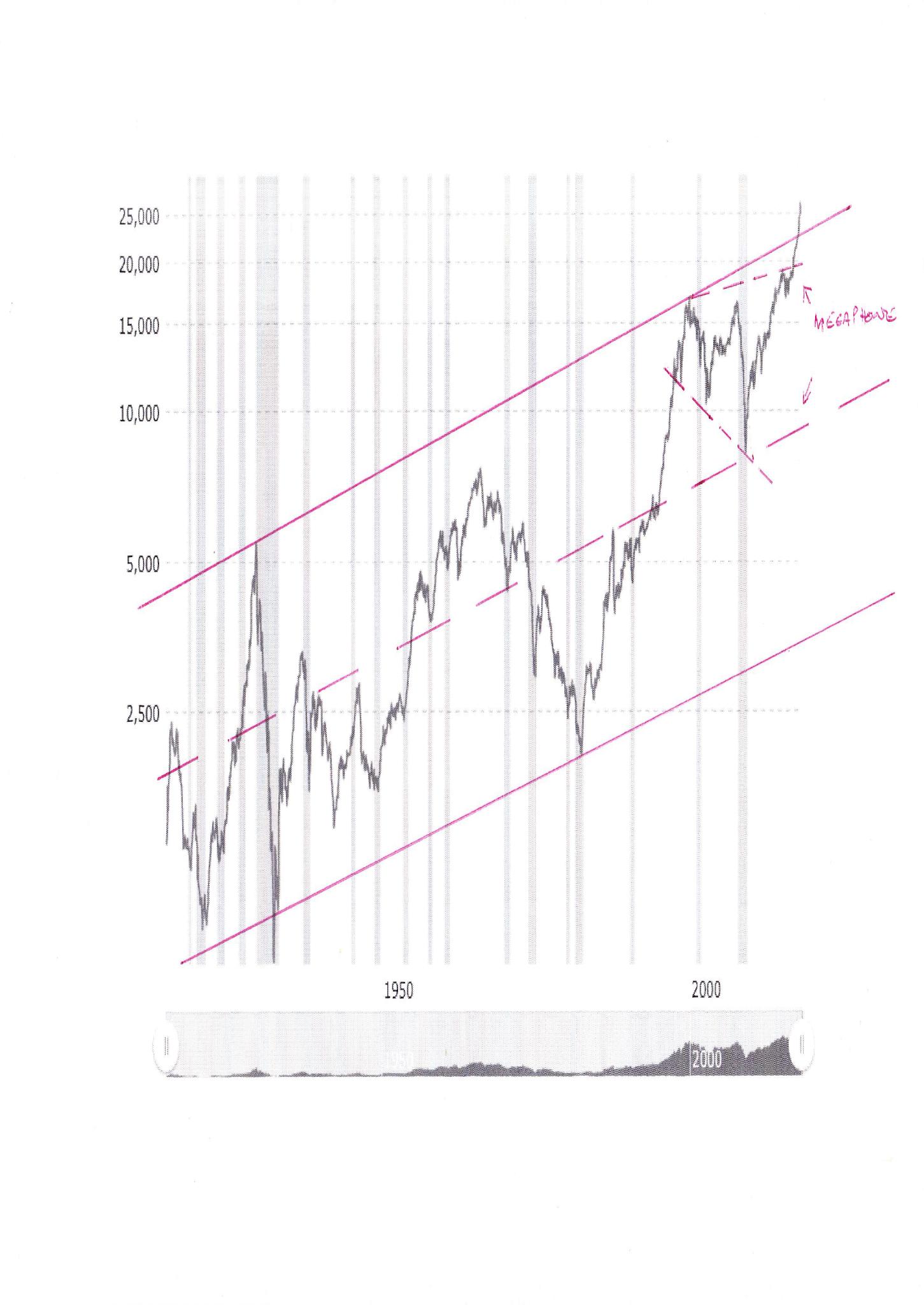
Note the megaphone formation and the “last gasp lunge” above the multi decade upper channel line
Chart #2 – Diamond Formation on Daily Chart – DJIA
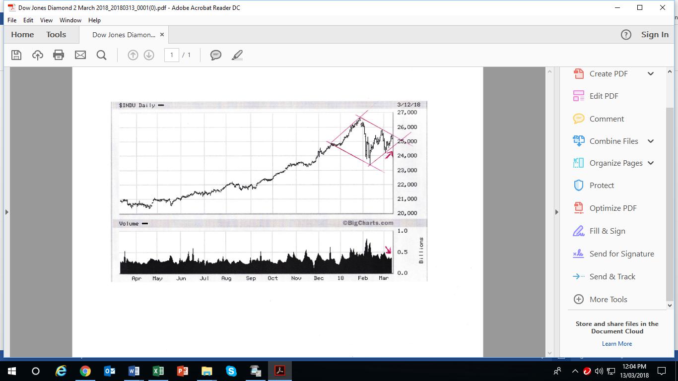
Note the divergence arrows in price and volume and the fact that the diamond formation is days away from completion. Technically, it is possible that we might witness a false break up if the Plunge Protection Team attempts to intervene. The probabilities are high that such an intervention will fail.
Chart #3 – Point and Figure 5% X 3 box reversal chart
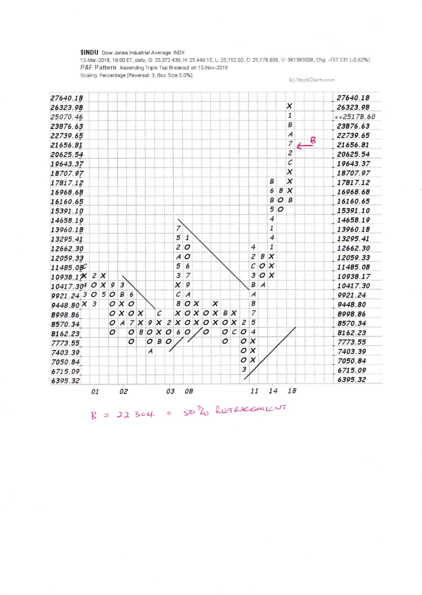
Note that point B (at 22,304) represents a 50% reversal. If that is penetrated, the DJIA will retrace 100% of its previous rise, which commenced at approximately 16,100 .
Chart #4 – 10 Year Weekly Chart of the DJIA
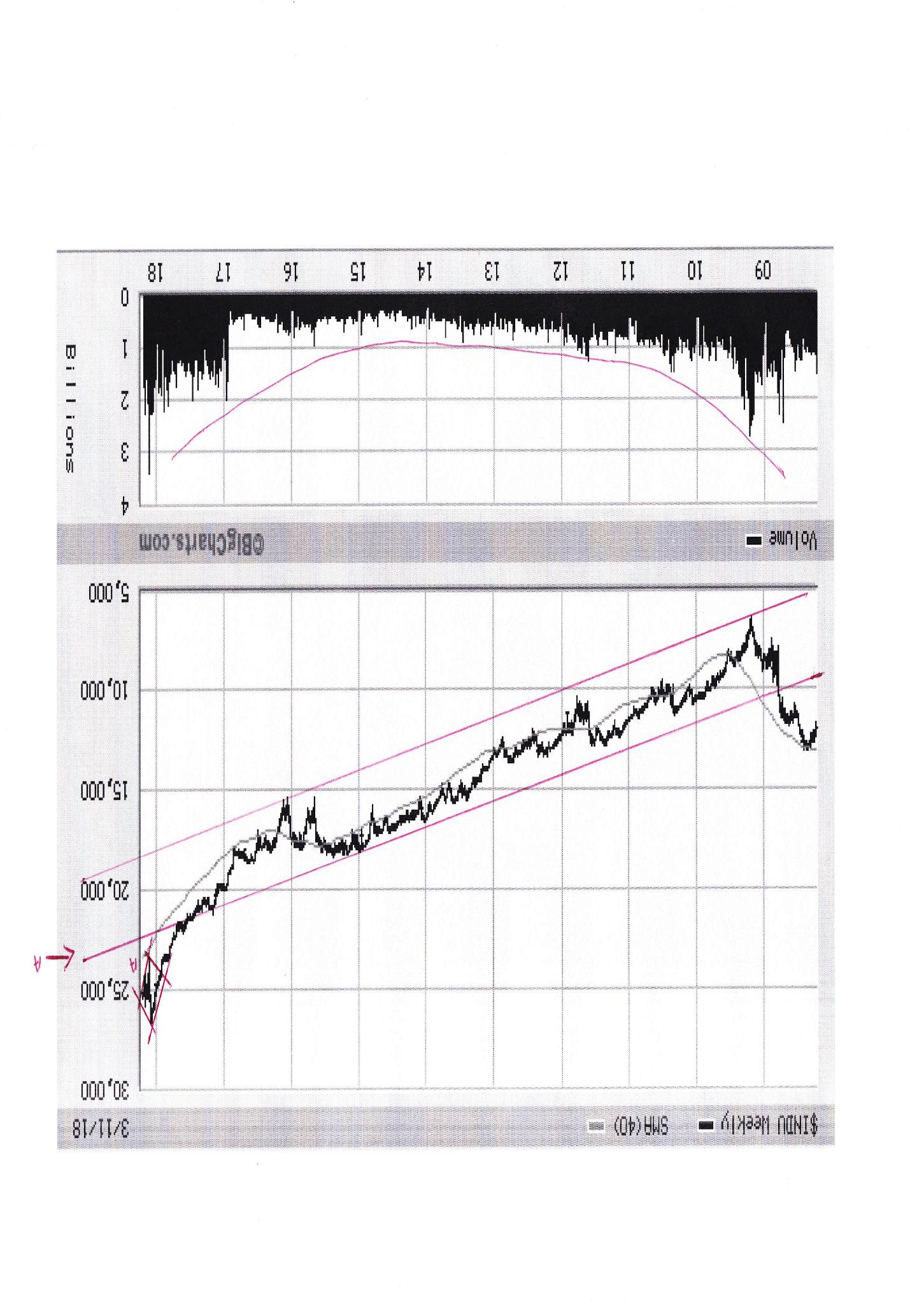
Note the explosion in trading activity that emerged in the closing stages of 2016. This might be attributable to the so-called “Trump Bump” or it might have been a function of algorithm trading (or both). But it is eerily reminiscent of the mania that preceded the commencement of the Global Financial Crisis
Chart #5 – 90 year chart of P/E Ratios of the S&P 500
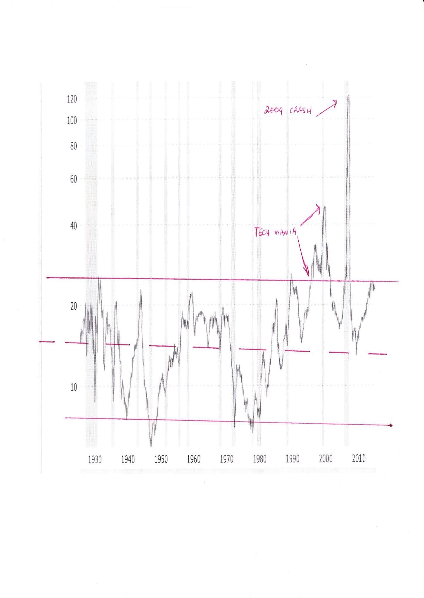
Note that the only periods in which the upper channel line were penetrated were:
-
During the tech mania that preceded the Nasdaq crash and Y2K
-
Following the market collapse in 2009 when company earnings were being decimated
Currently, the PE ratio is bouncing down off that upper channel line.
Conclusion
If it looks like a duck and it walks like duck and it quacks like a duck, then it is probably a duck. The DJIA has very probably peaked.
BB Comment:
The technical “targets” of 16,000 on the DJIA an 15:1 on the S&P 500 Index will be dependent on whether the US equity market enters a PRIMARY Bear Trend. That will only manifest if both the DJIA and the Dow Jones Transportation Index fall to lower lows than preceded the most recent up move. The low on the DJIA is 24,200 and the low on the Transports is 10,146
Brian Bloom
Author, Beyond Neanderthal and The Last Finesse
Australia
share
share
share
share
share