Examining EP For Economic Growth And Global Warming


Electrical Power Demand (EP) is my favorite economic series. EP is measured in kilowatts; a unit of power designed by engineers and not subject to hedonic adjustments by government funded statisticians. If the economy is growing, the demand for EP will increase. If the economy is contracting, the demand for EP will decrease – it’s just that simple. Barron’s has published weekly EP data since August 1929, so the 52 week moving average in the chart below begins in August 1930. The 52Wk M/A is used to smooth out the seasonal peaks and valleys in EP, listed in the chart’s text box.
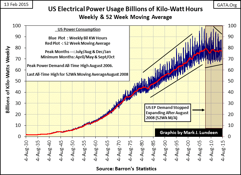
Economic growth in the American economy since 1930 has been impressive, unfortunately not as impressive as the creation of dollars by the Federal Reserve System. Since 1930 electrical power consumption has increased by a factor of 44, while Currency in Circulation (CinC: paper dollars and base-metal coins in circulation) has exploded by a factor of 357. A better graphic can’t be found than the chart below displaying the effects of monetary inflation on actual economic growth. Since the US Government abandoned the Bretton Wood’s gold standard in August 1971, monetary inflation has run amuck with CinC increasing by 2,151% while EP increased by only 155%.
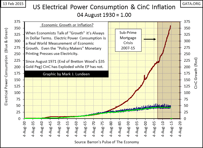
The credit-crisis era (2007-2015) is highlighted in the chart above, illustrating how the “monetary authorities” have flooded the world with dollars in a vain attempt to save their precious banking system. This vast increase in the supply of dollars has had no positive effect on the real economy; as measured by EP. Below I’ve plotted EP’s 52Wk M/A in my Bear’s Eye View (BEV) format, where each new all-time high is shown as a Zero%, and all weekly data points not making new all-time highs are shown as a percentage decline from their previous all-time high.
The Bear’s Eye view of EP provides a unique insight into the American economy from the days of the Great Depression to our current economic malaise. The Great Depression consisted of two separate downturns in the economy. The largest occurred in 1933 with a brutal 17% decline in the demand for EP, and then another in 1938 with a still painful 6.58% decline.
The 8.21% EP decline in 1946 was unique. All of the declines in EP of 2% or greater were caused by an economic contraction, except for the 1946 decline which was caused by retooling America’s factories from wartime to peacetime production. The post WW2 years were good times for returning American veterans. As seen in EP’s BEV plot below, weekly demand for EP was making new all-time highs throughout the period from 1947 to 1974, twenty seven years of amazing economic growth. This amazing string of uninterrupted new all-time highs in EP demand was finally broken in autumn 1974. Three years after the US Treasury suspended the gold standard the Dow Jones saw its first 40% decline since 1942 as EP declined 0.94%.
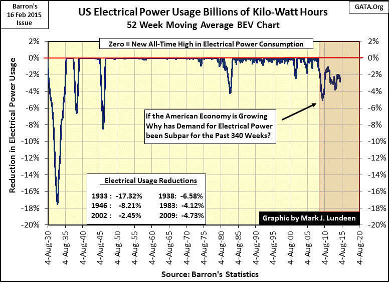
The EP chart below covers the past five decades in greater detail, placing the 0.94% EP decline in 1974 in perspective with modern times; the post Bretton Woods era. It’s hard to say why EP didn’t decline more during the 1974 recession, but in those days the United States was still a major exporter of manufactured goods before Japan, Korea, China, Taiwan, et al developed their export markets. So America’s factories must have kept on running.
As is evident in EP’s BEV chart above, the termination of the Bretton Woods $35 gold peg in 1971 also ended the decades of consecutive all-time highs in EP usage by the American economy. Some of this post 1974 volatility can be explained by seasonal demand for air conditioning (covered later in this article), but EP declines greater than 1% are better explained by economic predation by the banking and political establishment. Below is a small sample of past articles published by Barron’s. Today we have big structural problems in the economy and banking system, but Barron’s editorial staff from decades ago saw the future clearly.
This is one of my favorite quotes I’ve gleamed from the pages of Barron’s:
“To serve as a central banker, as BARRON’S again reminded its readers early last year when G. William Miller took over at the Fed, one needn’t be a flim-flam man, but it helps.”
- Robert M. Bleiberg: Barron’s Managing Editor, 11 June 1979
We don’t see financial commentary like that anymore, but returning to EP’s BEV chart above, during the economic malaise of the Carter Administration (1977-81), EP declined 1.08% in February 1980. In July 1981 Paul Volcker raised the Fed Funds rate to 22% to curb the inflationary spiral in consumer prices. But the cost to the economy was high, resulting in a 4.12% decline in EP, an economic contraction on a scale not seen since the Great Depression.
Today much is made about how Paul Volcker halted price inflation by raising interest rates in the late 1970s and early 1980s. However if you look back at this article’s second chart, you’ll see that in fact monetary inflation continues to this day. What Paul Volcker actually accomplished was a diversion of the Federal Reserve’s monetary inflation from consumer prices (CPI inflation) to inflating asset valuations in the stock and bond markets. This “monetary policy” eventually became a global crisis in 2007-08, and promises to create still larger calamities in the future.
The 1% decline in EP in autumn 1992 can be attributed to the popping of the Leveraged-Buyout Bubble of the late 1980s and the Japanese real estate and stock market bubbles. In the aftermath of these bubbles, the American banking system was in trouble. At the time Alan Ableson (Barron’s managing editor) commented that the reason Alan Greenspan lowered the Fed Funds to (a then shocking) 3% was to allow banks to borrow billions of dollars at the Fed Funds rate, and to invest the proceeds in the Treasury market to “re-liquefy the banking system.” At the time 3 year T-notes were yielding more than 6%. It was a wonderful deal for the banks and for Washington’s politicians. But inflating the money supply and driving the Federal Government deeper into debt to bail out the banking system was not a good deal for the American tax payer or to overseas holders of US dollars.
The next notable decline in EP occurred in the aftermath of Alan Greenspan’s high-tech stock market bubble, resulting in an EP contraction of 2.05% in February 2002. This economic contraction motivated the “policy makers” to inflate a bubble in the home mortgage market, which also became a notable event in the history of EP as it declined 5% early in the Obama Administration.
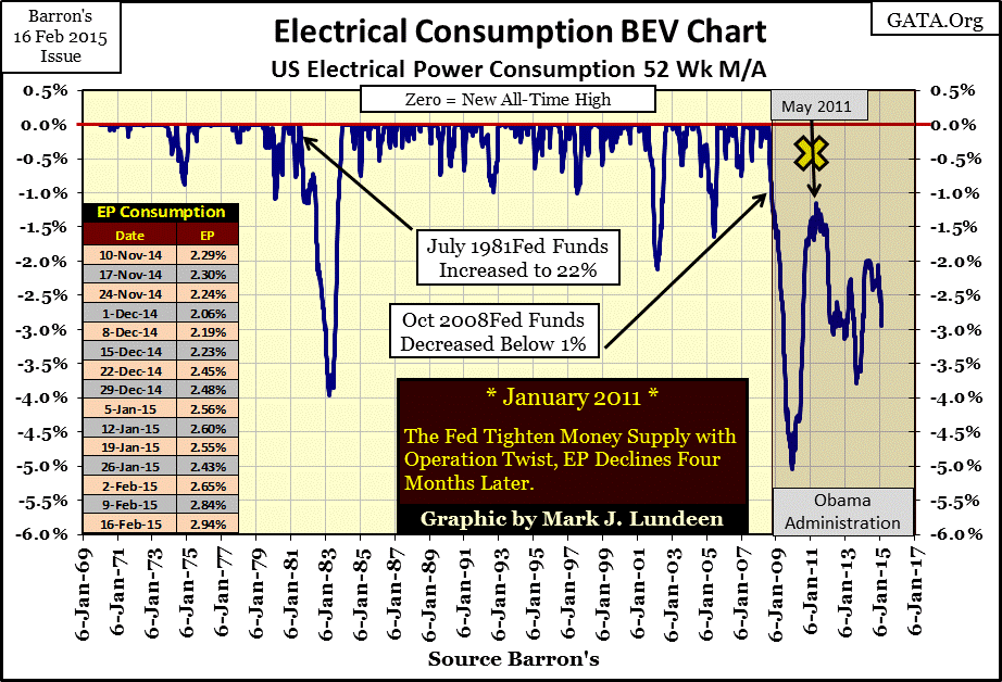
The current decline in EP (2008-2015) is ominous. The sharp decline in EP during the Volcker era Fed occurred on historic interest rates highs. Our current decline in EP began in August 2008, just weeks prior to Doctor Bernanke lowering the Fed Funds rate to historic lows. Previously, all significant declines in EP since 1929 had dropped sharply, bottomed, and then rebounded quickly forming a V pattern in EP’s BEV plot. A glance at EP’s long-term BEV plot (third chart in this article) shows the current economic decline stands out as unique.
Returning to EP’s 1969 to present BEV chart from August 2008 to December 2009 demand for EP fell 5.04%; the largest decline in EP since the Great Depression. From this bottom economic demand for EP once again began to rise as it always has. But a year later Doctor Bernanke announced what the financial media called “Operation Twist”, where the Fed began monetizing long-term US Treasury debt to lower long-term bond yields. This latest twist in “monetary science” was supposed to revitalize the economy, but in effect “Operation Twist” tightened the yield curve by shrinking the gap between short and long term yields. X marks the spot in May 2011 where demand for EP rolled over for the second time, and didn’t bottom until September 2013. In May of 2014 EP rose to within 2% of its last all-time high of August 2008, and did so again in December 2014. But since the beginning of January of this year it’s apparent that the economy’s demand for electrical power is once again declining. This in the face of government claims that GDP is on the increase.
The current economic contraction, as seen in EP, has occurred with historic low interest rates. Janet Yellen claims that the FOMC intends to begin raising interest rates this summer, but looking at EP’s less than enthusiastic response to past “economic stimulation” by the Federal Reserve I don’t see that happening. The day is coming when short and long term interest rates will increase, with or without the Fed’s permission, resulting in a decline in demand for EP on a scale not seen since the early 1930s.
As promised, let’s now examine seasonal variations in the demand for electrical power. Before the 1960s seasonal demand for air-conditioning was almost non-existent; since then seasonal peaks have greatly impacted the electrical utility industry. I was formerly a Chief Electrician in the US Navy, so I understand the impact air conditioning, or any large load has on electrical-power systems. The situation is that any electrical utility has control of only voltage and frequency; on a ship that means that the generators are operated at 450V and 60Hz. But it’s the consumers of electrical power that determine how many amperes of current (POWER!) are actually demanded; and delivering demanded amps at rated voltage is what electrical power is all about.
Every time someone turned on a light, operated an elevator or gun mount demand for EP increased, which in effect required the boilers to deliver more steam to the generators to maintain the ship’s electrical grid at 450V as current demand increased. And as electrical equipment is turned off, demand for EP on a ship decreases, but understand that the ship’s Electrical Division has no control over how many amps of current are demanded; the crew operating the ship does.
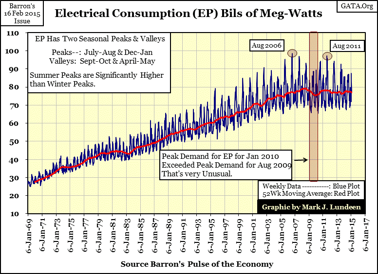
That is how we need to understand EP’s seasonal peaks in the chart below; for instance the month the American electrical grid saw its all-time highest demand for EP, August 2006, was caused by the public’s response to a summer heat wave. August 2006 was a month when the nation’s air-conditioners were never idle; instead people went to Walmart for more window units. However, not every summer places such a strain on the electrical grid. In the red box below we see the summer peak of 2009 was actually less than the winter peak of 2010, just five months later. Global warming? From August 2009 to January 2010; not in in North America! In fact the current trend in EP data shows summers as well as winters are getting cooler. The global warming advocates can’t dispute the data as all we are looking at with EP’s seasonal factors are the kilowatts demanded by the public to keep their businesses and homes at a comfortable temperature from season to season, year after year.
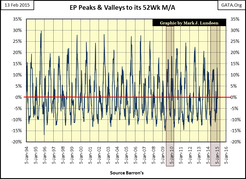
Below is a better chart for examining the seasonal peaks and valleys in EP demand, expressing seasonal extremes as a percentage above and below EP’s 52Wk M/A. Summer peaks are the big spikes located between the chart’s gridlines, the smaller winter peaks are located directly on the gridlines. The negative percentage declines are seasonal events occurring between the summer and winter peaks in the spring and autumn.
The summer of 2006 marks our current all-time high in EP demand, but at the time the same could have been said of the summer of 1995. However peak demand for EP in the summer of 1995 was 29.66% above the 52Wk M/A while in 2006 peak seasonal demand was only 27.58% above. Keep in mind what we are looking at: a fifty state sample of human response to the heat of summer, frigid nights in winter, and the comfortable days of spring and fall. If the claims of “global warming” were real we should be able to see evidence of it in the demands for seasonal kilowatts, but it’s not evident when looking at the past two decades of peak EP below. In fact in the past six months, for the second time in twenty years (Red Boxes) we are now seeing a winter peak exceed the previous summer’s peak demand for EP.
Keep in mind that the Federal Government’s budget is well over a trillion dollars a year, with a significant portion of that sent to the university system for “economic” and “environmental research.” Academia knows who butters their bread. Currently Washington wants the money it spends on academic research to prove that the economy is “growing” and the Earth is warming due to human consumption of fossil fuels. Washington wants to collect the “cap and trade” tax whether “climate change” is based on scientific reality or not. One only has to watch the Network news to see proof that the best and the brightest in academia aren’t taking any chances on angering their political patrons; so we frequently hear “news” of “economic growth” and the connection between rising temperatures and fossil fuels. But the record of electrical power consumption (as documented weekly in Barron’s for the past nine decades) strongly suggests that honesty is no longer a virtue in Washington, academia and the media.


