For Gold & the Dow Jones; It’s the Old Hurry Up and Wait


This week the Dow Jones was down from last week’s close, not so much that it would be noticeable in its BEV chart below. As it has since last November, the Dow Jones is range bound between its BEV -5% & -15% lines. How much longer can this go on? Well, I’m already annoyed by what we see below; the Dow Jones can’t surge above its BEV -5% line, yet refuses to go below its -15% line for the past seven months. How much longer can this go on you ask? Long enough to really annoy me.
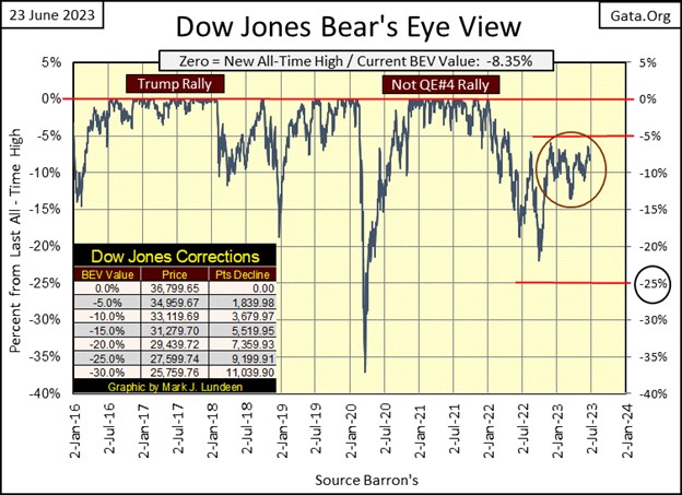
That may not be much of an answer, then I don’t expect myself to know everything about what will be in the market. I will say this; one day the Dow Jones will close either above its BEV -5%, or below its BEV -15% lines, and then everything will change.
Of the above two possibilities, breaking below its BEV -15% line is much more significant than should the Dow Jones close above its BEV -5% line, or even seeing the Dow Jones make another BEV Zero. And should (when) the Dow Jones take out its lows of last September’s (BEV -21.94% / 28,725), we may see some exciting times in the stock market.
Why that would be? Because market valuations remain bloated from the FOMC’s Not QE#4, and there is too much debt weighing down the economy. For instance, in commercial real estate, which is in a bear market not seen since the 1930s. It’s not only in my part of town where one sees many empty store fronts, store fronts that no doubt aren’t servicing the mortgages used to buy them.
I don’t believe that fact is fully priced into market valuations, ditto for problem school loans, auto loans, credit card debt. Looking at the banking stocks; their future appears grim, and that isn’t good for the broad market.
In the daily-bar chart below, once again the Dow Jones attempted to break above the 34,500 line, and failed. What is going on here? People like you and me, investors managing a few thousands to a few million dollars, have room to maneuver; sell whatever, whenever we want. We may not like the offered prices, still we can sell a significant percentage of any position we have, and not impact the market.
But there are those who manage hundreds-of-billions of dollars, who in today’s market find it impossible selling a significant portion of their holdings without crushing the market. Truth be told, they may be willing to do just that, but they know they would receive a very nasty phone call from the Treasury Department, or worse, the Department of Justice. These managers of mega funds would like to greatly reduce their exposure to the market by raising cash, but they can’t as there is insufficient demand for all they have to sell.
I don’t know, but I believe what we’ve seen since last November, are these big money managers attempting to dump a good amount of their holdings, on anyone foolish enough to buy what they are selling, every time the Dow Jones approaches 34,500. They only stop their selling when the Dow Jones falls somewhere below 33,000.
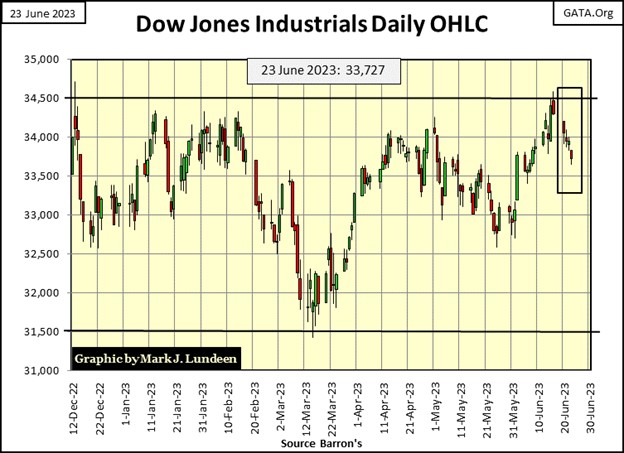
If so, and I believe it is so, this is very bearish market action. Currently, the big money managers have only pushed the Dow Jones to its 31,500 line last March before they stopped selling. But should the Dow Jones (my proxy for the broad market) begin selling off all by itself, without their participation, it won’t be long before they’ll have to join in, and we could see the Dow Jones closing below 30,000 pretty darn fast.
The following is pure speculation on my part. But I’m not stupid, and neither is anyone who manages billions-of-dollars. They are trapped, down on the playing field, slugging it out every day. And when they look up to the market’s peanut gallery, at those of us with no exposure to the market, looking down at them like vultures, having fun eating hotdogs and drinking beer as we wait for them to suffer grievous losses, before we’ll buy what they so desperately want to sell, it has to be a problem for them.
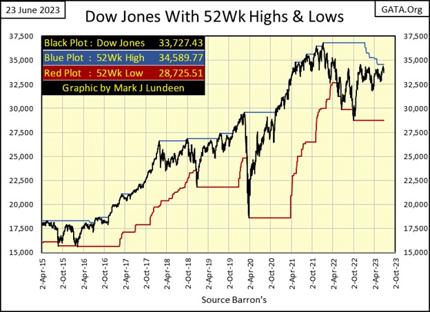
Here is the Dow Jones plotted with its 52Wk High & Low lines. The Dow Jones’ 52Wk High line is in a state of decay, as its last all-time high on 04 January 2022 is getting ever farther away. Currently, the Dow Jones last 52Wk High is 34,589, just 89 points above that 34,500 level the Dow Jones failed to take out this week. So close, yet so far.
Will the Dow Jones push up its 52Wk High line by closing above 34,589, and if so, how high will it push up its 52Wk High line? I don’t know. Actually, I’m more interested in the Dow Jones 52Wk Low line; how much longer do I have to wait until the Dow Jones once again begins pushing down on it?
Here are the BEV values for the major market indexes I follow, most were down by a few BEV points from last week’s close. If you’re a bull, the market is going the wrong way. Then for the bears, it’s all much the same as we’ve seen since last November. Like what recruits have to deal with in boot camp; everyone, both bulls and bears, now must “hurry up and wait” for what is coming our way, whatever that is.
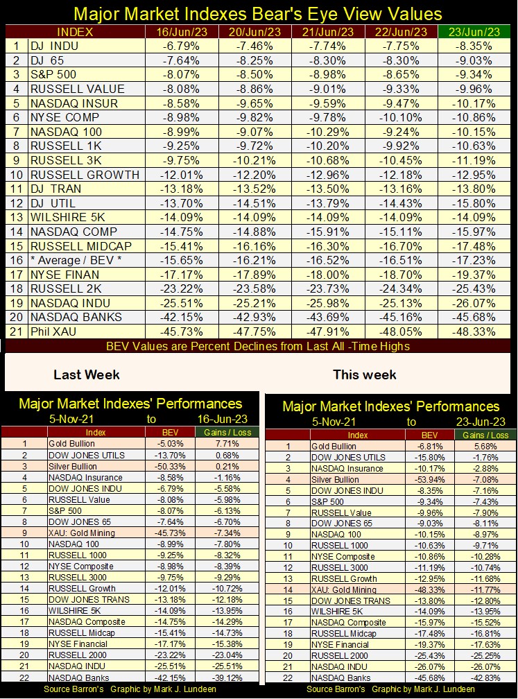
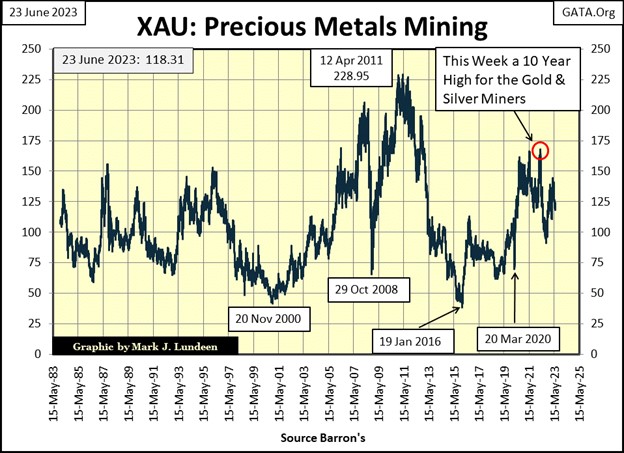
In the performance table for this week, gold remains at the #1 spot, as it has for months. Silver at #4 is doing good, but the XAU has dropped down to #14. What is with the gold and silver miners?
I haven’t a clue, but suspect the miners’ main problem is they lack friends in high places. When you realize the XAU closed the week only $11.25 above where it closed on its first day of trading in December 1983, one either has to believe these gold miners are the biggest bargain of the century; or wonder why rational people would want anything to do with them.
As for me, I like buying cheap. And, as there is nothing in the market as historically cheap as the gold and silver mining stocks are right now, I love them. Here is a major market index performance table going back to December 1996, when this data began in my files. The gold miners are at the bottom of the table, where they’ve been for many decades.
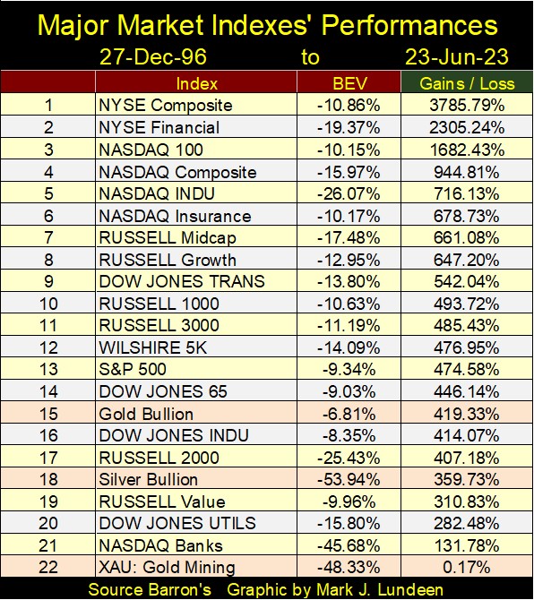
In a market where valuations are bloated by “liquidity injected” into the financial system, it’s refreshing knowing overvaluation isn’t a problem plaguing the XAU. I like thinking of the gold and silver miners as compelling bargains, true investments that need to be in people’s portfolios.
Just buy them, and forget about them for as long as it takes to make a killing. That isn’t very professional investment advice, but then I’m only a market enthusiast. In no way, shape or form do I think of myself as a “market expert.” But I do like the gold and silver miners.
Long ago, as a hobby I became interested in the markets. Back then, computers were only seen on TV, not something found in peoples’ homes. It’s just a fact; without a computer, and the necessary data to work with, its hard following what is happening in the financial markets. So back then, I followed the markets as best I could.
I retired from the Navy, almost thirty years ago. With my laptop computer, I began going through old issues of Barron’s, compiling data from its many data series. It’s really amazing what has been published in Barron’s statistics since its first issue in April 1921. It’s a shame Barron’s doesn’t promote their historical data. So, I guess the burden of posting charts going back to the 1920s is on me.
It took a few years, but finally I had data to work with, so I began studying books on technical analysis for the markets. However, what was to be found in books was the same stuff used by “market experts” who made appearances on CNBC. Then a thought occurred to me, most likely from something I read long ago in Barron’s; that what is known by everyone, isn’t worth much in the market.
I still have those old books on technical analysis, collecting dust on my book shelves. I never look at them anymore, as studying what everyone else is doing seems a waste of time. So, I began looking at my data, seeking market insights one would not find in a book on the market.
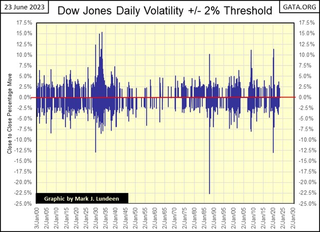
One insight I found concerned market volatility; how far (in percentage terms) the Dow Jones closed from the day before. With daily data for the Dow Jones going back to the 19th century, with the many bull and bear markets it has seen in over 120 years, it soon became obvious that daily volatility in bull markets was very different from daily volatility in bear markets.
I discovered days of extreme-market volatility, days the Dow Jones moves +/-2%, or more from a previous day’s close. I call such days “Dow Jones 2% days,” but the 2% is a threshold value, that when exceeded signals a day of extreme-market volatility has occurred. So, in my articles, a Dow Jones 2% day may be a day where the Dow Jones moved much more than just 2%. In the big bear markets, possibly over +/-10%.
There may be much excitement in the public from the rising Dow Jones. But for the Dow Jones itself, as it is advancing towards new all-time highs, it does so in little steps, both up and down steps, one day after another. In bull markets, days of extreme market volatility, Dow Jones 2% days are rare market events.
Bear markets are very different, where Dow Jones 2% days become frequent occurrences. When Mr Bear, and his clean-up crew are taking out the garbage the bulls have left behind on Wall Street;
- extremes in market valuations,
- pie-in-the-sky plans for corporate expansion come to nothing,
- massive debts no longer being serviced,
the Dow Jones will see many days where it closed +/-2% or more from the day before, as market expectations are downgraded from illiquid assets being marked down or completely written off corporate balance sheets. At a time like this, it’s best to be OUT of the market.
Here is something to keep in mind; if the Dow Jones advanced 3%, or more from the day before, and you’re feeling bullish about that – market history strongly suggests you shouldn’t be!
In the chart below, every day the Dow Jones moved * PLUS * 10%, or more, from its previous day’s close, happened during a selling panic at the NYSE;
- Great Depression of the 1930s
- Flash Crash of October 1987
- 2007-09 Sub-Prime Mortgage Crisis
- March 2020 Flash Crash
Below is a chart investors can use not only to make money on, but to save themselves from the worst a bear market has to offer. I took the daily data seen above, converted the data into absolute values (all positive values) and took a 200D M/A of the data. Keep in mind, a 200D M/A is a lagging indicator, meaning peaks and valleys in volatility seen in the plot below, usually happens maybe months after the actual bottoms and tops in the market. No matter, the chart below is an excellent tool for investors to use to time entry and exit points in the market.
Bull market tops occur when the Dow Jones volatility’s 200D M/A bottoms below the 1.00% line. How far below? Each bull market top is different.
Bear markets bottom as daily volatility peaks well above the 1.00% line. How far above the 1.00% any bear market will take volatility, is dependent on how bad the bear market is. I believe the pending bear market will be a whopper, so we may see Dow Jones daily volatility’s 200D M/A exceed the 2.5% seen during the Great Depression.
So, money is made by entering the market, following a daily volatility peak (bear market bottom), and staying in the market until volatility once again declines below the 1.00% line (the bull market top). Money is lost by being in the market at a volatility bottom (bull market top), and staying in the market as daily volatility rises above the 1.00% line, as always happens in bear markets.
Following this volatility model will not get investors in at the absolute bottom of a bear market, or out at the absolute top of a bull market. There were times this volatility model left much to be desired, as from the end of WWII to August 1971. For almost three decades, Dow Jones’ volatility failed to rise above the 1.00% line. But since the dollar was decoupled from its $35 gold peg in August 1971, timing market entry and exit points using Dow Jones’ volatility has proven to be very useful.
I don’t know of anyone else who has commented on this, though I have a hard time believing I’m the only person who follows bull and bear market volatility. I doubt a book on the market has ever documented what I made very clear above, making this very valuable information for my readers to know. In fact, if I wasn’t currently an old geezer, I doubt I’d be telling anyone this!
What does this timing tool tell us about the current market? That the market advance off the March 2020 Flash Crash bottom, (last volatility spike seen above) topped when this 200D M/A bottomed at 0.56% in early November 2021. It’s interesting to note, this is also when the major market indexes I follow were all making new all-time highs.
Compare my table of Major Market BEV values below for early November 2021, with this week’s above. Look at all those BEV Zero’s (new all-time highs) when volatility for the Dow Jones bottomed at 0.56% a year and a half ago.
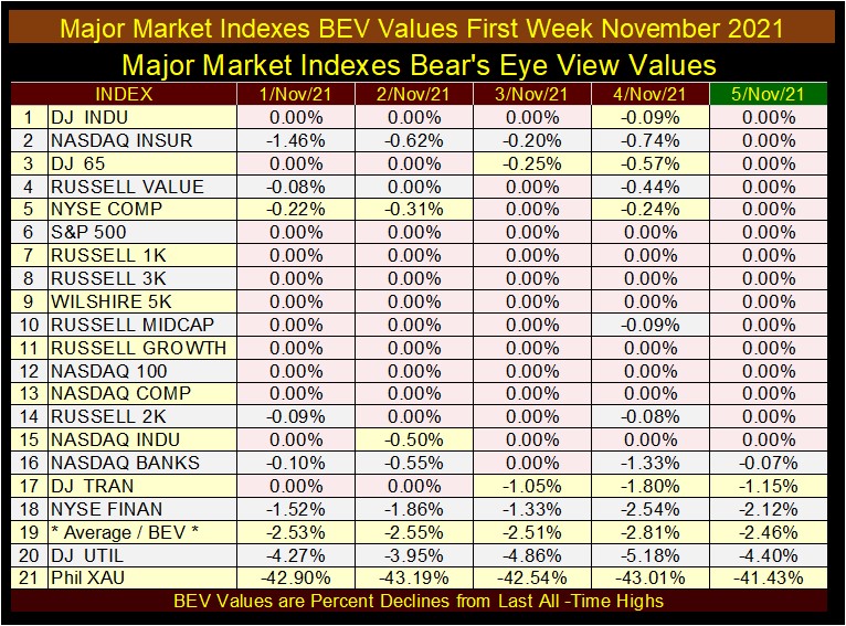
Since then (1st week November 2021), as daily volatility for the Dow Jones has trended higher, these major market indexes stopped making new all-time highs. When this 200D M/A broke above 1.00% last autumn, the market saw its latest period of softness, but has rebounded since, as Dow Jones volatility’s 200D M/A, was reduced by about 0.25%.
I expect this reduction in daily volatility is temporary, that in the weeks, months and maybe years to come, once again this plot will again rise above the dreaded 1.00% line, to levels yet unknown. I’ll be very glad I’m out of the stock market, when Dow Jones daily volatility 200D M/A peaks once again.
Digging all this out of daily volatility for the Dow Jones, I thought I’d do the same for gold, and once again the results were interesting, but definitely not the same as with the Dow Jones.
First, gold is more volatile than is the Dow Jones. So, for its days of extreme market volatility, I used a 3% threshold. The 3% threshold isn’t based on science, just on my personal intuition, but it has worked out very well nonetheless. Also, rising daily volatility for gold is not necessarily bullish or bearish, but occurs when the price of gold is making a major movement, to either the up or downside. So, context with the past is essential for using this data for gold.
Let’s look at this chart; comparing the bull 1969 to 1980 bull market with our bull market 2001 to today. Gold moved from $43.5 in 1969 to $840 in 1980, as daily volatility exploded. But then, gold began a twenty-year bear market also in 1980, and for the first three years of this bear market, daily volatility was also huge, which tells us what? Rising volatility for gold can happen during bull and bear markets, in fact anytime the price of gold is doing something in a big way.
Since 1983, gold’s daily volatility has greatly decreased, as seen in the reduction in the number of gold’s 3% days below. But since gold began its second bull market in 2001, 3% days never became as frequent as they were in the 1970s, which tells us what? I believe it tells us how heavily involved the “policy makers” have become in the gold and silver futures market, making the old monetary metal markets as boring and frustrating to investors as they could make them.
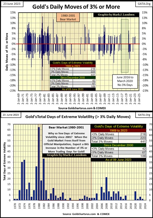
This chart above shows the number of 3% days gold has seen by year. 1973 & 74 were up years for gold, as was 1979, years where gold saw plenty of days of extreme volatility (both +/-). But the year with the most 3% days was 1980. Gold’s bull market peaked in 1980 closing above $840. But that was in January 1980. For the rest of the year gold was going down, as its 3% days kept coming, driving the total for 1980 to 67. What did 1973, 74, 79 & 80 have in common? Gold was doing something “BIG”; going up or down made no difference.
Since 2001 in the chart above, one could reason gold hasn’t done anything “BIG” since the early 1980s, even as it has seen its price rise from $253 in 2001 to $2061 in 2020. You can thank the “policy makers” and their hired goons selling digital gold by the thousands of tons at the COMEX futures markets for that.
I expect it’s only a matter of time before gold, after many decades, once again does something “BIG”, by stacking up 3% days. Does that mean gold will advance as it does so? As we’ve seen during the early 80s, maybe not. But my expectations are that next time we see a year with gold stacking up 30 plus, 3% days, it will be an amazing year for the gold bulls.
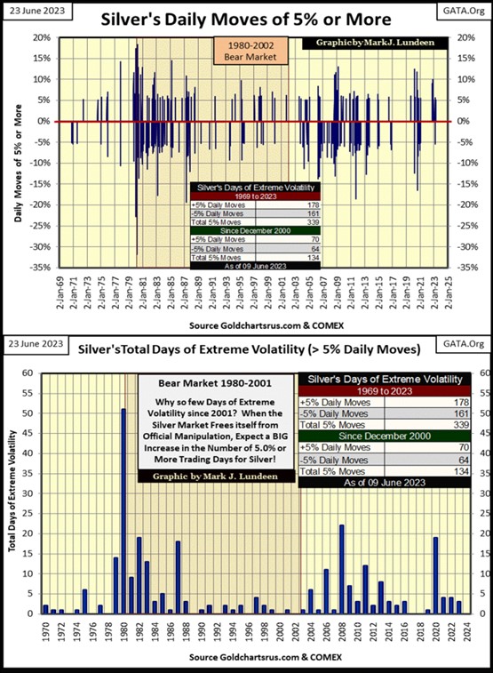
For your information, here is an identical chart for silver, which I’m not going to comment on, except to note silver being more volatile than gold, has a 5% threshold for its days of extreme market volatility.
Looking at gold’s BEV chart below, at last week’s close, gold closed in scoring position. Then came this week, and it didn’t. No matter, gold in dollar terms remained above $1900, and that is good. Then gold falling below $1900 isn’t good, but not a reason to panic either. I have my position, and what happens on a daily basis in the gold market is something I’m not going to allow to dictate what I do.
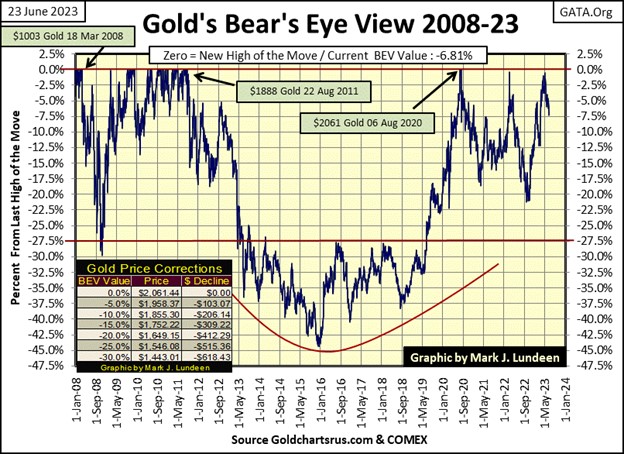
Not much happening on gold’s side of the table below. In the past two weeks gold saw some selling pressure, but the bears failed to drive it down below $1900. Should they drive gold below $1900 in the next few weeks, I won’t like that, but that doesn’t change my opinion on the gold market; that gold bullion is a strategic long-term hold.
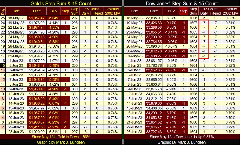
For the Dow Jones; it’s seen some selling pressure too in the past two weeks, without much impact on its valuation. Volatility broke below 0.80%, which is low, and good for the bulls.
I don’t expect much for the Dow Jones to the downside until daily volatility once again begins rising to, and then above 1.00%. In other words; until the Dow Jones begins seeing a series of 2% days, the prospects of any excitement in the market are minimal.
So, as far as the Dow Jones goes, gold too; it’s the old hurry up and wait, until the market receives orders from headquarters to change all that. I’m not holding my breath until it does.
Mark J. Lundeen
********
More from Gold-Eagle


