Gold And Silver’s Step Sums 1969-2014


The step sum is a single item Advance – Decline Line. In other words; if gold, silver or the Dow Jones is down from the previous day’s close, we give it a value of (-1), if they end the day up from the previous day’s close, we give it a value of (+1). So a step sum plot is merely the net sum of up and down market days over time. The amazing thing about the daily ups and downs of the market is that over time, through bull markets and bear, gold, silver and other markets see about as many up days as down. Look at gold’s step sum in the chart below (Red Plot / Right Scale). Since May 1969 there have been 11,463 trading sessions at the COMEX, yet as of today gold’s step sum is only 265. That is a total of only 265 net up days in the past forty five years.
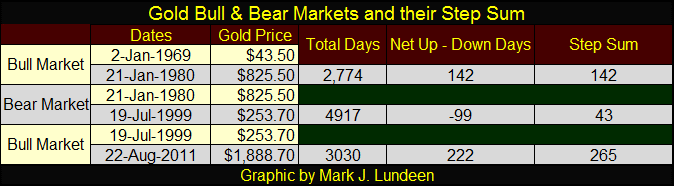
Here’s a table listing the specifics for gold’s bull and bear markets since 1969. Note how during a secular bull or bear market lasting many thousands of trading days, the Net Up – Down Days is very small. The entire 1980-1999 bear market saw only 99 more down days than up during a two decade (4917 day) market decline of 69%.
But as small as the sum of the steps may be compared to the total number of days in a bull or bear market, it does contain useful information. Typically, in bull markets the step sum plot trends up along with the price plot; in bear markets it trends down with the price plot. That was certainly the case for the entire 1969-1980 gold-bull market (see below) and to a lesser extent for the first seven years of the 1980-1999 bear market. But beginning in August 1987, as the price of gold began to decline once again, gold’s step sum refused to follow for the next eight years, forming what I call a step sum “Bear Box.”
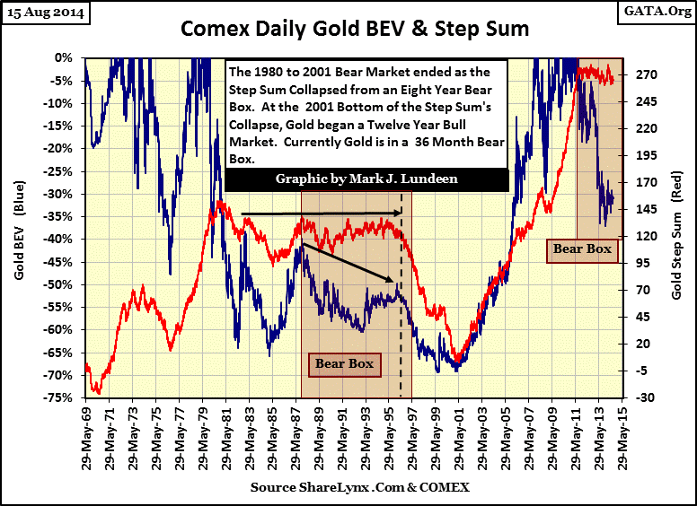
Why a bear box? Well, forget the step sum; if you were holding gold you were losing money! So what causes the step sum to be range bound in the bear box? I believe the step sum was telling us that market sentiment among the only people whose opinions really matter in any market, the people who are actually buying and selling every day, remained stubbornly bullish for those eight years in the face of declining gold prices. Within the bear box, following each bad day the gold bulls came to work the next day determined to bid the price of gold up; if not the step sum would have followed the price of gold down.
For years the gold bugs simply refused to accept the validity of the price of gold reaching its final bull market high in January 1980. There was resolute faith from the 1950s through the mid 1980s that the expanding money supply and its erosion of the dollar’s purchasing power ultimately had to drive the price of gold higher.
“November 15, 1951 reached a new low of 53 cents in terms of 1935-1939 dollar value. In extended comment on the shrinkage of the dollar, the National City Bank’s December Letter says: “From the standpoint of the creditor—the buyer of Savings bonds, the pensioner, the insurance beneficiary, the school teacher with lagging pay—the experience during and since World War II has been disheartening. Inflation is a concealed type of tax and these are the people who took the brunt of it.” In line with the repeated views of Professor Sumner H. Slichter, the City Bank adds: “People reconciled to a dollar of wasting value look around for real estate or other equity investments as a hedge against price inflation and dollar shrinkage.”
- Barron’s Editorial, 31 Dec 1951
That’s what people thought in December 1951; and it was only going to get worse.
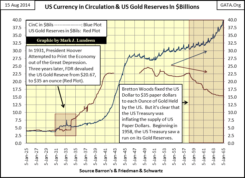
Below is a chart plotting CinC against US gold reserves in billions of dollars from 1925 to 1965. Here are some pertinent facts concerning the chart:
- Note how the two plots overlay each other from 1926-31 (the last years of the gold standard), until President Hoover attempted to print his way out of the Great Depression (rising CinC blue plot in the little red box). Monetary inflation didn’t work in the 1930s, and ultimately it won’t work in the 2010s.
- In the little red box; the big up surge in the red US gold reserves plot marks the 12-Feb-1934 issue of Barron’s which first accounted the US gold reserves at the new price of $35 an ounce; a 70% devaluation from the previous week’s $20.67.
- The 1934-41 increase in US gold reserves was the result of the Adolf Hitler coming to power; much of Europe’s monetary gold was transferred to the newly completed (1937) US Treasury gold depository at Fort Knox, Kentucky.
- After WW2, as a result of the US Treasury’s over issuance of US paper dollars (rising Blue Plot), Europe’s central banks began reclaiming their monetary gold from Fort Knox by exchanging their excess paper dollars for “US gold” (declining Red Plot) beginning in 1958.
This an important point that is never mentioned about the 1958-1971 run on the US gold reserve; most of the gold held in Fort Knox initially came from Europe before WW2.
Going back to the 1951 quote from Barron’s above, I have many similar quotes from the next four decades documenting the nation’s concerns on inflation. But the table below is the best explanation of the gold market’s stubborn bullishness from 1987 to 1996. Remember, the price of gold from 1945 to 1971 was $35 an ounce as per an international monetary treaty ratified by the US Senate; in fact it still is! Yet Washington continued to issue more newly printed dollars into circulation than the US gold reserves would allow by law.
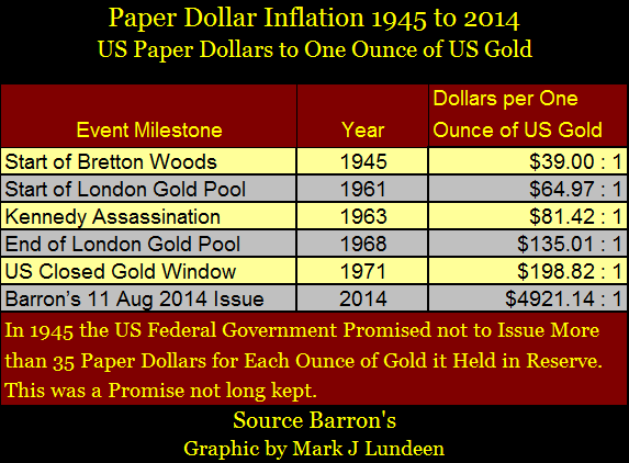
This explosion of paper dollars was occurring in a world that still fondly remembered the old gold standard, where until 1933 Americans could present a paper $20 bill at any bank and demand a $20 gold coin in exchange. Keeping this in mind, seeing the ratio of paper dollars in circulation to one ounce of US gold increase from $39 in 1945 to $199 in 1971 would naturally result in a loss of confidence in the dollar by foreign central banks, and gold bugs followed these trends. The run on the US gold reserves was inevitable, and simple logic demanded rising gold prices.
It’s a different world today; one where short attention spans in both the media and the public dominate cultural and financial opinions. There are now $4,921 paper dollars in circulation for each ounce of gold the US Treasury claims to hold and no one seems to care! But in the decades following WW2, a significant percentage of Americans still understood that American industry and finance was built on the gold standard with its limited money supply. They rightfully looked at the expanding supply of unbacked paper dollars with alarm. After all, America was a Judaic-Christian nation decades ago. Many people knew that the third horse of the Apocalypse was monetary inflation (Rev 6:5) which the bible tells us made the rich in the “end times” richer and the poor poorer. Not that Janet Yellen would ever admit that this has always been the case.
This is just my opinion, but I believe that gold’s eight year bear box (first chart above) marks the beginning of the end of the old guard’s faith that the ever increasing supply of dollars would force the price of gold to rise. Unfortunately, they were wrong as these were the years when Alan Greenspan and Wall Street devised ways to funnel the growing money supply into the high-tech bubble.
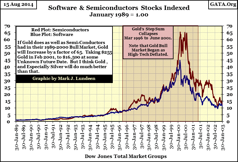
The 1987-1996 bear box terminated when for the first time since January 1980 the price of gold (first chart / blue plot) declined with a collapsing step sum (first chart / red plot) as valuations in semiconductors and software shares (chart above) inflated to astounding valuations from 1996-2000. As Greenspan’s high-tech bubble entered its manic blow-off phase, the old guard’s faith in gold finally collapsed along with gold’s step sum.
Note in gold’s step sum chart (first chart) how the gold bear market actually bottomed on 19 July 1999 with a closing price of $253.70. This was “Brown’s Bottom” when Gordon Brown (Chancellor of the Exchequer) announced that the Bank of England was going to sell 400 tons of its monetary gold in seventeen auctions over the next three years. What a sweetheart deal for the friends of Gordon Brown, if not for the citizens of the UK. Seeing the Bank of England selling its gold for the purpose of purchasing government bonds denominated in dollars and euros for monetary reserves was too much for the long traumatized gold bulls.
Even though the bear market reached its ultimate low price on Brown’s bottom (19 July 1999), gold’s step sum (market sentiment) continued to decline for two more years. Then on 15 February 2001, gold closed at $255.10 and began to rise, while its step sum bottomed four months later (June), marking the start of the 2001-2014 bull market in gold.
Below is gold’s step sum chart from 1998 to 2014 which provides our bull market a little more detail. From the summer of 2001 to March 2008 (the beginning of the sub-prime mortgage debacle) the blue price plot and red step sum plot both increased, as expected in a bull market. But beginning in March 2008, a bear box began forming, where the price of gold declined as its step sum plot continued rising for the next four months. Remembering that the step sum plot is a market sentiment indicator, we see how from March-June 2008 the gold bulls refused to believe that the price of gold could go down amidst the turmoil in the global credit markets. It seems that the gold bulls were unaware that market trends today are matters of “policy directives”, and “official policy” for gold during a credit crisis was for it to go down. This time it didn’t take eight years for the bulls to figure it out; in June 2008 the red step sum plot fell in line with the bearish blue price plot. The price of gold bottomed on 23 October 2008 with the step sum bottoming a month later on 18 November 2008, signaling the start of the next phase of the bull market.
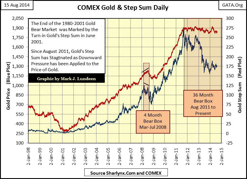
This is something useful to know about bear boxes; when the step sum trend diverges from the price trend, trust the price trend to be correct. When the step sum’s trend finally reverses and falls in line with the price trend, the box formation is terminated, indicating that a market bottom is approaching. After
gold’s 2008 bear box terminated, the bottom could be recognized when both the price and step sum trends reverse upwards together. Looking back at the first step sum chart at the beginning of the article, you’ll see the same thing happen after gold’s eight year bear box terminated in 1996; five years later both plots turned upward in early 2001, signaling that the bottom was in.
Are there bull boxes? Sure there are, and they work in exactly the same way as a bear box, but everything is in reverse as we can see with the Dow Jones during the Great Depression. One has to appreciate the trauma the financial markets suffered during the October 1929 to July 1932 market crash. In early July 1932, the Dow Jones had just endured its largest percentage decline in history (-89%), and everyone was still suffering from battered investor syndrome. Then, from July 1932 to July 1933 the Dow Jones saw its greatest year in history, a completely unexpected twelve month gain of 153%!
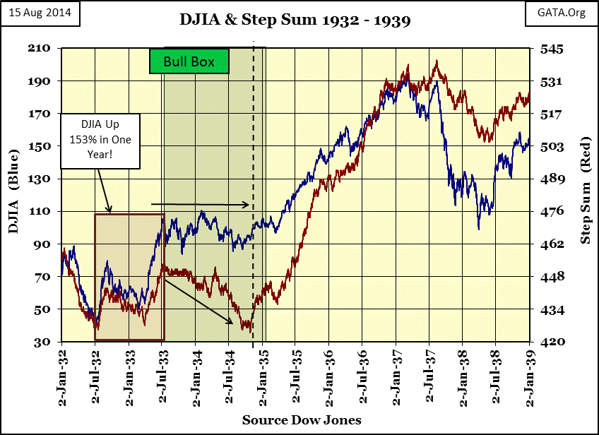
But as we see in the chart above, in July of 1933 market sentiment (Red Plot / step sum) topped out with the Dow’s price plot. The step sum then began a fifteen month decline. But note that while market sentiment (step sum) may have been running away from Mr Bear, the valuation of the Dow Jones remained remarkably steady. After a spectacular one year appreciation of 153%, the Dow Jones price correction in the following bull box was pretty tame. In October 1934 the bull box terminated when the red step sum plot reversed, and the Dow’s price and step sum trends began moving upwards together toward their highs of 1937.
Here’s a more recent example of a bull box in the NYSE Financial Index. These primarily bank stocks were ground zero for the 2007-2009 credit crisis. From June to October 2010 in the aftermath of the credit crisis, the NYSE Financial Index was going up, but the market refused to believe it. At the dashed line the step sum finally fell in-line with the price trend (which marks the termination of the bull box), and both the price and step sum plots continued rising until the high of the move in February 2011, when both the NYSE Financial price and step sum trend turned downward; a solid and timely sell signal.
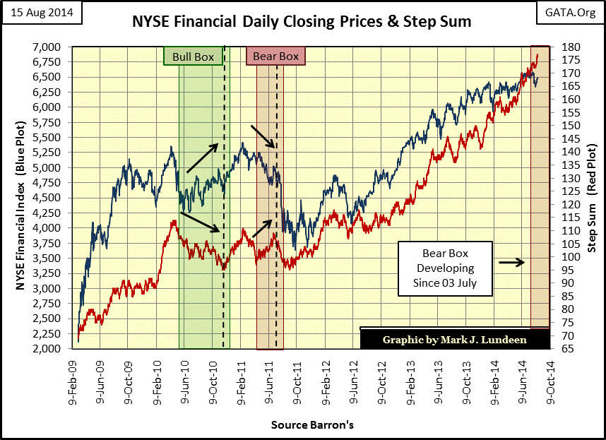
Currently we see what appears to be a new bear box forming in the NYSE Financial Index and its step sum. It will have to last for a minimum of two months (three would be better) before it becomes official, and I’d like to see the blue price plot come down more as the red step sum plot continues rising. But a step sum bear box forming in a critical stock sector like the financial shares (as the Federal Reserve is scaling back on its QE program) could prove to be a turning point in the 2009-2014 “recovery.” I’ll keep my eyes on this.
Going back to the gold step sum chart (three charts up), gold is currently in a thirty-six month bear box. My step sum studies strongly suggest that the gold market’s current bull market correction has not yet, and will not see its ultimate bottom until market sentiment (the red step sum plot) collapses downward. Whenever a bear box terminates, we can’t know for certain how far down a market will go. It could be a little or it could be a lot.
But there have been times when a step sum box didn’t “terminate” but became “invalid.” How’s that? There are times when the red step sum plot simply refuses to collapse; instead the blue price plot eventually rises and comes back in line with its step sum. This has been the case for most of the history of the silver market, where we see the step sum either goes up, or sideways, but has never actually collapsed since 1983. Silver is just different. Look at the 1983-2002 bear box in silver’s step sum chart below; from 1987 to 1993 it even has a second five year bear box forming within it. Because the step sum never actually collapsed in either bear box, both boxes were invalidated.
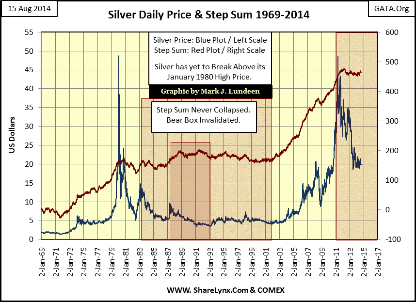
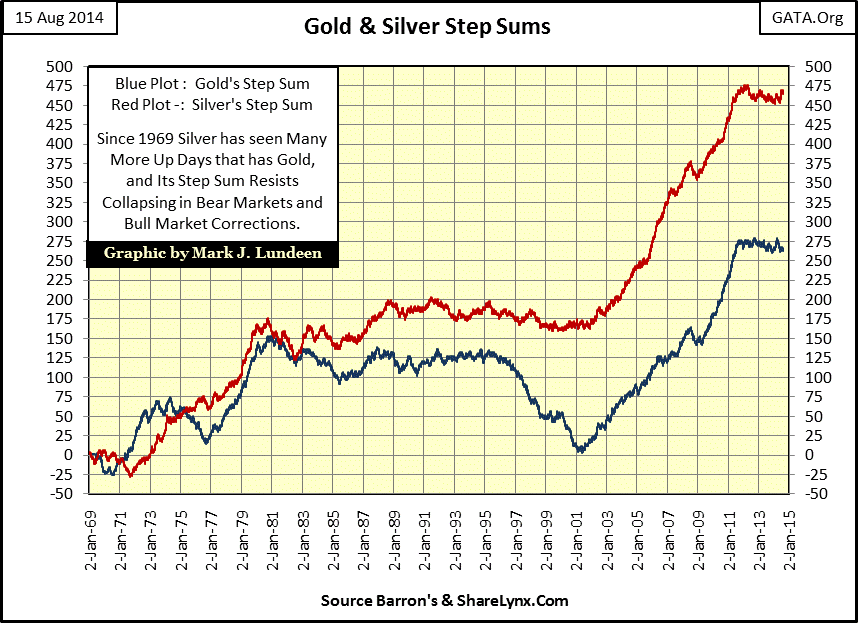
Here’s a chart plotting gold’s and silver’s step sums together. Since 1982, the silver market has seen many more up days than has gold, yet unlike gold, it has yet to see a new all-time high since 1980.
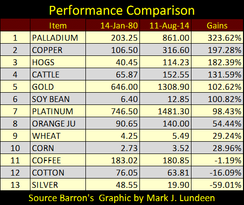
Here is a table for price gains since Barron’s 14 January 1980 issue, the issue recording silver’s 1969-80 bull market peak price; the price guaranteed to highlight silver’s poor performance relative to the other metals in the list. But the other metals also saw all-time highs in late 1979 and early 1980, and after thirty-four years of monetary inflation flowing from the Federal Reserve, all the commodities in the table below have made new all-time highs since January 1980, except for silver. I can’t explain it except to say that for something in such great demand for industry as silver, whose above ground stockpiles have shrunk from many billions of ounces in 1980 to just a few hundred million ounces today – this is very weird!
Here is silver’s step sum chart from 1998 to today.
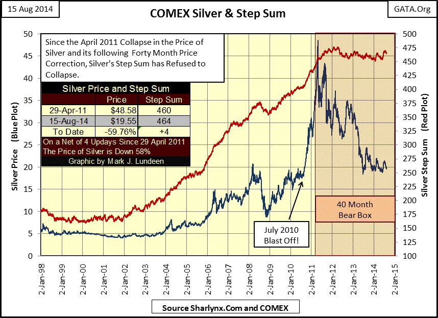
The question is whether or not this forty month bear box will ultimately terminate by seeing the step sum plot collapse, taking the price of silver with it, or is the bear box going to be invalidated with the price plot rising up towards its stem sum plot? The same question can be asked for gold’s bear box. Personally, I expect to see both bear boxes invalidated, not that it really matters one way or the other to long-term investors as both gold and silver are still in bull markets. When interest rates once again begin to rise, and global financial assets currently valued in tens of trillions of dollars once again begin to deflate in earnest, we should see some amazing gains in the precious metals markets.
More from Gold-Eagle


