Gold And Silver Price Updates…Not A Flag Nor Pennant, But A Top - New Longs Are About To Be Fleeced


 Many analysts and writers have described the pattern forming in the past couple of weeks in gold as a "bull Flag or Pennant" with some appearing to be "playing to the gallery" - i.e. telling their audience what they want to hear, which is that gold will continue to go up. I, on the other hand, decided that the triangle that had formed was not a continuation pattern, but a top, and said so about a week ago. So, as you will readily understand, I was not looking good when gold seemingly broke out upside on Thursday, and came in for considerable flak. However, on Friday there were some dramatic developments across the sector which look set to vindicate my stance.
When you buy a used car it is not enough to look at the clean shiny exterior and decide as many do, that the car is good - you have to know what its internal state is - the condition of the motor and the transmission etc. which means you have to poke around and dig deeper. In the same way it is not enough to look at the price pattern in something like gold and say "It's looks like a bull Flag and therefore it is a bull Flag" - you have to know what's going on beneath the surface - in the "internal plumbing" of the market so to speak, and we do this by using COT data and the volume pattern, and as we will see, the internal state of this market is not good at all and calls for a sharp drop soon that will take most by surprise. There are a number of compelling reasons to expect an intermediate correction in the Precious Metals sector imminently that could be severe, which we will now proceed to look at.
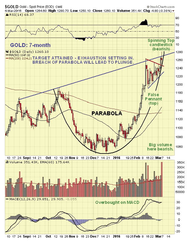
Starting with the 1-year chart for gold, we see that it has made a parabolic slingshot advance that has brought it to the trendline target shown, where the advance hit a wall. Many are expecting the choppy action of the past couple of weeks to be followed by another sharp upleg, but that looks highly unlikely to several reasons. In the 1st place, look at how steep the parabola has become - even if gold has started a new bullmarket, do you really expect it to just go up vertically, like a rocket, without any reactions of periods of consolidation?

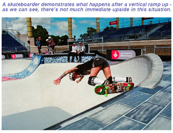
If you think that gold is going up from here, I suggest you take a trip down to your local skate park and watch the kids in action. See what happens immediately after they zip up a ramp that becomes vertical - if they are good they might work in some turns or spins, like the triangle on our gold chart, but after that it's kind of difficult to resume the upward path. Take a look at the following picture and rate the chances of the skater going vertically upwards from this position. Not very high are they? - so why do you think gold should be any different after its vertical ramp?
gold chart, but after that it's kind of difficult to resume the upward path. Take a look at the following picture and rate the chances of the skater going vertically upwards from this position. Not very high are they? - so why do you think gold should be any different after its vertical ramp?
Another important reason why the triangular pattern of the past few weeks is not viewed as a valid Flag or Pennant, is that the volume pattern is not consistent with it being one. Volume should die back steadily to a low level as the pattern forms, and clearly it has not, as we can see on the 7-month chart for gold below. Thursday's supposed breakout from the Pennant, which is viewed as false, did not make it past the target line projected from the peak of last August, then on Friday a "Spinning Top" candlestick appeared whose bearish implications are magnified by the fact that it occurred on multi-month record volume, and confirmed by very bearish candles appearing all over the sector at the same time.
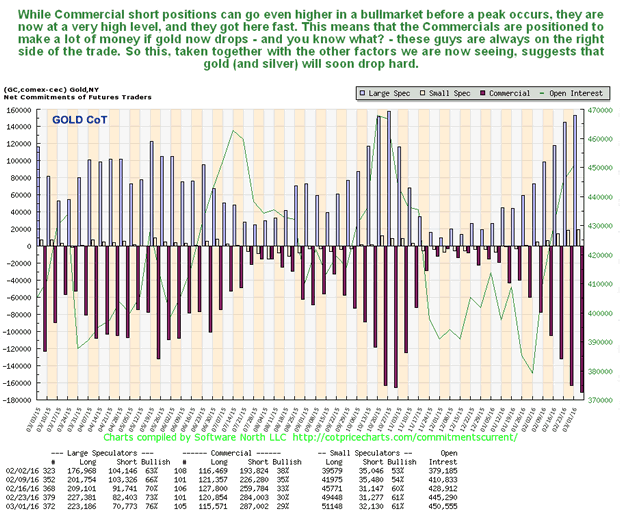
The latest gold COTs are a disaster with Commercial shorts, which were already high a week ago having piled up even more, and since this data is for Tuesday night's close, you can bet that they went even higher on Thursday's advance to new highs. Now, I've heard the justification that they reach higher peaks in a bullmarket uptrend, but even so, taking the other factors detailed here into account, this looks bad - and it won't be the Commercials on the losing side if gold if now proceeds to drop.
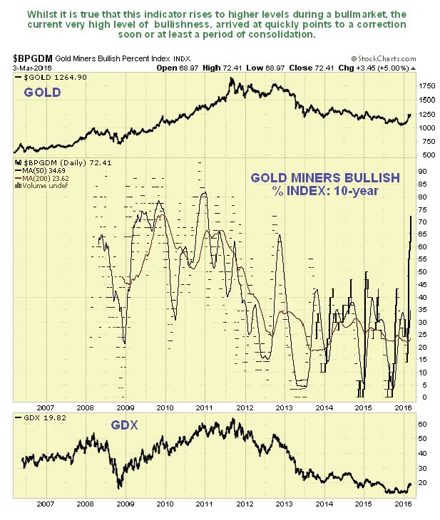
Our next chart shows that there aren't many investors left to turn bullish on gold stocks, which is clearly a dangerous situation. The Gold Miners Bullish Percent Index has ramped from about 14% to 72% is just 6 weeks...
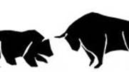
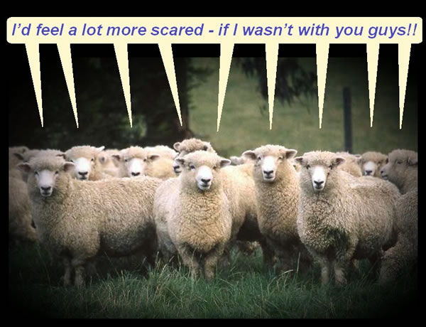
They're nearly all in - so it's fleecing time again!
A group of new longs contemplates their fate...
Now we will take a look at concurrent ominous developments across the sector late on Friday, which all point to the same thing - a breakdown and drop. We start with the 3-month chart for the Market Vectors Gold Miners, on which a very bearish prominent "Gravestone Doji" appeared...
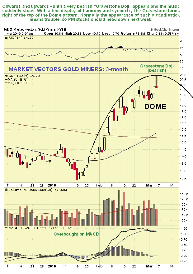
As Steve Nison writes in his terrific book "Japanese Candlestick Charting Techniques" - "The gravestone's forte is in calling tops. The shape of the gravestone doji makes its name appropriate. As we have discussed, many of the Japanese technical terms are based on military analogies. In Japanese candlestick literature, it is said that the gravestone doji represents the gravestone of the bulls that have died defending their territory." So there you have it.
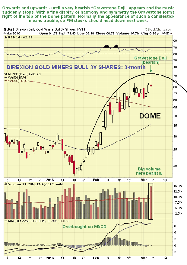
The very same candlestick also appeared on the Direxion Gold Miners Bull 3X Shares chart...
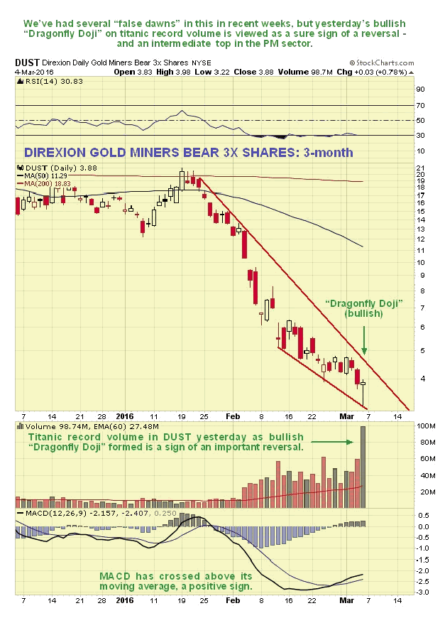
As you would expect the inverse candlestick, a "Dragonfly Doji", appeared on the chart Direxion Gold Miners Bear 3X Shares chart, and what was notable here also was that volume exploded to titanic record levels, a sure sign of a reversal...
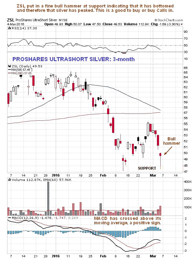
Silver and silver related investments also showed reversal candles, with a fine bull hammer appearing on the chart for ProShares Ultrashort Silver, right at support at the February low.
Finally, the "Moron Index", a proprietary clivemaund.com indicator, has spiked over the past couple of weeks. This is carefully calculated on the basis of the number of Emails I get from people telling me that I am wrong, and laced with insults and profanities. This is usually a very reliable indicator, since such people, by their very nature, are led by cheerleaders, and thus invariably end up on the wrong side of the trade.
Conclusion: We are at an intermediate top, and recent new longs will end up being fleeced.
********
Courtesy of Courtesy of http://www.clivemaund.com

Clive P. Maund’s interest in markets started when, as an aimless youth searching for direction in his mid-20’s, he inherited some money. Unfortunately it was not enough to live a utopian lifestyle as a playboy or retire very young. Therefore on the advice of his brother, he bought a load of British Petroleum stock, which promptly went up 20% in the space of a few weeks. Clive sold them at the top…which really fired his imagination. The prospect of being able to buy securities and sell them later at a higher price, and make money for doing little or no work was most attractive – and so the quest began, especially as he had been further stoked up by watching from the sidelines with a mixture of fascination and envy as fortunes were made in the roaring gold and silver bull market of the late 70’s.
Clive furthered his education in Technical Analysis or charting by ordering various good books from the US and by applying what he learned at work on an everyday basis. He also obtained the UK Society of Technical Analysts’ Diploma.
The years following 2005 saw the boom phase of the Gold and Silver bull market, until they peaked in late 2011. While there is ongoing debate about whether that was the final high, it is not believed to be because of the continuing global debasement of fiat currency. The bear market since 2011 is viewed as being very similar to the 2-year reaction in the mid-70’s, which was preceded by a powerful advance and was followed by a gigantic parabolic price ramp. Moreover, Precious Metals should come back into their own when the various asset bubbles elsewhere burst, which looks set to happen anytime soon.
Visit Clive at his website: CliveMaund.com
More from Gold-Eagle


