Gold Market Update


Yesterday was an extraordinary day in the Precious Metals markets, with a good chance that it signals the reversal from the brutal 3-year plus bearmarket that so many have waited so long to see. The day started with gold and silver plunging on the news that the Swiss voted against backing their currency with gold, but later in the day they rallied strongly on heavy turnover to close with giant reversal candlesticks on their charts. Regardless of the reasons for this bizarre behavior, technically this action looks very positive, and this is written with the awareness that gold has reacted back this morning on dollar strength.
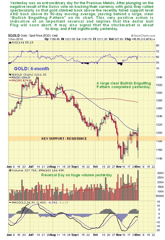
On gold’s 6-month chart we can see how it approached its November lows in the early trade after the Swiss vote, but rallied strongly on big volume to close above its November highs, above the recently failed key support that is now resistance and above its 50-day moving average, which was quite an accomplishment, leaving behind a large “Bullish Engulfing Pattern” on its chart. This points to a probable strong advance dead ahead, so today’s reaction should be used to clear out any short positions, and also to go long aggressively with stops below the November low. This action by gold, and by silver, suggests that the current bull Flag in the dollar, which is getting a bit “long in the tooth”, may be about to abort.
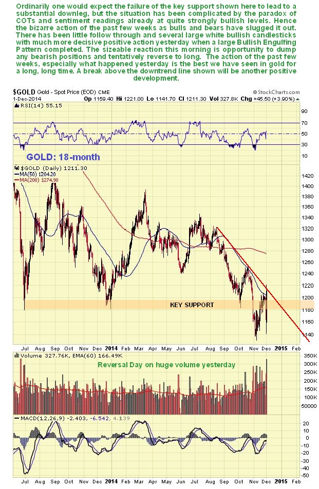
On the 18-month chart we can see the unusual action in gold since its broke down below the key support level at last year’s lows late in October. After such a breakdown, going on price alone, we would naturally expect to see follow through to the downside, but there was very little reaction before it turned around and took on the support level that had become resistance. It backed off again last Friday and into yesterday morning before the dramatic reversal later in the day which took it back above the resistance. However, around the time gold dropped to new lows, COTs and sentiment indicators were already bullish, as we noted at the time, which made the market very difficult to call, but yesterday’s action was the most bullish we have seen in a long time, so there is a good chance that the bottom is in.
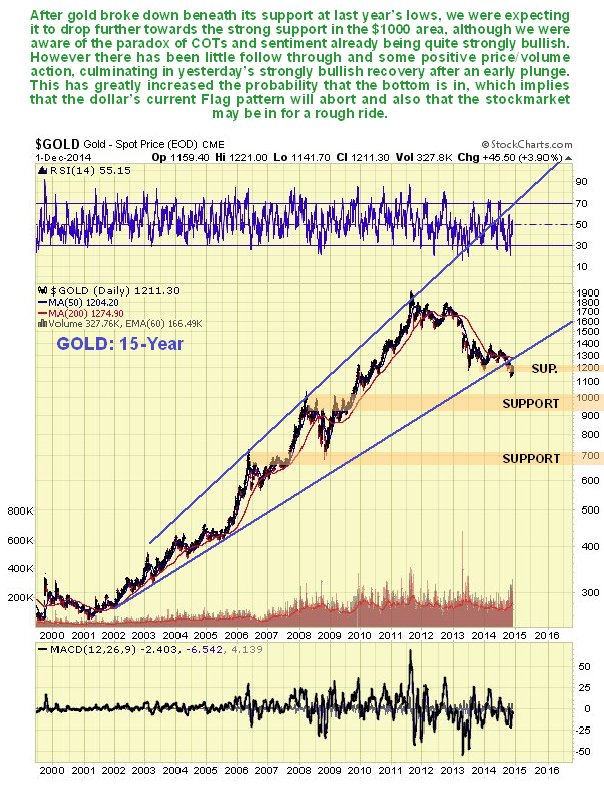
On the long-term 15-year chart we can see that the combination of the failure of support at last year’s lows, and the failure of the long-term uptrend, clearly opened up the risk of a drop back to the strong support in the $1000 zone, although matters were complicated by the already bullish COTs and sentiment, as mentioned above. Now, with yesterday’s bullish price and volume action, the smoke is beginning to clear, and we can see the implications of the bullish COTs and sentiment starting to translate into price and volume action. The result is that it looks like the bottom is in, and that gold won’t drop back as far as $1000 after all. Instead, it could take off higher from here, and given the heavy bearish sentiment that has prevailed of late, it could be a scorcher of a rally with the afterburners full on.
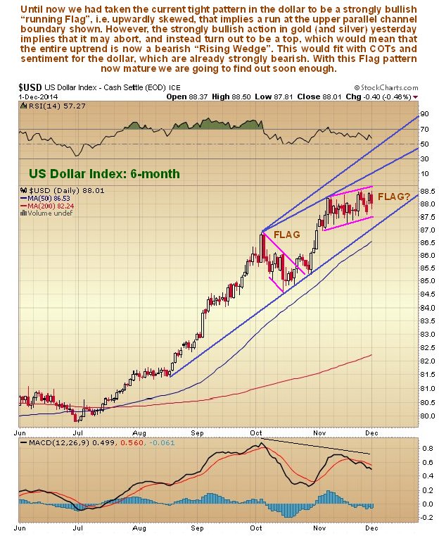
Now we will look at the dollar. Until now we have interpreted the tight sideways pattern in the dollar that has formed in recent weeks as a very bullish “running Flag” so called because it is upwardly skewed which makes it more bullish, which is shown on the 6-month chart below. However, we were also aware that COTs and sentiment for the dollar are already at bearish extremes, so our view was that the dollar would have one last upleg before calling it a day. The implications of the bullish action in gold yesterday are that this won’t happen – instead the dollar Flag will abort and it will break lower, or that if it does advance it won’t be by far. This is certainly a possibility as this Flag is getting “long in the tooth” and the uptrend in the dollar could thus be morphing into a bearish Rising Wedge.
The latest US dollar hedgers chart, which is a form of COT chart, shows readings that well into bearish territory, although they have eased somewhat in recent weeks as the dollar has crept higher.
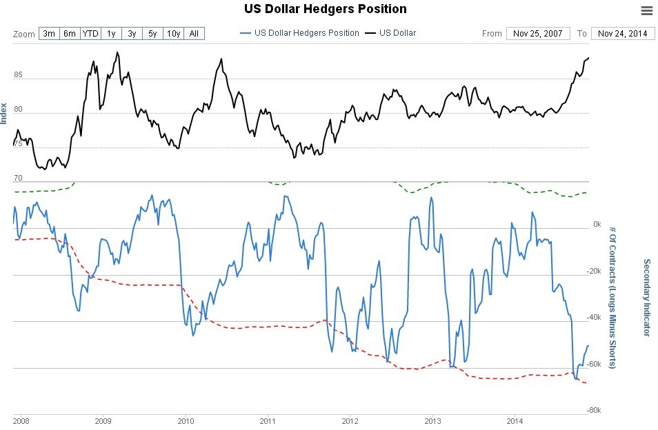
Click on chart to popup a larger clear version.
Chart courtesy of www.sentimentrader.com
Optimism towards the dollar could scarcely be greater as the following chart for the US dollar optix, or optimism index, makes clear. Readings are in “nosebleed” territory. This may however only call for a significant reaction, not necessarily a bearmarket. It is worth noting that the dollar index is close to resistance at its 2009 and 2010 peaks.
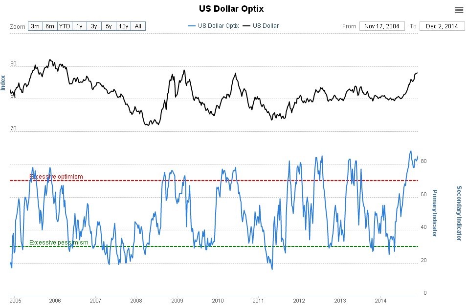
Click on chart to popup a larger clear version.
Chart courtesy of www.sentimentrader.com
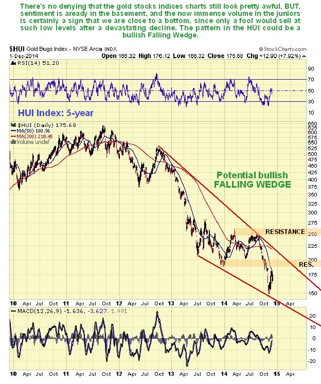
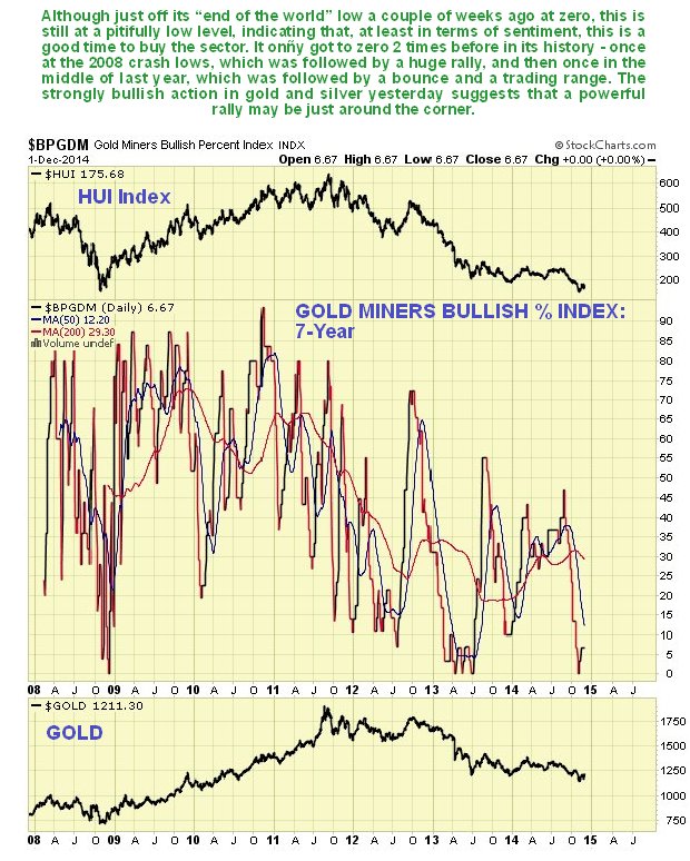
What about Precious Metals stocks? At first sight their charts don’t exactly look great, even though they have been outperforming gold in recent weeks, which is a positive sign in itself. On the 5-year chart for the HUI index, we can see its horrible long downtrend from 2011 – 2012 and how it still appears to be on the defensive, with moving averages in bearish alignment and zones of resistance overhead. However, with gold and silver suddenly looking a lot better, there should be some evidence of a potential trend change visible, and there is. Assuming the recent low holds, there is a marked convergence of the downtrend, which makes it a bullish Falling Wedge, and clearly it will be an important positive development when this index breaks out first above the nearby resistance shown and then out from the downtrend a little further above.
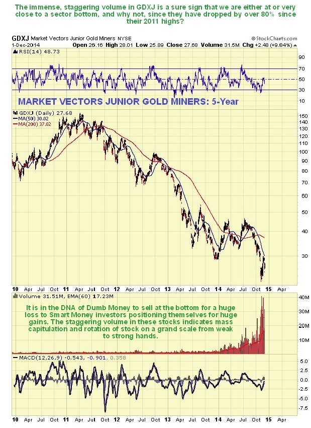
While the chart for the HUI index, which does not show volume, is not particularly encouraging, the same is not true of the chart for the Market Vectors Junior Gold Miners, code GDXJ. The 5-year chart for GDXJ shows that volume has built up steadily over the past year to arrive at tremendous climactic levels. The is definitely a sign that we are at a bottom, or close to it, since only fools sell at such low levels with such huge losses, and somebody is taking the other side of the trade, that somebody being Smart Money. The immense volume makes it all the more bullish, as it is shows rapid rotation of stock from weak to strong hands. We picked up on this earlier this year, and thought that the bottom might be in, but it has got even more extreme with the recent new lows.
Supporting the contention that the sector is bottoming is the Gold Miners Bullish Percent Index, which actually hit zero some weeks back at the recent low after the breakdown, but has now clawed its way back up to the still dismal reading of 6.67% bullish. There is obviously plenty of room for improvement here – and plenty of scope for a sector rally.
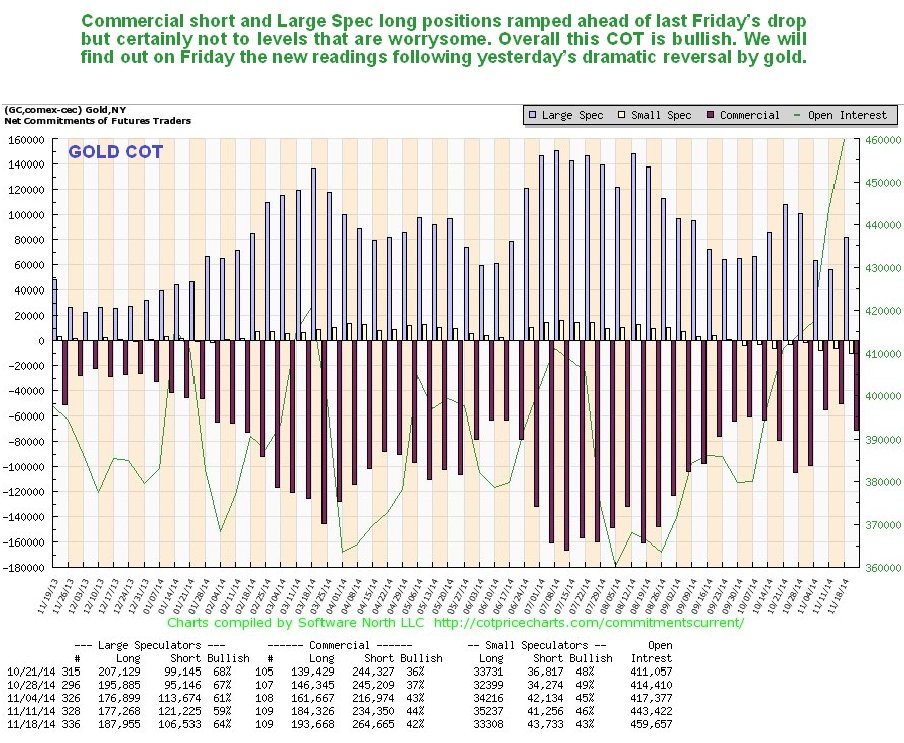
Turning now to the latest COTs we see that, while they are not as bullish as they could be, the readings are still on the bullish side, and we should bear in mind that last week’s uptick in Commercial short and Large Spec long positions preceded the sharp drop on Friday and into Monday morning, so it will be interesting to see how the COTs look after yesterday’s sudden recovery when they are released on Friday.
Click on chart to popup a larger clear version.
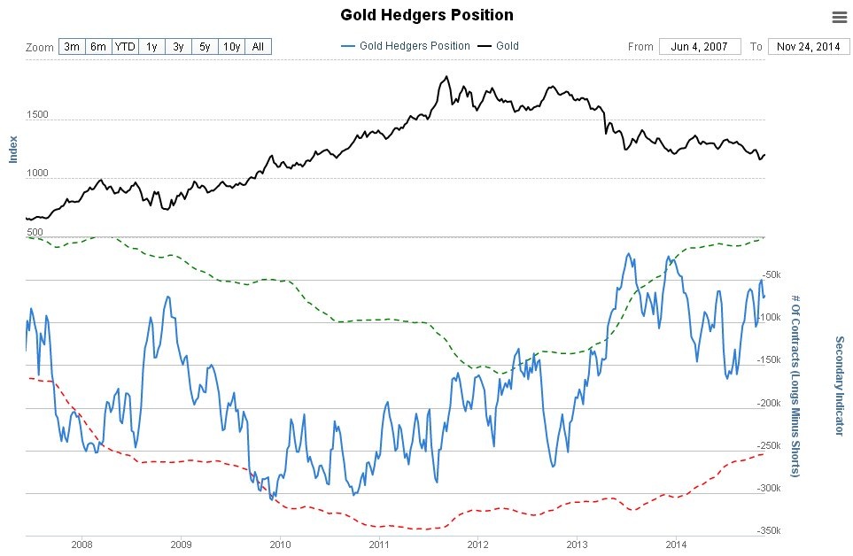
The Gold Hedgers chart shown below, which goes all the way back to 2008 and is another form of COT chart, makes clear that historically, readings are quite strongly bullish now.
Click on chart to popup a larger clear version.
Chart courtesy of www.sentimentrader.com
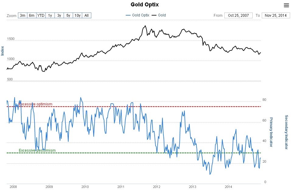
The latest Gold Optimism chart, or Optix, is strongly bullish as it shows that extreme pessimism still prevails towards gold, which is of course exactly what you want to see at or close to a market bottom…
Click on chart to popup a larger clear version.
Chart courtesy of www.sentimentrader.com
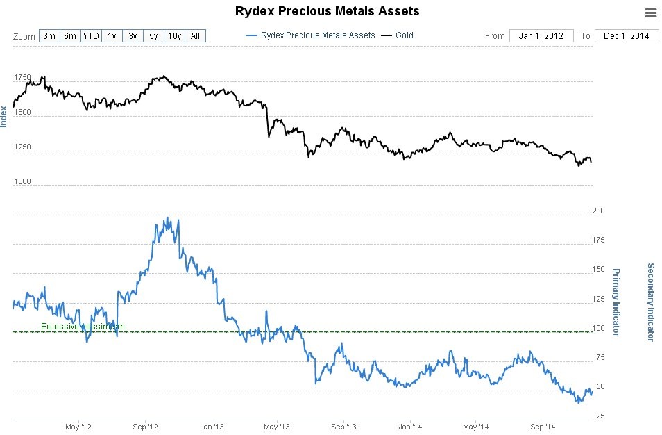
The Rydex Traders continue to maintain their fine and long-standing tradition of being a contrary indicator. Their holdings in the Precious Metals sector are near record lows, which has got to be bullish.
Click on chart to popup a larger clear version.
Chart courtesy of www.sentimentrader.com
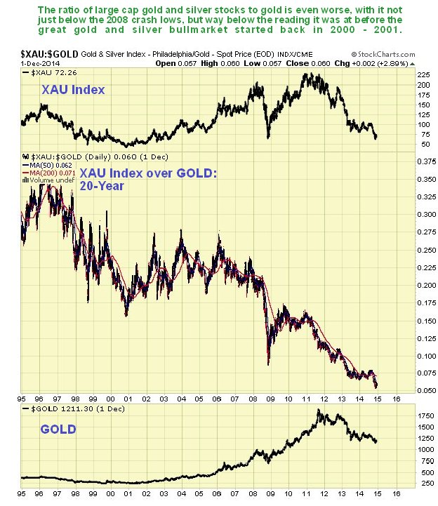
According to the long-term XAU index over Gold chart, the sector is even more attractive than it was back in 2000 before the start of the bullmarket, because stocks have become so undervalued relative to gold – much more so than at the depths of the 2008 market crash and more still than in 2000. The rationale behind this is that when investors are fearful towards the sector, they favor bullion over stocks, as they know that bullion will always have value, whereas stocks can go to zero. What this chart shows is that right now they are more fearful towards the sector than they have ever been, and on a contrarian basis that is very bullish.

Clive P. Maund’s interest in markets started when, as an aimless youth searching for direction in his mid-20’s, he inherited some money. Unfortunately it was not enough to live a utopian lifestyle as a playboy or retire very young. Therefore on the advice of his brother, he bought a load of British Petroleum stock, which promptly went up 20% in the space of a few weeks. Clive sold them at the top…which really fired his imagination. The prospect of being able to buy securities and sell them later at a higher price, and make money for doing little or no work was most attractive – and so the quest began, especially as he had been further stoked up by watching from the sidelines with a mixture of fascination and envy as fortunes were made in the roaring gold and silver bull market of the late 70’s.
Clive furthered his education in Technical Analysis or charting by ordering various good books from the US and by applying what he learned at work on an everyday basis. He also obtained the UK Society of Technical Analysts’ Diploma.
The years following 2005 saw the boom phase of the Gold and Silver bull market, until they peaked in late 2011. While there is ongoing debate about whether that was the final high, it is not believed to be because of the continuing global debasement of fiat currency. The bear market since 2011 is viewed as being very similar to the 2-year reaction in the mid-70’s, which was preceded by a powerful advance and was followed by a gigantic parabolic price ramp. Moreover, Precious Metals should come back into their own when the various asset bubbles elsewhere burst, which looks set to happen anytime soon.
Visit Clive at his website: CliveMaund.com