Looking At Consumer And Corporate Debt


This week the Dow Jones didn’t move far from where it closed last week, advancing to -2.75% from last October’s all-time highs, from last week’s -3.15%. The change from last week’s position in the Dow Jones Bear’s Eye View chart below is imperceptible.
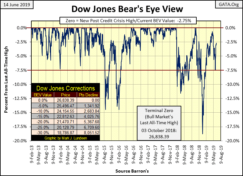
Looking at the Dow Jones in daily bars below tells us why; daily volatility within the circle containing last week’s market action disappeared. So the Dow Jones cleared 26,000 every day last week, but couldn’t do much after it did.
We saw similar weeks in late February and again in April. Back then such weeks were markers for pending market declines. If this pattern holds true again for mid-June, it’s an indication the market bulls are showing signs of exhaustion.
Let’s see what the bulls can do with the Dow Jones next week. Can they use this week’s quiet trading as a breather before their final assault on last October’s BEV Zero at 26,838, or will next week’s market action see Mr Bear taking the Dow Jones towards its lows of two weeks ago.
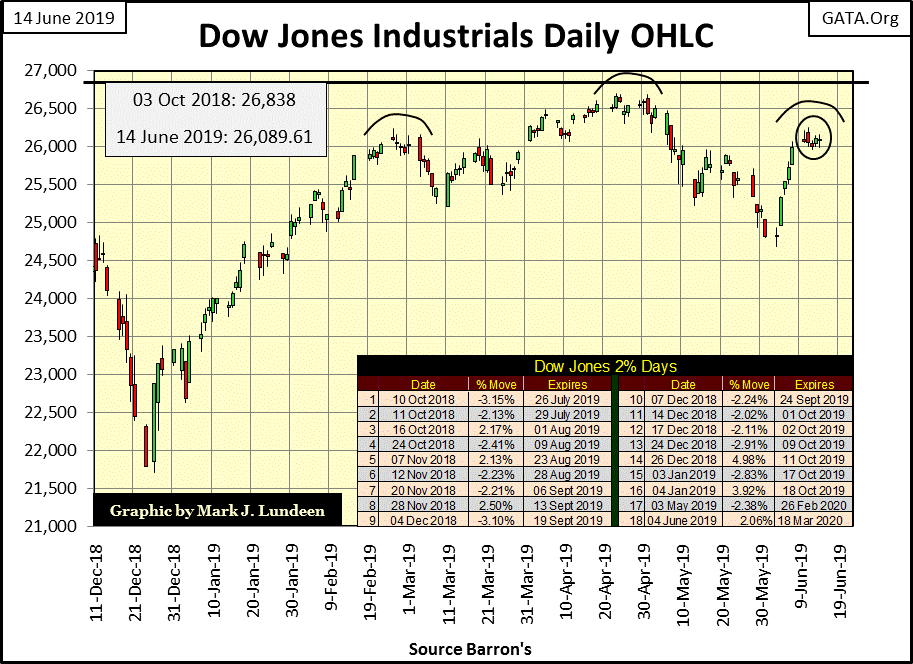
Currently I’m a bear on the Dow Jones, so I’m expecting the next move will be down to test the low of May 31st (24,815) in the weeks to come. For one thing, the Dow Jones hasn’t done much since it bounded off its low of December 24th, an 18% correction from its last all-time highs of October. All January and February the Dow Jones advanced with enthusiasm, but then came March and April, followed by May and June, and we now have a head and shoulder topping formation in the above Dow Jones daily bar chart.
Seeing a head and shoulders formation doesn’t guarantee future market declines. But seeing how the market has advanced since March 1st invites questions of the bulls’ ability to take out the Dow Jones all-time highs of last October.
So it’s a coin toss between the bulls and Mr Bear; heads and the bulls take the Dow Jones into new all-time high territory, tails and Mr Bear takes the Dow Jones below its lows of May 31st, and I’m betting on Mr Bear.
I’m still on record believing the coming bear market will be a massive deflationary market event that may surpass the 89% market decline of the Great Depression bear market. The Federal Reserve System has created massive levels of debt that must be serviced, and as the economy today is carrying its burden of debt, few people dwell on this topic.
It was much the same for the mortgage market before the sub-prime mortgage market became a crisis. But should the economy slide into a recession, debt defaults will begin a vicious circle of defaults deepening the recession, and the deepening recession increasing the number of debt defaults. But the economy isn’t in a recession just yet, and until it is, we can’t rule out the possibility of seeing the Dow Jones at new all-time highs.
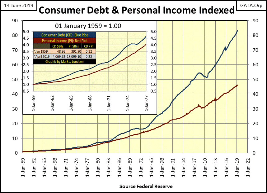
A frequent theme of mine is the growth of debt in the economy outstripping the economy’s means of servicing it. So, this week I thought I’d go back to my sources and create some charts illustrating this problem. The first is consumer debt (Blue Plot below) and personal income (Red Plot below) indexed to January 1959 = 1.00. Why January 1959? Because that’s as far back as the St. Louis Fed has data on personal income.
As these plots are indexed it’s self-evident how in the past sixty years consumer debt has expanded by a factor of 83.13, while personal income has expanded by only a factor of 46.19. To see the dollar values these factors are based on I have a table in the chart insert. Since 1959, consumer debt has increased from $49 billion to $4,073 billion.
That’s a big increase, but it’s not overwhelming personal income. In 1959 personal income was $392 billion, and as a ratio to consumer debt (CD/PI column) in 1959 consumer debt was only $0.12 for every dollar of personal income. Today this ratio of consumer debt to personal income has risen to only 0.22, or $0.22 of debt for every dollar of personal income.
But what exactly is contained in these data series? Does consumer debt also include mortgages, sub-prime auto and school loans? Maybe, and then maybe not. It would be nice if the Federal Reserve broke down this data into individual categories.
Here’s a chart plotting the ratio of consumer debt to personal income, or the CD/PI column seen in the table above.
From 1959 to 1993 this ratio remained bound between 13% & 17%, but has since increased into the low 20% range. What’s changed? Something has, and I suspect it’s those consumers with the lowest personal income increasing using credit-card debt to subsidize their living expenses.
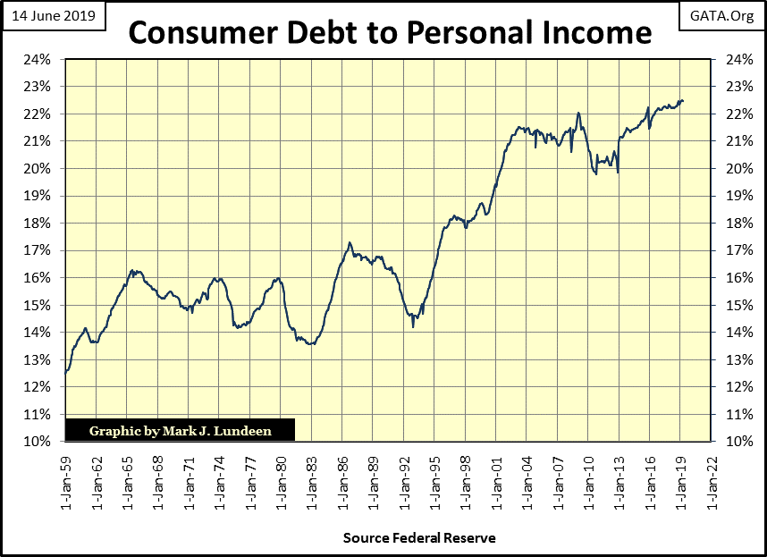
And that’s a big issue, as not all consumers are created equally. Someone with a post-graduate degree in gender studies from Harvard burdened with a six-figure school loan is most likely having problems servicing their debt, while a grandchild of Warren Buffett most likely isn’t carrying any school related debt after their graduation.
So, just looking at the ratio of consumer debt to personal income is a bit misleading, as the people receiving most of the personal income most likely have the least in consumer debt, while those carrying most of the consumer debt have the least in personal income.
But that doesn’t mean the wealthy are isolated from the growing debt burdens carried by the less affluent.
Most people see debt as something they must make monthly payments to. But successful people see debt as something that pays them a monthly or annual income. This makes those who receive income from debt vulnerable to counter-party risks should the economy slow down and unemployed debtors’ diminished income prove insufficient to service their debts.
With consumer debt being at $18 trillion as of April 2019, (latest data from the St. Louis Fed) that’s a lot of counter-party risk should even only 20% of the $18 trillion ($3.6 trillion) default in a coming recession.
Let’s compare consumer debt with corporate debt (chart below). As the St. Louis Fed has this data going back to October 1945, the factor increase for consumer debt below will be different from that above.
Consumer debt (Blue Plot) since 1945 is increasing at an alarming rate, as has corporate debt (Red Plot). But the difference between the two is that consumer debt is consumptive debt, debt that doesn’t create capital, while corporate debt is debt taken on intending to produce future profits for the corporation.
Or so it was before 2008. Since the credit crisis, corporations have taken on debt for the purpose of funding their share buy-back and dividend programs. How large a percentage of the total corporate debt for April 2019 had funded these programs that only temporarily supported their companies’ market capitalization I don’t know; but it’s significant.
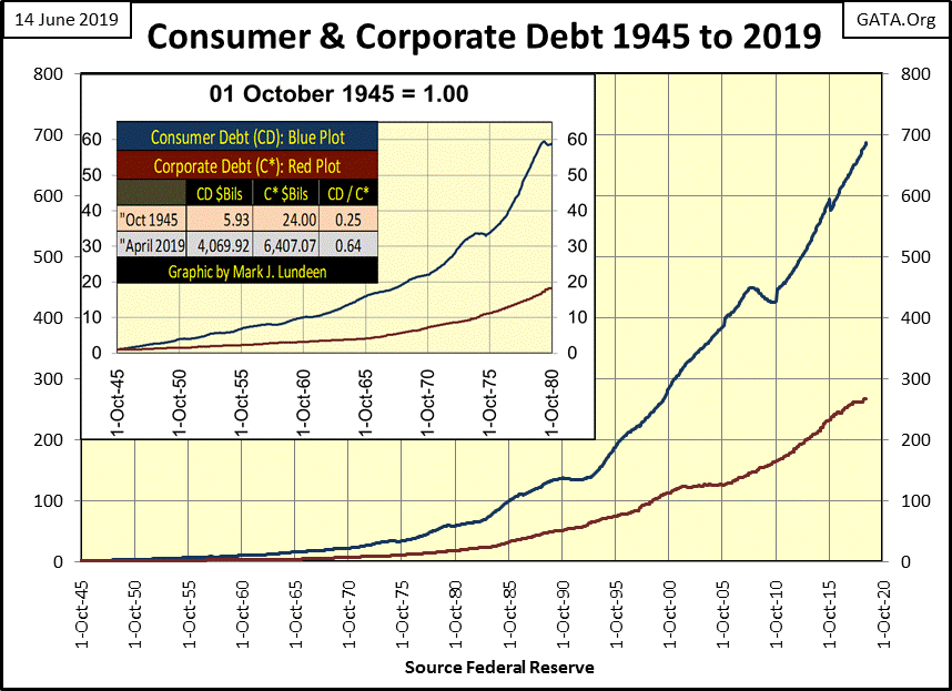
Regardless of what consumers and corporations have spent this borrowed money on since 1945, seeing consumer debt increase by a factor of 686, and corporate debt increase by a factor of 266 is alarming.
Two charts up we saw how consumer debt is increasing faster than personal income, a situation that is problematic. But what can we compare corporate debt to, to see if corporations assumption of debt is greater than their ability to service it?
In the table below I used the Dow Jones’ earnings and dividend cash payouts. Keep in mind the Dow Jones is only thirty large blue-chip companies. But earnings and cash dividend payouts for the Dow Jones are the only data I have that could serve as a metric of business income required to service corporate debt.
There is a big difference between earnings and dividend-cash payouts, as earnings are whatever accounting standards say they are, and since 1945, accounting standards have declined. I’m not an accountant – far from it. But I am widely read on the markets and business, which leads me to wonder if the Dow Jones earnings of $1,426.86 seen in April 2019 were accounted by the same standards of the $10.46 of October 1945; how much of the $1,426.86 would remain?
Dividend cash payouts are different, as corporations must have the cash deposited in the bank before they send out the dividend checks to their shareholders. But the same is true for the checks corporations must pay out to their creditors, the people who own the $6.40 trillion dollars of corporate debt as of April 2019. All of these checks must be funded by corporate earnings.
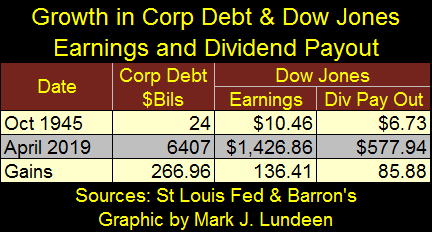
Anyway, as with consumer debt and personal income, growth in corporate debt since 1945 is increasing at a faster rate than the earnings for the Dow Jones, and I believe that’s a problem. A bigger problem is that during the credit-crisis of 2007-09, earnings for the Dow Jones went negative for the first time since 1932, though they didn’t stay there for long thanks to the Bernanke Fed’s “injection” of trillions of dollars into the financial markets beginning in late 2008 via his quantitative easings.
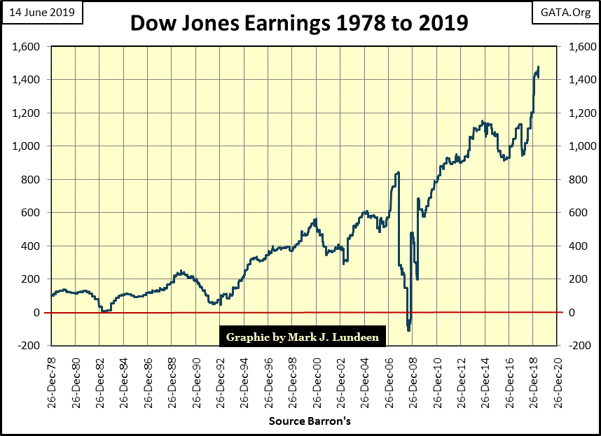
But what would the earnings for the Dow Jones have done if Doctor Bernanke had not supported market valuations with massive “injections” of monetary inflation from 2008-2014? I doubt they would have recovered, and then surpass their highs of October 2007 just a few years after they went negative. And if the earnings for the Dow Jones (my proxy for the broad-stock market) remained suppressed during the last decade, how much of the corporate bond market would have been defaulted on?
We’ll never know as Doctor Bernanke was successful in reflating the financial markets, but in doing so he only put off the still pending terrible day of reckoning.
But that’s just me talking about stuff no one else is interested in. What many “market experts” are interested in is how the stock market remains near its all-time highs, as seen in the table below. And again this week the NASDAQ Insurance index and the Dow Jones Utility Average were making market history by breaking above their old all-time highs (BEV Zeros / 0.00%).
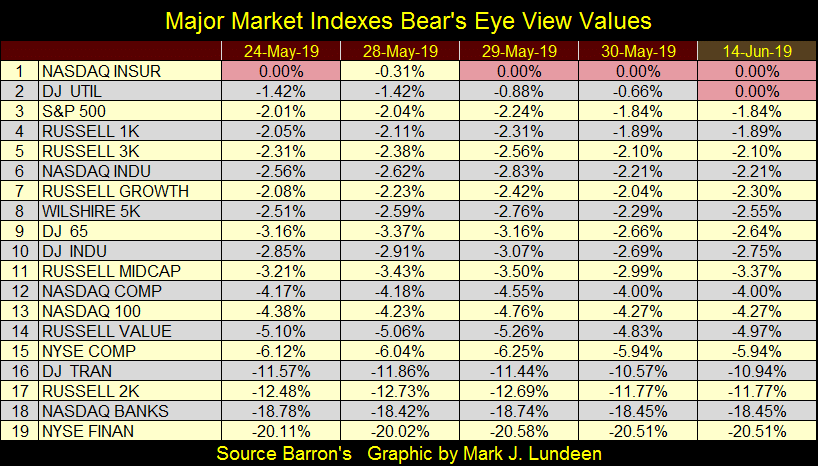
At Friday’s close indexes from #3 down to #14 in the table above were within 5% of their last all-time highs. How hard is it for the bulls to close a small gap like that and push these indexes into market history?
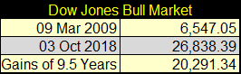
It shouldn’t be hard at all, unless after ten years of advancing from the market’s credit crisis lows of March 2009 the bulls are now exhausted (see table below on the Dow Jones Bull Market). Here’s my view on this geriatric advance that began in March 2009; after pushing the Dow Jones up from 6,547.05 on March 9th 2009 to 26,838.39 on October 3rd 2018, a gain of 20,291 points, these aging bulls are exhausted.
Even if they are successful in pushing the Dow Jones, and the other indexes seen above into new all-time highs in the months to come, let’s face it; the best of the post credit-crisis advance is now best seen by looking at the market’s rear-view mirror. For that reason we should anticipate seeing a major bull market elsewhere, like a bull market in gold and silver.
Here’s gold’s BEV chart; gold closed the week above its BEV -30% line. That’s good, but it’s been there before only to be beaten back by the bears in the gold cartel. Anyway, the key in gold’s BEV chart is its BEV -27.5% line ($1360), and gold is still struggling with it.
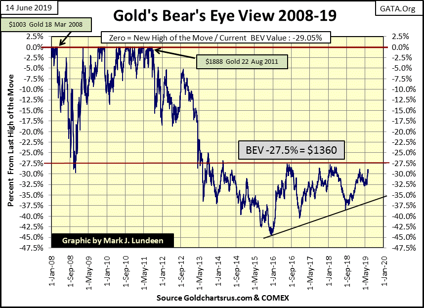
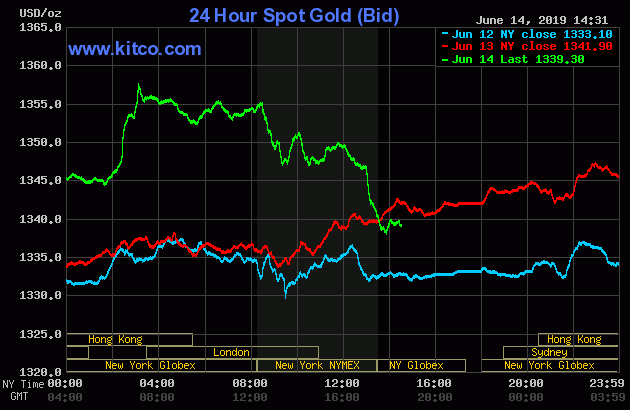
But the values seen in gold’s BEV chart above are New York daily closing prices. Gold in Hong Kong trading on Friday (Green Plot below) almost took out the $1360 level in Kitco’s spot price chart. Then as expected, London and New York took the price of gold down below its Thursday’s close.
I wonder how many tons of paper gold London and New York had to flood the market with to accomplish that?
Come Sunday night gold begins a new week of trading, and I’ll be looking to see if the bulls are able to take on the $1360 line of resistance once again.
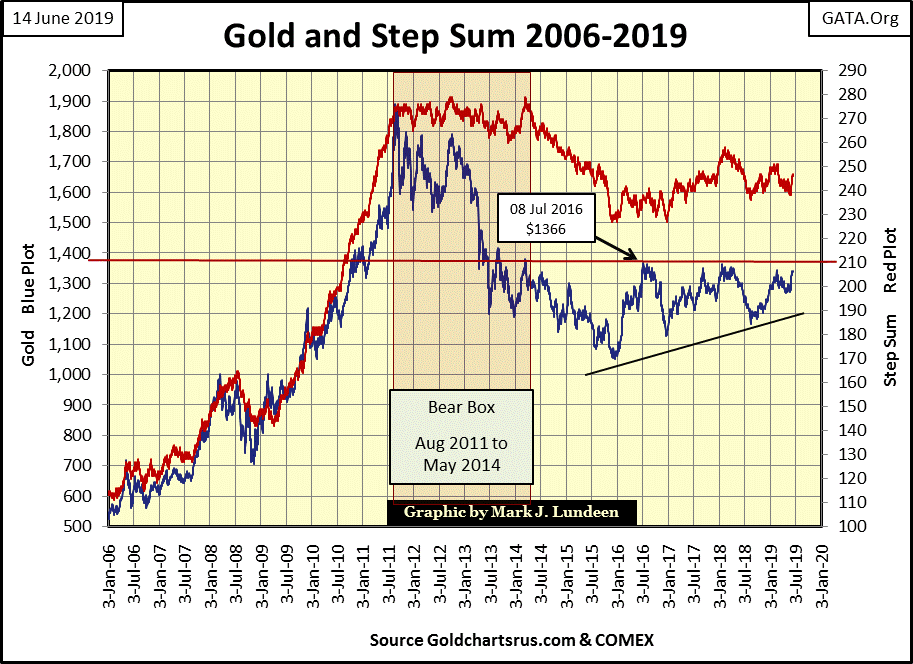
Next is gold’s step sum chart, which in June 2019 remains attractive, a positive chart for us bulls.
It has been eight years since gold saw its last all-time high of $1888 in August 2011. During the first three years of the post August 2011 decline gold and its step sum were in a huge bear box, which closed in May 2014. Box closed, market sentiment (step sum) fell in line with market reality (the declining price of gold), until both plots hit hard bottoms in December 2015.
That was an excellent time to buy, but after gold’s bear box closed, followed by a nineteen month collapse in the step sum (market sentiment), few people wanted to hear anything good about gold or silver. But then that is always true about hard bottoms in a market.
Since December 2015, gold’s upper limits has been about $1360, its lower limits being defined by a rising trend line. This is a very bullish chart pattern, and after three years it’s about time for gold to break out, and rise above its $1360 line of resistance with some enthusiasm. Hopefully we gold bulls will have a Very Merry Christmas in 2019.
Not much has changed in the step sum chart for the Dow Jones (below) in the past week. However, since late April the Dow Jones has been decoupled from its step sum, and in the weeks to come I could put these two plots in a bear box from the April 23 line to the present.
But instead, I’m going to wait to see what happens in the months to come. If the Dow Jones breaks below its lows of December 23, and if we are in a bear market, this will happen. I’ll then reactivate the failed bear box and pull its right border to the present date.
For the bulls, there is so much wrong with this chart. Remember how I identified a bearish head and shoulders topping patter in the daily-bar chart above? Below we see that head and shoulders formation develop after the bear box failed, within a larger head and shoulders formation spanning back to January 2018; can you see these two head and shoulders formations?
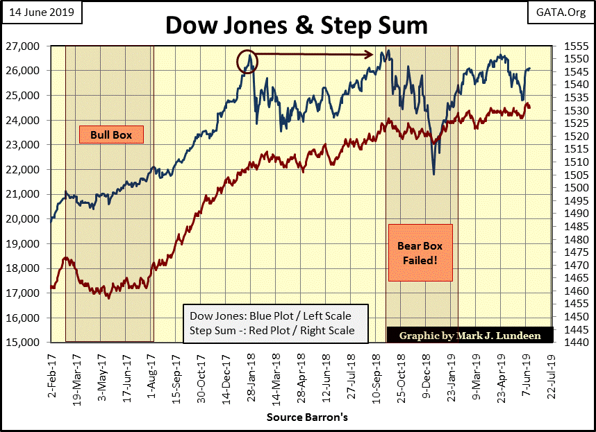
Then the Dow Jones’ rising step sum tells us that market sentiment remains very positive, and has been since January 2018. The Dow Jones valuation above (Blue Plot) saw a 12% correction in March 2018, and then an 18% correction in December 2018 as its step sum blissfully continues it rising trend the entire time. Market sentiment is fearless in June 2019.
After the plus 20,000 point advance in the Dow Jones since March 2009, we may be looking at the beginning of a historically bodacious step-sum topping formation. But that’s assuming the Dow Jones will break down from its current level as its step sum refuses to follow it down, only to collapse later as the bear market approaches it climatic finish.
A lot could go wrong that would cancel my epic bear box from hell. And big bear markets don’t always produce bear boxes in a step sum chart. But I’m looking at the Dow Jones step sum chart above, and week after week it only gets more intriguing.
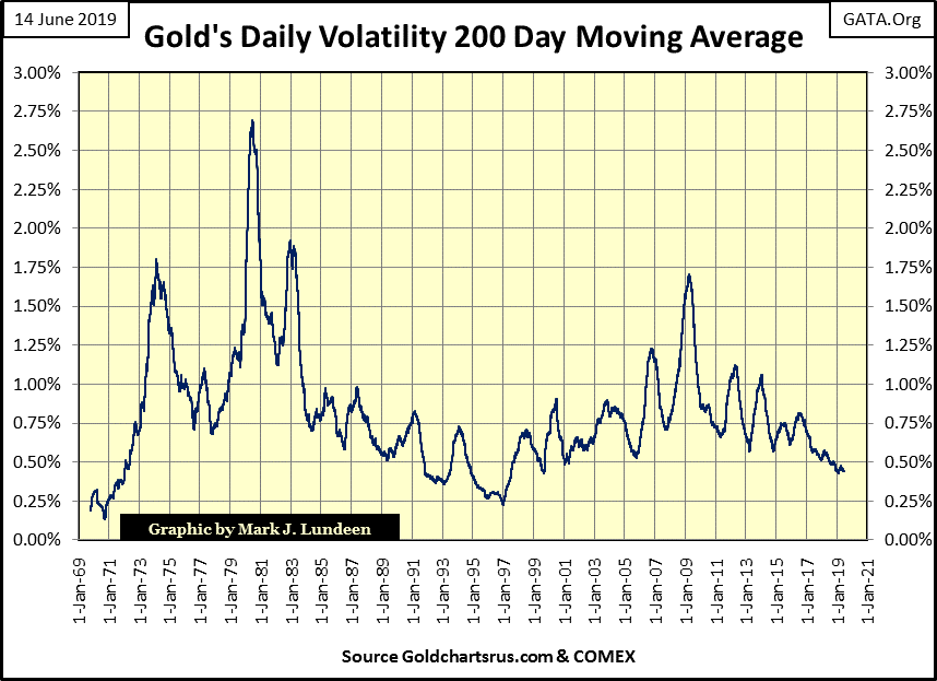
Gold’s step sum table below is looking interesting. On Thursday its 15 count saw a +9, or only three declining days (twelve advancing) in a running 15 day sample. One would think with advancing overwhelming declining days, gold should have easily cleared its $1360 line of resistance and possibly broke above $1400. Why it didn’t is seen in gold volatility’s 200 Day Moving Average; in the past twenty-five days fell down to 0.44% from 0.45%.
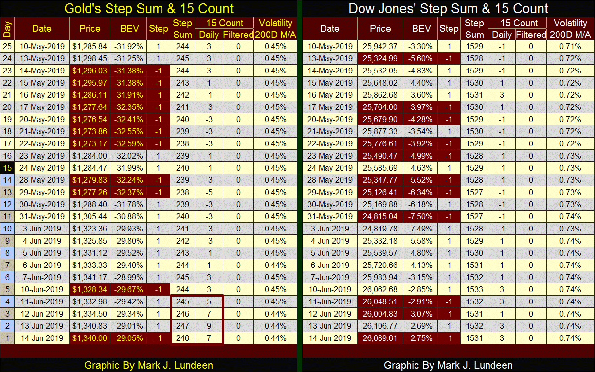
There is nothing magical about either 0.44% of 0.45%, except both values are at the lower end of gold’s volatility seen in the chart below. Gold hasn’t seen its daily volatility this low since the end of its 1980-2001 bear market; twenty years ago.
The stock market likes low volatility, in fact high daily volatility with the stock market is associated with deep bear market bottoms. But gold and silver are different, with low volatility markers of boring markets that deliver little to either bull or bear, markets like the one we have now; while markets with rising daily volatility provide excellent profits for gold and silver bulls.
The lesson to be learned from the chart below is when daily volatility for gold once again begins to rise to its 1.00% line, gold (and silver) will once again be moving to new all-time highs. Until then, even seeing days with a +9 for gold’s 15 count, like last Thursday, won’t provide much in the way of excitement for us bulls.
Here’s a video for Rodney Dangerfield's first economics class; it’s a funny clip. However, in our world where college-educated young peoples’ overwhelming concerns has to do with global warming and how many genders “science” has identified in the human race, Rodney shows just how puffed up professors can be.
Higher education really was much better when colleges and universities were self-funded, before the US Government implemented its school loan program.
https://www.youtube.com/watch?v=YlVDGmjz7eM
Remember Anthony Wieners’ laptop? The laptop the NYPD confiscated from Congressman Wiener on a raid for him sexting with underaged girls? It had a file in it labeled “life insurance” that internet scuttlebutt claims contains many compromising video clips of powerful and influential members of Washington’s elite having sex with under age children. The video with Hilary Clinton and Wiener’s wife Huma Abedin began as a rape film with an underaged girl, and ended as a snuff film, or so scuttlebutt would have it.
Is this true? As I haven’t examined Wiener’s “life insurance” with the NYPD I’m not in a position to say if it is or isn’t. But the clip below is interesting, as Members of Congress are already alleging AI doctored videos are about to become public, that they are all fabrications not to be believed.
When people, especially people of power and influence begin denying things no one has accused them of, well something just isn’t right. If the NYPD confirms these videos are legitimate, I’d believe New York’s finest before taking a Member of Congress’s word that any compromising video was faked.
And people wonder why Washington hates President Trump, he really does want to drain the swamp.
https://apnews.com/4b8ec588bf5047a981bb6f7ac4acb5a7
Mark J. Lundeen
********


