Market Turning Points


Current Position of the Market
SPX: Long-term trend - Bull Market
Intermediate trend - Is the 7-yr cycle sketching an intermediate top?
Analysis of the short-term trend is done on a daily basis with the help of hourly charts. They are important adjuncts to the analysis of daily and weekly charts which ultimately indicate the course of longer market trends.
PAUSE OR SHORT-TERM LOW?
Market Overview
Let’s start with a definitive statement: as of Friday’s close, there is no sign that we have ended the decline and started a reversal.
Last week, SPX continued to decline, slightly exceeded my second projection of 2046, and found support at (about) the 2040 level which has become the do-or-die decision point for the decline. If the index cannot hold it, lower lows – perhaps much lower lows -- are expected. If it holds, we could start a rally which could take us to a new high.
We can find several reasons for a potential hold. One is that this is the area of a former near-term low made on 2/09. SPX tested that level on a retracement; it held, and the index extended its rally to make a new all-time high. Another is that the index has reached the trend line drawn from 1820 to 1980. And finally, by the time we got there, the bears were spent and needed to catch their breath. It’s easy to see why we need at least a pause at that level, just as it is understandable why breaking below it could take the index to much lower prices before it finds better support. This possibility is fully confirmed by the P&F chart count which is saying that it has only reached a phase count and not the full extent of the distribution phase.
It is possible that the market will take a few more days to make a decision…perhaps until the Fed meeting on Wednesday.
Indicators survey
The SPX weekly has experienced its third consecutive weekly decline. Both momentum oscillators have also declined to a new low, both are in a bearish cross, but the MACD is still positive. Until it turns negative, there is no sign that the bull market has made a top. At best, we have started an intermediate decline.
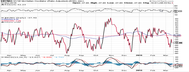
Breadth, as represented by the McClellan oscillator (which is a daily indicator courtesy of StockCharts.com) made a new low on Wednesday and showed some weak positive divergence on Friday. That was enough to suggest that we could have started a consolidation base.
As was suggested earlier, there is still enough potential count to send us to new lows in the P&F charts.
The longer-term 3X chart may be engaged in making a large rounding top formation. Perhaps this is due to the topping of the 7-year cycle which has not quite started its declining phase, yet.
Chart Analysis
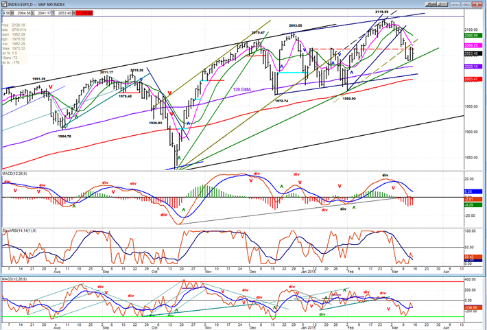
The weekly SPX chart changes slowly and there is no point displaying it every week. You can refer to the “Indicator Survey” above, to visualize what it is doing, which suggests that we are currently in a short-term downtrend. It will be shown again when there is a change of pattern.
On the daily chart (courtesy of QCharts.com, as well as others below), I have drawn three slanted trend lines. The first two provided brief support followed by a new high (of a much different scale) before breaking. After making a new high the price action created a third trend line which is currently being tested. The loss of momentum above the last trend line is very noticeable, but not nearly as noticeable as is the angle of each trend line. Price cannot sustain a loss of momentum forever since it indicates that existing buyers are being met with an increasing number of sellers every time it makes a new high. At some point, a reversal will occur which will start making new lows instead of new highs. The trend lines are exhibiting the “fan principle” but more often than not, the third trend line also marks the end of the fan (the third time is charm!).
If the third trend line is broken, prices could find support in the range where they have found it before, on the (purple) 120-DMA and just above the (red) 200-DMA. This could generate a new rally which may or not make a new high. Or, they could continue lower to re-test the October low of 1820. However, our current focus should be on whether or not the current support level will hold. This includes the trend line and the sizeable congestion area to the left of it which has only begun to be penetrated. So, even if we break the trend line, we could still benefit from that congestion level which is buttressed by two important moving averages at its base.
If we move lower and positive divergence becomes clearly visible in the oscillators, we can expect that those MAs will hold once again. And this is when it should start to get interesting, because if we get a rally which fails to make a new high before the index turns down again, it will be time to batten down the hatches and expect a potentially much more severe decline. I mean, after all, Primary wave IIIs (or Vs) do not grow to the sky! Currently, there is no clearly visible positive divergence in the ocillators, which leads us to conclude that the current decline is probably not over.
We’ll use the hourly chart to help us determine what chance we have of holding Wednesday’s low.
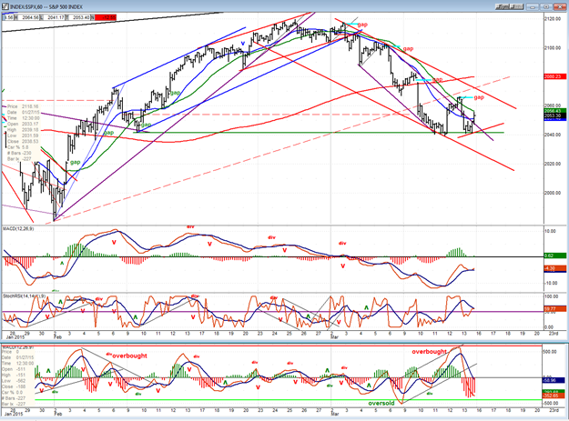
Until Wednesday, price trends were getting steeper and steeper but by then, making new lows became more and more laborious. This encouraged the bargain hunters to step in on Thursday to create a 25-point bounce. Friday must have disappointed the perma-bulls because the SPX retraced all but 2 points of Thursday’s gain. However, it did not make a new low and, after some hesitation, it even rallied a dozen points into the close. That, in itself, would suggest that we have found temporary support for the reasons mentioned above.
Was there a hint that this would take place? The momentum indicators certainly suggested that the test of Wednesday’s low was likely to be successful. Look at the positive divergence! On the other hand, the A/D oscillator fully reflected the price weakness and this is the one that really counts! It told us that there was still some heavy selling in that test of the low.
Getting back to the price chart, we can see that a secondary (purple), steeper channel was formed after the decline started. That showed that sellers were piling in. However, on the first rally, prices went outside of that channel, and by Friday’s close even more so. We now need to watch the on-going price action to determine whether this is only a pause in the decline or a more important low. The index should not exceed 2080 if it keeps pushing up over the next three days if it is to remain a rally in a downtrend. Beyond that, this becomes questionable. Traders may find something negative in the Fed’s report on Wednesday to keep the decline going.
Sentiment Indicator
I have decided to eliminate this indicator from my newsletter. I find it much too vague to be of any use.
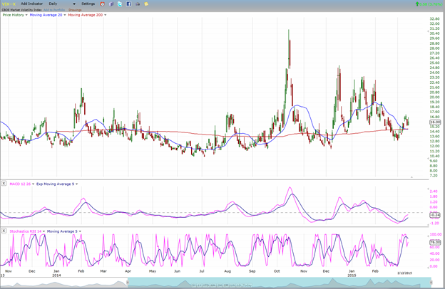
VIX (NYSE Volatility Index) - Leads and confirms market reversals.
VIX is only one of several other leading indexes (notably IWM and XBD) which are out of sync with the market decline. In fact, there is so much disparity that it’s a wonder that the SPX has been able to decline this far. It is probably because it is influenced by oil stocks that it has fallen so much relative to other indexes which are not affected as by them. Note that the NYA is also showing similar weakness. In any case, I believe that the entire market will have to show more coherent weakness in order to reach substantially lower lows.
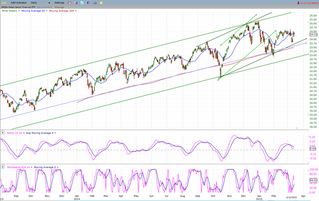
XLF (Financial Sector SPDR) - Historically a market leader.
XLF, which is probably one of the very best leading indexes, is also showing some deceleration. In addition, since it failed to make a new high on its last attempt at rallying, it is now showing some short term relative weakness to the SPX. This could be an early warning, but it would have to start an actual declining trend to confirm that market weakness is ahead. We should be aware, however, that in 2007 XLF reached 38, and that its high for this bull cycle has only been 25, so far. If it can’t get any higher and it is truly a market leader, what do you suppose this means for the stock market in the weeks and months ahead???
And yes, I mentioned that last week XBD made a bull market high of 189 (which could put it at the end of it run). Consider, however, that in 2007 it reached a high of 268!!!
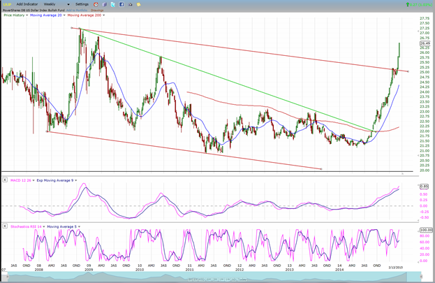
UUP (dollar ETF)
This 8-year weekly chart of UUP is probably more representative of what the USD is really doing. Bear in mind that the dollar is currently at 100. Unquestionably, it has already had a substantial run but, to put things in perspective, its Point & Figure chart shows that the degree of accumulation that it has built over the past 7 years entitles it to a move to 140. So don’t expect its demise to occur anytime soon. Its first significant consolidation could take place when it reaches 110. If it is currently the cause of the market’s headache, you might consider that this could turn into a minor migraine before it gets getter.
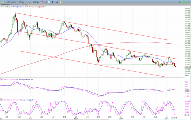
GLD (Gold trust)
There is no question that gold is also being affected by the dollar’s increase in value. So, if GLD is waiting for the dollar to get to 110 before turning up, how much lower could it get by then? The Point & figure chart suggests around 100. I don’t know if the dollar will coordinate its reaching of 110 with GLD’s 25-wk cycle low which is due around May 1st. You might keep that possibility in mind and its consequences!
You might also ponder what the dollar priced at 140 could do to the price of gold.
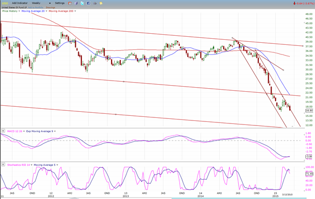
USO (US Oil Fund)
And then there is USO, which I suggested a few weeks ago would have a temporary pause at 16 before going to 13 and, eventually 8. So far, so good! Remember that USO’s price, besides reflecting the present oil glut in the world, is also affected by the dollar’s behavior.
Summary
I have endeavored here to give you a short-term and a longer term perspective about the market, primarily through the analysis of SPX charts. But also by suggesting that if two of the primary leading indexes (XLF and XBD) are exhibiting significant relative weakness to that index, it is not the short term synchronization of the market components that we should worry about; but rather, the long term one.
And if the dollar’s Point & Figure chart’s suggestion that it is capable of tacking on another 40% gain to its current price turns out to be correct, well … you can draw your own conclusion about how this would affect the world’s economies…especially if WTIC’s next target is 26 – and perhaps lower!
********
FREE TRIAL SUBSCRIPTON
Market Turning Points is an uncommonly dependable, reasonably priced service providing intra-day market updates, a daily Market Summary, and detailed weekend reports. It is ideally suited to traders, but it can also be valuable to investors since highly accurate longer-term price projections are provided using Point & Figure analysis and Fibonacci projections. Best-time reversal estimates are obtained from cycle analysis.
For a FREE 4-week trial, send an email to: [email protected]
For further subscription options, payment plans, weekly newsletters, and for general information, I encourage you to visit my website at www.marketurningpoints.com . By clicking on "Free Newsletter" you can access the latest newsletter which is normally posted on Sunday afternoon (unless it happens to be a 3-day weekend in which case it could be posted on Monday).
The above comments and those made in the daily updates and the Market Summary about the financial markets are based purely on what I consider to be sound technical analysis principles. They represent my own opinion and are not meant to be construed as trading or investment advice, but are offered as an analytical point of view which might be of interest to those who follow stock market cycles and technical analysis.

When Andre Gratian was a stock broker years ago, a friend introduced him to technical analysis of the market. Consequently, it is not an exaggeration to say that Andre fell in love with this approach! Ever since then, it has become an increasingly important part of his professional life. Gratian has studied the works of Wyckoff, Edwards & Magee, Edward J. Dewey (cycles) and many others. However, one of my most profitable undertaking has probably been to study Point & Figure charting, which he finds invaluable in analyzing stocks and indices. If he were restricted to one methodology, this is the one that he would choose. This well-rounded background has given him what he feels to be a special insight into the stock market, facilitating the recognition of meaningful patterns and the ‘turning points’ in all trends, whether they be short or long term. Andre feels very comfortable discussing the stock market and passing on meaningful information to others. His subscribers include individuals and money managers throughout the world. Moreover, his Newsletters are currently published on several financial sites, here and abroad.


