Market Update For Early August


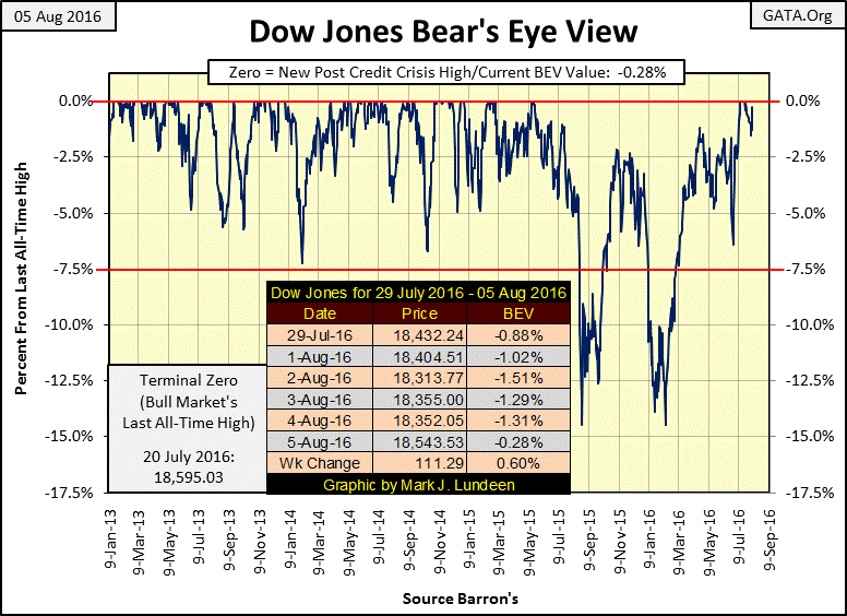
The last all-time high for the Dow Jones (BEV Zero in the chart below) was a few weeks ago on July 20th. As per the table on the chart, the Dow ended the week not far from making another. It could do so next week, and then may not.
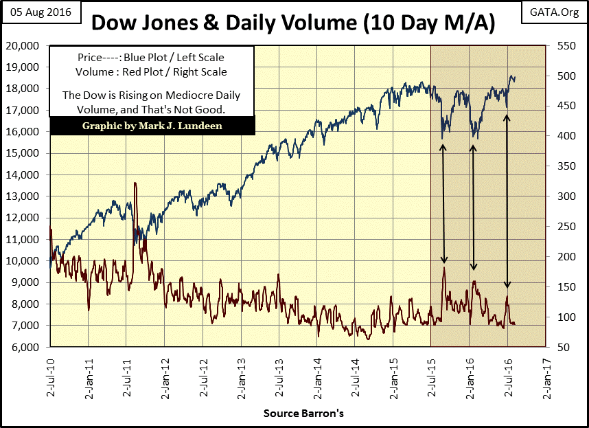
I don’t have a lot of faith in this market advance though. For one thing, trading volume for the Dow Jones Index stinks. I don’t want to bore my readers by covering the same subjects week after week. But week after week, month after month, and now year after year, there has been something very wrong with this market’s trading volume that needs to be pointed out.
Trading volume is the prime indicator of investor demand for shares trading in the stock market. Increasing volume indicates increase demand; declining volume indicates decreasing demand. Even so the relationship between the market valuation for the Dow Jones Index and its trading volume isn’t bolted together. It’s possible seeing a new all-time high valuation for the Dow Jones on trading volume that isn’t historic. However, record valuations for the Dow Jones, or anything else, should be seen on rising volume (rising demand).
Since January 2000, at the top of the high-tech bubble, trading volume and stock market valuations became inverted. The chart below only goes back to 2010, but what we see below; rising market valuations occurring on declining volume, and declining market valuations occurring on rising volume, a fact of life for the past sixteen years that violates the law of supply and demand.
It’s not difficult understanding what’s going on. Watching CNBC for a few hours tells the tale; the Federal Reserve, with the full knowledge of the Federal Government, and the financial media, is manipulating the stock market by supporting valuations during market declines with monetary inflation. This fact doesn’t bother most people, but if history is any guide, it should.
History is littered with ruined empires that were brought down by debasing their coin of the realm. The United States and the European Union won’t prove to be any different. But before Mr Bear tosses us on the ash heap of history, we may see the Dow Jones at a new all-time high in the near future.
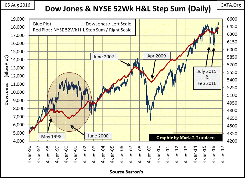
Below I’ve plotted the Dow with a step sum of the NYSE 52Wk High –Low Ratio (Red Plot). Days with more 52Wk Highs than 52Wk Lows are a +1; days with more 52Wk Lows than 52Wk Highs are a -1. The step sum is constructed from this single item Advance Decline data, which shows that since March of this year the NYSE has seen many more trading days with more 52Wk Highs than 52Wk Lows.
I guess that’s a good thing, but hardly a reason to jump back into the stock market. For one thing, with the exception of a few months last year, the step sum for the NYSE 52Wk H-L Ratio has been going up since April 2009, for over seven years. This market advance is getting very stale. I know market bulls don’t want to hear that, but that’s how I see it.
Here’s the Dow Jones (Red Plot below) with its 200 count (Blue Plot). The 200 count being the number of days the Dow has moved 2% or more (up or down) from a previous day’s closing price, within a running 200 trading day count. I call such days; days of extreme market volatility. At the end of this week, the 200 count spans from October 21st of last year. The Dow saw some 2% days last summer, but those are now all removed from the last 200 trading days. The current nine in the count are from last winter; the first on December 3rd, the last on March 1st.
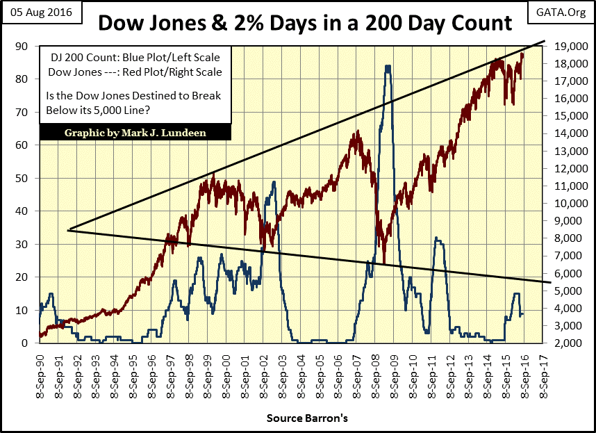
Will the Dow’s 200 count go back to zero? If the Dow Jones doesn’t see a 2% day by December 12th, that’s exactly what will happen. So, it all depends on Mr Bear. If he’ll allow the bulls (central bankers) to take the Dow Jones up above 19000 and then some, seeing a zero in the 200 count is very possible. But historically, the months of September and October are often the starting point for big bear markets. If once again we see the Dow Jones making large daily moves from previous day’s closing prices (2% or more, up or down is all good for Mr Bear), it will place the market under a lot of stress as the Dow Jones’ 200 count increases.
The following chart shows that for the past 116 years, identifying periods of market declines is a simple as that. Since 1900, seeing a value of something over 10 in the Dow’s 200 count has been a consistent feature of Dow Jones’ market declines.
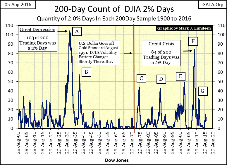
At the bottom of the high-tech bear market (E above), the Dow’s 200 count saw forty nine extreme days, and during the credit-crisis bear market (F) the 200 count shot up to eighty-four days of extreme market volatility. At the Great Depression’s bottom in 1932 (A), the 200 count increased to 103, where every other day suffered from extreme volatility. But bull markets are different, where the 200 count is at low single digits, or even at zero for years.
Looking at the trend lines on the Dow Jones from 1997 to the present (two charts up), technically a market decline to the 5000 level is possible. Practically however, due to the massive amounts of debt corporate American has taken on their balance sheets in the past few years to fund their share buyback and dividend programs, when the economy once again heads into dire-straits, I think we’d be lucky if the Dow Jones finds 5000 a hard bottom.
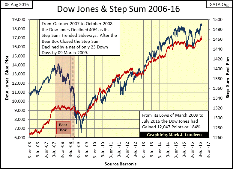
I haven’t shown a chart of the Dow Jones with its step sum for years. That’s because since the credit crisis bear market, the Dow Jones and its step sum haven’t formed any boxes. During the sub-prime bear market we see a whopper of a bear box. From October 2007 to October 2008, the Dow Jones declined 40% from an all-time high as its step sum plot absolutely refused to follow the price of the Dow Jones down. Talk about bullish market sentiment refusing to submit to market reality!
But then we have to realize that this was a time when Dr. Bernanke was in charge of “monetary policy” at the Federal Reserve, and he pretty much was set against having a massive bear market on his watch. No matter, as we can see below, Mr Bear eventually made clear to the good doctor the impractically of his position in the stock market.
At the time, what I found amazing was at the bottom of the second greatest decline in the Dow Jones since 1885, its step sum collapsed by only twenty three net down days. So obviously, even though Dr. Bernanke finally came around to Mr Bear’s view on the market, he wasn’t fully cooperating with the big-furry guy either, not with his quantitative easing of a few trillion dollars injected into the financial system.
Had the “policy makers” not been practicing bear-market interruptus with monetary inflation during the credit crisis, I expect the Dow Jones would have seen a decline of over 70%, and a collapse in the Dow Jones’ step sum of more than just twenty three net down days before the stock market found its natural bottom.
I’ll tell you a little secret about bear market bottoms: at the actual bottom of a bear market, Mr Bear is acknowledged by all as the undisputed victor. Market bulls who dared to challenge him are taken out of the ring on a stretcher. Even market bulls who use inflationary funding for their market purchases, like central bankers are known to do. But when is this going to happen? I haven’t a clue, and it’s frustrating having to wait for this inevitable outcome to happen. But wait long enough and you’ll see it happen along with me and the FOMC.
But while you’re waiting for Mr Bear to be crowned champion of the stock market there’s some good action happening with the gold miners.
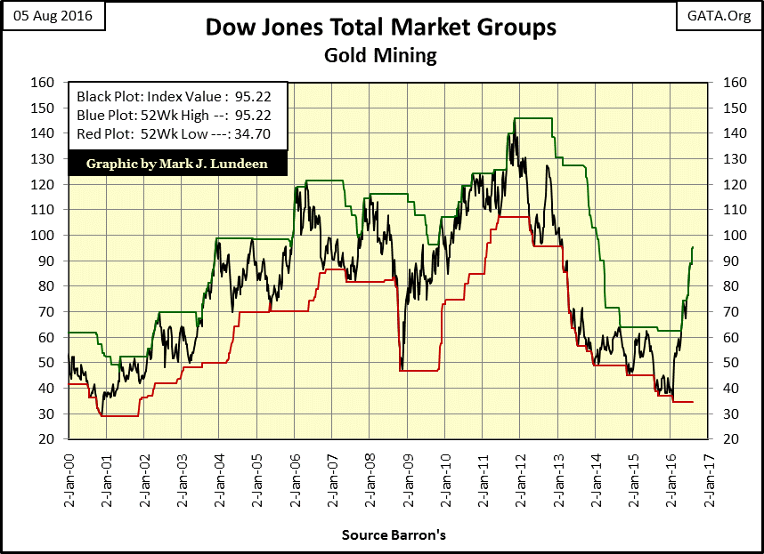
Here’s a chart for the DJTMG Gold Miners. It ended the week at a new 52Wk high. In fact, in the past seventeen weeks, the gold and silver miners have made eleven new 52Wk highs. What’s going on here?
If I had trading volume for the DJTMG, I’m sure we would see volume for the miners exploding as institutional money comes flooding into the precious metals group. Fiduciaries realize investing in physical gold and silver bullion isn’t practical for them. While investing in gold and silver mining is no more difficult than buying shares of any other company that trades in the stock market. So obviously, what we are seeing below is institutional money coming into the gold miners.
As this is such a small sector in the stock market, it doesn’t take much money to move this group up. I suspect there are more fiduciaries looking at this chart too, waiting for a pull back to enter the market. But since Barron’s January 25th issue, the gold miners haven’t given them a pull back. If they wait long enough, the market will give them what they want. But don’t be surprised if it doesn’t happen until this group crosses its 130 level. That is just a guess on my part, but what a chart!
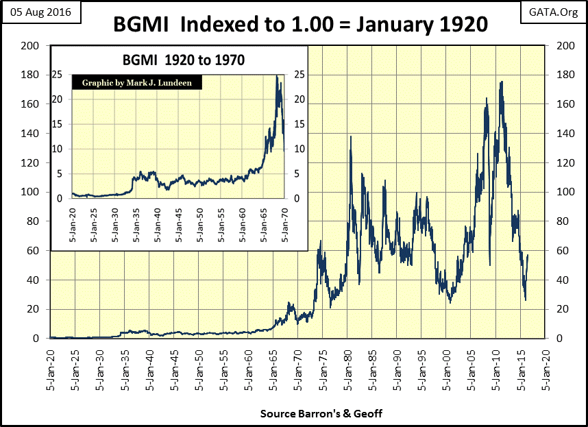
FYI, here’s a historical chart for the Barron’s Gold Mining Index. Like the DJTMG’s Gold Miners above and the XAU, the BGMI has also seen a significant advance since January of this year. Look at its advance off its bottom of October 2008 to its last all-time high of April 2011. When the gold miners want to move, up or down, they move.
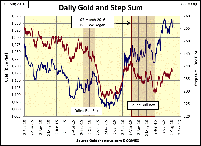
Moving on to what’s happening with gold bullion, we see below how on Tuesday of last week gold attempted, but failed to break above the $1363 daily closing of July 8th. This is no reason for panic, even if the price of gold sees further declines in the coming weeks. Market sentiment (the step sum) is still not convinced the price of gold is going higher, which is bullish.
Being a market prognosticator is a hazardous occupation. Every week I show my readers what I’m looking at; frequently with charts that go back many decades to make my point, however I can still be wrong. But looking at the price of gold with its step sum below, I’m feeling pretty good about what could happen in the next few weeks for gold and silver.
Gold is coming off a market decline of 44% that began in 2011. For bulls in the gold market, the painful memories of that five year decline are fresh. That can be seen in gold’s step sum plot in the chart. However, keep in mind that when looking at the plots of a step sum chart, whenever the two plots diverge, it’s the price plot (market reality) that’s usually the key to future price trends, while the step sum plot (market sentiment) is usually wrong. So, until I see both plots in the chart below breaking down, I’m staying bullish on gold.
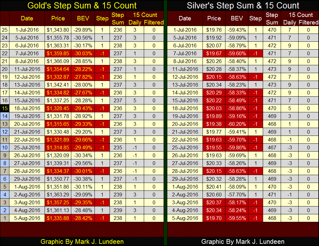
Here’s the step sum and 15 count table for gold and silver. I’d be happier if we saw more days with gold and silver closing up, with gold finally breaking above $1400 and silver $21. But for all the down days, the bears can’t be happy gold isn’t below $1300 and silver below $19.
Take a moment and study the table. The bears may have seen more daily victories than defeats, but for all the effort they’ve made in the past twenty-five trading days, they really haven’t accomplished much. This is especially true for silver. They drove its 15 count from a +9 to a -3, and they could only get silver six cents below where it was on July 1st? And the bears at the end of the week failed to get silver to break below its lows of July 25th.
What happens when the market once again begins a cycle where there are more up than down days? That’s going to happen sometime in the near future, because that’s what markets always do. I expect the bears will soon be forced to accept prices for gold and silver that are higher than they now find acceptable, and that won’t be bad for shares in the gold and silver mining shares either.
Mark J. Lundeen
More from Gold-Eagle


