“Monetary Policy”: Easy And Tight Money


I’m using my Bear’s Eye View chart (BEV - Two Charts Down) spanning from January 1982 to the close of this week to provide a full picture of the Dow Jones’ thirty-nine year advance. What makes this BEV chart so important? Because it was in the early 1980s when inflation flowing from the Federal Reserve stopped flowing into commodity prices, and began flowing into financial-asset valuations, like the Dow Jones.
Here’s a chart plotting daily closes from January 1958 to January 1986, and from January 1966 to January 1982 (sixteen years), where the Dow Jones made five attempts to get above 1000, but failed to stay above 1000. The reason the Dow Jones couldn’t close above, and then stay above 1000 for these sixteen years was because “liquidity” flowing from the Federal Reserve was flowing into consumer prices.
During the last half of the 1970s and first years of the 1980s, CPI inflation was increasing by annual double-digit percentages as the stock market (chart below) did little to motivate investors to invest in stocks.
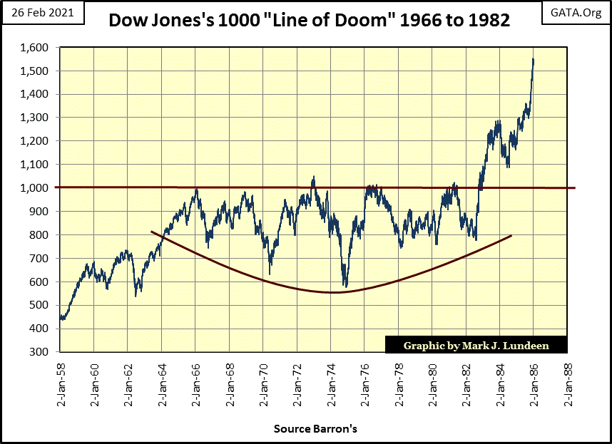
All that changed in 1982, for reasons covered later in this article. It’s informative comparing the Dow Jones in the chart above, when it finally rose above 1000, and stayed above 1000 with its BEV chart below. From a period of market history where the Dow Jones rarely made new all-time highs (above) to when making new all-time highs (0.00% in the chart below), was something investors grew to expect.
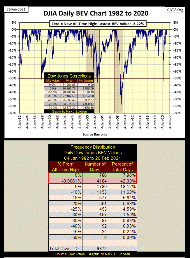
The 0% row in the Freq-Distribution table above tells us exactly how many daily new all-time highs the Dow Jones made since January 1982. To the close of this week – 786 new all-time highs, or almost 8% of all daily closes since January 1982 closed at a new all-time high.
The next row in the table (-0.0001%) contains what I call daily closes in scoring position; daily closes NOT at a new all-time high, BUT WITHIN 5% of making a new all-time high. Since January 1982, 4,184 (42.38%) of all Dow Jones daily closes were in scoring position.
Between the 0% and the -0.0001% rows in the freq-table above, the Dow Jones closed at a new all-time high or within scoring position of one for 50.34% of its last 9,872 daily closings. But we know this doesn’t have to be so, as was the case from 1966 to 1982, when monetary inflation flowing from the Federal Reserve flowed into consumer prices, not the stock market.
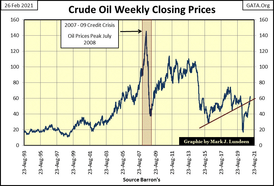
This makes the current rise in basic commodity prices, such as crude oil below a concern, should the flow of “liquidity” from the FOMC once again shift, but this time from financial asset valuations into consumer prices.
Is that the next big thing? Annual double-digit advances in CPI inflation as the financial markets deflate for the better part of the next decade? It’s too early to say that just yet – but I’m thinking maybe that is what’s coming down the track.
If so, news of a pending train wreck hasn’t yet impacted market valuations in the stock market as seen in the table below. The major market indexes I cover were producing some BEV Zeros in the first half of the week, but that stopped on Thursday and again on Friday. This is how markets work; they’re up one day and down the next. The key is seeing the underlying trend that’s driving a market, and right now the underlying trend for the stock market remains bullish.
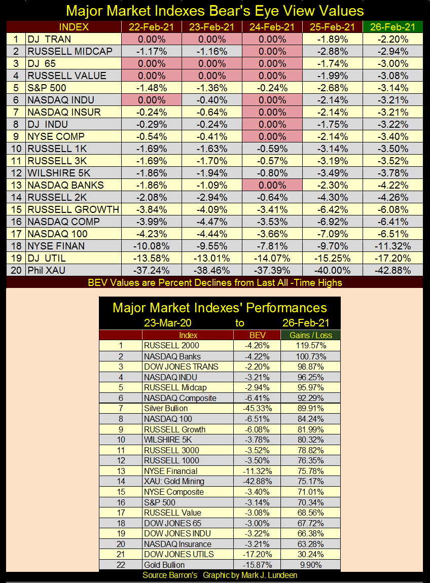
Jeeze Louise; the NASDAQ Banking Index closed the week at #2, up 100% from its lows of last March; that plus it made a BEV Zero on Wednesday. Last summer the banks and NYSE Finance Index were on the other side of this table. How things can change, sometimes for the better.
The chart of the Dow Jones in daily bars (below) is the chart that got my attention this week. I like following market extremes, such as days of extreme volatility, which for the Dow Jones are days the Dow Jones moves >(+/-)2% from a previous day’s closing price.
This week the Dow Jones didn’t see any 2% days, but as seen within the black circle, Wednesday, Thursday and Friday were all big daily moves.
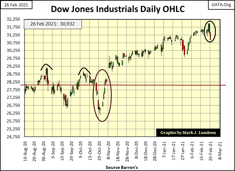
If you look at the Dow Jones in daily bars going back to the late 1920s, bull markets transit to bear market pretty much the same way. They advance in tiny baby steps, and then out of nowhere the Dow Jones begins seeing +/- 2% days as Mr Bear begins clawing back capital gains from the bulls.
This is a pattern on display in the chart above for this week; big daily moves for the Dow Jones isn’t bullish. With the Dow Jones failing to close above 32,000 on Wednesday this week, and with the bond market seeing yields once again advancing (bond valuations trending down), I’d advise investors not to get married to their bullish positions as we move into March 2021.
Can the bull market in stocks survive rising inflation, bond yields? Here’s what history says
Last Updated: Feb. 22, 2021 at 3:53 p.m. ET
“Rising Treasury yields are sending shivers through the stock market, particularly for highflying tech-related stocks. But history shows that when yields are rising “for the right reasons,” tech shares and cyclically sensitive stocks tend to thrive, according to Raymond James.
The right reasons are “improving economic growth and a ‘healthy’ rise in inflation,” said Larry Adam, chief investment officer for the private client group at Raymond James, in a weekend note. And those reasons have driven the yield on the 10-year Treasury not to just shy of 1.4%, or about their highest in a year. Yields also are coming off their largest weekly rise in six weeks.”
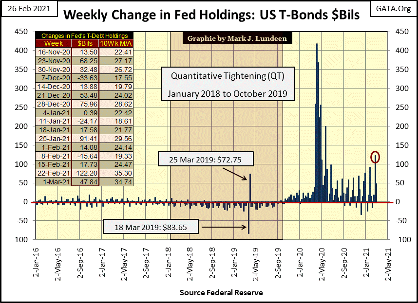
What a joke: “a health rise in inflation.” I got news for Larry Adam of Raymond James; Chairman Powell’s Not-QE#4 seen in the chart below isn’t fostering anything good in the financial markets. It’s only a holding action to hold off the hobgoblins-of-deflation for as long as he can.
Decades ago, before August 1982, investors kept a sharp eye looking out for a shift in “monetary policy” from easy to tight or from tight to easy money. Experienced investors recognized easy monetary policy from the FOMC fostered “economic growth” in the stock market, while tight money took back from the bulls what the easy money gave them.
There was a rule-of-thumb way back then; with three hikes in the Fed Discount Rate came tight money and a stumble in the stock market. It was a good rule, but few investors follow it anymore as things have changed since Alan Greenspan took over management of “monetary policy” at the FOMC in August 1987.
Over the decades things change in the market. Back in the Roaring 1920s and the depressing 1930, when Barron’s covered trends in interest rates they would examine trends in the call-money rate; the rate brokers charged investors for borrowed money in margin-accounts and the prime-rate banks charged big corporations like General Electric.
By the 1960s, call money and prime rates fell out of favor as the Discount Rate managed by the Federal Reserve itself became popular with market watchers to track trends in interest rates. That changed in the second half of the 1970s when Paul Volcker, then Fed Chairman, jacked up his Fed-Funds Rate to over 20%, and kept it there for years, an act of “tight-money policy” no one who had lived through it has forgotten.
But what is easy and tight money?
Normally shorter term money, the Fed-Funds Rate, is lower than longer term money, the yield for the 30Yr T-bond. When it is “monetary policy” is said to be “easy”, how easy depends on how far the Fed-Funds Rate is below the long-term T-bond yield. The credit system is said to be “tight” when short term money (Fed-Funds Rate) is manhandled by the FOMC, above the yield for the T-bond long bond yield.
Decades ago market watchers used the yield from the longest dated T-bond they could get, a system I continue to use today. However, sometime during the Greenspan Fed it became popular to use the yield for the 10Yr T-bond to determine if money is easy or tight.
So, it’s not a rising or declining trend in the cost of money (interest rates and bond yields) but the relationship between the rate of short-term money (Fed-Funds Rate) and long-term rates (US T-long bond yield) that determines whether money is easy or tight;
-
Fed Funds lower than T-long bond yield = easy money;
-
Fed Funds higher than T-long bond yield = tight money.
To best see whether money is easy or tight, we look at what’s called the yield curve. Three examples are shown below. In Barron’s 06 July 1981 issue (Blue Plot) is the tightest money ever seen in US markets, a week where the FOMC increased (inverted) their Fed-Funds Rate 8.68% percentage points above the yield for 30Yr T-bond. Skip ahead and take a look before reading on. The late 1970s and early 1980s was a market era when the entire yield curve was in double-digits.
The amazing thing about this historic yield inversion (and double-digit yields) was that in the main it didn’t result in mass bankruptcy in the corporate bond market, or in personal finance. Nor did this massive 8.68% inversion in the yield curve trigger waves of defaults through the mortgage market as homeowners facing bankruptcy returned the keys for their homes to the banks. None of that happened.
Balance sheets way back then were in the main solid; with more assets than liabilities. Generally speaking, memories of the depressing 1930s were still alive in corporate boardrooms in the 1970s. So, corporations as well as individuals attempted to live within their means, saving cash to deposit in a bank as they did.
Though this historic inversion of the yield curve did greatly slowdown the economy, it didn’t result in a crash of the stock market or financial system and lots of people enjoyed the double-digit income from their savings all banks then paid.
So why did Fed Chairman Paul Volcker invert his Fed-Funds Rate 8.68% above the yield of the 30Yr T-Bond? To prick the bubble in commodity prices the Federal Reserve had been inflating since before WWII. Keep in mind; inverting the yield curve is how the FOMC pricks the market bubbles their “monetary policy” has inflated.
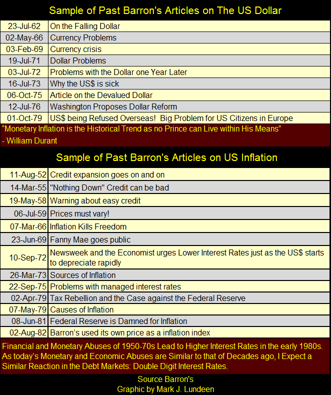
Here’s a table listing old Barron’s articles on the declining dollar and rising inflation, dates are Barron’s issue dates. Since its creation in 1913, the Federal Reserve has only inflated bubbles in commodity and housing prices, or financial asset valuations. The Federal Reserve has also concentrated financial and political power in the hands of people who frequently don’t have the best interest of the country at heart. What good is it?
In the late 1970s and early 1980s, the FOMC’s bubble was in commodity prices (CPI inflation), not in financial asset valuations. Following this huge inversion of the yield curve in July 1981, the Dow Jones was down by only 20% in the following year. Seeing the Dow Jones down 20% wasn’t a big deal then, or is it now. And August 1982 proved to be the blast off date for a tremendous “bull market” (an inflationary bubble in financial asset valuations) that continues to this day.
The second example of a historic yield curve is from Barron’s 04 December 2006 issue (Red Plot below), where the FOMC inverted their Fed-Funds Rate a pathetic 0.76% above the yield for the 30Yr T-bond. Tiny though this inversion was, its effects were profound as in December 2006 monetary inflation flowing from the FOMC had grossly inflated valuations in the real estate market, as well as valuations in the stock and bond markets.
Think of the tiny 0.76% inversion seen in the red plot below as the triggering event that resulted in a catastrophic deflation in the global financial system two years later; the sub-prime mortgage debacle of 2007-09.
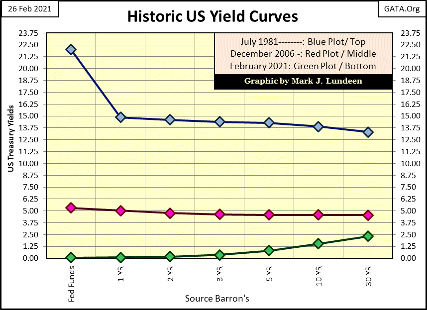
This week’s yield curve is seen in green above. With Fed Funds nailed to the floor, rising bond yields (deflating bond prices) are now driving “monetary policy” ever easier. What’s amazing is how valuations in the bond market are now deflating as the FOMC’s Not-QE#4 weekly “monetizes” huge portions of the bond market. If the FOMC is buying; who is selling?
This week with the FOMC’s Fed-Funds Rate 2.26% below the yield for the 30yr T-bond, money is loose. As monetary inflation has been flowing into financial market valuations since August 1982, inflating financial asset valuations for the past four decades, I’m going to assume the flow of inflation will continue to do so until once again the FOMC imposes “tight money” in the credit markets.
I’m not guaranteeing we won’t see a crash in the market until the FOMC raises their Fed-Funds Rate above the 30yr T-bond yield. Should the Dow Jones once again begin a series of its dreaded days-of-extreme volatility (2% days), all bets will be off. But historically, big market declines are triggered by the FOMC raising their Fed-Funds Rate to something above long T-bond yields, as seen below.
In 2005 the FOMC continued increasing their Fed-Funds Rate until it rose above the yield for the 30yr T-bond in early 2006 (inside circle left side), and kept it there until the summer of 2007. This period of market history was the top of the sub-prime mortgage debacle. No doubt the FOMC only desired to reign in the excesses in the single home mortgage market, but in fact they triggered a collapse in the financial markets not seen since the depressing 1930s.
They responded first with a drop in their Fed-Funds Rate down to 2%, but that wasn’t enough – the financial markets began crashing as the global-banking system gagged on toxic mortgages. In October 2008, as “market regulators” froze on the tracks of the oncoming freight train, the FOMC began another reduction in their Fed-Funds Rate; by December it was at zero. A historic first, as Doctor Bernanke began his first of three quantitative easings. Three months later (March 2009) the financial markets once again began to reflate.
And so it was, until the first week of January 2016 when once again the FOMC began increasing their Fed-Funds Rate. By October of 2018, with their Fed-Funds Rate just short of 2.5%, the FOMC stopped increasing the cost of short term money. However, note the yield for the 30Yr T-bond continued to drop, threatening to invert the yield curve once again.
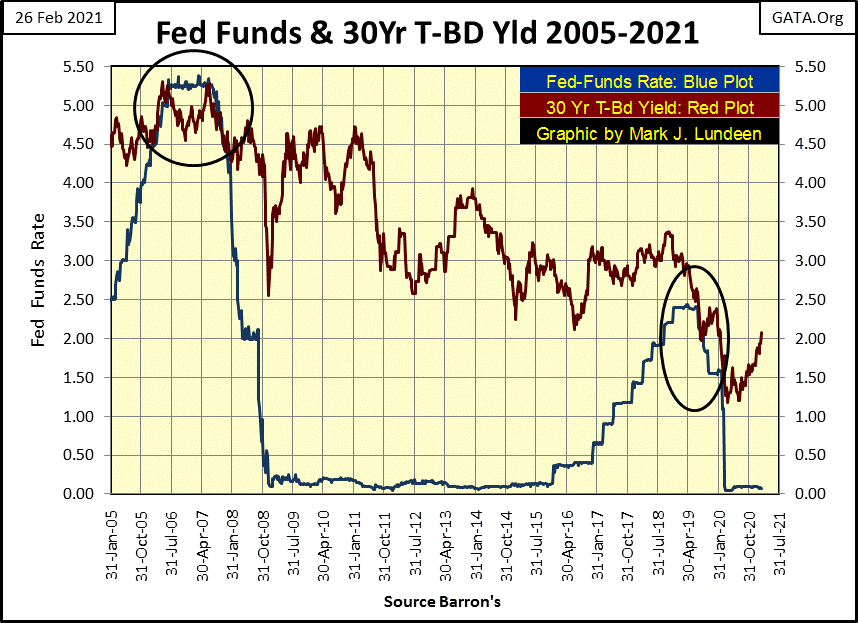
In August of 2019, the yield curve did invert for four weeks. Not by much; only 0.15% (fifteen basis points). But given the leverage (massive debt load on the economy), it was enough to prick the bubble the FOMC had inflated in the financial markets.
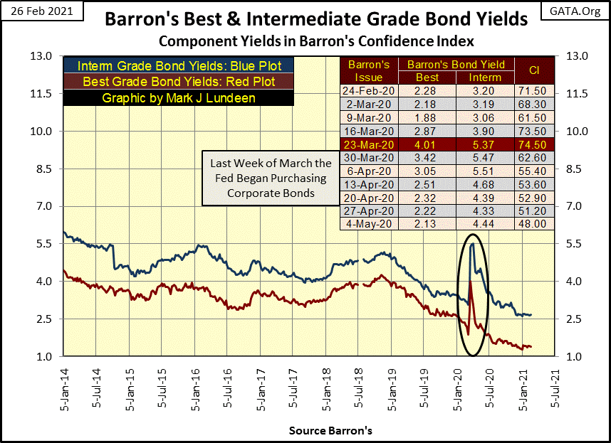
Prices for corporate bonds began crashing as their yields soared in late March 2020 (chart below); the Dow Jones deflated by 38% in less than a month. All that was a year ago, so now in February 2021 who cares anymore? Well, I do. Keep in mind how fast things can change when the FOMC loses control of the markets.
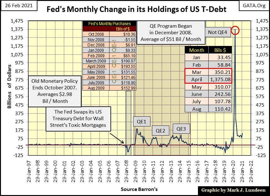
Fed Chairman Powell began his Not-QE#4 in October 2019. Between March and April 2020, he “injected” $1.725 trillion dollars into the financial system to “stabilize the financial markets” (chart below).
To fully appreciate the extremes the markets were at a year ago, it took a two month “injection” of $1.725 trillion to “stabilize” the financial markets. Consider that prior to October 2007 the FOMC typically “monetized” only $2.98 billion a month, as seen in the chart below.
The financial system has never recovered from the 2008-09 sub-prime mortgage debacle; proof of that is painfully on display in the chart below. How to best describe our current situation is best summed up by a line from a 1970 Door’s song; Roadhouse Blues:
“the future is uncertain and the end is always near”
https://www.youtube.com/watch?v=O8NsXbviNgI
Concerning our present economic situation; there is more truth in the pithy verse above than in Fed Chairman Powell’s congressional testimony when he told Congress last week on Wednesday that printing money doesn’t cause inflation. I’m sure most members of Congress were ready to believe.
https://moneyvids.com/fed-chair-jerome-powell-says-money-printing-doesnt-lead-to-inflation/
When you actually look at the membership of the US Senate and House of Representatives, most of them are actually stupid. As I recall, Joe Biden was a US Senator.
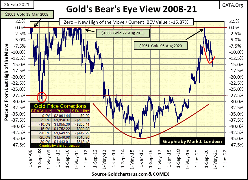
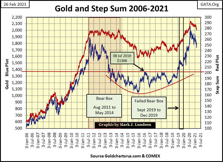
So, when one looks at the chart above, one has to wonder why gold, silver and the precious metal miners are doing so poorly? That’s an easy question to answer; the bears are the big Wall Street banks, and Washington allows them to cheat. Neither Wall Street nor Washington wants gold to rise up to its fair market valuation, a price far above last August’s $2,061. Not after all the inflation they’ve “injected” into the economy since August 1971. But I can’t plot fair market values on a chart, so let’s look at COMEX gold in its BEV chart below.
I was afraid gold would break below its BEV -15% line below ($1752), invalidating the little red bottom formation I had placed in the chart; well it did. So what’s next? Can the bears break below gold’s BEV -20% line ($1649), or is the next big level for gold to take out its BEV -10% line ($1855) as it rebounds off the lows of this correction?
I don’t care to guess which is to come next, and anything I would say about which way is next for gold would be a guess. But what isn’t a guess is since 2001 gold and silver have been advancing in a bull market that has a long way to go. I feel optimistic; a new all-time high for gold sometime this summer? Sure, why not?
Here’s gold and its step sum; both are headed down as the correction continues. This too shall pass.
Anyway, looking at gold’s advance off its bottom of July 2018, it’s accurate saying gold had advanced from $1200 to over $2000 last August without a correction. Well, gold is now correcting an $800, two-year advance. When, in its own good time, gold once again resumes its advance, it should be exciting for us gold bulls.
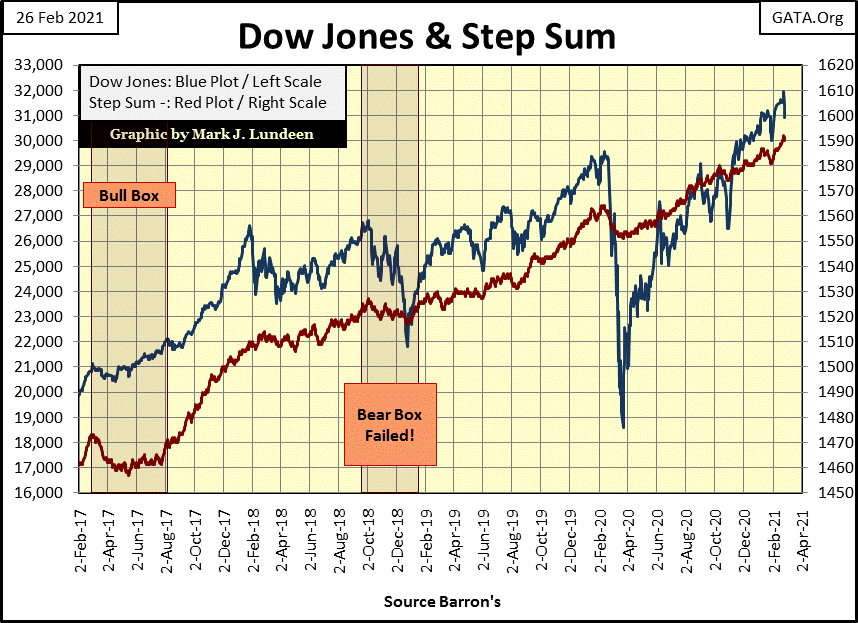
This week the Dow Jones closed down 560 points from last Friday’s close, and 1,029 points down from its last all-time high seen just last Wednesday. Well things like this happen all the time in bull markets, and right now the Dow Jones (my proxy for the general stock market) remains in a bull market.
But this week the Dow Jones’ 15 count saw a +9 (step sum table below), leaving the stock market in an overbought condition.
In gold’s step sum table below, one has to be a bit amazed at all selling pressure gold has seen for the past twenty-five trading sessions. Gold, not seeing a 15 count below a -5 means it isn’t in an oversold market. But for someone who is waiting for gold to resume its advance, seeing all that red on the left side of the table is disheartening. Gold’s step sum is down by eight big steps since January 22nd as its daily volatility remains below 1.0%. I guess this is how things go six months into a correction. But in time gold’s step sum table will look like the Dow Jones on the other side of the table.
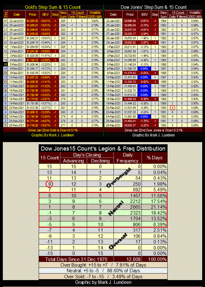
Not much red to be seen on the Dow Jones’ side of the table, and on Monday the Dow Jones’ 15 count increased to a +9. Even a 15 count of +7 is an overbought market, but a +9 is flashing that the bulls are getting out of hand, and the advance is due for a pull back.
In the Dow Jones’ 15 count legion & freq distribution table above, since December 1970 the Dow Jones closed with a 15 count of +9 for only 250 daily closing. And seeing the Dow Jones with a 15 count of +11, the next step up, has happened on only 54 daily closings in the past fifty-one years.
Taking into consideration the big increase in daily volatility seen at this week’s end, and noting the Dow Jones’ 15 count saw a +9 this week, the stock market is now a VERY overbought market. The prospect for a market pullback in the weeks to come is more likely than seeing the Dow Jones making any additional new all-time highs any time soon.
That’s how I see it. If I’m right call me a genius, if I’m wrong don’t call me at all. So until next week, may the Good Lord bless my readers and may they and their families prosper.
Mark J. Lundeen
********


