Part V: HUI Fractal Potential
 share
share
 share
share
 share
share
 share
share
 share
share
In this recent editorial series I have tried to methodically lay out how I view the fundamentals of the Precious Metals sector while incorporating the historical ramifications of the fractal work, including how the psychology of investors might affect market movement into the future. Those opinions can be seen in the links, below. I think we need to maintain a firm grasp of the above items before we turn our attention to the Precious Metals stocks as viewed in the HUI Index. I had intended a thorough review of my “fractal” work with the HUI at this point, but have elected to streamline that concept in favor of adding focus to my current expectations of the coming moves in the Precious Metals stocks at what I consider to be a very interesting inflection point. As always, I will simply lay out what I see in the charts in terms of the underlying fundamentals. If you would like to review my earlier work with the HUI Fractals, you will find a link to my previous work at the bottom of any of my editorials.
PART I- REVIEW
www.gold-eagle.com/editorials_08/goldrunner021008.html
PART II- SILVER MOMENTUM
www.gold-eagle.com/editorials_08/goldrunner021608.html
PART III- LONG-TERM FRACTAL GOLD
https://www.gold-eagle.com/editorials_08/goldrunner022308.html
PART IV- WHEN INFLATION AND DEFLATION CLASH
https://www.gold-eagle.com/editorials_08/goldrunner022708.html
The HUI Fractal History
What I called the “HUI Fractal work” was really a forward-looking trading model that included several different charting techniques, a variety of technical indicators, and some fractal relationships in the HUI chart. Up until that time I had traded the Precious Metals stocks on an intermediate-term basis using basic charting techniques along with what I saw in the technical indicators. I was very happy with my success using those basics, but I wanted to try to create a potential general pathway for future price movement that I might use as a reference point as price moved along. Thus in late 2004 and into early 2005, I worked on combining all of the above toward that end. Somewhere around May of 2005 I moved my work to the Gold-Eagle Forum where different posters could add feedback to the work I was doing. There were several posters including Half_Monty who asked a plethora of questions that pushed my work further along. Sometime in the June time-frame Dr. Vronsky started to encourage me to show my work in an editorial format, rather then just posting on the Forum. I was rather ambivalent in doing so and did not write my first editorial until August of 2005.
The “core” of the HUI Fractal work originally anticipated a rise in the HUI to between 385 and 393 into late February of 2006, then a drop to around 320 into late June of 2006 with a continuing correction into September or October of that year. Then, I expected the HUI to start a move that would take it up to the channel top to around 1250 in this May 2008 time-frame.
Thus, taking into account the expected wave formation in price, the HUI Fractal work played out about perfectly- in fact, too perfectly, into the early 2007 time-frame. Unfortunately, the next sideways move in the HUI for about 6 months, my work did not expect. We will consider that movement in the coming charts since I think understanding that time-frame might be very important to today. It also became very important to the fractal relationship movements of the HUI compared to the Dow as we shall see. Overall, I am very happy with the performance of what I termed the HUI Fractal work since it performed very well as a forward-looking entity. For a good part of the time, the fractal relationships in price movement, time, and the technical indicators was so close that I merely referred back to pictures of each. I would have never expected such an exact fractal comparison. In the “real world” I always go to the individual charts of the underlying stocks to make the final investment decisions.
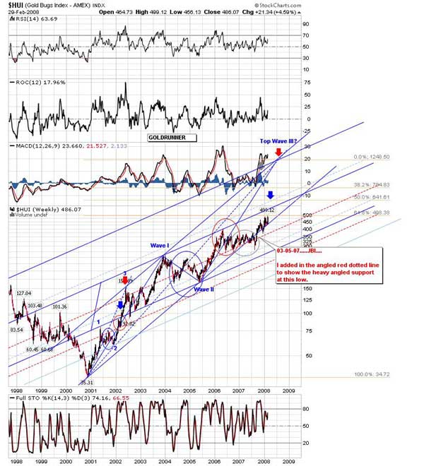
The first chart shows the HUI Fractal work into early 2007. This is a copy of a chart from 2-23-07 that I copied from an earlier editorial. At this time, the HUI Fractal was still “perfect.” Several reference points to the earlier fractal on the left of the chart are marked. The price movement is completely contained inside the upward channel.
Fractal HUI- Chart 1

An Armstrong Turn Date Aberration?
Chart 2 was originally developed on 2-02-07. It shows how the above price movement resolved all the way to today. In this chart we can see that from the end of the time period of the chart, above, the price movement in the HUI did not continue to rise as the fractal work had expected with an acceleration of liquidity into the PM stocks. Instead, the HUI continued to move laterally, in fact, eventually broke the lower channel support line to the downside. That period is circled in green. At that point there were many analysts calling for an HUI drop to much lower levels, in fact, some were calling for an end to the HUI Bull market. Yet, we can see that a sharp move higher commenced in August of 2007- one that sent “price” back up into the channel body. Let’s take a few minutes to consider what might have been the cause of that “unnatural” sideways movement in the HUI chart that is circled in green.
Fractal HUI Chart 2
The unnatural sideways movement in the HUI circled in green started right near the point of the “Armstrong Cycle turn date” in late Feb. of 2007. Armstrong’s turn date was expected to mark an “inflation high” for the general economic period- a topping signal for the general markets. Armstrong’s work has been extremely accurate in the past and is widely followed do to its past success. At that point in time the internet was full of cries over the end of the “carry trade” that would send the general stocks spiraling lower. It was a cry of “deflation” in the general markets. Don’t forget that Gold as we have previously described, tends to do well in a period of deflation or one of inflation, but Gold stocks do poorly in a deflationary period where panic creates margin selling across the board. And even stranger, our expected fractal relationship in the Dow to turn lower did not materialize at that time. Instead, the Dow rallied up to new highs. Considering our past discussions about managed markets including the Fed and Friends walking a tightrope to assure market liquidity flows to help prevent a deflationary panic in the general markets, even with the massive dollar inflation scheme, the above has “Fed program” written all over it. It appears that the Fed might have been a bit worried about the Armstrong deflationary turn date that is so widely followed by investors. Armstrong could never have anticipated the Fed’s dollar inflation scheme in today’s markets since his work was done, long ago. So, it is logical that the Fed and Friends wanted to protect the general markets from a deflationary panic due to the combined effects of the expected Armstrong turn date, along with and acceleration in selling in the next period of “Sell in May.”
Thus, our fractal expectations based on general liquidity flows to the PM stocks and away from the general markets did not play out in a timely manner for that six month period of time. Yet, the “deflationary backdrop theme” reinvented itself over the summer as deflationary news started to cross the wires. Around August of 2007 the deflationary backdrop forces regained their stead, causing the Dow to roll over later than we had expected while the HUI took a sharp turn back up and into the channel.
Below, are two charts that we showed in early 07 to describe how we thought the fractal relationships among the HUI, the Dow, and the US Dollar would play out. In Chart 3 developed in January of 2007 we can see that the US Dollar did roll over as we expected in time. In fact, at the very end of that chart (today) you can see that the USD has again started to accelerate to the downside- something that will become very important to our expectations for the near-term HUI future movements.
Fractal HUI Chart 3

In Chart 4 there is a vertical red line to the right where we expected the Dow to roll over while the HUI accelerated to the upside in early 2007. We can see that the movements were delayed into August of 2007, but then moved back to our expected Dow Rollover/ HUI rise relationship at the black vertical line. This chart was shown in a previous editorial. The difference in time between the red line vertical line and the black vertical line is represented on our above HUI chart in the green circle.
Fractal HUI Chart 4

The Big HUI Question
In our earlier parts of the editorial series we developed our thoughts on the many items that come together to create market price in this environment. We have shown the price of Silver exploding above the angled resistance line to a more vertical move that we expect to run up to around $26 to $27, but may even spike higher. We have shown the price of Gold just busting out into a higher vertical run that we expect to take us to around $1130, then on to around $$1,250- suspecting that it could even spike higher to around the $1,437 area, a Gann number. We have discussed our perception of the driving force behind today’s PM markets in the form of US Dollar printing that adversely affects the value of the US Dollar, in fact, have shown above that the US Dollar has again broken out to a new low. We have discussed how investor psychology can adversely affect the upward movement of the PM stocks if investors are worried about a primary environment of deflation, though we have argued that the charts show nothing but inflation. This would suggest a near-term turn to reality by the PM stocks enjoying an aggressive rally. How might that period of aberration in the HUI chart that was circled in green affect the PM stocks as shown in the HUI Index into the immediate future as compared to our fractal expectations from 2005? To answer that question, let’s return our attention to a copy of Chart 2, above.
Fractal HUI Chart 5
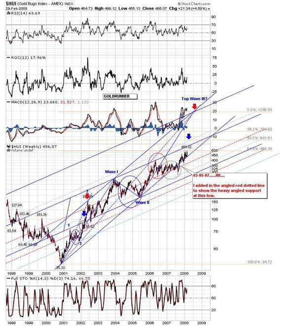
Though this chart is a bit dated, it shows most everything we wish to consider. We have shown in a previous editorial how the technical set-up in the charts of Gold and the HUI are very similar to the point at which $Platinum exploded higher. That is exactly what I expect for us to see with the HUI going forward. The only question is “How much higher?” Well, we can see in the chart that the HUI price has risen back up into the channel, and price has crawled up the bottom channel line. We have PM investors all over the internet scared of deflation while every chart I see screams “Inflation.” The PPI just came out screaming inflation last week. I think we are at an inflection point where the HUI moves vertically. In the chart above we can see the middle dark blue line that indicates the line of angled top resistance sitting around 550 to 560. In the earlier fractal, the HUI price drove directly through that angled resistance line up to the area where the orange fib line intersects the dotted light blue line at around 640. Price then corrected to the angled top resistance line before going higher. The next move up was pretty vertical to the equivalent of around 780. If the HUI price melts up even higher, it would leave our original price target of 1250 at the channel top. Boy that seems crazy, I know- but with the HUI spring coiled so tightly with the massive concern over deflation with all charts screaming inflation, you just never know. Thus, I will simply let the markets do what they do, fully aware of the potential verticality in the HUI chart. In fact, I did a bit of homework to backup the potentials. Below, is another HUI chart for us to consider.
Fractal HUI Chart 6
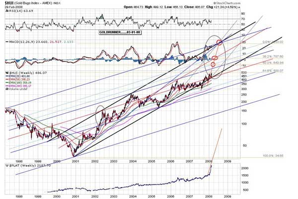
In this chart I have the same potential upside targets as in Chart 5, but circled in red. We can see that there is an area of sparse chart resistance between angled lines, especially above the one at HUI 780. That would create the possibility of a final vertical surge in the HUI should investor sentiment swing hard. I have circled the previous analogous fractal move on the left in green to show the comparison. I have also included a chart at the bottom of $Platinum to show that the slope of the rather vertical rise in the $Plat chart is similar to the slope of a rise that might occur in the HUI chart. As we have noted in the earlier parts of this editorial series, the “time” factor is totally dependent on how long it takes the investor psychology to develop, thus we might see an extension of “time” in this period as we did into the May 2006 top. Thus, the coming rise in the HUI might have a window open to rise into that extends as late as August of 2008. That would match the 3 month difference in our earlier Feb 06 expected top versus the actual top into May. I am positioned for an upside move in the PM stocks at this time, and I will simply monitor the movement as it goes. Don’t forget, we have discussed the fact that the Fed and Friends are probably not aligned against us during these PM momentum runs since they have to maintain liquidity rotations into the general markets into the next deflationary scare bottom. To that end, I do expect a continued rollover by the Dow into the 4th quarter of 08 as our fractal work suggests, though we might see a bit of a reprieve for a bit.
This weekend, before making the decision to show the full extent of the potential of the HUI fractal move, I took some time to consider the individual charts of some of the HUI components. The individual charts that I looked at confirmed the upside possibilities that I see in the HUI chart. I expect to return shortly with some of those charts, but need to take a break for now.
As we move toward establishing our own subscription website I would again like to thank readers for the multitude of kind comments that I have received. We are compiling an e-mail list to contact when we are closer to activating the site for those who request such a notice by emailing me at this address. [email protected]
Thank you for allowing us to share with you our thoughts on the Precious Metals markets.
For the moment…………..Goldrunner.
Below, is the link to the Gold-Eagle Forum where many of us discuss the various topics of the Precious Metals sector………..
https://www.gold-eagle.com/cgi-bin/gn/get/forum.html.
Again, I’d like to thank all of the posters at the Gold-Eagle Forum for their daily input. This thank you is especially extended to TQ and to Grininbarrett who have positively affected my growth over the years. Special thanks go to Dr. Vronsky and Westerman for creating the Gold-Eagle site and for editing my work. A very special “Congratulations” go out to Dr. Vronsky and Westerman after Gold-Eagle saw its hit counter ring up to 281 million this last week.
Thanks also go out to CaptainHook and David Petch of TreasureChests since I have learned so much from them. They offer a wide diversity of fundamental and technical information and can be found at
http://treasurechestsinfo.com/Nuke/
There are many great editorials that can be found on the Gold-Eagle site at the following link. Master David Petch from TreasureChests is one contributor…….
https://www.gold-eagle.com/research/petchndx.html
Here is the link to a site I use to research the warrants of Precious Metals stocks. I will be discussing some aspects of the leveraged use of warrants later in this editorial series.
http://preciousmetalswarrants.com/
E-mail contact:
share
share
share
share
share