Primer on Extreme Market Volatility


This week the Dow Jones failed to see a new BEV Zero; five days without a new all-time high. But that happens frequently in any market advance, as in any market advance, the market in question isn’t going to see a continuous string of new all-time highs, day after day. That just doesn’t happen.
So, how can we tell if the advance remains intact? In the BEV chart below, as long as the Dow Jones remains within scoring position; daily BEV closings spanning from -0.01% to -4.99% (within 5% of its last all-time high), it’s okay assuming the advance remains intact. When the Dow Jones’ daily closing BEV value falls below its BEV -5% line, we should now assume the advance is losing steam, but the advance’s ultimate all-time high may not yet be seen. And when (not if) the Dow Jones closes below its BEV -10% line, I’d sell, and let someone else have whatever crumbs remain in the advance, if there are any crumbs left.
But with the Dow Jones closing the week with a BEV value of -1.04%, why think about that now? I’m going to assume there is more of this advance to come, as long as the Dow Jones remains above its BEV -5% line, in the chart below.
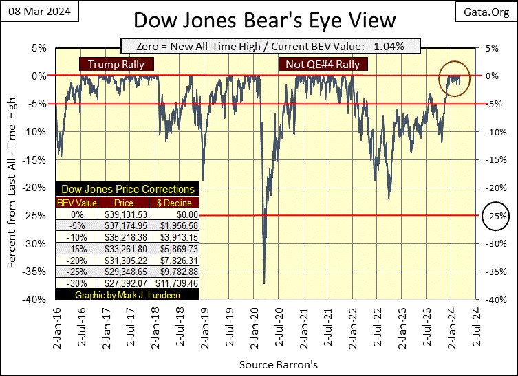
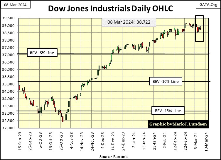
In the daily bar chart for the Dow Jones below, the 39,000 level is offering the advance some resistance. I’m not surprised; 39,000 is a big number for an advance that began in August 1982, when the Dow Jones closed for the last time below 800. Forty-two years, and 38,200 points later for the market to develop a case of acrophobia isn’t surprising. Don’t worry, as long as the idiots at the FOMC continue “injecting liquidity” into the financial system, this market is going up.
But the idiots say their QT that began in May 2022 continues. In fact, just this week they sold $35.35 billion of Treasury debt back into the Treasury market. “Injecting liquidity” into the financial system? How could that be?
Yeah, that is what they say, as seen in the chart of weekly changes in the Federal Reserve’s balance sheet below.
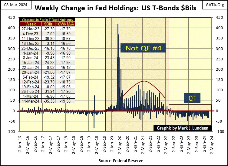
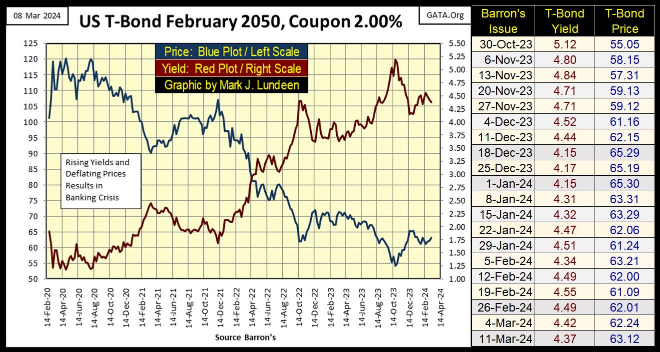
But I’m beginning to believe there is something odd going on in the debt markets. For one thing, for the FOMC to have sold as much of their monetary reserves (T-Debt) as they say they have, $1.46 trillion dollars since May 2022, T-debt prices should be down, and T-debt yields should be up. From May 2022 to October 2023, that is actually what happened to this T-Bond below. But since October of last year, T-bond prices have been trending up, as T-bond yields have been trending down.
How is that possible? Should the idiots also be purchasing T-debt in excess to what they have publicly claimed to have sold, and deposited the newly purchased T-debt into a super-secret, special-purpose accounting vehicle to hide these transactions, that would explain what we have seen since last October in the chart below.
Are they doing this? Heck, I don’t know. Since 1913, the Federal Reserve’s books have never been audited by Congress, or by anyone else. So, no one outside the Federal Reserve System actually knows anything, as a fact about the Federal Reserve. And to anybody that really matters in Washington and Wall Street; they like it this way.
I’m not accusing anyone of doing anything immoral or illegal when it comes to “monetary policy,” because due to my, and everybody else’s total ignorance on the subject, I know nothing about it. I’m just noting the oddness of seeing T-bond prices rise, and T-bond yields decline, as the idiots at the FOMC claim they are selling tens-of-billions of Treasury debt weekly, for the past five months into the Treasury market. Logically, that should not be.
Oh, the hell with logic, and let’s move back to the stock market, to see how the major market indexes I follow are doing below. This week we did see some BEV Zeros, most of them on Thursday. But come Friday’s close, these indexes were a BEV Zero free zone. No matter, the top fourteen of these indexes closed the week well within scoring position, so I’m going to assume more new all-time highs for these indexes in the weeks to come, if not next week.
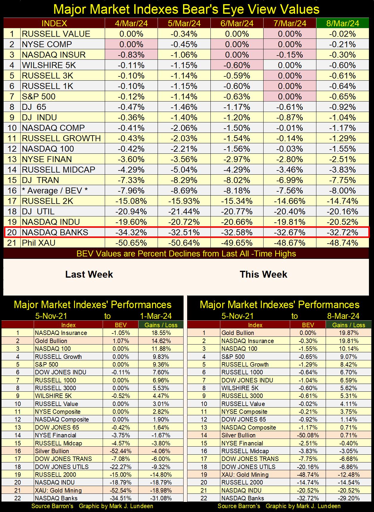
In the performance tables above, it was a good week for precious metal assets. Both the XAU and silver moved up the week by two rows, and gold, which saw a new all-time high close every day this week, finished the week at #1 in this week’s table.
Is this a breakout in precious metals assets? It sure looks like one! And I suspect John Hathaway of Sprott would agree, as seen in the 13-minute video below.
What about Eskay Mining? I think the bottom is in, but it may be a while before Eskay is once again in a raging market advance as it was in 2022. One thing to keep in mind is the major miners of gold and silver always have a problem; their reserves of ore are constantly being depleted as they extract gold and silver from the Earth.
At some point, these major miners are going to have to shop around for new reserves of gold and silver ore, and the little exploration companies, like Eskay Mining, will then become the focus of the industry if the majors want to survive as miners of gold and silver.
And when will that be? Let me check with my crystal ball; I see, I see – July 23rd at 10:32 AM, but the actual year this happens is covered with a heavy fox within the crystal’s matrix. I hate when that happens! Well, as it is, if gold and silver begin to take off from current price levels, gold and silver mining, as well as precious-metal exploration companies, could become the markets hot sector for 2024 by this summer. I’m not holding my breath until it happens, but it’s a possibility.
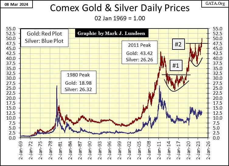
Yes, it is a possibility, especially with gold breaking out above its indexed value of 47.5 in the chart below, on its way somewhere deep into the 50s. Gold at $2350 = 54 in this chart, and that is something we could see in the weeks and months to come. We’re waiting for silver to break out above its indexed 15-level ($27.75) seen in the chart. Things could become interesting when that happens.
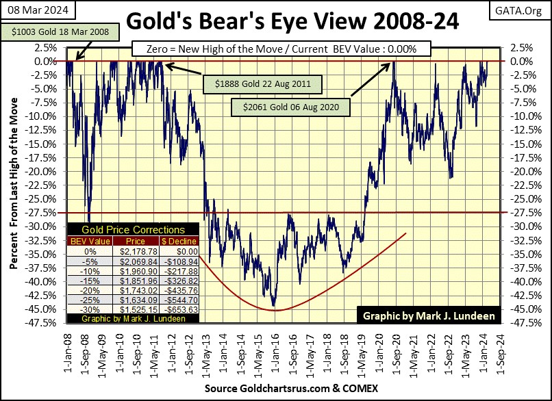
Let’s now look at gold’s BEV chart, one that goes back to 2008. Geeze Louise, look at that crater from 2011 to 2020, where the price of gold collapsed by 45% in December 2015, from its all-time high of August 2011. This decline knocked out any weak hands in the gold market, leaving the gold market in the control of the gold market’s strong hands.
You don’t believe me? What was the largest percentage decline in the gold market since that -45% bottom in December 2015? That’s right, only a 21% market decline in the autumn of 2022, and gold didn’t stay down for long.
Who are the weak hands? People who like buying at the top, to then sell at the bottom. They sold in 2015, and they have been out of the gold market for the past nine years. Don’t worry about them, when the price of gold rises high enough to attract their attention; they’ll be back.
For reasons best known to them; they refuse to buy gold at its current low prices. But as the price of gold and silver rise to levels not believable today, they and their weak-handed friends will be back, giddy with all the bargains they will then be “scooping up” in the gold and silver markets.
Did I mention gold closed at a new all-time high every day this week? Yep, I’m feeling giddy this weekend, and hope to be next weekend too.
Here is gold’s step sum table below. It looks really good. Gold’s 15-count went over bought this week with a count of +7, then a +9 the next day. What is a 15-count? Using a +1 for an advancing day, and a -1 for a declining day, the 15-count is the net of the daily advances and declines in a running 15-day sample. Here is a table for the 15-count, and anything over a +5 is overbought, and anything under -5 is oversold.
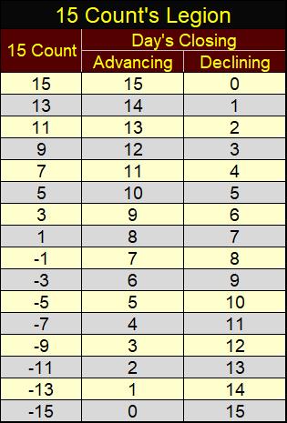
So right now, I suppose I should be warning my readers that the gold market is overbought, and due for a period dominated by daily declines in the gold market, those red days seen in the tables below. But I’m not. Let’s not sell the gold bulls short at this important point in the market.
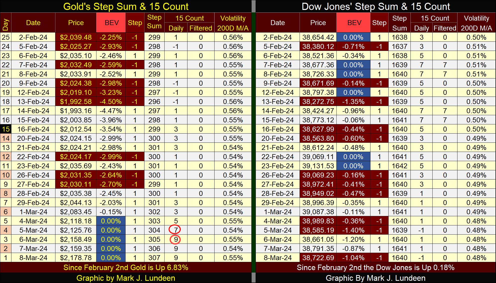
On the Dow Jones side of the step sum table, we haven’t seen a new BEV Zero in the past two weeks. But don’t worry, the Dow Jones’ BEV values remain well within scoring position, and until that changes, I’m remaining bullish on the stock market. Not that I would buy anything in the broad-stock market, because I don’t like buying at a market’s top.
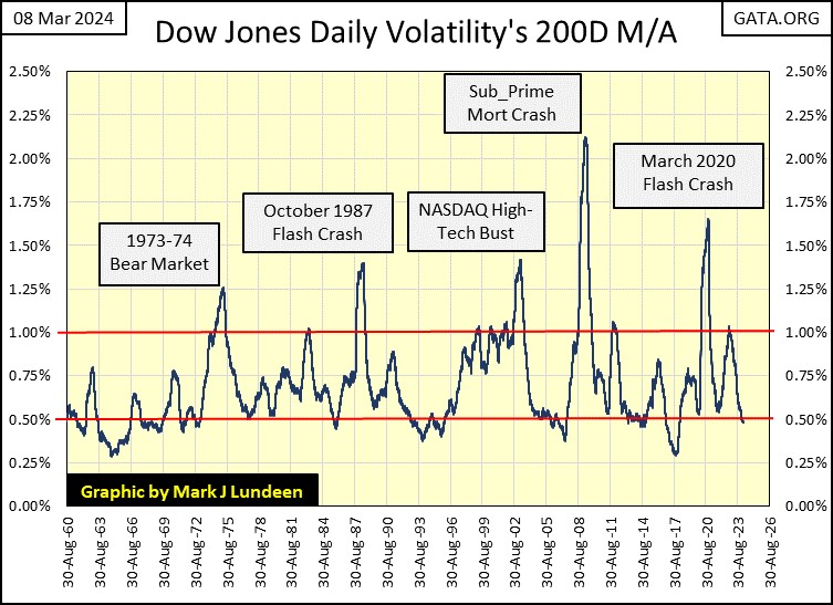
What makes me believe we are at a market top for the Dow Jones? I’m looking at its daily volatility’s 200D M/A; it’s closed the week at 0.48%. In the chart below plotting the Dow Jones’ daily volatility’s 200D M/A since 1960, bear markets bottom when daily volatility spikes well above the 1.00% line, and bull market advances terminate when this market metric falls below the 0.50% line.
If market history is any guide, and it usually is, that means the next big thing for the stock market is a big bear market. Let me look at my crystal ball to see when that is going to start; I see, I see – July 23rd at 10:32 AM, but once again the actual year is covered with a heavy fox within the crystal’s matrix. Bloody hell – now I really hate when that happens!
Maybe I should just admit I haven’t a clue when the bottom is going to fall out from beneath the stock market; I just know it will. I don’t want my wealth exposed to the ravages of Mr Bear, and his cleanup crew as they tear into this market’s bloated valuations, and the banking systems’ insolvent balance sheets. What is coming our way will be damn ugly.
Let’s go a little deeper into stock market volatility.
For the stock market, the personality differences between bull and bear markets are extreme. Bull markets are in the main, quite markets. Yes, there can be lots of excitement in the hearts and minds of the bulls as market valuations rise to new all-time high territory. But the stock market itself rises into market history in tiny steps, low volatility, small percentage gains or losses in market valuation from one daily closing to the next.
Bear markets are very different. The terror felt by bulls during a bear-market decline are reenforced by extreme variations in market valuation from one day to the next. Such extreme days for the Dow Jones I call Dow Jones 2% days, days the Dow Jones moves up or down by 2% from one daily close to the next, or more.
Some times in bear markets, these “2% days” can move up or down by 10%, and more. During the Great Depression market crash in the early 1930s, the NASDAQ High-Tech bust (2000-2002), the Sub-Prime Mortgage Debacle (2007-2009) and the March 2020 Flash Crash, the Dow Jones * ADVANCED * by over 10% from one day to the next, during these significant Dow Jones bear markets.
So, why do I call such days of extreme-market volatility “Dow Jones 2% Days?” I have to call them something. So, when a day comes whose valuation has increased or decreased by more than 2% from the day before, crossed over this 2% threshold, be it by +/- 2% or +/- 10%, I’m only pointing this out by calling it a Dow Jones 2% day, that it was an extreme move in the market’s valuation of the Dow Jones.
Dow Jones 2% Days are rare market events. Since 02 January 1900, there has only been 1,926 days of extreme-market volatility, or 2% days for the Dow Jones during these 33,512 NYSE trading sessions for the past 124 years of Dow Jones’ market history. That makes it around one Dow Jones 2% day, for each 17.39 NYSE trading sessions.
Dow Jones 2% days during a bull market are extremely rare market events. These extreme events are best thought of as bear-market phenomena, though they do occur frequently as the market bounces off the ultimate bottom of a bear market, early in a bull market’s advance, the period of a bull market when most investors still believe it’s a bear market. Seeing the Dow Jones daily volatility’s 200D M/A close this week at 0.48% (see the Dow Jones step sum table above) tells me the Dow Jones is in a bull market. However, with volatility so low, we should understand the current advance in the Dow Jones nearing its ultimate market top.
Below is a chart plotting each, and every Dow Jones 2% day, since the first day of trading at the NYSE since the turn of the 20th century. These 2% days fill the chart, but keep in mind there are on only 1926 of them, out of the 33,512 NYSE trading sessions plotted below.
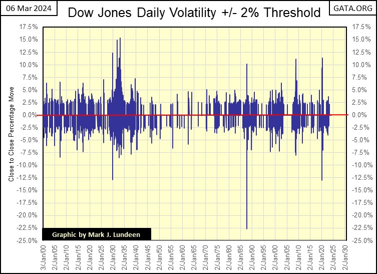
Concentrations of these days-of-extreme market volatility occur during bear markets, while bull markets are almost free of them. It’s very important to understand that Dow Jones 2% days of particularly large percentage ADVANCES are * BEAR MARKET EVENTS *, NOT an all-clear signal from the market that it is now safe to “scoop up all the bargains” to be found in the stock market.
These big up days in the market is how Mr Bear savages the shorts, foolish mortals who the day before thought they were so clever to go short in a bear market. On these big advances, to the shorts’ horror, they discover Mr Bear has no friends!
I don’t recommend it, but if one were to go short during a bear market, I would never do so on a big down day, but wait until the bear market saw a large Dow Jones daily advance before I would short the market, or purchase a put during a bear market decline.
During the NASDAQ High-Tech bear market (2000 -2002), and the Sub-Prime Mortgage Debacle bear market (2007-2009), I followed these market declines on CNBC. There was never a shortage of “market experts” who on a day the Dow Jones was up by 5%, or more, would begin prattling that the bottom was in, and now was the time to buy, just because the market was up that day by whopping 5% or more. Until the market has seen its ultimate bottom, bargain hunting in the stock market is usually a big mistake.
The above chart plotting the actual days of extreme market volatility for the Dow Jones, its 2% days, while interesting, is not very useful. A better way to display this data is to convert all 2% days into their absolute values (converting negative days into positive days), and counting their occurrences a running 200-day sample, as seen below.
Note; the volatility peaks (peak Dow Jones 2% day counts) seen below are lagging market indicators to the actual bear market bottom, volatility-spike peaks that can lag by three to as many as eight months following a bear market bottom.
I’m not going to cover this data prior to 1920, as the Federal Reserve’s influence in the market was not yet established. But the low volatility for the 1920s bull market can be seen, as well as the insane market volatility for the Great Depression market crash (box A) is displayed. At its peak, this 200-day running sample had a Dow Jones 2% day, every other day in the early 1930s! The emotional scars that left in the market’s psyche lasted for many decades.
The 1930s had a very nice bull market people don’t talk about, from July 1932 to March 1937. You can see that bull market in the chart below, by observing the decline of days-of-extreme market volatility from the peak at box A, to late 1936 when the count of Dow Jones 2% days decline to single digits in the 200-count seen below.
Then came the Depressing 1930s’ second big bear market, a 49% decline in the Dow Jones, identified by the rise in Dow Jones 2% days, peaking at box B with fifty-nine Dow Jones 2% days, in a 200-day sample.
The next big market event was the second deepest bear market bottom for the Dow Jones, a 52% market decline seen in April 1942. So, where is this big bear market’s volatility spike in the chart below? There never was one. Box B occurred during the Great Depression, but this market bottom occurred during WW2. It seems after the Roaring 1920s, and the Depressing 1930s, with the start of WW2, people for the most part, had better things to do with their money than risk losing it in the stock market.
And so it would be until the Baby Boomers came of age, a generation not scarred by the personal memories of the Depressing 1930s, and its two massive market crashes. It didn’t hurt that the Federal Reserve in the 1970s was more than willing to supply as much “liquidity” as the market desired, especially after the US took its dollar off the Bretton Woods $35 gold peg in 1971.
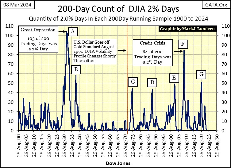
Following the abandoning of the dollar’s $35 gold peg, market volatility in the Dow Jones (my proxy for the broad-stock market) increased dramatically, as seen in the five spikes in Dow Jones volatility (boxes C to G) above. Box;
- C = 1973 to 1974 bear market bottom,
- D = October 1987 flash crash, the day Wall Street’s computers took over, and sold the Dow Joens down 22% in one day (see my first volatility chart),
- E = NASDAQ High-Tech Bubble bust,
- F = Sub-Prime Mortgage debacle bear market bottom,
- G = March 2020 Flash Crash bottom.
These last two volatility spikes in the Dow Jones (F & G above) were terminated by the idiots at the FOMC, flooding the financial system with “liquidity” from a QE. Something I call bear-market interruptus, a bear market abortion in progress, terminating these bear markets’ declines before they came to term.
I find the March 2020 Flash Crash particularly interesting, as from an all-time high in February, the Dow Jones imploded by 37% in only twenty-eight NYSE trading sessions. This is something that has never happened before in Dow Jones history, and this bear market abortion happened only four years ago.
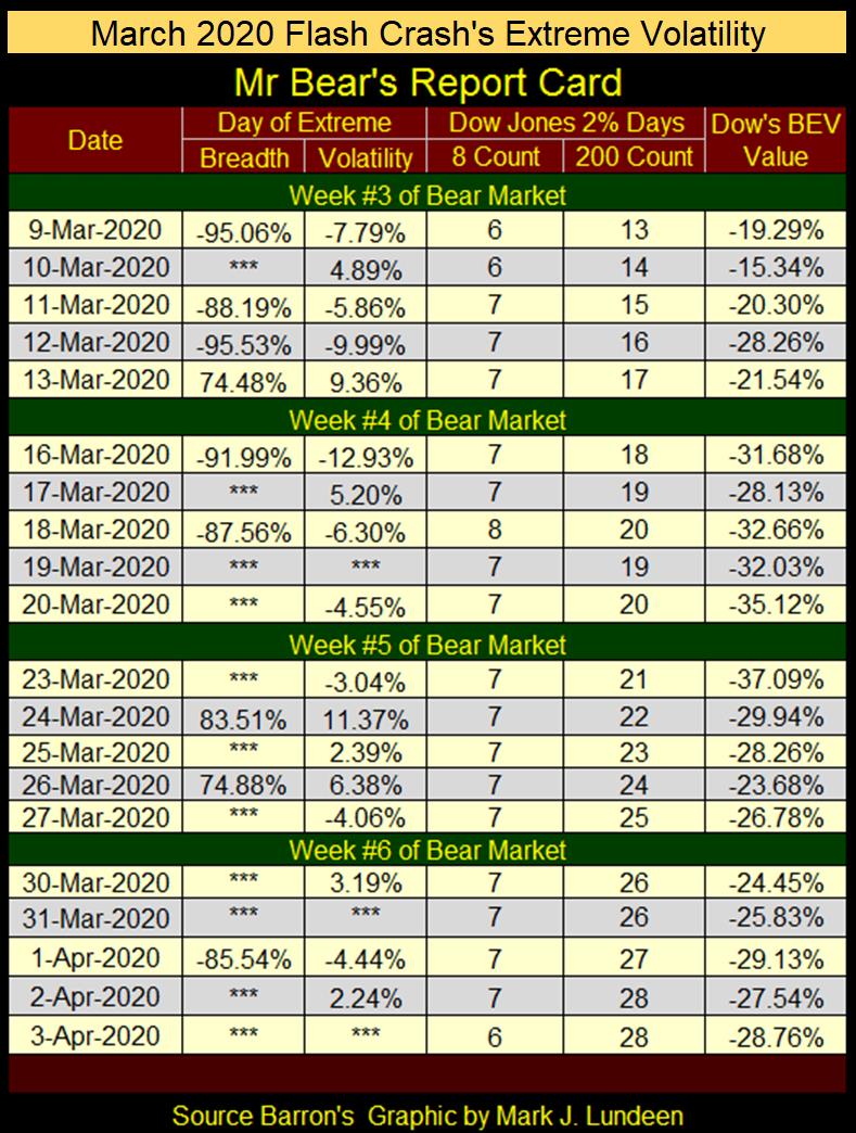
During a major market decline, I publish what I call Mr Bear’s Report Card, listing the market’s extreme days, of which there are two;
- Extreme days of Market Breadth (NYSE 70% Days), something not covered this week,
- Dow Jones 2% days.
Below is Mr Bear’s Report Card from my 03 April 2020 article. Note below how the March 2020 Flash Crash bottomed on March 23rd, and began an advance that could be argued continues to this day. But early in this advance, in the days and weeks that followed this bottom, 2% days for the Dow Jones remained common market events.
But not any longer. Now at a market top, as it is at the close of this week, the last 2% day for the Dow Jones was on 02 June 2023. Last June was a long time ago. As I’d expect at a market top, memories of a big 2% days are only a distant memory in the market.
When (not if) the Dow Jones once again sees multiple 2% days, and it once again closed below its BEV -10% line, it’s best to assume the worst, and “get the hell out of Dodge City!”
Good grief! Take a moment, and a hard look at the wild daily price moves in March 2020 below. For these twenty NYSE trading sessions, there were only three days the Dow Jones didn’t move 2%, or more from a previous day’s closing price. There were even two double-digit percentage, daily moves in this table.
This is Great Depression market action, and so it would have been had FOMC Primate Idiot, Powell not “injected” a few trillion dollars of “liquidity” into the market in March 2020.
The effects of these market extremes from March 2020, is best seen in a fascinating video of an actual trader from a large Wall Street bank, “going ape” as he attempted, unsuccessfully to hedge his failing positions.
https://www.youtube.com/watch?v=FIiPY2xJOyo&t=2s
You just make sure Mr Bear, on his next assault on the stock market, doesn’t make you go ape.
Mark J. Lundeen
*********


