The Stock Market Is Under Pressure


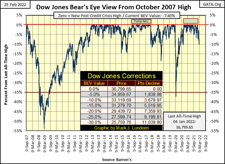
This week, the Dow Jones closed just a tad below where it closed last week / BEV -7.45% compared to BEV -7.39%. However on Wednesday, it almost closed in double-digits; BEV -9.97%. That, and all this (past) week looking at the pre-market trading, the Dow Jones was frequently down in overnight trading by 500 or more points. Then on Friday, the Dow Jones saw its first day of extreme volatility since last summer, a Dow Jones 2% day, advancing 2.51% from Thursday’s closing price.
Was that bullish? They sure thought so at CNBC. But I’m not so sure of that, as historically, the biggest daily advances in the Dow Jones are exclusive to bear markets.
What’s with the Dow Jones? The Ukraine situation is one factor. But I don’t know what to think or believe when it comes to the developing Ukrainian / Russian situation. By default, I must look at the mainstream media to gather information on Eastern Europe. But they’ve lied to me so often in the past, I’ve developed a tendency to take the other side of any issue they bring up. I’m not all that sure Putin is the bad guy causing all of problems on the Ukrainian steppes.
When in the past three decades has Washington passed up an opportunity to go to war against anybody? How long before American troops are once again where they don’t belong; like in the Ukraine?
The Democratic politicians, who now dominate Washington, are in the main the old draft-dodging, anti-war protestors from the Vietnam era. I remember these people well. Now today, no longer worried that they themselves will be drafted into the army, they’ve become the biggest bunch of bullying war-mongers the United States has ever seen.
A reader of mine, one B. Fitzwilson, thinks the Ukrainian situation may be a cover for a developing banking crisis in Canada. Canada’s Prime Minister, Justin Trudeau, is cracking down on the protesting truckers, and anyone who supported these “terrorists” with food and water, by shutting down their access to any money they’ve deposited in the Canadian banking system. This will make the little shits fear the power of Ottawa!
From what I hear, Trudeau has reversed this order. But the concept of having a government retaliate against its population via government sanctioned bank robbery will prove difficult to forget.
If one industry is based on good faith and confidence; it is banking. Having the government threaten to steal the funds from the bankers’ clients is not a positive event for the Canadian banking system.
Trudeau may one day, possibly soon, regret doing this. Between Ottawa and Washington DC, there exists more ignorant people in control of hundreds of millions of lives than at any time in history. Real morons who are not afraid of using the brute force of government to ensure their political lives continue to be as comfortable as possible.
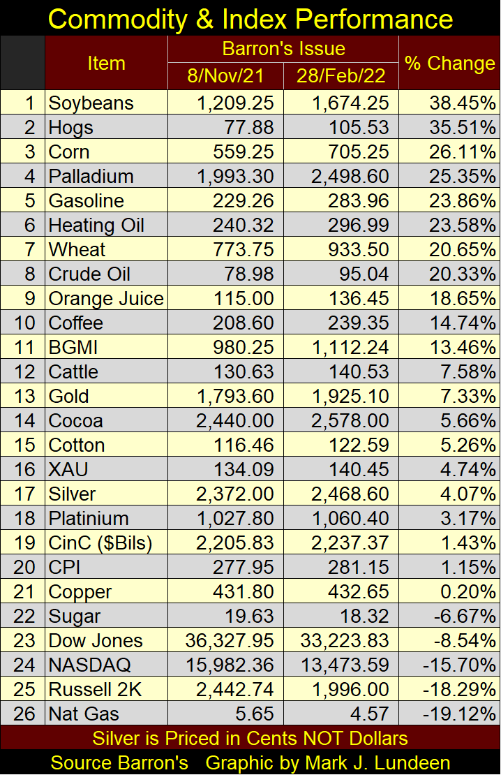
Here is my table listing the BEV values for the major market indexes I follow. This week was a holiday shortened trading week with Presidents Day on Monday. So, I included last Friday’s data to fill the hole. From last Friday to Wednesday’s close (Feb 23rd) one can’t fail to see “liquidity” flowing from the stock market. By Wednesday’s close, thirteen of these indexes’ BEV values were double-digit.
Then came Thursday and Friday, and the market recovered. But for how long?
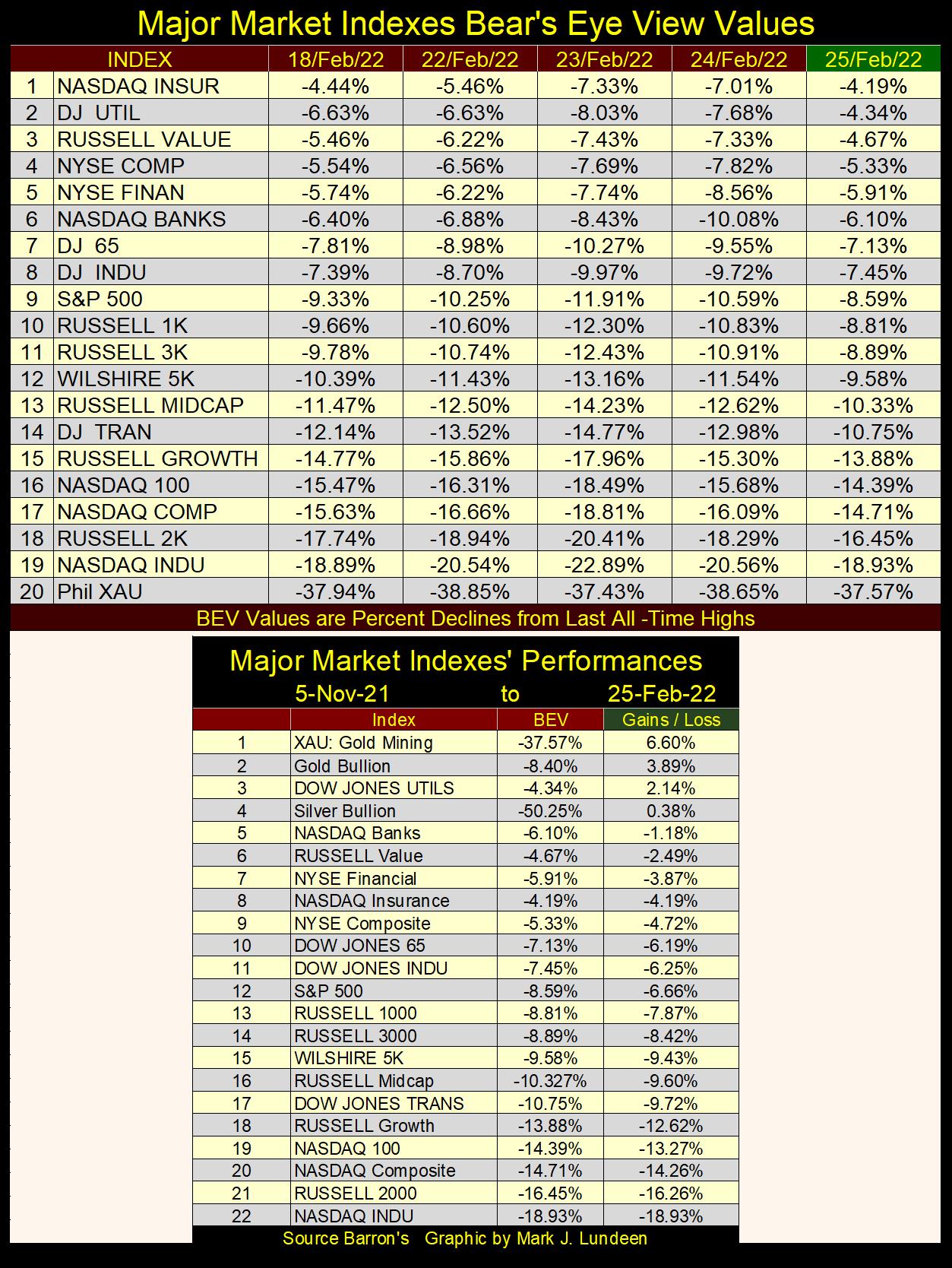
Moving to the table above, since November 5th, a week when 17 out of these 22 indexes were seeing multiple new all-time highs, they continue leaking “liquidity.” But that isn’t true for the precious-metal assets, and the Dow Jones Utility Average.
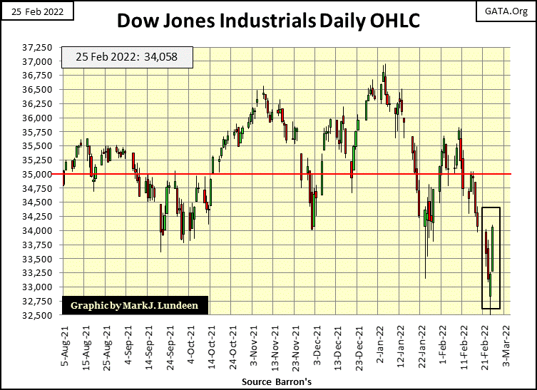
The Dow Jones in daily bars below has an interesting view of this week’s trading. It was down big on Tuesday and Wednesday, then came Thursday and Friday which caused the venerable Dow to recoup all the ground it lost since last Friday. This sort of stuff happens. But when this happens all of the time, one begins to become suspicious that not all is right with the market.
Here is the 10-Wk M/A for the weekly changes in the Federal Reserve’s balance sheet. Fed Head Powell’s Not QE#4 is a truly astounding act of “monetary policy.” You won’t see this chart anywhere else but here, because it is so embarrassing!
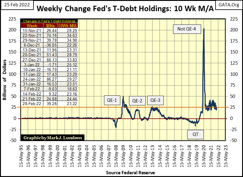
For the last two years, the idiot savants at the FOMC have really shown the world what “monetary policy” is all about; keep “injecting liquidity” into the financial system until all is right with the world, or until the world begins upchucking dollars. Which is what is happening now in late February 2022 when looking at the rising cost of living in the table below.
Remember, early November, just three months ago was when my major market indexes were all making new all-time highs. The double-digit percentage increases in commodity prices since early November are amazing. And they are the result of what we see above. That gold and silver and their mining shares aren’t doing better in this inflationary-economy is reason for believing they really are being controlled by COMEX goons.
#23 to 25 below are big stock indexes, and they are all down, even with the massive “injections of liquidity” seen above. Come the day the idiots at the FOMC stop “injecting liquidity” into the market, the stock market would collapse. As it is, they are in a controlled deflation. This is no time to be shopping around for bargains in the stock market.
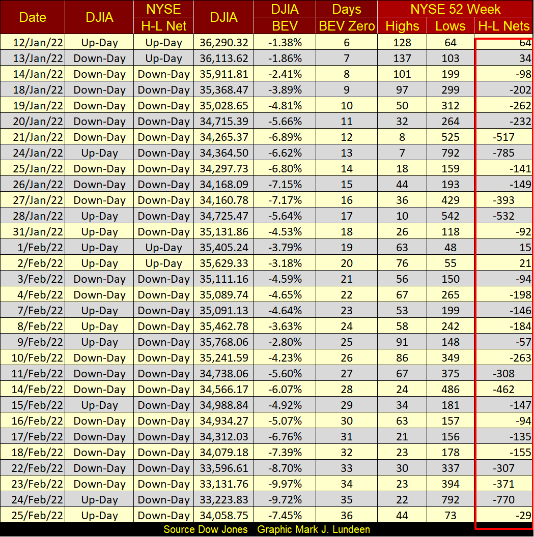
Here's my table for the NYSE 52Wk Highs and Lows. Looking at the H-L Nets column, since mid-January 52Wk Lows have dominated 52Wk Highs at the NYSE. On Thursday this week, the H-L net was -770, even as the Dow Jones and the rest of the major market indexes had a good day. I take this as a sign of internal weakness in the market
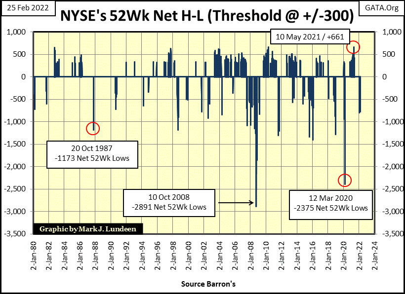
How bad can this get, with NYSE 52Wk Lows dominating 52Wk Highs? Chart below plotting this data since 1980 gives a good answer to that question. During the March 2020 flash crash, there was a day where the 52Wk H-L nets saw a -2375, and during the sub-prime mortgage crisis, the NYSE 52Wk H-L nets saw a -2891.
These extremes in 52Wk Lows brought with them massive “injections of liquidity”. During the sub-prime mortgage debacle (October 2008) Dr. Bernanke responded with his QE 1-3. The March 2020 extreme in NYSE 52Wk Lows resulted in Fed Head Powell to implement his Not-QE#4. But Powell’s Not-QE#4 has been going on for two years. Should the NYSE’s 52Wk H-L net once again go below -2000 sometime in 2022, what are the idiots at the FOMC going to do then?
Below is a chart for the earnings for the Dow Jones going back to 1929. Looking at the volatility in Dow Jones earnings since the US Treasury suspended the Bretton Woods’ $35 gold peg in August 1971, causes one to wonder what is going on. In the red circle, once again the earnings for the Dow Jones have recovered nicely from a steep decline, but this time during the Covid crisis when much of the economy was shut down.
This chart below, with its reoccurring earnings recovery in the Dow Jones since 2002 brings to my mind a quote from Mark Twain.
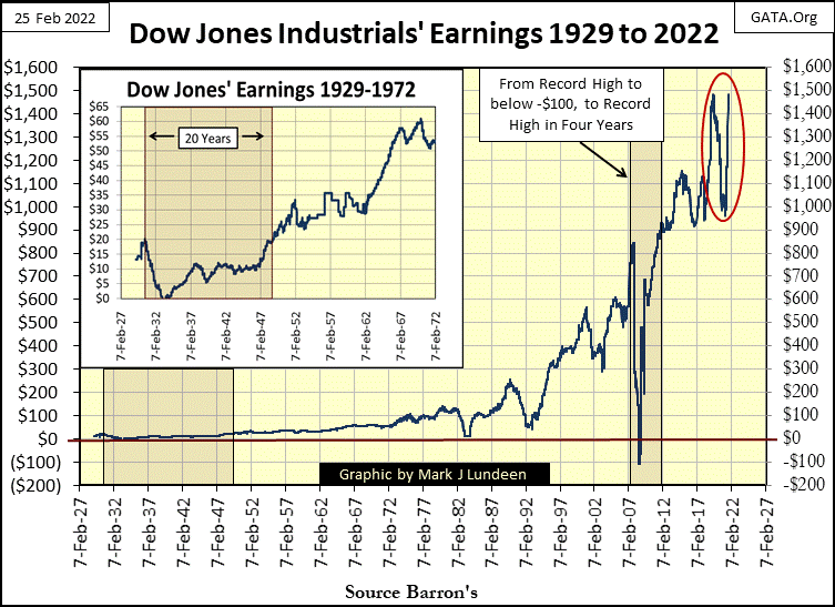
Obviously, corporate earnings today are unstable. Come the next period of market instability, I’m expecting corporate earnings to once again disappear.
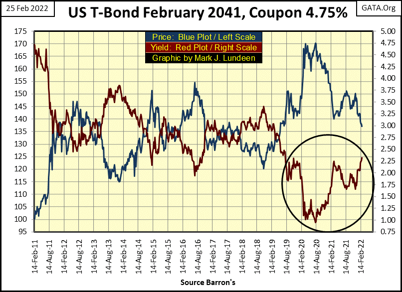
The growing number of problems for the FOMC isn’t limited to the weak stock market and price inflation in commodities. Treasury bond yields bottomed in August 2020, and have been on the rise ever since, as seen in this chart for a 30 Year Treasury bond issued in February 2011. Since August 2020, this T-bond’s price (Blue Plot) has dropped by about 20% as its yield (Red Plot) increased from just below 1.00% to about 2.30%.
If that isn’t enough to shake the market’s confidence in the Treasury market, what is to follow in the bond market in the years to come will. Because monetary inflation, and rising consumer prices it eventually produces, is never a positive for creditors, but is for gold and silver holders.
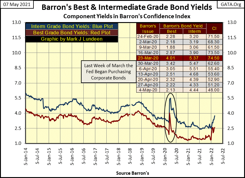
And it just isn’t T-bond yields increasing as consumer price inflation becomes ever more odious. Barron’s Best and Intermediate Grade Bond Yields too are increasing as the cost of living becomes ever more costly, as seen in the chart below.
In the circle below, highlighting the yield spikes of March 2020 that motivated Fed Head Powell to begin “monetizing” corporate bonds, driving their yields back down to within “policy parameters.” Then came January 2022, and corporate bond yield are once again rising. This is to be expected, as bond buyers begin demanding yields that compensate them for consumer-price inflationary losses.
Here's a chart from Kitco.com plotting gold for the last three days of this week. All of my charts are based on close of the day data. But this Kitco.com chart shows gold being traded on a continual basis, twenty-four hours a day. Note on February 24th (Orange Plot), gold almost broke above $1980 in London trading, before the COMEX goons came into the market and whacked it back down below $1900.
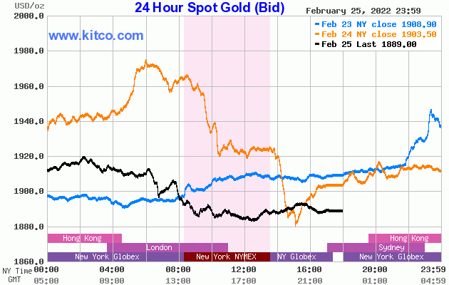
This looks bad for the bulls in the gold market, that the bears in the gold market can just flood the market with insincere promises to deliver tons of metal that doesn’t exist to suppress gold and silver prices in the futures markets.
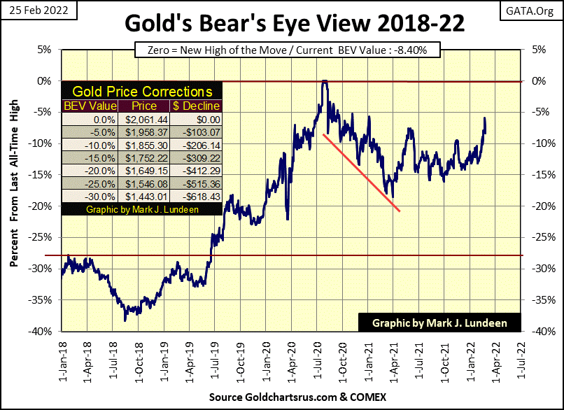
But it’s a losing battle for the bears. If that wasn’t so, gold would still be trading below $1443 (BEV -30%) in gold’s BEV chart below, as it was before the summer of 2019. I look at gold’s BEV chart below, and I’m quite optimistic that gold will be trading at new all-time highs sometime in 2022.
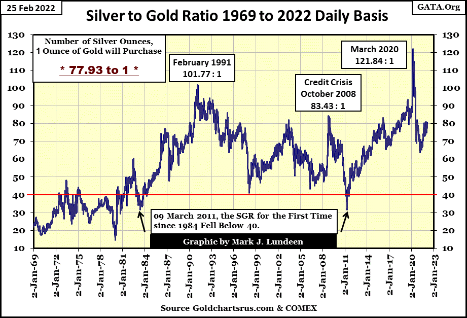
So, gold has done well since its lows of April 2021, in the chart above. But the fun really hasn’t begun, and won’t until the Silver to Gold Ratio (SGR-number of ounces of silver for one ounce of gold), once again makes a move on its red 40 line in the chart below.
What the stock and bond markets will look like when this ratio falls from this week’s close of 77.93 down to 40, I don’t know, but suspect these markets won’t be good.
For people who are buying gold and silver at today’s price, I suspect they will be very pleased when this ratio once again falls below 40. This will be especially so for people buying silver, as a declining SGR indicates silver is appreciating faster than gold. A drop in the SGR from 80 to 40 means that silver appreciated twice as fast as did gold.
For retail investors dealing with less than $100,000 to invest, silver is the superior precious metal to invest in. But silver is a volatile investment, an asset that many can’t hold on to during a bull market because of wild swings in silver prices.
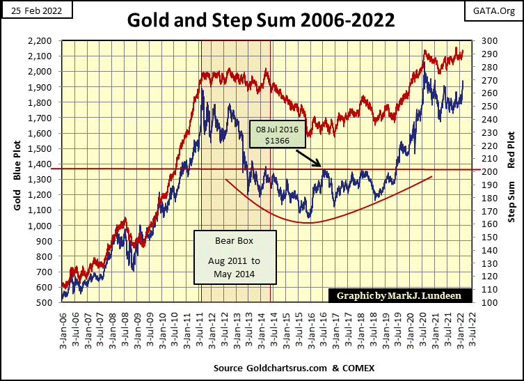
Gold and its step sum plots below continue to look very positive. Remember, the step sum (Red Plot) is a market sentiment indicator, or a plot of the market’s expectation, which currently is looking bullish. The blue price plot is a plot of market reality. For the past year in the step sum chart below; market expectations and market reality has been bullish, and that is good. I believe it’s just a matter of time before these two plots begin some real up field running, as seen below from 2006 to 2011.
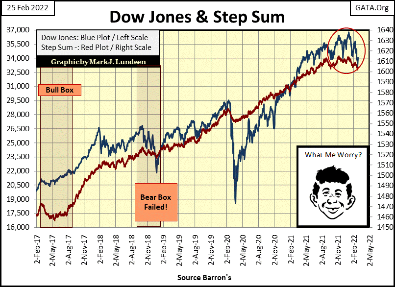
Here is the Dow Jones step sum chart. Unlike gold’s step sum chart above, both the Dow Jones’ step sum (market expectations) and the Dow Jones price plot (market reality) are trending downward.
Of course, this could change should the idiots at the FOMC “inject” sufficient “liquidity” into the market, thus bringing back the good times in the stock and bond markets. But with rising CPI inflation becoming daily news, the idiots are really having an increasingly difficult time keeping financial market asset valuations inflated. The “policy makers” may be on the road to a crisis that will be long remembered by all in the coming year.
In the step sum tables below, gold’s 15 count became an overbought +7 on Wednesday the 23rd. Markets don’t like being overbought, so I’m not surprised seeing gold selling off the rest of the week.
Looking at daily volatility for the gold market, its 200Day M/A remains mired below 0.60%. When gold finally does take off, expect its daily volatility’s 200Day M/A to increase to something above 1.00%. Which is another way of saying when gold once again becomes an exciting market that catches the attention of a larger segment of the investment universe, its daily volatility will increase significantly as “liquidity” begins flowing into the precious metal markets.
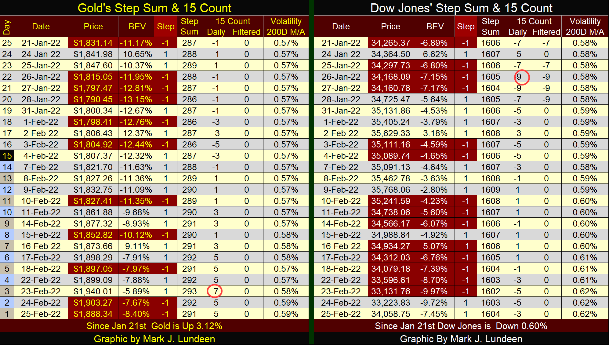
For the Dow Jones, its 15-count hit a -9 in late January. A 15-count of -9 is a very oversold market, a market that is due for a bounce. But in the past month, the Dow Jones found it harder to go up than down. That isn’t a bullish development in the stock market.
Also, the Dow’s daily volatility’s 200Day M/A has increased to 0.62%. While this is not a level of extreme volatility, seeing daily volatility’s trend rising is not a positive market trend for the bulls. Should Dow Jones daily volatility’s 200 Day M/A increase to something above 1.00%, my readers won’t need me to tell them that Mr Bear is once again on the prowl on Wall Street.
Mark J. Lundeen
********


