US Stocks Approaching A Major Top: The Jaws Of Death Pattern Completes


The stock market is inside a parabolic rally, a near vertical rise with no significant corrective declines in a year, the S&P500 not even experiencing a 1% daily decline in months. Parabolic rallies typically do not end well, but they can blow off to the upside higher than rational expectation. Like a pressure cooker, unless some of the steam is let out once in a while, an explosive release will follow. Volume is down this year, and one of the reasons is there have been no significant declines. Corrective declines increase volume as sellers show up, fear of deeper declines moving holders to sell. The reality that declines can happen creates supply and sell orders. Declines move sidelines money into action, buying the dips, seeing prices that look like a bargain, motivating buyers to trade. Volume rises. Imbalances are corrected. A healthy long-term Bull market can sustain. This is not the case with the current market, which supports what the technical patterns are warning about the current state of the stock market.
Patterns and wave mappings are warning that a major stock market top is approaching.
To begin, let’s look at the long-term picture for the U.S. Stock market, with the Dow Industrials as the template.
Since 1989, the Industrials have formed a Megaphone pattern, a Broadening Top that I have dubbed the “Jaws of Death.” This is a pattern that has appeared before all the severe stock Bear Markets and economic Great Recessions / Depressions over the past century. These patterns are five wave deals, with overlapping tops and bottoms. If we connect the bottom points and draw an inverse but similarly sloping trend-line from the tops we see the pattern. These patterns are termination tops. In almost all cases, the final rally leg is extended, and parabolic in nature, almost straight up. Once the top arrives, we can identify a minimum downside price target, which is where the bottom trend-line sits when it is below the top. So, using this approach, that means this pattern is projecting a downside price target of around 5,000 for the Dow Industrials at the bottom of the next Bear market, which would be an almost 80 percent decline. Startling, right? Not believable, right? Not in today’s age where markets are cushioned by computer trading, the Plunge Protection Team, circuit breakers, and all those smart people who run things, so cannot happen now, right?
This time-tested Megaphone pattern begs to differ. It has been prescient many times in the past century in all different market, regulatory, political and technological environments. That is because price patterns measure the psychological state of all market participants at the same time on planet earth, including all knowledge everyone has about everything. It is the sum total of everything known by man and therefore has predictive capability to project where stock prices are headed next, as the market reacts to that knowledge with the simple human emotions of fear and greed.
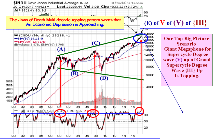
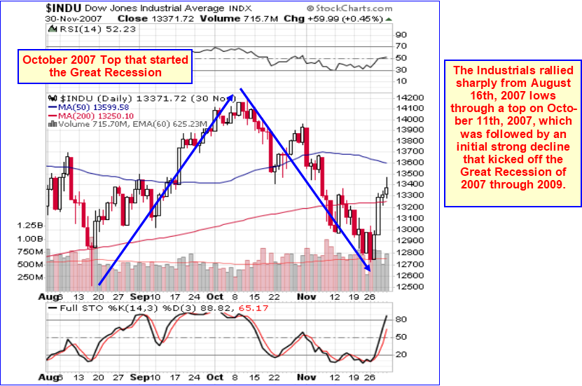
The primary difference this time, is the size of this Megaphone Top pattern, which is huge, almost three decades in the making. Nothing this large appeared before the 1929 crash and Great Depression, nor the 2000 to 2003 Recession and plunge, nor the 2007/2009 Crash and Great Recession. The Megaphone Top patterns that preceded them were tiny compared to this monster. Let’s see what the Megaphone pattern looked like that led to the Great Recession of 2007/2009:
Note the pattern looks identical to what we see now, with a huge fifth wave “e” up extension like we see now, only this pattern developed over a four-year period, which was enough to lead to the Great Recession of 2007/2009, which of course led to a 55 percent plunge in the stock market. Think we cannot see an 80 percent plunge in stocks after the current Megaphone Jaws of Death pattern tops? Well we saw 55 percent in 2007 through 2009 given a much smaller Megaphone pattern than is staring at us now.
Now let’s look at the pre-2000 to 2003 Megaphone Jaws of Death warning pattern that led to the 911 plunge and subsequent Recession:
Note that the initial downside price target is where the declining bottom boundary occurs, directly below the top “e” point. Also note, that just like now, and also like back in 2004 to 2008, the final fifth wave “e” is extending. That parabolic rally led to a crash, just like the one we are seeing now is going to result in.
Now let’s look at the classic 1929 pre-crash, pre-Great Depression warning pattern:
Again, note that the fifth and final wave “e” up extended, was parabolic, giving investors the impression all was well with the world and with stocks and with everything, “buy, buy, buy, this market can never go down.” It capped the “roaring” twenties. Also note that the initial downside price target was the bottom boundary of the pattern just below the point “e” top.
There are other examples of this over the past century which I show in my book, The Coming Economic Ice Age. The problem with the current pattern is that it is so huge, taking three decades rather than just a few months or years, that to precisely identify when “the” top has been reached is difficult. Estimating the precise timing of the top off this huge size pattern can be difficult, and any estimate could be off by a few years, which is insignificant relative to the size of the pattern and the size of the coming decline, but important to know to get out of harm’s way before its too late, but not too soon as to miss the rising trend. But estimates aside, this pattern is nearly complete, so we must be alert at any moment.
This brings us to other analytical studies from which we can draw upon to try and identify good solid candidates for a top for this wave “e” here in 2017.
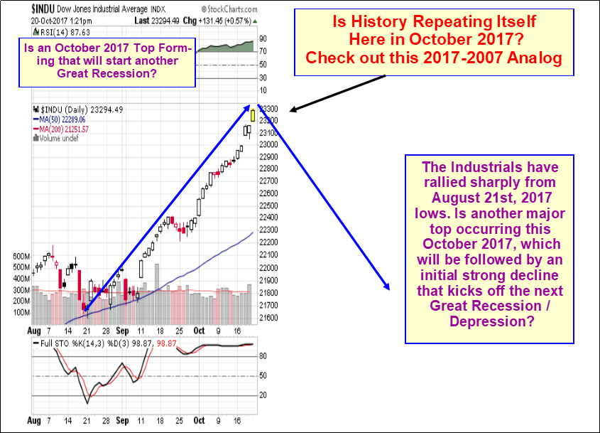
Next, let’s examine a fascinating price pattern Analog between 2007 and here in 2017. There is a striking similarity between the stock rise to a Bull market top from August 2007 through October 2007 (which concluded a 4-year Bull market on October 11th which was followed by the Great Recession and a Bear market that wiped out 55 percent of the stock market) and the stock rise from August 2017 through October 2017, which we believe is concluding the 8 Year Bull market from 2009. Check out these charts below. The point of analogs is they identify similar psychological profiles for the totality of stock investors during two different time periods, giving us an insight into what could happen next.
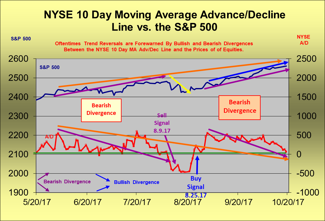
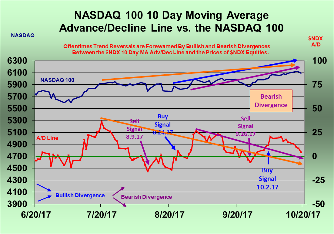
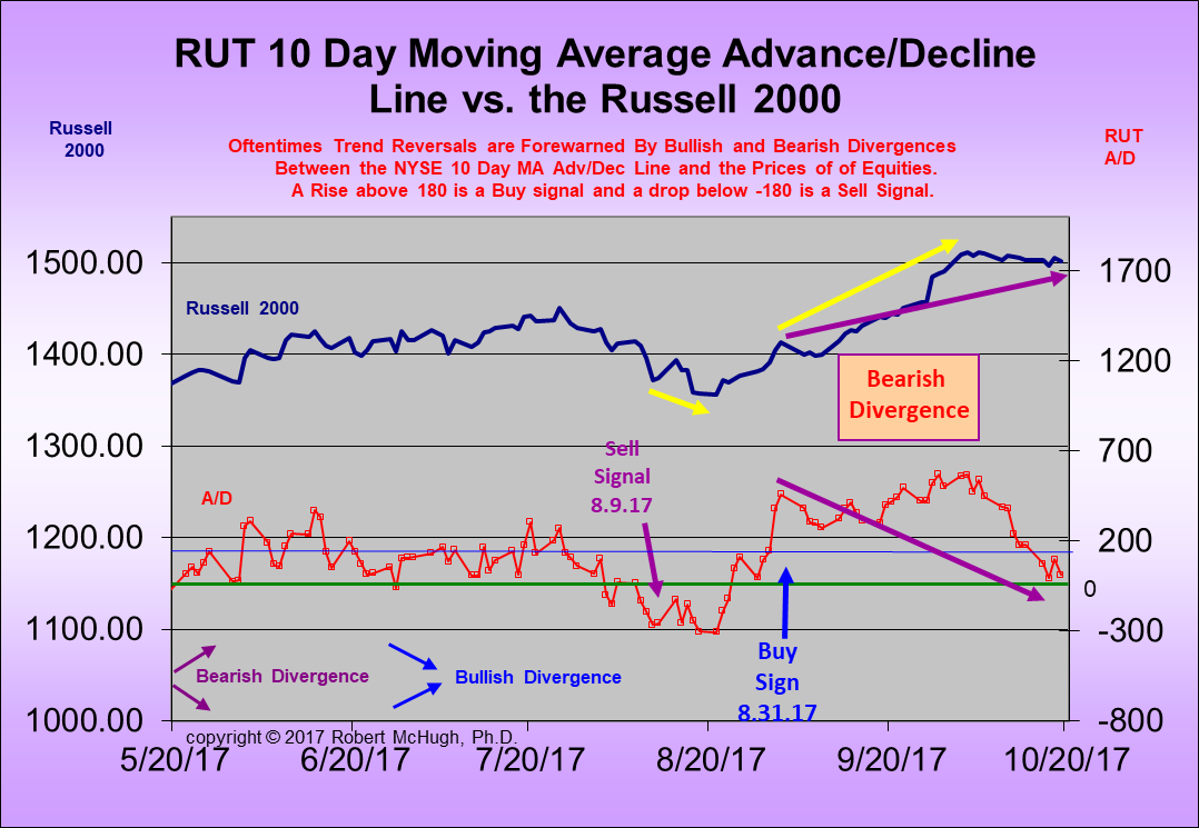
Another indication that stocks are fast approaching a top is when we see divergences between major stock indices and their 10-day average Advance/Decline Line Indicators. Right now, we see this is the case with the Blue Chip S&P 500, the Technology NASDAQ 100, and the Small Cap Russell 2000.
In the case of comparing the S&P 500 versus the NYSE 10-day average Advance/Decline Line Indicator, we see that a Buy signal was generated on August 30th, 2017, which captured the entire rally over the past two months. However, at the same time we see breadth has declined sharply during the course of this rally (red line) as prices (blue line) have risen. This divergence is an early warning of an approaching end to the rally in the S&P 500.
If we look at the Elliott Wave charts, we see the Industrials and the S&P 500 are finishing fifth waves of several degrees of various rising trends.
In the EW world, impulsive rallies usually have a lifespan of five waves, so when we see fifth waves concluding, there is evidence that a top is near and a decline is next. The larger the rising wave trend, the greater the subsequent decline.
Our next chart shows the Dow Industrials completing a five wave Rising Bearish Wedge that started back in August 2015. The upper and lower boundary lines have converged, and the pattern is nearly complete as prices have exceeded the upper boundary line during its fifth and final wave in a typical textbook “throw-over.” This signals the end is near. Note that the minimum downside price target for this intermediate term highly reliable stock pattern is 15,500 for the Industrials, a 33 percent drop. Ouch.

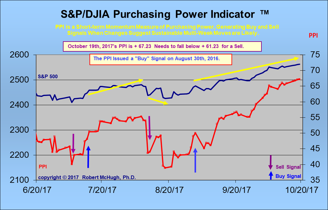
All the analysis so far gets us a good early warning of the high potential for a stock market top that leads to a serious decline. In order to identify and confirm more precisely when that top is in and the serious decline has started, we go to what we call our key trend-finder indicators.
First is our Purchasing Power Indicator, which does a great job identifying strong short-term trend turns. After our Purchasing Power Indicator generated a Buy signal on November 7th, 2016, right after the election, the Industrials rose 1,715 points! After the Purchasing Power Indicator reentered a Buy signal on January 3rd, 2017, the Industrials rose 1,234 points. And now, since the PPI Buy signal on August 30th, the Industrials so far have risen 1,436 points. This signal has captured 4,385 Dow Industrials rally points since the November 2016 election. It works on the Sell side as well. After our PPI generated a Sell on July 24th, 2015 the Industrials fell 2,198 points. Here is a current chart comparing our Purchasing Power Indicator with the S&P 500:
We also have an Intermediate term key trend-finder indicator called our Secondary Trend Indicator, which was formerly called our Technical Indicator Index. It captures a longer-term horizon than our Purchasing Power Indicator, but gives a nice second opinion on whether or not the stock market is starting a new important trend up or down. For example, since our STI triggered a Buy signal on August 30th, the Industrials have risen 1,436 points. After an STI Buy signal in May 2016, the Industrials rose 744 points. It triggered a Buy signal March 3rd, 2016 which led to a 1,223 point rally in the Industrials. After the July 22nd, 2015 Sell Signal, the Industrials fell 2,400 points through January 20th, 2016!
Bear markets can wipe out years of stock market gains in a few months, which is why we pay so much attention to the evidence for approaching major tops. Precious metals will likely draw money as a safe haven during this coming stock market Bear market. We expect gold and silver to resume their Bull market in earnest as stocks decline.
Note: All the above analysis is an early warning. We would not conclude the stock market top has arrived until we get new Sell signals in our key trend-finder indicators: Our Purchasing Power Indicator and Secondary Trend Indicator. The above evidence suggests these indicator signals could change in the near future. We will be monitoring them closely for new Signals. We present these signals to our subscribers in our daily Market Forecast Report newsletters at www.technicalindicatorindex.com .
*********
Get a FREE 30 Day Trial Subscription to receive our Daily and Weekend U.S. and International Market Forecast Reports at www.technicalindicatorindex.com Simply click on the button at the upper right of the home page. We cover stock markets and Gold daily and have Buy / Sell signals for Mining stocks and Precious metals.
We also offer a Platinum Trading service. Email us at [email protected] for information on that program.
When did Noah build the ark? Before it rained. Well, dark clouds are rolling in. We believe it is now time to make sure our arks are built and can float. We can help you with our daily and weekend market updates, or conservative portfolio model, and Platinum Educational Trading program.
Do not be satisfied hearing what the market did; learn how to predict what the market is going to do. Join us at www.technicalindicatorindex.com as we study the language of the markets. Markets tell where they are headed. Technical Analysis is the science where we learn and apply the forecasting language of the markets.
Dr. McHugh’s book, “The Coming Economic Ice Age, Five Steps to Survive and Prosper,” is available at amazon.com at http://tinyurl.com/lypv47v
Robert McHugh Ph.D. is President and CEO of Main Line Investors, Inc., a registered investment advisor in the Commonwealth of Pennsylvania, and can be reached at www.technicalindicatorindex.com. The statements, opinions, buy and sell signals, and analyses presented in this newsletter are provided as a general information and education service only. Opinions, estimates, buy and sell signals, and probabilities expressed herein constitute the judgment of the author as of the date indicated and are subject to change without notice. Nothing contained in this newsletter is intended to be, nor shall it be construed as, investment advice, nor is it to be relied upon in making any investment or other decision. Prior to making any investment decision, you are advised to consult with your broker, investment advisor or other appropriate tax or financial professional to determine the suitability of any investment. Neither Main Line Investors, Inc. nor Robert D. McHugh, Jr., Ph.D. Editor shall be responsible or have any liability for investment decisions based upon, or the results obtained from, the information provided. Copyright 2017, Main Line Investors, Inc. All Rights Reserved.


