Wall Street Keeps Passing Up Opportunities to do Something Bullish


Last week, the Dow Jones closed at its BEV -5% line, in its Bear’s Eye View (BEV) chart below. At the time, I said if the Dow Jones is in a bull market, it will advance into scoring position, above its BEV -5% line, if not, it would back down. This week the Dow Jones retreated, down to its black trend line.
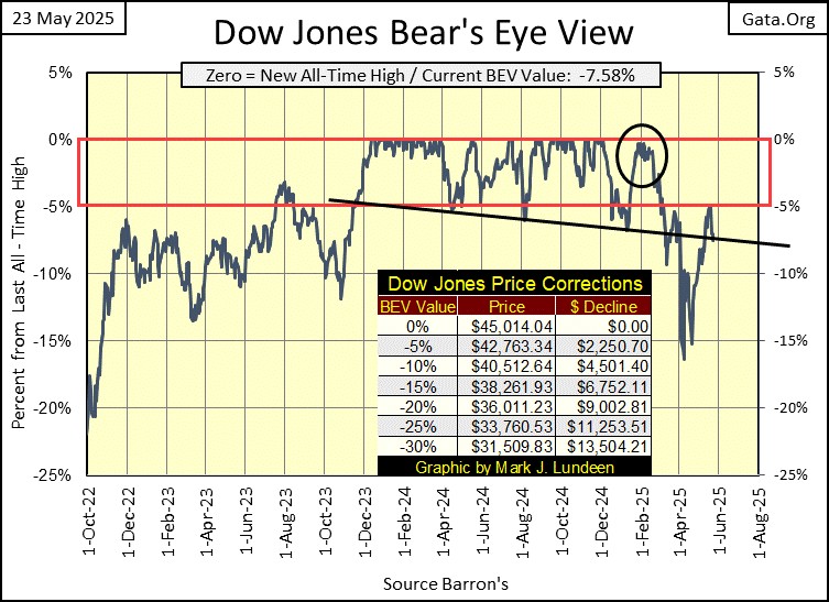
I don’t want to make too much of this, as this doesn’t mean it’s the end of the world as far as the stock market is concerned. But since December 4th, when the Dow Jones made its last BEV Zero in the chart above, the story of the Dow Jones has been one of failure, at every opportunity it’s had to demonstrate some market strength.
- In early February (Black Circle above), the Dow Jones came close to making a new BEV Zero, but failed to do so.
- Then in late March, it came close to entering scoring position, but didn’t. Once again, the Dow Jones failed to pass a bullish-market milestone, as it then deflated to below its BEV -15% line in early April.
- Since its lows of April, the Dow Jones has rebounded. This week, on Monday’s close, the Dow Jones closed with a BEV of -4.94%, inside scoring position. But it didn’t stay there for long, with the Dow Jones closing the week with a BEV of -7.58%, or 7.58% below its last all-time high of December 4th of last year, which is below scoring position.
This is not how a market advances. But it doesn’t mean the end is near either. Still, considering how long, and high the Dow Jones has advanced since August 1982, I’m much more inclined to be pessimistic on the stock market’s near-term future, as 2025 flows towards the new year.
The Dow Jones in daily bars below, tells the same tale woe that its BEV chart above does; a story of failure since its last all-time high on December 4th.
Note; there are now two double tops in the chart below. The first forming around December’s the last all-time high. And now a second double top, forming at the Dow Jones BEV 5% line, or at 42,700. Since March, 42,700 has provided a stiff resistance to every Dow Jones advance. Will the Dow Jones now attempt to break above 42,700 with a third try, or give up, and test its lows of early April?
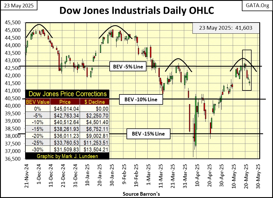
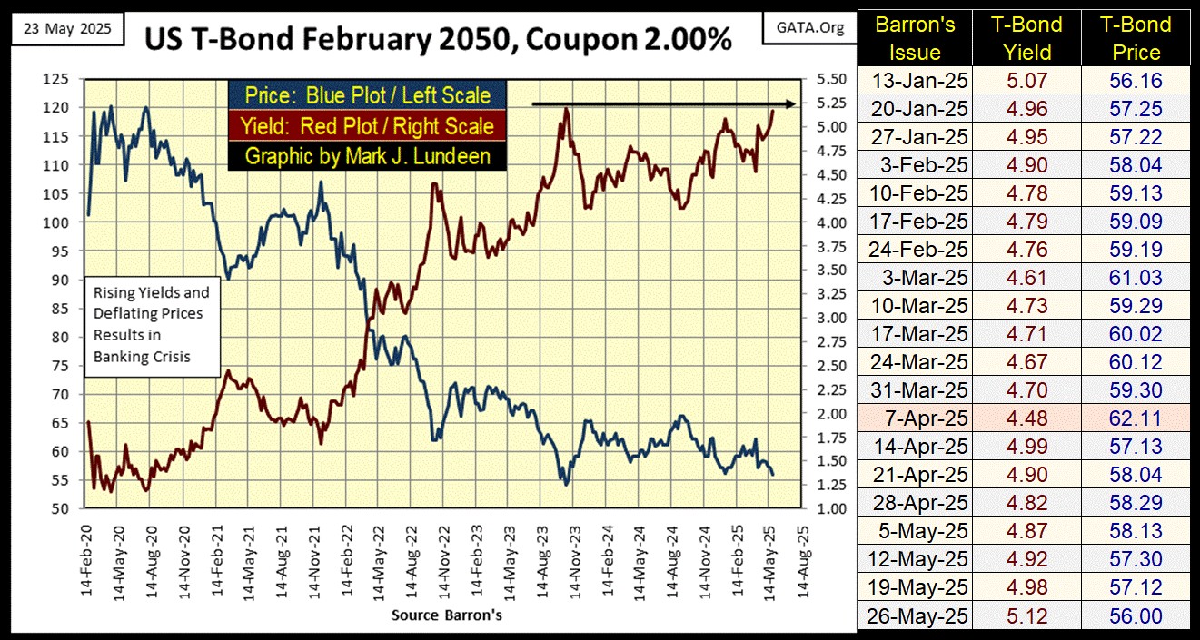
For the Dow Jones to next break below its lows of April, would be very bearish for the stock market. But will it? Maybe we should look at something else to gain an insight into the possibilities for our future, such as this 30yr-T-bond below, that was issued in February 2020. Of course, in May 2025, this is now only a 25yr-T-bond.
I’ve made the point that historically, rising bond yields are bearish for the stock market. At week’s close, this T-bond’s yield (Red Plot below) closed at 5.12%, testing its highs of late October 2023; 5.19%. In the weeks to come, should its yield rise to something above 5.25%, it would confirm my suspicions that something big, bad, and very ugly is waiting for us, somewhere out there in the woods, just out of sight of the light from our campfire.
Exactly what that will prove to be; an angry sasquatch, or a pack of hungry dire-wolfs, we don’t know yet. Or even worse, could it be Mr Bear? I just can’t put my fingers in it, not yet anyway. However, markets frequently move up, or down in anticipation of what is to come, though yet we know not why. We need only wait to see what the future brings, be that something good, or bad.
It’s not only the Dow Jones passing up opportunities to demonstrate market strength. In the table below, listing the BEV values for the major market indexes I follow, on Monday, there was one BEV Zero, and twelve indexes in scoring position.
This week was a great opportunity for these indexes to generate some additional BEV Zeros in the table below. Instead, there were no additional BEV Zeros following Monday, and by Friday’s close, only three indexes closed in scoring position. There was one exception to this week’s weakness; the gold and silver miners in the XAU, increasing from #21 last week, to #18 this week.
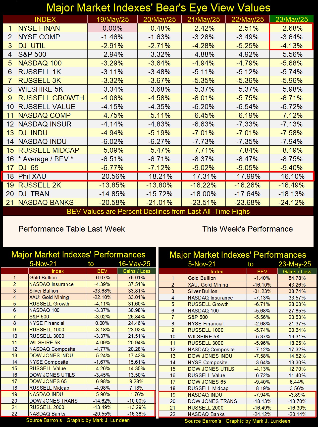
In this week’s market performance table above, once again gold, the XAU and silver took the top three positions, tossing the NASDAQ Insurance index back where it belonged; not in the top three spots!
In the weeks to come, should a growing gap form between the market’s precious metal assets now in the top three spots, and the rest of the market, that would be very bearish.
Below, Ray Dalio of Bridgewater states the obvious.
Here is something Ray didn’t say in the clip above. Because the dollars all US bonds are payable in, are seeing their purchasing power diluted, due to Consumer Price Inflation (CPI), caused by the US Government printing money, ultimately will result in the bond market selling off.
Bonds shed their market valuation, thus increasing the current yields of existing bonds. This is a necessary requirement for the bond market to attract new buyers, for current bond owners who wish to sell (at a loss), in an economy suffering from CPI inflation.
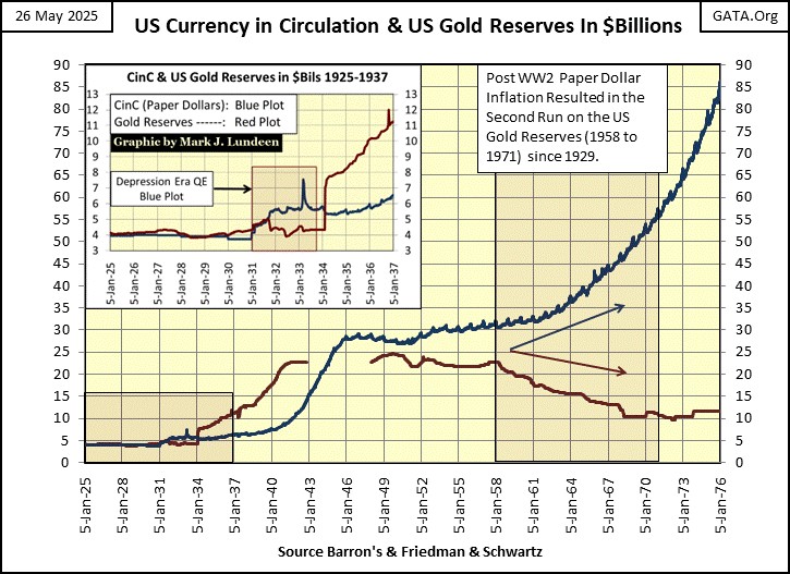
A point I frequently hammer home is; in August 1971, President Nixon didn’t decouple the dollar’s link to the Bretton Woods’ $35 gold peg. August 1971 was when it could no longer be denied, the reality of decades of unchecked US paper dollar issuance, no longer limited by US Treasury gold at a rate of $35 paper dollars, per one ounce of US gold, as was obligated by international law.
By 1971, “when Nixon took the dollar off the gold standard” the US dollar hadn’t been pegged to its $35 gold peg for decades. One only has to glean through the dusty old pages of Barron’s, to compile the data of CinC (paper dollars in circulation), and dollars in US Treasury gold, published weekly since the late 1920s by the US Treasury, to confirm this truth, as seen in the chart below.
What Nixon did in August 1971, was to “Temporarily Close” the US Treasury’s “gold window,” which has yet to be reopened, to prevent foreign-central banks from redeeming their unwanted paper dollars (Blue Plot below) for US gold (Red Plot below), thus terminating a run on US Treasury gold that began in 1958. See the large Red Rectangle in the chart below.
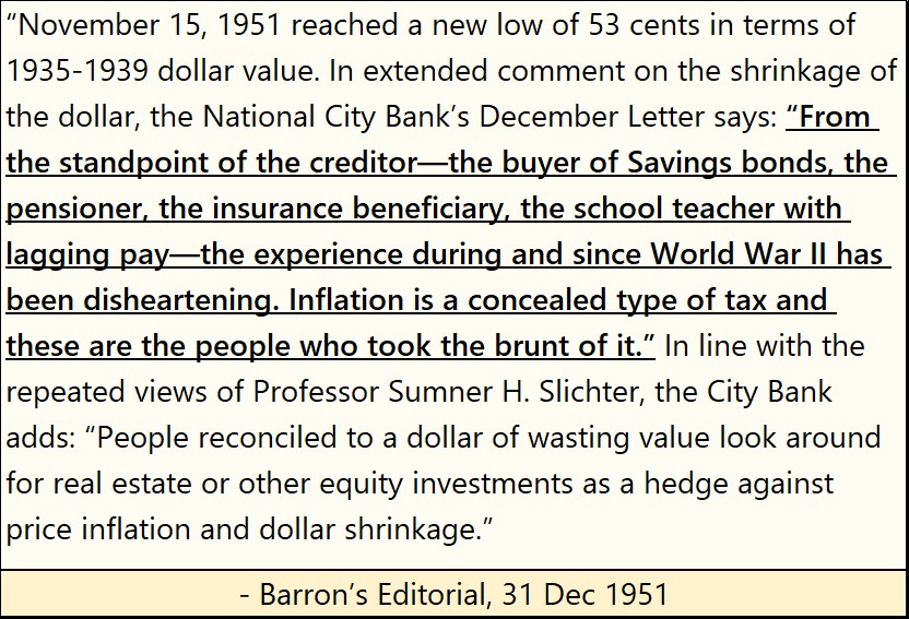
CinC (paper dollar) inflation, had been eroding the dollar’s purchasing power a long time before 1971, as seen in the Barron’s quote below from December 1951.
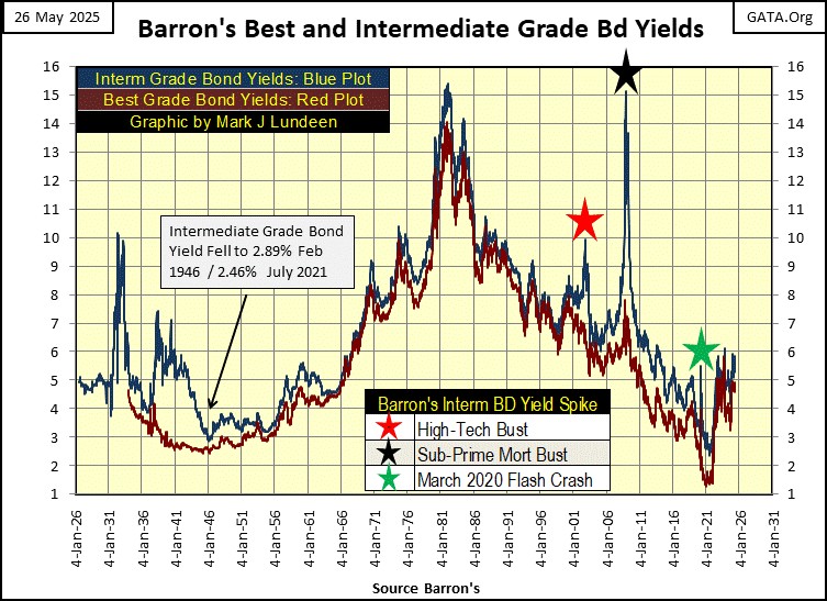
However, it wasn’t until 1956 that the dollar’s “wasting value” resulted in the US bond market finally responding to the ever-shrinking purchasing power of the dollar. As seen in the chart below, plotting Barron’s Best & Intermediate Grade Bond’s Yields, when bond yields began trending upward for the next quarter century, from low single digits, too deep into double-digit yields.
Beginning in 1956, bond buyers began demanding an inflation premium, higher yields to compensate them for the dollar’s diminishing purchasing power over time. If bond yields had increased to double-digits by the 1970s, it was in response to rising CPI inflation, which also increased to double-digits.
Here is a historical market observation, made possible by studying these bond yields;
- rising bond yields = rising CPI inflation,
- falling bond yields = falling CPI inflation.
During market eras where CPI inflation dominates the economy, investments in stocks, and bonds offer poor returns to investors. However, commodities do well as CPI inflation inflates their market prices. But commodities require investors to speculate in the futures markets, something most retail investors will not excel in.
There is a better option for investors during times of rising CPI inflation. Looking at the Barron’s Stock Averages below, the top performing group from 1958 to 1980 were the gold and silver miners in the Barron’s Gold Mining Index (BGMI). Nothing else came close to gold mining as an investment during this era of rising CPI inflation.
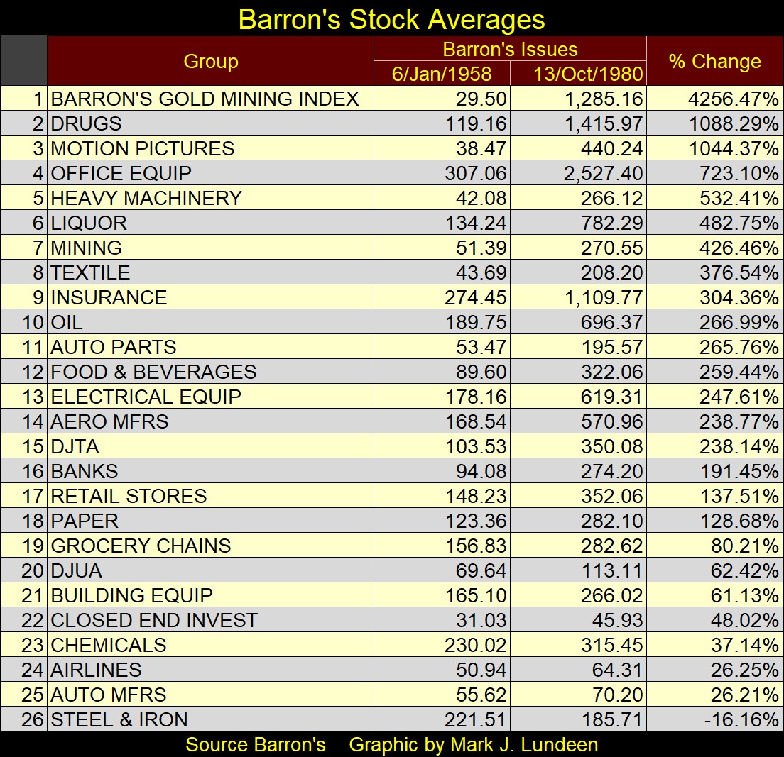
So, the BGMI did well for investors during the inflationary era of the 1950s to early 1980s markets. But importantly, the BGMI also did well during the deflationary markets of the Depressing 1930s, as seen in the chart below.
Below, I indexed;
- The Dow Jones (Red Plot),
- The Barron’s Gold Mining Index (Blue Plot),
- CinC (Currency in Circulation = paper dollars circulating in the economy) (Green Plot),
to 1.00 = 05 January 1920.
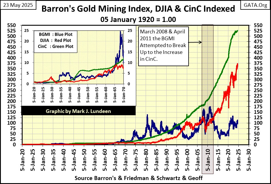
As painfully evident above, CinC inflation (Green plot) has been relentless since 1920, which in 2025, has advanced far above the Dow Jones (Red Plot), and the BGMI (Blue Plot).
I then created the two plots seen below, by creating a ratio of the Dow Jones (Red Plot), and BGMI (Blue Plot), to CinC (Green Plot) seen above. When these ratios rise above the Green 1.0 line, they have increased more than has CinC. When they fall below the Green 1.0 line, they have increased less than CinC. In effect, we’re looking at the Dow Jones and the BGMI’s performance, compared to increases in paper money inflation, “injected” into the economy by the idiots at the FOMC.
Looking at the 1920s, the Dow Jones soared far above the increases in CinC, for the only time since the Federal Reserve was created in 1913. At the Dow Jones peak in 1929, for every unit CinC increased in these ratios, the Dow Jones had advanced by four. Something that was never to happen again with the Dow Jones.
Since 1966, the Dow Jones may have increased greatly, but not as much as the increases in CinC, as seen by the Dow Jones (Red Plot) never rising above the Green 1.0 line for the past six decades. This makes the Dow Jones, an inflation adjusted loser.
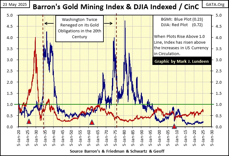
Now look at the BGMI. It too saw gains in the 1920s, if less than the Dow Jones. But during the Depressing 1930s, as everything else crashed on Wall Street, the BGMI actually enjoyed a bull market that was greater than the Dow Jones saw in the 1920s. What is also notable about the BGMI plot above, is how from 1965 to 1995, its gains were all above the rate of inflation. Unfortunately, volatility for the BGMI was insane for these thirty years. So, holding on to these gold mining shares for the long-term, became impossible.
As of now, with the BGMI ratio above at 0.23, these gold miners are historically cheap, and cheap is good when one is buying. Should the BGMI’s ratio above once again increase to 2.0, something it has done many times in the past century, assuming CinC remains fixed at todays volume of dollars in circulation, the BGMI would have to increase from its present 1,119, to 9,900.
Will that happen? Today, should bond yields continue to rise, and over time I expect they will, it’s reasonable expecting the gold and silver miners to once again become the stock market’s must-have sector for professional money managers, and retail investors.
It is just a fact that in 2025, there are so many trillions of dollars flowing daily in today’s financial markets. Unfortunately for the gold and silver miners, most of these dollars aren’t flowing into the XAU or BGMI – not yet anyway. But come a market crisis, that will change. In investing; it always best to buy before the crowd arrives, like now for gold and silver miners, and have a little patience to wait for the crowd to follow.
But why did Washington and Wall Street want to decouple the dollar from its $35 gold peg, and inflate the supply of CinC? For the same reason many people wish they could write checks for amounts far above the funds they have in their checking accounts – so they can do things their current resources can’t provide. For people writing bad checks, that scam won’t last for long, as their gains is the banks loss, and banks don’t like losing money.
But for the CinC inflation scam, and the Federal Reserve System that enables it, both bankers and politicians have benefited immensely since the Fed was legislated into existence in 1913.
America didn’t have a central bank since Andrew Jackson killed the Second Bank of the United States in 1833. By the time of the American Civil War; 1861 to 1865, plans were being laid for resurrecting central banking once again in the United States.
Then came 1913, a bad year that saw;
- the Federal Reserve System,
- the income tax,
- senators elected directly by the public into office, instituted, and things have never been the same.
One feature of the post 1913 world would have, would be for America’s new central bank to facilitate ever greater debt burdens on government, corporations, and individuals.
Below is a chart for consumer debt (Blue Plot) and personal income (Red Plot) plotted, indexed to 1.00 = January 1959. As of March 2025, the latest data, since 1959 consumer debt is up by a factor of 102.26, while personal income is up by a factor of only 65.18. The American “consumer” is being consumed by debt.
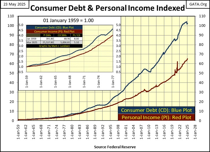
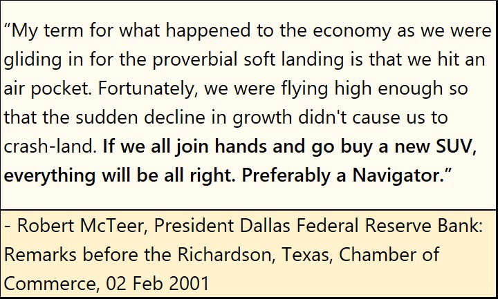
Well, after all, “consumers” are only doing what their betters have been telling them to do for decades; buy now, pay later. Of course, the banking system has been providing ample credit for consumers, via credit cards. “Consumer” going deeper into debt, can even save the economy from a massive contraction. As happened in 2000-01, when the then President of the Dallas Federal Reserve Bank said this, which was widely reported in the financial media at the time.
Below is a chart of the US national debt going back to 1952. Currently, the national debt is over 36 trillion dollars. This vast sum of debt would not have been possible, had the US dollar kept to its $35 gold peg. But, that is why they got rid of it, to make possible what is seen below, and above, unchecked inflation of the supply of dollars circulating in the economy, and the debt this inflation creates.
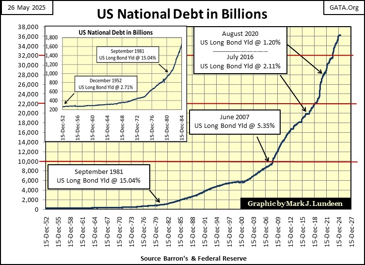
These numbers, trillions-of-dollars mean nothing to most people. How does one obtain a sense of scale, to understand what 36 trillion dollars really mean?
The best way of doing so, is looking at the numbers of stars found in the local universe, as seen in the link below. Within five million light years from Earth, in what is called the local group of galaxies, there are only 700 billion stars. That the US national debt is 36 trillion dollars, a sum which doesn’t include the Federal Government’s massive “unfounded liabilities,” is frightening!
http://www.atlasoftheuniverse.com/localgr.html
Geeze Louise! What are these people (you know; “THEM”) doing with all of these dollars? Things they couldn’t do without them, things they would rather not have to explain to the taxpayers. Whatever programs and projects they are spending trillions of dollars on, don’t count on the financial media of telling us, either because they don’t know, or if they do know, won’t. It’s just the way it is.
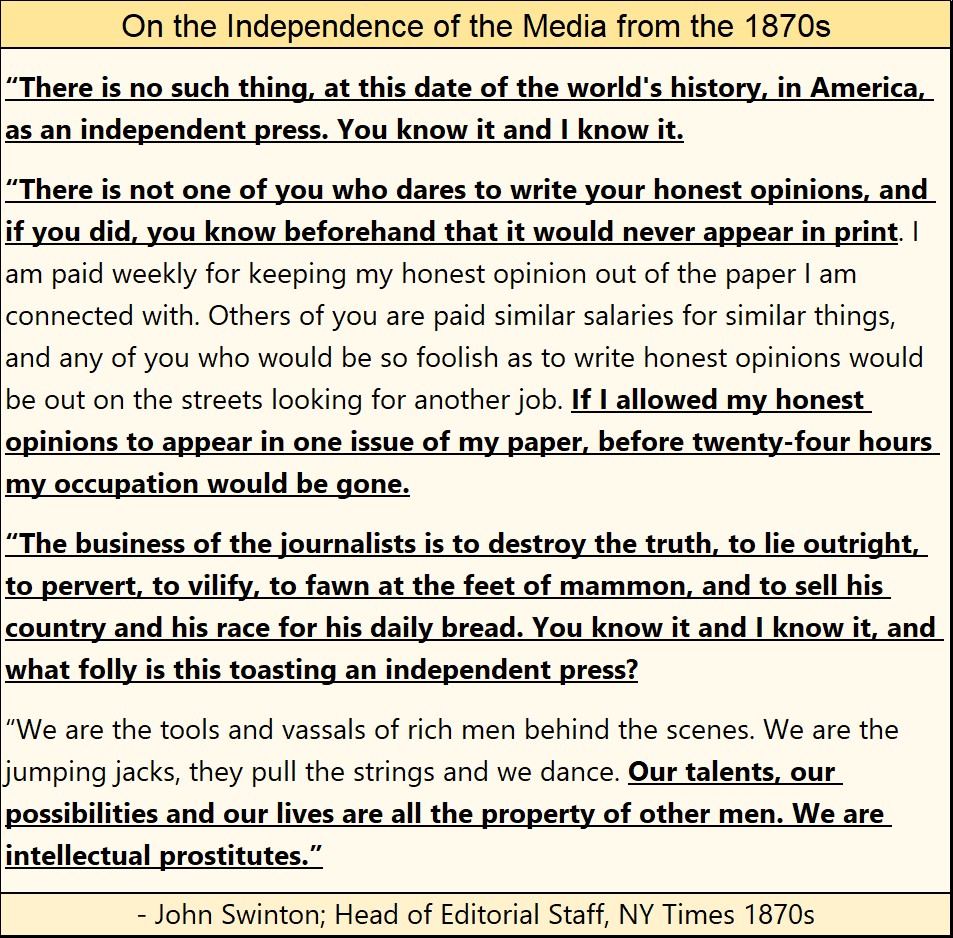
Reasons to be suspicious of being deceived by the mainstream media have been obvious, to those looking for them, for a long time. Here is a quote from John Swinton, a New York based journalist from the 1870s.
However, with the arrival of the 21st Century, and the internet, things have changed. However, the problem with the truth, be it in the 1870s, or 2020s, it’s hard to believe. Far easier for most people to believe the daily untruths fed to them by the media.
But for those who want to take the deep dive into where the many trillions of dollars have been going, the below hour and forty-five-minute podcast with Tucker Carlson and Catherine Fitts below, will greatly enlighten you, though you may find it hard to believe.
Catherine Fitts knows her stuff. She was a deputy director of HUD during George H.W. Bush’s mis-administration. She was doing such a good job eliminating fraud, waste and abuse; Barron’s had a long write up on how she was cleaning up HUD.
She got fired of course. The Feds then confiscated all of her data she used to construct her models for her work. But that was a long time ago, back when America’s national debt was only 3.4 trillion dollars, not the 36 trillion dollars it is today.
https://tuckercarlson.com/tucker-show-catherine-fitts
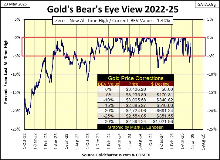
Now to gold’s BEV chart below. Like the Dow Jones at the close of last week, gold too closed last week below scoring position, just below its BEV -5% line. But unlike the Dow Jones’ current tale of woe, at this week’s close, gold closed well within scoring position, with a BEV of -1.40%. As it looks, gold should be generating additional BEV Zeros in the weeks to come.
Not much more to say about that. Except the bull market in gold remains on solid ground, and will remain so, for as long as gold remains in scoring position, within the Red Rectangle below.
In gold’s step sum table below, apparently the period of where daily declines overwhelm daily advances is coming to an end, as seen with its 15-count closing the week with a +3.
In the weeks to come, it would be good seeing additional daily declines, to keep gold’s 15-count from increasing to an overbought +7. Don’t worry, as bull markets see plenty of down days, as bear markets see plenty of advancing days.
Anyway, if gold is in a market advance, it daily advances will move its valuation up more, that its daily declines can take it down, as that is what happens when a market advances.
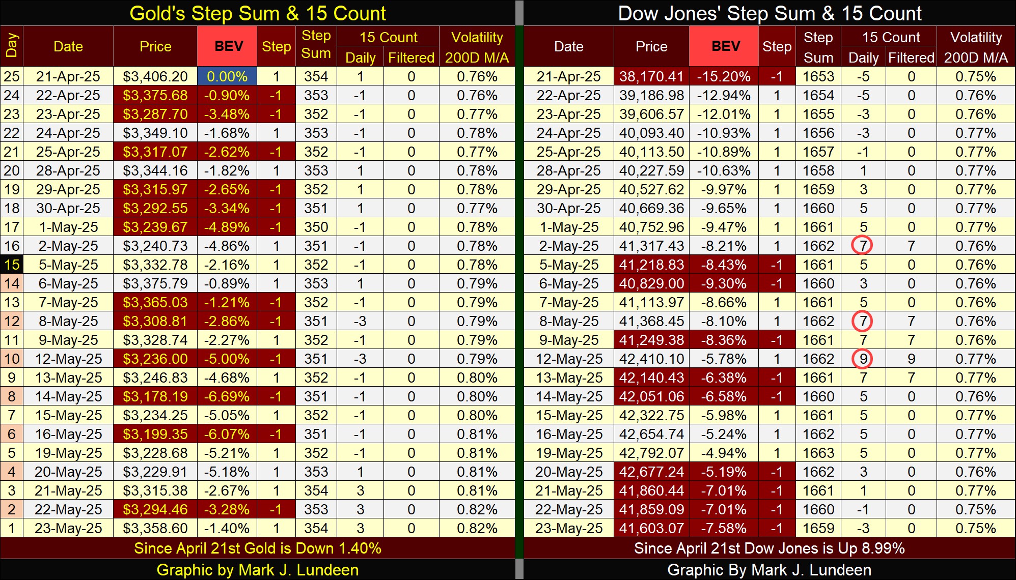
The Dow Jones in its step sum table, is working off its overbought +9, 15-count, by seeing an increase in down days in the market. And the down days are having their effect on the Dow Jones valuation. Since May 19th, (Monday this week), the Dow Jones is down over 1,100 points.
Question; what is to come for the Dow Jones when I return from my break, two weeks from now? Right now, I’m thinking market gravity will continue pulling it down, below its BEV -10% line (40,500). I’m not stating the following as a fact, but if there really is an angry sasquatch, lurking somewhere out there in the dark, the Dow Jones could be down below its BEV -15% line (38,200) when I return. But like me, my readers will just have to wait to see what June has to offer the Dow Jones
Mark J. Lundeen
*******


