The XAU Was A Top Performer For 2019


This week the Dow Jones Index closed on a high note; its fifteenth new all-time high since November 1st. But since March 2009 the Dow Jones, and most of the stock market has seen many new all-time highs. As seen in the Dow Jones Bear’s Eye View (BEV) chart below, every time the Dow Jones touches that red 0.00% line, market history is made; like the 0.00% seen at the close of this week.
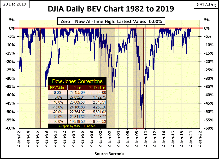
All that sounds good, but one of these days ---. One of these days what? One of these days Mr Bear is going to give the market a real stress test, then we’ll see massive valuation deflation in the financial markets. I say that because deflation is impossible unless market valuations are first inflated, and the FOMC has been inflating market valuations since 1982. On 04 January 1982 the Dow Jones closed at 882.52; this week it closed at 28,455.09.
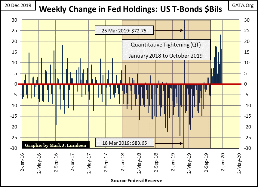
And the Federal Reserve is inflating market valuations. As seen in their weekly changes of their holding of US Treasury Debt for their reserves (Below). This week they “monetized” sixteen billion more of Uncle Sam’s IOU, they then “injected” the resulting effluent into the financial system.
Below charts the weekly changes in the Federal Reserve’s US Treasury holdings. We see their post QE-3 monetary policy, then in January 2018 they began their Quantitative tightening (QT), where week after week they sold down their T-debt reserves, until October of this year, where all they do now is “monetize” additional T-debt to “stimulate” the economy and financial markets.
All this “execution of monetary policy” doesn’t seem so bad looking at the chart above. One week they buy some T-debt, the next they sell. But in the chart below where I take a 10Wk M/A of these weekly changes, it doesn’t look so benign.
Before the 2007-09 financial crisis, the FOMC only “monetized” a few billion dollars of T-debt a week. Apparently that was all it took to inflate a huge bubble in the NASDAQ High-Tech market in the 1990s, and again in the housing market from 2002-2007. Then came early 2008, when Wall Street began upchucking toxic mortgages, and “monetary policy” has never been the same.
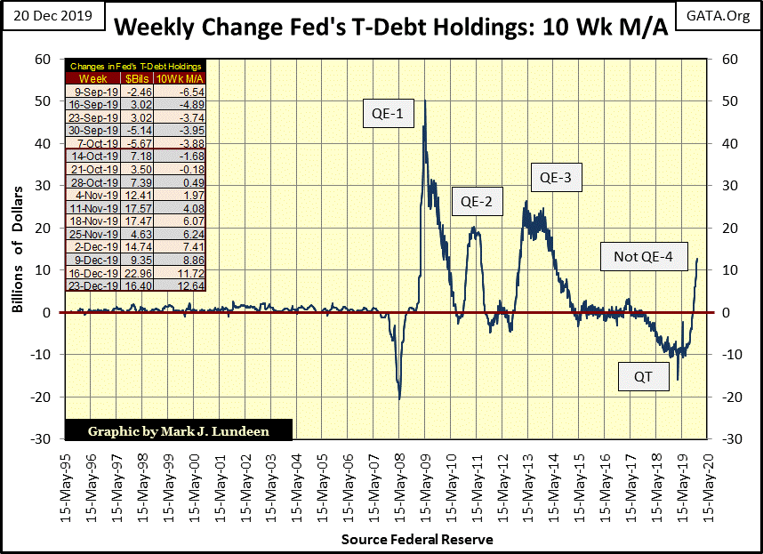
Back when I was a fleet-sailor a few decades ago, should I have seen the above wave pattern in an oscilloscope for a system of mine, I’d be thinking a positive feedback loop is over-driving its circuitry. That’s not good, as whatever this equipment was supposed to be doing for me, it is now constantly attempting (but failing) to compensate for something it is doing to its self.
And that is a darn good description of what the Federal Reserve has been doing since early 2008 above & below.
- The FOMC inflated a bubble in the housing market that created a mania in real estate.
- When housing and mortgage valuations began deflating it almost destroyed the banking system the FOMC is responsible for. So the FOMC (reacting to a deflationary market event they themselves made inevitable) began a series of three QEs,
- Which lead to a QT.
- Which made the current NOT QE-4 the inevitable next step.
This reminds me of a scene from Doctor Strange Love where General Turgidson (George C. Scott) talks about the “Ruskies”, except replace the “Ruskies” with any member of the Federal Reserve Open Market Committee (FOMC), most especially current Chairman Powell.
https://youtu.be/UxLe8MWdWe0?t=22
Our “policy makers” have totally lost control over their “monetary policy.” Now in 2019, and going forward into 2020 and beyond, past grave errors in “policy” will continue to dictate future “policy” to the “policy makers” as they hang on for dear life hoping no one notices.
But what’s to notice? With the Dow Jones going on from one new all-time high to another, what could be wrong with the world?
As for the major market indexes I follow in the table below, look at all those pretty pink BEV Zeros (new all-time highs) from last week.
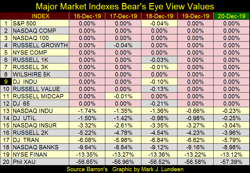
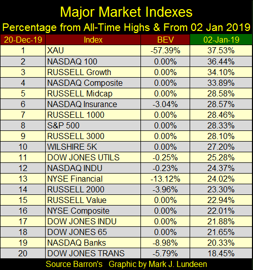
So how did the stock market, as recorded in the indexes seen above do this year? Since 02 January 2019 they are all up by double-digit percentages. But surprisingly the XAU (#1: Precious Metals Mining) outperformed even the hot NASDAQ indexes.
Here’s the XAU (daily data) in the chart below, from its first day of trading in 1983 to the close of this week. Thirty-six years of trading and the XAU closed the week ten-points below its first daily closing in December 1983.
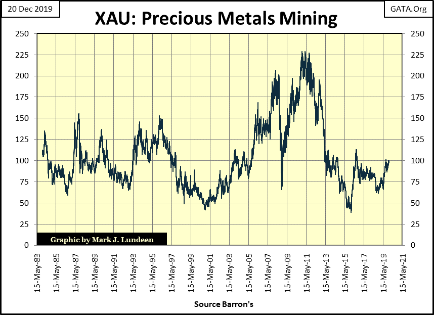
Not much of an endorsement for investing in mining shares, or so most people would think. But during this period of history in the financial markets, key commodities have been relentlessly manipulated by a “bunch of ignorant peons” (as General Turgidson would put it) managing “monetary policy” at the FOMC. There are excellent reasons to believe all that is going to change for the benefit of precious metals assets, like the gold and silver miners in the XAU and elsewhere.
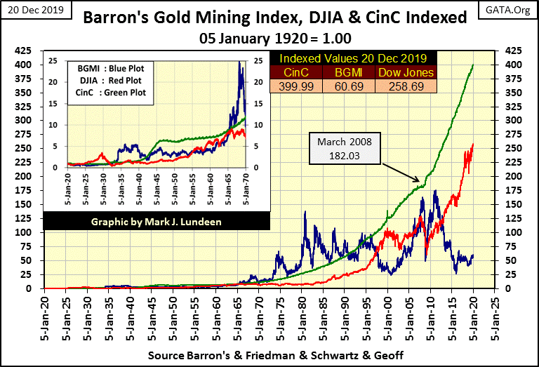
I have Barron’s Gold Mining Index (BGMI) weekly data going back to 1920, thanks to a good bloke from Down Under who goes by the name of Geoff, who filled in the blanks using weekly Homestake Mining data from 1920 to the actual 1938 start in Barron’s. Geoff: my readers and I am most grateful for the effort you made.
Anyway, below we’re looking at the indexed values for the BGMI (Blue Plot below), Dow Jones (Red Plot), and US Currency in Circulation (CinC Green Plot = US Dollars in Circulation) going back to January 1920 – 100 years of data in just a few weeks.
I’ve covered this chart in detail in past articles, but with just a quick study one would see how the BGMI was countercyclical to the Dow Jones. There were times when that wasn’t true, but most of the time it is.
This chart also shows how inflation flowing from the Federal Reserve (Green Plot) drives valuations in both the Dow Jones and the BGMI, but typically for these two market series not at the same time. In other words, first the Dow Jones inflates, and when the Dow Jones begins deflating the BGMI inflates as a reaction to deflation in the broad-stock market.
Also note the Green CinC line is my rate of inflation, something the Dow Jones hasn’t surpassed since its bull market of the 1920s (see chart insert). Importantly, this is not so for the BGMI, which since 1920s has spent decades above the rate of inflation as seen in the indexed value of CinC below.
Twice since its 1980-2001 bear market bottom, the BGMI twice attempted to rise above the Green CinC line, and failed as a matter of “policy” coming from the FOMC. But there will be a third attempt in the not too distant future, and if the past is our guide in understanding the future, and it usually is, I’m expecting the BGMI to explode from its current depressed values as the Dow Jones enters a period of deflation, as some day it must. I also expect the BGMI will ultimately rise up to and then beyond the Green CinC line, as it did during the depressing 1930s, and again from the late-1960s to the mid-1990s.
For my readers who followed me into my little exploration play: Eskay Mining (NASDAQ: ESKYF), here’s a very interesting video with comments by Doctor Quinton Hennigh as he discusses Eskay Mining’s geological potential. The talk is very technical, but Doctor Hennigh is very excited about the data provided by Eskay Mining’s management on the company’s property, in fact he has joined Eskay’s exploration team.
Don’t be put off by the technical nature of the video. Watch it; maybe you’ll learn something.
Next is a press release from last October on the Company retaining a team of geologists from the Colorado School of Mines Doctor Hennigh mentioned in the video above. Eskay Mining closed the week at about $0.11.
Gold is behaving excellently! It’s currently in the fourth month of correction #2 below, and its BEV -22.5% line is holding.
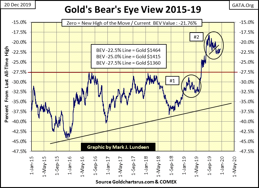
The big banks are really hammering it at the COMEX, yet they’ve failed to break gold below $1450 for two months now.
The Silver to Gold Ratio (SGR) closed the week at 86.18 ounces of silver for one ounce of gold. What does that tell us? That the big moves in silver and gold are still pending. We’ll know when the precious-metals bull market resumes when the SGR below once again approaches its 40 line, and then declines to levels not seen since the 1970s.
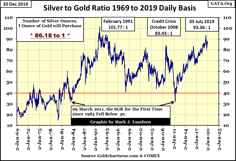
A big decline in the SGR: that’s what I’ll be watching to see when the precious-metals bull market once again departs the station on its way to much higher prices. However people whose wealth is now in the financial system will see valuation deflation in the broad-stock market and rising yields and rates in the debt markets as gold and silver finally resume the bull market that began in 2001.
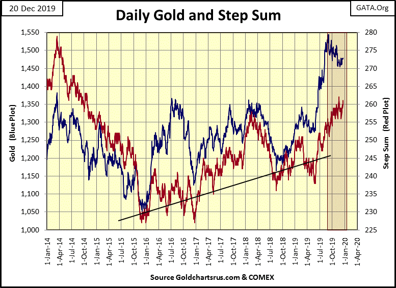
The Bear Box in gold’s step sum chart below is still intact. Market reality as seen in the blue price-of-gold plot is still in a bearish down trend, while market sentiment as seen in gold’s red step sum plot remains bullish. In other words market reality and sentiment in the gold market are decoupled, and they can’t both be right.
Typically market reality (market price) is a superior predictor of future price trends. So, we should expect the blue price plot below to once again begin a significant decline, taking the red step sum (market sentiment) plot down with it as the bulls abandon their bullish positions and exit the market. At some point both plots would bottom, and the advance would resume as both plots reversed upward, and together.
But there are times when these boxes fail, where market sentiment (the step sum) proves correct. For the past two months the bears have attempted to drive gold below its $1450 line in the chart below. That’s a long time; so I’m beginning wonder just how strong the bears are in this market? Maybe bullish market sentiment in the step sum is correct, that the next big move in the gold market is up.
This is something that we have to wait to see how it plays out.
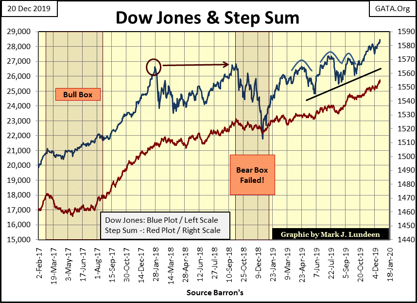
Below we see a bear box that failed just last year with the Dow Jones. The blue price plot declined by 18% during the correction as its red step sum plot ignored the market decline. The failure of this bear box provided an excellent technical indicator that higher prices were coming for the Dow Jones and the broad-stock market.
As the SGR remains mired in the 80s, I’m expecting further significant gains in the Dow Jones below.
The main item I’m looking at with the gold step sum table is its lousy daily volatility. Once we see some big days of extreme-market volatility, days gold moves up or down by 3% or more from a previous day’s close, we bulls will see much better market action. But gold hasn’t seen a day of extreme volatility since October 2016, over three years ago.
Until gold once again sees these big 3% daily moves, one or two a month would do, don’t expect much action in the gold and silver markets. Gold’s step sum closed the week at 260, where it was on November 15th, but the price of gold is up $10 since then.
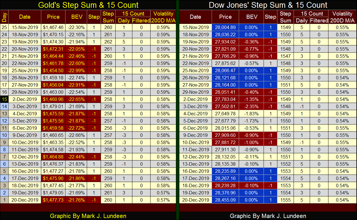
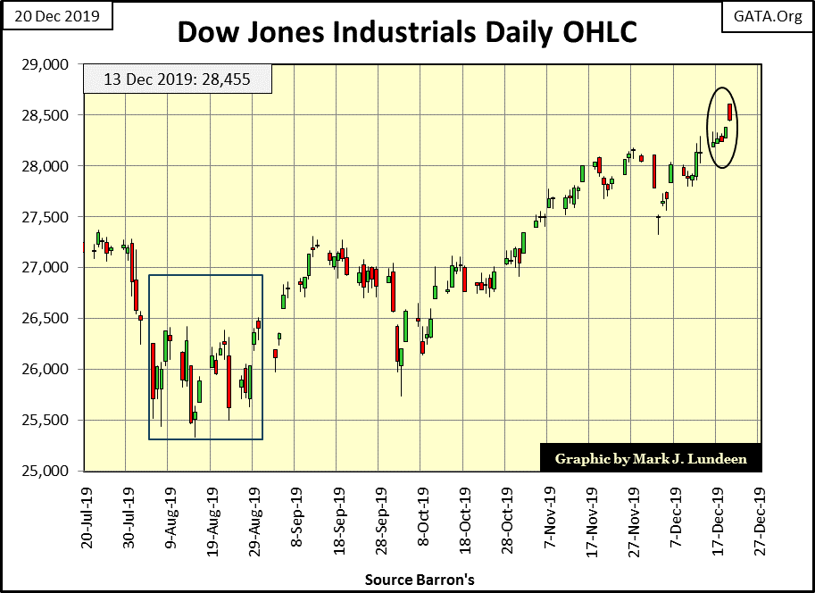
Look at all the beautiful blue days, days the Dow Jones closed at a new all-time high on its side of the table above. Volatility for the Dow Jones is even less than it is for gold. But low volatility for the stock market is something that just happens during bull-market advances.
When the Dow Jones once again begins making daily moves of 2% or more (up or down) from a previous day’s closing price; that will be a dependable sign of a market top in the stock market. Don’t be surprised should rising volatility in the Dow Jones trigger the same in gold.
********


